HarmonyOS6 PC 开发实战:呼吸灯动画——安静而有力的“生命感“效果
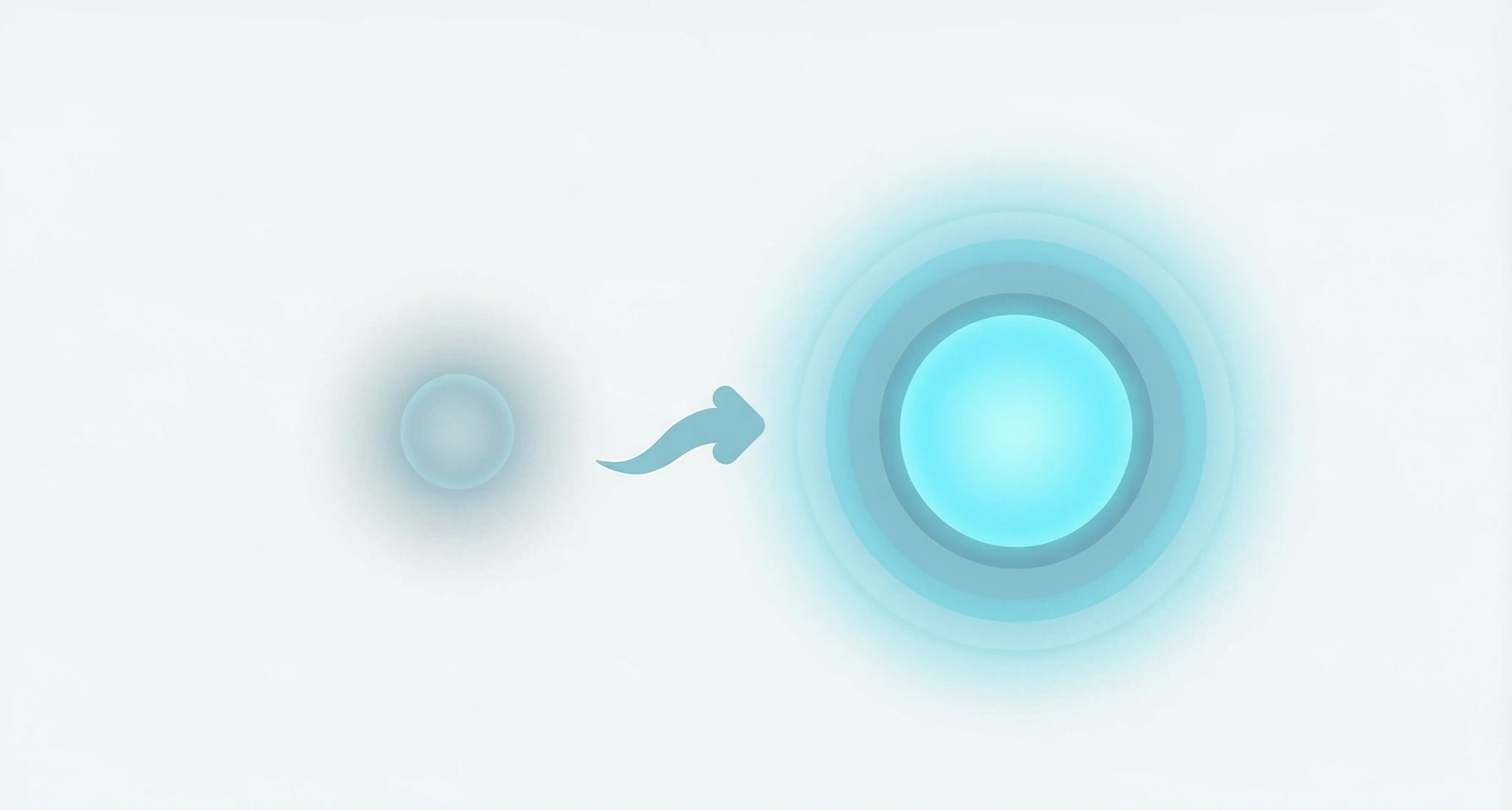
MacBook盖上盖子后,侧边那个缓慢明暗交替的白色指示灯,大概是很多人对"呼吸灯"的第一印象。那个效果确实很妙——明明是一台休眠的机器,但那个柔和的灯光起伏,让你觉得它是"活着"的,只是在睡觉。这种"呼吸感"在UI设计中同样好用。HarmonyOS6 PC端的应用里,加载等待状态、设备连接指示、后台运行提示——这些场景都需要一种"我正在工作,但不会打扰你"的视觉反馈。呼吸灯动画就是为这些场景量身
MacBook盖上盖子后,侧边那个缓慢明暗交替的白色指示灯,大概是很多人对"呼吸灯"的第一印象。那个效果确实很妙——明明是一台休眠的机器,但那个柔和的灯光起伏,让你觉得它是"活着"的,只是在睡觉。
这种"呼吸感"在UI设计中同样好用。HarmonyOS6 PC端的应用里,加载等待状态、设备连接指示、后台运行提示——这些场景都需要一种"我正在工作,但不会打扰你"的视觉反馈。呼吸灯动画就是为这些场景量身定做的。
跟脉冲动画不同,呼吸灯更慢、更柔和、更克制。它不追求"快看我看我"的效果,而是"别急,我在呢"的感觉。
效果描述
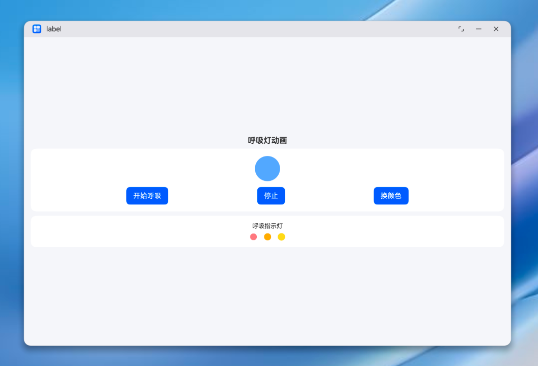
我们要实现的呼吸灯效果包含两个部分:
主体呼吸灯:一个60×60的圆形色块,opacity在0.3和1之间来回变化,scale在0.8和1之间来回变化。一个完整的呼吸周期是3秒(1.5秒吸气+1.5秒呼气)。支持切换颜色。
指示灯组:三个小圆点,使用相同的呼吸参数但加了不同的偏移量,产生一种"波浪式呼吸"的效果——三个灯不是同步的,而是有先后次序的。
状态变量与颜色配置
@Entry
@Component
struct BreathDemo {
  @State breathOpacity: number = 0.3
  @State breathScale: number = 0.8
  @State isBreathing: boolean = false
  @State colorIndex: number = 0
  private breathColors: string[] = ['#4D96FF', '#FF6B6B', '#6BCB77', '#9B59B6', '#FFD93D']
  // ...
}
几个关键状态:
breathOpacity:透明度,在0.3和1之间循环breathScale:缩放比,在0.8和1之间循环isBreathing:控制呼吸动画的开关colorIndex:当前颜色索引,支持循环切换
颜色数组里放了5种颜色:蓝色(#4D96FF)、红色(#FF6B6B)、绿色(#6BCB77)、紫色(#9B59B6)、黄色(#FFD93D)。这几种颜色做呼吸灯效果都很舒服。
呼吸周期的核心实现
呼吸灯的关键函数 _breathCycle:
_breathCycle() {
  if (!this.isBreathing) return

  // 吸气阶段:从暗淡→明亮,从缩小→正常
  animateTo({ duration: 1500, curve: Curve.EaseInOut }, () => {
    this.breathOpacity = 1
    this.breathScale = 1
  })

  // 呼气阶段:1.5秒后,从明亮→暗淡,从正常→缩小
  setTimeout(() => {
    if (!this.isBreathing) return
    animateTo({ duration: 1500, curve: Curve.EaseInOut }, () => {
      this.breathOpacity = 0.3
      this.breathScale = 0.8
    })
    // 本轮呼吸结束,开始下一轮
    setTimeout(() => { this._breathCycle() }, 1500)
  }, 1500)
}
这段代码的结构跟脉冲动画很像——递归调用实现循环。但有几个本质区别:
1500ms 的慢节奏
一个完整周期是3秒。相比脉冲动画的1.4秒,呼吸灯慢了将近一倍。这个慢是有道理的——人在平静状态下的呼吸频率大约是每分钟12-20次,也就是3-5秒一个呼吸周期。3秒恰好落在了"平静呼吸"的区间。
如果你把周期改成1秒,效果看起来就会像"急促喘息",完全失去了呼吸灯那种安静沉稳的感觉。1500ms 单程,3000ms 一个完整周期,这个数字不是随便定的。
对称的 EaseInOut
吸气和呼气两个阶段都使用 Curve.EaseInOut 缓动曲线。这意味着:
- 吸气开始:慢慢变亮(EaseIn部分)
- 吸气中间:加速变亮
- 吸气结束:慢慢到达最亮(EaseOut部分)
- 呼气同理,慢慢变暗
这种对称的缓动曲线跟真实呼吸的节奏完全一致——你不会突然深吸一口气,也不会突然呼出来。一切都是渐进的、柔和的。
双重属性同步变化
透明度(0.3↔1)和缩放(0.8↔1)在同一个 animateTo 闭包里变化,所以它们的动画是完全同步的。吸气时同时变亮变大,呼气时同时变暗变小。
如果两个属性不同步——比如透明度先到达峰值,缩放还在半路上——视觉上就会有一种"脱节"的感觉。呼吸灯的魅力恰恰在于所有变化是统一的、协调的。
主体呼吸灯的视觉实现
Row() {
  Column()
    .width(60)
    .height(60)
    .backgroundColor(this.breathColors[this.colorIndex])
    .borderRadius(30)
    .opacity(this.breathOpacity)
    .scale({ x: this.breathScale, y: this.breathScale })
    .animation({ duration: 1500, curve: Curve.EaseInOut })
}
.width('100%')
.justifyContent(FlexAlign.Center)
.animation({ duration: 1500, curve: Curve.EaseInOut }) 确保组件在响应 breathOpacity 和 breathScale 变化时,使用1.5秒的缓动过渡。
borderRadius(30) 让60×60的方块变成圆形。呼吸灯用圆形是最自然的——方形呼吸灯会让人觉得有点奇怪,像一块LED面板在闪烁。
控制按钮:开始、停止、换颜色
Row({ space: 8 }) {
  Button('开始呼吸')
    .onClick(() => {
      if (this.isBreathing) return
      this.isBreathing = true
      this._breathCycle()
    })
  Button('停止')
    .onClick(() => {
      this.isBreathing = false
    })
  Button('换颜色')
    .onClick(() => {
      this.colorIndex = (this.colorIndex + 1) % this.breathColors.length
    })
}
.width('100%')
.justifyContent(FlexAlign.SpaceEvenly)
"开始呼吸"和"停止"的逻辑跟脉冲动画一样——用 isBreathing 布尔值控制循环的启停。
"换颜色"按钮比较有趣。它通过修改 colorIndex 来改变呼吸灯的颜色。因为 backgroundColor 绑定的是 this.breathColors[this.colorIndex],颜色变化会立即生效。而且由于 .animation() 修饰器的存在,颜色切换本身也会有一个平滑的过渡。
这个"换颜色"功能在PC端的实际应用中可以做成"主题色切换"或者"状态指示切换"——比如蓝色代表蓝牙连接中,绿色代表WiFi连接中,红色代表电池低。
指示灯组:波浪式呼吸
页面下方还有一组三个小圆点,也做呼吸效果,但加了一些偏移量:
Row({ space: 16 }) {
  ForEach([0, 1, 2], (idx: number) => {
    Column()
      .width(16)
      .height(16)
      .backgroundColor(['#FF6B6B', '#FFA500', '#FFD93D'][idx])
      .borderRadius(8)
      .opacity(this.breathOpacity + idx * 0.15)
      .scale({
        x: this.breathScale + idx * 0.05,
        y: this.breathScale + idx * 0.05
      })
      .animation({ duration: 1500, curve: Curve.EaseInOut })
  })
}
.width('100%')
.justifyContent(FlexAlign.Center)
三个圆点使用了红(#FF6B6B)、橙(#FFA500)、黄(#FFD93D)三种颜色。
关键在于这个偏移量的设计:
- 第1个灯:opacity = breathOpacity + 0,scale = breathScale + 0
- 第2个灯:opacity = breathOpacity + 0.15,scale = breathScale + 0.05
- 第3个灯:opacity = breathOpacity + 0.30,scale = breathScale + 0.10
因为三个灯的基准值不同,虽然它们都响应同一个 breathOpacity 和 breathScale 状态变量,但表现出来的动画相位是错开的。第3个灯总是比第1个灯"亮"一些、"大"一些。
这种"波浪式"效果在视觉上比三个完全同步的呼吸灯好看得多。它有一种"此起彼伏"的韵律感,像呼吸灯在"对话"。
坦白讲,更高级的做法是让三个灯使用不同的定时器来实现真正的相位差——比如第2个灯延迟500ms启动,第3个灯延迟1000ms。但用偏移量的方式更简单,在大多数场景下效果已经够用了。
完整代码
@Entry
@Component
struct BreathDemo {
  @State breathOpacity: number = 0.3
  @State breathScale: number = 0.8
  @State isBreathing: boolean = false
  @State colorIndex: number = 0
  private breathColors: string[] = ['#4D96FF', '#FF6B6B', '#6BCB77', '#9B59B6', '#FFD93D']

  build() {
    Column() {
      Scroll() {
        Column() {
          Text('呼吸灯动画')
            .fontSize(18)
            .fontWeight(FontWeight.Bold)
            .margin({ bottom: 8 })

          // 主体呼吸灯
          Column() {
            Column({ space: 12 }) {
              Row() {
                Column()
                  .width(60)
                  .height(60)
                  .backgroundColor(this.breathColors[this.colorIndex])
                  .borderRadius(30)
                  .opacity(this.breathOpacity)
                  .scale({ x: this.breathScale, y: this.breathScale })
                  .animation({ duration: 1500, curve: Curve.EaseInOut })
              }
              .width('100%')
              .justifyContent(FlexAlign.Center)

              Row({ space: 8 }) {
                Button('开始呼吸')
                  .onClick(() => {
                    if (this.isBreathing) return
                    this.isBreathing = true
                    this._breathCycle()
                  })
                Button('停止')
                  .onClick(() => {
                    this.isBreathing = false
                  })
                Button('换颜色')
                  .onClick(() => {
                    this.colorIndex = (this.colorIndex + 1) % this.breathColors.length
                  })
              }
              .width('100%')
              .justifyContent(FlexAlign.SpaceEvenly)
            }
          }
          .width('100%')
          .backgroundColor('#FFFFFF')
          .borderRadius(12)
          .padding(16)

          // 指示灯组
          Column() {
            Text('呼吸指示灯')
              .fontSize(14)
              .fontWeight(FontWeight.Medium)
              .margin({ bottom: 8 })
            Row({ space: 16 }) {
              ForEach([0, 1, 2], (idx: number) => {
                Column()
                  .width(16)
                  .height(16)
                  .backgroundColor(['#FF6B6B', '#FFA500', '#FFD93D'][idx])
                  .borderRadius(8)
                  .opacity(this.breathOpacity + idx * 0.15)
                  .scale({
                    x: this.breathScale + idx * 0.05,
                    y: this.breathScale + idx * 0.05
                  })
                  .animation({ duration: 1500, curve: Curve.EaseInOut })
              })
            }
            .width('100%')
            .justifyContent(FlexAlign.Center)
          }
          .width('100%')
          .backgroundColor('#FFFFFF')
          .borderRadius(12)
          .padding(16)
          .margin({ top: 10 })
        }
        .width('100%')
      }
      .layoutWeight(1)
    }
    .width('100%')
    .height('100%')
    .backgroundColor('#F5F6FA')
    .padding(16)
  }

  _breathCycle() {
    if (!this.isBreathing) return
    animateTo({ duration: 1500, curve: Curve.EaseInOut }, () => {
      this.breathOpacity = 1
      this.breathScale = 1
    })
    setTimeout(() => {
      if (!this.isBreathing) return
      animateTo({ duration: 1500, curve: Curve.EaseInOut }, () => {
        this.breathOpacity = 0.3
        this.breathScale = 0.8
      })
      setTimeout(() => { this._breathCycle() }, 1500)
    }, 1500)
  }
}
呼吸灯 vs 脉冲动画:什么时候用哪个?
这是个经常被问到的问题。两者都是循环动画,但性格完全不同。
| 特性 | 呼吸灯 | 脉冲 |
|---|---|---|
| 节奏 | 慢(3000ms/周期) | 快(1400ms/周期) |
| 缓动曲线 | EaseInOut(对称柔和) | EaseOut+EaseIn(弹性感) |
| 幅度 | 小(opacity 0.3↔1, scale 0.8↔1) | 大(opacity 0.5↔1, scale 1↔1.3) |
| 气质 | 安静、沉稳、“我在呢” | 活跃、紧迫、“快看我” |
| 典型场景 | 休眠指示、加载等待、后台运行 | 录音状态、紧急通知、操作反馈 |
选择原则很简单:如果用户需要"感知到某事在进行,但不需要立即行动",用呼吸灯。如果用户需要"注意到某事并可能需要采取行动",用脉冲。
在PC端,用户往往同时处理多个任务。呼吸灯这种不打扰但有存在感的动画,特别适合那些"后台进行中"的状态指示。
呼吸灯在PC端的实际应用场景
设备连接状态指示
HarmonyOS6 PC端连接各种外设——蓝牙耳机、鼠标、键盘、打印机。连接过程中,设备图标做呼吸灯效果,告诉用户"正在连接,别急"。连接成功后呼吸灯停止,图标恢复正常。
加载等待状态
PC端加载大数据集或者等待服务器响应时,一个缓慢呼吸的圆形比传统的"转圈"加载动画更有质感。特别是在一些设计感强的应用中,呼吸灯可以作为品牌化的加载方式。
后台任务运行指示
文件压缩、视频渲染、代码编译——这些PC端常见的耗时任务,在后台运行时可以用呼吸灯来表示进度。任务在"安静地"进行中,不打扰用户做其他事。
消息未读提示
如果有未读消息但用户没有在看消息页面,消息图标可以做一个非常轻柔的呼吸灯——不是让你赶紧去看,而是"提醒"你那里有东西。
智能助手待机状态
如果HarmonyOS6 PC端有类似语音助手的智能助手功能,助手在待机监听状态时做一个呼吸灯效果,让用户知道"它在听着呢"。这比一个静止不动的图标更能传达"待机中"的状态。
扩展:更丰富的呼吸灯变化
渐变色呼吸灯
如果想让呼吸灯更有设计感,可以在呼吸过程中同步切换颜色:
@State breathColor: string = '#4D96FF'
@State nextColor: string = '#FF6B6B'

_breathCycle() {
  if (!this.isBreathing) return

  animateTo({ duration: 1500, curve: Curve.EaseInOut }, () => {
    this.breathOpacity = 1
    this.breathScale = 1
    this.breathColor = this.nextColor  // 吸气过程中渐变为下一种颜色
  })

  setTimeout(() => {
    if (!this.isBreathing) return
    animateTo({ duration: 1500, curve: Curve.EaseInOut }, () => {
      this.breathOpacity = 0.3
      this.breathScale = 0.8
    })
    setTimeout(() => {
      // 准备下一次呼吸的颜色
      this.nextColor = this.breathColors[
        (this.breathColors.indexOf(this.nextColor) + 1) % this.breathColors.length
      ]
      this._breathCycle()
    }, 1500)
  }, 1500)
}
配合 .backgroundColor(this.breathColor) 和 .animation() 修饰器,颜色变化也会有平滑过渡。效果是呼吸灯在明暗变化的同时,颜色也在缓慢流转,非常梦幻。
多层呼吸灯
在主体呼吸灯的外面套一层更大的半透明圆,做反向呼吸(主体亮的时候外圈暗,主体暗的时候外圈亮):
Stack() {
  // 外圈:反向呼吸
  Column()
    .width(100)
    .height(100)
    .backgroundColor(this.breathColors[this.colorIndex])
    .borderRadius(50)
    .opacity(1.3 - this.breathOpacity)  // 反向
    .scale({ x: 1.8 - this.breathScale, y: 1.8 - this.breathScale })
    .animation({ duration: 1500, curve: Curve.EaseInOut })

  // 主体:正常呼吸
  Column()
    .width(60)
    .height(60)
    .backgroundColor(this.breathColors[this.colorIndex])
    .borderRadius(30)
    .opacity(this.breathOpacity)
    .scale({ x: this.breathScale, y: this.breathScale })
    .animation({ duration: 1500, curve: Curve.EaseInOut })
}
这种"呼吸扩散"的效果像水波纹一样从中心向外扩散,非常适合用在地图定位、来电提醒等需要"引起注意但不打扰"的场景。
踩坑记录
坑1:停止呼吸后元素停在"半呼吸"状态
跟脉冲动画一样,停止时 isBreathing 设为 false,但当前正在执行的 animateTo 会跑完。这意味着呼吸灯可能会停在 opacity=1 或 scale=1 的"明亮"状态。
如果你希望停止后一定回到暗淡状态,可以在停止按钮的点击回调里手动重置:
Button('停止')
  .onClick(() => {
    this.isBreathing = false
    // 让动画自然回到暗淡状态
    animateTo({ duration: 800, curve: Curve.EaseOut }, () => {
      this.breathOpacity = 0.3
      this.breathScale = 0.8
    })
  })
这样停止后会有一个800ms的"缓慢熄灭"效果,比突然停止更优雅。
坑2:呼吸灯在锁屏/后台时继续消耗性能
PC端应用切到后台时,呼吸灯动画还在跑。虽然单个呼吸灯的CPU消耗很小,但如果你的应用有多个呼吸灯效果,长时间累积起来也不是个小数。
建议在 aboutToDisappear 或者页面不可见的回调里停止呼吸动画:
aboutToDisappear() {
  this.isBreathing = false
}
坑3:指示灯组的偏移量导致属性越界
当 breathOpacity 为1时,第3个灯的opacity是 1 + 0.30 = 1.30。虽然ArkUI会自动把opacity钳制到1,但这种"越界"的值在逻辑上不够干净。如果需要精确控制,可以用 Math.min() 做一下限制:
.opacity(Math.min(this.breathOpacity + idx * 0.15, 1))
小结
呼吸灯动画是循环动画中最"安静"的一种。它用缓慢的节奏、柔和的缓动曲线和小幅度的属性变化,创造出一种"活着但在休眠"的感觉。
核心实现就是两个 animateTo 交替执行——一个吸气(变亮变大),一个呼气(变暗变小),加上递归调用实现无限循环。
记住呼吸灯的设计公式:
- 时长:1500ms 单程,3000ms 一个完整周期
- 缓动:EaseInOut,对称柔和
- 幅度:opacity 0.3↔1,scale 0.8↔1(可以根据场景微调)
- 气质:安静、不打扰、有生命感
在HarmonyOS6 PC端的开发中,呼吸灯是一个被低估的动效形式。它比加载转圈更有质感,比静态图标更有存在感,比脉冲动画更不打扰。适合所有需要"提示但不催促"的场景。
讨论HarmonyOS开发技术,专注于API与组件、DevEco Studio、测试、元服务和应用上架分发等。
更多推荐


 1
1 0
0- 0


 已为社区贡献387条内容

所有评论(0)