【鸿蒙应用开发实战·食光篇】第三篇:菜谱列表与详情页——Tab切换与食材步骤展示
【鸿蒙应用开发实战·食光篇】第三篇:菜谱列表与详情页——Tab切换与食材步骤展示
一、前言
本篇是「食光」开发的核心篇章——菜谱列表页(RecipeListPage) 和菜谱详情页(RecipeDetailPage)。这两个页面承载了应用的核心内容:浏览菜谱和查看详细做法。
与「阅迹」的书籍详情不同,菜谱详情需要处理数组型数据(食材清单、烹饪步骤),并实现Tab切换功能。
二、菜谱列表页(RecipeListPage)
2.1 页面状态
@Entry
@Component
struct RecipeListPage {
  @State currentCuisine: string = '';
  @State filteredRecipes: Recipe[] = RECIPES;
  @StorageLink('favoriteIds') favoriteIds: number[] = [];
}
2.2 接收菜系参数
aboutToAppear(): void {
  const params = router.getParams() as Record<string, Object>;
  if (params && params['cuisine']) {
    this.currentCuisine = params['cuisine'] as string;
  }
  this.filteredRecipes = getRecipesByCuisine(this.currentCuisine);
}
2.3 菜系标签栏
6个标签横向滚动,选中态用橙色背景凸显:
Scroll() {
  Row({ space: 10 }) {
    ForEach(ALL_CUISINES, (cuisine: string) => {
      Text(cuisine)
        .fontSize(14)
        .fontColor(this.currentCuisine === cuisine ? '#FFFFFF' : '#5D4037')
        .backgroundColor(this.currentCuisine === cuisine ? '#E67E22' : '#F5EDE0')
        .padding({ left: 18, right: 18, top: 8, bottom: 8 })
        .borderRadius(18)
        .onClick(() => {
          this.currentCuisine = cuisine;
          this.filteredRecipes = getRecipesByCuisine(cuisine);
        })
    })
  }
  .padding({ left: 16, right: 16, top: 4, bottom: 12 })
}
.scrollable(ScrollDirection.Horizontal)
.scrollBar(BarState.Off)
2.4 列表卡片设计
与「阅迹」的关键区别——每张卡片右侧增加了独立的收藏按钮:
ListItem() {
  Row() {
    // 左侧:封面(菜名首字 + 菜系名)
    Column() {
      Text(item.name.substring(0, 1)).fontSize(26).fontColor('#FFFFFF')
      Text(item.cuisine).fontSize(10).fontColor('rgba(255,255,255,0.7)').margin({ top: 4 })
    }
    .width(80).height(96)
    .backgroundColor(item.color).borderRadius(12)
    .justifyContent(FlexAlign.Center)

    // 中间:信息
    Column() {
      Text(item.name).fontSize(17).fontWeight(FontWeight.Bold)
      Row() {
        Text('⏱ ' + item.cookTime).fontSize(12).fontColor('#8B7355')
        Text('| ' + item.difficulty).fontSize(12)
          .fontColor(getDifficultyColor(item.difficulty)).margin({ left: 8 })
      }.margin({ top: 6 })
      Text(getStarString(item.rating)).fontSize(12).fontColor('#F39C12').margin({ top: 4 })
      Text(item.description.substring(0, 20) + '...')
        .fontSize(11).fontColor('#A09080').maxLines(1)
    }
    .layoutWeight(1).padding({ left: 12 }).height(96)

    // 右侧:独立收藏按钮
    Column() {
      Text(this.favoriteIds.indexOf(item.id) >= 0 ? '❤️' : '🤍').fontSize(18)
    }
    .width(30).justifyContent(FlexAlign.Center)
    .onClick((event?: ClickEvent) => {
      this.toggleFavorite(item.id);
    })
  }
  .padding(12).backgroundColor('#FFFFFF').borderRadius(14)
  .shadow({ radius: 4, color: '#0A000000', offsetY: 2 })
  .onClick(() => {
    router.pushUrl({ url: 'pages/RecipeDetailPage', params: { recipeId: item.id } });
  })
}
设计要点:收藏按钮的点击事件加了 (event?: ClickEvent) 参数,并没有阻止事件冒泡——点击收藏不会触发卡片的详情跳转,这是一个需要测试验证的细节。
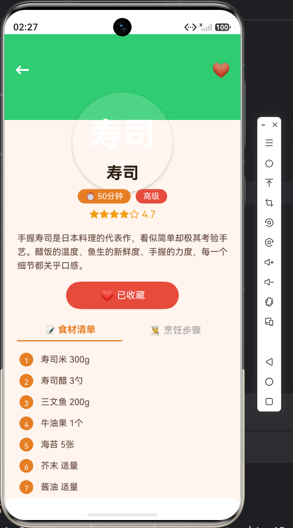
三、菜谱详情页(RecipeDetailPage)
3.1 页面功能
详情页是「食光」中最复杂的页面,包含多个区域:
┌──────────────────────────────┐
│ ← ❤️ │ ← 返回 + 收藏按钮
│ │
│ 麻 婆 豆 腐 │ ← 圆形头像式封面
│ 川菜 │
├──────────────────────────────┤
│ 麻婆豆腐 │ ← 菜名
│ ⏱20分钟 🌶️中级 │ ← 标签行
│ ★★★★☆ 4.8 │ ← 评分
│ [加入收藏] │ ← 收藏按钮
├──────────────────────────────┤
│ 📝食材清单 | 👨🍳烹饪步骤 │ ← Tab切换
│ 1. 嫩豆腐 300g │
│ 2. 牛肉末 50g │
│ 3. 豆瓣酱 1勺 │
├──────────────────────────────┤
│ 💡小贴士 │
│ 豆腐焯水时加盐可以增加韧性 │
├──────────────────────────────┤
│ 🍜 同菜系推荐 │
│ ┌──┐ ┌──┐ ┌──┐ │
│ │水│ │白│ │叉│ │ ← 3道同菜系菜
│ └──┘ └──┘ └──┘ │
└──────────────────────────────┘
3.2 状态管理
@Entry
@Component
struct RecipeDetailPage {
  @State currentRecipe: Recipe | undefined = undefined;
  @State isFavorited: boolean = false;
  @StorageLink('favoriteIds') favoriteIds: number[] = [];
  private relatedRecipes: Recipe[] = [];
  @State selectedTabIndex: number = 0;  // Tab切换状态
}
3.3 圆形封面大图
详情页的封面采用正圆形设计,与首页风格统一:
@Builder
coverSection(item: Recipe) {
  Stack() {
    // 背景全宽色块
    Column().width('100%').height(200).backgroundColor(item.color)

    // 顶部操作栏
    Row() {
      Text('←').fontSize(24).fontColor('#FFFFFF')
        .onClick(() => { router.back(); })
      Blank()
      Text(this.isFavorited ? '❤️' : '🤍').fontSize(24)
        .onClick(() => { this.toggleFavorite(item.id); })
    }
    .width('100%').padding({ left: 16, right: 16, top: 40 })

    // 正圆形封面(居中偏下)
    Column() {
      Text(item.name.substring(0, 2)).fontSize(52).fontColor('#FFFFFF')
      Text(item.cuisine).fontSize(14).fontColor('rgba(255,255,255,0.8)').margin({ top: 8 })
    }
    .width(160).height(160)
    .backgroundColor('rgba(255,255,255,0.15)')
    .borderRadius(80)  // 正圆形——宽高相等 + 圆角=宽一半
    .justifyContent(FlexAlign.Center)
    .position({ x: '50%', y: '78%' })
    .translate({ x: '-50%' })
    .shadow({ radius: 12, color: '#33000000', offsetY: 6 })
  }
  .width('100%').height(200)
}
与「阅迹」区别:「阅迹」详情封面是矩形(140×180),「食光」是正圆形(160×160,borderRadius=80)。
3.4 信息区与标签行
难度和烹饪时长用两个彩色标签展示:
Row({ space: 8 }) {
  Text('⏱ ' + item.cookTime)
    .fontSize(13).fontColor('#FFFFFF')
    .backgroundColor('#E67E22')
    .padding({ left: 12, right: 12, top: 4, bottom: 4 }).borderRadius(12)
  Text(item.difficulty)
    .fontSize(13).fontColor('#FFFFFF')
    .backgroundColor(getDifficultyColor(item.difficulty))
    .padding({ left: 12, right: 12, top: 4, bottom: 4 }).borderRadius(12)
}
难度颜色动态映射:初级绿色、中级橙色、高级红色。
3.5 Tab切换:食材 vs 步骤
这是「食光」详情页最核心的交互创新——用Tab切换展示食材清单和烹饪步骤。
Tab标题
@Builder
tabButton(label: string, index: number) {
  Text(label)
    .fontSize(15)
    .fontWeight(this.selectedTabIndex === index ? FontWeight.Bold : FontWeight.Normal)
    .fontColor(this.selectedTabIndex === index ? '#E67E22' : '#999')
    .padding({ bottom: 8 })
    .border({ width: { bottom: this.selectedTabIndex === index ? 2 : 0 }, color: '#E67E22' })
    .layoutWeight(1)
    .textAlign(TextAlign.Center)
    .onClick(() => { this.selectedTabIndex = index; })
}
Tab指示器实现:通过 border 的下边框模拟底部指示线,选中时显示2dp橙色底线。
食材清单Tab
@Builder
ingredientsContent(item: Recipe) {
  Column() {
    ForEach(item.ingredients, (ing: string, index: number) => {
      Row() {
        Text((index + 1).toString())
          .fontSize(12).fontColor('#FFFFFF')
          .backgroundColor('#E67E22')
          .width(22).height(22).borderRadius(11)
          .textAlign(TextAlign.Center).lineHeight(22)
        Text(ing).fontSize(14).fontColor('#5D4037').margin({ left: 12 })
      }
      .width('100%').padding({ left: 24, right: 24, top: 6, bottom: 6 })
    })
  }
  .width('100%').padding({ top: 12 })
}
每个食材前有一个编号圆圈,视觉上类似购物清单。
烹饪步骤Tab
@Builder
stepsContent(item: Recipe) {
  Column() {
    ForEach(item.steps, (step: string, index: number) => {
      Row() {
        Text((index + 1).toString())
          .fontSize(13).fontColor('#FFFFFF')
          .backgroundColor('#E67E22')
          .width(24).height(24).borderRadius(12)
          .textAlign(TextAlign.Center).lineHeight(24)
        Text(step).fontSize(13).fontColor('#5D4037').lineHeight(20)
          .margin({ left: 12 }).layoutWeight(1)
      }
      .width('100%').padding({ left: 24, right: 24, top: 8, bottom: 8 })
    })
  }
  .width('100%').padding({ top: 12 })
}
步骤文本使用 lineHeight(20) 增加行间距,长文本自动换行。
3.6 小贴士区域
@Builder
tipsSection(item: Recipe) {
  Column() {
    Row() {
      Text('💡 小贴士').fontSize(16).fontWeight(FontWeight.Bold).fontColor('#2D1F14')
      Blank()
    }
    .width('100%').margin({ bottom: 10 })
    Text(item.tips).fontSize(13).fontColor('#8B7355').lineHeight(20)
  }
  .width('100%').padding(16)
  .backgroundColor('#FFFFFF').borderRadius(14)
  .shadow({ radius: 3, color: '#0A000000', offsetY: 1 })
  .padding({ left: 20, right: 20, top: 24 })
}
小贴士区域用白色卡片包裹,与整体列表形成视觉区隔。
3.7 同菜系推荐
@Builder
relatedSection() {
  Column() {
    Row() {
      Text('🍜 同菜系推荐').fontSize(17).fontWeight(FontWeight.Bold)
      Blank()
    }.width('100%').margin({ bottom: 12 })

    Row({ space: 16 }) {
      ForEach(this.relatedRecipes, (item: Recipe) => {
        Column() {
          // 小圆形封面
          Column() {
            Text(item.name.substring(0, 1)).fontSize(24).fontColor('#FFFFFF')
            Text(item.cuisine).fontSize(10).fontColor('rgba(255,255,255,0.7)').margin({ top: 4 })
          }
          .width(100).height(120)
          .backgroundColor(item.color).borderRadius(12)

          Text(item.name).fontSize(13).fontColor('#2D1F14')
            .margin({ top: 6 }).maxLines(1)
          Text(item.cookTime).fontSize(11).fontColor('#8B7355')
        }
        .width(100)
        .onClick(() => {
          router.pushUrl({ url: 'pages/RecipeDetailPage', params: { recipeId: item.id } });
        })
      })
    }
  }
}
四、条件渲染与错误处理
if (this.currentRecipe) {
  // 正常渲染详情
} else {
  // 错误提示
  Column() {
    Text('🍽️').fontSize(64)
    Text('未找到菜品信息')
    Button('返回').onClick(() => { router.back(); })
  }
}
五、效果预览(请插入截图位置)
六、小结
本篇完成了:
✅ 菜谱列表页的菜系筛选与卡片列表
✅ 详情页圆形封面大图
✅ Tab切换(食材清单 vs 烹饪步骤)
✅ 小贴士与同菜系推荐
与「阅迹」的核心差异:
- 详情页增加了 Tab切换 功能(阅迹只有单页滚动)
- 数据结构更复杂:数组型食材和步骤
- 难度等级可视化(颜色映射)
- 封面设计:正圆形 vs 矩形
下一篇将开发收藏功能与个人中心,继续探索AppStorage的全局状态管理,敬请期待!
#鸿蒙开发 #ArkTS #Tab切换 #详情页 #HarmonyOS

讨论HarmonyOS开发技术,专注于API与组件、DevEco Studio、测试、元服务和应用上架分发等。
更多推荐

 6
6 0
0- 0


 已为社区贡献20条内容

所有评论(0)