基于原生的应用主题开发
场景一:设置应用自定义主题颜色

方案
CustomColors自定义主题颜色资源类型。
|
类型 |
说明 |
|
Partial< Colors > |
自定义主题颜色资源类型。 |
方法一:
- 在ability中设置ThemeControl。
- 约束:如果在ability中设置,需要在onWindowStageCreate()方法中setDefaultTheme。
|
接口名 |
方法/属性名 |
是否必填 |
描述(说明默认值) |
所属文件 |
|
ThemeControl |
setDefaultTheme(theme: CustomTheme): void |
是 |
将自定义Theme应用于APP组件,实现APP组件风格跟随Theme切换。Theme后续可扩展shape, typograph |
@ohos.arkui.theme.d.ts |
方法二:
- 在页面入口处统一设置。
- 约束:要在页面build前执行ThemeControl。
案例代码
方案一:在ability中设置ThemeControl。
import { AbilityConstant, UIAbility, Want } from '@kit.AbilityKit';
import { hilog } from '@kit.PerformanceAnalysisKit';
import { window, CustomColors, ThemeControl } from '@kit.ArkUI';

class RedColors implements CustomColors {
  fontEmphasize = 0xFFD53032
  iconEmphasize = 0xFFD53032
  backgroundEmphasize = 0xFFD53032
}

const abilityThemeColors = new RedColors();

export default class EntryAbility extends UIAbility {
  onWindowStageCreate(windowStage: window.WindowStage) {
    // Main window is created, set main page for this ability
    hilog.info(0x0000, 'testTag', '%{public}s', 'Ability onWindowStageCreate');

    windowStage.loadContent('pages/Index', (err, data) => {
      if (err.code) {
        hilog.error(0x0000, 'testTag', 'Failed to load the content. Cause: %{public}s', JSON.stringify(err) ?? '');
        return;
      }
      hilog.info(0x0000, 'testTag', 'Succeeded in loading the content. Data: %{public}s', JSON.stringify(data) ?? '');
      // invoking here works good
      ThemeControl.setDefaultTheme({
        colors: abilityThemeColors
      })
      hilog.info(0x0000, 'testTag', '%{public}s', 'ThemeControl.setDefaultTheme done');
    });
  }
}
方法二:在页面入口处统一设置在此之前需要自定义颜色,CustomTheme接口用于自定义Theme。CustomTheme的属性是可选的,只需要复写需要的修改的部分,其余部分会继承自系统。
// xxx.ets
import { CustomColors, CustomTheme } from '@ohos.arkui.theme'

export class AppColors implements CustomColors {
  fontPrimary: ResourceColor = '#6A3E80'
  fontOnPrimary: ResourceColor = '#FDECFF'
  iconOnPrimary: ResourceColor = '#FDECFF'
  iconFourth: ResourceColor = '#336A3E80'
  compBackgroundTertiary: ResourceColor = '#Oc9162A8'
  compBackgroundEmphasize: ResourceColor = '#FF75D9'
  backgroundEmphasize: ResourceColor = '#FF75D9'
  interactiveFocus: ResourceColor = '#FF75D9'
  compBackgroundPrimary: ResourceColor = '#FFF1FB'
  compBackgroundSecondary: ResourceColor = '#199162A8'
}

export class CustomTheme1 implements CustomTheme {
}

export let gCustomTheme1: CustomTheme = new CustomTheme1()

export class AppTheme implements CustomTheme {
  public colors: AppColors = new AppColors()
}

export let gAppTheme: CustomTheme = new AppTheme()

// xxx.ets
import { ThemeControl } from '@ohos.arkui.theme'
import { gAppTheme } from './AppTheme'

// 在页面build前执行ThemeControl,就可以改变主题颜色
ThemeControl.setDefaultTheme(gAppTheme)

@Entry
@Component
struct DisplayPage {
  build() {
    // 开发者需要自己补充的主题代码
  }
}
场景二:设置应用局部页面自定义主题和默认主题切换
将自定义Theme的配色通过设置WithTheme作用于内组件缺省样式,WithTheme作用域内组件配色跟随Theme的配色生效。
在下面示例中,通过WithTheme({ theme: this.myTheme })将作用域内的组件配色设置为自定义主题风格。后续可通过更改this.myTheme更换主题风格。
|
组件名 |
方法/属性名 |
是否必填 |
描述(说明默认值) |
所属文件 |
|
WithTheme(options: WithThemeOptions) |
WithThemeOptions? {theme?: CustomTheme // 自定义ThemecolorMode?: ColorMode // 深浅色模式} |
是 |
WithThemeOptions为自定义Theme或指定的深浅色模式 |
with_them |
效果
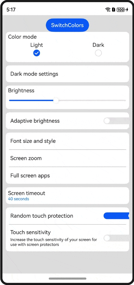
案例代码
// xxx.ets
import { CustomTheme } from '@ohos.arkui.theme'
import { CustomTheme1, gAppTheme, gCustomTheme1 } from './AppColors'
import { promptAction } from '@kit.ArkUI'
import { BusinessError } from '@kit.BasicServicesKit'

@Entry
@Component
struct DisplayPage {
  fontPrimary: ResourceColor | undefined = gAppTheme?.colors?.fontPrimary
  @State myTheme: CustomTheme = gAppTheme
  @State isCustomTheme:boolean = false;
  build() {
    WithTheme({ theme: this.myTheme }) {
      Column() {
        Button('SwitchColors')
          .onClick(()=>{
            this.isCustomTheme = !this.isCustomTheme
            if(this.isCustomTheme){
              this.myTheme = gCustomTheme1
              try {
                promptAction.showToast({
                  message: '系统默认主题色',
                  duration: 1000
                });
              } catch (error) {
                let message = (error as BusinessError).message
                let code = (error as BusinessError).code
                console.error(`showToast args error code is ${code}, message is ${message}`);
              };
            } else {
              this.myTheme = gAppTheme
              try {
                promptAction.showToast({
                  message: '自定义主题色',
                  duration: 1000
                });
              } catch (error) {
                let message = (error as BusinessError).message
                let code = (error as BusinessError).code
                console.error(`showToast args error code is ${code}, message is ${message}`);
              };
            }
          })
        // 开发者需要自己补充的主题代码
      }
      .padding('10vp')
      .backgroundColor(this.pageBackgroundColor)
      .width('100%')
      .height('100%')
    }
  }
}
其他常见问题
1.场景一和场景二的区别在哪里?如代码所见,可以看到场景二的这块绘制页面代码都是被包在WithTheme之中的,所以场景二主要使用于页面内局部的主题颜色适配,而场景一是全局的。
2.可以用Theme来设置页面局部深浅色吗?
可以通过WithTheme可以设置深浅色模式,ThemeColorMode.SYSTEM模式表示跟随系统模式,ThemeColorMode.LIGHT模式表示浅色模式,ThemeColorMode.DARK模式表示深色模式。
在WithTheme作用域内,组件的样式资源取值跟随指定的模式读取对应的深浅色模式系统和应用资源值,WithTheme作用域内的组件配色跟随指定的深浅模式生效。

讨论HarmonyOS开发技术,专注于API与组件、DevEco Studio、测试、元服务和应用上架分发等。
更多推荐


 0
0 0
0- 0


 已为社区贡献276条内容

所有评论(0)