#积分挑战#鸿蒙案例分享:商品列表之ListItem组件的使用
鸿蒙案例分享:商品列表之ListItem组件的使用
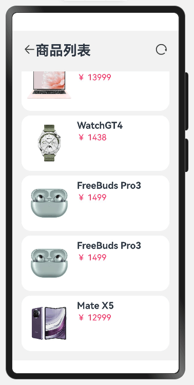
效果图:
前言
ListItem组件可以用来对数据进行遍历,而且可以添加一个下滑的滚动条,无论数据多少都能进行显示,十分强大。接下啦我将介绍一个案例。
一、代码
给出完整代码如下:
1、头部组件:
//自定义一个组件,并且要导出给别人使用
@Component
export struct Header {
  //定义一个参数,必须要初始化
  private content: ResourceStr = ''

  build() {
    Row() {
      Image($r('app.media.ic_public_back'))
        .width(25)
      Text(this.content)
        .fontSize(30)
        .fontWeight(FontWeight.Bold)
      //空白组件,可以完全占据子内容不存在的部分
      Blank()
      Image($r('app.media.ic_public_refresh'))
        .width(25)
    }
    .width('100%')
    .margin({ bottom: 20 })
    .height(30)
  }
}
2、页面
//import一定要放在最上面
import { Header } from '../components/Header'
//定义一个类
class Item {
name: string
image: ResourceStr
price: number
discount: number
constructor(name: string, image: ResourceStr, price: number, discount: number = 0) {
this.name = name
this.image = image
this.price = price
this.discount = discount
}
}
//全局自定义构建函数,效果和自定义组件类似,不过是用在当前页面的
/*@Builder function ItemCard(item: Item) {
Row({ space: 10 }) {
Image(item.image)
.width(100)
if (item.discount) {
Column({ space: 4 }) {
Text(item.name)
.fontSize(20)
.fontWeight(FontWeight.Bold)
Text('原价:¥ ' + item.price.toString())
.fontColor('#CCC')
.fontSize(16)//字体类型
.decoration({ type: TextDecorationType.LineThrough })
Text('折扣价:¥ ' + (item.price - item.discount).toString())
.fontColor('#F36')
.fontSize(18)
Text('补贴:¥ ' + item.discount.toString())
.fontColor('#F36')
.fontSize(18)
}
.height('100%')
.alignItems(HorizontalAlign.Start)
} else {
Column({ space: 4 }) {
Text(item.name)
.fontSize(20)
.fontWeight(FontWeight.Bold)
Text('¥ ' + item.price.toString())
.fontColor('#F36')
.fontSize(18)
}
.height('100%')
.alignItems(HorizontalAlign.Start)
}
}
.width('100%')
.height(120)
.backgroundColor('#FFF')
.padding(10)
.borderRadius(20)
}*/
//全局自定义公共样式
@Extend(Text) function priceText(title: string) {
.fontSize(20)
.fontWeight(FontWeight.Bold)
.onClick(() => {
console.log(title)
})
}
//页面主体
@Entry
@Component
struct ItemPage {
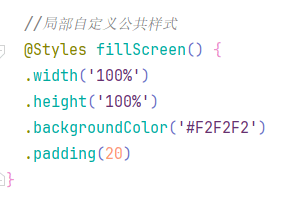
//局部自定义公共样式
@Styles fillScreen() {
.width('100%')
.height('100%')
.backgroundColor('#F2F2F2')
.padding(20)
}
@Builder ItemCard(item: Item) {
Row({ space: 10 }) {
Image(item.image)
.width(100)
if (item.discount) {
Column({ space: 4 }) {
Text(item.name)
.priceText("")
Text('原价:¥ ' + item.price.toString())
.fontColor('#CCC')
.fontSize(16)//字体类型
.decoration({ type: TextDecorationType.LineThrough })
Text('折扣价:¥ ' + (item.price - item.discount).toString())
.fontColor('#F36')
.fontSize(18)
Text('补贴:¥ ' + item.discount.toString())
.fontColor('#F36')
.fontSize(18)
}
.height('100%')
.alignItems(HorizontalAlign.Start)
} else {
Column({ space: 4 }) {
Text(item.name)
.fontSize(20)
.fontWeight(FontWeight.Bold)
Text('¥ ' + item.price.toString())
.fontColor('#F36')
.fontSize(18)
}
.height('100%')
.alignItems(HorizontalAlign.Start)
}
}
.width('100%')
.height(120)
.backgroundColor('#FFF')
.padding(10)
.borderRadius(20)
}
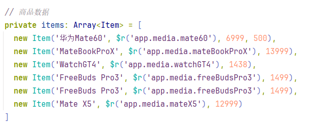
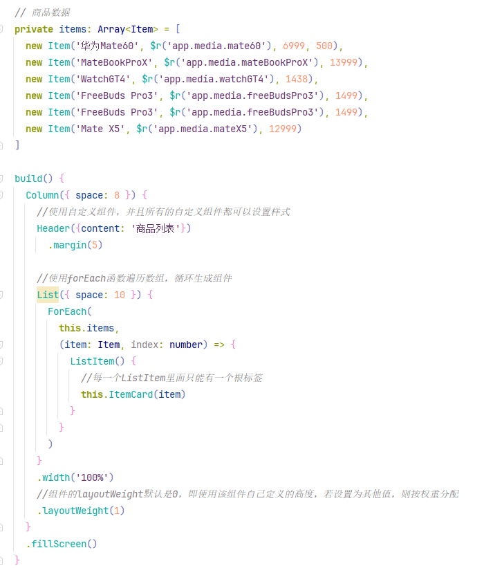
// 商品数据
private items: Array<Item> = [
new Item('华为Mate60', $r('app.media.mate60'), 6999, 500),
new Item('MateBookProX', $r('app.media.mateBookProX'), 13999),
new Item('WatchGT4', $r('app.media.watchGT4'), 1438),
new Item('FreeBuds Pro3', $r('app.media.freeBudsPro3'), 1499),
new Item('FreeBuds Pro3', $r('app.media.freeBudsPro3'), 1499),
new Item('Mate X5', $r('app.media.mateX5'), 12999)
]
build() {
Column({ space: 8 }) {
//使用自定义组件,并且所有的自定义组件都可以设置样式
Header({content: '商品列表'})
.margin(5)
//使用forEach函数遍历数组,循环生成组件
List({ space: 10 }) {
ForEach(
this.items,
(item: Item, index: number) => {
ListItem() {
//每一个ListItem里面只能有一个根标签
this.ItemCard(item)
}
}
)
}
.width('100%')
//组件的layoutWeight默认是0,即使用该组件自己定义的高度,若设置为其他值,则按权重分配
.layoutWeight(1)
}
.fillScreen()
}
}
二、代码解析
2.1 导出自定义组件 Header
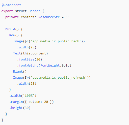
1、定义与导出:
@Component 是标记组件的装饰器。
使用 export 导出该组件,方便外部使用。
2、参数定义:
使用 private 定义了一个私有属性 content,表示标题内容,类型是 ResourceStr,并且初始化为空字符串。
3、构建组件:
Row() 定义了一行布局容器,包含:
返回按钮图标 Image($r('app.media.ic_public_back')),宽度为 25。
标题文本 Text(this.content),使用传入的 content 属性,字体大小为 30,加粗。
Blank() 是一个空白组件,用于占据中间多余空间。
刷新图标 Image($r('app.media.ic_public_refresh')),宽度为 25。
4、样式设置:
宽度 width('100%'),高度 height(30),底部外边距 margin({ bottom: 20 })。
我们在父组件导入:
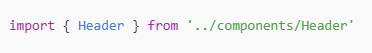
通过 import 引入 Header 组件,路径是 ../components/Header。
2.2 定义商品数据类 Item
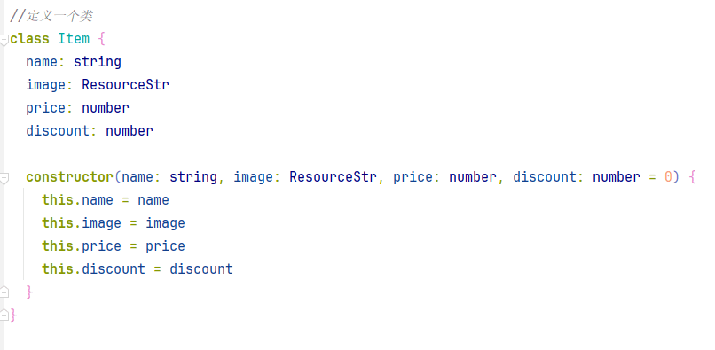
1、属性:
name: 商品名称。
image: 商品图片资源路径,类型为 ResourceStr。
price: 商品价格。
discount: 商品折扣,默认值为 0。
2、构造函数:
接收商品名称、图片、价格和折扣,初始化对应属性。
2.3 全局自定义构建函数 ItemCard
@Builder function ItemCard(item: Item) {
  Row({ space: 10 }) {
    Image(item.image)
      .width(100)
    if (item.discount) {
      Column({ space: 4 }) {
        Text(item.name)
          .fontSize(20)
          .fontWeight(FontWeight.Bold)
        Text('原价:¥ ' + item.price.toString())
          .fontColor('#CCC')
          .fontSize(16)//字体类型
          .decoration({ type: TextDecorationType.LineThrough })
        Text('折扣价:¥ ' + (item.price - item.discount).toString())
          .fontColor('#F36')
          .fontSize(18)
        Text('补贴:¥ ' + item.discount.toString())
          .fontColor('#F36')
          .fontSize(18)
      }
      .height('100%')
      .alignItems(HorizontalAlign.Start)
    } else {
      Column({ space: 4 }) {
        Text(item.name)
          .fontSize(20)
          .fontWeight(FontWeight.Bold)
        Text('¥ ' + item.price.toString())
          .fontColor('#F36')
          .fontSize(18)
      }
      .height('100%')
      .alignItems(HorizontalAlign.Start)
    }
  }
  .width('100%')
  .height(120)
  .backgroundColor('#FFF')
  .padding(10)
  .borderRadius(20)
}
1、功能:
生成商品卡片布局。
2、实现逻辑:
使用 Row 布局,其中包含:
商品图片 Image(item.image)。
商品信息 Column,包含商品名称、价格和折扣信息:
如果有折扣,显示原价(带删除线)、折扣价和补贴。
如果没有折扣,只显示商品名称和价格。
3、样式:
width('100%')、height(120)、背景颜色 backgroundColor('#FFF')、内边距 padding(10)、圆角 borderRadius(20)。
2.4 全局自定义公共样式 priceText
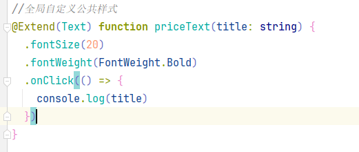
1、功能:
扩展 Text 的样式,统一设置字体大小、加粗,并添加点击事件。
2、实现:
fontSize(20) 设置字体大小。
fontWeight(FontWeight.Bold) 设置字体加粗。
onClick 为文本绑定点击事件,打印 title。
2.5 页面主体 ItemPage
//页面主体
@Entry
@Component
struct ItemPage {

  //局部自定义公共样式
  @Styles fillScreen() {
  .width('100%')
  .height('100%')
  .backgroundColor('#F2F2F2')
  .padding(20)
}


  // 商品数据
  private items: Array<Item> = [
    new Item('华为Mate60', $r('app.media.mate60'), 6999, 500),
    new Item('MateBookProX', $r('app.media.mateBookProX'), 13999),
    new Item('WatchGT4', $r('app.media.watchGT4'), 1438),
    new Item('FreeBuds Pro3', $r('app.media.freeBudsPro3'), 1499),
    new Item('FreeBuds Pro3', $r('app.media.freeBudsPro3'), 1499),
    new Item('Mate X5', $r('app.media.mateX5'), 12999)
  ]

  build() {
    Column({ space: 8 }) {
      //使用自定义组件,并且所有的自定义组件都可以设置样式
      Header({content: '商品列表'})
        .margin(5)

      //使用forEach函数遍历数组,循环生成组件
      List({ space: 10 }) {
        ForEach(
          this.items,
          (item: Item, index: number) => {
            ListItem() {
              //每一个ListItem里面只能有一个根标签
              ItemCard(item)
            }
          }
        )
      }
      .width('100%')
      //组件的layoutWeight默认是0,即使用该组件自己定义的高度,若设置为其他值,则按权重分配
      .layoutWeight(1)
    }
    .fillScreen()
  }
}
1、定义全屏样式,设置宽度、高度、背景颜色和内边距
2、定义商品数据数组,每个元素是 Item 的实例,包含商品名称、图片资源路径、价格和折扣。
3、列表生成:
(1)使用 ForEach 遍历 items 数组,每个元素生成一个 ListItem。
(2)ListItem 内部调用 ItemCard,生成商品卡片。

讨论HarmonyOS开发技术,专注于API与组件、DevEco Studio、测试、元服务和应用上架分发等。
更多推荐


 1
1 1
1- 0


 已为社区贡献5条内容

所有评论(0)