Harmony OS NEXT 装饰器
什么是装饰器?
- 装饰器是一个函数,这个函数仅在代码加载阶段执行一次。本质就是编译时执行的函数
- 装饰器的语法是 @后跟一个函数或者一个执行后返回函数的表达式
- 这个函数要么不返回值,要么返回一个新对象取代所修饰的目标对象
装饰器总览:
ArkUI提供了多种装饰器,通过使用这些装饰器,状态变量不仅可以观察在组件内的改变,还可以在不同组件层级间传递,比如父子组件、跨组件层级,也可以观察全局范围内的变化。根据状态变量的影响范围,将所有的装饰器可以大致分为:
- 管理组件拥有状态的装饰器:组件级别的状态管理,可以观察组件内变化,和不同组件层级的变化,但需要唯一观察同一个组件树上,即同一个页面内。
- 管理应用拥有状态的装饰器:应用级别的状态管理,可以观察不同页面,甚至不同UIAbility的状态变化,是应用内全局的状态管理。
从数据的传递形式和同步类型层面看,装饰器也可分为:
- 只读的单向传递;
- 可变更的双向传递。
图示如下,具体装饰器的介绍,可详见管理组件拥有的状态和管理应用拥有的状态。开发者可以灵活地利用这些能力来实现数据和UI的联动。
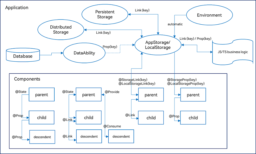
@Entry
- @Entry:@Entry装饰的自定义组件将作为UI页面的入口。在单个UI页面中,最多可以使用@Entry装饰一个自定义组件。@Entry可以接受一个可选的LocalStorage的参数。
@State
- @State装饰的变量拥有其所属组件的状态,可以作为其子组件单向和双向同步的数据源。当其数值改变时,会引起相关组件的渲染刷新。
-
@State装饰器装饰的变量不是都可以引起UI的渲染刷新! 框架只能观察到第一层的数据变化(Object.keys()观察) 在复杂数据类型(例如:数组中包含对象 )框架中对象的属性(第二层数据变化)变化不能引起UI界面的渲染
@Prop
- @Prop:@Prop装饰的变量可以和父组件建立单向同步关系,@Prop装饰的变量是可变的,但修改不会同步回父组件.
- 子组件的想要同步到父组件的数据必须使用回调函数的方式传参.
@Link
- @Link:@Link装饰的变量和父组件构建双向同步关系的状态变量,父组件会接受来自@Link装饰的变量的修改的同步,父组件的更新也会同步给@Link装饰的变量。
-
但是也只能观察到第一层的数据变化(Object.keys()观察)
不同点:
| 不同点 | @State | @Prop | @Link |
|---|---|---|---|
| 装饰内容 | 基本数据类型,类,数组 | 基本数据类型 | 基本数据类型,类,数组 |
| 关联 | 不与其他控件关联 | 父@State -> 子@Prop 单向关联 | 父@State <-> 子@Link 双向关联 |
| 初始化时机 | 声明时 | 创建组件时由参数传入 | 创建组件时由参数传入 |
@Component
- @Component:@Component装饰器仅能装饰struct关键字声明的数据结构。struct被@Component装饰后具备组件化的能力,需要实现build方法描述UI,一个struct只能被一个@Component装饰。
@Component
struct HelloComponent {
  @State message: string = 'Hello, World!';

  build() {
    // HelloComponent自定义组件组合系统组件Row和Text
    Row() {
      Text(this.message)
        .onClick(() => {
          // 状态变量message的改变驱动UI刷新,UI从'Hello, World!'刷新为'Hello, ArkUI!'
          this.message = 'Hello, ArkUI!';
        })
    }
  }
}
@Observed & @ObjectLink
- @Observed:@Observed装饰class,需要观察多层嵌套场景的class需要被@Observed装饰。单独使用@Observed没有任何作用,需要和@ObjectLink、@Prop连用。
- @ObjectLink:@ObjectLink装饰的变量接收@Observed装饰的class的实例,应用于观察多层嵌套场景,和父组件的数据源构建双向同步。
let NextID: number = 1;

@Observed
class Bag {
  public id: number;
  public size: number;

  constructor(size: number) {
    this.id = NextID++;
    this.size = size;
  }
}

@Observed
class User {
  public bag: Bag;

  constructor(bag: Bag) {
    this.bag = bag;
  }
}

@Observed
class Book {
  public bookName: BookName;

  constructor(bookName: BookName) {
    this.bookName = bookName;
  }
}

@Observed
class BookName extends Bag {
  public nameSize: number;

  constructor(nameSize: number) {
    // 调用父类方法对nameSize进行处理
    super(nameSize);
    this.nameSize = nameSize;
  }
}

@Component
struct ViewA {
  label: string = 'ViewA';
  @ObjectLink bag: Bag;

  build() {
    Column() {
      Text(`ViewC [${this.label}] this.bag.size = ${this.bag.size}`)
        .fontColor('#ffffffff')
        .backgroundColor('#ff3fc4c4')
        .width(320)
        .height(50)
        .borderRadius(25)
        .margin(10)
        .textAlign(TextAlign.Center)
      Button(`ViewA: this.bag.size add 1`)
        .width(320)
        .backgroundColor('#ff7fcf58')
        .margin(10)
        .onClick(() => {
          this.bag.size += 1;
        })
    }
  }
}

@Component
struct ViewC {
  label: string = 'ViewC1';
  @ObjectLink bookName: BookName;

  build() {
    Row() {
      Column() {
        Text(`ViewC [${this.label}] this.bookName.size = ${this.bookName.size}`)
          .fontColor('#ffffffff')
          .backgroundColor('#ff3fc4c4')
          .width(320)
          .height(50)
          .borderRadius(25)
          .margin(10)
          .textAlign(TextAlign.Center)
        Button(`ViewC: this.bookName.size add 1`)
          .width(320)
          .backgroundColor('#ff7fcf58')
          .margin(10)
          .onClick(() => {
            this.bookName.size += 1;
            console.log('this.bookName.size:' + this.bookName.size)
          })
      }
      .width(320)
    }
  }
}

@Entry
@Component
struct ViewB {
  @State user: User = new User(new Bag(0));
  @State child: Book = new Book(new BookName(0));

  build() {
    Column() {
      ViewA({ label: 'ViewA #1', bag: this.user.bag })
        .width(320)
      ViewC({ label: 'ViewC #3', bookName: this.child.bookName })
        .width(320)
      Button(`ViewC: this.child.bookName.size add 10`)
        .width(320)
        .backgroundColor('#ff7fcf58')
        .margin(10)
        .onClick(() => {
          this.child.bookName.size += 10
          console.log('this.child.bookName.size:' + this.child.bookName.size)
        })
      Button(`ViewB: this.user.bag = new Bag(10)`)
        .width(320)
        .backgroundColor('#ff7fcf58')
        .margin(10)
        .onClick(() => {
          this.user.bag = new Bag(10);
        })
      Button(`ViewB: this.user = new User(new Bag(20))`)
        .width(320)
        .backgroundColor('#ff7fcf58')
        .margin(10)
        .onClick(() => {
          this.user = new User(new Bag(20));
        })
    }
  }
}
@Provied & @Consume
- @Provide/@Consume:@Provide/@Consume装饰的变量用于跨组件层级(多层组件)同步状态变量,可以不需要通过参数命名机制传递,通过alias(别名)或者属性名绑定。
@Component
struct CompD {
  // @Consume装饰的变量通过相同的属性名绑定其祖先组件CompA内的@Provide装饰的变量
  @Consume reviewVotes: number;

  build() {
    Column() {
      Text(`reviewVotes(${this.reviewVotes})`)
      Button(`reviewVotes(${this.reviewVotes}), give +1`)
        .onClick(() => this.reviewVotes += 1)
    }
    .width('50%')
  }
}

@Component
struct CompC {
  build() {
    Row({ space: 5 }) {
      CompD()
      CompD()
    }
  }
}

@Component
struct CompB {
  build() {
    CompC()
  }
}

@Entry
@Component
struct CompA {
  // @Provide装饰的变量reviewVotes由入口组件CompA提供其后代组件
  @Provide reviewVotes: number = 0;

  build() {
    Column() {
      Button(`reviewVotes(${this.reviewVotes}), give +1`)
        .onClick(() => this.reviewVotes += 1)
      CompB()
    }
  }
}
@Preview
- @Preview实现组件预览功能,在单个源文件中,最多可以使用10个@Preview装饰自定义组件。
- 建议按如下方式预览:
@Preview
@Component    //定义组件片段TitlePreview
struct TitlePreview {
  build() {
    Title({ context: 'MyTitle' })    //在该片段中声明将要预览的组件Title,以及该组件依赖的入参 {context: ’MyTitle’}
  }
}
@Extend
- @Extend仅支持在全局定义,不支持在组件内部定义,用于扩展原生组件样式。
// xxx.ets
@Extend(Text) function fancy (fontSize: number) {
  .fontColor(Color.Red)
  .fontSize(fontSize)
}

@Entry
@Component
struct FancyUse {
  build() {
    Row({ space: 10 }) {
      Text('Fancy')
        .fancy(16)
      Text('Fancy')
        .fancy(24)
    }
  }
}
@styles
- @Styles装饰器可以将多条样式设置提炼成一个方法,直接在组件声明的位置调用。通过@Styles装饰器可以快速定义并复用自定义样式。用于快速定义并复用自定义样式。
// 定义在全局的@Styles封装的样式
@Styles function globalFancy  () {
  .width(150)
  .height(100)
  .backgroundColor(Color.Pink)
}

@Entry
@Component
struct FancyUse {
  @State heightValue: number = 100
  // 定义在组件内的@Styles封装的样式
  @Styles fancy() {
    .width(200)
    .height(this.heightValue)
    .backgroundColor(Color.Yellow)
    .onClick(() => {
      this.heightValue = 200
    })
  }

  build() {
    Column({ space: 10 }) {
      // 使用全局的@Styles封装的样式
      Text('FancyA')
        .globalFancy()
        .fontSize(30)
      // 使用组件内的@Styles封装的样式
      Text('FancyB')
        .fancy()
        .fontSize(30)
    }
  }
}
@ Builder
- @Builder所装饰的函数遵循build()函数语法规则,开发者可以将重复使用的UI元素抽象成一个方法,在build方法里调用。为了简化语言,我们将@Builder装饰的函数也称为“自定义构建函数”。
@Builder function overBuilder(paramA1: string) {
  Row() {
    Text(`UseStateVarByValue: ${paramA1} `)
  }
}
@Entry
@Component
struct Parent {
  @State label: string = 'Hello';
  build() {
    Column() {
      overBuilder(this.label)
    }
  }
}
不同点:
- @Extend 仅支持全局定义 @styles支持全局与局内定义
- @Extend 支持所有组件样式 @styles仅支持通用的属性样式
- @Extend 支持函数传递参数 @styles不支持传参
- @Extend 只能是定义的组件样式使用 @Style任意组件都可以使用
|
@Extend |
抽取 特定组件 样式、事件 |
可以传递参数 |
|
@Styles |
抽取 公共样式、事件 |
不可以传递参数 |
|
@Builder |
抽取 结构、样式、事件 |
可以传递参数 |
@Require(API 11 +):
- @Require是校验@Prop和@BuilderParam是否需要构造传参的一个装饰器, @Require装饰器不能单独使用,仅用于装饰struct内的@Prop和@BuilderParam成员状态变量.
@Entry
@Component
struct Index {
  @State message: string = 'Hello World';

  @Builder buildTest() {
    Row() {
      Text('Hello, world')
        .fontSize(30)
    }
  }

  build() {
    Row() {
      Child({ initMessage: this.message, message: this.message,
        buildTest: this.buildTest, initBuildTest: this.buildTest })
    }
  }
}

@Component
struct Child {
  @Builder buildFuction() {
    Column() {
      Text('initBuilderParam')
        .fontSize(30)
    }
  }

  @Require @BuilderParam buildTest: () => void;
  @Require @BuilderParam initBuildTest: () => void = this.buildFuction;
  @Require @Prop initMessage: string = 'Hello';
  @Require @Prop message: string;

  build() {
    Column() {
      Text(this.initMessage)
        .fontSize(30)
      Text(this.message)
        .fontSize(30)
      this.initBuildTest();
      this.buildTest();
    }
    .width('100%')
    .height('100%')
  }
}
@AnimatableExtend:
@AnimatableExtend装饰器用于自定义可动画的属性方法,在这个属性方法中修改组件不可动画的属性。在动画执行过程时,通过逐帧回调函数修改不可动画属性值,让不可动画属性也能实现动画效果。
-
可动画属性:如果一个属性方法在animation属性前调用,改变这个属性的值可以生效animation属性的动画效果,这个属性称为可动画属性。比如height、width、backgroundColor、translate属性,Text组件的fontSize属性等。
-
不可动画属性:如果一个属性方法在animation属性前调用,改变这个属性的值不能生效animation属性的动画效果,这个属性称为不可动画属性。比如Polyline组件的points属性等.
- @AnimatableExtend仅支持定义在全局,不支持在组件内部定义。
- @AnimatableExtend定义的函数参数类型必须为number类型或者实现 AnimtableArithmetic<T>接口的自定义类型。
- @AnimatableExtend定义的函数体内只能调用@AnimatableExtend括号内组件的属性方法。
@AnimatableExtend(Text) function animatableFontSize(size: number) {
  .fontSize(size)
}

@Entry
@Component
struct AnimatablePropertyExample {
  @State fontSize: number = 20
  build() {
    Column() {
      Text("AnimatableProperty")
        .animatableFontSize(this.fontSize)
        .animation({duration: 1000, curve: "ease"})
      Button("Play")
        .onClick(() => {
          this.fontSize = this.fontSize == 20 ? 36 : 20
        })
    }.width("100%")
    .padding(10)
  }
}
@BuilderParam:
- @BuilderParam用来装饰指向@Builder方法的变量(@BuilderParam是用来承接@Builder函数的),开发者可在初始化自定义组件时对此属性进行赋值,为自定义组件增加特定的功能。该装饰器用于声明任意UI描述的一个元素,类似slot占位符。
@Component
struct Child {
  label: string = `Child`
  @Builder customBuilder() {}
  @Builder customChangeThisBuilder() {}
  @BuilderParam customBuilderParam: () => void = this.customBuilder;
  @BuilderParam customChangeThisBuilderParam: () => void = this.customChangeThisBuilder;

  build() {
    Column() {
      this.customBuilderParam()
      this.customChangeThisBuilderParam()
    }
  }
}

@Entry
@Component
struct Parent {
  label: string = `Parent`

  @Builder componentBuilder() {
    Text(`${this.label}`)
  }

  build() {
    Column() {
      this.componentBuilder()
      Child({ customBuilderParam: this.componentBuilder, customChangeThisBuilderParam: ():void=>{this.componentBuilder()} })
    }
  }
}
@Track(API 11 +):
- @Track是class对象的属性装饰器。当一个class对象是状态变量时,@Track装饰的属性发生变化,只会触发该属性关联的UI更新;而未被标记的属性不能在UI中使用。
-
不能在UI中使用非@Track装饰的属性,包括不能绑定在组件上、不能用于初始化子组件,错误的使用将导致JSCrash;可以在非UI中使用非@Track装饰的属性,如事件回调函数中、生命周期函数中等。
-
建议开发者不要混用包含@Track的class对象和不包含@Track的class对象,如联合类型中、类继承中等。
class Log {
  @Track logInfo: string;
  owner: string;
  id: number;
  time: Date;
  location: string;
  reason: string;

  constructor(logInfo: string) {
    this.logInfo = logInfo;
    this.owner = 'OH';
    this.id = 0;
    this.time = new Date();
    this.location = 'CN';
    this.reason = 'NULL';
  }
}

@Entry
@Component
struct AddLog {
  @State log: Log = new Log('origin info.');

  build() {
    Row() {
      Column() {
        Text(this.log.logInfo)
          .fontSize(50)
          .fontWeight(FontWeight.Bold)
          .onClick(() => {
            // The properties without @Track can be used in the event handler.
            console.log('owner: ' + this.log.owner +
              ' id: ' + this.log.id +
              ' time: ' + this.log.time +
              ' location: ' + this.log.location +
              ' reason: ' + this.log.reason);
            this.log.time = new Date();
            this.log.id++;

            this.log.logInfo += ' info.';
          })
      }
      .width('100%')
    }
    .height('100%')
  }
}
@Watch:
- @Watch用于监听状态变量的变化,当状态变量变化时,@Watch的回调方法将被调用。@Watch在ArkUI框架内部判断数值有无更新使用的是严格相等(===),遵循严格相等规范。当在严格相等为false的情况下,就会触发@Watch的回调。
@Component
struct TotalView {
  @Prop @Watch('onCountUpdated') count: number = 0;
  @State total: number = 0;
  // @Watch 回调
  onCountUpdated(propName: string): void {
    this.total += this.count;
  }

  build() {
    Text(`Total: ${this.total}`)
  }
}

@Entry
@Component
struct CountModifier {
  @State count: number = 0;

  build() {
    Column() {
      Button('add to basket')
        .onClick(() => {
          this.count++
        })
      TotalView({ count: this.count })
    }
  }
}
@Concurrent:
-
在使用TaskPool时,执行的并发函数需要使用该装饰器修饰,否则无法通过相关校验。
-
并发函数中返回Promise的表现需关注,其中并发同步函数会处理返回该Promise并返回结果。
import taskpool from '@ohos.taskpool';

@Concurrent
function add(num1: number, num2: number): number {
  return num1 + num2;
}

async function ConcurrentFunc(): Promise<void> {
  try {
    let task: taskpool.Task = new taskpool.Task(add, 1, 2);
    console.info("taskpool res is: " + await taskpool.execute(task));
  } catch (e) {
    console.error("taskpool execute error is: " + e);
  }
}

@Entry
@Component
struct Index {
  @State message: string = 'Hello World'

  build() {
    Row() {
      Column() {
        Text(this.message)
          .fontSize(50)
          .fontWeight(FontWeight.Bold)
          .onClick(() => {
            ConcurrentFunc();
          })
      }
      .width('100%')
    }
    .height('100%')
  }
}
@CustomDialog
- @CustomDialog装饰器用于装饰自定义弹框,此装饰器内进行自定义内容(也就是弹框内容)。
@CustomDialog
struct CustomDialogExample {
  controller: CustomDialogController = new CustomDialogController({
    builder: CustomDialogExample({}),
  })

  build() {
    Column() {
      Text('我是内容')
        .fontSize(20)
        .margin({ top: 10, bottom: 10 })
    }
  }
}
页面内需要在构造器内进行接收,同时创建相应的函数操作。
@Entry
@Component
struct CustomDialogUser {
  dialogController: CustomDialogController = new CustomDialogController({
    builder: CustomDialogExample({
      cancel: ()=> { this.onCancel() },
      confirm: ()=> { this.onAccept() },
    }),
  })

  onCancel() {
    console.info('Callback when the first button is clicked')
  }

  onAccept() {
    console.info('Callback when the second button is clicked')
  }

  build() {
    Column() {
      Button('click me')
        .onClick(() => {
          this.dialogController.open()
        })
    }.width('100%').margin({ top: 5 })
  }
}
@LocalStorageProp(需要LocalStorage)
- @LocalStorageProp(key)是和LocalStorage中key对应的属性建立单向数据同步,ArkUI框架支持修改@LocalStorageProp(key)在本地的值,但是对本地值的修改不会同步回LocalStorage中。相反,如果LocalStorage中key对应的属性值发生改变,例如通过set接口对LocalStorage中的值进行修改,改变会同步给@LocalStorageProp(key),并覆盖掉本地的值。
@LocalStorageLink(需要LocalStorage)
-
@LocalStorageLink(key)是和LocalStorage中key对应的属性建立双向数据同步:
-
本地修改发生,该修改会被写回LocalStorage中;
-
LocalStorage中的修改发生后,该修改会被同步到所有绑定LocalStorage对应key的属性上,包括单向(@LocalStorageProp和通过prop创建的单向绑定变量)、双向(@LocalStorageLink和通过link创建的双向绑定变量)变量。
@StorageProp(需要AppStorage||PersistentStorage)
- @StorageProp(key)是和AppStorage中key对应的属性建立单向数据同步,我们允许本地改变的发生,但是对于@StorageProp,本地的修改永远不会同步回AppStorage中,相反,如果AppStorage给定key的属性发生改变,改变会被同步给@StorageProp,并覆盖掉本地的修改。
@StorageLink(需要AppStorage||PersistentStorage)
- 当@StorageLink(key)装饰的数值改变被观察到时,修改将被同步回AppStorage对应属性键值key的属性中。
- AppStorage中属性键值key对应的数据一旦改变,属性键值key绑定的所有的数据(包括双向@StorageLink和单向@StorageProp)都将同步修改。
- 当@StorageLink(key)装饰的数据本身是状态变量,它的改变不仅仅会同步回AppStorage中,还会引起所属的自定义组件的重新渲染。

讨论HarmonyOS开发技术,专注于API与组件、DevEco Studio、测试、元服务和应用上架分发等。
更多推荐
 31
31 0
0- 0


 已为社区贡献7条内容

所有评论(0)