#跟着坚果学鸿蒙#鸿蒙next 普通输入获取验证码效果实现
·
前言导读
相信大家再日常开发中都会遇到,开发获取短信验证码节目功能这里呢我就给大家·分享一个简单的获取短信验证码的功能,大家也可以把代码适当的封装
成一个自定义的控件然后去复用 ,然后能给方便给周围的同时和同学,那么话不说我们带着大家一起来实现如下效果
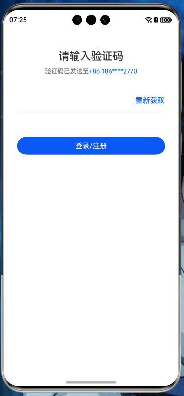
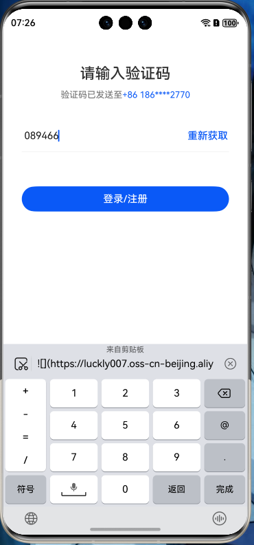
效果图
具体实现
import Constants from '../common/Constants';

@Entry
@Component
struct Index {
  private maxLength: number = 6;
  private strokeWidth: number = 1;

  build() {
    Column() {
      Row() {
        Text("请输入验证码")
          .fontSize($r('app.float.font_size_l'))
          .fontWeight(FontWeight.Medium)
      }
      .height($r('app.float.list_padding_top'))

      Row() {
        Text("验证码已发送至")
          .fontSize($r('app.float.font_size_m'))
          .fontColor($r('app.color.phone_color'))
          .fontWeight(FontWeight.Regular)
        Text("+86 186****2770")
          .fontSize($r('app.float.font_size_m'))
          .fontColor($r('app.color.theme_color'))
          .fontWeight(FontWeight.Regular)
      }
      .margin({
        top: $r('app.float.row_width'),
        bottom: $r('app.float.margin_bottom_one')
      })

      Row() {
        TextInput()
          .backgroundColor(Color.Transparent)
          .width(Constants.EIGHTY_PERCENT)
          .maxLength(this.maxLength)
          .type(InputType.Number)
          .translate({ x: Constants.NEGATIVE_TWELVE })
        Text("重新获取")
          .fontSize($r('app.float.font_size'))
          .fontWeight(FontWeight.Medium)
          .fontColor($r('app.color.theme_color'))
      }
      .width(Constants.EIGHTY_FIVE_PERCENT)

      Divider()
        .strokeWidth(this.strokeWidth)
        .width(Constants.EIGHTY_FIVE_PERCENT)
        .color($r('app.color.line_divider'))
        .margin({
          top: $r('app.float.text_margin'),
          bottom: $r('app.float.divider_bottom')
        })

      Button("登录/注册")
        .backgroundColor($r('app.color.theme_color'))
        .fontColor(Color.White)
        .width(Constants.EIGHTY_FIVE_PERCENT)
        .height($r('app.float.bottom_height'))

    }
    .padding({ top: Constants.LINE_WIDTH })
    .height(Constants.ONE_HUNDRED_PERCENT)
    .width(Constants.ONE_HUNDRED_PERCENT)
  }
}
我们使用了 Column 和Row布局嵌套实现了整个布局 然后验证码部分是用了 TextInput 来实现 其实我们可以把代码适当的封装然后去实现我们的效果 我们可以把代码抽离出来的
-
自定义组件写法
import { VerifyCodeInputCallback } from './VerifyCodeInputCallback';
import Constants from '../common/Constants';


/*****
 *
 * 创建人:xuqing
 * 创建时间:2025年5月17日19:23:04
 * 类说明:自定义验证码输入框
 *
 */


const TAG = 'BackgroundColorChange';
@Component
export default struct VerifyCodeInput {


  private maxLength: number = 6;
  private strokeWidth: number = 1;
  verifyCodeInputCallback?:VerifyCodeInputCallback


  @Builder
  buildVerifyCodeComponent() {

    Column() {
      Row() {
        Text("请输入验证码")
          .fontSize($r('app.float.font_size_l'))
          .fontWeight(FontWeight.Medium)
      }
      .height($r('app.float.list_padding_top'))

      Row() {
        Text("验证码已发送至")
          .fontSize($r('app.float.font_size_m'))
          .fontColor($r('app.color.phone_color'))
          .fontWeight(FontWeight.Regular)
        Text("+86 186****2770")
          .fontSize($r('app.float.font_size_m'))
          .fontColor($r('app.color.theme_color'))
          .fontWeight(FontWeight.Regular)
      }
      .margin({
        top: $r('app.float.row_width'),
        bottom: $r('app.float.margin_bottom_one')
      })

      Row() {
        TextInput()
          .backgroundColor(Color.Transparent)
          .width(Constants.EIGHTY_PERCENT)
          .maxLength(this.maxLength)
          .type(InputType.Number)
          .translate({ x: Constants.NEGATIVE_TWELVE })
          .onChange((value)=>{
            this.verifyCodeInputCallback?.getinputcode(value);
          })
        Text("重新获取")
          .fontSize($r('app.float.font_size'))
          .fontWeight(FontWeight.Medium)
          .fontColor($r('app.color.theme_color'))
      }
      .width(Constants.EIGHTY_FIVE_PERCENT)

      Divider()
        .strokeWidth(this.strokeWidth)
        .width(Constants.EIGHTY_FIVE_PERCENT)
        .color($r('app.color.line_divider'))
        .margin({
          top: $r('app.float.text_margin'),
          bottom: $r('app.float.divider_bottom')
        })

      Button("登录/注册")
        .backgroundColor($r('app.color.theme_color'))
        .fontColor(Color.White)
        .width(Constants.EIGHTY_FIVE_PERCENT)
        .height($r('app.float.bottom_height'))

    }
    .padding({ top: Constants.LINE_WIDTH })
    .height(Constants.ONE_HUNDRED_PERCENT)
    .width(Constants.ONE_HUNDRED_PERCENT)
  }

  build() {
    Column() {
      this.buildVerifyCodeComponent();
    }.width('100%')
  }

}
-
回调接口
/***
 *
 * 输入框回调
 *
 */
export  interface  VerifyCodeInputCallback{
  getinputcode: (value?:string) => void
}
-
调用 我们的自定义组件
import VerifyCodeInput from './VerifyCodeInput';
@Entry
@Component
struct Index2 {
build() {
Column() {
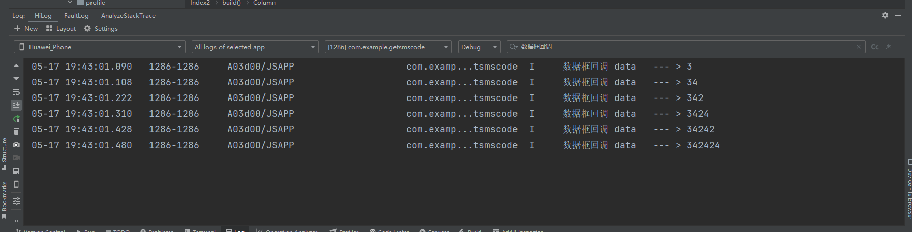
VerifyCodeInput({verifyCodeInputCallback: {
getinputcode(data) {
console.log("数据框回调 data --- > " + data)
}
}
});
}
}
}
-
查看调用日志
最后总结
在鸿蒙next 里面确实还有很多功能效果没有现成的组件去实现,但是生态越来越强大,我相信在不久未来 鸿蒙系统的生态会发展得越来越好,有兴趣的同学可以拷贝代码自己去尝试 , 今天的文章就讲到这里

讨论HarmonyOS开发技术,专注于API与组件、DevEco Studio、测试、元服务和应用上架分发等。
更多推荐

 0
0 0
0- 0


 已为社区贡献16条内容

所有评论(0)