#跟着坚果学鸿蒙# 导航代码块实例——Navigation页面布局
前言
本系列文章来具体测试官网示例效果,并通过实际的运行来查看是否能对大家产生对应的帮助,可以快速的获取功对应功能所需求的代码块,通过对基础代码块的修改来完成最终的目标功能。
示例效果说明
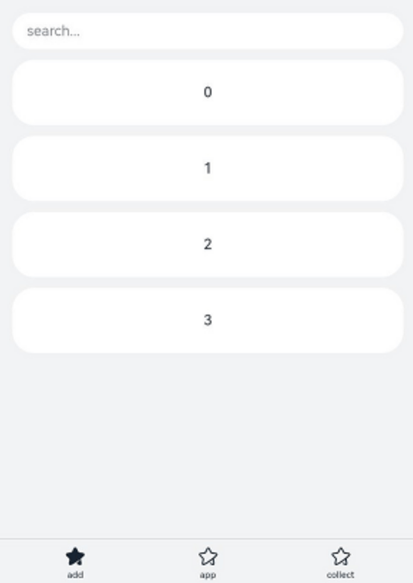
该示例主要演示Navigation页面的布局包括标题栏(title),菜单栏(menus),内容区和工具栏(toolbarConfiguration)。
示例代码
/**
 * 测试人:红目香薰
 * 时间:2025年5月21日16:42:01
 */
class A {
  text: string = ''
  num: number = 0
}


@Entry
@Component
struct NavigationExample {
  private arr: number[] = [0, 1, 2, 3, 4, 5, 6, 7, 8, 9]
  @State currentIndex: number = 0


  @Builder
  NavigationTitle() {
    Column() {
      Text('Title')
        .fontColor('#182431')
        .fontSize(30)
        .lineHeight(41)
        .fontWeight(700)
      Text('subtitle')
        .fontColor('#182431')
        .fontSize(14)
        .lineHeight(19)
        .opacity(0.4)
        .margin({ top: 2, bottom: 20 })
    }.alignItems(HorizontalAlign.Start)
  }


  @Builder
  NavigationMenus() {
    Row() {
      Image('resources/base/media/ic_public_add.svg')
        .width(24)
        .height(24)
      Image('resources/base/media/ic_public_add.svg')
        .width(24)
        .height(24)
        .margin({ left: 24 })
      Image('common/ic_public_more.svg')
        .width(24)
        .height(24)
        .margin({ left: 24 })
    }
  }


  build() {
    Column() {
      Navigation() {
        TextInput({ placeholder: 'search...' })
          .width('90%')
          .height(40)
          .backgroundColor('#FFFFFF')
          .margin({ top: 8 })


        List({ space: 12, initialIndex: 0 }) {
          ForEach(this.arr, (item: number) => {
            ListItem() {
              Text('' + item)
                .width('90%')
                .height(72)
                .backgroundColor('#FFFFFF')
                .borderRadius(24)
                .fontSize(16)
                .fontWeight(500)
                .textAlign(TextAlign.Center)
            }
          }, (item: number) => item.toString())
        }
        .height(324)
        .width('100%')
        .margin({ top: 12, left: '10%' })
      }
      .title(this.NavigationTitle)
      .menus(this.NavigationMenus)
      .titleMode(NavigationTitleMode.Full)
      .toolbarConfiguration([
        {
          value: $r("app.string.navigation_toolbar_add"),
          icon: $r("app.media.ic_public_highlightsed")
        },
        {
          value: $r("app.string.navigation_toolbar_app"),
          icon: $r("app.media.ic_public_highlights")
        },
        {
          value: $r("app.string.navigation_toolbar_collect"),
          icon: $r("app.media.ic_public_highlights")
        }
      ])
      .hideTitleBar(false)
      .hideToolBar(false)
      .onTitleModeChange((titleModel: NavigationTitleMode) => {
        console.info('titleMode' + titleModel)
      })
    }.width('100%').height('100%').backgroundColor('#F1F3F5')
  }
}
示例效果
核心代码
🧱 类与组件定义
class A:定义一个普通类,包含字符串和数字属性;
@Entry @Component struct NavigationExample:定义页面入口组件。
📦 状态变量与数据
private arr: number[] = [0, 1, 2, 3, 4, 5, 6, 7, 8, 9]:用于列表展示的数据源;
@State currentIndex: number = 0:状态变量,用于响应式更新 UI。
🏗️ 自定义构建方法(Builder)
@Builder NavigationTitle():构建导航栏标题区域;
包含主标题和副标题文本;
设置字体样式、颜色、行高、对齐方式等。
@Builder NavigationMenus():构建导航栏菜单图标区域;
使用多个 Image 组件加载图标;
设置图标大小、间距等。
📐 核心布局结构
外层使用 Column() 垂直排列整体内容;
内部使用 Navigation() 构建带标题栏的导航容器;
包含搜索框 TextInput;
列表 List 展示多个 ListItem;
支持设置工具栏 toolbarConfiguration;
支持监听标题模式变化 .onTitleModeChange(...)。
📋 列表与交互
List({ space: 12 }):创建纵向滚动列表;
ForEach(this.arr, ...):遍历数组生成列表项;
每个 ListItem 中显示居中编号文本;
列表支持高度设置、外边距、圆角背景等样式控制。
🎨 Navigation 配置项
.title(...):绑定自定义标题构建器;
.menus(...):绑定自定义菜单构建器;
.titleMode(NavigationTitleMode.Full):设置标题栏完整显示模式;
.toolbarConfiguration([...]):配置工具栏按钮及其图标;
.hideTitleBar(false) 和 .hideToolBar(false):显示标题栏与工具栏;
.onTitleModeChange(...):监听标题模式变化事件。
🎨 样式与修饰符
设置组件宽度、高度、背景颜色;
TextInput 设置输入样式;
List 设置高度、宽度、内边距;
外层容器设置背景色为 #F1F3F5。

讨论HarmonyOS开发技术,专注于API与组件、DevEco Studio、测试、元服务和应用上架分发等。
更多推荐

 1
1 0
0- 0


 已为社区贡献342条内容

所有评论(0)