鸿蒙开发之多样化底部导航栏02——凸起导航栏
·
一、前言
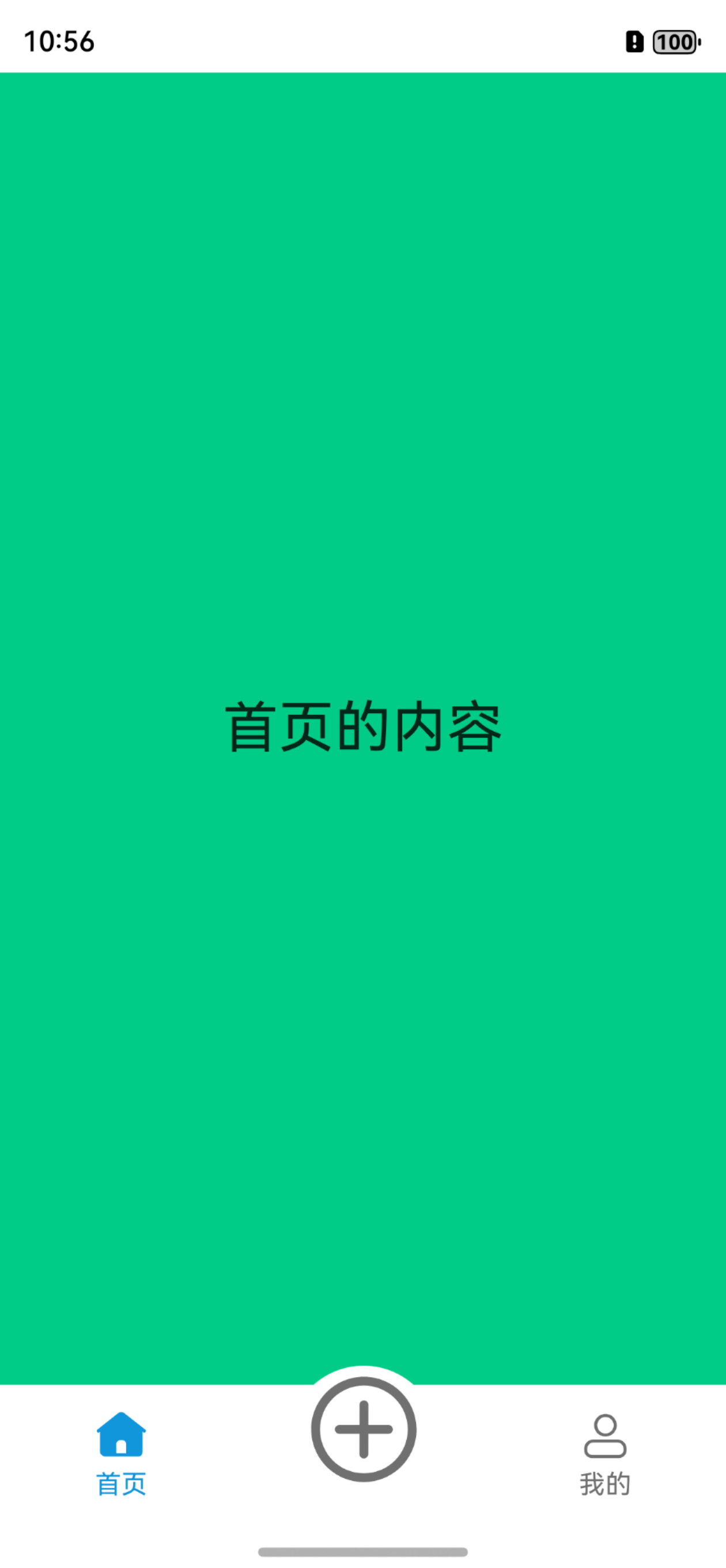
在上一讲的鸿蒙开发之多样化底部导航栏01——默认导航栏中,我们应该都知道如何写一个标准的默认导航栏了。不过,我们有时不想太过于本分的按照默认方式创建导航栏,想凸显一下自己的个性和重要的功能,所以我们想让中间的按钮凸出以达到和其他按钮不同。
预览效果:
二、正题:
本文中的凸起导航栏我们打算让中间的发布向上凸出导航栏上边框,而这样的效果则需要改造默认导航栏的样式,使用自定义的方式来搭建才能显示效果。该代码在项目路径:src/main/ets/pages/2-ConvexTabbar.ets
1、核心组件:
系统库组件:
-
Tabs
自定义组件:
-
CustomTabBar
2、核心代码:
2.1 TabContent():
后面不用再跟tabBar(),而是使用它后面的自定义TabBar组件CustomTabBar()代替,因此它的灵活性就高了,在自定义组件里面,我们可以做到我们想做的事情。
Tabs({ index: this.selectedIndex, barPosition: BarPosition.End, controller: this.controller }) {
        TabContent() {
          ...
        }

        TabContent() {
          // 占个位置而已
        }

        TabContent() {
          ...
        }
      }
      .barHeight(0) //这个很重要,Tabs默认留出一段空白给导航栏
      .onChange((index: number) => {
        this.selectedIndex = index; // 用于切换页签
      })
2.2 CustomTabBar():
列表TABINFO中保存着页签信息,通过ForEach循环把所有的页签传递给TabItem()组件中
@Component
struct CustomTabBar {
  ...
  build() {
    Flex({ direction: FlexDirection.Row, justifyContent: FlexAlign.SpaceAround, alignItems: ItemAlign.Center }) {
      ForEach(TABINFO, (item: TabBarDataType, tabIndex: number) => {
        TabItem({
          ...
        })
      })
    }
  }
}
2.3 TabItem():
在TabItem这里,你可以设置自己需要的样式
@Component
struct TabItem {
  ...

  build() {
    Column() {
      Stack() {
        // 判断tab的下标是否不为1
        if (this.tabBarIndex !== PUBLISH_TAB_BAR_INDEX) {
          ...
        } else {
          // 把发布按钮放大
        }
      }
       // 如果不是发布按钮则添加文字

      if (this.tabBarIndex !== PUBLISH_TAB_BAR_INDEX)
      {
        Text(TABINFO[this.tabBarIndex].title)
          .fontSize(14)
          .fontColor(this.selectedIndex === this.tabBarIndex ? '#1296db' : '#707070')
      }
    }
    .width(60)
    .onClick(() => {
      if (this.tabBarIndex === PUBLISH_TAB_BAR_INDEX) {
        promptAction.showToast({
          message: '这里随你所愿',
          duration: 2000
        });
      } else {
        this.selectedIndex = this.tabBarIndex;
      }
    })
  }
}三、完整代码:
import { promptAction } from '@kit.ArkUI';

export class TabBarDataType {
  id: number;
  title: ResourceStr;
  selectedIcon: ResourceStr;
  defaultIcon: ResourceStr;

  constructor(id: number, title: ResourceStr, selectedIcon: ResourceStr, defaultIcon: ResourceStr) {
    this.id = id;
    this.title = title;
    this.selectedIcon = selectedIcon;
    this.defaultIcon = defaultIcon;
  }
}

const PUBLISH_TAB_BAR_INDEX: number = 1; // 初始化社区的tab下标

const TABINFO: TabBarDataType[] = [
  new TabBarDataType(0, '首页', $r("app.media.ic_tabbar_home_on"), $r("app.media.ic_tabbar_home_off")),
  new TabBarDataType(1, '发布', $r("app.media.ic_tabbar_publish_on"), $r("app.media.ic_tabbar_publish_off")),
  new TabBarDataType(2, '我的', $r("app.media.ic_tabbar_my_on"), $r("app.media.ic_tabbar_my_off")),
];

@Entry
@Component
export struct ConvexTabbar {
  @Provide selectedIndex: number = 0; // 初始化被选定的tabBar下标
  private controller: TabsController = new TabsController(); // 初始化Tab控制器

  build() {
    Column() {
      Tabs({ index: this.selectedIndex, barPosition: BarPosition.End, controller: this.controller }) {
        TabContent() {
          Column() {
            Text('首页的内容')
              .fontSize(30)
          }
          .width('100%')
          .height('100%')
          .backgroundColor('#00CB87')
          .justifyContent(FlexAlign.Center)
        }

        TabContent() {
          // 占个位置而已
        }

        TabContent() {
          Column() {
            Text('我的内容')
              .fontSize(30)
          }
          .width('100%')
          .height('100%')
          .backgroundColor('#E67C92')
          .justifyContent(FlexAlign.Center)
        }
      }
      .barHeight(0)
      .vertical(false)
      .scrollable(false)
      .layoutWeight(1)
      // .backgroundColor('#ffdbd9d9')
      .onChange((index: number) => {
        this.selectedIndex = index;
      })

      // 自定义TabBar组件
      CustomTabBar({ selectedIndex: $selectedIndex })
    }
    .width('100%')
    .height('100%')
  }
}

@Component
struct CustomTabBar {
  @Link selectedIndex: number; // 初始化被选定的tabBar下标
  @State iconOffset: number = 0; // 初始化tabBar图片的偏移量

  build() {
    Flex({ direction: FlexDirection.Row, justifyContent: FlexAlign.SpaceAround, alignItems: ItemAlign.Center }) {
      ForEach(TABINFO, (item: TabBarDataType, tabIndex: number) => {
        TabItem({
          iconOffset: this.iconOffset,
          tabBarIndex: tabIndex,
          selectedIndex: $selectedIndex,
        })
      })
    }
  }
}

@Component
struct TabItem {
  @Prop iconOffset: number; // 初始化tabBar图片的偏移量
  @Prop tabBarIndex: number; // tabBar下标
  @Link selectedIndex: number; // 初始化被选定的tabBar下标

  build() {
    Column() {
      Stack() {
        // 判断tab的下标是否不为1
        if (this.tabBarIndex !== PUBLISH_TAB_BAR_INDEX) {
          Column() {
            // 通过被选中的tabBar下标值和tabBar的默认下标值来改变图片显示
            Image(this.selectedIndex === this.tabBarIndex ? TABINFO[this.tabBarIndex].selectedIcon :
            TABINFO[this.tabBarIndex].defaultIcon)
              .width(28)
              .height(28)// TODO:知识点:使用interpolation属性对图片进行插值,使图片显示得更清晰
              .interpolation(ImageInterpolation.High)
          }
          .width(37)
          .height(37)
          .justifyContent(FlexAlign.Center)
        } else {
          Column() {
            Image(this.selectedIndex === this.tabBarIndex ? TABINFO[this.tabBarIndex].selectedIcon :
            TABINFO[this.tabBarIndex].defaultIcon)
              .width(60)
              .aspectRatio(1)
              .margin({ top: 4 })
              .interpolation(ImageInterpolation.High)
            // .backgroundColor(Color.Pink)
          }
          .width(80)
          .height(80)
          .borderRadius(40)
          .margin({ top: -10 })
          .backgroundColor(Color.White)
        }
      }

      if (this.tabBarIndex !== PUBLISH_TAB_BAR_INDEX) {
        Text(TABINFO[this.tabBarIndex].title)
          .fontSize(14)
          .fontColor(this.selectedIndex === this.tabBarIndex ? '#1296db' : '#707070')
      }
    }
    .width(60)
    .onClick(() => {
      if (this.tabBarIndex === PUBLISH_TAB_BAR_INDEX) {
        promptAction.showToast({
          message: '这里随你所愿',
          duration: 2000
        });
      } else {
        this.selectedIndex = this.tabBarIndex;
      }
    })
  }
}
讨论HarmonyOS开发技术,专注于API与组件、DevEco Studio、测试、元服务和应用上架分发等。
更多推荐


 0
0 0
0- 0


 已为社区贡献5条内容

所有评论(0)