鸿蒙-1. 组件基础
开发环境
1. 起步-鸿蒙简介#
介绍:
- HarmonyOS 是新一代的智能终端操作系统,为不同设备的智能化、互联与协同提供了统一的语言。带来简洁,流畅,连续,安全可靠的全场景交互体验。
历程:
| 时间 | 事件 |
|---|---|
| 2019 | HarmonyOS 1.0,华为在东莞举行华为开发者大会,正式发布操作系统鸿蒙 OS,主要用于物联网 |
| 2020 | HarmonyOS 2.0,基于开源项目 OpenHarmony 开发的面向多种全场景智能设备的商用版本 |
| 2021 | HarmonyOS 3.0,先后优化游戏流畅度、地图三维体验、系统安全,另外系统的稳定性也得到了增强 |
| 2023.2 | HarmonyOS 3.1,系统纯净能力进一步提升,对后台弹窗、 隐藏应用、后台跳转等情况 |
| 2023.7 | 华为 Mate 50 系列手机获推 HarmonyOS 4.0 |
| 2024 | HarmonyOS Next 发布 |
和我们有什么关系?
- 环境弱行业卷,怎么办?
- 纯鸿蒙应用开发潮,你跟不跟?
- 前端技术迁移鸿蒙开发易上手,你学不学?
2. 起步-DevEco Studio#
安装 DevEco Studio 编辑器
- 下载:DevEco Studio-鸿蒙应用集成开发环境(IDE)-华为开发者联盟
- Windows(64-bit)
- Mac(X86)
- Mac(ARM)
- 安装:DevEco Studio → 一路 Next
- 运行:
- 基础安装:Node.js >= 16.9.1 + Install ohpm 鸿蒙包管理器
- SDK 安装
- 安装完毕
- 基础安装:Node.js >= 16.9.1 + Install ohpm 鸿蒙包管理器
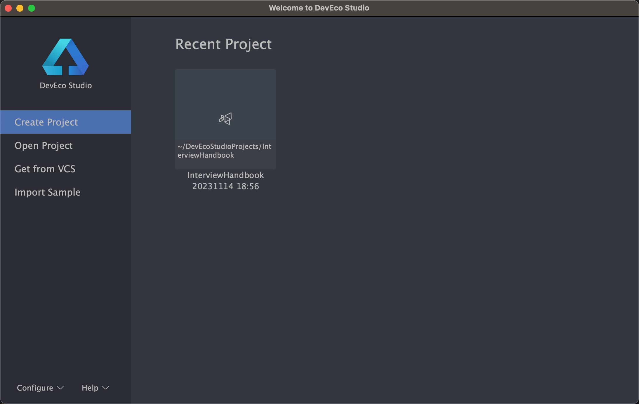
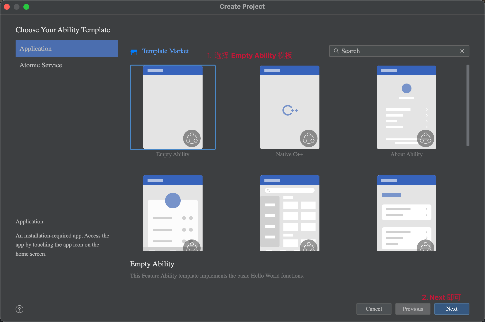
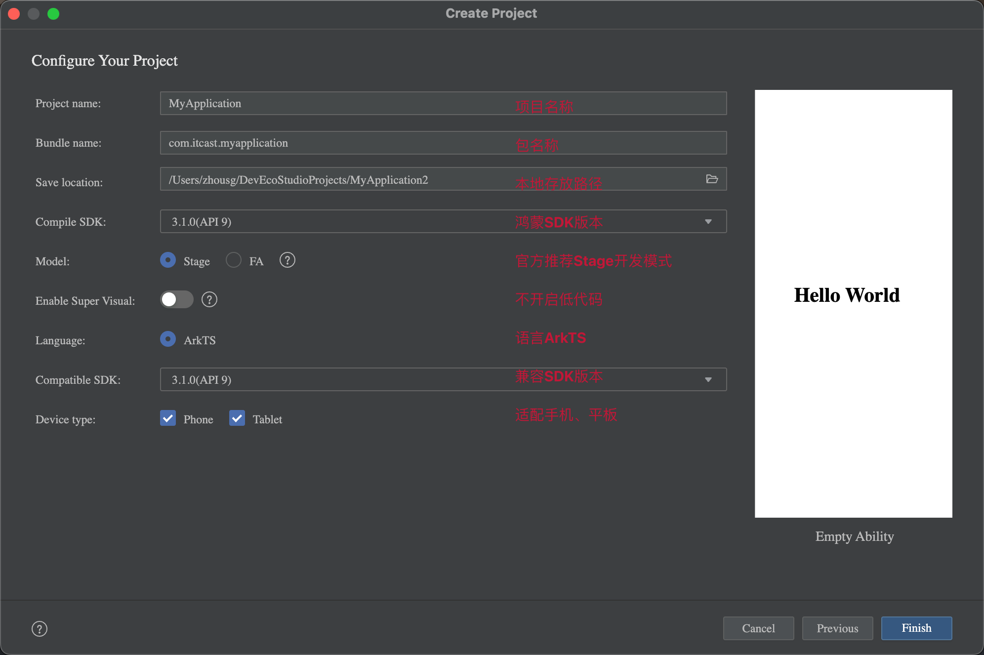
3. 起步-HelloWorld#
创建一个空项目:
-
Create Project
-
选择项目模板
-
填写项目信息
-
Finish
4. 起步-效果预览#
效果预览方法:
- Previewer 预览模式
- Local Emulator 本地模拟器
- Remote Emulator 远程模拟器
- Remote Device 远程真机
- Local Device 本地真机
推荐使用
- Previewer 预览 和 Local Emulator 本地模拟器;
- 尤其推荐使用
遥遥领先真机调试;
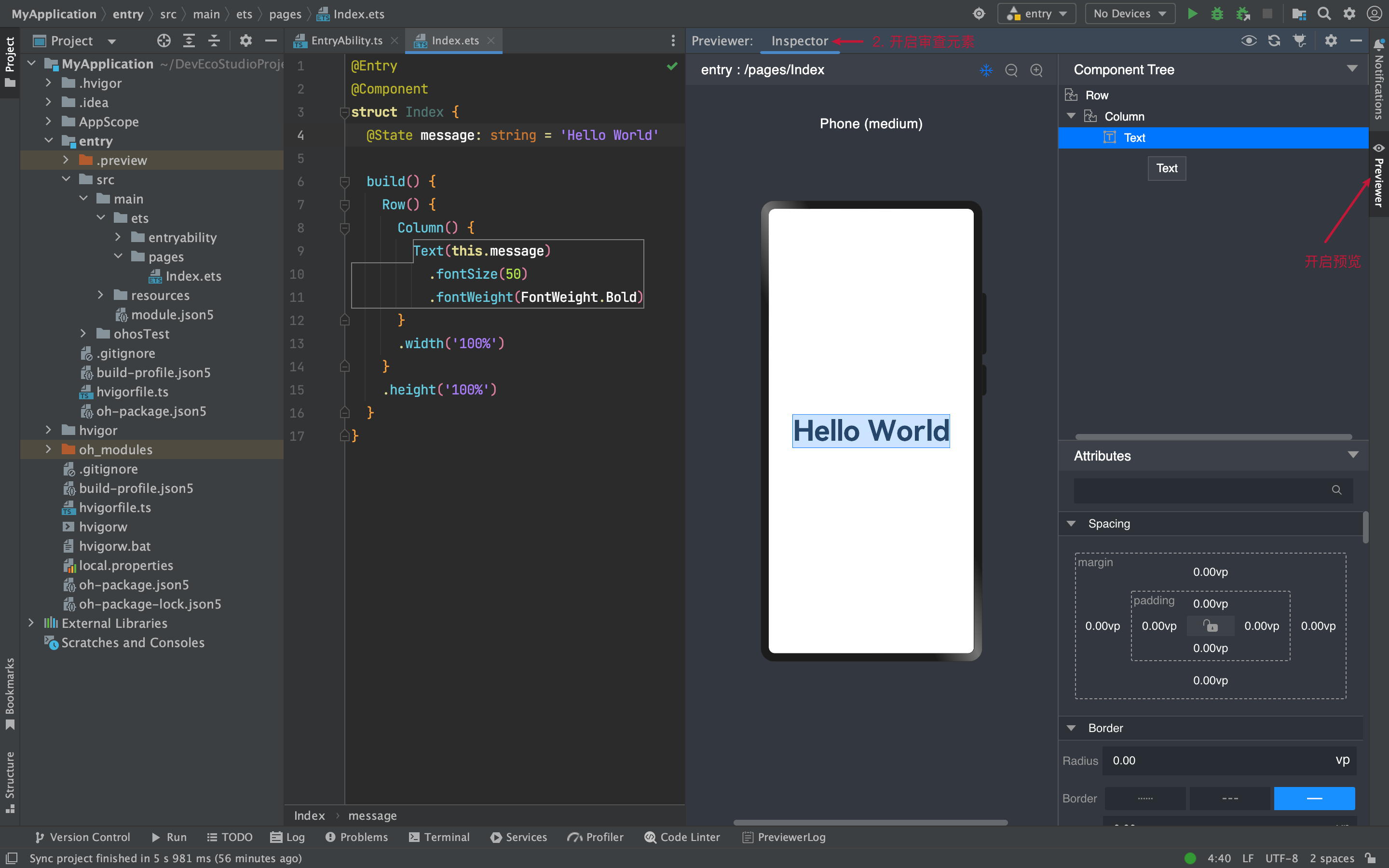
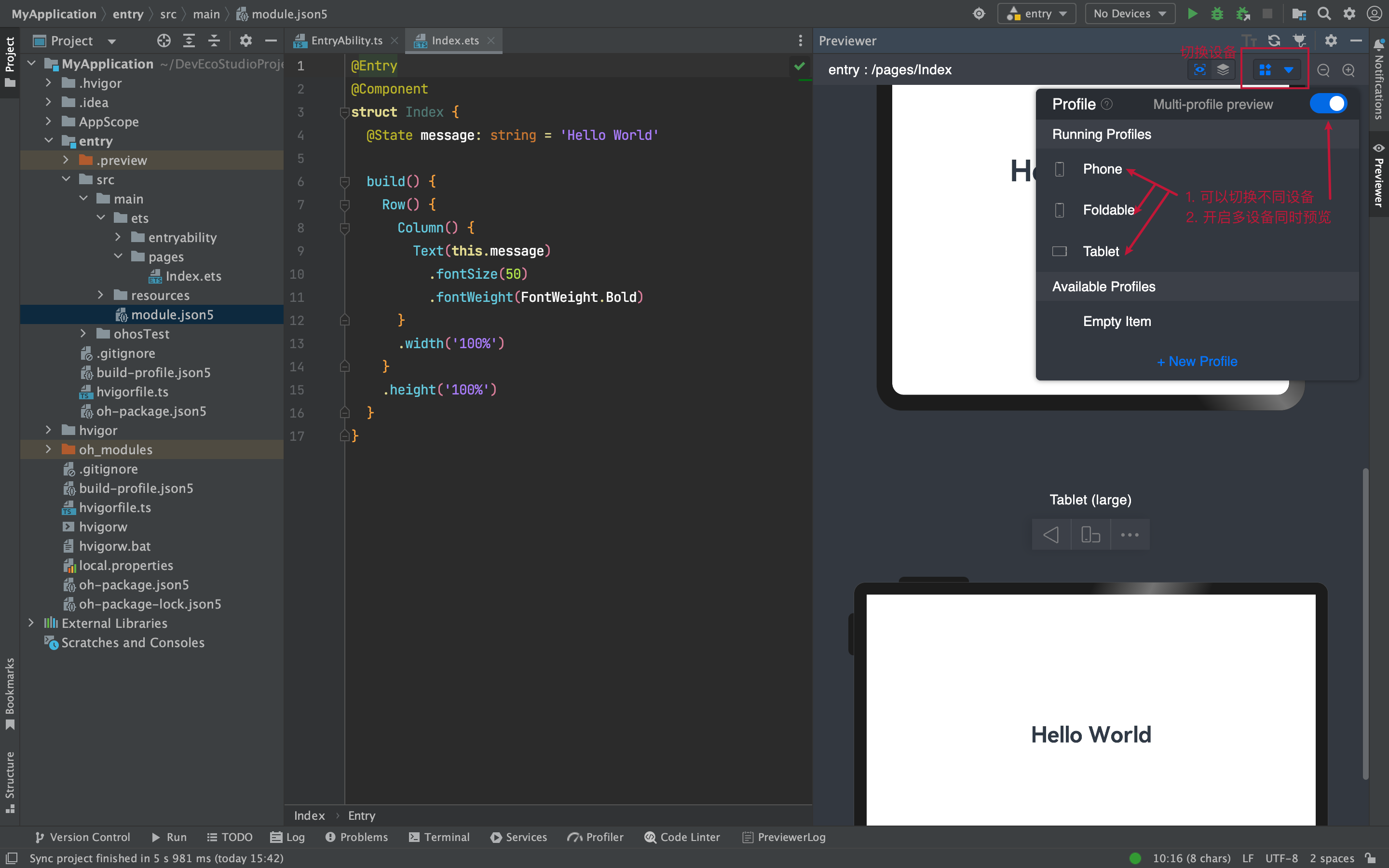
1)Previewer 预览
场景:静态页面(没有组件间数据通信、不涉及到网络请求)
条件:有 @Entry 或 @Preview 装饰器页面
-
预览和审查元素
-
多设备预览
2)Local Emulator 本地模拟器
场景:动态页面(几乎全场景,一些无法模拟的硬件功能)
-
新建模拟器
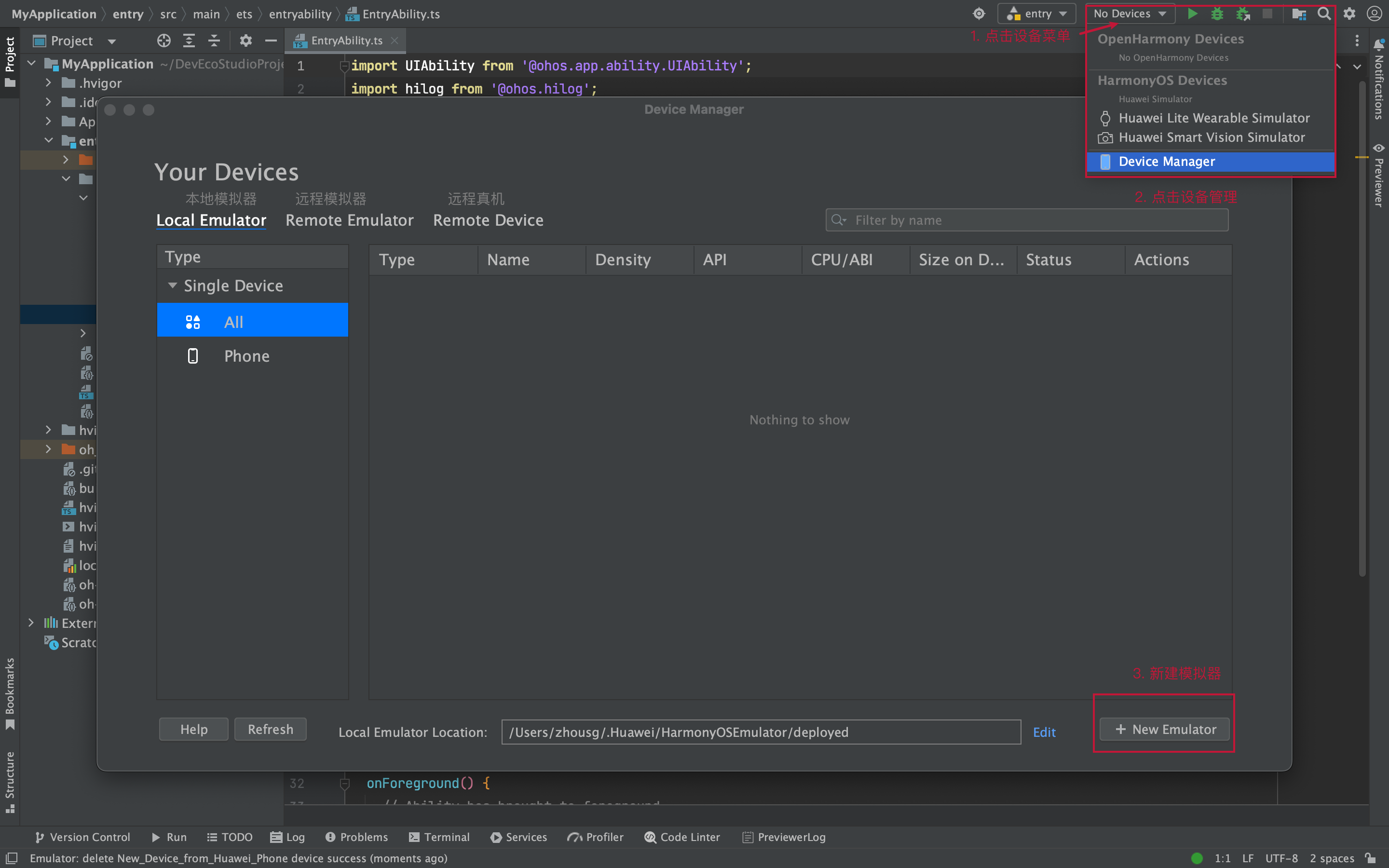
一路 Next ...
-
启动模拟器
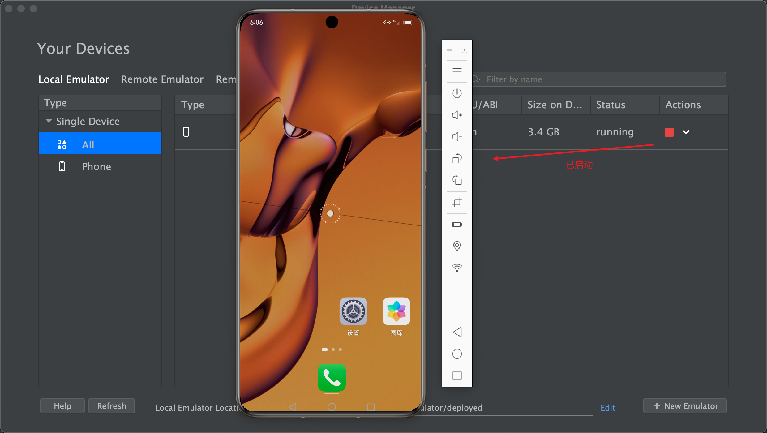
-
运行项目看效果
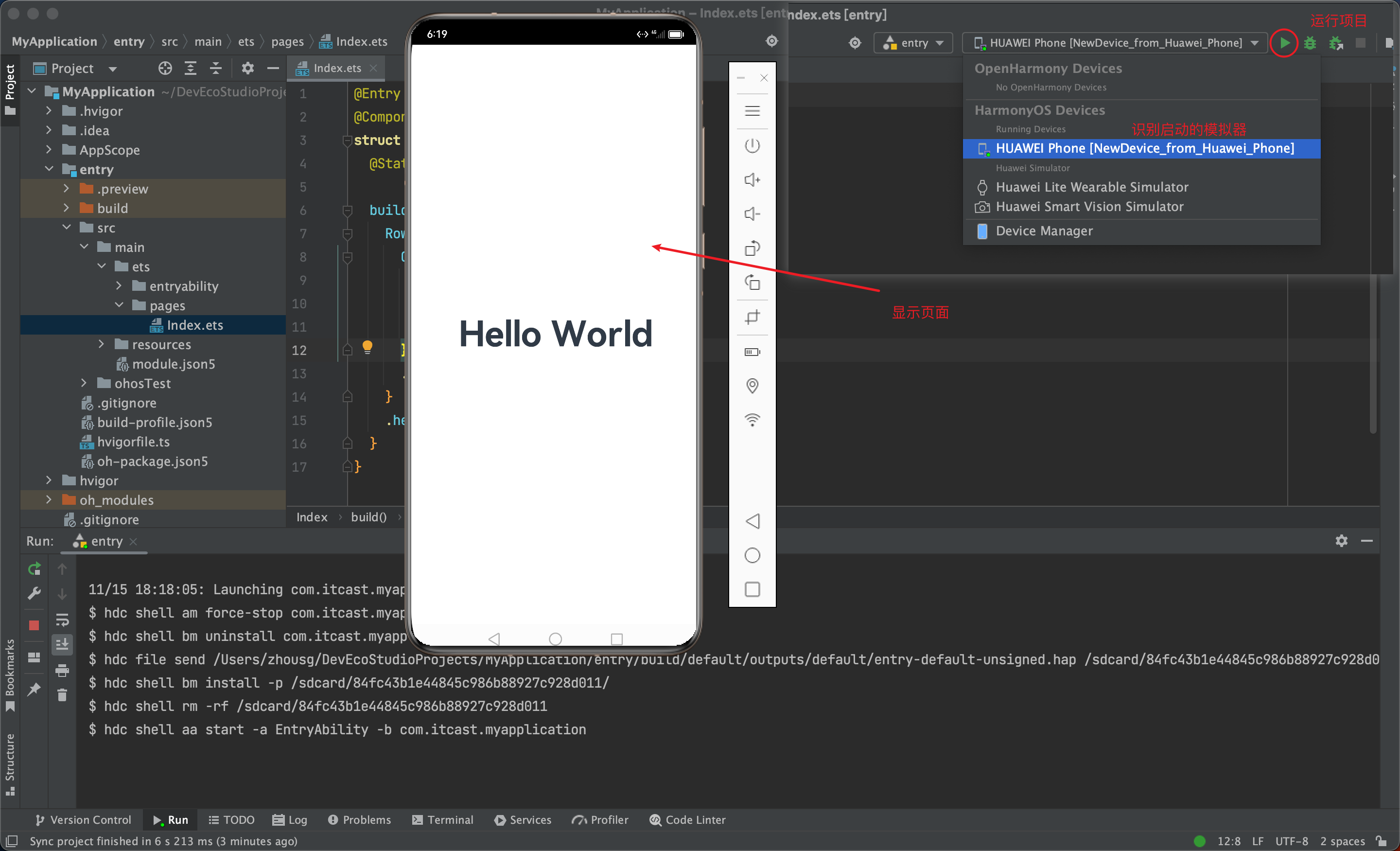
-
更改后每次需要(打包 → 卸载 → 安装 → 预览),有没有热更新或者刷新这种预览方式?
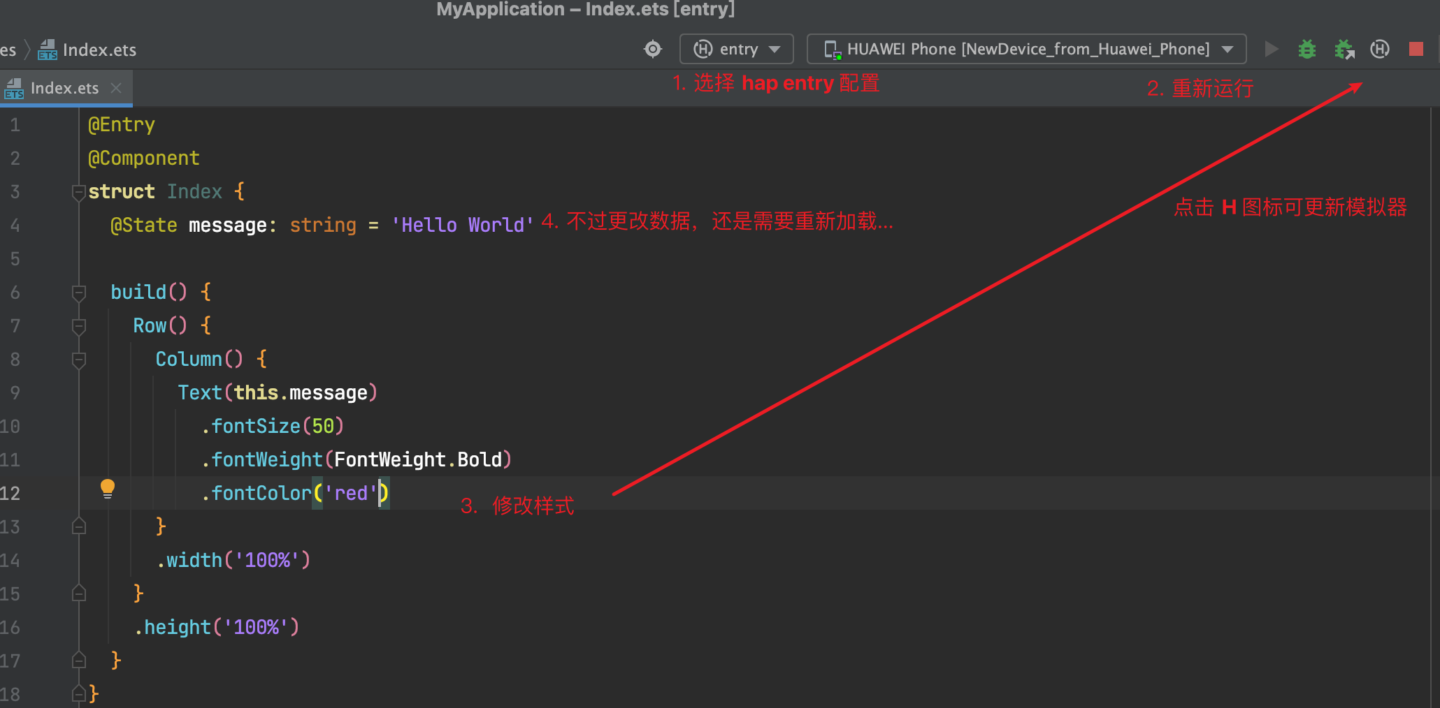
调试静态页面可以,一旦有了数据变化也需要重启,体验一般~ (学习需要耐心,期待 Next 做的更好~)
其他方式
- Remote Emulator 远程模拟器
- Remote Device 远程真机
- Local Device 本地真机
条件:
- 需要注册华为账号, 点这 华为开发者联盟-HarmonyOS开发者官网,共建鸿蒙生态 然后点击登录页面,去注册吧~
- 登录之后,需要自动生成签名信息,这个我们后面讲真机调试再给大家演示。
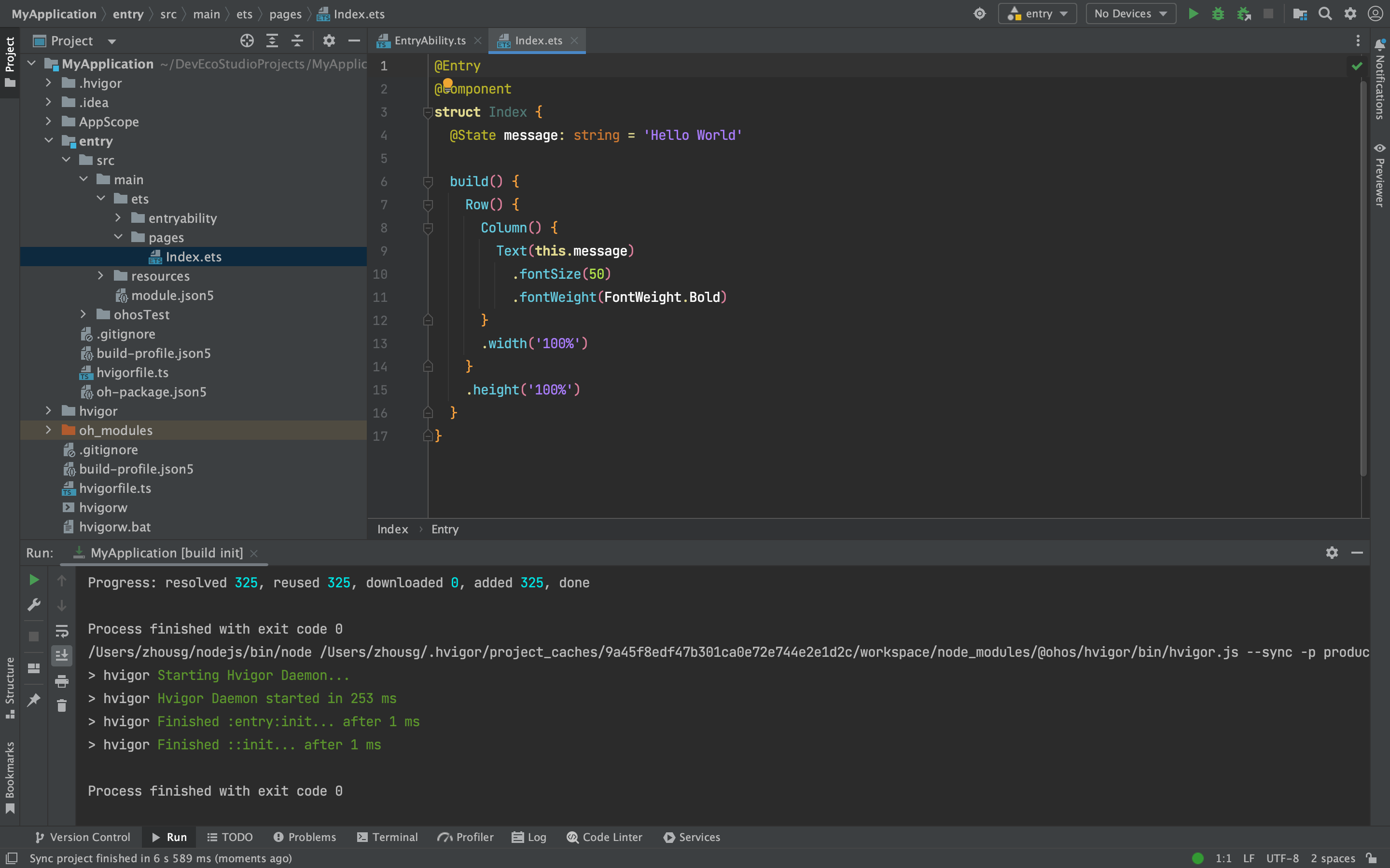
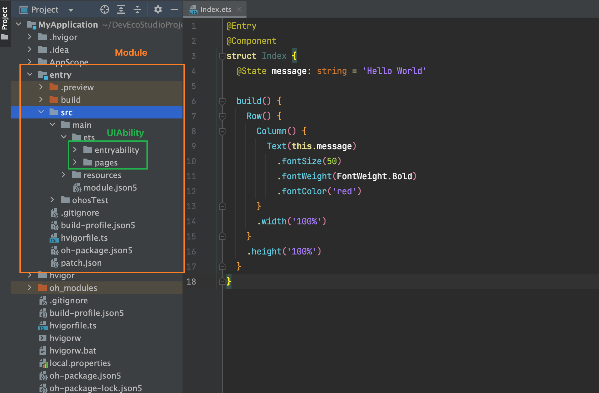
5. 起步-工程结构#
我们在哪里写代码?
Stage 模型
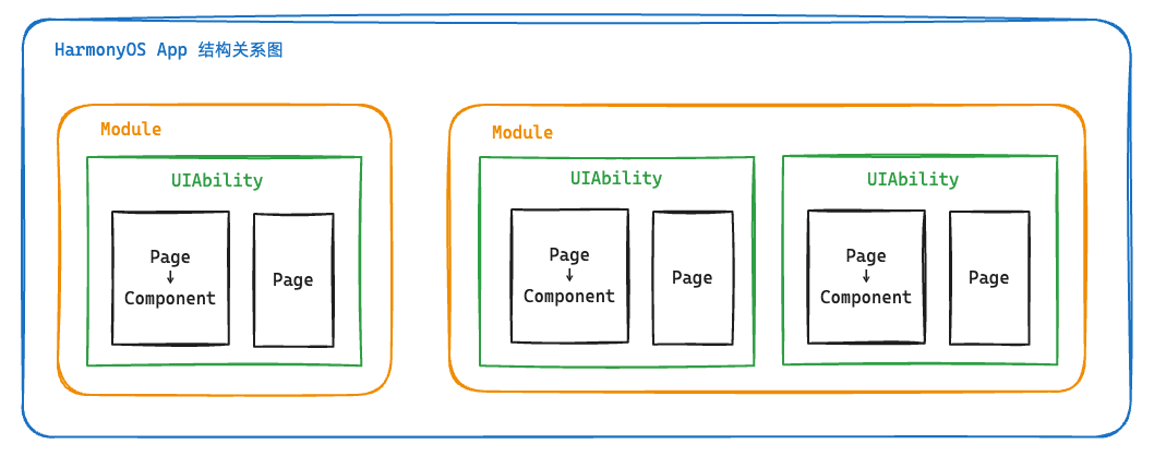
了解App结构关系,等后面我们项目阶段来讲一些工程配置文件作用,现在你要知道:
-
entry 是一个 Module 应用包
-
entryability 是一个 UIAbility 包含用户界面的应用组件
-
pages 是页面
-
components 可以是组件
组件基础#
1. 组件-什么是ArkTS#
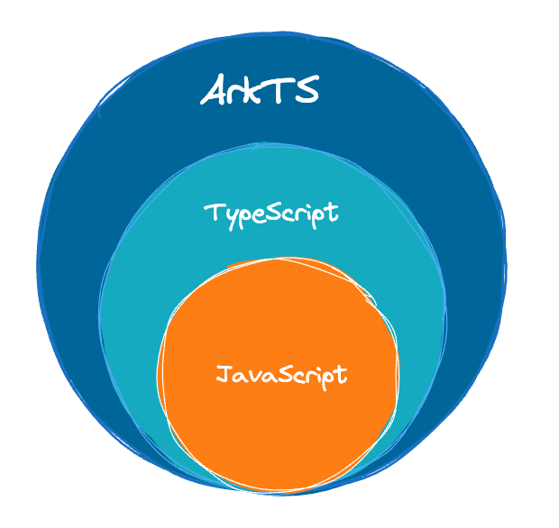
ArkTS是HarmonyOS优选的主力应用开发语言。ArkTS围绕应用开发在TypeScript(简称TS)生态基础上做了进一步扩展,继承了TS的所有特性,是TS的超集。
扩展能力如下:
- 基本语法
- 定义声明式UI、自定义组件、动态扩展UI元素;
- 提供ArkUI系统组件,提供组件事件、方法、属性;
- 共同构成 UI 开发主体
- 状态管理
- 组件状态、组件数据共享、应用数据共享、设备共享;
- 渲染控制
- 条件渲染、循环渲染、数据懒加载;
声明式UI?
问题?通过一段 HTML 标签展示出对应的页面方便,还是使用 document.createElement('tag')创建标签构建页面方便?
- 显然是 HTML , 其实 HTML 本身就是声明式的,通过描述的方式去声明 UI 界面。
- 一些前端框架也是声明式UI,如
Vue使用的tempalte模板,如React使用的JSX。 - 在例如现在的
Jetpack ComposeSwiftUIFlutter等APP开发技术也是声明式。
2. 基础-组件结构#
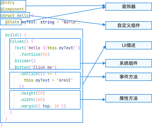
ArkTS通过装饰器 @Component 和 @Entry 装饰 struct 关键字声明的数据结构,构成一个自定义组件。 自定义组件中提供了一个 build 函数,开发者需在该函数内以链式调用的方式进行基本的 UI 描述,UI 描述的方法请参考 UI 描述规范。
1)页面组件
1@Entry
2@Component
3struct Index {
4  // 工程默认显示 `Index` 页面组件
5  // build 是声明UI的位置
6  build() {
7    Text('页面组件')
8  }
9}
2)自定义组件
1// 定义 `Footer` 组件
2@Component
3struct Footer {
4  build() {
5    Text('自定义组件')
6  }
7}
8
9@Entry
10@Component
11struct Index {
12  build() {
13    Column(){
14      // 使用 `Footer` 组件
15      Footer()
16    }
17  }
18}
为了更好维护,自定义组件通常会新建一个文件 Footer.ets,通过模块化语法导出导入(默认|按需)使用。
components/Footer.ets
1@Component
2export default struct Footer {
3  build() {
4    Text('自定义组件')
5  }
6}
Index.ets
1import Footer from './components/Footer.ets'
2
3@Entry
4@Component
5struct Index {
6  build() {
7    Column(){
8      // 使用 `Footer` 组件
9      Footer()
10    }
11  }
12}
TIP
@Entry @Component是页面组件,将来需要页面跳转就需要再定义一个页面。@Component自定义组件,一个页面组件下可以有多个自定义组件。build(){}只能有一个根元素
3. 基础-系统组件(ArkUI)#
常用系统组件 Text Column Row Button TextInput 更多组件
- Text 文本组件
- Column 列组件,纵向排列,Flex布局主轴是Y
- Row 行组件,横向向排列,Flex布局主轴是X
- Button 按钮组件
- InputText 输入框组件
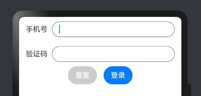
实现一个简易登录界面:
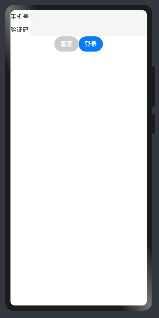
1@Entry
2@Component
3struct Index {
4
5  build() {
6    Column(){
7      Row(){
8        Text('手机号')
9        TextInput()
10      }
11      Row(){
12        Text('验证码')
13        TextInput()
14      }
15      Row(){
16        Button('重置').backgroundColor('#ccc')
17        Button('登录')
18      }
19    }
20  }
21}
TIP
- ArkUI 组件一般都是 Flex 模式,大部分布局可以由行和列组成。
4. 基础-组件状态#
如何使用
@State定义一个状态变量?
1)组件变量,不具备驱动UI更新能力。
1@Entry
2@Component
3struct Index {
4  count = 100
5
6  build() {
7    Text(this.count.toString())
8      .onClick(() => this.count++)
9  }
10}
2)状态变量,指驱动UI更新的数据,加上 @State 装饰器即可,注意:加上类型和初始值。
1@Entry
2@Component
3struct Index {
4
5  @State
6  count: number = 100
7
8  build() {
9    Text(this.count.toString())
10      .onClick(() => this.count++)
11  }
12}
TIP
- 加上类型和初始值
- 状态变量不可设置的类型有:
anyundefinednull与复杂类型的联合类型
其他:
- 绑定事件在系统组件后链式使用
onXxxxx进行绑定即可 - 使用
@ohos.promptAction可以进行轻提示promptAction.showToast({ message: 'Tip' })
📕📕📕 练习案例→实现登录表单数据收集、重置、模拟提交。
1import promptAction from '@ohos.promptAction'
2@Entry
3@Component
4struct Index {
5
6  @State
7  mobile: string = ''
8  @State
9  code: string = ''
10
11  build() {
12    Column(){
13      Row(){
14        Text('手机号')
15        TextInput({ text: this.mobile })
16          .onChange((value)=>this.mobile = value)
17      }
18      Row(){
19        Text('验证码')
20        TextInput({ text: this.code })
21          .onChange((value)=>this.code = value)
22      }
23      Row(){
24        Button('重置')
25          .backgroundColor('#ccc')
26          .onClick(()=>{
27            this.mobile = ''
28            this.code = ''
29          })
30        Button('登录')
31          .onClick(()=>{
32            if (this.mobile && this.code) {
33              promptAction.showToast({ message: `${this.mobile} 登录成功` })
34            } else {
35              promptAction.showToast({ message: `请输入手机号或验证码` })
36            }
37          })
38      }
39    }
40  }
41}样式处理#
1. 样式-语法(链式&枚举)#
ArkTS以声明方式组合和扩展组件来描述应用程序的UI;
同时还提供了基本的属性、事件和子组件配置方法,帮助开发者实现应用交互逻辑。
1)样式属性
- 属性方法以
.链式调用的方式配置系统组件的样式和其他属性,建议每个属性方法单独写一行。
1@Entry
2@Component
3struct Index {
4  build() {
5    Text('演示')
6      .backgroundColor('red')
7      .fontSize(50)
8      .width('100%')
9      .height(100)
10  }
11}
2)枚举值
- 对于系统组件,ArkUI还为其属性预定义了一些枚举类型。文档链接
1@Entry
2@Component
3struct Index {
4  build() {
5    Text('演示')
6      .fontSize(50)
7      .width('100%')
8      .height(100)
9      .backgroundColor(Color.Blue)
10      .textAlign(TextAlign.Center)
11      .fontColor(Color.White)
12  }
13}
TIP
- 样式相关属性通过链式函数的方式进行设置
- 如果类型是枚举的,通过枚举传入对应的值
2. 样式-单位vp和适配#
知道
vp单位,以及适配思想
1) vp 是什么?virtual pixel
-
屏幕密度相关像素,根据屏幕像素密度转换为屏幕物理像素,当数值不带单位时,默认单位
vp;在实际宽度为1440物理像素的屏幕上,1vp约等于3px(物理像素)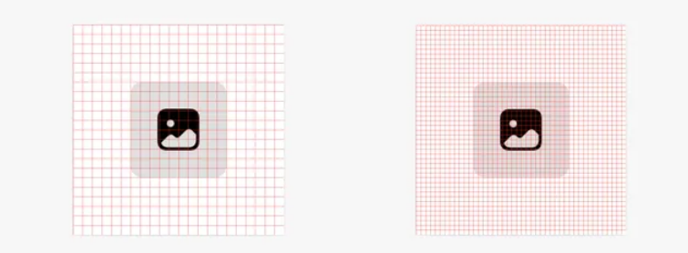
-
上图的意思是,使用这个单位在不同屏幕物理分辨率的实际尺寸一致(A设备1英寸,B设备1英寸)。
2)之前 vw 、rem 和 rpx 相对于屏幕宽度的单位,可以实现等比例适配,vp 可以吗?
1import promptAction from '@ohos.promptAction'
2
3@Entry
4@Component
5struct Index {
6  build() {
7    Text('演示')
8      .width('100%')
9      .backgroundColor('red')
10      .onAreaChange((oldArea, newArea) => {
11        promptAction.showToast({
12          // 1. onAreaChange改变尺寸后会触发
13          // 2. newArea为现在元素尺寸
14          message: newArea.width.toString()
15        })
16      })
17  }
18}
我们发现:不同的设备屏幕的宽度 vp 是不一致的,那怎么适配呢?
3)根据官方的文档,结合自己的理解,采用:伸缩布局,网格系统,栅格系统进行布局适配。
伸缩 layoutWeight(flex: number) 占剩余空间多少份,可以理解成CSS的 flex: 1
1@Entry
2@Component
3struct Index {
4  build() {
5    Row(){
6      Text('left')
7        .layoutWeight(1)
8        .backgroundColor('red')
9      Text('right')
10        .layoutWeight(2)
11        .backgroundColor('green')
12    }
13    .width('100%')
14  }
15}
等比例,设置元素宽高比 aspectRatio(ratio: number)
1@Entry
2@Component
3struct Index {
4  build() {
5    Text('left')
6      .width('50%')
7        // 宽高比例
8      .aspectRatio(1)
9      .backgroundColor('red')
10  }
11}
TIP
- vp 是鸿蒙默认单位,和屏幕像素有关,最终表现视觉大小在任何设备一致
- 鸿蒙一般以伸缩
layoutWeight、网格、栅格进行布局适配,如要等比例缩放可以设置高宽比aspectRatio
📕📕📕 练习案例→实现知乎评论回复-评论区域

设计稿一般是1080px:(这里没有设计稿,提供了一些尺寸)
- Nav
- 左侧返回按钮24vp高宽背景颜色
#f5f5f5,图标12vp尺寸颜色#848484 - 标题18vp
- 左侧返回按钮24vp高宽背景颜色
- Comment
- 头像尺寸32vp高宽,右侧间距10vp
- 标题15vp,颜色默认
- 内容16vp,颜色
#565656 - 底部12vp,颜色
#c3c4c5
1@Entry
2@Component
3struct Index {
4  build() {
5    Column(){
6      // 导航
7      Row(){
8        Row(){
9          Image($r('app.media.ic_public_arrow_left'))
10            .width(16)
11            .aspectRatio(1)
12            // svg 图标可以使用填充颜色
13            // .fillColor('red')
14        }
15        .width(24)
16        .aspectRatio(1)
17        .backgroundColor('#f5f5f5')
18        .borderRadius(12)
19        .justifyContent(FlexAlign.Center)
20        .margin({ left: 16 })
21
22        Text('评论回复')
23          .layoutWeight(1)
24          .textAlign(TextAlign.Center)
25          .padding({ right: 40 })
26      }
27      .height(40)
28      .border({ width: { bottom: 0.5 }, color: '#e4e4e4' })
29      // 评论
30      Row(){
31        Image($r('app.media.avatar'))
32          .width(32)
33          .aspectRatio(1)
34          .borderRadius(16)
35        Column({ space: 5 }){
36          Text('周杰伦')
37            .width('100%')
38            .fontWeight(FontWeight.Bold)
39            .fontSize(15)
40          Text('大理石能雕刻出肌肉和皮肤的质感,那个年代的工匠好牛啊')
41            .width('100%')
42          Row(){
43            Text('10-21 · IP属地北京')
44              .fontSize(12)
45              .fontColor('#c3c4c5')
46            Row({ space: 4 }){
47              Image($r('app.media.ic_public_heart'))
48                .width(14)
49                .aspectRatio(1)
50                .fillColor('#c3c4c5')
51              Text('100')
52                .fontSize(12)
53                .fontColor('#c3c4c5')
54            }
55          }
56          .width('100%')
57          .justifyContent(FlexAlign.SpaceBetween)
58        }
59        .layoutWeight(1)
60        .padding({ left: 10 })
61      }
62      .padding(15)
63      .alignItems(VerticalAlign.Top)
64    }
65  }
66}
2. 样式-@Styles 复用#
在开发过程中会出现大量代码在进行重复样式设置,
@Styles可以帮我们进行样式复用
1// 全局
2@Styles
3function functionName() { ... }
4
5@Entry
6@Component
7sturt Index{
8  // 组件内
9  @Styles
10  functionName() { ... }
11
12  build() {
13    Text('Text')
14      .functionName()
15  }
16}
需求:文字和按钮相同背景,点击+1
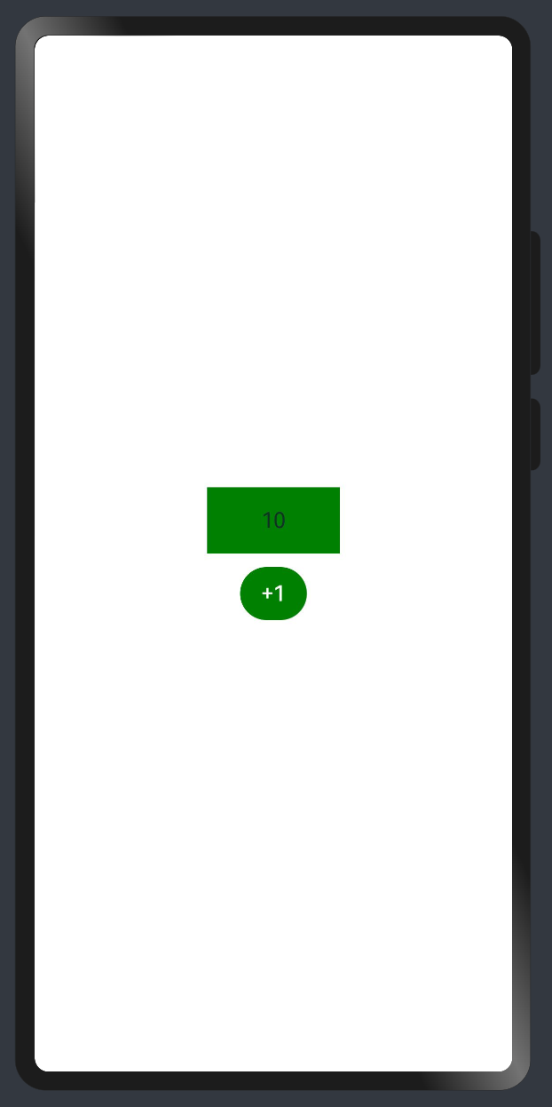
1)全局
1@Styles function sameStyle() {
2  .backgroundColor(Color.Green)
3  .onClick(() => {
4    this.count++
5  })
6}
7
8@Entry
9@Component
10struct Index {
11  @State
12  count: number = 10
13
14  build() {
15    Column() {
16      Text(this.count.toString())
17        .width(100)
18        .height(50)
19        .margin({ bottom: 10 })
20        .textAlign(TextAlign.Center)
21        .sameStyle()
22
23      Button('+1')
24        .sameStyle()
25    }
26    .height('100%')
27    .width('100%')
28    .justifyContent(FlexAlign.Center)
29  }
30}
2)组件内
1@Entry
2@Component
3struct Index {
4  @State
5  count: number = 10
6
7  // 不需要 `function` 关键字,覆盖全局
8  @Styles
9  sameStyle (){
10    .backgroundColor(Color.Pink)
11    .onClick(() => {
12      this.count += 10
13    })
14  }
15
16  build() {
17    Column() {
18      Text(this.count.toString())
19        .width(100)
20        .height(50)
21        .margin({ bottom: 10 })
22        .textAlign(TextAlign.Center)
23        .sameStyle()
24
25      Button('+1')
26        .sameStyle()
27    }
28    .height('100%')
29    .width('100%')
30    .justifyContent(FlexAlign.Center)
31  }
32}
📕📕📕 练习案例-登录表单-样式优化
1import promptAction from '@ohos.promptAction'
2@Entry
3@Component
4struct Index {
5
6  @State
7  mobile: string = ''
8  @State
9  code: string = ''
10
11
12  @Styles
13  inputStyle () {
14    .border({ width: 1, color: Color.Gray })
15    .layoutWeight(1)
16    .margin({ left: 10, bottom: 10, top: 10 })
17    .backgroundColor(Color.White)
18  }
19
20  build() {
21    Column(){
22      Row(){
23        Text('手机号')
24        TextInput({ text: this.mobile })
25          .inputStyle()
26          .onChange((value)=>this.mobile = value)
27      }
28      Row(){
29        Text('验证码')
30        TextInput({ text: this.code })
31          .inputStyle()
32          .onChange((value)=>this.code = value)
33      }
34      Row({ space: 15 }){
35        Button('重置')
36          .backgroundColor('#ccc')
37          .onClick(()=>{
38            this.mobile = ''
39            this.code = ''
40          })
41        Button('登录')
42          .onClick(()=>{
43            if (this.mobile && this.code) {
44              promptAction.showToast({ message: `${this.mobile} 登录成功` })
45            } else {
46              promptAction.showToast({ message: `请输入手机号或验证码` })
47            }
48          })
49      }
50    }
51    .padding({ left: 15, right: 15 })
52  }
53}
3. 样式-@Extends 复用#
@Extend用于扩展原生组件样式,通过传参提供更灵活的样式复用
- 使用
@Extend装饰器修饰的函数只能是 全局 - 函数可以进行 传参,如果参数是状态变量,状态更新后会刷新UI
- 且参数可以是一个函数,实现复用事件且可处理不同逻辑
1// 全局  原生组件                     参数
2//  ↓     ↓                          ↓
3@Extend(Text) function functionName(w: number) {
4  .width(w)
5}
需求:把 Text 改成按钮样式,且绑定 click 事件执行不同逻辑
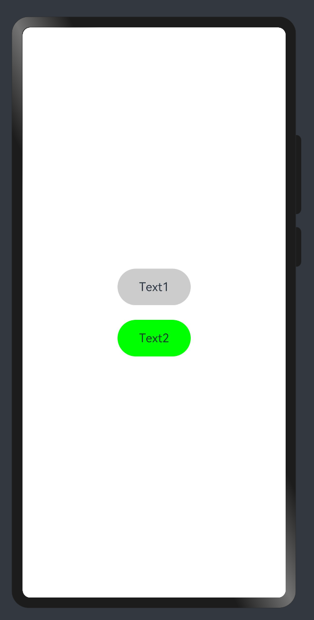
1import promptAction from '@ohos.promptAction'
2
3@Extend(Text) function myClick(color: string, cb: () => void) {
4  .backgroundColor(color)
5  .width(100)
6  .height(50)
7  .textAlign(TextAlign.Center)
8  .borderRadius(25)
9  .onClick(() => cb())
10}
11
12@Entry
13@Component
14struct Other {
15  @State
16  color: string = '#ccc'
17
18  build() {
19    Column({ space: 20 }) {
20      Text('Text1')
21        .myClick(this.color, () => {
22          this.color = '#069'
23        })
24      Text('Text2')
25        .myClick('green', () => {
26          promptAction.showToast({ message: '做其他事~' })
27        })
28    }
29    .width('100%')
30    .height('100%')
31    .justifyContent(FlexAlign.Center)
32  }
33}
4. 样式-多态#
stateStyles()可以依据组件的内部状态的不同,快速设置不同样式。
stateStyles 是属性方法,可以根据UI内部状态来设置样式,类似于 css 伪类,但语法不同。ArkUI 提供以下四种状态:
-
focused:获焦态。
-
normal:正常态。
-
pressed:按压态。
-
disabled:不可用态。
1import promptAction from '@ohos.promptAction'
2
3// 胶囊按钮
4@Extend(Text)
5function capsule(){
6  .height(40)
7  .borderRadius(20)
8  .backgroundColor(Color.Gray)
9  .padding({ left: 15, right: 15 })
10  .margin({ bottom: 15 })
11}
12
13@Entry
14@Component
15struct Index {
16  @State
17  disabled: boolean = false
18  @State
19  focused: boolean = false
20
21  build() {
22    Column() {
23
24      // Button TextInput 默认开启获取焦点,页面中默认第一个这样的元素获取焦点
25      // Button 比较多限制,一个是默认开启获取焦点能看,二是禁用状态下样式无法修改
26      // Button('Button').focusable(false)
27
28      Text('toggle disabled:' + this.disabled)
29        .capsule()
30        .onClick(()=>{
31          this.disabled = !this.disabled
32        })
33      Text('toggle focused:' + this.focused)
34        .capsule()
35        .onClick(()=>{
36          this.focused = !this.focused
37        })
38      Text('clickMe')
39        .capsule()
40        .enabled(!this.disabled)
41        .focusable(this.focused)
42        .onClick(() => {
43          promptAction.showToast({ message: 'click' })
44        })
45        .fontColor('#fff')
46        .stateStyles({
47          normal: {
48            .backgroundColor(Color.Blue)
49          },
50          focused: {
51            .backgroundColor(Color.Red)
52          },
53          disabled: {
54            .backgroundColor(Color.Black)
55          },
56          pressed: {
57            .backgroundColor(Color.Orange)
58          }
59        })
60    }
61  }
62}
TIP
- 使用比较多的应该是
normalpressed结合下的按压效果 enabled(true|false)开启|禁用focusable(true|false)开启获取焦点能力|关闭
注意:
- 页面初始化的时候,默认第一个能获取焦点的元素,会自动获取焦点
组件状态#
1. 状态-class语法#
在鸿蒙开发中关于对象状态范式采用
class方式,后续组件传值遇到深层对象嵌套需要利用class
1)class 创建对象和 class 类型
1class Person {
2  age: number;
3  name: string;
4
5  constructor(name: string, age: number) {
6    this.name = name
7    this.age = age
8  }
9}
10
11// 当类型使用和构当造函数使用
12const p: Person = new Person('jack', 18)
13// 当类型使用这种使用后续居多,我们使用字面量对象居多,可以省略 constructor
14const p1: Person = {
15  name: 'tom',
16  age: 20
17}2)implements 实现 interface 接口
1interface IPerson {
2  name: string,
3  age: number,
4  say: () => void
5}
6
7// 实现 IPerson 接口,需要符合接口约定
8class Person implements IPerson{
9  age: number;
10  name: string;
11
12  constructor(name: string, age: number) {
13    this.name = name
14    this.age = age
15  }
16
17  say () {
18    promptAction.showToast({ message: this.name })
19  }
20}3)extends 继承
1class HmPerson extends Person {
2  github: string = 'https://github.com/zhousg'
3
4  coding () {
5    promptAction.showToast({ message: this.name + ': coding' })
6  }
7}
TIP
- 定义类
class 类名 { 属性 + 构造器 + 方法 },类可以创建对象,也可以当类型使用。
扩展:
- class 可以实现
implements接口,需要受到接口约束 - class 可以继承
extends另外一个class的属性和方法
2. 状态-复杂状态#
当装饰的数据类型为class或者Object时,可以观察到自身的赋值的变化,和其属性赋值的变化,即Object.keys(observedObject)返回的所有属性。
1)对象类型状态
1// 对象模型
2class User {
3  nickname: string
4  age: number
5}
6
7@Entry
8@Component
9struct Index {
10
11  @State
12  user: User = { nickname: 'jack', age: 18 }
13
14  build() {
15    Column({ space: 20 }){
16      Text(this.user.nickname)
17      Text(this.user.age.toString())
18      Button('age++')
19        .onClick(() => {
20          this.user.age ++
21        })
22    }
23    .width('100%')
24    .height('100%')
25    .justifyContent(FlexAlign.Center)
26  }
27}
2)嵌套对象类型状态
1// 对象模型
2class User {
3  nickname: string
4  age: number
5}
6
7class UserData {
8  code: number
9  message: string
10  // 嵌套对象
11  data: User
12}
13
14@Entry
15@Component
16struct Index {
17  @State
18  res: UserData = {
19    code: 10000,
20    message: '获取用户信息成功',
21    // 嵌套对象
22    data: { nickname: 'jack', age: 18 }
23  }
24
25  build() {
26    Column({ space: 20 }) {
27      Text(this.res.data.nickname)
28      Text(this.res.data.age.toString())
29      Button('age++')
30        .onClick(() => {
31          // ❌ this.res.data.age ++
32          const user = this.res.data
33          // 替换属性,触发UI更新
34          this.res.data = { ...user, age: user.age + 1 }
35        })
36    }
37    .width('100%')
38    .height('100%')
39    .justifyContent(FlexAlign.Center)
40  }
41}
3)对象数组类型状态
1// 对象模型
2class User {
3  nickname: string
4  age: number
5}
6
7@Entry
8@Component
9struct Index {
10  @State
11  list: User[] = [
12    { nickname: 'jack', age: 18 },
13    { nickname: 'tom', age: 16 }
14  ]
15  build() {
16    Column({ space: 20 }) {
17      Text(JSON.stringify(this.list[0]))
18      Text(JSON.stringify(this.list[1]))
19      Button('age++')
20        .onClick(() => {
21          // ❌ this.list[1].age ++
22          const user = this.list[1]
23          this.list[1] = { ...user, age: user.age + 1 }
24        })
25    }
26    .width('100%')
27    .height('100%')
28    .justifyContent(FlexAlign.Center)
29  }
30}
TIP
- 使用
class来约束对象类型,和嵌套对象和对象数组。 - 嵌套对象和对象数组,采用赋值的方式进行更新,可以更新UI。
- 🚦 后期如果学习组件传值,会给大家补充另外一种深层数据变更更新UI的方式
界面渲染#
1. 渲染-条件渲染#
条件渲染可根据应用的不同状态,使用if、else和else if渲染对应状态下的UI内容。
- 条件渲染,是根据状态数据进行判断展示不同UI
- 条件渲染,是会销毁和创建组件,组件状态将不会保留
1)使用 if else 实现 loading 效果
1@Entry
2@Component
3struct Index {
4
5  @State
6  loading: boolean = false
7
8  build() {
9    Column({ space: 20 }){
10      if (this.loading) {
11        LoadingProgress()
12          .width(100)
13          .height(100)
14      } else  {
15        Text('后台数据')
16        Text('后台数据')
17        Text('后台数据')
18      }
19      Button('更新数据')
20        .onClick(() => {
21          this.loading = true
22          setTimeout(() => {
23            this.loading = false
24          }, 2000)
25        })
26    }
27    .width('100%')
28    .height('100%')
29    .justifyContent(FlexAlign.Center)
30  }
31}
2)添加渲染会销毁和重新创建组件,组件状态将不会保留。
1@Component
2struct CounterComp {
3  @State
4  count: number = 0
5
6  build() {
7    Text(this.count.toString())
8      .onClick(() => {
9        this.count ++
10      })
11  }
12}
13
14@Entry
15@Component
16struct Index {
17
18  @State
19  show: boolean = true
20
21  build() {
22    Column({ space: 20 }){
23      if (this.show) {
24        // 累计的 count 切换时候不会保留
25        CounterComp()
26      }
27      Button('toggle')
28        .onClick(() => {
29          this.show = !this.show
30        })
31    }
32    .width('100%')
33    .height('100%')
34    .justifyContent(FlexAlign.Center)
35  }
36}
2. 渲染-循环渲染#
ForEach接口基于数组类型数据来进行循环渲染,需要与容器组件配合使用。
语法:
1ForEach(
2  // 数据源
3  arr: Array,
4  // 组件生成函数
5  itemGenerator: (item: Array, index?: number) => void,
6  // 键值生成函数
7  keyGenerator?: (item: Array, index?: number): string => string
8)
应用:
1class User {
2  id: string
3  name: string
4  age: number
5}
6
7
8@Entry
9@Component
10struct Index {
11  @State
12  userList: User[] = []
13
14  build() {
15    Scroll() {
16      Column({ space: 20 }) {
17        // 循环渲染
18        ForEach(
19          // 1. 数据源
20          this.userList,
21          // 2. 组件生成函数
22          (item: User) => {
23            // 内容
24            Text(`${item.name} 今年 ${item.age} 岁`)
25          },
26          // 3. 键值生成函数
27          item => item.id
28        )
29        Button('加载更多')
30          .onClick(() => {
31            const arr: User[] = []
32            for (let index = 0; index < 10; index++) {
33              arr.push({ id: Math.random().toString(), name: 'jack', age: Math.ceil(Math.random() * 100) })
34            }
35            this.userList.push(...arr)
36          })
37      }
38    }
39    .width('100%')
40  }
41}
TIP
关于 keyGenerator 键生成函数的一些建议:
- 不能缺省
- 避免最终生成的键包含
index - 对象数组,建议使用对象中
id唯一标识 - 基本数据数字,建议转换成具有
id唯一标识的对象,再使用

讨论HarmonyOS开发技术,专注于API与组件、DevEco Studio、测试、元服务和应用上架分发等。
更多推荐

 23
23 1
1- 0


 已为社区贡献5条内容

所有评论(0)