鸿蒙自定义组件从0到进阶
自定义组件是鸿蒙(HarmonyOS)应用开发中实现UI复用与业务逻辑解耦的核心机制。基于ArkUI框架与ArkTS语言的声明式编程范式,开发者可通过封装独立的功能单元(如按钮、卡片、复杂布局等),快速构建跨设备适配、高可维护性的应用界面。在ets文件下与pages目录同级,新建component文件夹用于存放自定义组件,学过三层架构也可以新建一个uicomponent模块用于存放自定义组件,然后
将页面通用部分组件化是一个开发者应有的基本素质,组件化不仅可以减少代码量,提高复用性,还可以减少后期维护的困难,既能加速开发者的进度,又能减少工作量和后期维护,在鸿蒙中也有相关的操作,基础功能就是将通用UI封装成组件,进阶便是将一些功能和页面一起封装或者灵活将功能和组件结合使用。现在,基础篇教程开始。
一、什么是自定义组件?
自定义组件是鸿蒙(HarmonyOS)应用开发中实现 UI复用 与 业务逻辑解耦 的核心机制。基于ArkUI框架与ArkTS语言的声明式编程范式,开发者可通过封装独立的功能单元(如按钮、卡片、复杂布局等),快速构建跨设备适配、高可维护性的应用界面。
二、为什么要将页面封装成组件?
-
模块化开发:将UI与逻辑封装为独立组件,提升代码复用率,降低多端开发成本;
-
跨设备协同:通过自适应布局(如栅格系统、比例缩放)与分布式能力,无缝适配手机、平板、智慧屏等设备形态;
-
高效交互:基于ArkTS状态管理(
@State、@Prop)与响应式更新机制,实现数据驱动的高性能渲染; -
生态扩展:支持开源社区共享组件库,加速复杂功能集成(如地图、图表、AI能力嵌入)。
三、前置基础知识
1.数据传递
- 自定义组件避不开的一个问题就是父子组件,跨组件之间的数据传递,无法进行数据传递的自定义组件就是一个半成品。
- 父组件传递子组件(单向传递):@Prop修饰器。在子组件中声明一个此装饰器修饰的数据,可以不初始化,即可从父组件接收传过来的数据,但是只能接收,不能修改父组件中的数据。
- 父组件传递子组件(双向传递):@Link修饰器。在子组件中声明一个此装饰器修饰的数据,必须初始化,即可从父组件接收传过来的数据,也可以修改父组件中对应的数据。
- 父组件传递子组件(双向/跨组件传递):@Provide/@Consume修饰器。在父组件中使用@Provide中使用此修饰器修饰,也可以取别名,然后在子组件中使用@Consume读取该值,双向修改且可以跨组件传递。
- AppStorage(自由选择):有许多相关接口和修饰器,如果感兴趣可以在后续文章中给出(评论,有一个人感兴趣我都写)。
- emitter(事件发送/事件接收):可以参考作者的其他文章:鸿蒙中使用emitter注意事项_tree emitter.on-CSDN博客
四、如何封装(基础篇)?
1.明确需求
- 理论上,我们只需要将复用的代码新建一个文件存进去,并且声明为@Component修饰,然后再将该结构导出,在需要的页面导入并使用即可,理论很难懂,那就直接上代码实践。代码是在测试项目中写的,所以忽略掉奇奇怪怪的文件,看我用红框标记的文件即可。
- 设置场景:需要写一个电商界面,UI设计给出如下设计图:
 (注:这个里面的小说是纯数据,没内容,也不涉及商用,单纯展示)
- 此时此刻就可以注意到该页面有大量的相似的元素,并且结构相似,写完一次复制粘贴该代码明显不符合真是开发场景,此时,就应该将其封装成一个一个小组件,然后调用ForEach或者LazyForEach来重复渲染,减少代码量(此次示例仅展示榜单里面的组件复用)。
2.主页面准备
- 准备的页面中不包含设计图的搜索框和推荐的那个分栏和下边的Tab栏
class book {
  imgUrl: string
  title: string
  author: string
  introduce: string
  readNumber: number
  hot: number

  constructor(imgUrl: string, title: string, author: string, introduce: string, readNumber: number,hot: number) {
    this.imgUrl = imgUrl
    this.title = title
    this.author = author
    this.introduce = introduce
    this.readNumber = readNumber
    this.hot = hot
  }
}
interface bookType{
  id: string
  imgUrl: string
  title: string
  author: string
  introduce: string
  readNumber: number
  hot: number
}
interface tabType_second{
  id: number
  title: string
}

@Entry
@Component
export struct BaseComponentPage{
  @State arr: tabType_second[] = [
    {
      id: 1,
      title: '推荐榜'
    },
    {
      id: 2,
      title: '完本榜'
    },
    {
      id: 3,
      title: '口碑榜'
    },
    {
      id: 4,
      title: '巅峰榜'
    }
  ]
  @State book_list: bookType[] = []
  @State timeId: number = 0
  aboutToAppear(): void {

  }
  aboutToDisappear(): void {
    clearInterval(this.timeId)
  }
  build() {
    Scroll(){
      Column(){
        // 排行榜
        Tabs(){

        }
        .padding({left: 10,right: 10,bottom: 10})
        .backgroundColor(Color.White)
        .scrollable(false)
        .width('100%')
        .height(400)
        .borderRadius(8)
        // 列表
        Flex({
          wrap: FlexWrap.Wrap,
        }){

        }
        .width('100%')
      }
      .width('100%')
    }
    .scrollBar(BarState.Off)
    .scrollable(ScrollDirection.Vertical)
    .padding({left: 5,right: 5})
  }
}- 对于初学者来说,肯定是会将代码写一次然后复制粘贴反复使用,也可能使用ForEach来渲染,例如下方代码(查看被回车隔开的代码即可):
class book {
  imgUrl: string
  title: string
  author: string
  introduce: string
  readNumber: number
  hot: number

  constructor(imgUrl: string, title: string, author: string, introduce: string, readNumber: number,hot: number) {
    this.imgUrl = imgUrl
    this.title = title
    this.author = author
    this.introduce = introduce
    this.readNumber = readNumber
    this.hot = hot
  }
}
interface bookType{
  id: string
  imgUrl: string
  title: string
  author: string
  introduce: string
  readNumber: number
  hot: number
}
interface tabType_second{
  id: number
  title: string
}

@Entry
@Component
export struct BaseComponentPage{
  @State arr: tabType_second[] = [
    {
      id: 1,
      title: '推荐榜'
    },
    {
      id: 2,
      title: '完本榜'
    },
    {
      id: 3,
      title: '口碑榜'
    },
    {
      id: 4,
      title: '巅峰榜'
    }
  ]
  @State arr_1: number[] = [1, 2, 3, 4, 5, 6, 7, 8, 9, 10]
  @State book_list: bookType[] = []
  @State timeId: number = 0
  aboutToAppear(): void {

  }
  aboutToDisappear(): void {
    clearInterval(this.timeId)
  }
  build() {
    Scroll(){
      Column(){
        // 排行榜
        Tabs(){
          ForEach(this.arr, (item: tabType_second) => {
            TabContent(){


              Scroll() {
                Flex({
                  direction: FlexDirection.Column,
                  wrap: FlexWrap.Wrap,
                  justifyContent: FlexAlign.Start
                }) {
                  ForEach(this.arr_1, (item: number) => {
                    Row() {
                      Image($r('app.media.book_02'))
                        .height('95%')
                      Column() {
                        Row() {
                          Text(item.toString())
                            .fontColor(Color.Orange)
                          Text('异兽围城')
                        }
                        .width('100%')
                        Text() {
                          Span('情节紧凑')
                            .fontColor(Color.Orange)
                          Span('·99万')
                            .fontColor(Color.Gray)
                        }
                        .width('100%')
                      }
                      .justifyContent(FlexAlign.SpaceBetween)
                      .padding({
                        left: 10
                      })
                      .layoutWeight(1)
                      .height('95%')
                    }
                    .padding(5)
                    .width(200)
                    .height(110)
                  })
                }
              }
              .scrollable(ScrollDirection.Horizontal)
              .scrollBar(BarState.Off)


            }
            .tabBar(item.title)
          })
        }
        .padding({left: 10,right: 10,bottom: 10})
        .backgroundColor(Color.White)
        .scrollable(false)
        .width('100%')
        .height(400)
        .borderRadius(8)
        // 列表
        Flex({
          wrap: FlexWrap.Wrap,
        }){
          ForEach(this.book_list, (item: bookType) => {

          })
        }
        .width('100%')
      }
      .width('100%')
    }
    .scrollBar(BarState.Off)
    .scrollable(ScrollDirection.Vertical)
    .padding({left: 5,right: 5})
  }
}- 但是,这样书写会导致该页面代码篇幅太长,如果后期出了什么问题需要修改,但是你忘记了代码结构或者修改代码的不是你,就会将该代码从头到尾全部重新理解一次,大大的增加了时间,此时,就可以将其封装成组件,不仅减少了时间,还能防止其他页面需要使用的时候重新书写(并且重新书写可能样式不一样导致用户体验下降)。
3.新建自定义组件
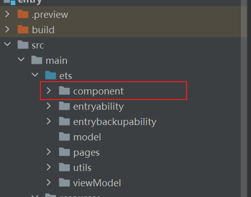
- 在ets文件下与pages目录同级,新建component文件夹用于存放自定义组件,学过三层架构也可以新建一个uicomponent模块用于存放自定义组件,然后配置好依赖即可。例如:
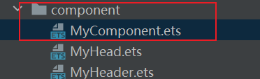
- 右击该文件夹,新建ArkTS File,随便一个名字,最好使用英文做到见名知意和大驼峰命名法。如下:
- 构建自定义组件的基本结构:
@Component export struct MyComponent { build(){ Column(){ } .width('100%') .height('100%') } } - 将上方代码可以重复使用的地方复制粘贴,并且修改样式至不报错,如下:
@Component export struct MyComponent { @Prop item: number build(){ Row() { Image($r('app.media.book_02')) .height('95%') Column() { Row() { Text(this.item.toString()) .fontColor(Color.Orange) Text('异兽围城') } .width('100%') Text() { Span('情节紧凑') .fontColor(Color.Orange) Span('·99万') .fontColor(Color.Gray) } .width('100%') } .justifyContent(FlexAlign.SpaceBetween) .padding({ left: 10 }) .layoutWeight(1) .height('95%') } .padding(5) .width(200) .height(110) } } - 在原本的文件中替换代码至如下方式,并且导入该组件,如下:
import { MyComponent } from "../component/MyComponent" class book { imgUrl: string title: string author: string introduce: string readNumber: number hot: number constructor(imgUrl: string, title: string, author: string, introduce: string, readNumber: number,hot: number) { this.imgUrl = imgUrl this.title = title this.author = author this.introduce = introduce this.readNumber = readNumber this.hot = hot } } interface bookType{ id: string imgUrl: string title: string author: string introduce: string readNumber: number hot: number } interface tabType_second{ id: number title: string } @Entry @Component export struct BaseComponentPage{ @State arr: tabType_second[] = [ { id: 1, title: '推荐榜' }, { id: 2, title: '完本榜' }, { id: 3, title: '口碑榜' }, { id: 4, title: '巅峰榜' } ] @State arr_1: number[] = [1, 2, 3, 4, 5, 6, 7, 8, 9, 10] @State book_list: bookType[] = [] @State timeId: number = 0 aboutToAppear(): void { } aboutToDisappear(): void { clearInterval(this.timeId) } build() { Scroll(){ Column(){ // 排行榜 Tabs(){ ForEach(this.arr, (item: tabType_second) => { TabContent(){ Scroll() { Flex({ direction: FlexDirection.Column, wrap: FlexWrap.Wrap, justifyContent: FlexAlign.Start }) { ForEach(this.arr_1, (item: number) => { // 修改部分 MyComponent({ item: item }) }) } } .scrollable(ScrollDirection.Horizontal) .scrollBar(BarState.Off) } .tabBar(item.title) }) } .padding({left: 10,right: 10,bottom: 10}) .backgroundColor(Color.White) .scrollable(false) .width('100%') .height(400) .borderRadius(8) // 列表 Flex({ wrap: FlexWrap.Wrap, }){ ForEach(this.book_list, (item: bookType) => { }) } .width('100%') } .width('100%') } .scrollBar(BarState.Off) .scrollable(ScrollDirection.Vertical) .padding({left: 5,right: 5}) } } - 至此,你已经学会了如何封装组件,极大的提高了效率和后期维护。
五、进阶篇
- 详情参考作者其他文章:鸿蒙原生开发中自定义组件进阶——实现插槽(slot) 非常实用_鸿蒙插槽-CSDN博客
今天的介绍就到此为止,代码都可以实现,使用的DevEco Studio5.0.0,觉得无法联系的可以将下面的书籍自己写一些练一下,设计图随便去某个移动端小说软件里面看一看就好,如果觉得这篇文章对你有帮助,点个关注,点赞,收藏吧!

讨论HarmonyOS开发技术,专注于API与组件、DevEco Studio、测试、元服务和应用上架分发等。
更多推荐

 58
58 0
0- 0


 已为社区贡献5条内容

所有评论(0)