RN多设备适配开发指导
1、概述
在使用 RN 进行移动端开发时,开发者往往需要面对多设备适配的挑战。为了实现系统一致、多端统一的体验,如果所有页面都完全使用 RN 组件重构,不仅开发周期长、成本高,也难以落地。因此,本文将介绍一套面向多设备适配的 RN 响应式布局方案,涵盖动态断点、栅格系统、导航分栏、自适应隐藏等关键能力,帮助开发者在保证体验一致性的同时提升开发效率。
使用场景
为更直观地展示 RN 在多设备适配中的响应式布局能力,本文结合实际业务页面,选取了三个典型场景进行分析:视频首页聚焦于栅格系统与断点联动;IM 聊天首页体现分栏导航与断点适配;音乐首页则演示了自适应显隐与断点控制的配合。通过这些场景,展示如何灵活运用响应式布局能力,在不同终端下实现一致、可扩展的用户体验。
|
页面 |
sm |
md |
lg |
|---|---|---|---|
|
视频首页 |
|
|
|
|
IM聊天首页 |
|
|
|
|
音乐首页 |
|
|
|


2、多设备适配指导
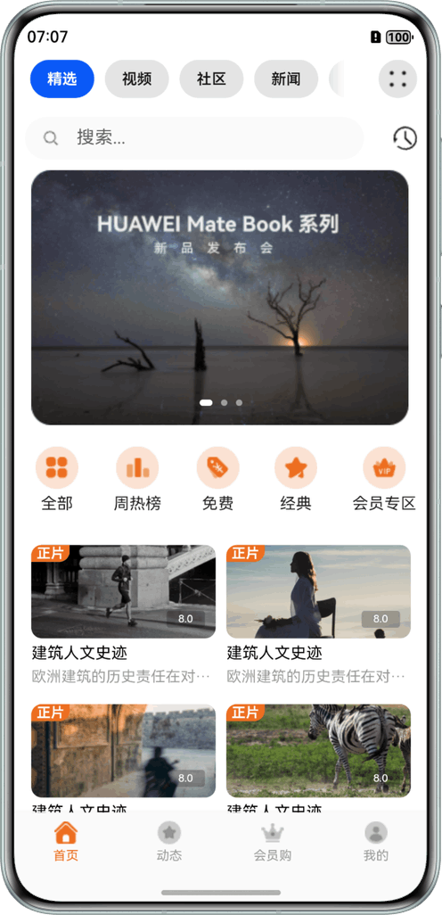
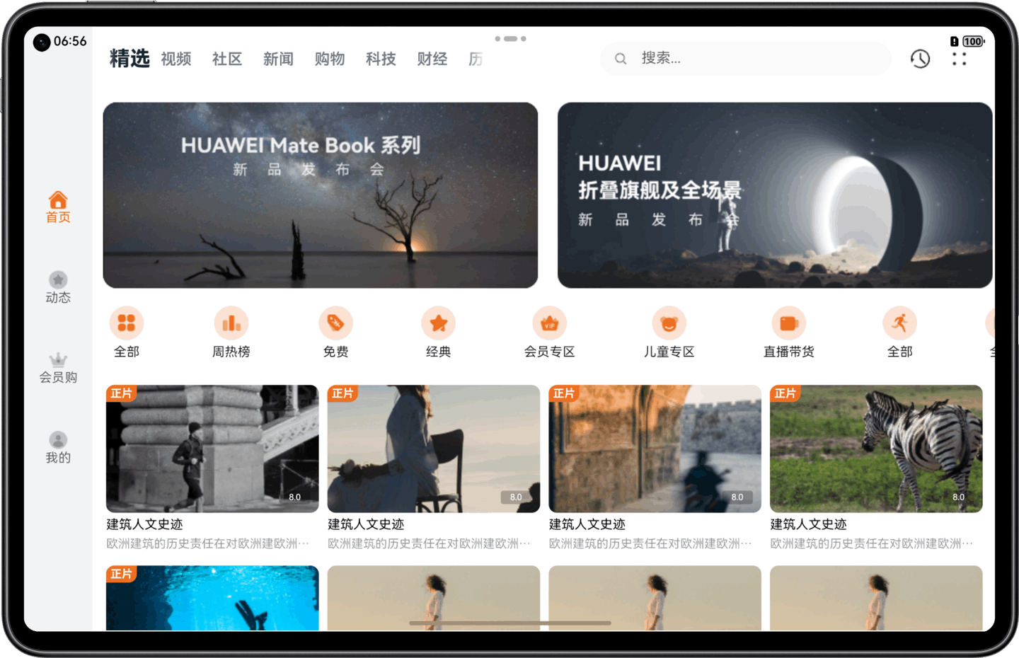
2.1 视频首页开发说明
视频首页划分为4个区域,效果图如下:
- 整个页面进行了响应式适配,借助栅格组件能力监听不同断点变化实现不同的布局效果。
- 区域2在小设备显示单行,在中/大设备显示两行,断点变化时切换显示效果。
- 区域3使用自适应布局延伸能力随不同设备尺寸延伸或隐藏。
- 区域4使用响应式布局的栅格断点系统,根据断点变化调整组件属性实现布局效果。
视频首页包含4个基础区域,具体介绍及实现方案如下表所示:
|
区域编号 |
简介 |
实现方案 |
|---|---|---|
|
1 |
底部/侧边页签 |
监听断点变化改变位置。 |
|
2 |
顶部页签及搜索框 |
监听断点变化实现折行显示。 |
|
3 |
Banner图和图标列表区域 |
监听断点变化展示不同状态的banner。 |
|
4 |
推荐影片 |
借助栅格组件能力监听断点变化改变列数。 |
2.1.1 断点区间
RN 断点机制是结合HarmonyOS平台动态断点能力封装的一套跨平台响应式适配方案。在 HarmonyOS 平台下,断点值通过调用 ArkTS 接口直接获取;在其他平台,则根据当前屏幕宽度计算所在断点区间。该机制帮助开发者基于应用窗口宽度实现差异化的页面布局,从而提升多设备下的 UI 适配效率与一致性体验。
断点系统以应用窗口宽度为基础,将其划分为多个区间即断点,默认提供的断点区间如下所示:
|
断点名称 |
取值范围(px) |
|
xs |
[0, 320) |
|
sm |
[320, 600) |
|
md |
[600, 840) |
|
lg |
[840, 1440) |
|
xl |
[1440, +∞) |
断点设置与获取方法如下表所示:
|
名称 |
描述 |
类型 |
平台 |
返回值 |
|---|---|---|---|---|
|
getInstance |
获取 BreakpointManager 的单例 |
function |
All |
BreakpointManager |
|
getCurrentWidthBreakpoint |
获取当前的横向断点 |
function |
All |
string |
|
getCurrentHeightBreakpoint |
获取当前的纵向断点 |
function |
All |
string |
|
subscribeToBreakpoint |
订阅断点变化 |
function |
All |
( callback: (widthBreakpoints: string, heightBreakpoints: string) => void, ) => function |
|
destroy |
注销监听 |
function |
All |
() => void |
关键代码片段:
const App = (props: any) => {
  // Render each message item
  // 监听断点变化的回调
  const [currentBp, setCurrentBp] = useState<string>('unknown');
  const onBreakpointChange = (breakpoint: string) => {
    setCurrentBp(breakpoint);
  };
  const HomeScreen = () => {
    ......
    return (
      <View>
        <GridRow
          onBreakpointChange={onBreakpointChange}
          style={styles.gridRow}
          columns={12}
        >
          {/* 大屏侧边栏 */}
          {
            currentBp == 'lg' && <GridCol
              span={{ xs: 0, sm: 0, md: 0, lg: 1 }}
              offset={0}
              order={0}
            >
             ......
            </GridCol>
          }
          {/* 消息列表页 */}
          {
            (currentBp !== 'sm' || (currentBp === 'sm' && showPage === 'list')) && <GridCol
              span={{ xs: 12, sm: 12, md: 6, lg: 4 }}
              offset={0}
              order={0}
            >
              <View style={styles.container}>
                {/* Header */}
                ......
                {/* Bottom */}
                {
                  (currentBp == 'sm' || currentBp == 'md') && <View style={styles.bottomWrap}>
                    ......
                  </View>
                }
              </View>
            </GridCol>
          }
          {/* 详情页 */}
          {
            (currentBp !== 'sm' || (currentBp === 'sm' && showPage === 'detail')) && <GridCol
              span={{ xs: 12, sm: 12, md: 6, lg: 7 }}
              offset={0}
              order={0}
            >
              ......
            </GridCol>
          }
        </GridRow>
      </View>
    )
  }
  return (
    <>
      <NavigationSplitContainer
        mode={NavigationMode.Stack}
        navBarPosition={NavBarPosition.Start}
        navBarWidth={400}
        navBarWidthRange={[240, 400]}
        minContentWidth={200}
        onNavBarStateChange={newState => {
          console.log('onNavBarStateChange: ', newState);
        }}
        onNavigationModeChange={newMode => {
          console.log('onNavigationModeChange: ', newMode);
        }}
      >
        <HomeScreen></HomeScreen>
      </NavigationSplitContainer>
    </>
  );
};参考链接:GridRow,GridCol,NavigationSplitContainer。
2.1.2 底部/侧边页签
底部/侧边页签区域,不同断点下显示在首页的不同位置。在sm和md断点下,页签显示在底部;在lg断点下页签显示在左侧,且页签居中显示。
关键代码片段:
<GridRow
        onBreakpointChange={onBreakpointChange}
        style={styles.gridRow}
        columns={12}>
        {/* 侧边栏 */}
        {currentBp == 'lg' && (
            <GridCol span={{ xs: 0, sm: 0, md: 0, lg: 1 }} offset={0} order={0}>
                <View style={styles.bottomWrapLg}>
                    <TouchableOpacity style={styles.bottomItemLg}>
                        <NavHomeImage style={styles.bottomImg} />
                        <Text style={styles.bottomTitleActive}>首页</Text>
                    </TouchableOpacity>
                    <TouchableOpacity style={styles.bottomItemLg}>
                        <NavSourchImage style={styles.bottomImg} />
                        <Text style={styles.bottomTitle}>动态</Text>
                    </TouchableOpacity>
                    <TouchableOpacity style={styles.bottomItemLg}>
                        <NavSettingImage style={styles.bottomImg} />
                        <Text style={styles.bottomTitle}>会员购</Text>
                    </TouchableOpacity>
                    <TouchableOpacity style={styles.bottomItemLg}>
                        <NavOwerImage style={styles.bottomImg} />
                        <Text style={styles.bottomTitle}>我的</Text>
                    </TouchableOpacity>
                </View>
            </GridCol>
        )}
        {/* 列表页 */}
        {(currentBp === 'sm' || currentBp === 'md') && (
            <GridCol
                span={{ xs: 12, sm: 12, md: 12, lg: 4 }}
                offset={0}
                order={0}>
                <View style={styles.container}>
                    {/* Bottom */}
                    {(currentBp == 'sm' || currentBp == 'md') && (
                        <View style={styles.bottomWrap}>
                            <TouchableOpacity style={styles.bottomItem}>
                                <NavHomeImage style={styles.bottomImg} fill={'#fe8d00'} />
                                <Text style={styles.bottomTitleActive}>首页</Text>
                            </TouchableOpacity>
                            <TouchableOpacity style={styles.bottomItem}>
                                <NavSourchImage style={styles.bottomImg} />
                                <Text style={styles.bottomTitle}>动态</Text>
                            </TouchableOpacity>
                            <TouchableOpacity style={styles.bottomItem}>
                                <NavSettingImage style={styles.bottomImg} />
                                <Text style={styles.bottomTitle}>会员购</Text>
                            </TouchableOpacity>
                            <TouchableOpacity style={styles.bottomItem}>
                                <NavOwerImage style={styles.bottomImg} />
                                <Text style={styles.bottomTitle}>我的</Text>
                            </TouchableOpacity>
                        </View>
                    )}
                </View>
            </GridCol>
        )}
    </GridRow>
2.1.3 顶部页签及搜索框
不同断点下,顶部页签和搜索框占用不同栅格列数,使用栅格布局实现在sm断点下分两行显示。
关键代码片段:
<View style={{ width: '100%' }}>
    {currentBp === 'md' && (
        <View>
            <View
                style={{
                    flex: 1,
                }}>
                <CustomTab />
            </View>
            <View style={{ flex: 1 }}>
                <SearchImage/>
                <TextInput
                    placeholder="搜索..."
                    onChangeText={text => setText(text)}
                    value={text}
                />
            </View>
            <View>
                <ResetImage style={{ width: 22, height: 22 }} />
            </View>
            <View>
                <MoreImage />
            </View>
        </View>
    )}
    {currentBp === 'sm' && (
        <>
            {/* 头部 */}
            <View>
                <View style={{ flex: 1 }}>
                    <CustomTab />
                </View>
                <View>
                    <MoreImage />
                </View>
            </View>
            {/* 搜索框 */}
            <View style={[styles.inputContent]}>
                <SearchImage/>
                <TextInput
                    placeholder="搜索..."
                    onChangeText={text => setText(text)}
                    value={text}
                />
                <View style={{ paddingLeft: 17 }}>
                    <ResetImage style={{ width: 22, height: 22 }} />
                </View>
            </View>
        </>
    )}
</View>
2.1.4 Banner图和图标列表区域
不同断点下,Banner图展示不同;
在“一多”的应用中,经常会出现窗口大小改变如果组件随着窗口宽度变化只改变宽度、不改变高度,会导致图片变形,视觉上会给用户带来较差体验。实现这部分时,主要利用断点进行判断,展示不同的宽度的图片。
关键代码片段:
<View>
    {currentBp == 'sm' && (
        <Swiper
            style={{ height: 200, borderRadius: 20 }}
            showsPagination={true}
            autoplay={true}
            autoplayTimeout={3}
            dotColor="rgba(255,255,255,0.5)"
            activeDotColor="#fff">
            {images.map((uri: any, index: number) => (
                <Image
                    key={index}
                    source={require('../../../assets/images/image1.webp')}
                    resizeMode="cover"
                />
            ))}
        </Swiper>
    )}
    {currentBp == 'md' && (
        <FlatList
            data={data}
            renderItem={({ item }: any) => (
                <Image source={require('../../../assets/images/image1.webp')}/>
            )}
            horizontal
            showsHorizontalScrollIndicator={false}
            keyExtractor={item => item.id}
            style={styles.content}
        />
    )}
</View>
2.1.5 推荐影片区域
该区域采用栅格组件实现响应式布局,通过在不同断点下动态划分父组件的列数,实现灵活的自适应布局能力。
该栅格组件参考ArkUI的GridRow/GridCol设计,基于RN实现,提供与ArkUI一致的基础栅格布局能力,方便开发者快速上手并复用ArkUI的栅格设计经验。
栅格组件支持的配置属性如下表所示:
|
名称 |
描述 |
类型 |
平台 |
|---|---|---|---|
|
columns |
设置布局列数。默认值:12 |
number | GridRowColumnOption |
All |
|
gutter |
栅格布局间距。默认值:0 |
Length | GutterOption |
All |
|
breakpoints |
设置断点值的断点数列以及基于窗口或容器尺寸的相应参照。 默认值:{ value: [320, 600, 840], reference: BreakpointsReference.WindowSize } |
BreakPoints |
All |
|
direction |
栅格布局排列方向。默认值:GridRowDirection.Row |
GridRowDirection |
All |
|
onBreakpointChange |
断点发生变化时触发回调。 |
(breakpoint: string) => void |
All |
关键代码片段:
// 监听断点变化的回调
    const [currentBp, setCurrentBp] = useState<string>('unknown');
    // 断点
    const onBreakpointChange = (breakpoint: string) => {
        setCurrentBp(breakpoint);
    };
    const HomeScreen = () => {
        return (
            <View>
                <GridRow
                    onBreakpointChange={onBreakpointChange}
                    style={styles.gridRow}
                    columns={12}>
                    {/* 大屏侧边栏 */}
                    {currentBp == 'lg' && (
                        <GridCol span={{ xs: 0, sm: 0, md: 0, lg: 1 }} offset={0} order={0}/>
                    )}
                    {/* 消息列表页 */}
                    {(currentBp === 'sm' || currentBp === 'md') && (
                        <GridCol span={{ xs: 12, sm: 12, md: 12, lg: 4 }} offset={0} order={0}/>
                    )}
                </GridRow>
            </View>
        );
    };
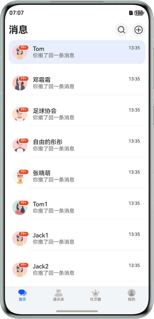
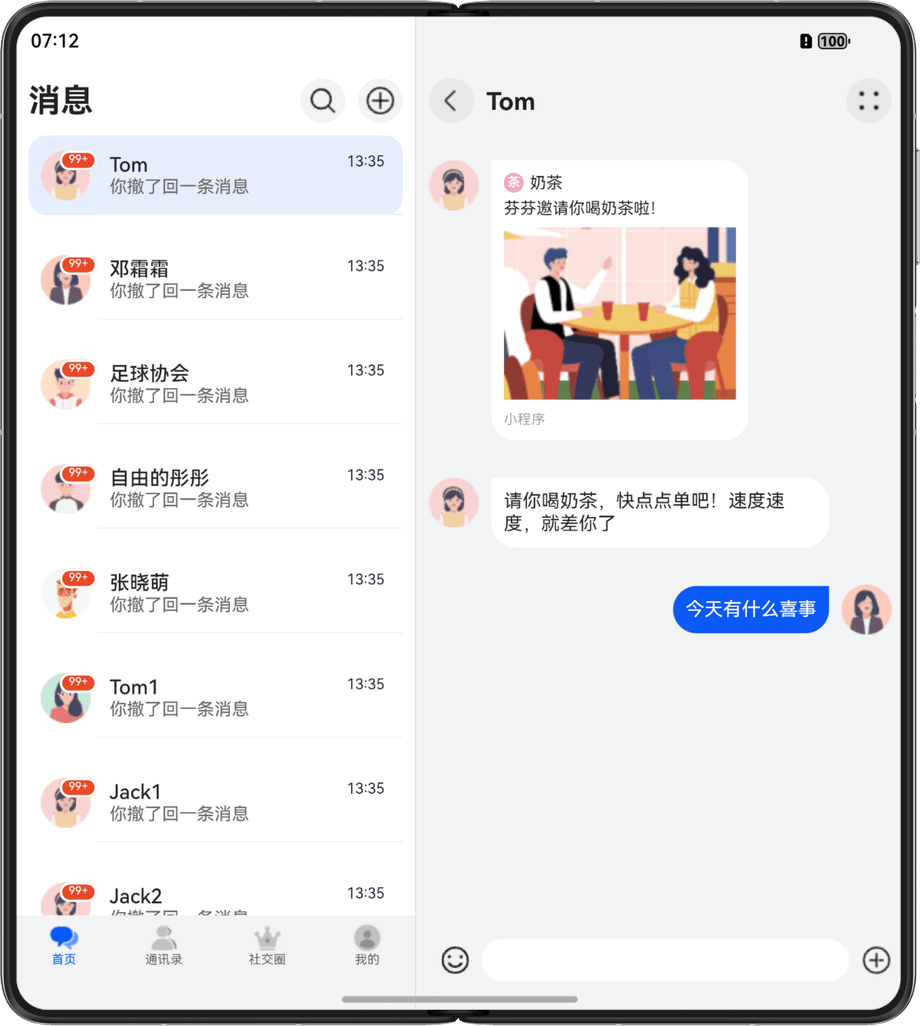
2.2 IM聊天首页开发说明
将IM聊天首页划分为2个区域,效果图如下:

- 整个页面响应式适配,监听不同断点变化实现不同的布局效果。
- 区域2在小设备上呈单列显示,在中设备和大设备上双列显示,断点变化时切换显示效果。
IM聊天首页页包含2个基础区域,具体介绍及实现方案如下表所示:
|
区域编号 |
简介 |
实现方案 |
|---|---|---|
|
1 |
底部/侧边页签 |
监听断点变化改变位置。(同视频首页) |
|
2 |
聊天主体部分 |
监听断点变化利用分栏组件组件实现单栏/分栏效果。 |
2.2.1 聊天主体部分开发说明
本章节重点介绍聊天页如何实现分栏。
自适应分栏组件参考ArkUI的Navigation组件开发的NavigationSplitContainer,使开发者能够轻松的完成分栏及路由跳转能力的开发。
分栏组件的配置属性,如下表:
|
名称 |
类型 |
是否必填 |
说明 |
|---|---|---|---|
|
navBarWidth |
Length |
否 |
设置导航栏宽度。仅在Navigation组件分栏时生效。 |
|
navBarPosition |
NavBarPosition |
否 |
导航栏位置。 默认值:NavBarPosition.Start。 |
|
mode |
NavigationMode |
否 |
设置导航栏的显示模式,支持单栏(Stack)、分栏(Split)和自适应(Auto)。 |
|
navBarWidthRange |
Length[] |
否 |
设置导航栏最小和最大宽度(双栏模式下生效) 默认值:最小默认值 240,最大默认值为组件宽度的40% ,且不大于 432,如果只设置一个值,则未设置的值按照默认值计算。 |
|
minContentWidth |
Length |
否 |
内容区最小宽度。默认值为360。 |
|
navBarStyle |
ViewStyle |
否 |
导航栏样式,可以覆盖导航栏默认样式。 |
|
navBarItemStyle |
ViewStyle |
否 |
导航栏里各个子项目的样式。仅NavigationSplitContainer.Screen子组件存在时生效。 |
|
contentStyle |
ViewStyle |
否 |
内容区样式,可以覆盖内容区默认样式。 |
|
onNavBarStateChange |
onNavBarStateChange(callback: (isVisible: boolean) => void) |
否 |
导航栏显示状态切换时触发该回调。isVisible为true时表示显示,为false时表示隐藏。 |
|
onNavigationModeChange |
onNavigationModeChange(callback: (mode: NavigationMode) => void) |
否 |
当Navigation首次显示或者单双栏状态发生变化时触发该回调。NavigationMode.Split:当前Navigation显示为双栏; NavigationMode.Stack:当前Navigation显示为单栏。 |
关键代码片段:
 <NavigationSplitContainer
        mode={NavigationMode.Stack}
        navBarPosition={NavBarPosition.Start}
        navBarWidth={400}
        navBarWidthRange={[240, 400]}
        minContentWidth={200}>
        <HomeScreen></HomeScreen>
    </NavigationSplitContainer>
    <NavigationSplitContainer
        mode={NavigationMode.Auto}
        navBarPosition={NavBarPosition.Start}
        navBarWidth={400}
        navBarWidthRange={[240, 400]}
        minContentWidth={200}
        navBarItemStyle={{
            paddingVertical: 30,
            paddingHorizontal: 30,
            marginBottom: 5,
            backgroundColor: 'red',
            borderRadius: 5,
            activeBackgroundColor: 'yellow',
        }}>
        <NavigationSplitContainer.Screen name="Home" component={HomeScreen} />
        <NavigationSplitContainer.Screen
            name="Profile"
            component={ProfileScreen}
        />
        <NavigationSplitContainer.Screen
            name="Settings"
            component={SettingsScreen}
        />
    </NavigationSplitContainer>
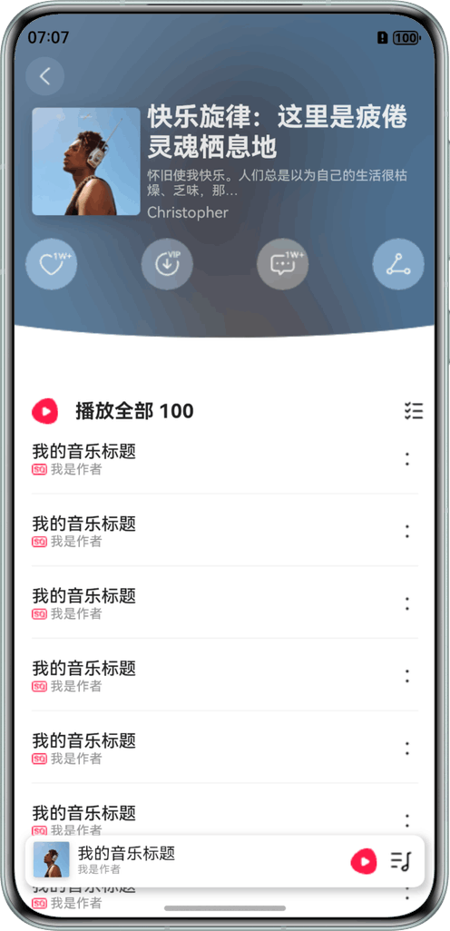
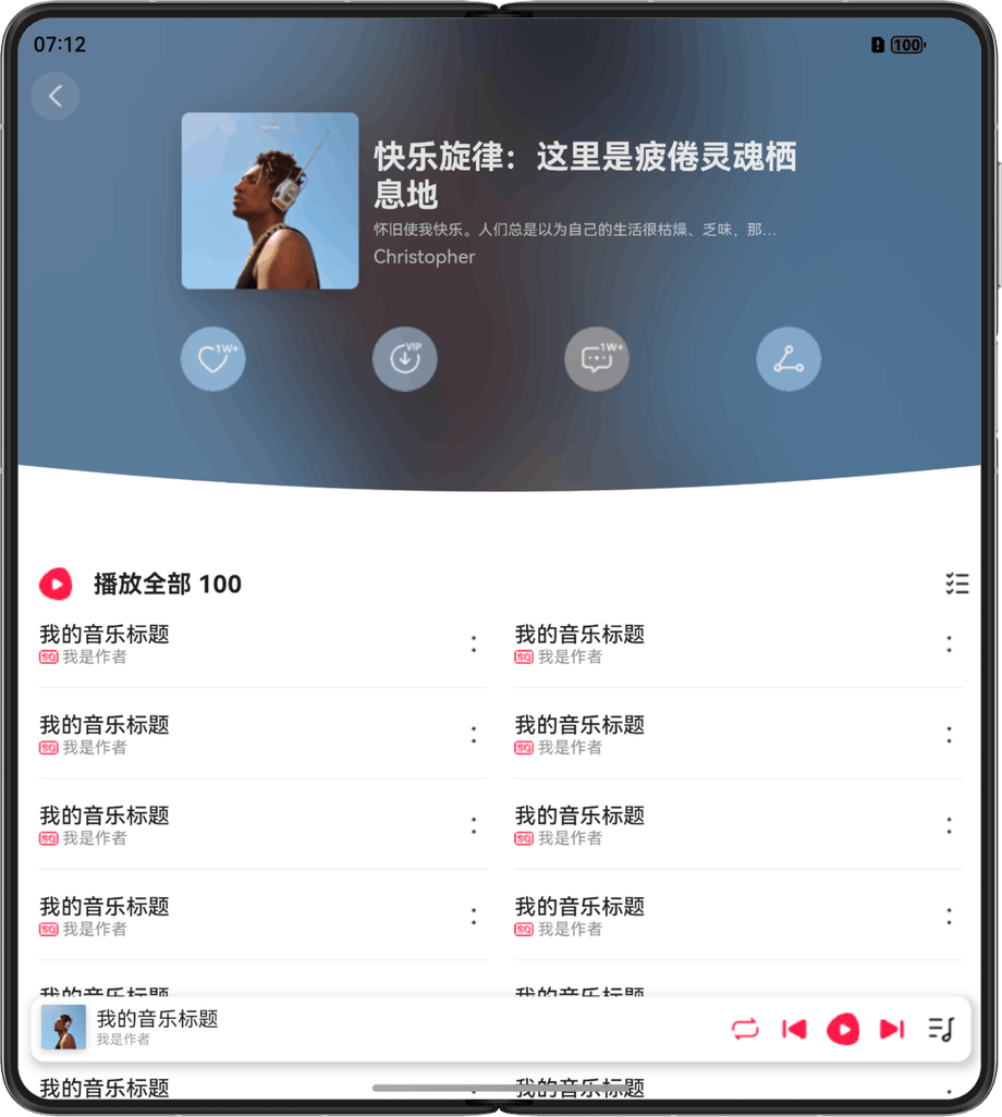
2.3 音乐首页开发说明
将音乐首页划分为3个区域,效果图如下:
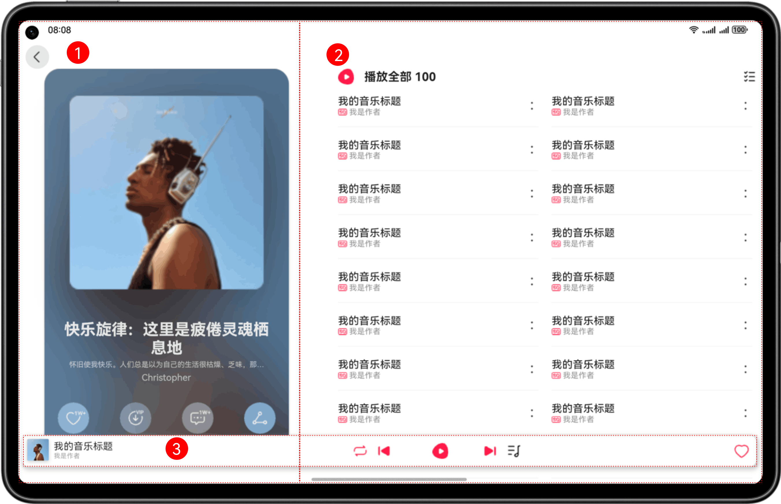
- 整个页面进行了响应式适配,借助断点变化实现不同的布局效果。
- 区域3在设备上呈3个区域,头像、音乐控制按钮、收藏,音乐控制按钮部分使用自动隐藏组件。
音乐首页包含3个基础区域,具体介绍及实现方案如下表所示:
|
区域编号 |
简介 |
实现方案 |
|---|---|---|
|
1 |
顶部页签 |
监听断点变化改变展示大小和位置。 |
|
2 |
音乐列表 |
借助栅格组件能力监听断点变化改变列数。 |
|
3 |
音乐播放控制和收藏 |
监听断点变化展示不同状态,利用自适应显隐组件控制音乐控制按钮的显示与隐藏。 |
2.3.1 音乐播放控制和收藏开发说明
本章节重点介绍音乐控制按钮的自适应显隐功能。
自适应显隐容器:容器组件内的子组件,按照其预设的显示优先级,随容器组件尺寸变化显示或隐藏,其中相同显示优先级的子组件同时显示或隐藏。它是一种比较高级的布局方式,常用于分辨率变化较大,且不同分辨率下显示内容有所差异的场景。主要思想是通过增加或减少显示内容,来保持最佳的显示效果。
DisplayPriorityBox支持的配置属性如下表所示:
|
名称 |
描述 |
类型 |
平台 |
|---|---|---|---|
|
DisplayPriorityBox |
自适应隐藏容器,容器组件内的子组件,按照其预设的displayPriority优先级,随容器组件尺寸变化显示或隐藏,displayPriority数值越大,优先级越高。若容器空间不足,隐藏低优先级子组件,其中相同优先级的子组件同时显示或隐藏。 |
component |
All |
|
displayPriority |
设置组件优先级,仅在DisplayPriorityBox容器组件中生效。小数点后的数字不作优先级区分,即区间为[x, x + 1)内的数字视为相同优先级。例如:1.0与1.9为同一优先级。当displayPriority < 1或为非number类型时,默认为1。 |
any |
All |
关键代码片段:
const displayPriorityBoxWidth = useBreakpointValue({
        base: 70,
        sm: 70,
        md: 212,
        lg: 310,
        xl: 310,
    });
    const displayPriorityBoxLeft = useBreakpointValue({
        base: 0,
        sm: 0,
        md: 0,
        lg: -350,
        xl: -350,
    });
    // 若是PC或pad的时候,单独加部分的样式
    const isWide = Dimensions.get('screen').height >= 900 || Dimensions.get('screen').width >= 900;
    const allIcons = () => (
        <View>
            <DisplayPriorityBox style={{ width: displayPriorityBoxWidth, height: 48, flexDirection: 'row', justifyContent: 'space-between', left: displayPriorityBoxLeft }}>
                {[
                    { priority: 1, source: require('../../../../asset/play_mode.png'), style: { width: 24, height: 24 } },
                    { priority: 1, source: require('../../../../asset/control_left.png'), style: { width: 28, height: 28 } },
                    { priority: 10, source: require('../../../../asset/play_icon.svg'), style: { width: 24, height: 24 } },
                    { priority: 1, source: require('../../../../asset/control_right.png'), style: { width: 28, height: 28 } },
                    { priority: 10, source: require('../../../../asset/play_list_icon.png'), style: { width: 24, height: 24 } }].map(({ priority, source, style }, index) => (
                        <View
                            key={index}
                            displayPriority={priority}
                            style={{
                                flexDirection: 'row',
                                alignItems: 'center',
                                flex: 1,
                                width: 25
                            }}
                        >
                            <Image source={source} style={style} />
                        </View>
                    ))}
            </DisplayPriorityBox>
        </View>
    );

讨论HarmonyOS开发技术,专注于API与组件、DevEco Studio、测试、元服务和应用上架分发等。
更多推荐
 0
0 0
0- 0


 已为社区贡献276条内容

所有评论(0)