【鸿蒙开发】系统组件Grid
鸿蒙开发arkui组件,Grid组件
Grid组件
Grid网格容器,由“行”和“列”分割的单元格所组成,通过指定“项目”所在的单元格做出各种各样的布局。
子组件只能是GridItem
接口:
Grid(scroller?: Scroller)
参数:
|
参数名 |
参数类型 |
必填 |
参数描述 |
|---|---|---|---|
|
scroller |
否 |
可滚动组件的控制器。用于与可滚动组件进行绑定。 说明: 不允许和其他滚动类组件绑定同一个滚动控制对象。 |
属性:
除支持通用属性外,还支持以下属性:
|
名称 |
参数类型 |
描述 |
|---|---|---|
|
columnsTemplate |
string |
设置当前网格布局列的数量,不设置时默认1列。 例如, '1fr 1fr 2fr' 是将父组件分3列,将父组件允许的宽分为4等份,第一列占1份,第二列占1份,第三列占2份。 说明: 设置为'0fr'时,该列的列宽为0,不显示GridItem。设置为其他非法值时,GridItem显示为固定1列。 |
|
rowsTemplate |
string |
设置当前网格布局行的数量,不设置时默认1行。 例如,'1fr 1fr 2fr'是将父组件分三行,将父组件允许的高分为4等份,第一行占1份,第二行占一份,第三行占2份。 说明: 设置为'0fr',则这一行的行宽为0,这一行GridItem不显示。设置为其他非法值,按固定1行处理。 |
|
columnsGap |
Length |
设置列与列的间距。 默认值:0 说明: 设置为小于0的值时,按默认值显示。 |
|
rowsGap |
Length |
设置行与行的间距。 默认值:0 说明: 设置为小于0的值时,按默认值显示。 |
|
scrollBar |
设置滚动条状态。 默认值:BarState.Off |
|
|
scrollBarColor |
string | number | Color |
设置滚动条的颜色。 |
|
scrollBarWidth |
string | number |
设置滚动条的宽度。宽度设置后,滚动条正常状态和按压状态宽度均为滚动条的宽度值。 默认值:4 单位:vp |
|
cachedCount |
number |
设置预加载的GridItem的数量,只在LazyForEach中生效。具体使用可参考减少应用白块说明。 默认值:1 说明: 设置缓存后会在Grid显示区域上下各缓存cachedCount*列数个GridItem。LazyForEach超出显示和缓存范围的GridItem会被释放。 设置为小于0的值时,按默认值显示。 |
|
editMode8+ |
boolean |
设置Grid是否进入编辑模式,进入编辑模式可以拖拽Grid组件内部GridItem。 默认值:false |
|
layoutDirection8+ |
设置布局的主轴方向。 默认值:GridDirection.Row |
|
|
maxCount8+ |
number |
当layoutDirection是Row/RowReverse时,表示可显示的最大列数 当layoutDirection是Column/ColumnReverse时,表示可显示的最大行数。 默认值:Infinity 说明: 当maxCount小于minCount时,maxCount和minCount都按默认值处理。 设置为小于0的值时,按默认值显示。 |
|
minCount8+ |
number |
当layoutDirection是Row/RowReverse时,表示可显示的最小列数。 当layoutDirection是Column/ColumnReverse时,表示可显示的最小行数。 默认值:1 说明: 设置为小于0的值时,按默认值显示。 |
|
cellLength8+ |
number |
当layoutDirection是Row/RowReverse时,表示一行的高度。 当layoutDirection是Column/ColumnReverse时,表示一列的宽度。 默认值:第一个元素的大小 |
|
multiSelectable8+ |
boolean |
是否开启鼠标框选。 默认值:false - false:关闭框选。 - true:开启框选。 |
|
supportAnimation8+ |
boolean |
是否支持动画。当前支持GridItem拖拽动画。 默认值:false |
Grid组件根据rowsTemplate、columnsTemplate属性的设置情况,可分为以下三种布局模式:
- rowsTemplate、columnsTemplate同时设置:
- Grid只展示固定行列数的元素,其余元素不展示,且Grid不可滚动。
- 此模式下以下属性不生效:layoutDirection、maxCount、minCount、cellLength。
- Grid的宽高没有设置时,默认适应父组件尺寸。
- Gird网格列大小按照Gird自身内容区域大小减去所有行列Gap后按各个行列所占比重分配。
- GridItem默认填满网格大小。
- rowsTemplate、columnsTemplate仅设置其中的一个:
- 元素按照设置的方向进行排布,超出Grid显示区域后,Grid可通过滚动的方式展示。
- 如果设置了columnsTemplate,Gird滚动方向为垂直方向,主轴方向为垂直方向,交叉轴方向为水平方向。
- 如果设置了rowsTemplate,Gird滚动方向为水平方向,主轴方向为水平方向,交叉轴方向为垂直方向。
- 此模式下以下属性不生效:layoutDirection、maxCount、minCount、cellLength。
- 网格交叉轴方向尺寸根据Gird自身内容区域交叉轴尺寸减去交叉轴方向所有Gap后按所占比重分配。
- 网格主轴方向尺寸取当前网格交叉轴方向所有GridItem高度最大值。
- rowsTemplate、columnsTemplate都不设置:
- 元素在layoutDirection方向上排布,列数由Grid的宽度、首个元素的宽度、minCount、maxCount、columnsGap共同决定。
- 行数由Grid高度、首个元素高度、cellLength、rowsGap共同决定。超出行列容纳范围的元素不显示,也不能通过滚动进行展示。
- 此模式下仅生效以下属性:layoutDirection、maxCount、minCount、cellLength、editMode、columnsGap、rowsGap。
- 当前layoutDirection设置为Row时,先从左到右排列,排满一行再排一下一列。剩余高度不足时不再布局,整体内容顶部居中。
- 当前layoutDirection设置为Column时,先从上到下排列,排满一列再排一下一列,剩余宽度度不足时不再。整体内容顶部居中。
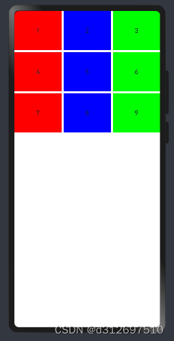
3X3布局
@Entry
@Component
struct APage {
  build() {
    Column() {
      Grid() {
        GridItem() {
          Text("1")
        }.backgroundColor("red")

        GridItem() {
          Text("2")
        }.backgroundColor("blue")

        GridItem() {
          Text("3")
        }.backgroundColor("green")

        GridItem() {
          Text("4")
        }.backgroundColor("red")

        GridItem() {
          Text("5")
        }.backgroundColor("blue")

        GridItem() {
          Text("6")
        }.backgroundColor("green")

        GridItem() {
          Text("7")
        }.backgroundColor("red")

        GridItem() {
          Text("8")
        }.backgroundColor("blue")

        GridItem() {
          Text("9")
        }.backgroundColor("green")
      }
      .width("100%")
      .height(300)
      .columnsTemplate("1fr 1fr 1fr")
      .rowsTemplate("1fr 1fr 1fr")
      .columnsGap(5)
      .rowsGap(5)

    }
    .width("100%")
    .height("100%")
  }
}
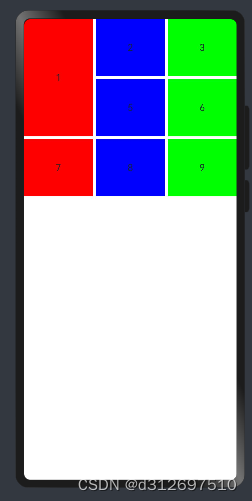
合并网格
合并第一行第一列
修改"1"网格项属性 .rowStart(1).rowEnd(2)
注释"4"网格项
@Entry
@Component
struct APage {
  build() {
    Column() {
      Grid() {
        GridItem() {
          Text("1")
        }.backgroundColor("red")
        .rowStart(1).rowEnd(2)

        GridItem() {
          Text("2")
        }.backgroundColor("blue")

        GridItem() {
          Text("3")
        }.backgroundColor("green")

        // GridItem() {
        //   Text("4")
        // }.backgroundColor("red")

        GridItem() {
          Text("5")
        }.backgroundColor("blue")

        GridItem() {
          Text("6")
        }.backgroundColor("green")

        GridItem() {
          Text("7")
        }.backgroundColor("red")

        GridItem() {
          Text("8")
        }.backgroundColor("blue")

        GridItem() {
          Text("9")
        }.backgroundColor("green")
      }
      .width("100%")
      .height(300)
      .columnsTemplate("1fr 1fr 1fr")
      .rowsTemplate("1fr 1fr 1fr")
      .columnsGap(5)
      .rowsGap(5)

    }
    .width("100%")
    .height("100%")
  }
}
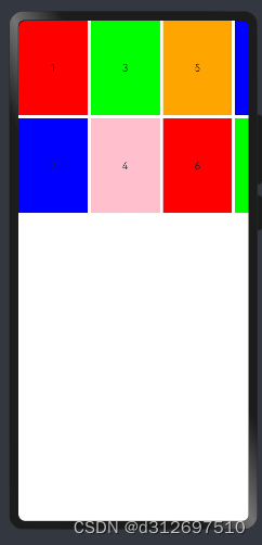
网格超出滚动
2行超出的网格项横向滚动
@Entry
@Component
struct APage {
  build() {
    Column() {
      Grid() {
        GridItem() {
          Text("1")
        }.width("30%").backgroundColor("red")

        GridItem() {
          Text("2")
        }.width("30%").backgroundColor("blue")

        GridItem() {
          Text("3")
        }.width("30%").backgroundColor("green")

        GridItem() {
          Text("4")
        }.width("30%").backgroundColor(Color.Pink)

        GridItem() {
          Text("5")
        }.width("30%").backgroundColor(Color.Orange)

        GridItem() {
          Text("6")
        }.width("30%").backgroundColor("red")

        GridItem() {
          Text("7")
        }.width("30%").backgroundColor("blue")

        GridItem() {
          Text("8")
        }.width("30%").backgroundColor("green")

        GridItem() {
          Text("9")
        }.width("30%").backgroundColor(Color.Pink)

        GridItem() {
          Text("10")
        }.width("30%").backgroundColor(Color.Orange)
      }
      .width("100%")
      .height(300)
      .rowsTemplate("1fr 1fr")
      .columnsGap(5)
      .rowsGap(5)

    }
    .width("100%")
    .height("100%")
  }
}

讨论HarmonyOS开发技术,专注于API与组件、DevEco Studio、测试、元服务和应用上架分发等。
更多推荐


 22
22 0
0- 0


 已为社区贡献27条内容

所有评论(0)