ArkUI构造布局
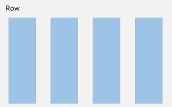
构造布局线性布局 (Row/Column)图1 Column容器内子元素排列示意图图2 Row容器内子元素排列示意图基本概念布局容器:具有布局能力的容器组件,可以承载其他元素作为其子元素,布局容器会对其子元素进行尺寸计算和布局排列。布局子元素:布局容器内部的元素。主轴:线性布局容器在布局方向上的轴线,子元素默认沿主轴排列。Row容器主轴为水平方向,Column容器主轴为垂直方向。交叉轴:垂直于主轴
构造布局
线性布局 (Row/Column)
图1 Column容器内子元素排列示意图
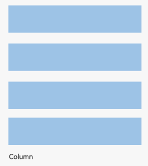
图2 Row容器内子元素排列示意图
基本概念
- 布局容器:具有布局能力的容器组件,可以承载其他元素作为其子元素,布局容器会对其子元素进行尺寸计算和布局排列。
- 布局子元素:布局容器内部的元素。
- 主轴:线性布局容器在布局方向上的轴线,子元素默认沿主轴排列。Row容器主轴为水平方向,Column容器主轴为垂直方向。
- 交叉轴:垂直于主轴方向的轴线。Row容器交叉轴为垂直方向,Column容器交叉轴为水平方向。
- 间距:布局子元素的间距。
布局子元素在排列方向上的间距
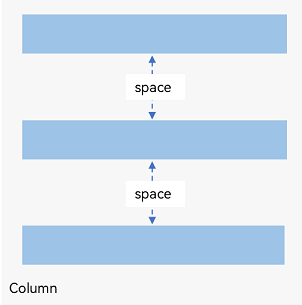
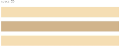
在布局容器内,可以通过space属性设置排列方向上子元素的间距,使各子元素在排列方向上有等间距效果。
Column容器内排列方向上的间距
图3 Column容器内排列方向的间距图
Column({ space: 20 }) { Text('space: 20').fontSize(15).fontColor(Color.Gray).width('90%') Row().width('90%').height(50).backgroundColor(0xF5DEB3) Row().width('90%').height(50).backgroundColor(0xD2B48C) Row().width('90%').height(50).backgroundColor(0xF5DEB3)}.width('100%')
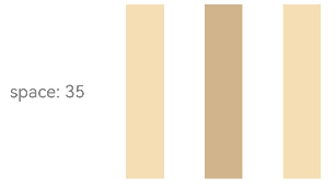
Row容器内排列方向上的间距
图4 Row容器内排列方向的间距图
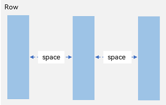
Row({ space: 35 }) { Text('space: 35').fontSize(15).fontColor(Color.Gray) Row().width('10%').height(150).backgroundColor(0xF5DEB3) Row().width('10%').height(150).backgroundColor(0xD2B48C) Row().width('10%').height(150).backgroundColor(0xF5DEB3)}.width('90%')
布局子元素在交叉轴上的对齐方式
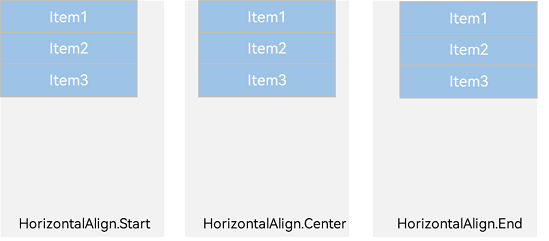
在布局容器内,可以通过alignItems属性设置子元素在交叉轴(排列方向的垂直方向)上的对齐方式。且在各类尺寸屏幕中,表现一致。其中,交叉轴为垂直方向时,取值为VerticalAlign类型,水平方向取值为HorizontalAlign类型。
alignSelf属性用于控制单个子元素在容器交叉轴上的对齐方式,其优先级高于alignItems属性,如果设置了alignSelf属性,则在单个子元素上会覆盖alignItems属性。
Column容器内子元素在水平方向上的排列
图5 Column容器内子元素在水平方向上的排列图
-
HorizontalAlign.Start:子元素在水平方向左对齐。
Column({}) {  Column() {  }.width('80%').height(50).backgroundColor(0xF5DEB3)
  Column() {  }.width('80%').height(50).backgroundColor(0xD2B48C)
  Column() {  }.width('80%').height(50).backgroundColor(0xF5DEB3)}.width('100%').alignItems(HorizontalAlign.Start).backgroundColor('rgb(242,242,242)')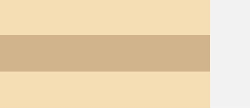
-
HorizontalAlign.Center:子元素在水平方向居中对齐。
Column({}) {  Column() {  }.width('80%').height(50).backgroundColor(0xF5DEB3)
  Column() {  }.width('80%').height(50).backgroundColor(0xD2B48C)
  Column() {  }.width('80%').height(50).backgroundColor(0xF5DEB3)}.width('100%').alignItems(HorizontalAlign.Center).backgroundColor('rgb(242,242,242)')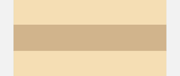
-
HorizontalAlign.End:子元素在水平方向右对齐。
Column({}) {  Column() {  }.width('80%').height(50).backgroundColor(0xF5DEB3)
  Column() {  }.width('80%').height(50).backgroundColor(0xD2B48C)
  Column() {  }.width('80%').height(50).backgroundColor(0xF5DEB3)}.width('100%').alignItems(HorizontalAlign.End).backgroundColor('rgb(242,242,242)')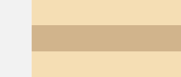
Row容器内子元素在垂直方向上的排列
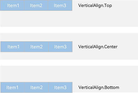
图6 Row容器内子元素在垂直方向上的排列图
-
VerticalAlign.Top:子元素在垂直方向顶部对齐。
Row({}) {  Column() {  }.width('20%').height(30).backgroundColor(0xF5DEB3)
  Column() {  }.width('20%').height(30).backgroundColor(0xD2B48C)
  Column() {  }.width('20%').height(30).backgroundColor(0xF5DEB3)}.width('100%').height(200).alignItems(VerticalAlign.Top).backgroundColor('rgb(242,242,242)')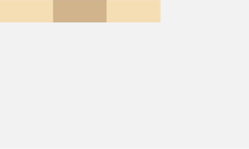
-
VerticalAlign.Center:子元素在垂直方向居中对齐。
Row({}) {  Column() {  }.width('20%').height(30).backgroundColor(0xF5DEB3)
  Column() {  }.width('20%').height(30).backgroundColor(0xD2B48C)
  Column() {  }.width('20%').height(30).backgroundColor(0xF5DEB3)}.width('100%').height(200).alignItems(VerticalAlign.Center).backgroundColor('rgb(242,242,242)')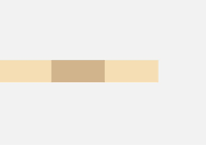
-
VerticalAlign.Bottom:子元素在垂直方向底部对齐。
Row({}) {  Column() {  }.width('20%').height(30).backgroundColor(0xF5DEB3)
  Column() {  }.width('20%').height(30).backgroundColor(0xD2B48C)
  Column() {  }.width('20%').height(30).backgroundColor(0xF5DEB3)}.width('100%').height(200).alignItems(VerticalAlign.Bottom).backgroundColor('rgb(242,242,242)')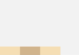
布局子元素在主轴上的排列方式
在布局容器内,可以通过justifyContent属性设置子元素在容器主轴上的排列方式。可以从主轴起始位置开始排布,也可以从主轴结束位置开始排布,或者均匀分割主轴的空间。
Column容器内子元素在垂直方向上的排列
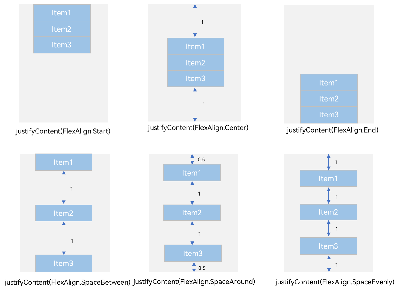
图7 Column容器内子元素在垂直方向上的排列图
-
justifyContent(FlexAlign.Start):元素在垂直方向首端对齐,第一个元素与行首对齐,同时后续的元素与前一个对齐。
Column({}) {  Column() {  }.width('80%').height(50).backgroundColor(0xF5DEB3)
  Column() {  }.width('80%').height(50).backgroundColor(0xD2B48C)
  Column() {  }.width('80%').height(50).backgroundColor(0xF5DEB3)}.width('100%').height(300).backgroundColor('rgb(242,242,242)').justifyContent(FlexAlign.Start)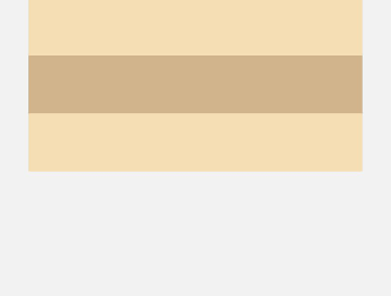
-
justifyContent(FlexAlign.Center):元素在垂直方向中心对齐,第一个元素与行首的距离与最后一个元素与行尾距离相同。
Column({}) {  Column() {  }.width('80%').height(50).backgroundColor(0xF5DEB3)
  Column() {  }.width('80%').height(50).backgroundColor(0xD2B48C)
  Column() {  }.width('80%').height(50).backgroundColor(0xF5DEB3)}.width('100%').height(300).backgroundColor('rgb(242,242,242)').justifyContent(FlexAlign.Center)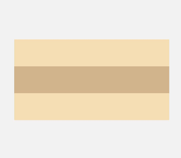
-
justifyContent(FlexAlign.End):元素在垂直方向尾部对齐,最后一个元素与行尾对齐,其他元素与后一个对齐。
Column({}) {  Column() {  }.width('80%').height(50).backgroundColor(0xF5DEB3)
  Column() {  }.width('80%').height(50).backgroundColor(0xD2B48C)
  Column() {  }.width('80%').height(50).backgroundColor(0xF5DEB3)}.width('100%').height(300).backgroundColor('rgb(242,242,242)').justifyContent(FlexAlign.End)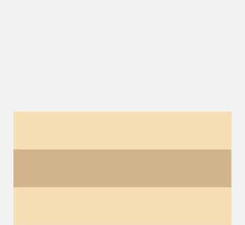
-
justifyContent(FlexAlign.SpaceBetween):垂直方向均匀分配元素,相邻元素之间距离相同。第一个元素与行首对齐,最后一个元素与行尾对齐。
Column({}) {  Column() {  }.width('80%').height(50).backgroundColor(0xF5DEB3)
  Column() {  }.width('80%').height(50).backgroundColor(0xD2B48C)
  Column() {  }.width('80%').height(50).backgroundColor(0xF5DEB3)}.width('100%').height(300).backgroundColor('rgb(242,242,242)').justifyContent(FlexAlign.SpaceBetween)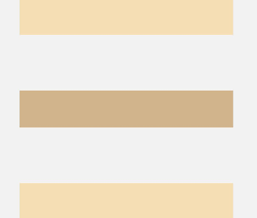
-
justifyContent(FlexAlign.SpaceAround):垂直方向均匀分配元素,相邻元素之间距离相同。第一个元素到行首的距离和最后一个元素到行尾的距离是相邻元素之间距离的一半。
Column({}) {  Column() {  }.width('80%').height(50).backgroundColor(0xF5DEB3)
  Column() {  }.width('80%').height(50).backgroundColor(0xD2B48C)
  Column() {  }.width('80%').height(50).backgroundColor(0xF5DEB3)}.width('100%').height(300).backgroundColor('rgb(242,242,242)').justifyContent(FlexAlign.SpaceAround)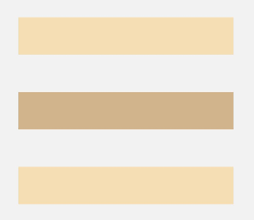
-
justifyContent(FlexAlign.SpaceEvenly):垂直方向均匀分配元素,相邻元素之间的距离、第一个元素与行首的间距、最后一个元素到行尾的间距都完全一样。
Column({}) {  Column() {  }.width('80%').height(50).backgroundColor(0xF5DEB3)
  Column() {  }.width('80%').height(50).backgroundColor(0xD2B48C)
  Column() {  }.width('80%').height(50).backgroundColor(0xF5DEB3)}.width('100%').height(300).backgroundColor('rgb(242,242,242)').justifyContent(FlexAlign.SpaceEvenly)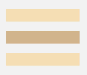
Row容器内子元素在水平方向上的排列
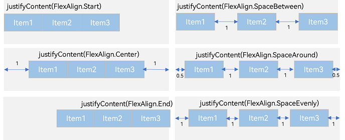
图8 Row容器内子元素在水平方向上的排列图
-
justifyContent(FlexAlign.Start):元素在水平方向首端对齐,第一个元素与行首对齐,同时后续的元素与前一个对齐。
Row({}) {  Column() {  }.width('20%').height(30).backgroundColor(0xF5DEB3)
  Column() {  }.width('20%').height(30).backgroundColor(0xD2B48C)
  Column() {  }.width('20%').height(30).backgroundColor(0xF5DEB3)}.width('100%').height(200).backgroundColor('rgb(242,242,242)').justifyContent(FlexAlign.Start)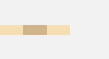
-
justifyContent(FlexAlign.Center):元素在水平方向中心对齐,第一个元素与行首的距离与最后一个元素与行尾距离相同。
Row({}) {  Column() {  }.width('20%').height(30).backgroundColor(0xF5DEB3)
  Column() {  }.width('20%').height(30).backgroundColor(0xD2B48C)
  Column() {  }.width('20%').height(30).backgroundColor(0xF5DEB3)}.width('100%').height(200).backgroundColor('rgb(242,242,242)').justifyContent(FlexAlign.Center)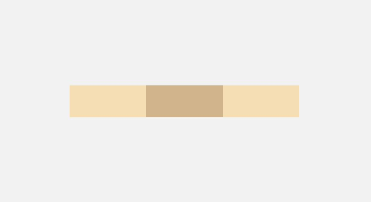
-
justifyContent(FlexAlign.End):元素在水平方向尾部对齐,最后一个元素与行尾对齐,其他元素与后一个对齐。
Row({}) {  Column() {  }.width('20%').height(30).backgroundColor(0xF5DEB3)
  Column() {  }.width('20%').height(30).backgroundColor(0xD2B48C)
  Column() {  }.width('20%').height(30).backgroundColor(0xF5DEB3)}.width('100%').height(200).backgroundColor('rgb(242,242,242)').justifyContent(FlexAlign.End)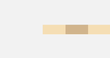
-
justifyContent(FlexAlign.SpaceBetween):水平方向均匀分配元素,相邻元素之间距离相同。第一个元素与行首对齐,最后一个元素与行尾对齐。
Row({}) {  Column() {  }.width('20%').height(30).backgroundColor(0xF5DEB3)
  Column() {  }.width('20%').height(30).backgroundColor(0xD2B48C)
  Column() {  }.width('20%').height(30).backgroundColor(0xF5DEB3)}.width('100%').height(200).backgroundColor('rgb(242,242,242)').justifyContent(FlexAlign.SpaceBetween)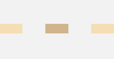
-
justifyContent(FlexAlign.SpaceAround):水平方向均匀分配元素,相邻元素之间距离相同。第一个元素到行首的距离和最后一个元素到行尾的距离是相邻元素之间距离的一半。
Row({}) {  Column() {  }.width('20%').height(30).backgroundColor(0xF5DEB3)
  Column() {  }.width('20%').height(30).backgroundColor(0xD2B48C)
  Column() {  }.width('20%').height(30).backgroundColor(0xF5DEB3)}.width('100%').height(200).backgroundColor('rgb(242,242,242)').justifyContent(FlexAlign.SpaceAround)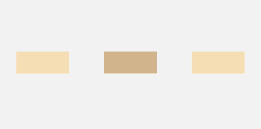
-
justifyContent(FlexAlign.SpaceEvenly):水平方向均匀分配元素,相邻元素之间的距离、第一个元素与行首的间距、最后一个元素到行尾的间距都完全一样。
Row({}) {  Column() {  }.width('20%').height(30).backgroundColor(0xF5DEB3)
  Column() {  }.width('20%').height(30).backgroundColor(0xD2B48C)
  Column() {  }.width('20%').height(30).backgroundColor(0xF5DEB3)}.width('100%').height(200).backgroundColor('rgb(242,242,242)').justifyContent(FlexAlign.SpaceEvenly)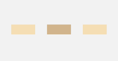
自适应拉伸
在线性布局下,常用空白填充组件Blank,在容器主轴方向自动填充空白空间,达到自适应拉伸效果。Row和Column作为容器,只需要添加宽高为百分比,当屏幕宽高发生变化时,会产生自适应效果。
@Entry@Componentstruct BlankExample { build() { Column() { Row() { Text('Bluetooth').fontSize(18) Blank() Toggle({ type: ToggleType.Switch, isOn: true }) }.backgroundColor(0xFFFFFF).borderRadius(15).padding({ left: 12 }).width('100%') }.backgroundColor(0xEFEFEF).padding(20).width('100%') }}
图9 竖屏

图10 横屏

自适应缩放
自适应缩放是指子元素随容器尺寸的变化而按照预设的比例自动调整尺寸,适应各种不同大小的设备。在线性布局中,可以使用以下两种方法实现自适应缩放。
-
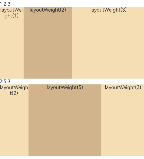
父容器尺寸确定时,使用layoutWeight属性设置子元素和兄弟元素在主轴上的权重,忽略元素本身尺寸设置,使它们在任意尺寸的设备下自适应占满剩余空间。
@Entry@Componentstruct layoutWeightExample {  build() {    Column() {      Text('1:2:3').width('100%')      Row() {        Column() {          Text('layoutWeight(1)')            .textAlign(TextAlign.Center)        }.layoutWeight(1).backgroundColor(0xF5DEB3).height('100%')
        Column() {          Text('layoutWeight(2)')            .textAlign(TextAlign.Center)        }.layoutWeight(2).backgroundColor(0xD2B48C).height('100%')
        Column() {          Text('layoutWeight(3)')            .textAlign(TextAlign.Center)        }.layoutWeight(3).backgroundColor(0xF5DEB3).height('100%')
      }.backgroundColor(0xffd306).height('30%')
      Text('2:5:3').width('100%')      Row() {        Column() {          Text('layoutWeight(2)')            .textAlign(TextAlign.Center)        }.layoutWeight(2).backgroundColor(0xF5DEB3).height('100%')
        Column() {          Text('layoutWeight(5)')            .textAlign(TextAlign.Center)        }.layoutWeight(5).backgroundColor(0xD2B48C).height('100%')
        Column() {          Text('layoutWeight(3)')            .textAlign(TextAlign.Center)        }.layoutWeight(3).backgroundColor(0xF5DEB3).height('100%')      }.backgroundColor(0xffd306).height('30%')    }  }}
图11 横屏
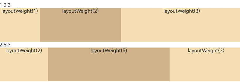
图12 竖屏
-
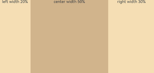
父容器尺寸确定时,使用百分比设置子元素和兄弟元素的宽度,使他们在任意尺寸的设备下保持固定的自适应占比。
@Entry@Componentstruct WidthExample {  build() {    Column() {      Row() {        Column() {          Text('left width 20%')            .textAlign(TextAlign.Center)        }.width('20%').backgroundColor(0xF5DEB3).height('100%')
        Column() {          Text('center width 50%')            .textAlign(TextAlign.Center)        }.width('50%').backgroundColor(0xD2B48C).height('100%')
        Column() {          Text('right width 30%')            .textAlign(TextAlign.Center)        }.width('30%').backgroundColor(0xF5DEB3).height('100%')      }.backgroundColor(0xffd306).height('30%')    }  }}
图13 横屏

图14 竖屏
自适应延伸
自适应延伸是指在不同尺寸设备下,当页面的内容超出屏幕大小而无法完全显示时,可以通过滚动条进行拖动展示。这种方法适用于线性布局中内容无法一屏展示的场景。通常有以下两种实现方式。
-
在List中添加滚动条:当List子项过多一屏放不下时,可以将每一项子元素放置在不同的组件中,通过滚动条进行拖动展示。可以通过scrollBar属性设置滚动条的常驻状态,edgeEffect属性设置拖动到内容最末端的回弹效果。
-
使用Scroll组件:在线性布局中,开发者可以进行垂直方向或者水平方向的布局。当一屏无法完全显示时,可以在Column或Row组件的外层包裹一个可滚动的容器组件Scroll来实现可滑动的线性布局。
垂直方向布局中使用Scroll组件:
@Entry@Componentstruct ScrollExample {  scroller: Scroller = new Scroller();  private arr: number[] = [0, 1, 2, 3, 4, 5, 6, 7, 8, 9];
  build() {    Scroll(this.scroller) {      Column() {        ForEach(this.arr, (item?:number|undefined) => {          if(item){            Text(item.toString())            .width('90%')            .height(150)            .backgroundColor(0xFFFFFF)            .borderRadius(15)            .fontSize(16)            .textAlign(TextAlign.Center)            .margin({ top: 10 })          }        }, (item:number) => item.toString())      }.width('100%')    }    .backgroundColor(0xDCDCDC)    .scrollable(ScrollDirection.Vertical) // 滚动方向为垂直方向    .scrollBar(BarState.On) // 滚动条常驻显示    .scrollBarColor(Color.Gray) // 滚动条颜色    .scrollBarWidth(10) // 滚动条宽度    .edgeEffect(EdgeEffect.Spring) // 滚动到边沿后回弹  }}
水平方向布局中使用Scroll组件:
@Entry@Componentstruct ScrollExample {  scroller: Scroller = new Scroller();  private arr: number[] = [0, 1, 2, 3, 4, 5, 6, 7, 8, 9];
  build() {    Scroll(this.scroller) {      Row() {        ForEach(this.arr, (item?:number|undefined) => {          if(item){            Text(item.toString())            .height('90%')            .width(150)            .backgroundColor(0xFFFFFF)            .borderRadius(15)            .fontSize(16)            .textAlign(TextAlign.Center)            .margin({ left: 10 })          }        })      }.height('100%')    }    .backgroundColor(0xDCDCDC)    .scrollable(ScrollDirection.Horizontal) // 滚动方向为水平方向    .scrollBar(BarState.On) // 滚动条常驻显示    .scrollBarColor(Color.Gray) // 滚动条颜色    .scrollBarWidth(10) // 滚动条宽度    .edgeEffect(EdgeEffect.Spring) // 滚动到边沿后回弹  }}
row
| 组件 | 参数名 | 参数类型 | 必填 | 描述 | 作用 |
|---|---|---|---|---|---|
| space | number | string | 否 | 横向布局元素间距。从API version 9开始,space为负数或者justifyContent设置为FlexAlign.SpaceBetween、FlexAlign.SpaceAround、FlexAlign.SpaceEvenly时不生效。默认值:0,单位vp**说明:**可选值为大于等于0的数字,或者可以转换为数字的字符串。 | ||
| alignItems | value | VerticalAlign | 是 | 子组件在垂直方向上的对齐格式。默认值:VerticalAlign.Center | 设置子组件在垂直方向上的对齐格式 |
| justifyContent | value | FlexAlign | 是 | 子组件在水平方向上的对齐格式。默认值:FlexAlign.Start | 设置子组件在水平方向上的对齐格式。 |
Column
| 组件 | 参数名 | 参数类型 | 必填 | 描述 | 作用 |
|---|---|---|---|---|---|
| space | string | number | 否 | 纵向布局元素垂直方向间距。从API version 9开始,space为负数或者justifyContent设置为FlexAlign.SpaceBetween、FlexAlign.SpaceAround、FlexAlign.SpaceEvenly时不生效。默认值:0单位:vp**说明:**可选值为大于等于0的数字,或者可以转换为数字的字符串。 | ||
| alignItems | value | HorizontalAlign | 是 | 子组件在水平方向上的对齐格式。默认值:HorizontalAlign.Center | 设置子组件在水平方向上的对齐格式。 |
| justifyContent | value | FlexAlign | 是 | 子组件在垂直方向上的对齐格式。默认值:FlexAlign.Start | 设置子组件在垂直方向上的对齐格式 |
层叠布局 (Stack)
概述
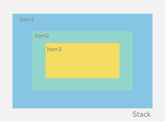
层叠布局(StackLayout)用于在屏幕上预留一块区域来显示组件中的元素,提供元素可以重叠的布局。层叠布局通过Stack容器组件实现位置的固定定位与层叠,容器中的子元素依次入栈,后一个子元素覆盖前一个子元素,子元素可以叠加,也可以设置位置。
层叠布局具有较强的页面层叠、位置定位能力,其使用场景有广告、卡片层叠效果等。
如图1,Stack作为容器,容器内的子元素的顺序为Item1->Item2->Item3。
图1 层叠布局
开发布局
Stack组件为容器组件,容器内可包含各种子元素。其中子元素默认进行居中堆叠。子元素被约束在Stack下,进行自己的样式定义以及排列。
// xxx.etslet MTop:Record<string,number> = { 'top': 50 }
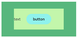
@Entry@Componentstruct StackExample {  build() {    Column(){      Stack({ }) {        Column(){}.width('90%').height('100%').backgroundColor('#ff58b87c')        Text('text').width('60%').height('60%').backgroundColor('#ffc3f6aa')        Button('button').width('30%').height('30%').backgroundColor('#ff8ff3eb').fontColor('#000')      }.width('100%').height(150).margin(MTop)    }  }}
对齐方式
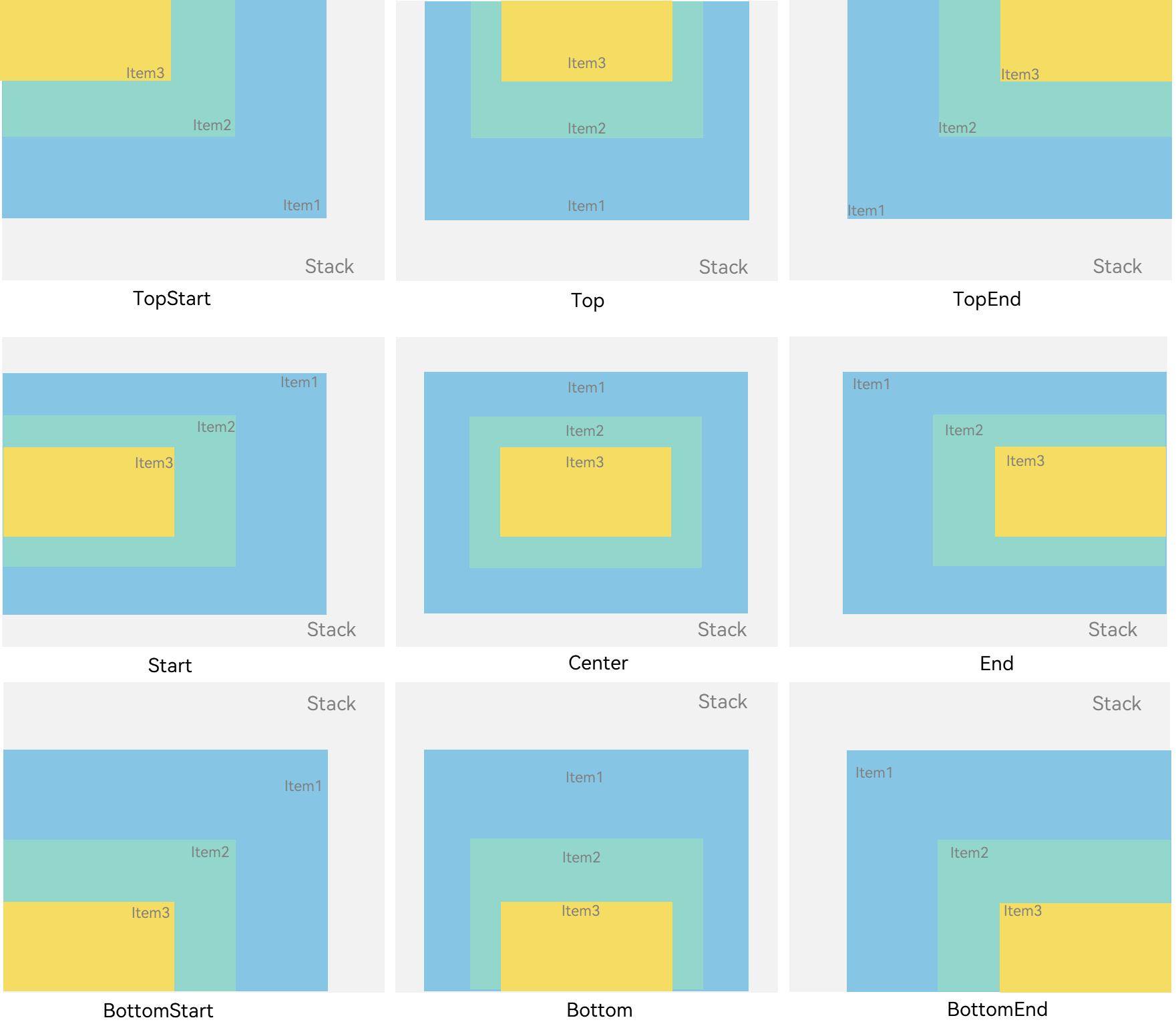
Stack组件通过alignContent参数实现位置的相对移动。如图2所示,支持九种对齐方式。
图2 Stack容器内元素的对齐方式
// xxx.ets@Entry@Componentstruct StackExample { build() { Stack({ alignContent: Alignment.TopStart }) { Text('Stack').width('90%').height('100%').backgroundColor('#e1dede').align(Alignment.BottomEnd) Text('Item 1').width('70%').height('80%').backgroundColor(0xd2cab3).align(Alignment.BottomEnd) Text('Item 2').width('50%').height('60%').backgroundColor(0xc1cbac).align(Alignment.BottomEnd) }.width('100%').height(150).margin({ top: 5 }) }}
Z序控制
Stack容器中兄弟组件显示层级关系可以通过Z序控制的zIndex属性改变。zIndex值越大,显示层级越高,即zIndex值大的组件会覆盖在zIndex值小的组件上方。
在层叠布局中,如果后面子元素尺寸大于前面子元素尺寸,则前面子元素完全隐藏。
Stack({ alignContent: Alignment.BottomStart }) {  Column() {    Text('Stack子元素1').textAlign(TextAlign.End).fontSize(20)  }.width(100).height(100).backgroundColor(0xffd306)
  Column() {    Text('Stack子元素2').fontSize(20)  }.width(150).height(150).backgroundColor(Color.Pink)
  Column() {    Text('Stack子元素3').fontSize(20)  }.width(200).height(200).backgroundColor(Color.Grey)}.width(350).height(350).backgroundColor(0xe0e0e0)
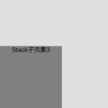
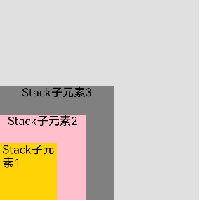
上图中,最后的子元素3的尺寸大于前面的所有子元素,所以,前面两个元素完全隐藏。改变子元素1,子元素2的zIndex属性后,可以将元素展示出来。
Stack({ alignContent: Alignment.BottomStart }) {  Column() {    Text('Stack子元素1').fontSize(20)  }.width(100).height(100).backgroundColor(0xffd306).zIndex(2)
  Column() {    Text('Stack子元素2').fontSize(20)  }.width(150).height(150).backgroundColor(Color.Pink).zIndex(1)
  Column() {    Text('Stack子元素3').fontSize(20)  }.width(200).height(200).backgroundColor(Color.Grey)}.width(350).height(350).backgroundColor(0xe0e0e0)
场景示例
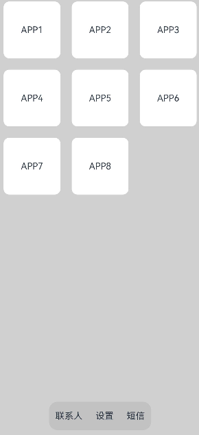
使用层叠布局快速搭建页面。
@Entry@Componentstruct StackSample {  private arr: string[] = ['APP1', 'APP2', 'APP3', 'APP4', 'APP5', 'APP6', 'APP7', 'APP8'];
  build() {    Stack({ alignContent: Alignment.Bottom }) {      Flex({ wrap: FlexWrap.Wrap }) {        ForEach(this.arr, (item:string) => {          Text(item)            .width(100)            .height(100)            .fontSize(16)            .margin(10)            .textAlign(TextAlign.Center)            .borderRadius(10)            .backgroundColor(0xFFFFFF)        }, (item:string):string => item)      }.width('100%').height('100%')
      Flex({ justifyContent: FlexAlign.SpaceAround, alignItems: ItemAlign.Center }) {        Text('联系人').fontSize(16)        Text('设置').fontSize(16)        Text('短信').fontSize(16)      }      .width('50%')      .height(50)      .backgroundColor('#16302e2e')      .margin({ bottom: 15 })      .borderRadius(15)    }.width('100%').height('100%').backgroundColor('#CFD0CF')  }}
| 组件 | 参数名 | 参数类型 | 必填 | 描述 | 作用 |
|---|---|---|---|---|---|
| alignContent | Alignment | 否 | 设置子组件在容器内的对齐方式。默认值:Alignment.Center | ||
| alignContent | value | Alignment | 是 | 所有子组件在容器内的对齐方式。默认值:Alignment.Center | 设置所有子组件在容器内的对齐方式。该属性与通用属性align同时设置时,后设置的属性生效 |
弹性布局 (Flex)
概述
弹性布局(Flex)提供更加有效的方式对容器中的子元素进行排列、对齐和分配剩余空间。常用于页面头部导航栏的均匀分布、页面框架的搭建、多行数据的排列等。
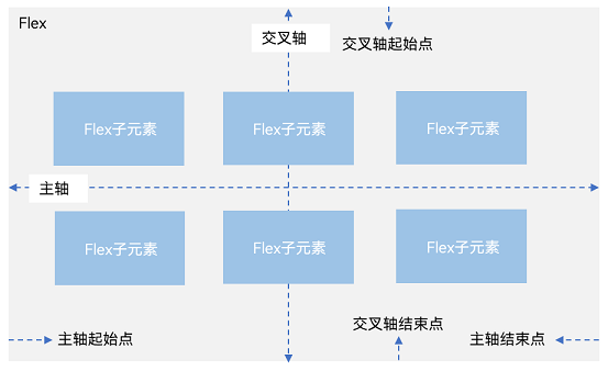
容器默认存在主轴与交叉轴,子元素默认沿主轴排列,子元素在主轴方向的尺寸称为主轴尺寸,在交叉轴方向的尺寸称为交叉轴尺寸。
图1 主轴为水平方向的Flex容器示意图
基本概念
- 主轴:Flex组件布局方向的轴线,子元素默认沿着主轴排列。主轴开始的位置称为主轴起始点,结束位置称为主轴结束点。
- 交叉轴:垂直于主轴方向的轴线。交叉轴开始的位置称为交叉轴起始点,结束位置称为交叉轴结束点。
布局方向
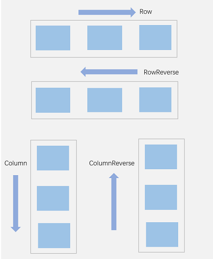
在弹性布局中,容器的子元素可以按照任意方向排列。通过设置参数direction,可以决定主轴的方向,从而控制子元素的排列方向。
图2 弹性布局方向图
-
FlexDirection.Row(默认值):主轴为水平方向,子元素从起始端沿着水平方向开始排布。
Flex({ direction: FlexDirection.Row }) { Text('1').width('33%').height(50).backgroundColor(0xF5DEB3) Text('2').width('33%').height(50).backgroundColor(0xD2B48C) Text('3').width('33%').height(50).backgroundColor(0xF5DEB3)}.height(70).width('90%').padding(10).backgroundColor(0xAFEEEE)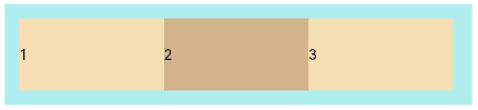
-
FlexDirection.RowReverse:主轴为水平方向,子元素从终点端沿着FlexDirection. Row相反的方向开始排布。
Flex({ direction: FlexDirection.RowReverse }) { Text('1').width('33%').height(50).backgroundColor(0xF5DEB3) Text('2').width('33%').height(50).backgroundColor(0xD2B48C) Text('3').width('33%').height(50).backgroundColor(0xF5DEB3)}.height(70).width('90%').padding(10).backgroundColor(0xAFEEEE)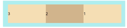
-
FlexDirection.Column:主轴为垂直方向,子元素从起始端沿着垂直方向开始排布。
Flex({ direction: FlexDirection.Column }) { Text('1').width('100%').height(50).backgroundColor(0xF5DEB3) Text('2').width('100%').height(50).backgroundColor(0xD2B48C) Text('3').width('100%').height(50).backgroundColor(0xF5DEB3)}.height(70).width('90%').padding(10).backgroundColor(0xAFEEEE)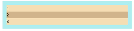
-
FlexDirection.ColumnReverse:主轴为垂直方向,子元素从终点端沿着FlexDirection. Column相反的方向开始排布。
Flex({ direction: FlexDirection.ColumnReverse }) { Text('1').width('100%').height(50).backgroundColor(0xF5DEB3) Text('2').width('100%').height(50).backgroundColor(0xD2B48C) Text('3').width('100%').height(50).backgroundColor(0xF5DEB3)}.height(70).width('90%').padding(10).backgroundColor(0xAFEEEE)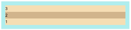
布局换行
弹性布局分为单行布局和多行布局。默认情况下,Flex容器中的子元素都排在一条线(又称“轴线”)上。wrap属性控制当子元素主轴尺寸之和大于容器主轴尺寸时,Flex是单行布局还是多行布局。在多行布局时,通过交叉轴方向,确认新行排列方向。
-
FlexWrap. NoWrap(默认值):不换行。如果子元素的宽度总和大于父元素的宽度,则子元素会被压缩宽度。
Flex({ wrap: FlexWrap.NoWrap }) { Text('1').width('50%').height(50).backgroundColor(0xF5DEB3) Text('2').width('50%').height(50).backgroundColor(0xD2B48C) Text('3').width('50%').height(50).backgroundColor(0xF5DEB3)} .width('90%').padding(10).backgroundColor(0xAFEEEE)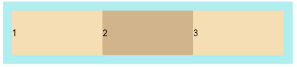
-
FlexWrap. Wrap:换行,每一行子元素按照主轴方向排列。
Flex({ wrap: FlexWrap.Wrap }) { Text('1').width('50%').height(50).backgroundColor(0xF5DEB3) Text('2').width('50%').height(50).backgroundColor(0xD2B48C) Text('3').width('50%').height(50).backgroundColor(0xD2B48C)} .width('90%').padding(10).backgroundColor(0xAFEEEE)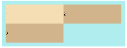
-
FlexWrap. WrapReverse:换行,每一行子元素按照主轴反方向排列。
Flex({ wrap: FlexWrap.WrapReverse}) { Text('1').width('50%').height(50).backgroundColor(0xF5DEB3) Text('2').width('50%').height(50).backgroundColor(0xD2B48C) Text('3').width('50%').height(50).backgroundColor(0xF5DEB3)}.width('90%').padding(10).backgroundColor(0xAFEEEE)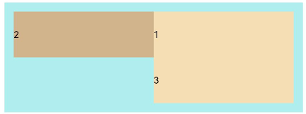
主轴对齐方式
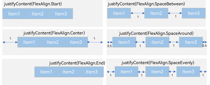
通过justifyContent参数设置子元素在主轴方向的对齐方式。
-
FlexAlign.Start(默认值):子元素在主轴方向起始端对齐, 第一个子元素与父元素边沿对齐,其他元素与前一个元素对齐。
let PTopBottom:Record<string,number> = { 'top': 10, 'bottom': 10 }Flex({ justifyContent: FlexAlign.Start }) { Text('1').width('20%').height(50).backgroundColor(0xF5DEB3) Text('2').width('20%').height(50).backgroundColor(0xD2B48C) Text('3').width('20%').height(50).backgroundColor(0xF5DEB3)}.width('90%').padding(PTopBottom).backgroundColor(0xAFEEEE)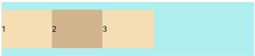
-
FlexAlign.Center:子元素在主轴方向居中对齐。
let PTopBottom:Record<string,number> = { 'top': 10, 'bottom': 10 }Flex({ justifyContent: FlexAlign.Center }) { Text('1').width('20%').height(50).backgroundColor(0xF5DEB3) Text('2').width('20%').height(50).backgroundColor(0xD2B48C) Text('3').width('20%').height(50).backgroundColor(0xF5DEB3)}.width('90%').padding(PTopBottom).backgroundColor(0xAFEEEE)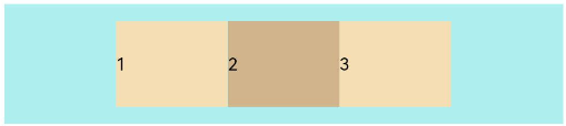
-
FlexAlign.End:子元素在主轴方向终点端对齐, 最后一个子元素与父元素边沿对齐,其他元素与后一个元素对齐。
let PTopBottom:Record<string,number> = { 'top': 10, 'bottom': 10 }Flex({ justifyContent: FlexAlign.End }) { Text('1').width('20%').height(50).backgroundColor(0xF5DEB3) Text('2').width('20%').height(50).backgroundColor(0xD2B48C) Text('3').width('20%').height(50).backgroundColor(0xF5DEB3)}.width('90%').padding(PTopBottom).backgroundColor(0xAFEEEE)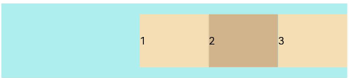
-
FlexAlign.SpaceBetween:Flex主轴方向均匀分配弹性元素,相邻子元素之间距离相同。第一个子元素和最后一个子元素与父元素边沿对齐。
let PTopBottom1:Record<string,number> = { 'top': 10, 'bottom': 10 }Flex({ justifyContent: FlexAlign.SpaceBetween }) { Text('1').width('20%').height(50).backgroundColor(0xF5DEB3) Text('2').width('20%').height(50).backgroundColor(0xD2B48C) Text('3').width('20%').height(50).backgroundColor(0xF5DEB3)}.width('90%').padding(PTopBottom1).backgroundColor(0xAFEEEE)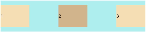
-
FlexAlign.SpaceAround:Flex主轴方向均匀分配弹性元素,相邻子元素之间距离相同。第一个子元素到主轴起始端的距离和最后一个子元素到主轴终点端的距离是相邻元素之间距离的一半。
let PTopBottom:Record<string,number> = { 'top': 10, 'bottom': 10 }Flex({ justifyContent: FlexAlign.SpaceAround }) { Text('1').width('20%').height(50).backgroundColor(0xF5DEB3) Text('2').width('20%').height(50).backgroundColor(0xD2B48C) Text('3').width('20%').height(50).backgroundColor(0xF5DEB3)}.width('90%').padding(PTopBottom).backgroundColor(0xAFEEEE)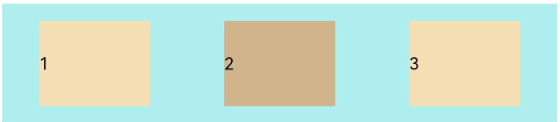
-
FlexAlign.SpaceEvenly:Flex主轴方向元素等间距布局,相邻子元素之间的间距、第一个子元素与主轴起始端的间距、最后一个子元素到主轴终点端的间距均相等。
let PTopBottom:Record<string,number> = { 'top': 10, 'bottom': 10 }Flex({ justifyContent: FlexAlign.SpaceEvenly }) { Text('1').width('20%').height(50).backgroundColor(0xF5DEB3) Text('2').width('20%').height(50).backgroundColor(0xD2B48C) Text('3').width('20%').height(50).backgroundColor(0xF5DEB3)}.width('90%').padding(PTopBottom).backgroundColor(0xAFEEEE)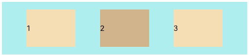
交叉轴对齐方式
容器和子元素都可以设置交叉轴对齐方式,且子元素设置的对齐方式优先级较高。
容器组件设置交叉轴对齐
可以通过Flex组件的alignItems参数设置子元素在交叉轴的对齐方式。
-
ItemAlign.Auto:使用Flex容器中默认配置。
let SWh:Record<string,number|string> = { 'width': '90%', 'height': 80 }Flex({ alignItems: ItemAlign.Auto }) { Text('1').width('33%').height(30).backgroundColor(0xF5DEB3) Text('2').width('33%').height(40).backgroundColor(0xD2B48C) Text('3').width('33%').height(50).backgroundColor(0xF5DEB3)}.size(SWh).padding(10).backgroundColor(0xAFEEEE)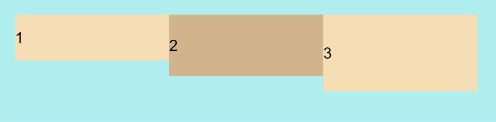
-
ItemAlign.Start:交叉轴方向首部对齐。
let SWh:Record<string,number|string> = { 'width': '90%', 'height': 80 }Flex({ alignItems: ItemAlign.Start }) { Text('1').width('33%').height(30).backgroundColor(0xF5DEB3) Text('2').width('33%').height(40).backgroundColor(0xD2B48C) Text('3').width('33%').height(50).backgroundColor(0xF5DEB3)}.size(SWh).padding(10).backgroundColor(0xAFEEEE)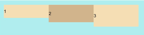
-
ItemAlign.Center:交叉轴方向居中对齐。
let SWh:Record<string,number|string> = { 'width': '90%', 'height': 80 }Flex({ alignItems: ItemAlign.Center }) { Text('1').width('33%').height(30).backgroundColor(0xF5DEB3) Text('2').width('33%').height(40).backgroundColor(0xD2B48C) Text('3').width('33%').height(50).backgroundColor(0xF5DEB3)}.size(SWh).padding(10).backgroundColor(0xAFEEEE)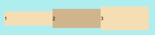
-
ItemAlign.End:交叉轴方向底部对齐。
let SWh:Record<string,number|string> = { 'width': '90%', 'height': 80 }Flex({ alignItems: ItemAlign.End }) { Text('1').width('33%').height(30).backgroundColor(0xF5DEB3) Text('2').width('33%').height(40).backgroundColor(0xD2B48C) Text('3').width('33%').height(50).backgroundColor(0xF5DEB3)}.size(SWh).padding(10).backgroundColor(0xAFEEEE)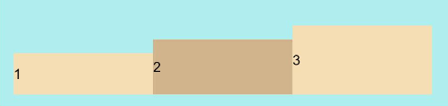
-
ItemAlign.Stretch:交叉轴方向拉伸填充,在未设置尺寸时,拉伸到容器尺寸。
let SWh:Record<string,number|string> = { 'width': '90%', 'height': 80 }Flex({ alignItems: ItemAlign.Stretch }) { Text('1').width('33%').backgroundColor(0xF5DEB3) Text('2').width('33%').backgroundColor(0xD2B48C) Text('3').width('33%').backgroundColor(0xF5DEB3)}.size(SWh).padding(10).backgroundColor(0xAFEEEE)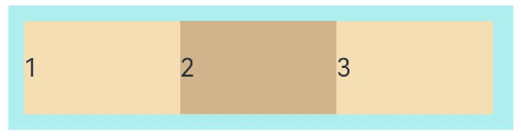
-
ItemAlign. Baseline:交叉轴方向文本基线对齐。
let SWh:Record<string,number|string> = { 'width': '90%', 'height': 80 }Flex({ alignItems: ItemAlign.Baseline }) { Text('1').width('33%').height(30).backgroundColor(0xF5DEB3) Text('2').width('33%').height(40).backgroundColor(0xD2B48C) Text('3').width('33%').height(50).backgroundColor(0xF5DEB3)}.size(SWh).padding(10).backgroundColor(0xAFEEEE)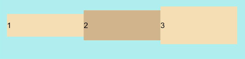
子元素设置交叉轴对齐
子元素的alignSelf属性也可以设置子元素在父容器交叉轴的对齐格式,且会覆盖Flex布局容器中alignItems配置。如下例所示:
Flex({ direction: FlexDirection.Row, alignItems: ItemAlign.Center }) { // 容器组件设置子元素居中  Text('alignSelf Start').width('25%').height(80)    .alignSelf(ItemAlign.Start)    .backgroundColor(0xF5DEB3)  Text('alignSelf Baseline')    .alignSelf(ItemAlign.Baseline)    .width('25%')    .height(80)    .backgroundColor(0xD2B48C)  Text('alignSelf Baseline').width('25%').height(100)    .backgroundColor(0xF5DEB3)    .alignSelf(ItemAlign.Baseline)  Text('no alignSelf').width('25%').height(100)    .backgroundColor(0xD2B48C)  Text('no alignSelf').width('25%').height(100)    .backgroundColor(0xF5DEB3)
}.width('90%').height(220).backgroundColor(0xAFEEEE)
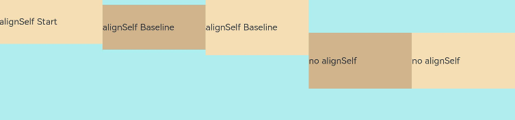
上例中,Flex容器中alignItems设置交叉轴子元素的对齐方式为居中,子元素自身设置了alignSelf属性的情况,覆盖父组件的alignItems值,表现为alignSelf的定义。
内容对齐
可以通过alignContent参数设置子元素各行在交叉轴剩余空间内的对齐方式,只在多行的Flex布局中生效,可选值有:
-
FlexAlign.Start:子元素各行与交叉轴起点对齐。
Flex({ justifyContent: FlexAlign.SpaceBetween, wrap: FlexWrap.Wrap, alignContent: FlexAlign.Start }) { Text('1').width('30%').height(20).backgroundColor(0xF5DEB3) Text('2').width('60%').height(20).backgroundColor(0xD2B48C) Text('3').width('40%').height(20).backgroundColor(0xD2B48C) Text('4').width('30%').height(20).backgroundColor(0xF5DEB3) Text('5').width('20%').height(20).backgroundColor(0xD2B48C)}.width('90%').height(100).backgroundColor(0xAFEEEE)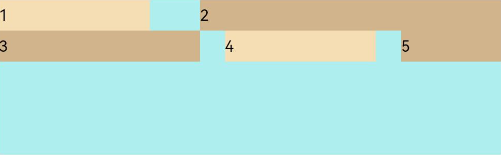
-
FlexAlign.Center:子元素各行在交叉轴方向居中对齐。
Flex({ justifyContent: FlexAlign.SpaceBetween, wrap: FlexWrap.Wrap, alignContent: FlexAlign.Center }) { Text('1').width('30%').height(20).backgroundColor(0xF5DEB3) Text('2').width('60%').height(20).backgroundColor(0xD2B48C) Text('3').width('40%').height(20).backgroundColor(0xD2B48C) Text('4').width('30%').height(20).backgroundColor(0xF5DEB3) Text('5').width('20%').height(20).backgroundColor(0xD2B48C)}.width('90%').height(100).backgroundColor(0xAFEEEE)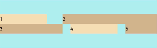
-
FlexAlign.End:子元素各行与交叉轴终点对齐。
Flex({ justifyContent: FlexAlign.SpaceBetween, wrap: FlexWrap.Wrap, alignContent: FlexAlign.End }) { Text('1').width('30%').height(20).backgroundColor(0xF5DEB3) Text('2').width('60%').height(20).backgroundColor(0xD2B48C) Text('3').width('40%').height(20).backgroundColor(0xD2B48C) Text('4').width('30%').height(20).backgroundColor(0xF5DEB3) Text('5').width('20%').height(20).backgroundColor(0xD2B48C)}.width('90%').height(100).backgroundColor(0xAFEEEE)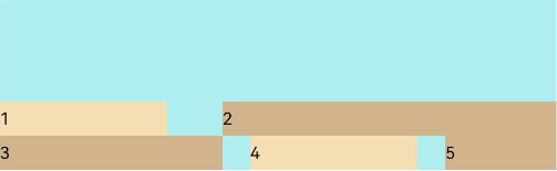
-
FlexAlign.SpaceBetween:子元素各行与交叉轴两端对齐,各行间垂直间距平均分布。
Flex({ justifyContent: FlexAlign.SpaceBetween, wrap: FlexWrap.Wrap, alignContent: FlexAlign.SpaceBetween }) { Text('1').width('30%').height(20).backgroundColor(0xF5DEB3) Text('2').width('60%').height(20).backgroundColor(0xD2B48C) Text('3').width('40%').height(20).backgroundColor(0xD2B48C) Text('4').width('30%').height(20).backgroundColor(0xF5DEB3) Text('5').width('20%').height(20).backgroundColor(0xD2B48C)}.width('90%').height(100).backgroundColor(0xAFEEEE)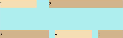
-
FlexAlign.SpaceAround:子元素各行间距相等,是元素首尾行与交叉轴两端距离的两倍。
Flex({ justifyContent: FlexAlign.SpaceBetween, wrap: FlexWrap.Wrap, alignContent: FlexAlign.SpaceAround }) { Text('1').width('30%').height(20).backgroundColor(0xF5DEB3) Text('2').width('60%').height(20).backgroundColor(0xD2B48C) Text('3').width('40%').height(20).backgroundColor(0xD2B48C) Text('4').width('30%').height(20).backgroundColor(0xF5DEB3) Text('5').width('20%').height(20).backgroundColor(0xD2B48C)}.width('90%').height(100).backgroundColor(0xAFEEEE)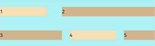
-
FlexAlign.SpaceEvenly: 子元素各行间距,子元素首尾行与交叉轴两端距离都相等。
Flex({ justifyContent: FlexAlign.SpaceBetween, wrap: FlexWrap.Wrap, alignContent: FlexAlign.SpaceEvenly }) { Text('1').width('30%').height(20).backgroundColor(0xF5DEB3) Text('2').width('60%').height(20).backgroundColor(0xD2B48C) Text('3').width('40%').height(20).backgroundColor(0xD2B48C) Text('4').width('30%').height(20).backgroundColor(0xF5DEB3) Text('5').width('20%').height(20).backgroundColor(0xD2B48C)}.width('90%').height(100).backgroundColor(0xAFEEEE)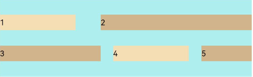
自适应拉伸
在弹性布局父组件尺寸过小时,通过子元素的以下属性设置其在父容器的占比,达到自适应布局。
-
flexBasis:设置子元素在父容器主轴方向上的基准尺寸。如果设置了该属性,则子项占用的空间为该属性所设置的值;如果没设置该属性,那子项的空间为width/height的值。
Flex() {  Text('flexBasis("auto")')    .flexBasis('auto') // 未设置width以及flexBasis值为auto,内容自身宽度    .height(100)    .backgroundColor(0xF5DEB3)  Text('flexBasis("auto")'+' width("40%")')    .width('40%')    .flexBasis('auto') //设置width以及flexBasis值auto,使用width的值    .height(100)    .backgroundColor(0xD2B48C)
  Text('flexBasis(100)')  // 未设置width以及flexBasis值为100,宽度为100vp    .flexBasis(100)      .height(100)    .backgroundColor(0xF5DEB3)
  Text('flexBasis(100)')    .flexBasis(100)    .width(200) // flexBasis值为100,覆盖width的设置值,宽度为100vp    .height(100)    .backgroundColor(0xD2B48C)}.width('90%').height(120).padding(10).backgroundColor(0xAFEEEE)
-
flexGrow:设置父容器的剩余空间分配给此属性所在组件的比例。用于分配父组件的剩余空间。
Flex() {  Text('flexGrow(2)')    .flexGrow(2)    .width(100)    .height(100)    .backgroundColor(0xF5DEB3)  Text('flexGrow(3)')    .flexGrow(3)    .width(100)    .height(100)    .backgroundColor(0xD2B48C)
  Text('no flexGrow')    .width(100)    .height(100)    .backgroundColor(0xF5DEB3)}.width(420).height(120).padding(10).backgroundColor(0xAFEEEE)
父容器宽度420vp,三个子元素原始宽度为100vp,左右padding为20vp,总和320vp,剩余空间100vp根据flexGrow值的占比分配给子元素,未设置flexGrow的子元素不参与“瓜分”。
第一个元素以及第二个元素以2:3分配剩下的100vp。第一个元素为100vp+100vp * 2/5=140vp,第二个元素为100vp+100vp * 3/5=160vp。
-
flexShrink: 当父容器空间不足时,子元素的压缩比例。
Flex({ direction: FlexDirection.Row }) {  Text('flexShrink(3)')    .flexShrink(3)    .width(200)    .height(100)    .backgroundColor(0xF5DEB3)    Text('no flexShrink')    .width(200)    .height(100)    .backgroundColor(0xD2B48C)
  Text('flexShrink(2)')    .flexShrink(2)    .width(200)    .height(100)    .backgroundColor(0xF5DEB3)  }.width(400).height(120).padding(10).backgroundColor(0xAFEEEE)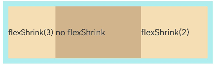
场景示例
使用弹性布局,可以实现子元素沿水平方向排列,两端对齐,子元素间距平分,垂直方向上子元素居中的效果。
@Entry @Componentstruct FlexExample { build() { Column() { Column({ space: 5 }) { Flex({ direction: FlexDirection.Row, wrap: FlexWrap.NoWrap, justifyContent: FlexAlign.SpaceBetween, alignItems: ItemAlign.Center }) { Text('1').width('30%').height(50).backgroundColor(0xF5DEB3) Text('2').width('30%').height(50).backgroundColor(0xD2B48C) Text('3').width('30%').height(50).backgroundColor(0xF5DEB3) } .height(70) .width('90%') .backgroundColor(0xAFEEEE) }.width('100%').margin({ top: 5 }) }.width('100%') }}
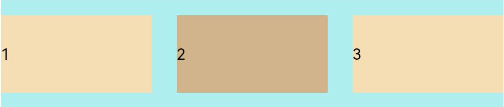 。
。
| 参数名 | 参数类型 | 必填 | 描述 | 作用 |
|---|---|---|---|---|
| value | FlexOptions | 否 | 弹性布局子组件参数。 | |
| direction | FlexDirection | 否 | FlexDirection.Row | 子组件在Flex容器上排列的方向,即主轴的方向。 |
| wrap | FlexWrap | 否 | FlexWrap.NoWrap | Flex容器是单行/列还是多行/列排列。**说明:**在多行布局时,通过交叉轴方向,确认新行堆叠方向。 |
| justifyContent | FlexAlign | 否 | FlexAlign.Start | 所有子组件在Flex容器主轴上的对齐格式。 |
| alignItems | ItemAlign | 否 | ItemAlign.Start | 所有子组件在Flex容器交叉轴上的对齐格式。 |
| alignContent | FlexAlign | 否 | FlexAlign.Start | 交叉轴中有额外的空间时,多行内容的对齐方式。仅在wrap为Wrap或WrapReverse下生效。 |
| space12+ | FlexSpaceOptions | 否 | {main:LengthMetrics.px(0), cross:LengthMetrics.px(0)} | 所有子组件在Flex容器主轴或交叉轴的space。space为负数、百分比或者justifyContent设置为FlexAlign.SpaceBetween、FlexAlign.SpaceAround、FlexAlign.SpaceEvenly时不生效。**说明:**可选值为大于等于0的数字,或者可以转换为数字的字符串。 |
相对布局 (RelativeContainer)
概述
在应用的开发过程中,经常需要设计复杂界面,此时涉及到多个相同或不同组件之间的嵌套。如果布局组件嵌套深度过深,或者嵌套组件数过多,会带来额外的开销。如果在布局的方式上进行优化,就可以有效的提升性能,减少时间开销。
RelativeContainer为采用相对布局的容器,支持容器内部的子元素设置相对位置关系,适用于界面复杂场景的情况,对多个子组件进行对齐和排列。子元素支持指定兄弟元素作为锚点,也支持指定父容器作为锚点,基于锚点做相对位置布局。下图是一个RelativeContainer的概念图,图中的虚线表示位置的依赖关系。
图1 相对布局示意图
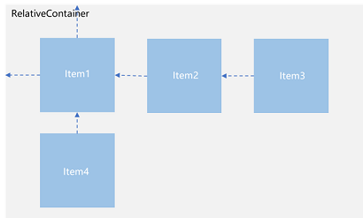
子元素并不完全是上图中的依赖关系。比如,Item4可以以Item2为依赖锚点,也可以以RelativeContainer父容器为依赖锚点。
基本概念
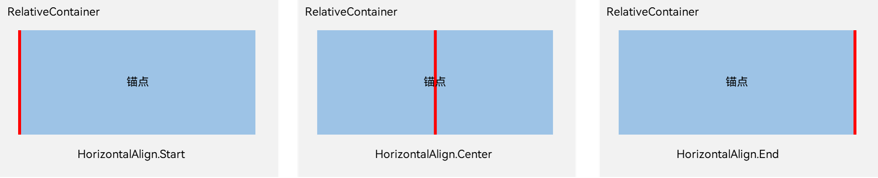
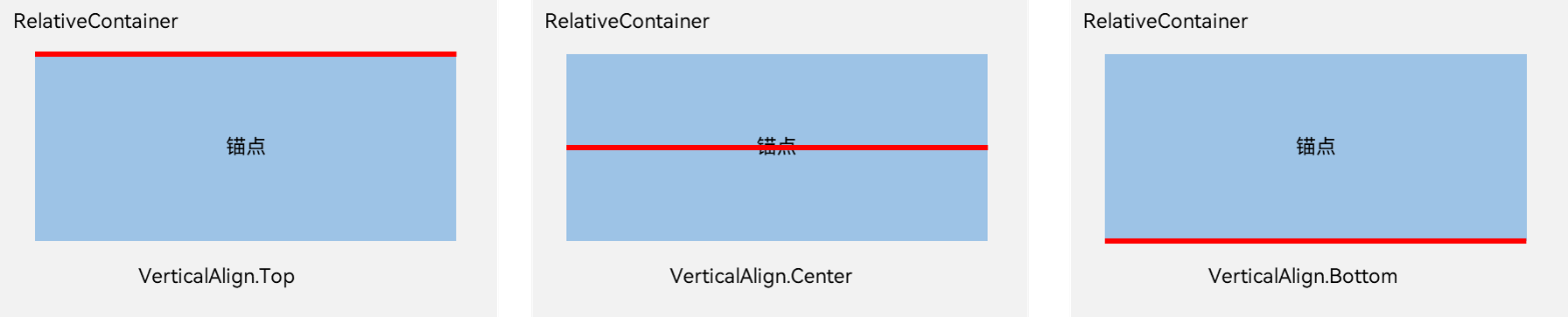
- 锚点:通过锚点设置当前元素基于哪个元素确定位置。
- 对齐方式:通过对齐方式,设置当前元素是基于锚点的上中下对齐,还是基于锚点的左中右对齐。
设置依赖关系
锚点设置
锚点设置是指设置子元素相对于父元素或兄弟元素的位置依赖关系。在水平方向上,可以设置left、middle、right的锚点。在竖直方向上,可以设置top、center、bottom的锚点。
为了明确定义锚点,必须为RelativeContainer及其子元素设置ID,用于指定锚点信息。ID默认为“container”,其余子元素的ID通过id属性设置。不设置id的组件能显示,但是不能被其他子组件作为锚点,相对布局容器会为其拼接id,此id的规律无法被应用感知。互相依赖,环形依赖时容器内子组件全部不绘制。同方向上两个以上位置设置锚点,但锚点位置逆序时此子组件大小为0,即不绘制。
说明
在使用锚点时要注意子元素的相对位置关系,避免出现错位或遮挡的情况。
-
RelativeContainer父组件为锚点,__container__代表父容器的ID。
let AlignRus:Record<string,Record<string,string|VerticalAlign|HorizontalAlign>> = {  'top': { 'anchor': '__container__', 'align': VerticalAlign.Top },  'left': { 'anchor': '__container__', 'align': HorizontalAlign.Start }}let AlignRue:Record<string,Record<string,string|VerticalAlign|HorizontalAlign>> = {  'top': { 'anchor': '__container__', 'align': VerticalAlign.Top },  'right': { 'anchor': '__container__', 'align': HorizontalAlign.End }}let Mleft:Record<string,number> = { 'left': 20 }let BWC:Record<string,number|string> = { 'width': 2, 'color': '#6699FF' }
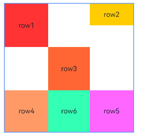
@Entry@Componentstruct Index {  build() {    RelativeContainer() {      Row(){Text('row1')}.justifyContent(FlexAlign.Center).width(100).height(100)      .backgroundColor("#FF3333")      .alignRules(AlignRus)      .id("row1")
      Row(){Text('row2')}.justifyContent(FlexAlign.Center).width(100).height(100)      .backgroundColor("#FFCC00")      .alignRules(AlignRue)      .id("row2")    }.width(300).height(300)    .margin(Mleft)    .border(BWC)  }}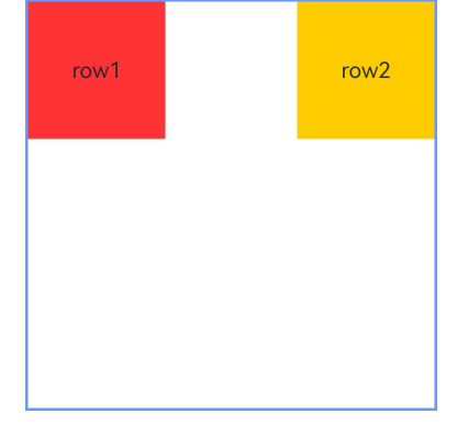
-
以兄弟元素为锚点。
let AlignRus:Record<string,Record<string,string|VerticalAlign|HorizontalAlign>> = {  'top': { 'anchor': '__container__', 'align': VerticalAlign.Top },  'left': { 'anchor': '__container__', 'align': HorizontalAlign.Start }}let RelConB:Record<string,Record<string,string|VerticalAlign|HorizontalAlign>> = {  'top': { 'anchor': 'row1', 'align': VerticalAlign.Bottom },  'left' : { 'anchor': 'row1', 'align': HorizontalAlign.Start }}let Mleft:Record<string,number> = { 'left': 20 }let BWC:Record<string,number|string> = { 'width': 2, 'color': '#6699FF' }
@Entry@Componentstruct Index {  build() {    RelativeContainer() {      Row(){Text('row1')}.justifyContent(FlexAlign.Center).width(100).height(100)      .backgroundColor("#FF3333")      .alignRules(AlignRus)      .id("row1")
      Row(){Text('row2')}.justifyContent(FlexAlign.Center).width(100).height(100)      .backgroundColor("#FFCC00")      .alignRules(RelConB)      .id("row2")    }.width(300).height(300)    .margin(Mleft)    .border(BWC)  }}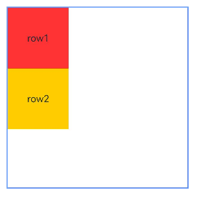
-
子组件锚点可以任意选择,但需注意不要相互依赖。
@Entry@Componentstruct Index {  build() {    Row() {      RelativeContainer() {        Row(){Text('row1')}.justifyContent(FlexAlign.Center).width(100).height(100)          .backgroundColor('#ff3339ff')          .alignRules({            top: {anchor: "__container__", align: VerticalAlign.Top},            left: {anchor: "__container__", align: HorizontalAlign.Start}          })          .id("row1")
        Row(){Text('row2')}.justifyContent(FlexAlign.Center).width(100)          .backgroundColor('#ff298e1e')          .alignRules({            top: {anchor: "__container__", align: VerticalAlign.Top},            right: {anchor: "__container__", align: HorizontalAlign.End},            bottom: {anchor: "row1", align: VerticalAlign.Center},          })          .id("row2")
        Row(){Text('row3')}.justifyContent(FlexAlign.Center).height(100)          .backgroundColor('#ffff6a33')          .alignRules({            top: {anchor: "row1", align: VerticalAlign.Bottom},            left: {anchor: "row1", align: HorizontalAlign.Start},            right: {anchor: "row2", align: HorizontalAlign.Start}          })          .id("row3")
        Row(){Text('row4')}.justifyContent(FlexAlign.Center)          .backgroundColor('#ffff33fd')          .alignRules({            top: {anchor: "row3", align: VerticalAlign.Bottom},            left: {anchor: "row1", align: HorizontalAlign.Center},            right: {anchor: "row2", align: HorizontalAlign.End},            bottom: {anchor: "__container__", align: VerticalAlign.Bottom}          })          .id("row4")      }      .width(300).height(300)      .margin({left: 50})      .border({width:2, color: "#6699FF"})    }    .height('100%')  }}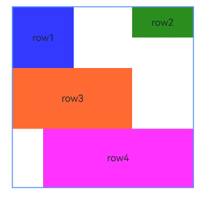
设置相对于锚点的对齐位置
设置了锚点之后,可以通过align设置相对于锚点的对齐位置。
在水平方向上,对齐位置可以设置为HorizontalAlign.Start、HorizontalAlign.Center、HorizontalAlign.End。
在竖直方向上,对齐位置可以设置为VerticalAlign.Top、VerticalAlign.Center、VerticalAlign.Bottom。
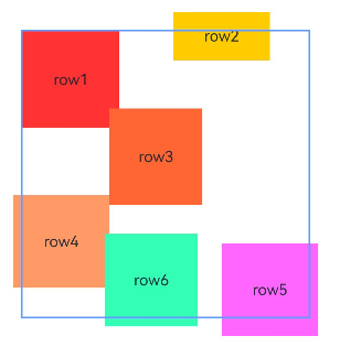
子组件位置偏移
子组件经过相对位置对齐后,位置可能还不是目标位置,开发者可根据需要进行额外偏移设置offset。
@Entry@Componentstruct Index {  build() {    Row() {      RelativeContainer() {        Row(){Text('row1')}.justifyContent(FlexAlign.Center).width(100).height(100)          .backgroundColor("#FF3333")          .alignRules({            top: {anchor: "__container__", align: VerticalAlign.Top},            left: {anchor: "__container__", align: HorizontalAlign.Start}          })          .id("row1")
        Row(){Text('row2')}.justifyContent(FlexAlign.Center).width(100)          .backgroundColor("#FFCC00")          .alignRules({            top: {anchor: "__container__", align: VerticalAlign.Top},            right: {anchor: "__container__", align: HorizontalAlign.End},            bottom: {anchor: "row1", align: VerticalAlign.Center},          })          .offset({            x:-40,            y:-20          })          .id("row2")
        Row(){Text('row3')}.justifyContent(FlexAlign.Center).height(100)          .backgroundColor("#FF6633")          .alignRules({            top: {anchor: "row1", align: VerticalAlign.Bottom},            left: {anchor: "row1", align: HorizontalAlign.End},            right: {anchor: "row2", align: HorizontalAlign.Start}          })          .offset({            x:-10,            y:-20          })          .id("row3")
        Row(){Text('row4')}.justifyContent(FlexAlign.Center)          .backgroundColor("#FF9966")          .alignRules({            top: {anchor: "row3", align: VerticalAlign.Bottom},            bottom: {anchor: "__container__", align: VerticalAlign.Bottom},            left: {anchor: "__container__", align: HorizontalAlign.Start},            right: {anchor: "row1", align: HorizontalAlign.End}          })          .offset({            x:-10,            y:-30          })          .id("row4")
        Row(){Text('row5')}.justifyContent(FlexAlign.Center)          .backgroundColor("#FF66FF")          .alignRules({            top: {anchor: "row3", align: VerticalAlign.Bottom},            bottom: {anchor: "__container__", align: VerticalAlign.Bottom},            left: {anchor: "row2", align: HorizontalAlign.Start},            right: {anchor: "row2", align: HorizontalAlign.End}          })          .offset({            x:10,            y:20          })          .id("row5")
        Row(){Text('row6')}.justifyContent(FlexAlign.Center)          .backgroundColor('#ff33ffb5')          .alignRules({            top: {anchor: "row3", align: VerticalAlign.Bottom},            bottom: {anchor: "row4", align: VerticalAlign.Bottom},            left: {anchor: "row3", align: HorizontalAlign.Start},            right: {anchor: "row3", align: HorizontalAlign.End}          })          .offset({            x:-15,            y:10          })          .backgroundImagePosition(Alignment.Bottom)          .backgroundImageSize(ImageSize.Cover)          .id("row6")      }      .width(300).height(300)      .margin({left: 50})      .border({width:2, color: "#6699FF"})    }    .height('100%')  }}
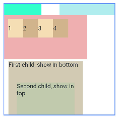
多种组件的对齐布局
Row、Column、Flex、Stack等多种布局组件,可按照RelativeContainer组件规则进行对其排布。
@Entry@Componentstruct Index {  @State value: number = 0  build() {    Row() {
      RelativeContainer() {        Row().width(100).height(100)          .backgroundColor('#ff33ffcc')          .alignRules({            top: {anchor: "__container__", align: VerticalAlign.Top},            left: {anchor: "__container__", align: HorizontalAlign.Start}          })          .id("row1")
        Column().width('50%').height(30).backgroundColor(0xAFEEEE)          .alignRules({            top: {anchor: "__container__", align: VerticalAlign.Top},            left: {anchor: "__container__", align: HorizontalAlign.Center}          }).id("row2")
        Flex({ direction: FlexDirection.Row }) {          Text('1').width('20%').height(50).backgroundColor(0xF5DEB3)          Text('2').width('20%').height(50).backgroundColor(0xD2B48C)          Text('3').width('20%').height(50).backgroundColor(0xF5DEB3)          Text('4').width('20%').height(50).backgroundColor(0xD2B48C)        }        .padding(10)        .backgroundColor('#ffedafaf')        .alignRules({          top: {anchor: "row2", align: VerticalAlign.Bottom},          left: {anchor: "__container__", align: HorizontalAlign.Start},          bottom: {anchor: "__container__", align: VerticalAlign.Center},          right: {anchor: "row2", align: HorizontalAlign.Center}        })        .id("row3")
        Stack({ alignContent: Alignment.Bottom }) {          Text('First child, show in bottom').width('90%').height('100%').backgroundColor(0xd2cab3).align(Alignment.Top)          Text('Second child, show in top').width('70%').height('60%').backgroundColor(0xc1cbac).align(Alignment.Top)        }        .margin({ top: 5 })        .alignRules({          top: {anchor: "row3", align: VerticalAlign.Bottom},          left: {anchor: "__container__", align: HorizontalAlign.Start},          bottom: {anchor: "__container__", align: VerticalAlign.Bottom},          right: {anchor: "row3", align: HorizontalAlign.End}        })        .id("row4")
      }      .width(300).height(300)      .margin({left: 50})      .border({width:2, color: "#6699FF"})    }    .height('100%')  }}
组件尺寸
子组件尺寸大小不会受到相对布局规则的影响。若子组件某个方向上设置两个或以上alignRules时最好不设置此方向尺寸大小,否则对齐规则确定的组件尺寸与开发者设置的尺寸可能产生冲突。
@Entry@Componentstruct Index {  build() {    Row() {      RelativeContainer() {        Row(){Text('row1')}.justifyContent(FlexAlign.Center)          .width(100).height(100)          .backgroundColor("#FF3333")          .alignRules({            top: {anchor: "__container__", align: VerticalAlign.Top},            left: {anchor: "__container__", align: HorizontalAlign.Start}          })          .id("row1")
        Row(){Text('row2')}.justifyContent(FlexAlign.Center).width(100)          .backgroundColor("#FFCC00")          .alignRules({            top: {anchor: "__container__", align: VerticalAlign.Top},            right: {anchor: "__container__", align: HorizontalAlign.End},            bottom: {anchor: "row1", align: VerticalAlign.Center},          })          .id("row2")
        Row(){Text('row3')}.justifyContent(FlexAlign.Center).height(100)          .backgroundColor("#FF6633")          .alignRules({            top: {anchor: "row1", align: VerticalAlign.Bottom},            left: {anchor: "row1", align: HorizontalAlign.End},            right: {anchor: "row2", align: HorizontalAlign.Start}          })          .id("row3")
        Row(){Text('row4')}.justifyContent(FlexAlign.Center)          .backgroundColor("#FF9966")          .alignRules({            top: {anchor: "row3", align: VerticalAlign.Bottom},            bottom: {anchor: "__container__", align: VerticalAlign.Bottom},            left: {anchor: "__container__", align: HorizontalAlign.Start},            right: {anchor: "row1", align: HorizontalAlign.End}          })          .id("row4")
        Row(){Text('row5')}.justifyContent(FlexAlign.Center)          .backgroundColor("#FF66FF")          .alignRules({            top: {anchor: "row3", align: VerticalAlign.Bottom},            bottom: {anchor: "__container__", align: VerticalAlign.Bottom},            left: {anchor: "row2", align: HorizontalAlign.Start},            right: {anchor: "row2", align: HorizontalAlign.End}          })          .id("row5")
        Row(){Text('row6')}.justifyContent(FlexAlign.Center)          .backgroundColor('#ff33ffb5')          .alignRules({            top: {anchor: "row3", align: VerticalAlign.Bottom},            bottom: {anchor: "row4", align: VerticalAlign.Bottom},            left: {anchor: "row3", align: HorizontalAlign.Start},            right: {anchor: "row3", align: HorizontalAlign.End}          })          .id("row6")          .backgroundImagePosition(Alignment.Bottom)          .backgroundImageSize(ImageSize.Cover)      }      .width(300).height(300)      .margin({left: 50})      .border({width:2, color: "#6699FF"})    }    .height('100%')  }}
| 组件 | 参数名 | 参数类型 | 必填 | 描述 | 作用 |
|---|---|---|---|---|---|
| guideLine | value | Array<GuideLineStyle> | 是 | RelativeContainer容器内的辅助线。 | 设置RelativeContainer容器内的辅助线,Array中每个项目即为一条guideline。 |
| barrier | value | Array<BarrierStyle> | 是 | RelativeContainer容器内的屏障。 | 设置RelativeContainer容器内的屏障,Array中每个项目即为一条barrier。 |
| barrierStyle | Array<LocalizedBarrierStyle> | 是 | RelativeContaine容器内的屏障。 | ||
| GuideLineStyle | id | string | 是 | guideline的id,必须是唯一的并且不可与容器内组件重名。 | guideLine参数,用于定义一条guideline的id、方向和位置 |
| direction | Axis | 是 | 指定guideline的方向。默认值:Axis.Vertical | ||
| position | GuideLinePosition | 是 | 指定guideline的位置。默认值:{start: 0} | ||
| GuideLinePosition | start | Dimension | 否 | guideline距离容器左侧或者顶部的距离。 | guideLine位置参数,用于定义guideline的位置 |
| end | Dimension | 否 | guideline距离容器右侧或者底部的距离。 | ||
| BarrierStyle | id | string | 是 | barrier的id,必须是唯一的并且不可与容器内组件重名。 | barrier参数,用于定义一条barrier的id、方向和生成时所依赖的组件 |
| direction | BarrierDirection | 是 | 指定barrier的方向。默认值:BarrierDirection.LEFT | ||
| referencedId | Array | 是 | 指定生成barrier所依赖的组件。 | ||
| LocalizedBarrierStyle | id | string | 是 | barrier的id,必须是唯一的并且不可与容器内组件重名。 | barrier参数,用于定义一条barrier的id、方向和生成时所依赖的组件 |
| localizedDirection | LocalizedBarrierDirection | 是 | 指定barrier的方向。 | ||
| referencedId | Array | 是 | 指定生成barrier所依赖的组件。 | ||
| LocalizedBarrierDirection | START | 0 | 屏障在其所有referencedId的最左/右侧,LTR模式时为最左侧,RTL模式时为最右侧。 | 定义屏障线的方向。 | |
| END | 1 | 屏障在其所有referencedId的最左/右侧, LTR模式时为最右侧,RTL模式时为最左侧。 | |||
| TOP | 2 | 屏障在其所有referencedId的最上方。 | |||
| BOTTOM | 3 | 屏障在其所有referencedId的最下方。 |
位置设置
| 组件 | 参数名 | 参数类型 | 必填 | 描述 | 作用 |
|---|---|---|---|---|---|
| align | value | Alignment | 是 | 设置容器元素绘制区域内的子元素的对齐方式。只在Stack、Button、Marquee、StepperItem、text、TextArea、TextInput、FolderStack中生效,其中和文本相关的组件Marquee、text、TextArea、TextInput的align结果参考textAlign。不支持textAlign属性的组件则无法设置水平方向的文字对齐。默认值:Alignment.Center**说明:**在Stack中该属性与alignContent效果一致,只能设置子组件在容器内的对齐方式。 | 设置容器元素绘制区域内的子元素的对齐方式。 |
| direction | value | Direction | 是 | 设置容器元素内主轴方向上的布局。属性配置为auto的时候,按照系统语言方向进行布局。该属性在Column组件上不生效。默认值:Direction.Auto | 设置容器元素内主轴方向上的布局。 |
| position | value | Position | Edges12+ | LocalizedEdges12+ | 是 | 绝对定位,确定子组件相对父组件的位置。当父容器为Row/Column/Flex时,设置position的子组件不占位。Position类型基于父组件左上角确定位置;Edges类型基于父组件四边确定位置,top/left/right/bottom分别为组件各边距离父组件相应边的边距,通过边距来确定组件相对于父组件的位置;LocalizedEdges类型基于父组件四边确定位置,支持镜像模式。适用于置顶显示、悬浮按钮等组件在父容器中位置固定的场景。不支持在宽高为零的布局容器上设置。当父容器为RelativeContainer, 且子组件设置了alignRules属性, 则子组件的position属性不生效。 | 绝对定位,确定子组件相对父组件的位置。 |
| markAnchor | value | Position | LocalizedPosition12+ | 是 | 设置子元素在位置定位时的锚点,从position或offset的位置上,进一步偏移。设置.position({x: value1, y: value2}).markAnchor({x: value3, y: value4}),效果等于设置.position({x: value1 - value3, y: value2 - value4}),offset同理。单独使用markAnchor,设置.markAnchor({x: value1, y: value2}),效果等于设置.offset({x: -value1, y: -value2})。API version 9及以前,默认值为:{x: 0,y: 0}API version 10:无默认值。 | 设置子元素在位置定位时的锚点。 |
| alignRules | alignRule | LocalizedAlignRuleOptions | 是 | 指定设置在相对容器中子组件的对齐规则。 | 指定设置在相对容器中子组件的对齐规则,仅当父容器为RelativeContainer时生效。该方法水平方向上以start和end分别替代原方法的left和right,以便在RTL模式下能镜像显示,建议使用该方法指定设置在相对容器中子组件的对齐规则。 |
| value | AlignRuleOption | 是 | 指定设置在相对容器中子组件的对齐规则。 | 指定设置在相对容器中子组件的对齐规则,仅当父容器为RelativeContainer时生效 | |
| AlignRuleOption对象说明 | left | { anchor: string, align: HorizontalAlign } | 设置左对齐参数。- anchor:设置作为锚点的组件的id值。- align:设置相对于锚点组件的对齐方式。元服务API: 从API version 11开始,该接口支持在元服务中使用。 | ||
| right | { anchor: string, align: HorizontalAlign } | right设置右对齐参数。- anchor:设置作为锚点的组件的id值。- align:设置相对于锚点组件的对齐方式。元服务API: 从API version 11开始,该接口支持在元服务中使用。 | |||
| middle | { anchor: string, align: HorizontalAlign } | 设置横向居中对齐方式的参数。- anchor:设置作为锚点的组件的id值。- align:设置相对于锚点组件的对齐方式。元服务API: 从API version 11开始,该接口支持在元服务中使用。 | |||
| top | { anchor: string, align: VerticalAlign } | 设置顶部对齐的参数。- anchor:设置作为锚点的组件的id值。- align:设置相对于锚点组件的对齐方式。元服务API: 从API version 11开始,该接口支持在元服务中使用。 | |||
| bottom | { anchor: string, align: VerticalAlign } | 设置底部对齐的参数。- anchor:设置作为锚点的组件的id值。- align:设置相对于锚点组件的对齐方式。元服务API: 从API version 11开始,该接口支持在元服务中使用。 | |||
| center | { anchor: string, align: VerticalAlign } | 设置纵向居中对齐方式的参数。元服务API: 从API version 11开始,该接口支持在元服务中使用。 | |||
| bias11+ | Bias | 设置组件在锚点约束下的偏移参数,其值为到左/上侧锚点的距离与锚点间总距离的比值。卡片能力: 从API version 11开始,该接口支持在ArkTS卡片中使用。元服务API: 从API version 12开始,该接口支持在元服务中使用。 |
栅格布局 (GridRow/GridCol)
概述
栅格布局是一种通用的辅助定位工具,对移动设备的界面设计有较好的借鉴作用。主要优势包括:
- 提供可循的规律:栅格布局可以为布局提供规律性的结构,解决多尺寸多设备的动态布局问题。通过将页面划分为等宽的列数和行数,可以方便地对页面元素进行定位和排版。
- 统一的定位标注:栅格布局可以为系统提供一种统一的定位标注,保证不同设备上各个模块的布局一致性。这可以减少设计和开发的复杂度,提高工作效率。
- 灵活的间距调整方法:栅格布局可以提供一种灵活的间距调整方法,满足特殊场景布局调整的需求。通过调整列与列之间和行与行之间的间距,可以控制整个页面的排版效果。
- 自动换行和自适应:栅格布局可以完成一对多布局的自动换行和自适应。当页面元素的数量超出了一行或一列的容量时,他们会自动换到下一行或下一列,并且在不同的设备上自适应排版,使得页面布局更加灵活和适应性强。
GridRow为栅格容器组件,需与栅格子组件GridCol在栅格布局场景中联合使用。
栅格容器GridRow
栅格系统断点
栅格系统以设备的水平宽度(屏幕密度像素值,单位vp)作为断点依据,定义设备的宽度类型,形成了一套断点规则。开发者可根据需求在不同的断点区间实现不同的页面布局效果。
栅格系统默认断点将设备宽度分为xs、sm、md、lg四类,尺寸范围如下:
| 断点名称 | 取值范围(vp) | 设备描述 |
|---|---|---|
| xs | [0, 320) | 最小宽度类型设备。 |
| sm | [320, 520) | 小宽度类型设备。 |
| md | [520, 840) | 中等宽度类型设备。 |
| lg | [840, +∞) | 大宽度类型设备。 |
在GridRow栅格组件中,允许开发者使用breakpoints自定义修改断点的取值范围,最多支持6个断点,除了默认的四个断点外,还可以启用xl,xxl两个断点,支持六种不同尺寸(xs, sm, md, lg, xl, xxl)设备的布局设置。
| 断点名称 | 设备描述 |
|---|---|
| xs | 最小宽度类型设备。 |
| sm | 小宽度类型设备。 |
| md | 中等宽度类型设备。 |
| lg | 大宽度类型设备。 |
| xl | 特大宽度类型设备。 |
| xxl | 超大宽度类型设备。 |
-
针对断点位置,开发者根据实际使用场景,通过一个单调递增数组设置。由于breakpoints最多支持六个断点,单调递增数组长度最大为5。
breakpoints: {value: ['100vp', '200vp']}表示启用xs、sm、md共3个断点,小于100vp为xs,100vp-200vp为sm,大于200vp为md。
breakpoints: {value: ['320vp', '520vp', '840vp', '1080vp']}表示启用xs、sm、md、lg、xl共5个断点,小于320vp为xs,320vp-520vp为sm,520vp-840vp为md,840vp-1080vp为lg,大于1080vp为xl。
-
栅格系统通过监听窗口或容器的尺寸变化进行断点,通过reference设置断点切换参考物。 考虑到应用可能以非全屏窗口的形式显示,以应用窗口宽度为参照物更为通用。
例如,使用栅格的默认列数12列,通过断点设置将应用宽度分成六个区间,在各区间中,每个栅格子元素占用的列数均不同。
@State bgColors: Color[] = [Color.Red, Color.Orange, Color.Yellow, Color.Green, Color.Pink, Color.Grey, Color.Blue, Color.Brown];...GridRow({ breakpoints: { value: ['200vp', '300vp', '400vp', '500vp', '600vp'], reference: BreakpointsReference.WindowSize }}) { ForEach(this.bgColors, (color:Color, index?:number|undefined) => { GridCol({ span: { xs: 2, // 在最小宽度类型设备上,栅格子组件占据的栅格容器2列。 sm: 3, // 在小宽度类型设备上,栅格子组件占据的栅格容器3列。 md: 4, // 在中等宽度类型设备上,栅格子组件占据的栅格容器4列。 lg: 6, // 在大宽度类型设备上,栅格子组件占据的栅格容器6列。 xl: 8, // 在特大宽度类型设备上,栅格子组件占据的栅格容器8列。 xxl: 12 // 在超大宽度类型设备上,栅格子组件占据的栅格容器12列。 } }) { Row() { Text(`${index}`) }.width("100%").height('50vp') }.backgroundColor(color) })}

布局的总列数
GridRow中通过columns设置栅格布局的总列数。
-
columns默认值为12,即在未设置columns时,任何断点下,栅格布局被分成12列。
@State bgColors: Color[] = [Color.Red, Color.Orange, Color.Yellow, Color.Green, Color.Pink, Color.Grey, Color.Blue, Color.Brown,Color.Red, Color.Orange, Color.Yellow, Color.Green];...GridRow() { ForEach(this.bgColors, (item:Color, index?:number|undefined) => { GridCol() { Row() { Text(`${index}`) }.width('100%').height('50') }.backgroundColor(item) })}
-
当columns为自定义值,栅格布局在任何尺寸设备下都被分为columns列。下面分别设置栅格布局列数为4和8,子元素默认占一列,效果如下:
class CurrTmp{  currentBp: string = 'unknown';  set(val:string){    this.currentBp = val  }}let BorderWH:Record<string,Color|number> = { 'color': Color.Blue, 'width': 2 }@State bgColors: Color[] = [Color.Red, Color.Orange, Color.Yellow, Color.Green, Color.Pink, Color.Grey, Color.Blue, Color.Brown];@State currentBp: string = 'unknown';...Row() {  GridRow({ columns: 4 }) {    ForEach(this.bgColors, (item:Color, index?:number|undefined) => {      GridCol() {        Row() {          Text(`${index}`)        }.width('100%').height('50')      }.backgroundColor(item)    })  }  .width('100%').height('100%')  .onBreakpointChange((breakpoint:string) => {    let CurrSet:CurrTmp = new CurrTmp()    CurrSet.set(breakpoint)  })}.height(160).border(BorderWH).width('90%')
Row() {  GridRow({ columns: 8 }) {    ForEach(this.bgColors, (item:Color, index?:number|undefined) => {        GridCol() {          Row() {            Text(`${index}`)          }.width('100%').height('50')        }.backgroundColor(item)    })  }  .width('100%').height('100%')  .onBreakpointChange((breakpoint:string) => {    let CurrSet:CurrTmp = new CurrTmp()    CurrSet.set(breakpoint)  })}.height(160).border(BorderWH).width('90%')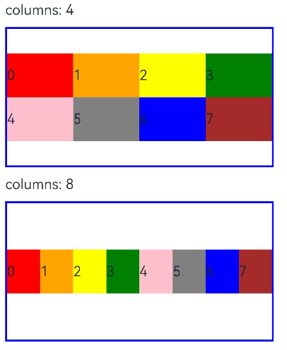
-
当columns类型为GridRowColumnOption时,支持下面六种不同尺寸(xs, sm, md, lg, xl, xxl)设备的总列数设置,各个尺寸下数值可不同。
@State bgColors: Color[] = [Color.Red, Color.Orange, Color.Yellow, Color.Green, Color.Pink, Color.Grey, Color.Blue, Color.Brown]GridRow({ columns: { sm: 4, md: 8 }, breakpoints: { value: ['200vp', '300vp', '400vp', '500vp', '600vp'] } }) { ForEach(this.bgColors, (item:Color, index?:number|undefined) => { GridCol() { Row() { Text(`${index}`) }.width('100%').height('50') }.backgroundColor(item) })}
若只设置sm, md的栅格总列数,则较小的尺寸使用默认columns值12,较大的尺寸使用前一个尺寸的columns。这里只设置sm:4, md:8,则较小尺寸的xs:12,较大尺寸的参照md的设置,lg:8, xl:8, xxl:8
排列方向
栅格布局中,可以通过设置GridRow的direction属性来指定栅格子组件在栅格容器中的排列方向。该属性可以设置为GridRowDirection.Row(从左往右排列)或GridRowDirection.RowReverse(从右往左排列),以满足不同的布局需求。通过合理的direction属性设置,可以使得页面布局更加灵活和符合设计要求。
-
子组件默认从左往右排列。
GridRow({ direction: GridRowDirection.Row }){}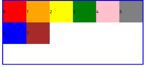
-
子组件从右往左排列。
GridRow({ direction: GridRowDirection.RowReverse }){}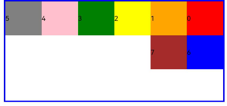
子组件间距
GridRow中通过gutter属性设置子元素在水平和垂直方向的间距。
-
当gutter类型为number时,同时设置栅格子组件间水平和垂直方向边距且相等。下例中,设置子组件水平与垂直方向距离相邻元素的间距为10。
GridRow({ gutter: 10 }){}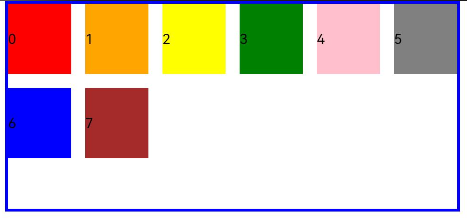
-
当gutter类型为GutterOption时,单独设置栅格子组件水平垂直边距,x属性为水平方向间距,y为垂直方向间距。
GridRow({ gutter: { x: 20, y: 50 } }){}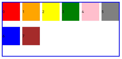
子组件GridCol
GridCol组件作为GridRow组件的子组件,通过给GridCol传参或者设置属性两种方式,设置span(占用列数),offset(偏移列数),order(元素序号)的值。
-
设置span。
let Gspan:Record<string,number> = { 'xs': 1, 'sm': 2, 'md': 3, 'lg': 4 }GridCol({ span: 2 }){}GridCol({ span: { xs: 1, sm: 2, md: 3, lg: 4 } }){}GridCol(){}.span(2)GridCol(){}.span(Gspan) -
设置offset。
let Goffset:Record<string,number> = { 'xs': 1, 'sm': 2, 'md': 3, 'lg': 4 }GridCol({ offset: 2 }){}GridCol({ offset: { xs: 2, sm: 2, md: 2, lg: 2 } }){}GridCol(){}.offset(Goffset) -
设置order。
let Gorder:Record<string,number> = { 'xs': 1, 'sm': 2, 'md': 3, 'lg': 4 }GridCol({ order: 2 }){}GridCol({ order: { xs: 1, sm: 2, md: 3, lg: 4 } }){}GridCol(){}.order(2)GridCol(){}.order(Gorder)
span
子组件占栅格布局的列数,决定了子组件的宽度,默认为1。
-
当类型为number时,子组件在所有尺寸设备下占用的列数相同。
@State bgColors: Color[] = [Color.Red, Color.Orange, Color.Yellow, Color.Green, Color.Pink, Color.Grey, Color.Blue, Color.Brown];...GridRow({ columns: 8 }) { ForEach(this.bgColors, (color:Color, index?:number|undefined) => { GridCol({ span: 2 }) { Row() { Text(`${index}`) }.width('100%').height('50vp') } .backgroundColor(color) })}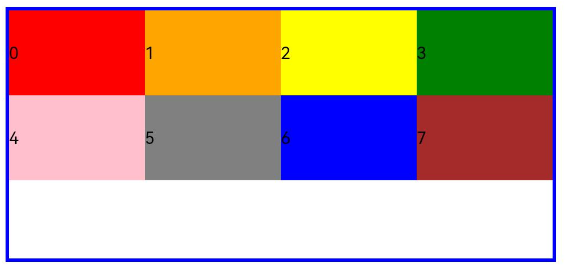
-
当类型为GridColColumnOption时,支持六种不同尺寸(xs, sm, md, lg, xl, xxl)设备中子组件所占列数设置,各个尺寸下数值可不同。
@State bgColors: Color[] = [Color.Red, Color.Orange, Color.Yellow, Color.Green, Color.Pink, Color.Grey, Color.Blue, Color.Brown];...GridRow({ columns: 8 }) { ForEach(this.bgColors, (color:Color, index?:number|undefined) => { GridCol({ span: { xs: 1, sm: 2, md: 3, lg: 4 } }) { Row() { Text(`${index}`) }.width('100%').height('50vp') } .backgroundColor(color) })}
offset
栅格子组件相对于前一个子组件的偏移列数,默认为0。
-
当类型为number时,子组件偏移相同列数。
@State bgColors: Color[] = [Color.Red, Color.Orange, Color.Yellow, Color.Green, Color.Pink, Color.Grey, Color.Blue, Color.Brown];...GridRow() { ForEach(this.bgColors, (color:Color, index?:number|undefined) => { GridCol({ offset: 2 }) { Row() { Text('' + index) }.width('100%').height('50vp') } .backgroundColor(color) })}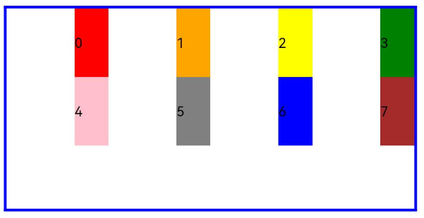
栅格默认分成12列,每一个子组件默认占1列,偏移2列,每个子组件及间距共占3列,一行放四个子组件。
-
当类型为GridColColumnOption时,支持六种不同尺寸(xs, sm, md, lg, xl, xxl)设备中子组件所占列数设置,各个尺寸下数值可不同。
@State bgColors: Color[] = [Color.Red, Color.Orange, Color.Yellow, Color.Green, Color.Pink, Color.Grey, Color.Blue, Color.Brown];...
GridRow() {  ForEach(this.bgColors, (color:Color, index?:number|undefined) => {    GridCol({ offset: { xs: 1, sm: 2, md: 3, lg: 4 } }) {            Row() {        Text('' + index)      }.width('100%').height('50vp')              }    .backgroundColor(color)  })}
order
栅格子组件的序号,决定子组件排列次序。当子组件不设置order或者设置相同的order, 子组件按照代码顺序展示。当子组件设置不同的order时,order较小的组件在前,较大的在后。
当子组件部分设置order,部分不设置order时,未设置order的子组件依次排序靠前,设置了order的子组件按照数值从小到大排列。
-
当类型为number时,子组件在任何尺寸下排序次序一致。
GridRow() { GridCol({ order: 4 }) { Row() { Text('1') }.width('100%').height('50vp') }.backgroundColor(Color.Red) GridCol({ order: 3 }) { Row() { Text('2') }.width('100%').height('50vp') }.backgroundColor(Color.Orange) GridCol({ order: 2 }) { Row() { Text('3') }.width('100%').height('50vp') }.backgroundColor(Color.Yellow) GridCol({ order: 1 }) { Row() { Text('4') }.width('100%').height('50vp') }.backgroundColor(Color.Green)}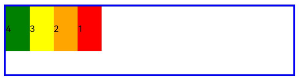
-
当类型为GridColColumnOption时,支持六种不同尺寸(xs, sm, md, lg, xl, xxl)设备中子组件排序次序设置。在xs设备中,子组件排列顺序为1234;sm为2341,md为3412,lg为2431。
GridRow() { GridCol({ order: { xs:1, sm:5, md:3, lg:7}}) { Row() { Text('1') }.width('100%').height('50vp') }.backgroundColor(Color.Red) GridCol({ order: { xs:2, sm:2, md:6, lg:1} }) { Row() { Text('2') }.width('100%').height('50vp') }.backgroundColor(Color.Orange) GridCol({ order: { xs:3, sm:3, md:1, lg:6} }) { Row() { Text('3') }.width('100%').height('50vp') }.backgroundColor(Color.Yellow) GridCol({ order: { xs:4, sm:4, md:2, lg:5} }) { Row() { Text('4') }.width('100%').height('50vp') }.backgroundColor(Color.Green)}
栅格组件的嵌套使用
栅格组件也可以嵌套使用,完成一些复杂的布局。
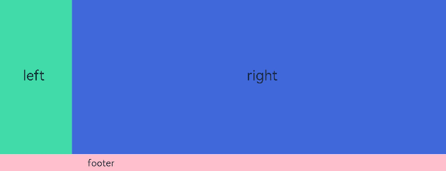
以下示例中,栅格把整个空间分为12份。第一层GridRow嵌套GridCol,分为中间大区域以及“footer”区域。第二层GridRow嵌套GridCol,分为“left”和“right”区域。子组件空间按照上一层父组件的空间划分,粉色的区域是屏幕空间的12列,绿色和蓝色的区域是父组件GridCol的12列,依次进行空间的划分。
@Entry@Componentstruct GridRowExample {  build() {    GridRow() {      GridCol({ span: { sm: 12 } }) {        GridRow() {          GridCol({ span: { sm: 2 } }) {            Row() {              Text('left').fontSize(24)            }            .justifyContent(FlexAlign.Center)            .height('90%')          }.backgroundColor('#ff41dbaa')
          GridCol({ span: { sm: 10 } }) {            Row() {              Text('right').fontSize(24)            }            .justifyContent(FlexAlign.Center)            .height('90%')          }.backgroundColor('#ff4168db')        }        .backgroundColor('#19000000')      }
      GridCol({ span: { sm: 12 } }) {        Row() {          Text('footer').width('100%').textAlign(TextAlign.Center)        }.width('100%').height('10%').backgroundColor(Color.Pink)      }    }.width('100%').height(300)  }}
综上所述,栅格组件提供了丰富的自定义能力,功能异常灵活和强大。只需要明确栅格在不同断点下的Columns、Margin、Gutter及span等参数,即可确定最终布局,无需关心具体的设备类型及设备状态(如横竖屏)等。
GridRow
| 组件 | 参数名 | 参数类型 | 必填 | 描述 | 作用 |
|---|---|---|---|---|---|
| option | GridRowOptions | 否 | 栅格布局子组件参数。 | ||
| GridRowOptions对象说明 | columns | number | GridRowColumnOption | 否 | 设置布局列数。默认值:12 | |
| gutter | Length | GutterOption | 否 | 栅格布局间距。默认值:0 | ||
| breakpoints | BreakPoints | 否 | 设置断点值的断点数列以及基于窗口或容器尺寸的相应参照。默认值:{value: [“320vp”, “600vp”, “840vp”],reference: BreakpointsReference.WindowSize} | ||
| direction | GridRowDirection | 否 | 栅格布局排列方向。默认值:GridRowDirection.Row | ||
| GutterOption | x | Length | GridRowSizeOption | 否 | 栅格子组件水平方向间距。 | 栅格布局间距类型,用于描述栅格子组件不同方向的间距。 |
| y | Length | GridRowSizeOption | 否 | 栅格子组件竖直方向间距。 | ||
| GridRowColumnOption | xs | number | 否 | 在栅格大小为xs的设备上,栅格容器组件的栅格列数。 | 栅格在不同宽度设备类型下,栅格列数 |
| sm | number | 否 | 在栅格大小为sm的设备上,栅格容器组件的栅格列数。 | ||
| md | number | 否 | 在栅格大小为md的设备上,栅格容器组件的栅格列数。 | ||
| lg | number | 否 | 在栅格大小为lg的设备上,栅格容器组件的栅格列数。 | ||
| xl | number | 否 | 在栅格大小为xl的设备上,栅格容器组件的栅格列数。 | ||
| xxl | number | 否 | 在栅格大小为xxl的设备上,栅格容器组件的栅格列数。 | ||
| GridRowSizeOption | xs | Length | 否 | 在最小宽度类型设备上,栅格子组件的间距。 | 栅格在不同宽度设备类型下,gutter的大小。 |
| sm | Length | 否 | 在小宽度类型设备上,栅格子组件的间距。 | ||
| md | Length | 否 | 在中等宽度类型设备上,栅格子组件的间距。 | ||
| lg | Length | 否 | 在大宽度类型设备上,栅格子组件的间距。 | ||
| xl | Length | 否 | 在特大宽度类型设备上,栅格子组件的间距。 | ||
| xxl | Length | 否 | 在超大宽度类型设备上,栅格子组件的间距。 | ||
| BreakPoints | value | Array | 否 | 设置断点位置的单调递增数组。默认值:[“320vp”, “600vp”, “840vp”] | 设置栅格容器组件的断点。 |
| reference | BreakpointsReference | 否 | 断点切换参照物。默认值:BreakpointsReference.WindowSize | 设置GridRow中的GridCol垂直主轴方向对齐方式。GridCol本身也可通过alignSelf(ItemAlign)设置自身对齐方式。当上述两种对齐方式都设置时,以GridCol自身设置为准。 | |
| alignItems | value | ItemAlign | 是 | GridRow中的GridCol垂直主轴方向对齐方式。默认值:ItemAlign.Start说明:ItemAlign支持的枚举:ItemAlign.Start、ItemAlign.Center、ItemAlign.End、ItemAlign.Stretch。 |
GridCol
| 组件 | 参数名 | 参数类型 | 必填 | 描述 | 作用 |
|---|---|---|---|---|---|
| option | GridColOptions | 否 | 栅格布局子组件参数。 | ||
| GridColOptions对象说明 | span | number | GridColColumnOption | 否 | 栅格子组件占用栅格容器组件的列数。span为0表示该元素不参与布局计算,即不会被渲染。默认值:1 | |
| offset | number | GridColColumnOption | 否 | 栅格子组件相对于原本位置偏移的列数。默认值:0 | ||
| order | number | GridColColumnOption | 否 | 元素的序号,根据栅格子组件的序号,从小到大对栅格子组件做排序。默认值:0**说明:**当子组件不设置order或者设置相同的order, 子组件按照代码顺序展示。当子组件部分设置order,部分不设置order时,未设置order的子组件依次排序靠前,设置了order的子组件按照数值从小到大排列。 | ||
| gridColOffset | value | number | GridColColumnOption | 是 | 相对于前一个栅格子组件偏移的列数。默认值:0 | 设置相对于前一个栅格子组件偏移的列数。 |
| order | value | number | GridColColumnOption | 是 | 元素的序号,根据栅格子组件的序号,从小到大对栅格子组件做排序。默认值:0 | 设置元素的序号,根据栅格子组件的序号,从小到大对栅格子组件做排序。 |
| GridColColumnOption | xs | number | 否 | 在栅格大小为xs的设备上,栅格容器组件的栅格列数。 | 用于自定义指定在不同宽度设备类型上,栅格子组件占据的栅格数量单位。 |
| sm | number | 否 | 在栅格大小为sm的设备上,栅格容器组件的栅格列数。 | ||
| md | number | 否 | 在栅格大小为md的设备上,栅格容器组件的栅格列数。 | ||
| lg | number | 否 | 在栅格大小为lg的设备上,栅格容器组件的栅格列数。 | ||
| xl | number | 否 | 在栅格大小为xl的设备上,栅格容器组件的栅格列数。 | ||
| xxl | number | 否 | 在栅格大小为xxl的设备上,栅格容器组件的栅格列数。 |
媒体查询 (@ohos.mediaquery)
媒体查询作为响应式设计的核心,在移动设备上应用十分广泛。媒体查询可根据不同设备类型或同设备不同状态修改应用的样式。媒体查询常用于下面两种场景:
- 针对设备和应用的属性信息(比如显示区域、深浅色、分辨率),设计出相匹配的布局。
- 当屏幕发生动态改变时(比如分屏、横竖屏切换),同步更新应用的页面布局。
引入与使用流程
媒体查询通过mediaquery模块接口,设置查询条件并绑定回调函数,任一媒体特征改变时,均会触发回调函数,返回匹配结果,根据返回值更改页面布局或者实现业务逻辑,实现页面的响应式设计。具体步骤如下:
首先导入媒体查询模块。
import { mediaquery } from '@kit.ArkUI';
通过matchMediaSync接口设置媒体查询条件,保存返回的条件监听句柄listener。例如监听横屏事件:
let listener: mediaquery.MediaQueryListener = mediaquery.matchMediaSync('(orientation: landscape)');
给条件监听句柄listener绑定回调函数onPortrait,当listener检测设备状态变化时执行回调函数。在回调函数内,根据不同设备状态更改页面布局或者实现业务逻辑。
onPortrait(mediaQueryResult: mediaquery.MediaQueryResult) {  if (mediaQueryResult.matches as boolean) {    // do something here  } else {    // do something here  }}
listener.on('change', onPortrait);
媒体查询条件
媒体查询条件由媒体类型、逻辑操作符、媒体特征组成,其中媒体类型可省略,逻辑操作符用于连接不同媒体类型与媒体特征,其中,媒体特征要使用“()”包裹且可以有多个。
语法规则
语法规则包括媒体类型(media-type)、媒体逻辑操作(media-logic-operations)和媒体特征(media-feature)。
[media-type] [media-logic-operations] [(media-feature)]
例如:
- screen and (round-screen: true) :表示当设备屏幕是圆形时条件成立。
- (max-height: 800px) :表示当高度小于等于800px时条件成立。
- (height <= 800px) :表示当高度小于等于800px时条件成立。
- screen and (device-type: tv) or (resolution < 2) :表示包含多个媒体特征的多条件复杂语句查询,当设备类型为tv或设备分辨率小于2时条件成立。
- (dark-mode: true) :表示当系统为深色模式时成立。
媒体类型(media-type)
查询条件未写媒体类型时,默认为screen。媒体类型必须写在查询条件开头。
| 类型 | 说明 |
|---|---|
| screen | 按屏幕相关参数进行媒体查询。 |
媒体逻辑操作(media-logic-operations)
媒体逻辑操作符:and、or、not、only用于构成复杂媒体查询,也可以通过comma(, )将其组合起来,详细解释说明如下表。
表1 媒体逻辑操作符
| 类型 | 说明 |
|---|---|
| and | 将多个媒体特征(Media Feature)以“与”的方式连接成一个媒体查询,只有当所有媒体特征都为true,查询条件成立。另外,它还可以将媒体类型和媒体功能结合起来。例如:screen and (device-type: wearable) and (max-height: 600px) 表示当设备类型是智能穿戴且应用的最大高度小于等于600个像素单位时成立。 |
| or | 将多个媒体特征以“或”的方式连接成一个媒体查询,如果存在结果为true的媒体特征,则查询条件成立。例如:screen and (max-height: 1000px) or (round-screen: true) 表示当应用高度小于等于1000个像素单位或者设备屏幕是圆形时,条件成立。 |
| not | not操作符必须搭配screen使用,取反媒体查询结果,媒体查询结果不成立时返回true,否则返回false。例如:not screen and (min-height: 50px) and (max-height: 600px) 表示当应用高度小于50个像素单位或者大于600个像素单位时成立。 |
| only | only操作符必须搭配screen使用, 当前效果与单独使用screen相同。例如:only screen and (height <= 50) |
| comma(, ) | 将多个媒体特征以“或”的方式连接成一个媒体查询,如果存在结果为true的媒体特征,则查询条件成立。其效果等同于or运算符。例如:screen and (min-height: 1000px), (round-screen: true) 表示当应用高度大于等于1000个像素单位或者设备屏幕是圆形时,条件成立。 |
媒体范围操作符包括<=,>=,<,>,详细解释说明如下表。
表2 媒体逻辑范围操作符
| 类型 | 说明 |
|---|---|
| <= | 小于等于,例如:screen and (height <= 50)。 |
| >= | 大于等于,例如:screen and (height >= 600)。 |
| < | 小于,例如:screen and (height < 50)。 |
| > | 大于,例如:screen and (height > 600)。 |
媒体特征(media-feature)
媒体特征包括应用显示区域的宽高、设备分辨率以及设备的宽高等属性,详细说明如下表。
表3 媒体特征说明表
比较height、width等宽高尺寸时,支持vp和px单位,无单位默认为px。
| 类型 | 说明 |
|---|---|
| height | 应用页面可绘制区域的高度。 |
| min-height | 应用页面可绘制区域的最小高度。 |
| max-height | 应用页面可绘制区域的最大高度。 |
| width | 应用页面可绘制区域的宽度。 |
| min-width | 应用页面可绘制区域的最小宽度。 |
| max-width | 应用页面可绘制区域的最大宽度。 |
| resolution | 设备的分辨率,支持dpi,dppx和dpcm单位。其中:- dpi表示每英寸中物理像素个数,1dpi ≈ 0.39dpcm;- dpcm表示每厘米上的物理像素个数,1dpcm ≈ 2.54dpi;- dppx表示每个px中的物理像素数(此单位按96px = 1英寸为基准,与页面中的px单位计算方式不同),1dppx = 96dpi。 |
| min-resolution | 设备的最小分辨率。 |
| max-resolution | 设备的最大分辨率。 |
| orientation | 屏幕的方向。可选值:- orientation: portrait(设备竖屏);- orientation: landscape(设备横屏)。 |
| device-height | 设备的高度。 |
| min-device-height | 设备的最小高度。 |
| max-device-height | 设备的最大高度。 |
| device-width | 设备的宽度。当前仅在应用初始化时保存一次,不会随设备宽度变化实时更新,例如折叠屏的折叠展开场景。 |
| device-type | 设备的类型。可选值:default、tablet。 |
| min-device-width | 设备的最小宽度。 |
| max-device-width | 设备的最大宽度。 |
| round-screen | 屏幕类型,圆形屏幕为true,非圆形屏幕为false。 |
| dark-mode | 系统当前的深浅模式。可选值:true、false。深色模式为true,浅色模式为false。 |
说明
目前在卡片中使用媒体查询,只支持height、width。
场景示例
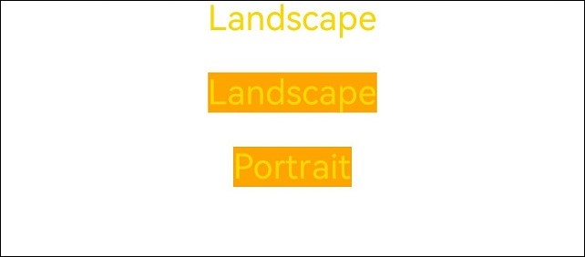
下例中使用媒体查询,实现屏幕横竖屏切换时,给页面文本应用添加不同的内容和样式。
Stage模型下的示例:
import { mediaquery, window } from '@kit.ArkUI';import { common } from '@kit.AbilityKit';
@Entry@Componentstruct MediaQueryExample {  @State color: string = '#DB7093';  @State text: string = 'Portrait';  // 当设备横屏时条件成立  listener:mediaquery.MediaQueryListener = this.getUIContext().getMediaQuery().matchMediaSync('(orientation: landscape)');
  // 当满足媒体查询条件时,触发回调  onPortrait(mediaQueryResult:mediaquery.MediaQueryResult) {    if (mediaQueryResult.matches as boolean) { // 若设备为横屏状态,更改相应的页面布局      this.color = '#FFD700';      this.text = 'Landscape';    } else {      this.color = '#DB7093';      this.text = 'Portrait';    }  }
  aboutToAppear() {    // 绑定当前应用实例    // 绑定回调函数    this.listener.on('change', (mediaQueryResult: mediaquery.MediaQueryResult) => {      this.onPortrait(mediaQueryResult)    });  }
  aboutToDisappear() {    // 解绑listener中注册的回调函数    this.listener.off('change');  }
  // 改变设备横竖屏状态函数  private changeOrientation(isLandscape: boolean) {    // 获取UIAbility实例的上下文信息    let context:common.UIAbilityContext = this.getUIContext().getHostContext() as common.UIAbilityContext;    // 调用该接口手动改变设备横竖屏状态    window.getLastWindow(context).then((lastWindow) => {      lastWindow.setPreferredOrientation(isLandscape ? window.Orientation.LANDSCAPE : window.Orientation.PORTRAIT)    });  }
  build() {    Column({ space: 50 }) {      Text(this.text).fontSize(50).fontColor(this.color)      Text('Landscape').fontSize(50).fontColor(this.color).backgroundColor(Color.Orange)        .onClick(() => {          this.changeOrientation(true);        })      Text('Portrait').fontSize(50).fontColor(this.color).backgroundColor(Color.Orange)        .onClick(() => {          this.changeOrientation(false);        })    }    .width('100%').height('100%')  }}
FA模型下的示例:
import { mediaquery } from '@kit.ArkUI';import { featureAbility } from '@kit.AbilityKit';
@Entry@Componentstruct MediaQueryExample {  @State color: string = '#DB7093';  @State text: string = 'Portrait';  listener:mediaquery.MediaQueryListener = mediaquery.matchMediaSync('(orientation: landscape)'); // 当设备横屏时条件成立
  onPortrait(mediaQueryResult:mediaquery.MediaQueryResult) { // 当满足媒体查询条件时,触发回调    if (mediaQueryResult.matches as boolean) { // 若设备为横屏状态,更改相应的页面布局      this.color = '#FFD700';      this.text = 'Landscape';    } else {      this.color = '#DB7093';      this.text = 'Portrait';    }  }
  aboutToAppear() {    // 绑定当前应用实例    this.listener.on('change', (mediaQueryResult:mediaquery.MediaQueryResult) => { this.onPortrait(mediaQueryResult) }); //绑定回调函数  }
  aboutToDisappear() {    // 解绑listener中注册的回调函数    this.listener.off('change');  }
  build() {    Column({ space: 50 }) {      Text(this.text).fontSize(50).fontColor(this.color)      Text('Landscape').fontSize(50).fontColor(this.color).backgroundColor(Color.Orange)        .onClick(() => {          let context = featureAbility.getContext();          context.setDisplayOrientation(0); //调用该接口手动改变设备横竖屏状态        })      Text('Portrait').fontSize(50).fontColor(this.color).backgroundColor(Color.Orange)        .onClick(() => {          let context = featureAbility.getContext();          context.setDisplayOrientation(1); //调用该接口手动改变设备横竖屏状态        })    }    .width('100%').height('100%')  }}
图1 竖屏
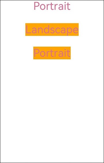
图2 横屏
创建列表 (List)
列表是一种复杂的容器,当列表项达到一定数量,内容超过屏幕大小时,可以自动提供滚动功能。它适合用于呈现同类数据类型或数据类型集,例如图片和文本。在列表中显示数据集合是许多应用程序中的常见要求(如通讯录、音乐列表、购物清单等)。
使用列表可以轻松高效地显示结构化、可滚动的信息。通过在List组件中按垂直或者水平方向线性排列子组件ListItemGroup或ListItem,为列表中的行或列提供单个视图,或使用循环渲染迭代一组行或列,或混合任意数量的单个视图和ForEach结构,构建一个列表。List组件支持使用条件渲染、循环渲染、懒加载等渲染控制方式生成子组件。
List、ListItemGroup和ListItem组件关系
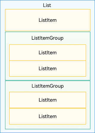
布局
List除了提供垂直和水平布局能力、超出屏幕时可以滚动的自适应延伸能力之外,还提供了自适应交叉轴方向上排列个数的布局能力。
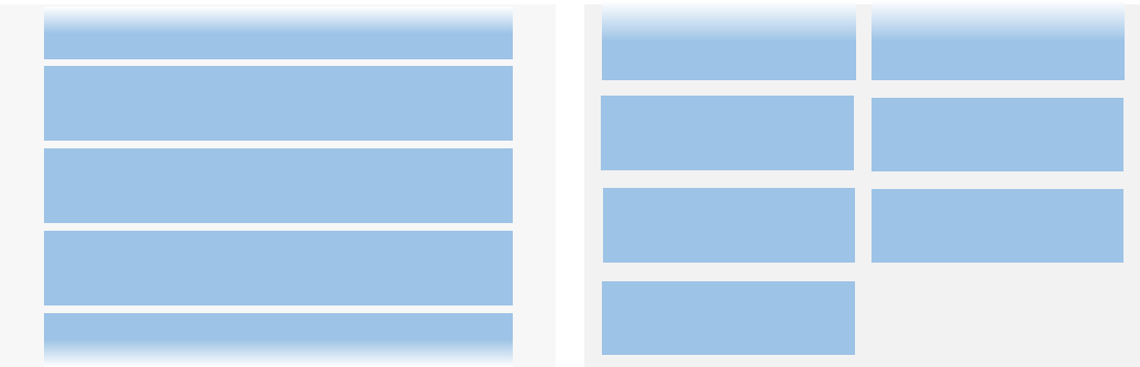
利用垂直布局能力可以构建单列或者多列垂直滚动列表,如下图所示。
图2 垂直滚动列表(左:单列;右:多列)
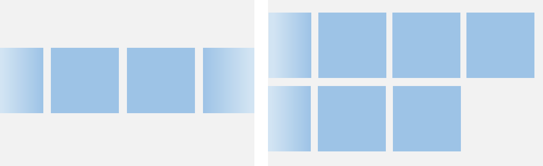
利用水平布局能力可以是构建单行或多行水平滚动列表,如下图所示。
图3 水平滚动列表(左:单行;右:多行)
Grid和WaterFlow也可以实现单列、多列布局,如果布局每列等宽,且不需要跨行跨列布局,相比Gird和WaterFlow,则更推荐使用List。
约束
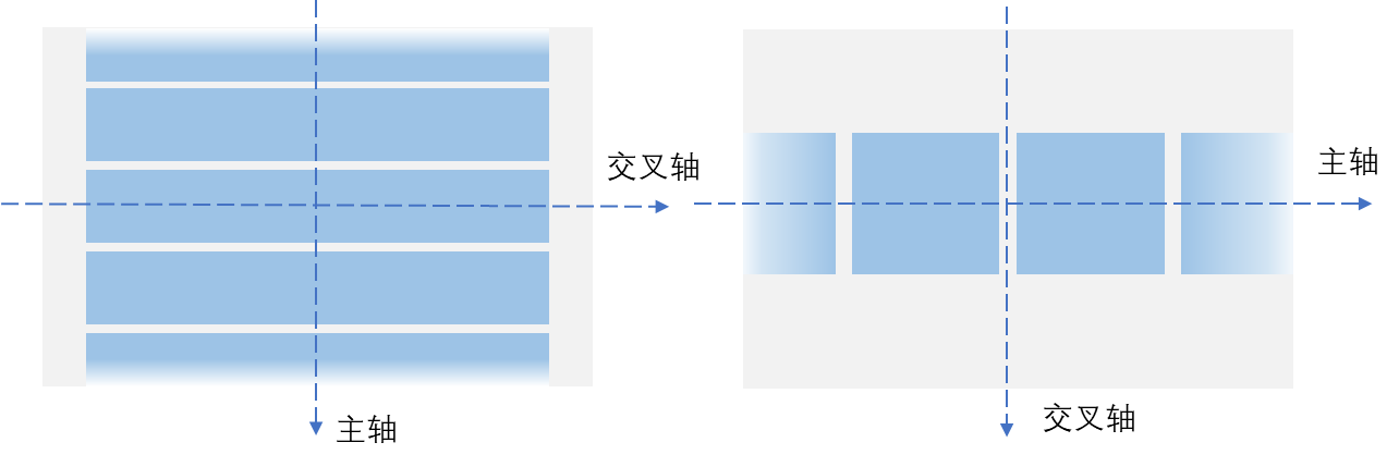
列表的主轴方向是指子组件列的排列方向,也是列表的滚动方向。垂直于主轴的轴称为交叉轴,其方向与主轴方向相互垂直。
如下图所示,垂直列表的主轴是垂直方向,交叉轴是水平方向;水平列表的主轴是水平方向,交叉轴是垂直方向。
图4 列表的主轴与交叉轴
如果List组件主轴或交叉轴方向设置了尺寸,则其对应方向上的尺寸为设置值。
如果List组件主轴方向没有设置尺寸,当List子组件主轴方向总尺寸小于List的父组件尺寸时,List主轴方向尺寸自动适应子组件的总尺寸。
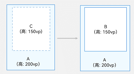
如下图所示,一个垂直列表B没有设置高度时,其父组件A高度为200vp,若其所有子组件C的高度总和为150vp,则此时列表B的高度为150vp。
图5 列表主轴高度约束示例1(A: List的父组件; B: List组件; C: List的所有子组件)
如果子组件主轴方向总尺寸超过List父组件尺寸时,List主轴方向尺寸适应List的父组件尺寸。
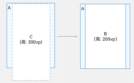
如下图所示,同样是没有设置高度的垂直列表B,其父组件A高度为200vp,若其所有子组件C的高度总和为300vp,则此时列表B的高度为200vp。
图6 列表主轴高度约束示例2(A: List的父组件; B: List组件; C: List的所有子组件)
List组件交叉轴方向在没有设置尺寸时,其尺寸默认自适应父组件尺寸。
开发布局
设置主轴方向
List组件主轴默认是垂直方向,即默认情况下不需要手动设置List方向,就可以构建一个垂直滚动列表。
若是水平滚动列表场景,将List的listDirection属性设置为Axis.Horizontal即可实现。listDirection默认为Axis.Vertical,即主轴默认是垂直方向。
List() { // ...}.listDirection(Axis.Horizontal)
设置交叉轴布局
List组件的交叉轴布局可以通过lanes和alignListItem属性进行设置,lanes属性用于确定交叉轴排列的列表项数量,alignListItem用于设置子组件在交叉轴方向的对齐方式。
List组件的lanes属性通常用于在不同尺寸的设备自适应构建不同行数或列数的列表,即一次开发、多端部署的场景,例如歌单列表。lanes属性的取值类型是"number | LengthConstrain",即整数或者LengthConstrain类型。以垂直列表为例,如果将lanes属性设为2,表示构建的是一个两列的垂直列表,如图2中右图所示。lanes的默认值为1,即默认情况下,垂直列表的列数是1。
List() { // ...}.lanes(2)
当其取值为LengthConstrain类型时,表示会根据LengthConstrain与List组件的尺寸自适应决定行或列数。
@Entry@Componentstruct EgLanes { @State egLanes: LengthConstrain = { minLength: 200, maxLength: 300 } build() { List() { // ... } .lanes(this.egLanes) }}
例如,假设在垂直列表中设置了lanes的值为{ minLength: 200, maxLength: 300 }。此时,
- 当List组件宽度为300vp时,由于minLength为200vp,此时列表为一列。
- 当List组件宽度变化至400vp时,符合两倍的minLength,则此时列表自适应为两列。
同样以垂直列表为例,当alignListItem属性设置为ListItemAlign.Center表示列表项在水平方向上居中对齐。alignListItem的默认值是ListItemAlign.Start,即列表项在列表交叉轴方向上默认按首部对齐。
List() { // ...}.alignListItem(ListItemAlign.Center)
在列表中显示数据
列表视图垂直或水平显示项目集合,在行或列超出屏幕时提供滚动功能,使其适合显示大型数据集合。在最简单的列表形式中,List静态地创建其列表项ListItem的内容。
图7 城市列表

@Entry@Componentstruct CityList {  build() {    List() {      ListItem() {        Text('北京').fontSize(24)      }
      ListItem() {        Text('杭州').fontSize(24)      }
      ListItem() {        Text('上海').fontSize(24)      }    }    .backgroundColor('#FFF1F3F5')    .alignListItem(ListItemAlign.Center)  }}
由于在ListItem中只能有一个根节点组件,不支持以平铺形式使用多个组件。因此,若列表项是由多个组件元素组成的,则需要将这多个元素组合到一个容器组件内或组成一个自定义组件。
图8 联系人列表项示例
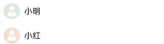
如上图所示,联系人列表的列表项中,每个联系人都有头像和名称。此时,需要将Image和Text封装到一个Row容器内。
List() {  ListItem() {    Row() {      Image($r('app.media.iconE'))        .width(40)        .height(40)        .margin(10)
      Text('小明')        .fontSize(20)    }  }
  ListItem() {    Row() {      Image($r('app.media.iconF'))        .width(40)        .height(40)        .margin(10)
      Text('小红')        .fontSize(20)    }  }}
迭代列表内容
通常,应用通过数据集合动态地创建列表。使用循环渲染可从数据源中迭代获取数据,并在每次迭代过程中创建相应的组件,降低代码复杂度。
ArkTS通过ForEach提供了组件的循环渲染能力。以简单形式的联系人列表为例,将联系人名称和头像数据以Contact类结构存储到contacts数组,使用ForEach中嵌套ListItem的形式来代替多个平铺的、内容相似的ListItem,从而减少重复代码。
import { util } from '@kit.ArkTS'
class Contact {  key: string = util.generateRandomUUID(true);  name: string;  icon: Resource;
  constructor(name: string, icon: Resource) {    this.name = name;    this.icon = icon;  }}
@Entry@Componentstruct SimpleContacts {  private contacts: Array<object> = [    new Contact('小明', $r("app.media.iconA")),    new Contact('小红', $r("app.media.iconB")),  ]
  build() {    List() {      ForEach(this.contacts, (item: Contact) => {        ListItem() {          Row() {            Image(item.icon)              .width(40)              .height(40)              .margin(10)            Text(item.name).fontSize(20)          }          .width('100%')          .justifyContent(FlexAlign.Start)        }      }, (item: Contact) => JSON.stringify(item))    }    .width('100%')  }}
在List组件中,ForEach除了可以用来循环渲染ListItem,也可以用来循环渲染ListItemGroup。ListItemGroup的循环渲染详细使用请参见支持分组列表。
自定义列表样式
设置内容间距
在初始化列表时,如需在列表项之间添加间距,可以使用space参数。例如,在每个列表项之间沿主轴方向添加10vp的间距:
List({ space: 10 }) { // ...}
添加分隔线
分隔线用来将界面元素隔开,使单个元素更加容易识别。如下图所示,当列表项左边有图标(如蓝牙图标),由于图标本身就能很好的区分,此时分隔线从图标之后开始显示即可。
图9 设置列表分隔线样式
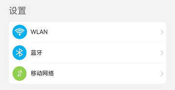
List提供了divider属性用于给列表项之间添加分隔线。在设置divider属性时,可以通过strokeWidth和color属性设置分隔线的粗细和颜色。
startMargin和endMargin属性分别用于设置分隔线距离列表侧边起始端的距离和距离列表侧边结束端的距离。
class DividerTmp {  strokeWidth: Length = 1  startMargin: Length = 60  endMargin: Length = 10  color: ResourceColor = '#ffe9f0f0'
  constructor(strokeWidth: Length, startMargin: Length, endMargin: Length, color: ResourceColor) {    this.strokeWidth = strokeWidth    this.startMargin = startMargin    this.endMargin = endMargin    this.color = color  }}@Entry@Componentstruct EgDivider {  @State egDivider: DividerTmp = new DividerTmp(1, 60, 10, '#ffe9f0f0')  build() {    List() {      // ...    }    .divider(this.egDivider)  }}
此示例表示从距离列表侧边起始端60vp开始到距离结束端10vp的位置,画一条粗细为1vp的分割线,可以实现图9设置列表分隔线的样式。
说明
- 分隔线的宽度会使ListItem之间存在一定间隔,当List设置的内容间距小于分隔线宽度时,ListItem之间的间隔会使用分隔线的宽度。
- 当List存在多列时,分割线的startMargin和endMargin作用于每一列上。
- List组件的分隔线画在两个ListItem之间,第一个ListItem上方和最后一个ListItem下方不会绘制分隔线。
添加滚动条
当列表项高度(宽度)超出屏幕高度(宽度)时,列表可以沿垂直(水平)方向滚动。在页面内容很多时,若用户需快速定位,可拖拽滚动条,如下图所示。
图10 列表的滚动条

在使用List组件时,可通过scrollBar属性控制列表滚动条的显示。scrollBar的取值类型为BarState,当取值为BarState.Auto表示按需显示滚动条。此时,当触摸到滚动条区域时显示控件,可上下拖拽滚动条快速浏览内容,拖拽时会变粗。若不进行任何操作,2秒后滚动条自动消失。
scrollBar属性API version 9及以下版本默认值为BarState.Off,从API version 10版本开始默认值为BarState.Auto。
List() { // ...}.scrollBar(BarState.Auto)
支持分组列表
在列表中支持数据的分组展示,可以使列表显示结构清晰,查找方便,从而提高使用效率。分组列表在实际应用中十分常见,如下图所示联系人列表。
图11 联系人分组列表
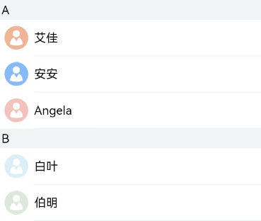
在List组件中使用ListItemGroup对项目进行分组,可以构建二维列表。
在List组件中可以直接使用一个或者多个ListItemGroup组件,ListItemGroup的宽度默认充满List组件。在初始化ListItemGroup时,可通过header参数设置列表分组的头部组件。
@Entry@Componentstruct ContactsList {    @Builder itemHead(text: string) {    // 列表分组的头部组件,对应联系人分组A、B等位置的组件    Text(text)      .fontSize(20)      .backgroundColor('#fff1f3f5')      .width('100%')      .padding(5)  }
  build() {    List() {      ListItemGroup({ header: this.itemHead('A') }) {        // 循环渲染分组A的ListItem      }
      ListItemGroup({ header: this.itemHead('B') }) {        // 循环渲染分组B的ListItem      }    }  }}
如果多个ListItemGroup结构类似,可以将多个分组的数据组成数组,然后使用ForEach对多个分组进行循环渲染。例如在联系人列表中,将每个分组的联系人数据contacts(可参考迭代列表内容章节)和对应分组的标题title数据进行组合,定义为数组contactsGroups。然后在ForEach中对contactsGroups进行循环渲染,即可实现多个分组的联系人列表。可参考添加粘性标题章节示例代码。
添加粘性标题
粘性标题是一种常见的标题模式,常用于定位字母列表的头部元素。如下图所示,在联系人列表中滚动A部分时,B部分开始的头部元素始终处于A的下方。而在开始滚动B部分时,B的头部会固定在屏幕顶部,直到所有B的项均完成滚动后,才被后面的头部替代。
粘性标题不仅有助于阐明列表中数据的表示形式和用途,还可以帮助用户在大量信息中进行数据定位,从而避免用户在标题所在的表的顶部与感兴趣区域之间反复滚动。
图12 粘性标题

List组件的sticky属性配合ListItemGroup组件使用,用于设置ListItemGroup中的头部组件是否呈现吸顶效果或者尾部组件是否呈现吸底效果。
通过给List组件设置sticky属性为StickyStyle.Header,即可实现列表的粘性标题效果。如果需要支持吸底效果,可以通过footer参数初始化ListItemGroup的底部组件,并将sticky属性设置为StickyStyle.Footer。
import { util } from '@kit.ArkTS'class Contact {  key: string = util.generateRandomUUID(true);  name: string;  icon: Resource;
  constructor(name: string, icon: Resource) {    this.name = name;    this.icon = icon;  }}class ContactsGroup {  title: string = ''  contacts: Array<object> | null = null  key: string = ""}export let contactsGroups: object[] = [  {    title: 'A',    contacts: [      new Contact('艾佳', $r('app.media.iconA')),      new Contact('安安', $r('app.media.iconB')),      new Contact('Angela', $r('app.media.iconC')),    ],    key: util.generateRandomUUID(true)  } as ContactsGroup,  {    title: 'B',    contacts: [      new Contact('白叶', $r('app.media.iconD')),      new Contact('伯明', $r('app.media.iconE')),    ],    key: util.generateRandomUUID(true)  } as ContactsGroup,  // ...]@Entry@Componentstruct ContactsList {  // 定义分组联系人数据集合contactsGroups数组  @Builder itemHead(text: string) {    // 列表分组的头部组件,对应联系人分组A、B等位置的组件    Text(text)      .fontSize(20)      .backgroundColor('#fff1f3f5')      .width('100%')      .padding(5)  }  build() {    List() {      // 循环渲染ListItemGroup,contactsGroups为多个分组联系人contacts和标题title的数据集合      ForEach(contactsGroups, (itemGroup: ContactsGroup) => {        ListItemGroup({ header: this.itemHead(itemGroup.title) }) {          // 循环渲染ListItem          if (itemGroup.contacts) {            ForEach(itemGroup.contacts, (item: Contact) => {              ListItem() {                // ...              }            }, (item: Contact) => JSON.stringify(item))          }        }      }, (itemGroup: ContactsGroup) => JSON.stringify(itemGroup))    }.sticky(StickyStyle.Header)  // 设置吸顶,实现粘性标题效果  }}
控制滚动位置
控制滚动位置在实际应用中十分常见,例如当新闻页列表项数量庞大,用户滚动列表到一定位置时,希望快速滚动到列表底部或返回列表顶部。此时,可以通过控制滚动位置来实现列表的快速定位,如下图所示。
图13 返回列表顶部

List组件初始化时,可以通过scroller参数绑定一个Scroller对象,进行列表的滚动控制。例如,用户在新闻应用中,点击新闻页面底部的返回顶部按钮时,就可以通过Scroller对象的scrollToIndex方法使列表滚动到指定的列表项索引位置。
首先,需要创建一个Scroller的对象listScroller。
private listScroller: Scroller = new Scroller();
然后,通过将listScroller用于初始化List组件的scroller参数,完成listScroller与列表的绑定。在需要跳转的位置指定scrollToIndex的参数为0,表示返回列表顶部。
Stack({ alignContent: Alignment.Bottom }) {  // 将listScroller用于初始化List组件的scroller参数,完成listScroller与列表的绑定。  List({ space: 20, scroller: this.listScroller }) {    // ...  }
  Button() {    // ...  }  .onClick(() => {    // 点击按钮时,指定跳转位置,返回列表顶部    this.listScroller.scrollToIndex(0)  })}
响应滚动位置
许多应用需要监听列表的滚动位置变化并作出响应。例如,在联系人列表滚动时,如果跨越了不同字母开头的分组,则侧边字母索引栏也需要更新到对应的字母位置。
除了字母索引之外,滚动列表结合多级分类索引在应用开发过程中也很常见,例如购物应用的商品分类页面,多级分类也需要监听列表的滚动位置。
图14 字母索引响应联系人列表滚动

如上图所示,当联系人列表从A滚动到B时,右侧索引栏也需要同步从选中A状态变成选中B状态。此场景可以通过监听List组件的onScrollIndex事件来实现,右侧索引栏需要使用字母表索引组件AlphabetIndexer。
在列表滚动时,根据列表此时所在的索引值位置firstIndex,重新计算字母索引栏对应字母的位置selectedIndex。由于AlphabetIndexer组件通过selected属性设置了选中项索引值,当selectedIndex变化时会触发AlphabetIndexer组件重新渲染,从而显示为选中对应字母的状态。
const alphabets = ['#', 'A', 'B', 'C', 'D', 'E', 'F', 'G', 'H', 'I', 'J', 'K',  'L', 'M', 'N', 'O', 'P', 'Q', 'R', 'S', 'T', 'U', 'V', 'W', 'X', 'Y', 'Z'];@Entry@Componentstruct ContactsList {  @State selectedIndex: number = 0;  private listScroller: Scroller = new Scroller();
  build() {    Stack({ alignContent: Alignment.End }) {      List({ scroller: this.listScroller }) {}      .onScrollIndex((firstIndex: number) => {        // 根据列表滚动到的索引值,重新计算对应联系人索引栏的位置this.selectedIndex      })
      // 字母表索引组件      AlphabetIndexer({ arrayValue: alphabets, selected: 0 })        .selected(this.selectedIndex)    }  }}
说明
计算索引值时,ListItemGroup作为一个整体占一个索引值,不计算ListItemGroup内部ListItem的索引值。
响应列表项侧滑
侧滑菜单在许多应用中都很常见。例如,通讯类应用通常会给消息列表提供侧滑删除功能,即用户可以通过向左侧滑列表的某一项,再点击删除按钮删除消息,如下图所示。其中,列表项头像右上角标记设置参考给列表项添加标记。
图15 侧滑删除列表项
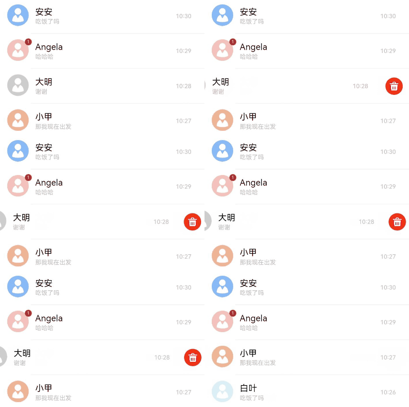
ListItem的swipeAction属性可用于实现列表项的左右滑动功能。swipeAction属性方法初始化时有必填参数SwipeActionOptions,其中,start参数表示设置列表项右滑时起始端滑出的组件,end参数表示设置列表项左滑时尾端滑出的组件。
在消息列表中,end参数表示设置ListItem左滑时尾端划出自定义组件,即删除按钮。在初始化end方法时,将滑动列表项的索引传入删除按钮组件,当用户点击删除按钮时,可以根据索引值来删除列表项对应的数据,从而实现侧滑删除功能。
-
实现尾端滑出组件的构建。
@Builder itemEnd(index: number) { // 构建尾端滑出组件 Button({ type: ButtonType.Circle }) { Image($r('app.media.ic_public_delete_filled')) .width(20) .height(20) } .onClick(() => { // this.messages为列表数据源,可根据实际场景构造。点击后从数据源删除指定数据项。 this.messages.splice(index, 1); })} -
绑定swipeAction属性到可左滑的ListItem上。
// 构建List时,通过ForEach基于数据源this.messages循环渲染ListItem。ListItem() { // ...}.swipeAction({ end: { // index为该ListItem在List中的索引值。 builder: () => { this.itemEnd(index) }, }}) // 设置侧滑属性.
给列表项添加标记
添加标记是一种无干扰性且直观的方法,用于显示通知或将注意力集中到应用内的某个区域。例如,当消息列表接收到新消息时,通常对应的联系人头像的右上方会出现标记,提示有若干条未读消息,如下图所示。
图16 给列表项添加标记
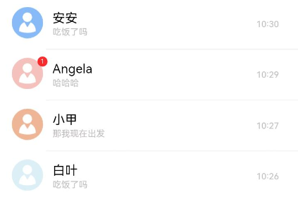
在ListItem中使用Badge组件可实现给列表项添加标记功能。Badge是可以附加在单个组件上用于信息标记的容器组件。
在消息列表中,若希望在联系人头像右上角添加标记,可在实现消息列表项ListItem的联系人头像时,将头像Image组件作为Badge的子组件。
在Badge组件中,count和position参数用于设置需要展示的消息数量和提示点显示位置,还可以通过style参数灵活设置标记的样式。
ListItem() { Badge({ count: 1, position: BadgePosition.RightTop, style: { badgeSize: 16, badgeColor: '#FA2A2D' } }) { // Image组件实现消息联系人头像 // ... }}
下拉刷新与上拉加载
页面的下拉刷新与上拉加载功能在移动应用中十分常见,例如,新闻页面的内容刷新和加载。这两种操作的原理都是通过响应用户的触摸事件,在顶部或者底部显示一个刷新或加载视图,完成后再将此视图隐藏。
以下拉刷新为例,其实现主要分成三步:
- 监听手指按下事件,记录其初始位置的值。
- 监听手指按压移动事件,记录并计算当前移动的位置与初始值的差值,大于0表示向下移动,同时设置一个允许移动的最大值。
- 监听手指抬起事件,若此时移动达到最大值,则触发数据加载并显示刷新视图,加载完成后将此视图隐藏。
说明
页面的下拉刷新操作推荐使用Refresh组件实现。
下拉刷新与上拉加载的具体实现可参考新闻数据加载。
编辑列表
列表的编辑模式用途十分广泛,常见于待办事项管理、文件管理、备忘录的记录管理等应用场景。在列表的编辑模式下,新增和删除列表项是最基础的功能,其核心是对列表项对应的数据集合进行数据添加和删除。
下面以待办事项管理为例,介绍如何快速实现新增和删除列表项功能。
新增列表项
如下图所示,当用户点击添加按钮时,提供用户新增列表项内容选择或填写的交互界面,用户点击确定后,列表中新增对应的项目。
图17 新增待办
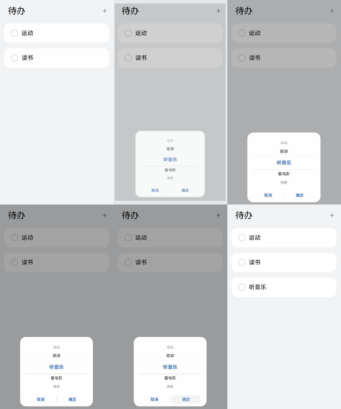
添加列表项功能实现主要流程如下:
-
定义列表项数据结构,以待办事项管理为例,首先定义待办数据结构。
//ToDo.etsimport { util } from '@kit.ArkTS' export class ToDo { key: string = util.generateRandomUUID(true); name: string; constructor(name: string) { this.name = name; }} -
构建列表整体布局和列表项。
//ToDoListItem.etsimport { ToDo } from './ToDo';@Componentexport struct ToDoListItem { @Link isEditMode: boolean @Link selectedItems: ToDo[] private toDoItem: ToDo = new ToDo(""); build() { Flex({ justifyContent: FlexAlign.SpaceBetween, alignItems: ItemAlign.Center }) { // ... } .width('100%') .height(80) //.padding() 根据具体使用场景设置 .borderRadius(24) //.linearGradient() 根据具体使用场景设置 .gesture( GestureGroup(GestureMode.Exclusive, LongPressGesture() .onAction(() => { // ... }) ) ) }} -
初始化待办列表数据和可选事项,最后,构建列表布局和列表项。
//ToDoList.etsimport { ToDo } from './ToDo';import { ToDoListItem } from './ToDoListItem';
@Entry@Componentstruct ToDoList {  @State toDoData: ToDo[] = []  @Watch('onEditModeChange') @State isEditMode: boolean = false  @State selectedItems: ToDo[] = [] private availableThings: string[] = ['读书', '运动', '旅游', '听音乐', '看电影', '唱歌']
  onEditModeChange() {    if (!this.isEditMode) {      this.selectedItems = []    } }
  build() {    Column() {      Row() {        if (this.isEditMode) {          Text('X')            .fontSize(20)            .onClick(() => {              this.isEditMode = false;            })            .margin({ left: 20, right: 20 })        } else {          Text('待办')            .fontSize(36)            .margin({ left: 40 })          Blank()          Text('+') //提供新增列表项入口,即给新增按钮添加点击事件            .onClick(() => {              this.getUIContext().showTextPickerDialog({                range: this.availableThings,                onAccept: (value: TextPickerResult) => {                  let arr = Array.isArray(value.index) ? value.index : [value.index];                  for (let i = 0; i < arr.length; i++) {                    this.toDoData.push(new ToDo(this.availableThings[arr[i]])); // 新增列表项数据toDoData(可选事项)                  }                },              })            })        }        List({ space: 10 }) {          ForEach(this.toDoData, (toDoItem: ToDo) => {            ListItem() {              // 将toDoData的每个数据放入到以model的形式放进ListItem里              ToDoListItem({                isEditMode: this.isEditMode,                toDoItem: toDoItem,                selectedItems: this.selectedItems })            }          }, (toDoItem: ToDo) => toDoItem.key.toString())        }      }    }  }}
删除列表项
如下图所示,当用户长按列表项进入删除模式时,提供用户删除列表项选择的交互界面,用户勾选完成后点击删除按钮,列表中删除对应的项目。
图18 长按删除待办事项
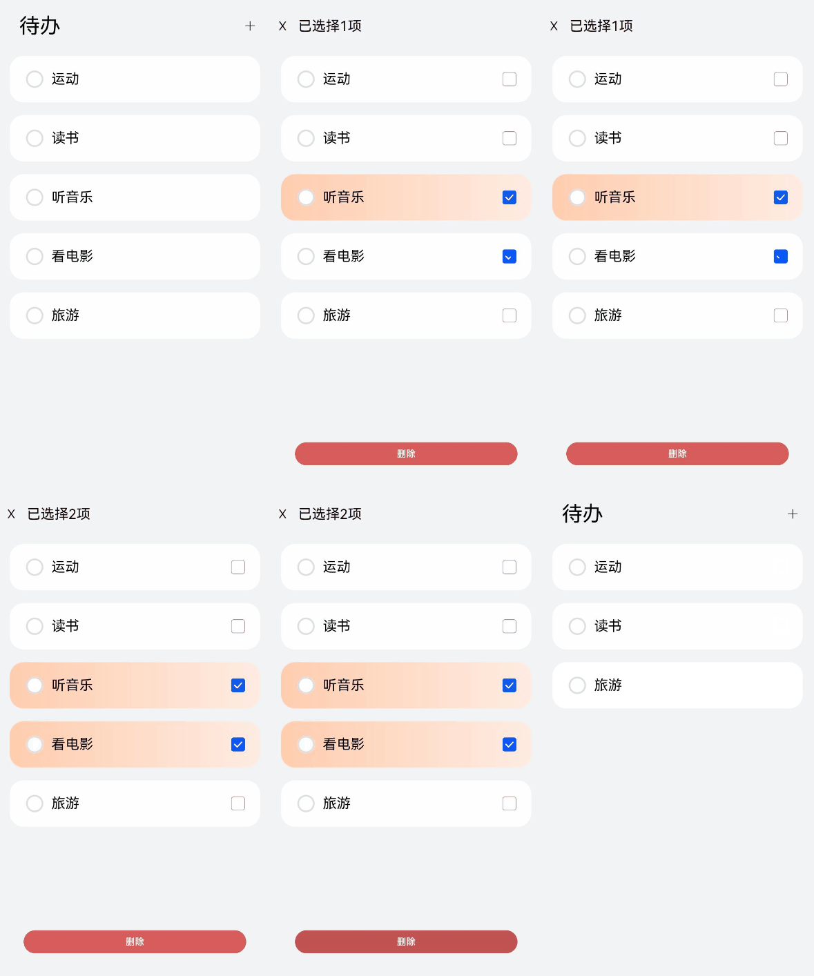
删除列表项功能实现主要流程如下:
-
列表的删除功能一般进入编辑模式后才可使用,所以需要提供编辑模式的入口。
以待办列表为例,通过监听列表项的长按事件,当用户长按列表项时,进入编辑模式。
// 结构参考export class ToDo {  key: string = util.generateRandomUUID(true);  name: string;  toDoData: ToDo[] = [];
  constructor(name: string) {    this.name = name;  }}
// 实现参考Flex({ justifyContent: FlexAlign.SpaceBetween, alignItems: ItemAlign.Center }) { // ...}.gesture(GestureGroup(GestureMode.Exclusive, LongPressGesture() .onAction(() => { if (!this.isEditMode) { this.isEditMode = true; //进入编辑模式 } }) )) -
需要响应用户的选择交互,记录要删除的列表项数据。
在待办列表中,通过勾选框的勾选或取消勾选,响应用户勾选列表项变化,记录所有选择的列表项。
// 结构参考import { util } from '@kit.ArkTS'export class ToDo { key: string = util.generateRandomUUID(true); name: string; toDoData: ToDo[] = [];
 constructor(name: string) {   this.name = name; }}
// 实现参考if (this.isEditMode) { Checkbox() .onChange((isSelected) => { if (isSelected) { this.selectedItems.push(toDoList.toDoItem) // this.selectedItems为勾选时,记录选中的列表项,可根据实际场景构造 } else { let index = this.selectedItems.indexOf(toDoList.toDoItem) if (index !== -1) { this.selectedItems.splice(index, 1) // 取消勾选时,则将此项从selectedItems中删除 } } })} -
需要响应用户点击删除按钮事件,删除列表中对应的选项。
// 结构参考import { util } from '@kit.ArkTS'export class ToDo {  key: string = util.generateRandomUUID(true);  name: string;  toDoData: ToDo[] = [];
  constructor(name: string) {    this.name = name;  }}
// 实现参考Button('删除') .onClick(() => { // this.toDoData为待办的列表项,可根据实际场景构造。点击后删除选中的列表项对应的toDoData数据 let leftData = this.toDoData.filter((item) => { return !this.selectedItems.find((selectedItem) => selectedItem == item); }) this.toDoData = leftData; this.isEditMode = false; })
长列表的处理
循环渲染适用于短列表,当构建具有大量列表项的长列表时,如果直接采用循环渲染方式,会一次性加载所有的列表元素,会导致页面启动时间过长,影响用户体验。因此,推荐使用数据懒加载(LazyForEach)方式实现按需迭代加载数据,从而提升列表性能。
关于长列表按需加载优化的具体实现可参考数据懒加载章节中的示例。
当使用懒加载方式渲染列表时,为了更好的列表滚动体验,减少列表滑动时出现白块,List组件提供了cachedCount参数用于设置列表项缓存数,只在懒加载LazyForEach中生效。
List() { // ...}.cachedCount(3)
以垂直列表为例:
- 若懒加载是用于ListItem,当列表为单列模式时,会在List显示的ListItem前后各缓存cachedCount个ListItem;若是多列模式下,会在List显示的ListItem前后各缓存cachedCount * 列数个ListItem。
- 若懒加载是用于ListItemGroup,无论单列模式还是多列模式,都是在List显示的ListItem前后各缓存cachedCount个ListItemGroup。
| 组件 | 参数名 | 参数类型 | 必填 | 描述 | 作用 |
|---|---|---|---|---|---|
| 接口List | space | number | string | 否 | 子组件主轴方向的间隔。默认值:0参数类型为number时单位为vp**说明:**设置为负数或者大于等于List内容区长度时,按默认值显示。space参数值小于List分割线宽度时,子组件主轴方向的间隔取分割线宽度。 | |
| initialIndex | number | 否 | 设置当前List初次加载时视口起始位置显示的item的索引值。默认值:0**说明:**设置为负数或超过了当前List最后一个item的索引值时视为无效取值,无效取值按默认值显示。 | ||
| scroller | Scroller | 否 | 可滚动组件的控制器。用于与可滚动组件进行绑定。**说明:**不允许和其他滚动类组件绑定同一个滚动控制对象。 | ||
| listDirection | value | Axis | 是 | 组件的排列方向。默认值:Axis.Vertical | 设置List组件排列方向 |
| divider | value | {strokeWidth: Length,color?:ResourceColor,startMargin?: Length,endMargin?: Length} | null | 是 | ListItem分割线样式。- strokeWidth: 分割线的线宽。- color: 分割线的颜色。- startMargin: 分割线与列表侧边起始端的距离。- endMargin: 分割线与列表侧边结束端的距离。 | 设置ListItem分割线样式,默认无分割线。 |
| scrollBar | value | BarState | 是 | 滚动条状态。默认值:BarState.Off**说明:**API version 9及以下版本默认值为BarState.Off,API version 10的默认值为BarState.Auto。 | 设置滚动条状态 |
| cachedCount | value | number | 是 | ListItem/ListItemGroup的预加载数量。默认值:1 | 设置列表中ListItem/ListItemGroup的预加载数量,只在LazyForEach中生效,其中ListItemGroup将作为一个整体进行计算,ListItemGroup中的所有ListItem会一次性全部加载出来。 |
| editMode | value | boolean | 是 | 当前List组件是否处于可编辑模式。默认值:false | 设置当前List组件是否处于可编辑模式。可参考示例3实现删除选中的list项。 |
| edgeEffect | value | EdgeEffect | 是 | List组件的边缘滑动效果,支持弹簧效果和阴影效果。默认值:EdgeEffect.Spring | |
| options11+ | EdgeEffectOptions | 否 | 组件内容大小小于组件自身时,是否开启滑动效果。默认值:false | 设置边缘滑动效果。 | |
| chainAnimation | value | boolean | 是 | 是否启用链式联动动效。默认值:false,不启用链式联动。true,启用链式联动 | 设置当前List是否启用链式联动动效,开启后列表滑动以及顶部和底部拖拽时会有链式联动的效果。 |
| multiSelectable | value | boolean | 是 | 是否开启鼠标框选。默认值:false,关闭框选。true,开启框选。 | 设置是否开启鼠标框选。 |
| lanes | value | number | LengthConstrain | 是 | List组件的布局列数或行数。默认值:1设置List组件的布局列数或行数。gutter为列间距,当列数大于1时生效。 | |
| gutter10+ | Dimension | 否 | 列间距。默认值:0 | ||
| alignListItem | value | ListItemAlign | 是 | 交叉轴方向的布局方式。默认值:ListItemAlign.Start | 设置List交叉轴方向宽度大于ListItem交叉轴宽度 * lanes时,ListItem在List交叉轴方向的布局方式 |
| sticky | value | StickyStyle | 是 | ListItemGroup吸顶或吸底效果。默认值:StickyStyle.None | 配合ListItemGroup组件使用,设置ListItemGroup中header和footer是否要吸顶或吸底。sticky属性可以设置为 StickyStyle.Header |
| scrollSnapAlign | value | ScrollSnapAlign | 是 | 列表项滚动结束对齐效果。默认值:ScrollSnapAlign.NONE | 设置列表项滚动结束对齐效果。 |
| enableScrollInteraction | alue | boolean | 是 | 是否支持滚动手势。默认值:true | 设置是否支持滚动手势,当设置为false时,无法通过手指或者鼠标滚动,但不影响控制器的滚动接口。 |
| scrollBarWidth | value | number | string | 是 | 滚动条的宽度。默认值:4单位:vp | 设置滚动条的宽度,不支持百分比设置。宽度设置后,滚动条正常状态和按压状态宽度均为滚动条的宽度值。如果滚动条的宽度超过List组件主轴方向的高度,则滚动条的宽度会变为默认值 |
| scrollBarColor | value | number | string | Color | 是 | 滚动条的颜色。 | 设置滚动条的颜色 |
| contentStartOffset | value | number | 是 | 内容区域起始偏移量。默认值:0单位:vp | 设置内容区域起始偏移量。列表滚动到起始位置时,列表内容与列表显示区域边界保留指定距离。 |
创建网格 (Grid/GridItem)
网格布局是由“行”和“列”分割的单元格所组成,通过指定“项目”所在的单元格做出各种各样的布局。网格布局具有较强的页面均分能力,子组件占比控制能力,是一种重要自适应布局,其使用场景有九宫格图片展示、日历、计算器等。
ArkUI提供了Grid容器组件和子组件GridItem,用于构建网格布局。Grid用于设置网格布局相关参数,GridItem定义子组件相关特征。Grid组件支持使用条件渲染、循环渲染、懒加载等方式生成子组件。
布局与约束
Grid组件为网格容器,其中容器内各条目对应一个GridItem组件,如下图所示。
图1 Grid与GridItem组件关系
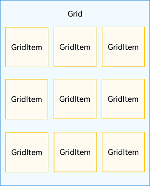
说明
Grid的子组件必须是GridItem组件。
网格布局是一种二维布局。Grid组件支持自定义行列数和每行每列尺寸占比、设置子组件横跨几行或者几列,同时提供了垂直和水平布局能力。当网格容器组件尺寸发生变化时,所有子组件以及间距会等比例调整,从而实现网格布局的自适应能力。根据Grid的这些布局能力,可以构建出不同样式的网格布局,如下图所示。
图2 网格布局
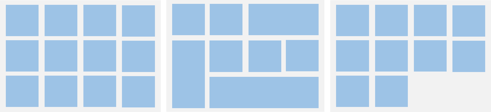
如果Grid组件设置了宽高属性,则其尺寸为设置值。如果没有设置宽高属性,Grid组件的尺寸默认适应其父组件的尺寸。
Grid组件根据行列数量与占比属性的设置,可以分为三种布局情况:
- 行、列数量与占比同时设置:Grid只展示固定行列数的元素,其余元素不展示,且Grid不可滚动。(推荐使用该种布局方式)
- 只设置行、列数量与占比中的一个:元素按照设置的方向进行排布,超出的元素可通过滚动的方式展示。
- 行列数量与占比都不设置:元素在布局方向上排布,其行列数由布局方向、单个网格的宽高等多个属性共同决定。超出行列容纳范围的元素不展示,且Grid不可滚动。
设置排列方式
设置行列数量与占比
通过设置行列数量与尺寸占比可以确定网格布局的整体排列方式。Grid组件提供了rowsTemplate和columnsTemplate属性用于设置网格布局行列数量与尺寸占比。
rowsTemplate和columnsTemplate属性值是一个由多个空格和’数字+fr’间隔拼接的字符串,fr的个数即网格布局的行或列数,fr前面的数值大小,用于计算该行或列在网格布局宽度上的占比,最终决定该行或列宽度。
图3 行列数量占比示例
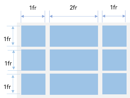
如上图所示,构建的是一个三行三列的网格布局,其在垂直方向上分为三等份,每行占一份;在水平方向上分为四等份,第一列占一份,第二列占两份,第三列占一份。
只要将rowsTemplate的值为’1fr 1fr 1fr’,同时将columnsTemplate的值为’1fr 2fr 1fr’,即可实现上述网格布局。
Grid() { ...}.rowsTemplate('1fr 1fr 1fr').columnsTemplate('1fr 2fr 1fr')
说明
当Grid组件设置了rowsTemplate或columnsTemplate时,Grid的layoutDirection、maxCount、minCount、cellLength属性不生效,属性说明可参考Grid-属性。
设置子组件所占行列数
除了大小相同的等比例网格布局,由不同大小的网格组成不均匀分布的网格布局场景在实际应用中十分常见,如下图所示。在Grid组件中,可以通过创建Grid时传入合适的GridLayoutOptions实现如图所示的单个网格横跨多行或多列的场景,其中,irregularIndexes和onGetIrregularSizeByIndex可对仅设置rowsTemplate或columnsTemplate的Grid使用;onGetRectByIndex可对同时设置rowsTemplate和columnsTemplate的Grid使用。
图4 不均匀网格布局
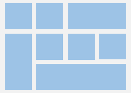
例如计算器的按键布局就是常见的不均匀网格布局场景。如下图,计算器中的按键“0”和“=”,按键“0”横跨第一、二两列,按键“=”横跨第五、六两行。使用Grid构建的网格布局,其行列标号从0开始,依次编号。
图5 计算器
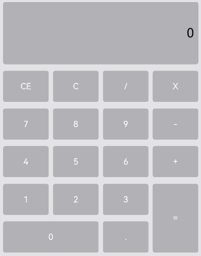
在网格中,可以通过onGetRectByIndex返回的[rowStart,columnStart,rowSpan,columnSpan]来实现跨行跨列布局,其中rowStart和columnStart属性表示指定当前元素起始行号和起始列号,rowSpan和columnSpan属性表示指定当前元素的占用行数和占用列数。
所以“0”按键横跨第一列和第二列,“=”按键横跨第五行和第六行,只要将“0”对应onGetRectByIndex的rowStart和columnStart设为5和0,rowSpan和columnSpan设为1和2,将“=”对应onGetRectByIndex的rowStart和columnStart设为4和3,rowSpan和columnSpan设为2和1即可。
layoutOptions: GridLayoutOptions = {  regularSize: [1, 1],  onGetRectByIndex: (index: number) => {    if (index == key1) { // key1是“0”按键对应的index      return [5, 0, 1, 2]    } else if (index == key2) { // key2是“=”按键对应的index      return [4, 3, 2, 1]    }    // ...    // 这里需要根据具体布局返回其他item的位置  }}
Grid(undefined, this.layoutOptions) {  // ...}.columnsTemplate('1fr 1fr 1fr 1fr').rowsTemplate('2fr 1fr 1fr 1fr 1fr 1fr')
设置主轴方向
使用Grid构建网格布局时,若没有设置行列数量与占比,可以通过layoutDirection设置网格布局的主轴方向,决定子组件的排列方式。此时可以结合minCount和maxCount属性来约束主轴方向上的网格数量。
图6 主轴方向示意图
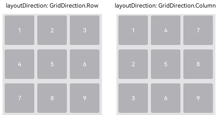
当前layoutDirection设置为Row时,先从左到右排列,排满一行再排下一行。当前layoutDirection设置为Column时,先从上到下排列,排满一列再排下一列,如上图所示。此时,将maxCount属性设为3,表示主轴方向上最大显示的网格单元数量为3。
Grid() { ...}.maxCount(3).layoutDirection(GridDirection.Row)
说明
- layoutDirection属性仅在不设置rowsTemplate和columnsTemplate时生效,此时元素在layoutDirection方向上排列。
- 仅设置rowsTemplate时,Grid主轴为水平方向,交叉轴为垂直方向。
- 仅设置columnsTemplate时,Grid主轴为垂直方向,交叉轴为水平方向。
在网格布局中显示数据
网格布局采用二维布局的方式组织其内部元素,如下图所示。
图7 通用办公服务
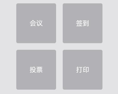
Grid组件可以通过二维布局的方式显示一组GridItem子组件。
Grid() {  GridItem() {    Text('会议')      ...  }
  GridItem() {    Text('签到')      ...  }
  GridItem() {    Text('投票')      ...  }
  GridItem() {    Text('打印')      ...  }}.rowsTemplate('1fr 1fr').columnsTemplate('1fr 1fr')
对于内容结构相似的多个GridItem,通常更推荐使用ForEach语句中嵌套GridItem的形式,来减少重复代码。
@Entry@Componentstruct OfficeService {  @State services: Array<string> = ['会议', '投票', '签到', '打印']
  build() {    Column() {      Grid() {        ForEach(this.services, (service:string) => {          GridItem() {            Text(service)          }        }, (service:string):string => service)      }      .rowsTemplate(('1fr 1fr') as string)      .columnsTemplate(('1fr 1fr') as string)    }  }}
设置行列间距
在两个网格单元之间的网格横向间距称为行间距,网格纵向间距称为列间距,如下图所示。
图8 网格的行列间距
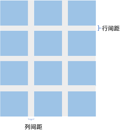
通过Grid的rowsGap和columnsGap可以设置网格布局的行列间距。在图5所示的计算器中,行间距为15vp,列间距为10vp。
Grid() { ...}.columnsGap(10).rowsGap(15)
构建可滚动的网格布局
可滚动的网格布局常用在文件管理、购物或视频列表等页面中,如下图所示。在设置Grid的行列数量与占比时,如果仅设置行、列数量与占比中的一个,即仅设置rowsTemplate或仅设置columnsTemplate属性,网格单元按照设置的方向排列,超出Grid显示区域后,Grid拥有可滚动能力。
图9 横向可滚动网格布局

如果设置的是columnsTemplate,Grid的滚动方向为垂直方向;如果设置的是rowsTemplate,Grid的滚动方向为水平方向。
如上图所示的横向可滚动网格布局,只要设置rowsTemplate属性的值且不设置columnsTemplate属性,当内容超出Grid组件宽度时,Grid可横向滚动进行内容展示。
@Entry@Componentstruct Shopping {  @State services: Array<string> = ['直播', '进口']
  build() {    Column({ space: 5 }) {      Grid() {        ForEach(this.services, (service: string, index) => {          GridItem() {          }          .width('25%')        }, (service:string):string => service)      }      .rowsTemplate('1fr 1fr') // 只设置rowsTemplate属性,当内容超出Grid区域时,可水平滚动。      .rowsGap(15)    }  }}
控制滚动位置
与新闻列表的返回顶部场景类似,控制滚动位置功能在网格布局中也很常用,例如下图所示日历的翻页功能。
图10 日历翻页
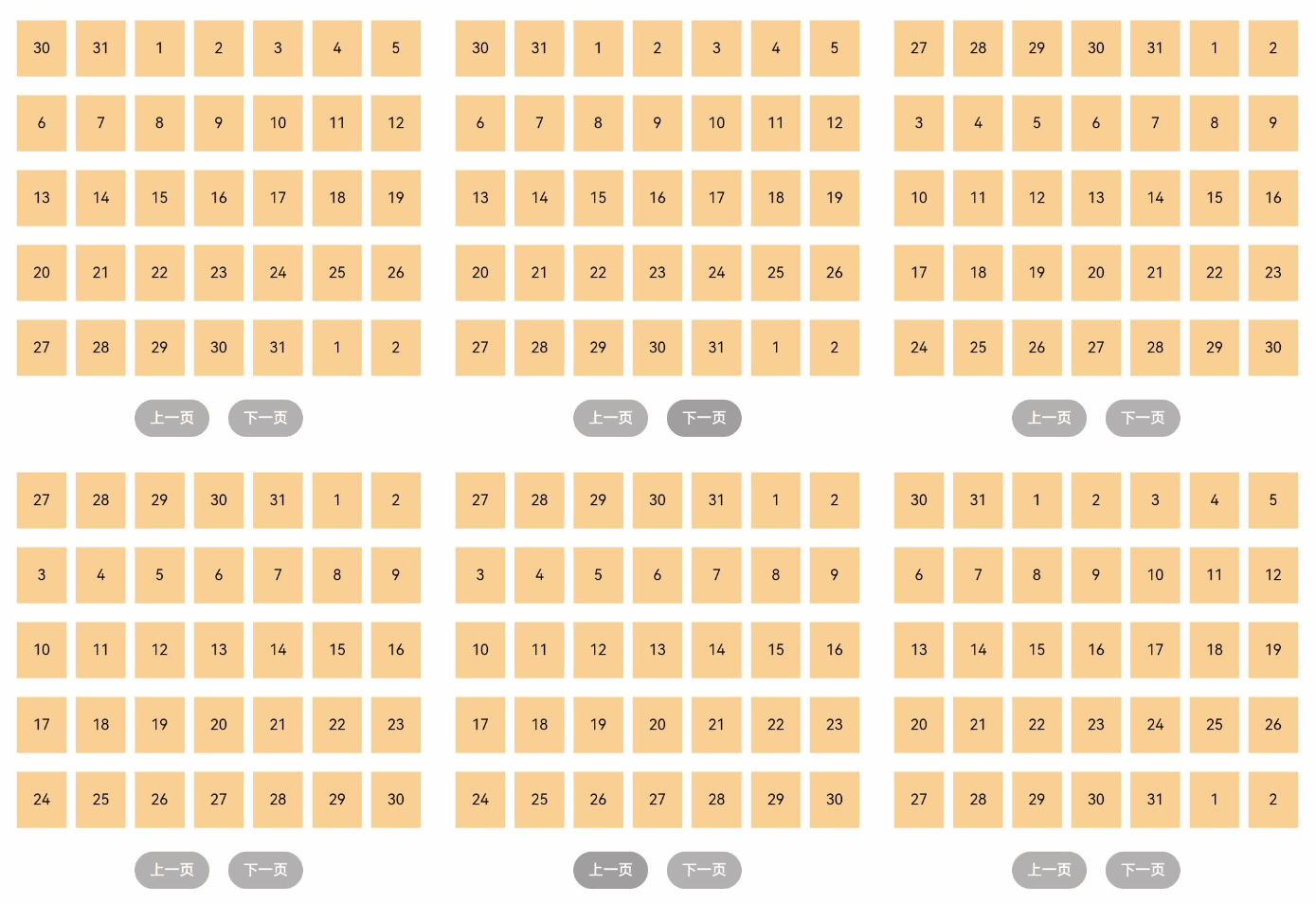
Grid组件初始化时,可以绑定一个Scroller对象,用于进行滚动控制,例如通过Scroller对象的scrollPage方法进行翻页。
private scroller: Scroller = new Scroller()
在日历页面中,用户在点击“下一页”按钮时,应用响应点击事件,通过指定scrollPage方法的参数next为true,滚动到下一页。
Column({ space: 5 }) {  Grid(this.scroller) {  }  .columnsTemplate('1fr 1fr 1fr 1fr 1fr 1fr 1fr')
  Row({space: 20}) {    Button('上一页')      .onClick(() => {        this.scroller.scrollPage({          next: false        })      })
    Button('下一页')      .onClick(() => {        this.scroller.scrollPage({          next: true        })      })  }}
性能优化
与长列表的处理类似,循环渲染适用于数据量较小的布局场景,当构建具有大量网格项的可滚动网格布局时,推荐使用数据懒加载方式实现按需迭代加载数据,从而提升列表性能。
关于按需加载优化的具体实现可参考数据懒加载章节中的示例。
当使用懒加载方式渲染网格时,为了更好的滚动体验,减少滑动时出现白块,Grid组件中也可通过cachedCount属性设置GridItem的预加载数量,只在懒加载LazyForEach中生效。
设置预加载数量后,会在Grid显示区域前后各缓存cachedCount*列数个GridItem,超出显示和缓存范围的GridItem会被释放。
Grid() { LazyForEach(this.dataSource, () => { GridItem() { } })}.cachedCount(3)
| 组件 | 参数名 | 参数类型 | 必填 | 描述 | 作用 |
|---|---|---|---|---|---|
| 接口Grid | scroller | Scroller | 否 | 可滚动组件的控制器。用于与可滚动组件进行绑定。**说明:**不允许和其他滚动类组件,如:List、Grid、Scroll等绑定同一个滚动控制对象。 | |
| layoutOptions10+ | GridLayoutOptions | 否 | 滚动Grid布局选项。 | ||
| GridLayoutOptions | regularSize | [number, number] | 是 | 大小规则的GridItem在Grid中占的行数和列数,只支持占1行1列即[1, 1]。元服务API: 从API version 11开始,该接口支持在元服务中使用。 | |
| irregularIndexes | number[] | 否 | 指定的GridItem索引在Grid中的大小是不规则的。当不设置onGetIrregularSizeByIndex时,irregularIndexes中GridItem的默认大小为垂直滚动Grid的一整行或水平滚动Grid的一整列。元服务API: 从API version 11开始,该接口支持在元服务中使用。 | ||
| onGetIrregularSizeByIndex | (index: number) => [number, number] | 否 | 配合irregularIndexes使用,设置不规则GridItem占用的行数和列数。开发者可为irregularIndexes中指明的index对应的GridItem设置占用的行数和列数。在API version 12之前,垂直滚动Grid不支持GridItem占多行,水平滚动Grid不支持GridItem占多列。元服务API: 从API version 11开始,该接口支持在元服务中使用。 | ||
| onGetRectByIndex11+ | (index: number) => [number, number,number,number] | 否 | 设置指定索引index对应的GridItem的位置及大小[rowStart,columnStart,rowSpan,columnSpan]。其中rowStart为行起始位置,columnStart为列起始位置,无单位。rowSpan为GridItem占用的行数,columnSpan为GridItem占用的列数,无单位。rowStart和columnStart取大于等于0的自然数,若取负数时,rowStart和columnStart默认为0。rowSpan和columnSpan取大于等于1的自然数,若取小数则向下取整,若小于1则按1计算。**说明:**第一种情况:某个GridItem发现给它指定的起始位置被占据了,则从起始位置[0,0]开始按顺序从左到右,从上到下寻找起始的放置位置。第二种情况:如果起始位置没有被占据,但其他位置被占据了,无法显示全部的GridItem大小,则只会布局一部分。元服务API: 从API version 12开始,该接口支持在元服务中使用。 | ||
| columnsTemplate | value | string | 是 | 当前网格布局列的数量或最小列宽值。 | 设置当前网格布局列的数量或最小列宽值,不设置时默认1列。'1fr 1fr 2fr’是将父组件分3行,将父组件允许的高分为4等份,第一行占1份,第二行占一份,第三行占2份。 |
| rowsTemplate | value | string | 是 | 当前网格布局行的数量或最小行高值。 | 设置当前网格布局行的数量或最小行高值,不设置时默认1行。例如, '1fr 1fr 2fr’是将父组件分3行,将父组件允许的高分为4等份,第一行占1份,第二行占一份,第三行占2份。 |
| columnsGap | value | Length | 是 | 列与列的间距。默认值:0 | 设置列与列的间距。设置为小于0的值时,按默认值显示。 |
| rowsGap | value | Length | 是 | 行与行的间距。默认值:0 | 设置行与行的间距。设置为小于0的值时,按默认值显示。 |
| 接口GridItem | value11+ | GridItemOptions | 否 | 为GridItem提供可选参数, 该对象内含有GridItemStyle枚举类型的style参数 |
创建轮播 (Swiper)
Swiper组件提供滑动轮播显示的能力。Swiper本身是一个容器组件,当设置了多个子组件后,可以对这些子组件进行轮播显示。通常,在一些应用首页显示推荐的内容时,需要用到轮播显示的能力。
针对复杂页面场景,可以使用 Swiper 组件的预加载机制,利用主线程的空闲时间来提前构建和布局绘制组件,优化滑动体验。
布局与约束
Swiper作为一个容器组件,如果设置了自身尺寸属性,则在轮播显示过程中均以该尺寸生效。如果自身尺寸属性未被设置,则分两种情况:如果设置了prevMargin或者nextMargin属性,则Swiper自身尺寸会跟随其父组件;如果未设置prevMargin或者nextMargin属性,则会自动根据子组件的大小设置自身的尺寸。
循环播放
通过loop属性控制是否循环播放,该属性默认值为true。
当loop为true时,在显示第一页或最后一页时,可以继续往前切换到前一页或者往后切换到后一页。如果loop为false,则在第一页或最后一页时,无法继续向前或者向后切换页面。
- loop为true
Swiper() {  Text('0')    .width('90%')    .height('100%')    .backgroundColor(Color.Gray)    .textAlign(TextAlign.Center)    .fontSize(30)
  Text('1')    .width('90%')    .height('100%')    .backgroundColor(Color.Green)    .textAlign(TextAlign.Center)    .fontSize(30)
  Text('2')    .width('90%')    .height('100%')    .backgroundColor(Color.Pink)    .textAlign(TextAlign.Center)    .fontSize(30)}.loop(true)

- loop为false
Swiper() { // ...}.loop(false)

自动轮播
Swiper通过设置autoPlay属性,控制是否自动轮播子组件。该属性默认值为false。
autoPlay为true时,会自动切换播放子组件,子组件与子组件之间的播放间隔通过interval属性设置。interval属性默认值为3000,单位毫秒。
Swiper() { // ...}.loop(true).autoPlay(true).interval(1000)

导航点样式
Swiper提供了默认的导航点样式和导航点箭头样式,导航点默认显示在Swiper下方居中位置,开发者也可以通过indicator属性自定义导航点的位置和样式,导航点箭头默认不显示。
通过indicator属性,开发者可以设置导航点相对于Swiper组件上下左右四个方位的位置,同时也可以设置每个导航点的尺寸、颜色、蒙层和被选中导航点的颜色。
- 导航点使用默认样式
Swiper() {  Text('0')    .width('90%')    .height('100%')    .backgroundColor(Color.Gray)    .textAlign(TextAlign.Center)    .fontSize(30)
  Text('1')    .width('90%')    .height('100%')    .backgroundColor(Color.Green)    .textAlign(TextAlign.Center)    .fontSize(30)
  Text('2')    .width('90%')    .height('100%')    .backgroundColor(Color.Pink)    .textAlign(TextAlign.Center)    .fontSize(30)}
- 自定义导航点样式
导航点直径设为30vp,左边距为0,导航点颜色设为红色。
Swiper() { // ...}.indicator( Indicator.dot() .left(0) .itemWidth(15) .itemHeight(15) .selectedItemWidth(30) .selectedItemHeight(15) .color(Color.Red) .selectedColor(Color.Blue))
Swiper通过设置displayArrow属性,可以控制导航点箭头的大小、位置、颜色,底板的大小及颜色,以及鼠标悬停时是否显示箭头。
- 箭头使用默认样式
Swiper() { // ...}.displayArrow(true, false)
- 自定义箭头样式
箭头显示在组件两侧,大小为18vp,导航点箭头颜色设为蓝色。
Swiper() { // ...}.displayArrow({ showBackground: true, isSidebarMiddle: true, backgroundSize: 24, backgroundColor: Color.White, arrowSize: 18, arrowColor: Color.Blue }, false)
页面切换方式
Swiper支持手指滑动、点击导航点和通过控制器三种方式切换页面,以下示例展示通过控制器切换页面的方法。
@Entry@Componentstruct SwiperDemo {  private swiperController: SwiperController = new SwiperController();
  build() {    Column({ space: 5 }) {      Swiper(this.swiperController) {        Text('0')          .width(250)          .height(250)          .backgroundColor(Color.Gray)          .textAlign(TextAlign.Center)          .fontSize(30)        Text('1')          .width(250)          .height(250)          .backgroundColor(Color.Green)          .textAlign(TextAlign.Center)          .fontSize(30)        Text('2')          .width(250)          .height(250)          .backgroundColor(Color.Pink)          .textAlign(TextAlign.Center)          .fontSize(30)      }      .indicator(true)
      Row({ space: 12 }) {        Button('showNext')          .onClick(() => {            this.swiperController.showNext(); // 通过controller切换到后一页          })        Button('showPrevious')          .onClick(() => {            this.swiperController.showPrevious(); // 通过controller切换到前一页          })      }.margin(5)    }.width('100%')    .margin({ top: 5 })  }}

轮播方向
Swiper支持水平和垂直方向上进行轮播,主要通过vertical属性控制。
当vertical为true时,表示在垂直方向上进行轮播;为false时,表示在水平方向上进行轮播。vertical默认值为false。
- 设置水平方向上轮播。
Swiper() { // ...}.indicator(true).vertical(false)
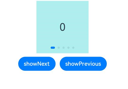
- 设置垂直方向轮播。
Swiper() { // ...}.indicator(true).vertical(true)
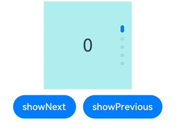
每页显示多个子页面
Swiper支持在一个页面内同时显示多个子组件,通过displayCount属性设置。
Swiper() { Text('0') .width(250) .height(250) .backgroundColor(Color.Gray) .textAlign(TextAlign.Center) .fontSize(30) Text('1') .width(250) .height(250) .backgroundColor(Color.Green) .textAlign(TextAlign.Center) .fontSize(30) Text('2') .width(250) .height(250) .backgroundColor(Color.Pink) .textAlign(TextAlign.Center) .fontSize(30) Text('3') .width(250) .height(250) .backgroundColor(Color.Blue) .textAlign(TextAlign.Center) .fontSize(30)}.indicator(true).displayCount(2)
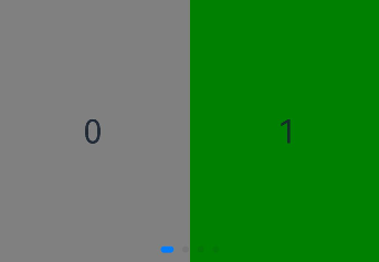
自定义切换动画
Swiper支持通过customContentTransition设置自定义切换动画,可以在回调中对视窗内所有页面逐帧设置透明度、缩放比例、位移、渲染层级等属性实现自定义切换动画。
@Entry@Componentstruct SwiperCustomAnimationExample {  private DISPLAY_COUNT: number = 2  private MIN_SCALE: number = 0.75
  @State backgroundColors: Color[] = [Color.Green, Color.Blue, Color.Yellow, Color.Pink, Color.Gray, Color.Orange]  @State opacityList: number[] = []  @State scaleList: number[] = []  @State translateList: number[] = []  @State zIndexList: number[] = []
  aboutToAppear(): void {    for (let i = 0; i < this.backgroundColors.length; i++) {      this.opacityList.push(1.0)      this.scaleList.push(1.0)      this.translateList.push(0.0)      this.zIndexList.push(0)    }  }
  build() {    Column() {      Swiper() {        ForEach(this.backgroundColors, (backgroundColor: Color, index: number) => {          Text(index.toString()).width('100%').height('100%').fontSize(50).textAlign(TextAlign.Center)            .backgroundColor(backgroundColor)            .opacity(this.opacityList[index])            .scale({ x: this.scaleList[index], y: this.scaleList[index] })            .translate({ x: this.translateList[index] })            .zIndex(this.zIndexList[index])        })      }      .height(300)      .indicator(false)      .displayCount(this.DISPLAY_COUNT, true)      .customContentTransition({        timeout: 1000,        transition: (proxy: SwiperContentTransitionProxy) => {          if (proxy.position <= proxy.index % this.DISPLAY_COUNT || proxy.position >= this.DISPLAY_COUNT + proxy.index % this.DISPLAY_COUNT) {            // 同组页面完全滑出视窗外时,重置属性值            this.opacityList[proxy.index] = 1.0            this.scaleList[proxy.index] = 1.0            this.translateList[proxy.index] = 0.0            this.zIndexList[proxy.index] = 0          } else {            // 同组页面未滑出视窗外时,对同组中左右两个页面,逐帧根据position修改属性值            if (proxy.index % this.DISPLAY_COUNT === 0) {              this.opacityList[proxy.index] = 1 - proxy.position / this.DISPLAY_COUNT              this.scaleList[proxy.index] = this.MIN_SCALE + (1 - this.MIN_SCALE) * (1 - proxy.position / this.DISPLAY_COUNT)              this.translateList[proxy.index] = - proxy.position * proxy.mainAxisLength + (1 - this.scaleList[proxy.index]) * proxy.mainAxisLength / 2.0            } else {              this.opacityList[proxy.index] = 1 - (proxy.position - 1) / this.DISPLAY_COUNT              this.scaleList[proxy.index] = this.MIN_SCALE + (1 - this.MIN_SCALE) * (1 - (proxy.position - 1) / this.DISPLAY_COUNT)              this.translateList[proxy.index] = - (proxy.position - 1) * proxy.mainAxisLength - (1 - this.scaleList[proxy.index]) * proxy.mainAxisLength / 2.0            }            this.zIndexList[proxy.index] = -1          }        }      })    }.width('100%')  }}

| 组件 | 参数名 | 参数类型 | 必填 | 描述 | 作用 |
|---|---|---|---|---|---|
| 接口Swiper | controller | SwiperController | 否 | 给组件绑定一个控制器,用来控制组件翻页。 | |
| autoPlay | value | boolean | 是 | 子组件是否自动播放。默认值:false | 设置子组件是否自动播放 |
| interval | value | number | 是 | 自动播放时播放的时间间隔。默认值:3000单位:毫秒 | 设置使用自动播放时播放的时间间隔。 |
| indicator | value | DotIndicator10+ | DigitIndicator10+ | boolean | 是 | 可选导航点指示器样式。- DotIndicator:圆点指示器样式。- DigitIndicator:数字指示器样式。- boolean:是否启用导航点指示器。默认值:true默认类型:DotIndicator | 设置可选导航点指示器样式 |
| loop | value | boolean | 是 | 是否开启循环。默认值:true | 设置是否开启循环。设置为true时表示开启循环,在LazyForEach懒循环加载模式下,加载的组件数量建议大于5个。 |
| duration | value | number | 是 | 子组件切换的动画时长。默认值:400单位:毫秒 | 设置子组件切换的动画时长。 |
| vertical | value | boolean | 是 | 是否为纵向滑动。默认值:false | 设置是否为纵向滑动。 |
| itemSpace | value | number | string | 是 | 子组件与子组件之间间隙。默认值:0 | 设置子组件与子组件之间间隙。不支持设置百分比 |
| displayMode | value | SwiperDisplayMode | 是 | 主轴方向上元素排列的模式。默认值:SwiperDisplayMode.STRETCH | 设置主轴方向上元素排列的模式,优先以displayCount设置的个数显示,displayCount未设置时本属性生效 |
| cachedCoun | value | number | 是 | 预加载子组件个数。默认值:1 | 设置预加载子组件个数, 以当前页面为基准,加载当前显示页面的前后个数。例如cachedCount=1时,会将当前显示的页面的前面一页和后面一页的子组件都预加载。如果设置为按组翻页,即displayCount的swipeByGroup参数设为true,预加载时会以组为基本单位。例如cachedCount=1,swipeByGroup=true时,会将当前组的前面一组和后面一组的子组件都预加载。 |
| disableSwipe | value | boolean | 是 | 禁用组件滑动切换功能。默认值:false | 设置禁用组件滑动切换功能 |
| indicatorStyle | value | IndicatorStyle | 否 | 导航点样式。 | 设置导航点样式。 |
| displayCount | value | number | string | SwiperAutoFill10+ | 是 | 视窗内显示的子元素个数。默认值:1 | 设置Swiper视窗内元素显示个数 |
| swipeByGroup11+ | boolean | 否 | 是否按组进行翻页。如果设为true,在翻页时会按组进行翻页,每组内子元素的数量为displayCount value的值;如果为false,则为默认翻页行为,即按照子元素进行翻页。默认值:false | ||
| effectMode | value | EdgeEffect | 是 | 边缘滑动效果。默认值:EdgeEffect.Spring | 设置边缘滑动效果,loop = false时生效。 目前支持的滑动效果参见EdgeEffect的枚举说明。控制器接口调用时不生效回弹。 |
| displayArrow | alue | boolean | ArrowStyle | 是 | 支持设置箭头和底板样式,异常场景使用ArrowStyle对象中的默认值。 | 设置导航点箭头样式。 |
| isHoverShow | boolean | 否 | 设置鼠标悬停时是否显示箭头。默认值:false**说明:**isHoverShow为false时,常驻显示箭头,支持点击翻页。isHoverShow为true时,只有在鼠标悬停时才会显示箭头,并支持点击翻页。 | ||
| nextMargin | value | Length | 是 | 后边距。默认值:0 | 设置后边距,用于露出后一项的一小部分。仅当SwiperDisplayMode为STRETCH模式时生效。 |
| ignoreBlank12+ | boolean | 否 | 非loop场景下尾页不显示nextMargin。默认值:false**说明:**尾页场景下,prevMargin和nextMargin的值相加作为左边边距显示前一个页面。 | ||
| prevMargin | value | Length | 是 | 前边距。默认值:0 | 设置前边距,用于露出前一项的一小部分。仅当SwiperDisplayMode为STRETCH模式时生效 |
| ignoreBlank12+ | boolean | 否 | 非loop场景下首页不显示prevMargin。默认值:false**说明:**首页场景下,prevMargin和nextMargin的值相加作为右边边距显示后一个页面。 | ||
| nestedScroll | value | SwiperNestedScrollMode | 是 | Swiper组件和父组件的嵌套滚动模式。默认值:SwiperNestedScrollMode.SELF_ONLY | 设置Swiper组件和父组件的嵌套滚动模式。loop为true时Swiper组件没有边缘,不会触发父组件嵌套滚动 |
| SwiperDisplayMode枚举说明 | Stretch(deprecated) | Swiper滑动一页的宽度为Swiper组件自身的宽度。从API version 10开始不再维护,建议使用STRETCH代替。 | |||
| AutoLinear(deprecated) | Swiper滑动一页的宽度为子组件宽度中的最大值。从API version 10开始不再维护,建议使用Scroller.scrollTo代替 | ||||
| STRETCH10+ | Swiper滑动一页的宽度为Swiper组件自身的宽度。元服务API: 从API version 11开始,该接口支持在元服务中使用 | ||||
| AUTO_LINEAR(deprecated) | Swiper滑动一页的宽度为视窗内最左侧子组件的宽度。从API version 10开始支持,从API version 12开始不再维护,建议使用Scroller.scrollTo代替。元服务API: 从API version 11开始,该接口支持在元服务中使用。 | ||||
| Indicator | left | Length | 是 | 设置导航点距离Swiper组件左边的距离。默认值:0单位:vp设置导航点距离Swiper组件距离。 | |
| top | Length | 是 | 设置导航点距离Swiper组件顶部的距离。默认值:0单位:vp | ||
| right | Length | 是 | 设置导航点距离Swiper组件右边的距离。默认值:0单位:vp | ||
| bottom | Length | 是 | 设置导航点距离Swiper组件底部的距离。默认值:0单位:vp | ||
| start12+ | LengthMetrics | 是 | 在RTL模式下为航点距离Swiper组件右边的距离,在LTR模式下为导航点距离Swiper组件左边的距离默认值:0单位:vp | ||
| end12+ | LengthMetrics | 是 | 在RTL模式下为航点距离Swiper组件左边的距离,在LTR模式下为导航点距离Swiper组件右边的距离。默认值:0单位:vp | ||
| static dot | 无 | 是 | 返回一个DotIndicator对象。 | ||
| static digit | 无 | 是 | 返回一个DigitIndicator对象。 |
选项卡 (Tabs)
当页面信息较多时,为了让用户能够聚焦于当前显示的内容,需要对页面内容进行分类,提高页面空间利用率。Tabs组件可以在一个页面内快速实现视图内容的切换,一方面提升查找信息的效率,另一方面精简用户单次获取到的信息量。
基本布局
Tabs组件的页面组成包含两个部分,分别是TabContent和TabBar。TabContent是内容页,TabBar是导航页签栏,页面结构如下图所示,根据不同的导航类型,布局会有区别,可以分为底部导航、顶部导航、侧边导航,其导航栏分别位于底部、顶部和侧边。
图1 Tabs组件布局示意图
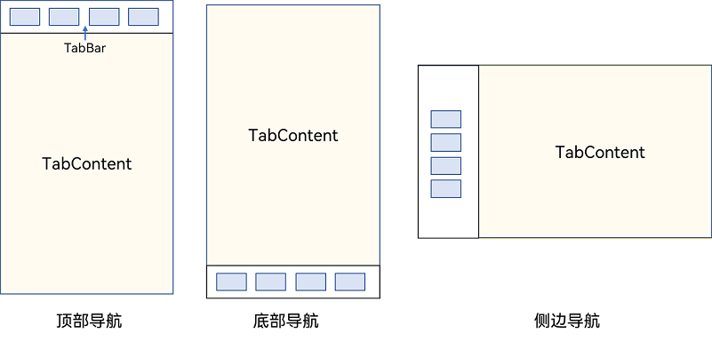
说明
- TabContent组件不支持设置通用宽度属性,其宽度默认撑满Tabs父组件。
- TabContent组件不支持设置通用高度属性,其高度由Tabs父组件高度与TabBar组件高度决定。
Tabs使用花括号包裹TabContent,如图2,其中TabContent显示相应的内容页。
图2 Tabs与TabContent使用
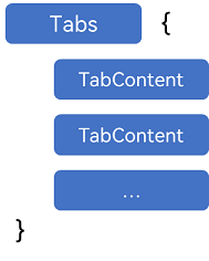
每一个TabContent对应的内容需要有一个页签,可以通过TabContent的tabBar属性进行配置。在如下TabContent组件上设置tabBar属性,可以设置其对应页签中的内容,tabBar作为内容的页签。
TabContent() { Text('首页的内容').fontSize(30) }.tabBar('首页')
设置多个内容时,需在Tabs内按照顺序放置。
Tabs() {  TabContent() {    Text('首页的内容').fontSize(30)  }  .tabBar('首页')
  TabContent() {    Text('推荐的内容').fontSize(30)  }  .tabBar('推荐')
  TabContent() {    Text('发现的内容').fontSize(30)  }  .tabBar('发现')    TabContent() {    Text('我的内容').fontSize(30)  }  .tabBar("我的")}
底部导航
底部导航是应用中最常见的一种导航方式。底部导航位于应用一级页面的底部,用户打开应用,能够分清整个应用的功能分类,以及页签对应的内容,并且其位于底部更加方便用户单手操作。底部导航一般作为应用的主导航形式存在,其作用是将用户关心的内容按照功能进行分类,迎合用户使用习惯,方便在不同模块间的内容切换。
图3 底部导航栏
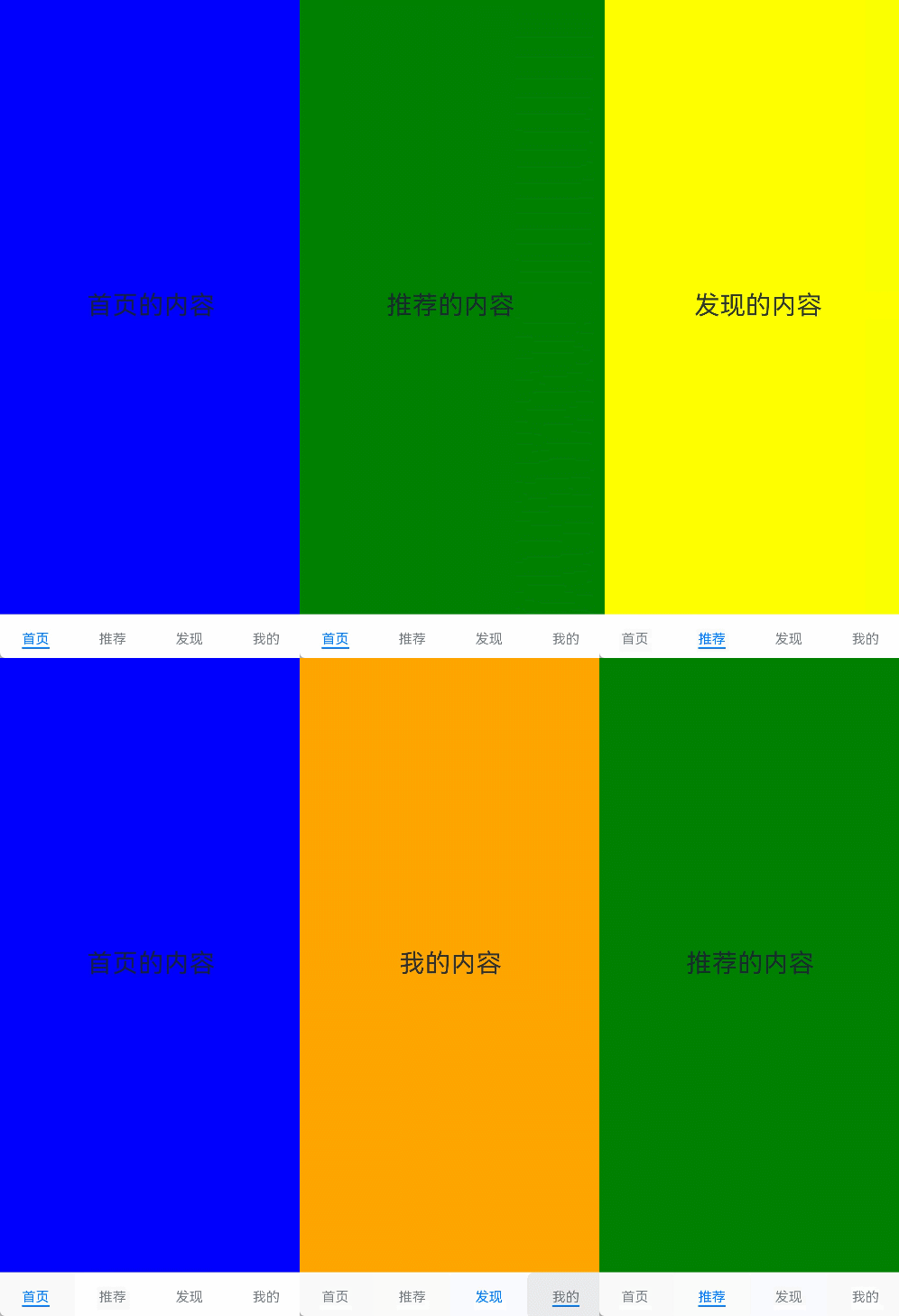
导航栏位置使用Tabs的barPosition参数进行设置。默认情况下,导航栏位于顶部,此时,barPosition为BarPosition.Start。设置为底部导航时,需要将barPosition设置为BarPosition.End。
Tabs({ barPosition: BarPosition.End }) { // TabContent的内容:首页、发现、推荐、我的 ...}
顶部导航
当内容分类较多,用户对不同内容的浏览概率相差不大,需要经常快速切换时,一般采用顶部导航模式进行设计,作为对底部导航内容的进一步划分,常见一些资讯类应用对内容的分类为关注、视频、数码,或者主题应用中对主题进行进一步划分为图片、视频、字体等。
图4 顶部导航栏
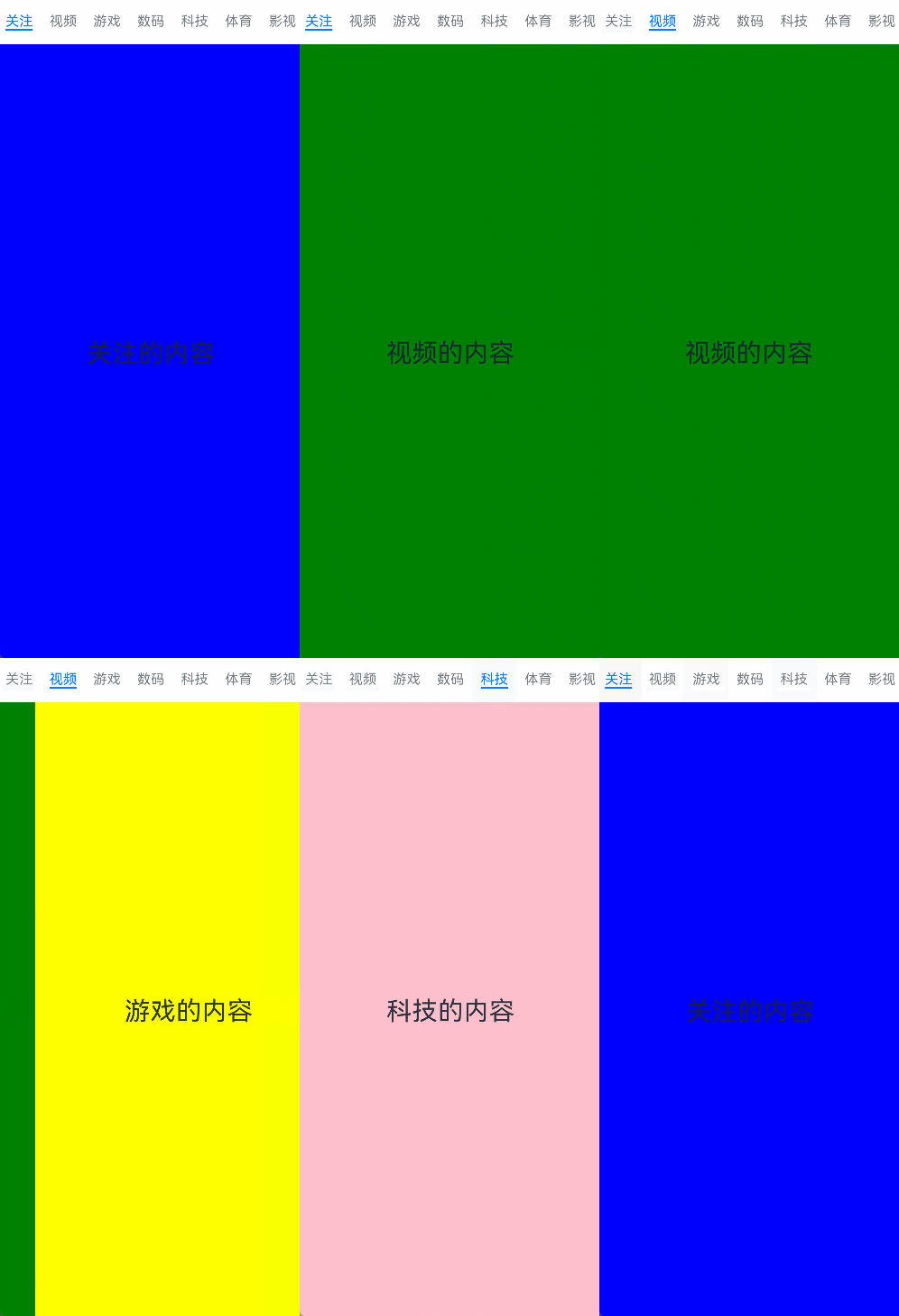
Tabs({ barPosition: BarPosition.Start }) { // TabContent的内容:关注、视频、游戏、数码、科技、体育、影视 ...}
侧边导航
侧边导航是应用较为少见的一种导航模式,更多适用于横屏界面,用于对应用进行导航操作,由于用户的视觉习惯是从左到右,侧边导航栏默认为左侧侧边栏。
图5 侧边导航栏
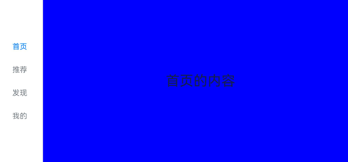
实现侧边导航栏需要将Tabs的vertical属性设置为true,vertical默认值为false,表明内容页和导航栏垂直方向排列。
Tabs({ barPosition: BarPosition.Start }) { // TabContent的内容:首页、发现、推荐、我的 ...}.vertical(true).barWidth(100).barHeight(200)
说明
- vertical为false时,tabbar的宽度默认为撑满屏幕的宽度,需要设置barWidth为合适值。
- vertical为true时,tabbar的高度默认为实际内容的高度,需要设置barHeight为合适值。
限制导航栏的滑动切换
默认情况下,导航栏都支持滑动切换,在一些内容信息量需要进行多级分类的页面,如支持底部导航+顶部导航组合的情况下,底部导航栏的滑动效果与顶部导航出现冲突,此时需要限制底部导航的滑动,避免引起不好的用户体验。
图6 限制底部导航栏滑动

控制滑动切换的属性为scrollable,默认值为true,表示可以滑动,若要限制滑动切换页签则需要设置为false。
Tabs({ barPosition: BarPosition.End }) {  TabContent(){    Column(){      Tabs(){        // 顶部导航栏内容        ...      }    }    .backgroundColor('#ff08a8f1')    .width('100%')  }  .tabBar('首页')
  // 其他TabContent内容:发现、推荐、我的  ...}.scrollable(false)
固定导航栏
当内容分类较为固定且不具有拓展性时,例如底部导航内容分类一般固定,分类数量一般在3-5个,此时使用固定导航栏。固定导航栏不可滚动,无法被拖拽滚动,内容均分tabBar的宽度。
图7 固定导航栏

Tabs的barMode属性用于控制导航栏是否可以滚动,默认值为BarMode.Fixed。
Tabs({ barPosition: BarPosition.End }) { // TabContent的内容:首页、发现、推荐、我的 ...}.barMode(BarMode.Fixed)
滚动导航栏
滚动导航栏可以用于顶部导航栏或者侧边导航栏的设置,内容分类较多,屏幕宽度无法容纳所有分类页签的情况下,需要使用可滚动的导航栏,支持用户点击和滑动来加载隐藏的页签内容。
图8 可滚动导航栏

滚动导航栏需要设置Tabs组件的barMode属性,默认值为BarMode.Fixed表示为固定导航栏,BarMode.Scrollable表示可滚动导航栏。
Tabs({ barPosition: BarPosition.Start }) { // TabContent的内容:关注、视频、游戏、数码、科技、体育、影视、人文、艺术、自然、军事 ...}.barMode(BarMode.Scrollable)
自定义导航栏
对于底部导航栏,一般作为应用主页面功能区分,为了更好的用户体验,会组合文字以及对应语义图标表示页签内容,这种情况下,需要自定义导航页签的样式。
图9 自定义导航栏
系统默认情况下采用了下划线标志当前活跃的页签,而自定义导航栏需要自行实现相应的样式,用于区分当前活跃页签和未活跃页签。
设置自定义导航栏需要使用tabBar的参数,以其支持的CustomBuilder的方式传入自定义的函数组件样式。例如这里声明tabBuilder的自定义函数组件,传入参数包括页签文字title,对应位置index,以及选中状态和未选中状态的图片资源。通过当前活跃的currentIndex和页签对应的targetIndex匹配与否,决定UI显示的样式。
@Builder tabBuilder(title: string, targetIndex: number, selectedImg: Resource, normalImg: Resource) { Column() { Image(this.currentIndex === targetIndex ? selectedImg : normalImg) .size({ width: 25, height: 25 }) Text(title) .fontColor(this.currentIndex === targetIndex ? '#1698CE' : '#6B6B6B') } .width('100%') .height(50) .justifyContent(FlexAlign.Center)}
在TabContent对应tabBar属性中传入自定义函数组件,并传递相应的参数。
TabContent() { Column(){ Text('我的内容') } .width('100%') .height('100%') .backgroundColor('#007DFF')}.tabBar(this.tabBuilder('我的', 0, $r('app.media.mine_selected'), $r('app.media.mine_normal')))
切换至指定页签
在不使用自定义导航栏时,默认的Tabs会实现切换逻辑。在使用了自定义导航栏后,默认的Tabs仅实现滑动内容页和点击页签时内容页的切换逻辑,页签切换逻辑需要自行实现。即用户滑动内容页和点击页签时,页签栏需要同步切换至内容页对应的页签。
图10 内容页和页签不联动

此时需要使用Tabs提供的onChange事件方法,监听索引index的变化,并将当前活跃的index值传递给currentIndex,实现页签的切换。
@Entry@Componentstruct TabsExample1 {  @State currentIndex: number = 2
  @Builder tabBuilder(title: string, targetIndex: number) {    Column() {      Text(title)        .fontColor(this.currentIndex === targetIndex ? '#1698CE' : '#6B6B6B')    }  }
  build() {    Column() {      Tabs({ barPosition: BarPosition.End }) {        TabContent() {          ...        }.tabBar(this.tabBuilder('首页', 0))
        TabContent() {          ...        }.tabBar(this.tabBuilder('发现', 1))
        TabContent() {          ...        }.tabBar(this.tabBuilder('推荐', 2))
        TabContent() {          ...        }.tabBar(this.tabBuilder('我的', 3))      }      .animationDuration(0)      .backgroundColor('#F1F3F5')      .onChange((index: number) => {        this.currentIndex = index      })    }.width('100%')  }}
图11 内容页和页签联动

若希望不滑动内容页和点击页签也能实现内容页和页签的切换,可以将currentIndex传给Tabs的index参数,通过改变currentIndex来实现跳转至指定索引值对应的TabContent内容。也可以使用TabsController,TabsController是Tabs组件的控制器,用于控制Tabs组件进行内容页切换。通过TabsController的changeIndex方法来实现跳转至指定索引值对应的TabContent内容。
@State currentIndex: number = 2private controller: TabsController = new TabsController()
Tabs({ barPosition: BarPosition.End, index: this.currentIndex, controller: this.controller }) {  ...}.height(600).onChange((index: number) => {   this.currentIndex = index})
Button('动态修改index').width('50%').margin({ top: 20 })  .onClick(()=>{    this.currentIndex = (this.currentIndex + 1) % 4})
Button('changeIndex').width('50%').margin({ top: 20 })  .onClick(()=>{    let index = (this.currentIndex + 1) % 4    this.controller.changeIndex(index)})
图12 切换指定页签
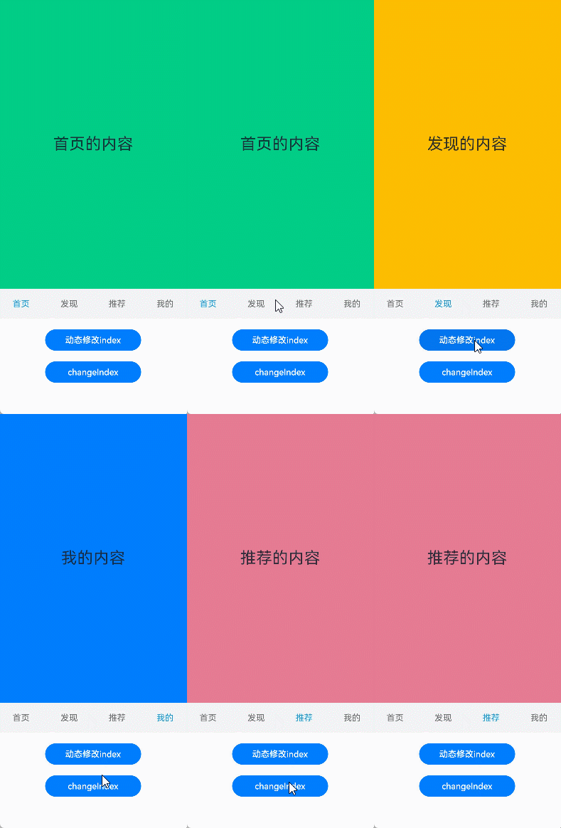
开发者可以通过Tabs组件的onContentWillChange接口,设置自定义拦截回调函数。拦截回调函数在下一个页面即将展示时被调用,如果回调返回true,新页面可以展示;如果回调返回false,新页面不会展示,仍显示原来页面。
Tabs({ barPosition: BarPosition.End, controller: this.controller, index: this.currentIndex }) {...}.onContentWillChange((currentIndex, comingIndex) => { if (comingIndex == 2) { return false } return true})
图13 支持开发者自定义页面切换拦截事件

| 组件 | 参数名 | 参数类型 | 必填 | 描述 | 作用 |
|---|---|---|---|---|---|
| 接口Tabs | barPosition | BarPosition | 否 | 设置Tabs的页签位置。默认值:BarPosition.Start | |
| index | number | 否 | 设置当前显示页签的索引。默认值:0**说明:**设置为小于0的值时按默认值显示。可选值为[0, TabContent子节点数量-1]。直接修改index跳页时,切换动效不生效。 使用TabController的changeIndex时,默认生效切换动效,可以设置animationDuration为0关闭动画。从API version 10开始,该参数支持$$双向绑定变量。 | ||
| controller | TabsController | 否 | 设置Tabs控制器。 | ||
| BarPosition枚举说明 | Start | vertical属性方法设置为true时,页签位于容器左侧;vertical属性方法设置为false时,页签位于容器顶部。 | Tabs页签位置枚举。 | ||
| End | vertical属性方法设置为true时,页签位于容器右侧;vertical属性方法设置为false时,页签位于容器底部。 | ||||
| vertical | value | boolean | 是 | 是否为纵向Tab。默认值:false,横向Tabs,为true时纵向Tabs。当横向Tabs设置height为auto时,Tabs组件高度自适应子组件高度,即为tabBar高度+divider线宽+TabContent高度+上下padding值+上下border宽度。当纵向Tabs设置width为auto时,Tabs组件宽度自适应子组件宽度,即为tabBar宽度+divider线宽+TabContent宽度+左右padding值+左右border宽度。 | 设置是否为纵向Tab。 |
| scrollable | value | boolean | 是 | 是否可以通过滑动页面进行页面切换。默认值:true,可以通过滑动页面进行页面切换。为false时不可滑动切换页面。 | 设置是否可以通过滑动页面进行页面切换。 |
| barMode | value | BarMode | 是 | 布局模式。默认值:BarMode.Fixed | 设置TabBar布局模式 |
| options10+。 | ScrollableBarModeOptions | 否 | Scrollable模式下的TabBar的布局样式。**说明:**仅Scrollable模式下有效 | ||
| barWidth | value | Length8+ | 是 | TabBar的宽度值。默认值:未设置SubTabBarStyle和BottomTabBarStyle的TabBar且vertical属性为false时,默认值为Tabs的宽度。未设置SubTabBarStyle和BottomTabBarStyle的TabBar且vertical属性为true时,默认值为56vp。设置SubTabBarStyle样式且vertical属性为false时,默认值为Tabs的宽度。设置SubTabBarStyle样式且vertical属性为true时,默认值为56vp。设置BottomTabBarStyle样式且vertical属性为true时,默认值为96vp。设置BottomTabBarStyle样式且vertical属性为false时,默认值为Tabs的宽度 | 设置TabBar的宽度值。设置为小于0或大于Tabs宽度值时,按默认值显示。 |
| barHeight | value | Length8+ | 是 | TabBar的高度值。默认值:未设置带样式的TabBar且vertical属性为false时,默认值为56vp。未设置带样式的TabBar且vertical属性为true时,默认值为Tabs的高度。设置SubTabBarStyle样式且vertical属性为false时,默认值为56vp。设置SubTabBarStyle样式且vertical属性为true时,默认值为Tabs的高度。设置BottomTabBarStyle样式且vertical属性为true时,默认值为Tabs的高度。设置BottomTabBarStyle样式且vertical属性为false时,默认值为56vp, 从API Version 12开始,默认值变更为52vp。 | 设置TabBar的高度值。设置为小于0或大于Tabs高度值时,按默认值显示。 |
| animationDuration | value | number | 是 | 点击TabBar页签和调用TabsController的changeIndex接口切换TabContent的动画时长。默认值:API version 10及以前,不设置该属性或设置为null时,默认值为0ms,即点击TabBar页签和调用TabsController的changeIndex接口切换TabContent无动画。设置为小于0或undefined时,默认值为300ms。API version 11及以后,不设置该属性或设置为异常值,且设置TabBar为BottomTabBarStyle样式时,默认值为0ms。设置TabBar为其他样式时,默认值为300ms。 | 设置点击TabBar页签和调用TabsController的changeIndex接口切换TabContent的动画时长。该参数不支持百分比设置。 |
| divider | value | DividerStyle | null | 是 | 分割线样式,默认不显示分割线。DividerStyle: 分割线的样式;null: 不显示分割线。 | 设置区分TabBar和TabContent的分割线样式 |
| fadingEdge | value | boolean | 是 | 页签超过容器宽度时是否渐隐消失。默认值:true | 设置页签超过容器宽度时是否渐隐消失。建议配合barBackgroundColor属性一起使用,如果barBackgroundColor属性没有定义,会默认显示页签末端为白色的渐隐效果。 |
| barOverlap | value | boolean | 是 | TabBar是否背后变模糊并叠加在TabContent之上。默认值:false | 设置TabBar是否背后变模糊并叠加在TabContent之上。 |
| barBackgroundColor | value | ResourceColor | 是 | TabBar的背景颜色。默认值:透明 | 设置TabBar的背景颜色。 |
| barBackgroundBlurStyle | value | BlurStyle | 是 | TabBar的背景模糊材质。默认值:BlurStyle.NONE | 设置TabBar的背景模糊材质。 |
| DividerStyle | strokeWidth | Length | 是 | 分割线的线宽(不支持百分比设置)。默认值:0.0单位:vp | 分割线样式对象。 |
| color | ResourceColor | 否 | 分割线的颜色。默认值:#33182431 | ||
| startMargin | Length | 否 | 分割线与侧边栏顶端的距离(不支持百分比设置)。默认值:0.0单位:vp | ||
| endMargin | Length | 否 | 分割线与侧边栏底端的距离(不支持百分比设置)。默认值:0.0单位:vp | ||
| BarGridColumnOptions | margin | Dimension | 否 | 栅格模式下的column边距(不支持百分比设置)。默认值:24.0单位:vp | TabBar栅格化方式设置的对象,包括栅格模式下的column边距和间隔,以及小、中、大屏下,页签占用的columns数量 |
| gutter | Dimension | 否 | 栅格模式下的column间隔(不支持百分比设置)。默认值:24.0单位:vp | ||
| sm | number | 否 | 小屏下,页签占用的columns数量,必须是非负偶数。小屏为大于等于320vp但小于600vp。默认值为-1,代表页签占用TabBar全部宽度。 | ||
| md | number | 否 | 中屏下,页签占用的columns数量,必须是非负偶数。中屏为大于等于600vp但小于800vp。默认值为-1,代表页签占用TabBar全部宽度。 | ||
| lg | number | 否 | 大屏下,页签占用的columns数量,必须是非负偶数。大屏为大于等于840vp但小于1024vp。默认值为-1,代表页签占用TabBar全部宽度。 | ||
| BarMode枚举说明 | Scrollable | 0 | 每一个TabBar均使用实际布局宽度,超过总长度(横向Tabs的barWidth,纵向Tabs的barHeight)后可滑动。 | ||
| Fixed | 1 | 所有TabBar平均分配barWidth宽度(纵向时平均分配barHeight高度)。 |
多选Checkbox
| 组件 | 参数名 | 参数类型 | 必填 | 描述 | 作用 |
|---|---|---|---|---|---|
| options | CheckboxOptions | 否 | 配置复选框的参数。 | ||
| CheckboxOptions对象说明 | name | string | 否 | 用于指定多选框名称。 | |
| group | string | 否 | 用于指定多选框所属群组的名称(即所属CheckboxGroup的名称)。**说明:**未配合使用CheckboxGroup组件时,此值无用。 | ||
| indicatorBuilder12+ | CustomBuilder | 否 | 配置多选框的选中样式为自定义组件。自定义组件与Checkbox组件为中心点对齐显示。indicatorBuilder设置为undefined/null时,默认为indicatorBuilder未设置状态。 | ||
| select | value | boolean | 是 | 多选框是否选中。默认值:false | 设置多选框是否选中。 |
| selectedColor | value | ResourceColor | 是 | 多选框选中状态颜色。默认值:$r(‘sys.color.ohos_id_color_text_primary_activated’)。异常值按照默认值处理。 | 设置多选框选中状态颜色。 |
| unselectedColor | value | ResourceColor | 是 | 多选框非选中状态边框颜色。默认值:‘#33ffffff’。 | 设置多选框非选中状态边框颜色。 |
| mark | value | MarkStyle | 是 | 多选框内部图标样式。 从API version 12开始,设置了indicatorBuilder时,按照indicatorBuilder中的内容显示。 | 设置多选框内部图标样式。 |
| shape | value | CheckBoxShape | 是 | CheckBox组件形状, 包括圆形和圆角方形。默认值:CheckBoxShape.CIRCLE | 设置CheckBox组件形状, 包括圆形和圆角方形 |
| contentModifier | modifier | ContentModifier | 是 | 在CheckBox组件上,定制内容区的方法。modifier: 内容修改器,开发者需要自定义class实现ContentModifier接口。 | 定制CheckBox内容区的方法。 |
---------------------------------------- |
| | options | CheckboxOptions | 否 | 配置复选框的参数。 | |
| CheckboxOptions对象说明 | name | string | 否 | 用于指定多选框名称。 | |
| | group | string | 否 | 用于指定多选框所属群组的名称(即所属CheckboxGroup的名称)。**说明:**未配合使用CheckboxGroup组件时,此值无用。 | |
| | indicatorBuilder12+ | CustomBuilder | 否 | 配置多选框的选中样式为自定义组件。自定义组件与Checkbox组件为中心点对齐显示。indicatorBuilder设置为undefined/null时,默认为indicatorBuilder未设置状态。 | |
| select | value | boolean | 是 | 多选框是否选中。默认值:false | 设置多选框是否选中。 |
| selectedColor | value | ResourceColor | 是 | 多选框选中状态颜色。默认值:$r(‘sys.color.ohos_id_color_text_primary_activated’)。异常值按照默认值处理。 | 设置多选框选中状态颜色。 |
| unselectedColor | value | ResourceColor | 是 | 多选框非选中状态边框颜色。默认值:‘#33ffffff’。 | 设置多选框非选中状态边框颜色。 |
| mark | value | MarkStyle | 是 | 多选框内部图标样式。 从API version 12开始,设置了indicatorBuilder时,按照indicatorBuilder中的内容显示。 | 设置多选框内部图标样式。 |
| shape | value | CheckBoxShape | 是 | CheckBox组件形状, 包括圆形和圆角方形。默认值:CheckBoxShape.CIRCLE | 设置CheckBox组件形状, 包括圆形和圆角方形 |
| contentModifier | modifier | ContentModifier | 是 | 在CheckBox组件上,定制内容区的方法。modifier: 内容修改器,开发者需要自定义class实现ContentModifier接口。 | 定制CheckBox内容区的方法。 |

讨论HarmonyOS开发技术,专注于API与组件、DevEco Studio、测试、元服务和应用上架分发等。
更多推荐

 29
29 0
0- 0


 已为社区贡献7条内容

所有评论(0)