HarmonyOS NEXT开发之文本框(TextArea)
TextArea 可以用来设置多行文本,用法和TextInput基本一致否设置无输入时的提示文本。text否设置输入框当前的文本内容。从API version 10开始,该参数支持双向绑定变量。
·
前言:
TextArea 可以用来设置多行文本,用法和TextInput基本一致
常用参数:
|
参数名 |
类型 |
是否必填 |
说明 |
|
placeholder |
否 |
设置无输入时的提示文本。 |
|
|
text |
否 |
设置输入框当前的文本内容。 从API version 10开始,该参数支持$$双向绑定变量。 |
参考代码:
TextArea(value?:{placeholder?: ResourceStr, text?: ResourceStr, controller?: TextAreaController})
常用属性:
|
名称 |
参数类型 |
描述 |
|
type |
InputType |
设置输入框类型。 默认值:InputType.Normal |
|
placeholderColor |
设置placeholder文本颜色。 默认值跟随主题。 |
|
|
showCounter |
value: boolean, options11+?: InputCounterOptions |
参数value为true时,才能设置options,文本框开启计数下标功能,需要配合maxlength(设置最大字符限制)一起使用。 |
|
maxLength |
number |
设置文本的最大输入字符数。 |
代码实例如下:
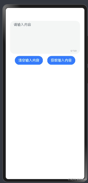
@Entry
@Component
struct Index {
  @State info:string = ''
  build() {
    Column(){
      TextArea({placeholder:'请输入内容',text:$$this.info})
        .maxLines(1)
        .maxLength(100)
        .showCounter(true)
        .height(150)
      Row({space:20}){
        Button('清空输入内容')
          .onClick(()=>{
            this.info=''
          })
        Button('获取输入内容')
          .onClick(()=>{
            AlertDialog.show({
              message:this.info
            })
          })
      }
      .margin({top:10})
    }
    .padding(20)
  }
}

讨论HarmonyOS开发技术,专注于API与组件、DevEco Studio、测试、元服务和应用上架分发等。
更多推荐
 23
23 0
0- 0


 已为社区贡献15条内容

所有评论(0)