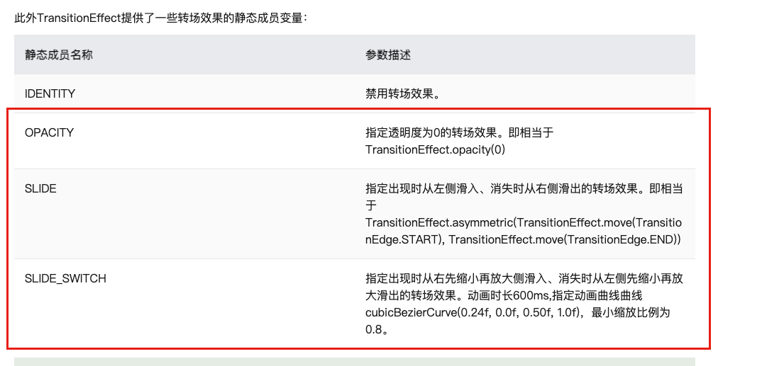
鸿蒙开发之动画
属性接口(以下简称属性)包含尺寸属性、布局属性、位置属性等多种类型,用于控制组件的行为。针对当前界面上的组件,其部分属性(如位置属性)的变化会引起UI的变化。根据变化时是否能够添加动画,可以将属性分为可动画属性和不可动画属性。组件内转场主要通过transition属性配置转场参数,在组件插入和删除时显示过渡动效,主要用于容器组件中的子组件插入和删除时,提升用户体验。解释:不论是组件的显示隐藏还是属
·
属性动画
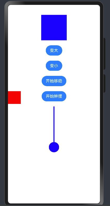
- 属性接口(以下简称属性)包含尺寸属性、布局属性、位置属性等多种类型,用于控制组件的行为。针对当前界面上的组件,其部分属性(如位置属性)的变化会引起UI的变化。添加动画可以让属性值从起点逐渐变化到终点,从而产生连续的动画效果。根据变化时是否能够添加动画,可以将属性分为可动画属性和不可动画属性。
- 可动画属性:系统可动画属性:
| 分类 | 说明 |
|---|---|
| 布局属性 | 位置、大小、内边距、外边距、对齐方式、权重等。 |
| 仿射变换 | 平移、旋转、缩放、锚点等。 |
| 背景 | 背景颜色、背景模糊等。 |
| 内容 | 文字大小、文字颜色,图片对齐方式、模糊等。 |
| 前景 | 前景颜色等。 |
| Overlay | Overlay属性等。 |
| 外观 | 透明度、圆角、边框、阴影等。 |
| … | … |
- 属性动画的实现方式有两种
- animation属性
- animateTo闭包函数
- 使用animateTo闭包函数
- animateTo(value: AnimateParam, event: () => void): void
- 原理:通用函数,对闭包前界面和闭包中的状态变量引起的界面之间的差异做动画。支持多次调用,支持嵌套。
- 解释:不论是组件的显示隐藏还是属性的变化,使用animateTo都可以实现动画
@Entry
@Component
struct AnimationCase {
  @State
  rWidth: number = 100
  @State
  xPostion: number = 0
  @State
  angle: number = 0

  build() {
    Column({ space: 20 }) {
      Row()
        .width(this.rWidth)
        .aspectRatio(1)
        .backgroundColor(Color.Blue)
      // .animation({
      //   duration: 500,
      //   iterations: -1,
      //   playMode: PlayMode.AlternateReverse
      // })
      Button("变大")
        .onClick(() => {
          animateTo({ duration: 500, iterations: -1, playMode: PlayMode.AlternateReverse }, () => {
            this.rWidth = 200
          })

        })
      Button("变小")
        .onClick(() => {
          this.rWidth = 100
        })

      Row()
        .width(50)
        .aspectRatio(1)
        .backgroundColor(Color.Red)
        .position({
          x: this.xPostion,
          y: 300
        })
        .animation({
          duration: 1000,
          iterations: -1,
          playMode: PlayMode.AlternateReverse
        })
      Button("开始移动")
        .onClick(() => {
          this.xPostion = 310
        })
      Button("开始钟摆")
        .onClick(() => {
          animateTo({ duration: 1000, iterations: -1 }, () => {
            this.angle = 360
          })

        })

      // 钟摆
      RelativeContainer() {
        Row()
          .width(4)
          .height(140)
          .backgroundColor(Color.Blue)
          .alignRules({
            middle: {
              anchor: '__container__',
              align: HorizontalAlign.Center
            }
          })
          .id("row1")

        Row()
          .width(40)
          .aspectRatio(1)
          .borderRadius(20)
          .backgroundColor(Color.Blue)
          .alignRules({
            middle: {
              anchor: '__container__',
              align: HorizontalAlign.Center
            },
            top: {
              anchor: 'row1',
              align: VerticalAlign.Bottom
            }
          })

      }.width(40)
      // .backgroundColor(Color.Gray)
      .rotate({
        angle: this.angle,
        centerX: 20,
        centerY: 0
      })

      // Button("开始恢复")
      //   .onClick(() => {
      //     this.xPostion = 0
      //   })
    }
    .height('100%')
    .width('100%')
  }
}
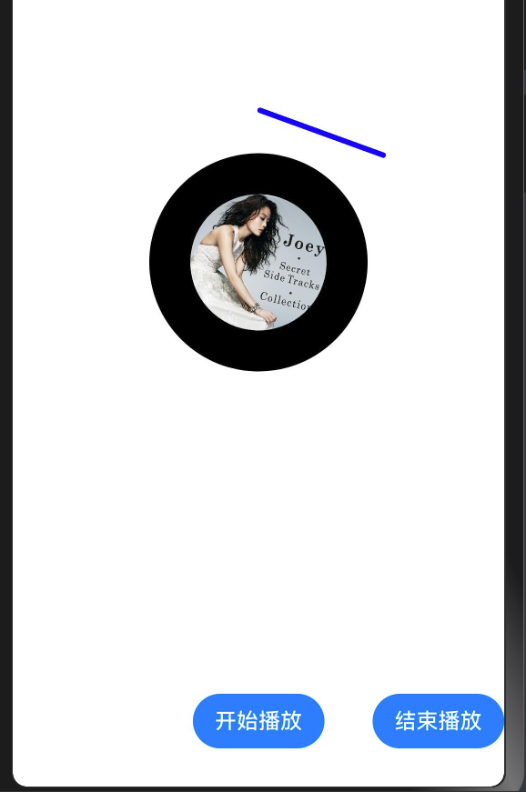
- 通过animation属性
- 识别组件的可动画属性变化,自动添加动画。
- 组件的接口调用是从下往上执行,animation只会作用于在其之上的属性调用。
- 组件可以根据调用顺序对多个属性设置不同的animation。
import Animator, { AnimatorResult } from '@ohos.animator'

@Entry
@Component
struct AnimatorCase {
  anObj: AnimatorResult | null = null
  @State
  angle: number = 0
  @State
  zAngle: number = 20

  aboutToAppear(): void {
    this.initAnimator()
  }

  initAnimator() {
    this.anObj = Animator.create({
      duration: 1000 * 15,
      easing: 'linear',
      delay: 0,
      fill: "none",
      iterations: -1,
      direction: "normal",
      begin: 0,
      end: 360
    })
    // 监听每帧的回调函数
    this.anObj.onFrame = (val) => {
      this.angle = val
    }
  }

  build() {
    RelativeContainer() {
      Row()
        .width(100)
        .height(4)
        .backgroundColor(Color.Blue)
        .borderRadius(2)
        .alignRules({
          left: {
            anchor: '__container__',
            align: HorizontalAlign.Center
          },
          bottom: {
            anchor: "c1",
            align: VerticalAlign.Top
          }
        })
        .rotate({
          angle: this.zAngle,
          centerX: 0,
          centerY: 0
        })
        .margin({
          bottom: 30
        })

      Row() {
        Image("https://img.1ting.com/images/special/411/20ca07249293be89fd8634480ec995d2.jpg")
          .width(100)
          .aspectRatio(1)
          .borderRadius(50)
      }
      .borderRadius(80)
      .width(160)
      .aspectRatio(1)
      .backgroundColor(Color.Black)
      .justifyContent(FlexAlign.Center)
      .alignRules({
        center: {
          anchor: '__container__',
          align: VerticalAlign.Center
        },
        middle: {
          anchor: '__container__',
          align: HorizontalAlign.Center
        }
      })
      .rotate({
        angle: this.angle,
        centerX: 80,
        centerY: 80
      })
      .id("c1")


      Button("开始播放")
        .alignRules({
          bottom: {
            anchor: '__container__',
            align: VerticalAlign.Bottom
          },
          middle: {
            anchor: '__container__',
            align: HorizontalAlign.Center
          }
        })
        .onClick(() => {
          this.anObj?.play()
          animateTo({ duration: 1000 }, () => {
            this.zAngle = 45
          })

        })
      Button("结束播放")
        .alignRules({
          bottom: {
            anchor: '__container__',
            align: VerticalAlign.Bottom
          },
          right: {
            anchor: '__container__',
            align: HorizontalAlign.End
          }
        })
        .onClick(() => {
          this.anObj?.pause()
          animateTo({ duration: 1000 }, () => {
            this.zAngle = 20
          })

        })
    }
    .height('100%')
    .width('100%')
  }
}
做一个心跳的案例吧,使用之前的点赞图标
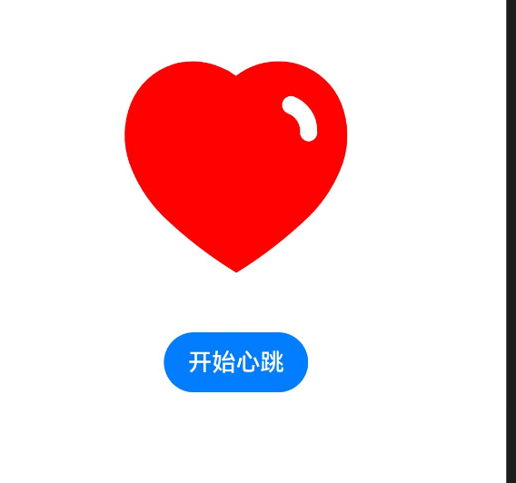
- 注意: 停止动画的方式不能再设置-具体看后面的解决方案
- 需要针对animation进行整体对象赋值,如果停止动画需要设置duration为0
@Entry
@Component
struct HeartCase {
  @State
  scaleValue: number = 1
  @State
  animationObj: AnimateParam = {
    duration: 500,
    playMode: PlayMode.Alternate,
    iterations: -1
  }

  build() {
    Row() {
      Column({ space: 20 }) {
        Column() {
          Image($r('app.media.like'))
            .width(60)
            .height(60)
            .fillColor(Color.Red)
            .scale({ x: this.scaleValue, y: this.scaleValue })
            .animation(this.animationObj)
        }.height(120)

        Button(this.scaleValue === 3 ? "结束心跳" : "开始心跳")
          .onClick(() => {
             if(this.scaleValue === 3) {
               // 清理
               this.scaleValue = 1
               this.animationObj = {
                 duration: 0,
               }
             }else {
               this.scaleValue = 3
               this.animationObj = {
                 duration: 500,
                 playMode: PlayMode.Alternate,
                 iterations: -1
               }
             }
          })
      }
      .width('100%')
    }
    .height('100%')
  }
}
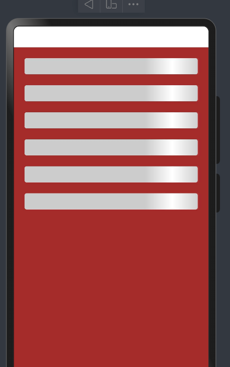
骨架屏的动画案例
@Entry
@Component
struct SkleonCase {
  @State message: string = 'Hello World';

  build() {
    RelativeContainer() {
      HmSkeleton()
    }
    .height('100%')
    .width('100%')
  }
}

@Component
struct HmSkeleton {
  build() {
    Column({ space: 20 }) {
      HmSkeletonItem()
      HmSkeletonItem()
      HmSkeletonItem()
      HmSkeletonItem()
      HmSkeletonItem()
      HmSkeletonItem()

    }
    .padding(20)
    .width("100%")
    .height("100%")
    .backgroundColor(Color.Brown)
  }
}

@Component
struct HmSkeletonItem {
  @State
  transLateX: number = 0

  build() {
    Row() {
      Row()
        .width(100)
        .height("100%")
        .position({
          x: this.transLateX
        })
        .linearGradient({
          direction: GradientDirection.Right,
          colors: [["rgba(255,255,255, 0)", 0], ["rgba(255,255,255, 1)", 0.5], ["rgba(255,255,255, 0)", 1]]
        })
        .onAppear(() => {
          animateTo({ duration: 1500, iterations: -1 }, () => {
            this.transLateX = 240
          })

        })
    }
    .width("100%")
    .height(30)
    .backgroundColor("#ccc")
    .borderRadius(4)
  }
}
图片帧动画
:::success
通过使用ImageAnimator组件实现逐帧播放图片的能力,可以配置需要播放的图片列表,每张图片可以配置时长
:::
@Entry
@Component
struct ImageAnimateCase {
  @State
  list: ImageFrameInfo[] = []
  @State
  state: AnimationStatus = AnimationStatus.Initial // 播放状态

  aboutToAppear(): void {
    this.list = [1, 2, 3, 4, 5, 6].map(item => {
      return { src: `/pages/10/images/coin${item}.png` } as ImageFrameInfo
    })
  }

  build() {
    Column({ space: 20 }) {
      ImageAnimator()
        .images(this.list)
        .width(300)
        .state(this.state)
        .iterations(-1)
        .aspectRatio(1)
        .duration(200)

      Button("播放/暂停")
        .onClick(() => {
          if (this.state !== AnimationStatus.Running) {
            this.state = AnimationStatus.Running
          } else {
            this.state = AnimationStatus.Paused
          }
        })
    }
    .justifyContent(FlexAlign.Center)
    .alignItems(HorizontalAlign.Center)
    .height('100%')
    .width('100%')
  }
}
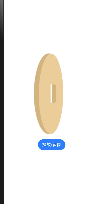
- 通过state属性可以控制图片的动画的执行方式
转场动画
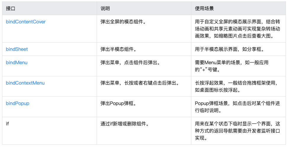
- 出现/消失转场
- 模态转场 bindSheet 半模态
- 共享元素转场
- 页面转场
- 组件内转场 transition属性
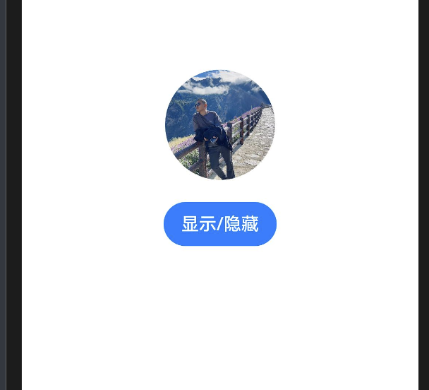
- 出现/消失专场 直接使用animateTo闭包函数即可
@Entry
@Component
struct ShowOrHideCase {
  @State message: string = 'Hello World';
  @State
  showMessage: boolean = false
  build() {
    Row() {
      Column() {
        Column() {
          if(this.showMessage) {
            Text(this.message)
              .fontSize(50)
              .fontWeight(FontWeight.Bold)
          }
        }
        .height(50)

        Button("显示/隐藏")
          .onClick(() => {
             animateTo({ duration: 1000 },  () => {
              this.showMessage = !this.showMessage
             })
          })

      }
      .width('100%')
    }
    .height('100%')
  }
}
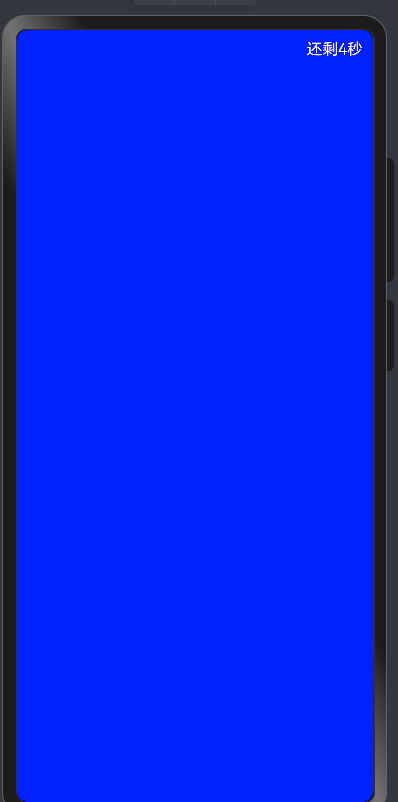
- 模态转场
- 模态转场是新的界面覆盖在旧的界面上,旧的界面不消失的一种转场方式
- 这里没用过的就是全屏模态,测试一下
@Entry
@Component
struct ShowOrHideCase {
  @State message: string = 'Hello World';
  @State
  showMessage: boolean = false
  @State
  showDialog: boolean = false
  @State
  timeCount: number = 5
  timer: number  = -1
  aboutToAppear(): void {
    this.showDialog = true
    this.beginCount()
  }
  @Builder
  getContent () {
    Column() {
      Row() {
       Text(`还剩${this.timeCount}秒`)
         .fontColor(Color.White)
         .onClick(() => {
           clearInterval(this.timer)
           this.timeCount = 5
           this.showDialog = false
         })
      }
      .width('100%')
      .justifyContent(FlexAlign.End)
      .padding(10)

    }
    .backgroundColor(Color.Blue)
    .width('100%')
    .height('100%')
  }

  beginCount () {
   this.timer = setInterval(() => {
      if(this.timeCount === 0) {
        clearInterval(this.timer)
        this.timeCount = 5 // 归位
        this.showDialog = false // 关闭弹层
        return
      }
      this.timeCount--
    }, 1000)
  }
  aboutToDisappear(): void {
    clearInterval(this.timer)
  }

  build() {
    Row() {
      Column() {
        Column() {
          if(this.showMessage) {
            Text(this.message)
              .fontSize(50)
              .fontWeight(FontWeight.Bold)
          }
        }
        .height(50)

        Button("显示/隐藏")
          .onClick(() => {
             animateTo({ duration: 1000 },  () => {
              this.showMessage = !this.showMessage
             })
          })
        Button("模态显示")
          .onClick(() => {
              this.showDialog = true
              this.beginCount()
          })

      }
      .width('100%')
    }
    .height('100%')
    .bindContentCover($$this.showDialog,
      this.getContent, {
        modalTransition: ModalTransition.NONE
      })
  }
}
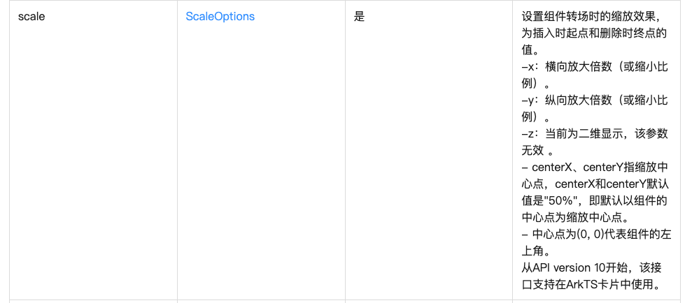
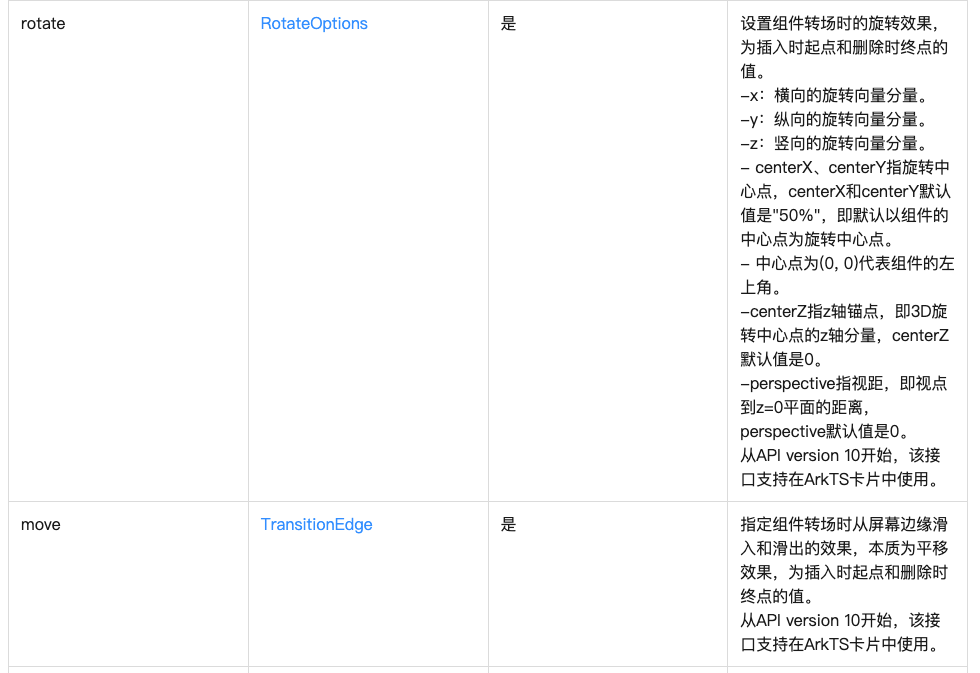
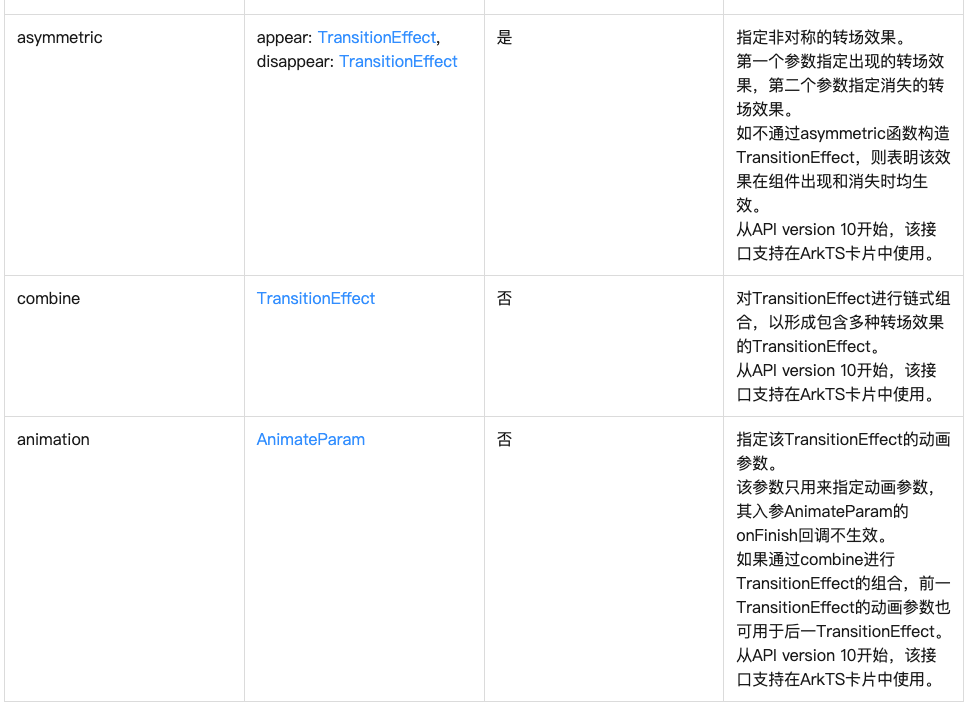
- 组件内元素专场transition
- 组件内转场主要通过transition属性配置转场参数,在组件插入和删除时显示过渡动效,主要用于容器组件中的子组件插入和删除时,提升用户体验。
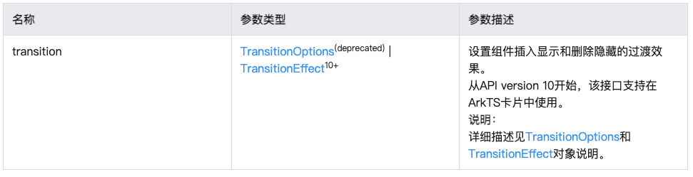
- 4.0中的我们使用的transitionOption的属性被废弃了,新增了TransitionEffect的属性设置方式
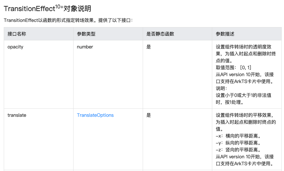
语法
.transition(TransitionEffect.SLIDE.animation({
  duration: 1000
}).combine(TransitionEffect.rotate({
  angle: -180
})).combine(TransitionEffect.translate({
  x: '-100%'
})))
- 有三种模式可选
.transition(TransitionEffect.SLIDE.animation({
  duration: 1000
}).combine(TransitionEffect.rotate({
  angle: -180
})).combine(TransitionEffect.translate({
  x: '-100%'
})))
@Entry
@Component
struct ComAnCase {
  @State
  showImage: boolean = false

  build() {
    Row() {
      Column({ space: 20 }) {
        Column() {
          if(this.showImage) {
            Image($r("app.media.handsome"))
              .width(100)
              .height(100)
              .borderRadius(50)
              .transition(TransitionEffect.OPACITY.animation({
                duration: 1000
              }).combine(TransitionEffect.rotate({
                angle: -180
              })).combine(TransitionEffect.translate({
                x: '-100%'
              })))
          }
        }
        .height(100)

       Button("显示/隐藏")
         .onClick(() => {
           this.showImage = !this.showImage
         })
      }
      .width('100%')
    }
    .height('100%')
  }
}
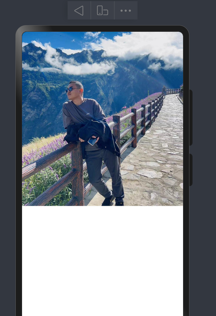
- 上图会从左侧翻转180度进行翻滚进去,并会以相同方式翻滚出去
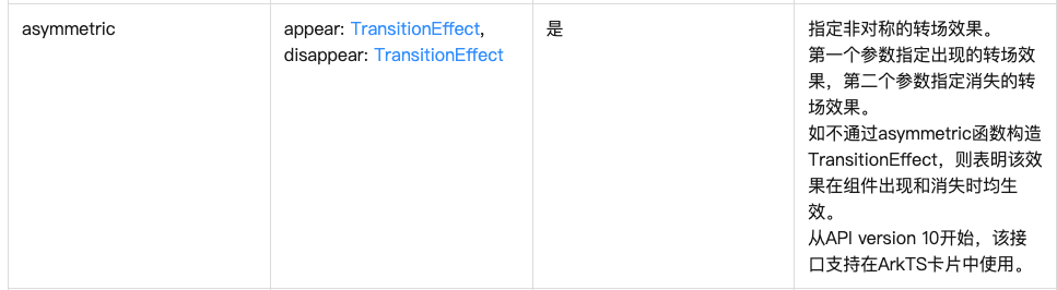
- 假如想要自己控制进入和出去的效果,比如从上面进入,下面出去,可以使用TransitionEffect.asymmetric方法,第一个设置进入时的动画,第二个设置离开时的动画
- 实现上面进来,下面出去的效果
@Entry
@Component
struct ComAnCase {
  @State
  showImage: boolean = false

  build() {
    Row() {
      Column({ space: 20 }) {

      Row() {
        Button("显示/隐藏")
          .onClick(() => {
            this.showImage = !this.showImage
          })
      }
        .width('100%')

        Column() {
          // if(this.showImage) {
          //   Image($r("app.media.handsome"))
          //     .width(100)
          //     .height(100)
          //     .borderRadius(50)
          //     .transition(TransitionEffect.SLIDE.animation({
          //       duration: 1000
          //     }).combine(TransitionEffect.rotate({
          //       angle: -180
          //     })).combine(TransitionEffect.translate({
          //       x: '-100%'
          //     })))
          // }
          if(this.showImage) {
            Image($r("app.media.handsome"))
              .width(100)
              .height(100)
              .borderRadius(50)
              .transition(
                TransitionEffect.asymmetric(
                  TransitionEffect.OPACITY.animation({
                    duration: 1000
                  }).combine(
                    TransitionEffect.move(TransitionEdge.TOP)

                  ),
                  TransitionEffect.OPACITY.animation({
                    duration: 1000
                  }).combine(
                    TransitionEffect.move(TransitionEdge.BOTTOM)
                  )
                )
              )
          }
        }
        .height(100)
      }
      .width('100%')
    }
    .height('100%')
  }
}
- 页面元素共享
- 当路由进行切换时,可以通过设置组件的 sharedTransition 属性将该元素标记为共享元素并设置对应的共享元素转场动效
- A页面
import { router } from '@kit.ArkUI';

@Entry
@Component
struct AImage {
  @State message: string = 'Hello World';

  build() {
    Row() {
      Column() {
         Image($r("app.media.handsome"))
           .width(200)
           .height(200)
           .borderRadius(50)
           .sharedTransition("myImage", {
             duration: 400
           })
           .onClick(() => {
             router.pushUrl({
               url: 'pages/04/BImage'
             })
           })
      }
      .width('100%')
    }
    .height('100%')
  }
}
- B页面
@Entry
@Component
struct BImage {
  @State message: string = 'Hello World';

  build() {
     Column() {
       Image($r("app.media.handsome"))
         .width('100%')
         .height('50%')
         .sharedTransition("myImage", {
           duration: 400
         })
     }
    .width('100%')
    .height('100%')
  }
}


讨论HarmonyOS开发技术,专注于API与组件、DevEco Studio、测试、元服务和应用上架分发等。
更多推荐


 24
24 0
0- 0


 已为社区贡献4条内容

所有评论(0)