鸿蒙5.0&next开发【常见导航样式案例开发】UI开发框架
不同的页签导航在基本功能上,会因产品形态的不同衍生出不同样式的UI效果。本文为满足开发者对于不同导航样式的需求,介绍了多种导航的实现。
概述
不同的页签导航在基本功能上,会因产品形态的不同衍生出不同样式的UI效果。本文为满足开发者对于不同导航样式的需求,介绍了多种导航的实现。
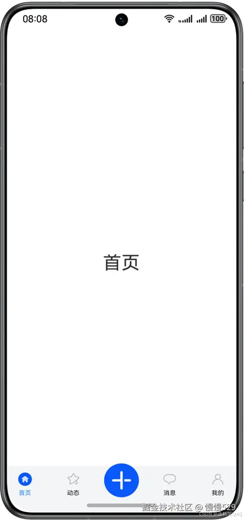
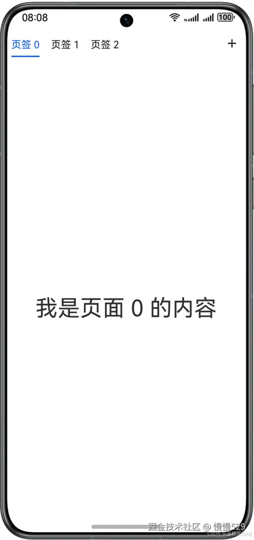
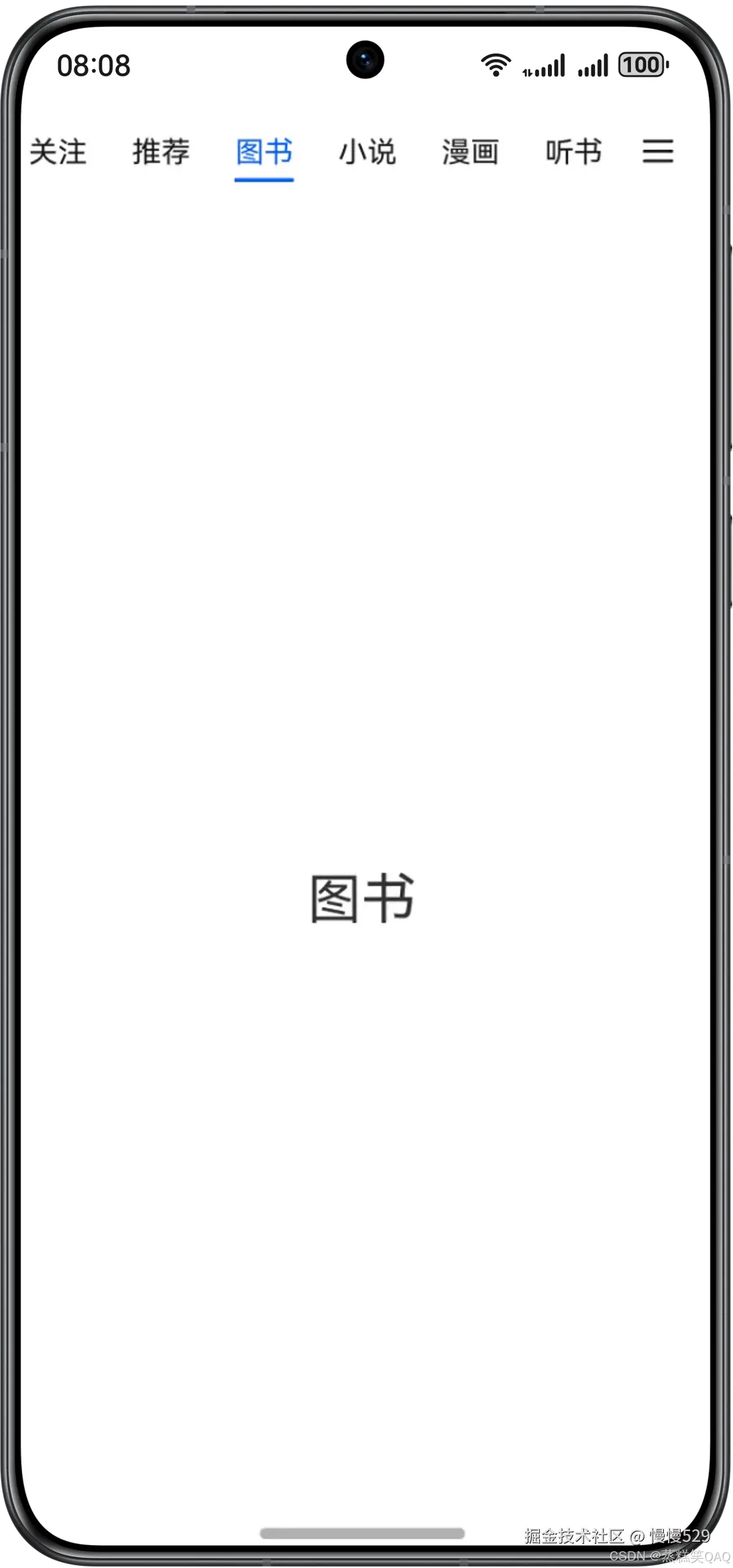
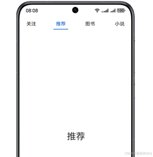
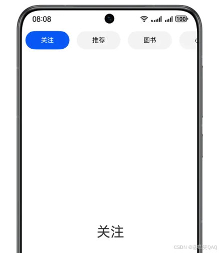
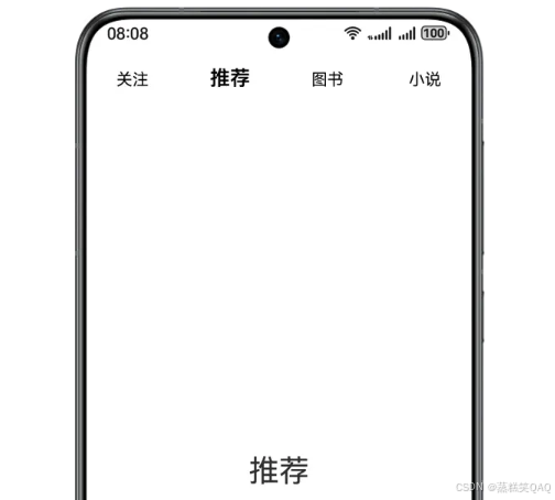
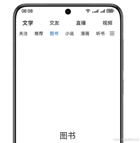
本文基于常见应用的页签导航效果,给出对应的实现方案。不同页签导航效果如下图所示。
图1 底部导航效果示意图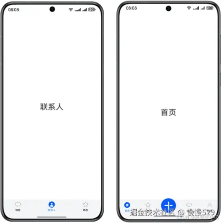
图2 顶部导航效果示意图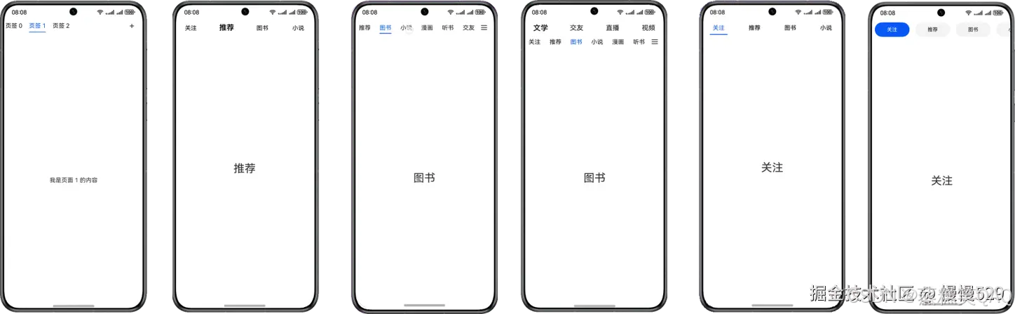
图3 侧边导航效果示意图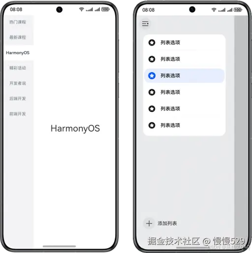
底部导航
基础底部导航
基础底部导航属于常规导航,一般以图标加文字的形式展示。
- 使用Tabs组件,设置barPosition为BarPosition.End控制导航条底部展示。Tabs组件嵌套tabContentBuilder自定义组件。
// entry/src/main/ets/pages/BottomTab.ets
build() {
  Tabs({
    barPosition: BarPosition.End,
    controller: this.tabsController
  }) {
    this.tabContentBuilder($r('app.string.message'),
      Constants.TAB_INDEX_ZERO, $r('app.media.activeMessage'), $r('app.media.message'))
    this.tabContentBuilder($r('app.string.people'),
      Constants.TAB_INDEX_ONE, $r('app.media.activePeople'), $r('app.media.people'))
    this.tabContentBuilder($r('app.string.activity'),
      Constants.TAB_INDEX_TWO, $r('app.media.activeStar'), $r('app.media.star'))
  }
  .width('100%')
  .backgroundColor('#F3F4F5')
  .barHeight(52)
  .barMode(BarMode.Fixed)
  .onAnimationStart((index: number, targetIndex: number) => {
    hilog.info(0x0000, 'index', index.toString());
    this.currentIndex = targetIndex;
  })
}
- tabContentBuilder自定义组件嵌套TabContent组件实现内容区,并设置tabBar属性实现导航条。
// entry/src/main/ets/pages/BottomTab.ets
@Builder
tabContentBuilder(text: Resource, index: number, selectedImg: Resource, normalImg: Resource) {
  TabContent() {
    Row() {
      Text(text)
        .height(300)
        .fontSize(30)
    }
    .width('100%')
    .justifyContent(FlexAlign.Center)
  }
  .padding({ left: 12, right: 12 })
  .backgroundColor(Color.White)
  .tabBar(this.tabBuilder(text, index, selectedImg, normalImg))
}
- 导航布局代码如下所示:
// entry/src/main/ets/pages/BottomTab.ets
@Builder
tabBuilder(title: Resource, index: number, selectedImg: Resource, normalImg: Resource) {
  Column() {
    Image(this.currentIndex === index ? selectedImg : normalImg)
      .width(24)
      .height(24)
      .objectFit(ImageFit.Contain)
    Text(title)
      .margin({ top: 4 })
      .fontSize(10)
      .fontColor(this.currentIndex === index ? '#3388ff' : '#E6000000')
  }
  .justifyContent(FlexAlign.Center)
  .height(52)
  .width('100%')
  .onClick(() => {
    this.currentIndex = index;
    this.tabsController.changeIndex(this.currentIndex);
  })
}
舵式底部导航
舵式导航是基础底部导航的一种扩展,中间按钮一般为核心功能,并且在设计效果上中心图标可以超出导航条的高度,两侧为普通操作按钮。
- 使用Tabs组件,设置barPosition为BarPosition.End控制导航条底部展示。Tabs组件嵌套TabContent组件实现内容区。
// entry/src/main/ets/pages/RudderStyleTab.ets
Tabs({ barPosition: BarPosition.End, controller: this.controller }) {
  ForEach(this.tabArray, (item: BottomTabModel, index: number) => {
    if (index === Constants.TAB_INDEX_TWO) {
      TabContent()
      .backgroundColor(Color.White)
    } else {
      TabContent() {
        Row() {
          Text(item.title)
            .fontSize(30)
        }
        .height(300)
        .width('100%')
        .justifyContent(FlexAlign.Center)
      }
      .backgroundColor(Color.White)
    }
  }, (item: BottomTabModel, index: number) => JSON.stringify(item) + index)
}
- 导航条通过自定义布局实现,替代tabBar属性设置。
// entry/src/main/ets/pages/RudderStyleTab.ets
Flex() {
  ForEach(this.tabArray, (item: BottomTabModel, index: number) => {
    this.Tab(item.selectImage, item.defaultImage, item.title, item.middleMode, index)
  }, (item: BottomTabModel, index: number) => JSON.stringify(item) + index)
}
- 实现导航条布局,通过offset控制中心图标与两侧图标的位置。
// entry/src/main/ets/pages/RudderStyleTab.ets
@Builder
Tab(selectImage: Resource, defaultImage: Resource, title: string | Resource, middleMode: boolean, index: number) {
  Column() {
    if (index === Constants.TAB_INDEX_TWO) {
      Image(defaultImage)
        .size({ width: 56, height: 56 })
        .offset({ y: -15 })
    } else {
      Image(this.currentIndex === index ? selectImage : defaultImage)
        .size({ width: 22, height: 22 })
        .offset({
          y: (this.currentIndex === index && this.currentIndex !== Constants.TAB_INDEX_TWO)
            ? this.iconOffset : this.initNumber
        })
        .objectFit(ImageFit.Contain)
        .animation({
          duration: Constants.ANIMATION_DURATION,
          curve: Curve.Ease,
          playMode: PlayMode.Normal
        })
    }

    if (!middleMode) {
      Text(title)
        .fontSize(10)
        .margin({ top: 6 })
        .fontColor(this.currentIndex === index ? '#3388ff' : '#E6000000')
    }
  }
  .padding({ top: 11 })
  .width('100%')
  .backgroundColor('#F3F4F5')
  .height(90)
  .translate({ y: 40 })
  .onClick(() => {
    if (index !== Constants.TAB_INDEX_TWO) {
      this.currentIndex = index;
      this.controller.changeIndex(index);
      this.iconOffset = Constants.ICON_Offset;
    }
  })
}
顶部导航
居左对齐样式
居左对齐导航属于常规导航,由于Tabs组件导航只能居中展示,无法通过tabBar属性设置导航条。为实现居左对齐样式,可使用自定义布局替代tabBar控制按钮对齐方向。
- Stack组件中嵌套Row组件和Column组件,实现导航条文字和下划线两部分。
// entry/src/main/ets/pages/LeftTab.ets
Stack({ alignContent: Alignment.TopStart }) {
  // 导航条文字
  Row() {
    ForEach(this.tabArray, (item: number, index: number) => {
      this.tab('页签 ' + item, item, index);
    })
    Blank()
    Text('+')
      .width(24)
      .height(24)
      .fontSize(24)
      .textAlign(TextAlign.Center)
      .margin({ right: 24 })
  }
  .justifyContent(FlexAlign.Start)
  .width('100%')

  // 导航条下划线
  Column()
    .width(this.indicatorWidth)
    .height(1.5)
    .backgroundColor('#0A59F7')
    .borderRadius(1)
    .margin({ left: this.indicatorLeftMargin, top: 35 })
}
.height(56)
.margin({ left: this.tabLeftOffset })
- 在onAreaChange()中计算当前激活Tab距离屏幕左侧的偏移量,赋值给indicatorLeftMargin变量,控制下划线的位置。
// entry/src/main/ets/pages/LeftTab.ets
@Builder
tab(tabName: string, _tabItem: number, tabIndex: number) {
  Row() {
    Text(tabName)
      .fontSize(16)
      .lineHeight(22)
      .fontColor(tabIndex === this.currentIndex ? '#0A59F7' : '#E6000000')
      .id(tabIndex.toString())
      .onAreaChange((_, newValue: Area) => {
        if (this.currentIndex === tabIndex && (this.indicatorLeftMargin === 0 || this.indicatorWidth === 0)) {
          let positionX: number;
          let width: number = Number.parseFloat(newValue.width.toString());
          if (newValue.position.x !== undefined) {
            positionX = Number.parseFloat(newValue.position.x?.toString())
            this.indicatorLeftMargin = Number.isNaN(positionX) ? 0 : positionX;
          }
          this.indicatorWidth = width;
        }
      })
  }
  .justifyContent(FlexAlign.Center)
  .constraintSize({ minWidth: 35 })
  .width(64)
  .height(35)
  .onClick(() => {
    this.controller.changeIndex(tabIndex);
    this.currentIndex = tabIndex;
  })
}
- 在点击页签过程中,实时计算选中页签距离左侧的偏移量和页签的宽度,并更新下划线的位置和宽度。
// entry/src/main/ets/pages/LeftTab.ets
// 点击tab切换
.onAnimationStart((_index: number, targetIndex: number, _event: TabsAnimationEvent) => {
  this.currentIndex = targetIndex;
  let targetIndexInfo = this.getTextInfo(targetIndex);
  this.startAnimateTo(this.animationDuration, targetIndexInfo.left, targetIndexInfo.width);
})

private getTextInfo(index: number): Record<string, number> {
  let modePosition: componentUtils.ComponentInfo = componentUtils.getRectangleById(index.toString());
  return { 'left': px2vp(modePosition.windowOffset.x), 'width': px2vp(modePosition.size.width) };
}

private startAnimateTo(duration: number, leftMargin: number, width: number) {
  animateTo({
    duration: duration,
    curve: Curve.Linear,
    iterations: 1,
    playMode: PlayMode.Normal,
  }, () => {
    this.indicatorLeftMargin = leftMargin;
    this.indicatorWidth = width;
  })
}
- 在左右滑动页面过程中,当滑动距离超出屏幕宽度一半时,更新下划线的位置和宽度。
// entry/src/main/ets/pages/LeftTab.ets
// 触摸滑动切换
.onGestureSwipe((index: number, event: TabsAnimationEvent) => {
  let currentIndicator = this.getCurrentIndicatorInfo(index, event);
  this.currentIndex = currentIndicator.index;
  this.indicatorLeftMargin = currentIndicator.left;
  this.indicatorWidth = currentIndicator.width;
})

private getCurrentIndicatorInfo(index: number, event: TabsAnimationEvent): Record<string, number> {
  let nextIndex = index;
  if (index > 0 && event.currentOffset > 0) {
    // 向左滑动切换
    nextIndex--;
  } else if (index < this.tabArray.length && event.currentOffset > 0) {
    // 向右滑动切换
    nextIndex++;
  }
  let indexInfo = this.getTextInfo(index);
  let nextIndexInfo = this.getTextInfo(index);

  let swipeRatio = Math.abs(event.currentOffset / this.tabsWidth);
  let currentIndex = swipeRatio > 0.5 ? nextIndex : index;
  let currentIndicatorLeft: number = indexInfo.left + (nextIndexInfo.left - indexInfo.left) * swipeRatio;
  let currentIndicatorWidth: number = indexInfo.width + (nextIndexInfo.width - indexInfo.width) * swipeRatio;
  return { 'index': currentIndex, 'left': currentIndicatorLeft, 'width': currentIndicatorWidth };
}
可滑动居左对齐样式
可滑动导航样式在居左对齐基础上增加滑动功能,适合页签数较多场景。
实现方式与居左对齐样式相同,唯一区别在于导航布局中嵌套List组件实现可滑动效果。
// src/main/ets/pages/SlideAndMoreTab.ets
Row() {
  List({ initialIndex: 0, scroller: this.listScroller }) {
    ForEach(this.tabArray, (item: TabItem, index: number) => {
      this.Tab(item.name, index)
    }, (item: TabItem, index: number) => JSON.stringify(item) + index)
  }
  .listDirection(Axis.Horizontal)
  .height(30)
  .scrollBar(BarState.Off)
  .width('85%')
  .friction(0.6)
  .onWillScroll((xOffset: number) => {
    this.indicatorLeftMargin -= xOffset;
  })

  Image($r('app.media.more'))
    .width(20)
    .height(15)
    .margin({ left: 16 })
}
.height(52)
.width('100%')
下划线样式
下划线导航样式属于常规导航,以文字加下划线的形式展示。
- 使用Tabs组件,设置barPosition为BarPosition.Start控制导航条顶部展示。通过tabBar属性和Builder装饰器实现导航。
// entry/src/main/ets/pages/UnderlineTab.ets
Tabs({ barPosition: BarPosition.Start }) {
  ForEach(this.tabArray.slice(0, 4), (item: TabItem) => {
    TabContent() {
      Row() {
        Text(item.name)
          .height(300)
          .fontSize(30)
      }
      .width('100%')
      .justifyContent(FlexAlign.Center)
      .height('100%')
    }.tabBar(this.tabBuilder(item.id, item.name))
  }, (item: TabItem, index: number) => JSON.stringify(item) + index)
}
- 使用Divider组件实现下划线。
// entry/src/main/ets/pages/UnderlineTab.ets
@Builder
tabBuilder(index: number, name: string | Resource) {
  Column() {
    Text(name)
      .fontColor(this.currentIndex === index ? '#0A59F7' : '#E6000000')
      .fontSize(16)
      .fontWeight(this.currentIndex === index ? FontWeight.Normal : FontWeight.Medium)
      .lineHeight(22)
      .margin({ top: 17, bottom: 7 })
    Divider()
      .width(48)
      .strokeWidth(Constants.STROKE_WIDTH)
      .color('#0A59F7')
      .opacity(this.currentIndex === index ? 1 : 0)
  }
}
背景高亮式
背景高亮导航样式属于常规导航,通过背景色突出选中页签。
- 使用Tabs组件,设置barPosition为BarPosition.Start控制导航条顶部展示。通过自定义布局实现导航背景高亮样式。
// src/main/ets/pages/BackgroundLightTab.ets
Tabs({ barPosition: BarPosition.Start, controller: this.controller }) {
  ForEach(this.tabArray.slice(0, 6),
    (item: TabItem) => {
      TabContent() {
        Row() {
          Text(item.name)
            .height(300)
            .fontSize(30)
        }
        .width('100%')
        .justifyContent(FlexAlign.Center)
      }
      .backgroundColor(Color.White)
    }, (item: TabItem, index: number) => JSON.stringify(item) + index)
}
.width('100%')
- 使用List组件实现可滑动效果。
// src/main/ets/pages/BackgroundLightTab.ets
List({ scroller: this.listScroller }) {
  ForEach(this.tabArray.slice(0, 6),
    (item: TabItem, index: number) => {
      this.tabBuilder(item.name, index);
    }, (item: TabItem, index: number) => JSON.stringify(item) + index)
}
- 其中在tabBuilder组件中判断tab的索引值与激活tab索引是否相同,控制背景色的变化。
// src/main/ets/pages/BackgroundLightTab.ets
Tabs({ barPosition: BarPosition.Start, controller: this.controller }) {
  ForEach(this.tabArray.slice(0, 6),
    (item: TabItem) => {
      TabContent() {
        Row() {
          Text(item.name)
            .height(300)
            .fontSize(30)
        }
        .width('100%')
        .justifyContent(FlexAlign.Center)
      }
      .backgroundColor(Color.White)
    }, (item: TabItem, index: number) => JSON.stringify(item) + index)
}
.width('100%')
文字缩放式
文字缩放式导航样式属于常规导航,通过字体加粗放大突出选中页签。
- 使用Tabs组件,设置barPosition为BarPosition.Start。通过tabBar属性和Builder装饰器实现导航。
// entry/src/main/ets/pages/WordTab.ets
Tabs({ barPosition: BarPosition.Start }) {
  ForEach(this.tabArray.slice(0, 4), (item: TabItem) => {
    TabContent() {
      Row() {
        Text(item.name)
          .height(300)
          .fontSize(30)
      }
      .width('100%')
      .justifyContent(FlexAlign.Center)
      .height('100%')
    }.tabBar(this.tabBuilder(item.id, item.name))
  }, (item: TabItem, index: number) => JSON.stringify(item) + index)
}
- 其中在tabBuilder组件判断tab的索引值与选中tab索引是否相同,控制字体大小的变化。
// entry/src/main/ets/pages/WordTab.ets
@Builder
tabBuilder(index: number, name: string | Resource) {
  Column() {
    Text(name)
      .fontColor(Color.Black)
      .fontSize(this.currentIndex === index ? 20 : 16)
      .fontWeight(this.currentIndex === index ? 600 : FontWeight.Normal)
      .lineHeight(22)
      .id(index.toString())
  }
}
双层嵌套式
双层嵌套样式拥有两层导航,外层嵌套内层,与单层导航相比可以容纳更多页签。
外层导航通过在TabContent组件设置tabBar属性,其中TabContent中嵌套List和子级Tabs。List组件嵌套subTabBuilder自定义组件实现内层导航。子级Tabs组件嵌套TabContent组件实现内容区。
// src/main/ets/pages/DoubleNestingTabOne.ets
@Builder
subTabBuilder(tabName: string | Resource, tabIndex: number) {
  Row() {
    Text(tabName)
      .fontSize(16)
      .fontColor(tabIndex === this.focusIndex ? '#0A59F7' : '#E6000000')
      .id(tabIndex.toString())
  }
  .justifyContent(FlexAlign.Center)
  .padding({ left: 12, right: 12 })
  .height(30)
  .onClick(() => {
    this.subController.changeIndex(tabIndex);
    this.focusIndex = tabIndex;
  })
}

// src/main/ets/pages/DoubleNestingTabOne.ets
TabContent() {
  Column() {
    Column() {
      Row() {
        List({ initialIndex: Constants.TAB_INDEX_ZERO, scroller: this.listScroller }) {
          ForEach(this.tabArray, (item: TabItem, index: number) => {
            this.subTabBuilder(item.name, index)
          }, (item: TabItem, index: number) => JSON.stringify(item) + index)
        }
        .listDirection(Axis.Horizontal)
        .height(30)
        .scrollBar(BarState.Off)
        .width('85%')
        .friction(0.6)

        Image($r('app.media.more'))
          .width(20)
          .height(15)
          .margin({ left: 16 })
      }
      .height(25)
      .width('100%')
    }
    .alignItems(HorizontalAlign.Center)
    .width('100%')
    .padding({ left: 4 })

    // src/main/ets/pages/DoubleNestingTabOne.ets
    Tabs({ barPosition: BarPosition.Start, controller: this.subController }) {
      // ...
    }
    .barHeight(0)
    .animationDuration(Constants.ANIMATION_DURATION)
    .onAnimationStart((index: number, targetIndex: number) => {
      hilog.info(0x0000, 'index', index.toString());
      this.focusIndex = targetIndex;
      this.listScroller.scrollToIndex(targetIndex, true, ScrollAlign.CENTER);
    })
  }
}
.tabBar(this.tabBuilder(Constants.TAB_INDEX_ZERO, this.topTabData[Constants.TAB_INDEX_ZERO]))
侧边导航
基础侧边导航
属于侧边导航类,通过List去实现左侧导航条区域。

基础侧边导航使用左右布局:左侧通过List组件与ListItem组件实现导航布局,右侧实现导航内容区。
// src/main/ets/pages/SideTab.ets
// 左侧导航布局
List({ scroller: this.classifyScroller }) {
  ForEach(this.ClassifyArray, (item: ClassifyModel, index?: number) => {
    ListItem() {
      ClassifyItem({
        classifyName: item.classifyName,
        isSelected: this.currentClassify === index,
        onClickAction: () => {
          if (index !== undefined) {
            this.classifyChangeAction(index, true);
          }
        }
      })
    }
  }, (item: ClassifyModel, index: number) => JSON.stringify(item) + index)
}
.height('110%')
.width('27.8%')
.backgroundColor('#F1F3F5')
.scrollBar(BarState.Off)
.margin({ top: 74 })

// 右侧内容区域
Column() {
  ForEach(this.ClassifyArray, (item: ClassifyModel, index: number) => {
    Text(this.currentClassify === index ? item.classifyName : '')
      .fontSize(30)
  },(item: ClassifyModel, index: number) => JSON.stringify(item) + index)
}
.width('72.2%')
抽屉式侧边导航
抽屉式导航属于侧边导航类,核心思路是“隐藏”,点击入口或侧滑可以像“抽屉”一样拉出菜单。
- 使用[SideBarContainer组件]实现侧边导航,并且通过设置该组件的showSideBar控制显示隐藏。在SideBarContainer实现左侧导航样式和右侧内容区。controlButton属性控制侧边导航按钮位置。
// src/main/ets/pages/DrawerTab.ets
SideBarContainer(SideBarContainerType.Overlay) {
  // 左侧导航区域
  Column() {
    // ...
  }
  .height('100%')
  .padding({ top: 104 })
  .backgroundColor('#E9EAEC')
  // src/main/ets/pages/DrawerTab.ets
  // 右侧内容区域
  Column() {
    // ...
  }
  .onClick(() => {
    animateTo({
      duration: Constants.ANIMATION_DURATION,
      curve: Curve.EaseOut,
      playMode: PlayMode.Normal,
    }, () => {
      this.show = false;
    })
  })
  .width('100%')
  .height('110%')
  .backgroundColor(this.show ? '#c1c2c4' : '')
}
.showSideBar(this.show)
.controlButton({
  left: 16,
  top: 48,
  height: 40,
  width: 40,
  icons: {
    shown: $r('app.media.changeBack'),
    hidden: $r('app.media.change'),
    switching: $r('app.media.change')
  }
})
.onChange((value: boolean) => {
  this.show = value;
})
- 左侧导航使用Image和Text实现图标加文字的效果。
// src/main/ets/pages/DrawerTab.ets
Column() {
  ForEach(this.navList, (item: number, index: number) => {
    Column() {
      Row() {
        Image(this.active === item ? $r('app.media.activeList') : $r('app.media.list'))
          .width(24)
          .height(24)
        Text($r('app.string.list_name'))
          .fontSize(16)
          .fontColor(Color.Black)
          .fontWeight(FontWeight.Medium)
          .margin({ left: 17 })
      }
      .height(48)
      .width('100%')

      if (this.navList.length - 1 !== index) {
        Row()
          .height(0.5)
          .backgroundColor('#0D000000')
          .width('90%')
      }
    }
    .onClick(() => {
      this.active = item;
    })
    .margin({
      top: 4,
      left:  4,
      right:  4,
      bottom:  4
    })
    .justifyContent(FlexAlign.Center)
    .width(264)
    .height(48)
    .padding({ left: 13})
    .borderRadius(16)
    .backgroundColor(this.active === item ? '#1A0A59F7' : '')
  }, (item: number, index: number) => JSON.stringify(item) + index)

  Row() {
    Image($r('app.media.add'))
      .width(40)
      .height(40)
    Text($r('app.string.add_list')).margin({ left: 8 })
  }
  .width('100%')
  .margin({ top: 284 })
}
.width(272)
.height(344)
.backgroundColor(Color.White)
.borderRadius(20)

讨论HarmonyOS开发技术,专注于API与组件、DevEco Studio、测试、元服务和应用上架分发等。
更多推荐
 27
27 0
0- 0


 已为社区贡献44条内容

所有评论(0)