鸿蒙5.0&next开发【常见列表流开发】UI开发框架
列表流是采用以“行”为单位进行内容排列的布局形式,每“行”列表项通过文本、图片等不同形式的组合,高效地显示结构化的信息,当列表项内容超过屏幕大小时,可以提供滚动功能。列表流具有排版整齐、重点突出、对比方便、浏览速度快等特点。同时列表流也具有非常广泛的使用场景,例如:应用首页、通讯录、音乐列表、购物清单等。
概述
列表流是采用以“行”为单位进行内容排列的布局形式,每“行”列表项通过文本、图片等不同形式的组合,高效地显示结构化的信息,当列表项内容超过屏幕大小时,可以提供滚动功能。列表流具有排版整齐、重点突出、对比方便、浏览速度快等特点。同时列表流也具有非常广泛的使用场景,例如:应用首页、通讯录、音乐列表、购物清单等。
列表流主要使用[List]组件,按垂直方向线性排列子组件[ListItemGroup]或[ListItem],混合渲染任意数量的图文视图,从而构建列表内容。在实际场景中,一般会根据需要,结合其它基础组件,形成相对复杂的交互功能。
多类型列表项场景
场景描述
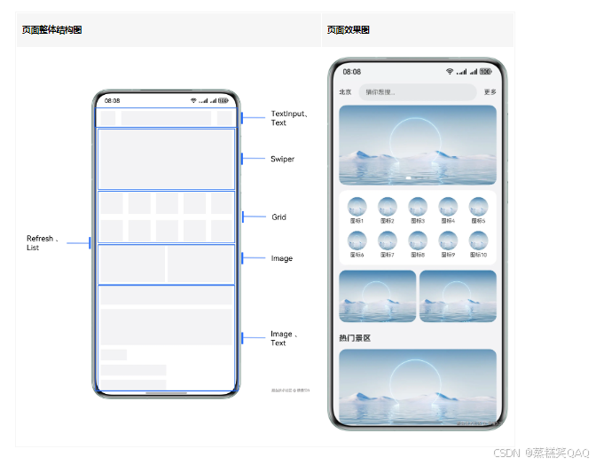
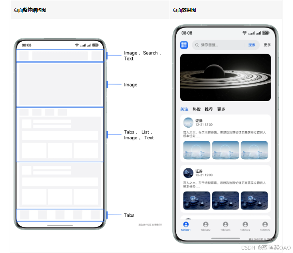
List组件作为整个首页长列表的容器,通过ListItem对不同模块进行视图界面定制,常用于门户首页、商城首页等多类型视图展示的列表信息流场景。
本场景以应用首页为例,将除页面顶部搜索框区域的其它内容,放在List组件内部,进行整体页面的构建。进入页面后,下滑刷新模拟网络请求;滑动页面列表内容,景区标题吸顶;滑动到页面底部,上滑模拟请求添加数据。
实现原理
根据列表内部各部分视图对应数据类型的区别,渲染不同的ListItem子组件。
Refresh组件可以进行页面下拉操作并显示刷新动效,List组件配合使用Swiper、Grid等基础组件用于页面的整体构建,再通过List组件的[sticky]属性、[onReachEnd()]事件和Refresh组件的[onRefreshing()]事件,实现下滑模拟刷新、上滑模拟添加数据及列表标题吸顶的效果。
开发步骤
- 顶部搜索框区域。
Row() {
  Text('北京')
    // ...
  TextInput({ placeholder: '猜你想搜...' })
    // ...
  Text('更多')
    // ...
}
实现效果:

- 在List的第一个ListItem分组中,使用Swiper组件构建页面轮播图内容。
List({ space: 12 }) {
  // Swiper
  ListItem() {
    Swiper() {
      ForEach(this.swiperContent, (item: SwiperType) => {
        Stack({ alignContent: Alignment.BottomStart }) {
          Image($r(item.pic))
        }
      }, (item: SwiperType) => JSON.stringify(item))
    }
    .autoPlay(true) // 设置子组件自动播放
    .duration(1000) // 设置子组件切换的动画时长
    .curve(Curve.Linear) // 设置动画曲线为匀速
    .indicator( // 设置导航点指示器
      new DotIndicator()
        .selectedColor(Color.White)
    )
    .itemSpace(10) // 设置子组件间的间距
    // ...
  }
  // ...
}
实现效果:

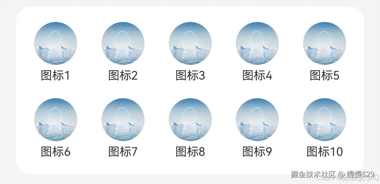
- 在List的第二个ListItem分组中,使用Grid组件构建页面网格区域。
List({ space: 12 }) {
  // Swiper
  ListItem() {
    // ...
  }

  // Grid
  ListItem() {
    Grid() {
      ForEach(this.gridTitle, (item: Resource) => {
        GridItem() {
          Column() {
            Image($r('app.media.pic1'))
              // ...
            Text(item)
              // ...
          }
        }
      }, (item: Resource) => JSON.stringify(item))
    }
    .rowsGap(16) // 设置行间距
    .columnsGap(19) // 设置列间距
    .columnsTemplate('1fr 1fr 1fr 1fr 1fr') // 设置每列占比
    // ...
  }

  // ...
}
实现效果:
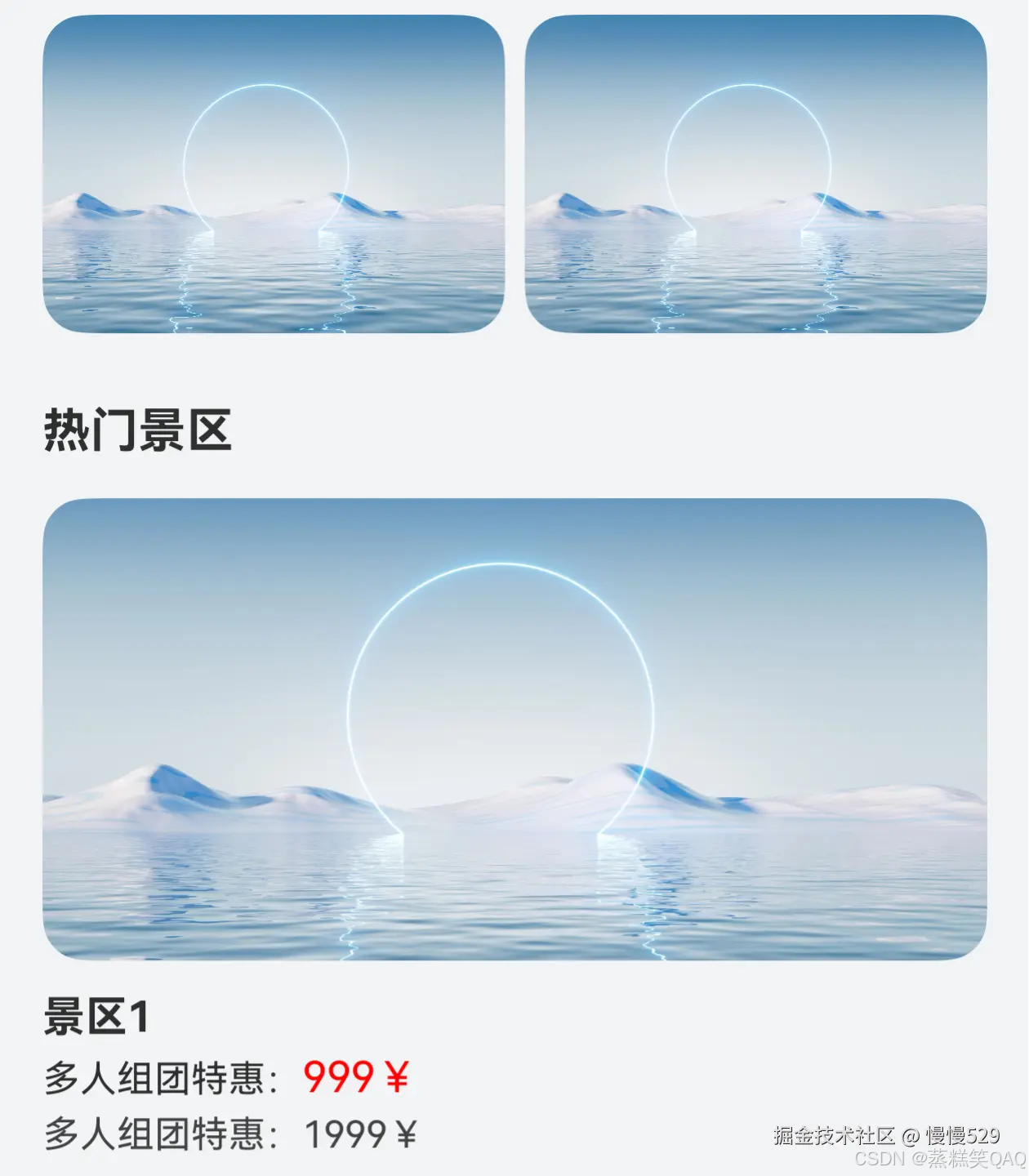
- 推荐内容及列表内容的构建。
// 列表内容自定义Builder函数
@Builder
scenicSpotDetailBuilder(title: Resource) {
  Column() {
    Image($r('app.media.pic1'))
      // ...
    Column() {
      Text(title)
        // ...
      Text() {
        Span('多人组团特惠:')
          // ...
        Span('999¥')
          // ...
      }
      .margin({ top: 4, bottom: 4 })

      Text() {
        Span('多人组团特惠:')
        Span('1999¥')
      }
      // ...
    }
    // ...
  }
}
List({ space: 12 }) {
  // Swiper
  ListItem() {
    // ...
  }

  // Grid
  ListItem() {
    // ...
  }

  // 推荐区域
  ListItem() {
    Row() {
      Image($r('app.media.pic1'))
        // ...
      Image($r('app.media.pic1'))
        // ...
    }
    // ...
  }

  // 列表内容展示
  ForEach(this.scenicSpotTitle, (item: Resource) => {
    ListItemGroup({ header: this.scenicSpotHeader(item) }) {
      ForEach(this.scenicSpotArray, (scenicSpotItem: Resource) => {
        ListItem() {
          this.scenicSpotDetailBuilder(scenicSpotItem);
        }
      }, (scenicSpotItem: Resource) => JSON.stringify(scenicSpotItem))
    }
    .borderRadius(this.borderRadiusVal)
  }, (item: Resource) => JSON.stringify(item))

  // ...
}
实现效果:
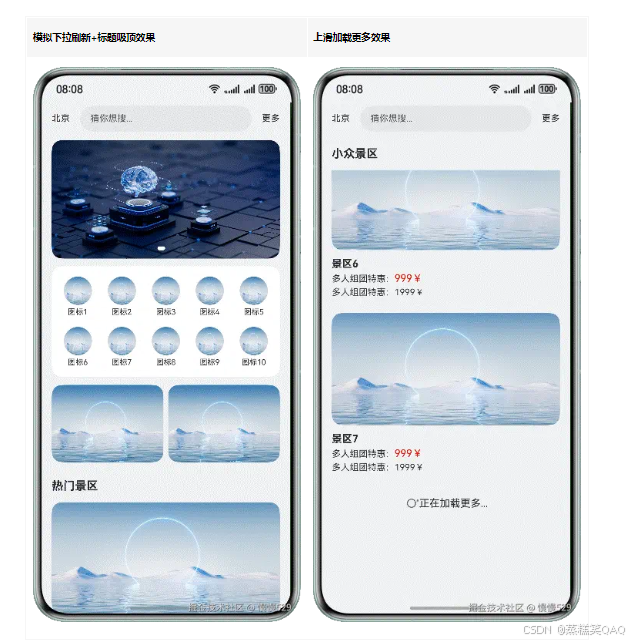
- 将构建好的页面内容,放在Refresh组件内部,并给List和Refresh组件添加对应的[onReachEnd()]和[onRefreshing()]回调,实现下拉模拟刷新和上滑添加列表数据的效果。
// 顶部搜索区域
Row() {
  // ...
}

Refresh({ refreshing: $$this.isRefreshing }) {
  List({ space: 12 }) {
    // Swiper
    ListItem() {
      // ...
    }

    // Grid
    ListItem() {
      // ...
    }

    // 推荐区域
    ListItem() {
      // ...
    }

    // 列表内容展示
    ForEach(this.scenicSpotTitle, (item: Resource) => {
      // ...
    }, (item: Resource) => JSON.stringify(item))

    // 是否加载更多
    ListItem() {
      Row() {
        if (!this.noMoreData) {
          LoadingProgress()
            // ...
        }
        Text(this.noMoreData ? '已经到底啦' : '正在加载更多...')
      }
    }
    // ...
  }
  // ...
  .onReachEnd(() => { // 添加列表到末尾位置时触发的回调
    if (this.scenicSpotArray.length >= 20) {
      // 当列表数据大于或等于20,noMoreData设置为true
      this.noMoreData = true;
      return;
    }
    setTimeout(() => {
      this.scenicSpotArray.push('景区' +  (this.scenicSpotArray.length + 1)); // 向列表内部添加数据
    }, 500)
  })
}
.onRefreshing(() => { // 添加进入刷新状态的回调
  this.isRefreshing = true; // 进入刷新状态
  setTimeout(() => {
    // 将scenicSpotArray设置为初始值
    this.scenicSpotArray = ['景区1', '景区2', '景区3', '景区4', '景区5'];
    this.noMoreData = false; // noMoreData设置为false
    this.isRefreshing = false; // 推出刷新状态
  }, 2000)
})
实现效果
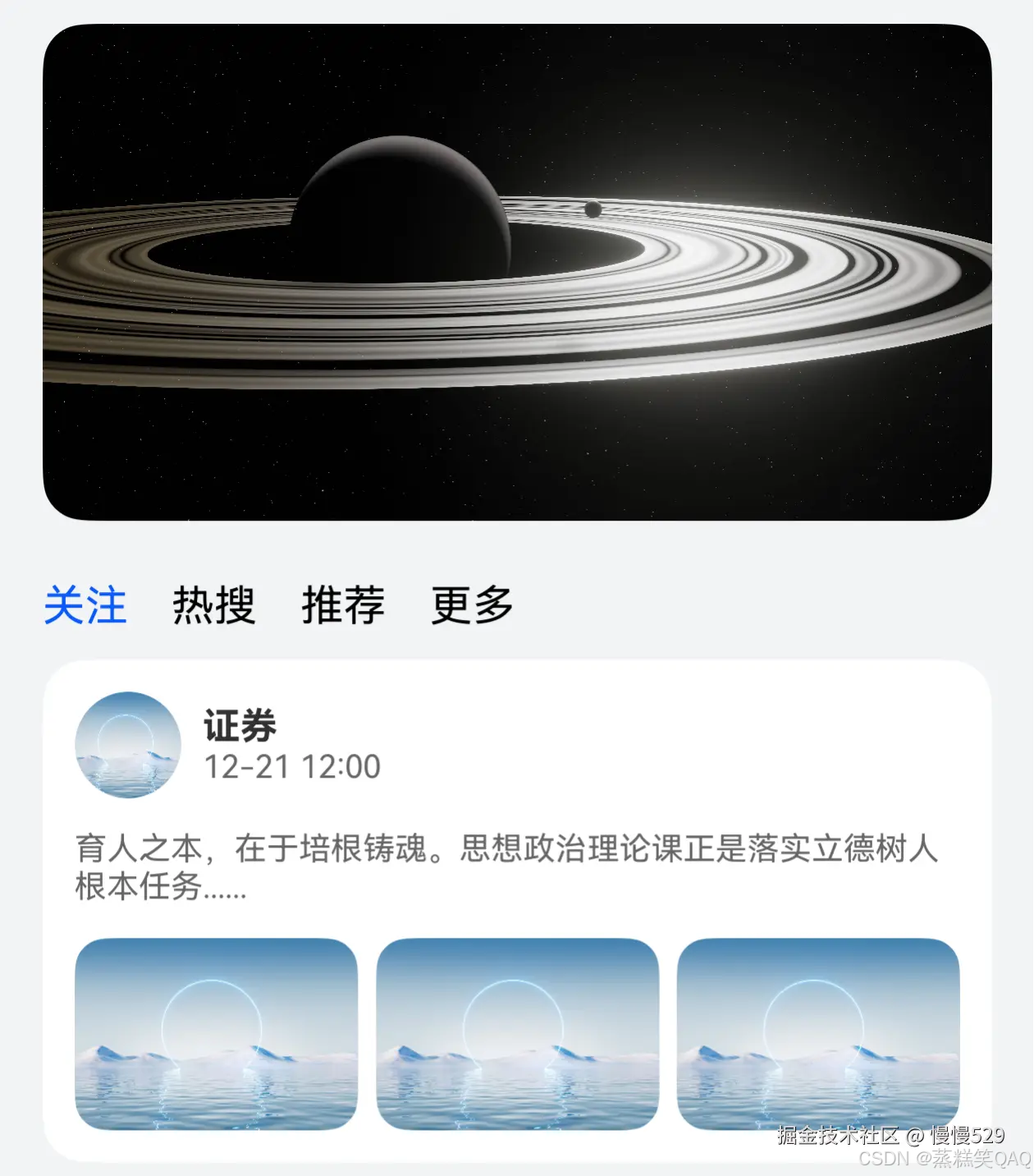
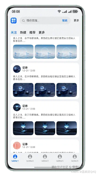
Tabs吸顶场景
场景描述
Tabs嵌套List的吸顶效果,常用于新闻、资讯类应用的首页。
本场景以Tabs页签首页内容为例,在首页TabContent的内容区域使用List组件配合其它组件,构建下方列表数据内容。进入页面后,向上滑动内容,中间Tabs页签区域实现吸顶展示的效果。
实现原理
Tabs组件可以在页面内快速实现视图内容的切换,让用户能够聚焦于当前显示的内容,并对页面内容进行分类,提高页面空间利用率。
通过Tabs组件,配合使用Stack、Scroll、Search以及List等基础组件构建完整页面,再使用List组件的[nestedScroll]属性,结合calc计算高度,实现中间Tabs页签区域吸顶展示的效果。
开发步骤
- 构建Tabs的自定义tabBar内容。
@Builder
tabBuilder(img: Resource, title: Resource, index: number) {
  Column() {
    Image(img)
      // ...
      .fillColor(this.currentIndex === index ? '#0a59f7' : '#66000000')
    Text(title)
      // ...
      .fontColor(this.currentIndex === index ? '#0a59f7' : '#66000000')
  }
  // ...
  .onClick(() => {
    this.currentIndex = index;
    this.tabsController.changeIndex(this.currentIndex);
  })
}
Tabs({ barPosition: BarPosition.End, controller: this.tabsController }) {
  TabContent() {
    // ...
  }
  .tabBar('tabBar1', $r('app.string.mine'), 0)

  // 其它tabBar内容
}
// ...
.onChange((index: number) => {
  this.currentIndex = index;
})
实现效果:

- 构建顶部搜索区域。
Row() {
  Image($r('app.media.app_icon'))
    // ...
  Search({
    placeholder: '猜你想搜...',
  })
    .searchButton('搜索', { fontSize: 14 })
      // ...
  Text('更多')
    // ...
}
实现效果:

- 图片占位区域、自定义导航内容及列表内容构建。
// 首页TabContent内容
Scroll(this.scrollController) {
  Column() {
    // Image占位区域
    Image($r('app.media.pic5'))
      // ...

    Column() {
      // 自定义导航内容
      Row({ space: 16 }) {
        ForEach(this.tabArray, (item: string, index: number) => {
          Text(item)
            .fontColor(this.currentTabIndex === index ? '#0a59f7' : Color.Black)
            .onClick(() => {
              // 点击控制Tabs内容切换
              this.contentTabController.changeIndex(index);
              this.currentTabIndex = index;
            })
        }, (item: string) => item)
      }
      // ...

      // Tabs
      Tabs({ barPosition: BarPosition.Start, controller: this.contentTabController }) {
        TabContent() {
          List({ space: 10, scroller: this.listScroller }) {
            CustomListItem({
              imgUrl: $r('app.media.pic1'),
              title: $r('app.string.manager_content')
            })
            // 其它内容
          }
          // ...
        }
        .tabBar('关注')

        // 其它TabContent
      }
      // ...
    }
    // ...
  }
}
// ...
.scrollBar(BarState.Off) // 隐藏滚动条
实现效果:
- 给List组件添加的[nestedScroll]属性,结合calc计算实现中间自定义Tab页签区域吸顶展示的效果。
Tabs({ barPosition: BarPosition.Start, controller: this.contentTabController }) {
  TabContent() {
    List({ space: 10, scroller: this.listScroller }) {
      // ...
    }
    // ...
    // 自定义导通过nestedScroll和calc计算高度,实现吸顶效果
    .nestedScroll({
      scrollForward: NestedScrollMode.PARENT_FIRST, // 设置组件向末尾滚动效果:父组件先滚动,滚动到边缘后自身滚动
      scrollBackward: NestedScrollMode.SELF_FIRST // 设置组件向起始端滚动效果:自身先滚动,滚动到边缘后父组件滚动
    })
  }
  .tabBar('关注')

  // 其它TabContent
}
.barHeight(0) // 将tabBar高度设置为0
.height('calc(100% - 100vp)') // Tabs高度需要减去顶部搜索框区域和自定义Tab高度
.onChange((index: number) => {
  this.currentTabIndex = index;
})
实现效果
分组吸顶场景
场景描述
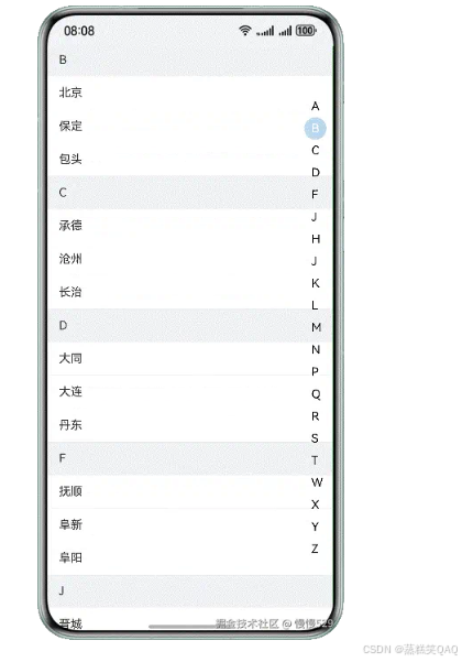
双列表同向联动,右边字母列表用于快速索引,内容列表根据首字母进行分组,常用于通讯录、城市选择、分组选择等页面。
本场景以城市列表页面为例,左侧城市列表数据和右侧字母导数据通过List组件来展示,并通过Stack组件使两个列表数据分层显示。在进入页面后,通过滑动左侧城市列表数据,列表字母标题吸顶展示,对应右侧字母导航内容高亮显示;点击右侧字母导航内容,左侧城市列表展示对应内容。
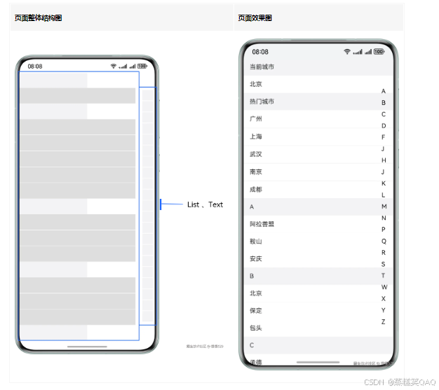
实现原理
左侧List作为城市列表,右侧List为城市首字母快捷导航列表,通过ListItem对对应数据进行渲染展示,并使用Stack堆叠容器组件,字母导航列表覆盖城市列表上方,再给对应List添加[sticky]属性和[onScrollIndex()]方法,实现两个列表数据间的联动效果。
开发步骤
- 城市列表使用ListItemGroup,对“当前城市”“热门城市”“城市数据”进行分组,并通过ListItem展示每个分组中的具体数据。
// 列表数据内容
@Builder
textContent(content: string) {
  Text(content)
    // ...
}
List({ scroller: this.cityScroller }) {
  // 当前城市
  ListItemGroup({ header: this.itemHead('当前城市') }) {
    ListItem() {
      this.textContent(this.currentCity);
    }
  }

  // 热门城市
  ListItemGroup({ header: this.itemHead('热门城市') }) {
    ForEach(this.hotCities, (item: string) => {
      ListItem() {
        this.textContent(item);
      }
    }, (item: string) => item)
  }
  .divider({
    strokeWidth: 1,
    color: '#EDEDED',
    startMargin: 10,
    endMargin: 45
  })

  // 城市列表数据
  ForEach(this.groupWorldList, (item: string) => {
    // 遍历城市首字母内容,并将其作为城市分组的标题
    ListItemGroup({ header: this.itemHead(item) }) {
      // 展示字母对应城市数据
      ForEach(this.getCitiesWithGroupName(item), (cityItem: City) => {
        ListItem() {
          this.textContent(cityItem.city);
        }
      }, (cityItem: City) => cityItem.city)
    }
  })
}
- 右侧字母导航列表数据,同样通过List组件进行展示。
// 右侧字母导航内容
Column() {
  List({ scroller: this.navListScroller }) {
    ForEach(this.groupWorldList, (item: string, index: number) => {
      ListItem() {
        Text(item)
          // ...
      }
    }, (item: string) => item)
  }
}
- 使用堆叠容器组件Stack,将字母导航内容覆盖到城市列表内容上方。
Stack({ alignContent: Alignment.End }) {
  // 左侧城市列表数据
  List({ scroller: this.cityScroller }) {
    // ...
  }
  // ...

  // 右侧字母导航内容
  Column() {
    List({ scroller: this.navListScroller }) {
      // ...
    }
  }
  // ...
}
-
最后,给城市列表添加[sticky]属性实现标题吸顶效果,及添加[onScrollIndex()]方法,通过selectNavIndex变量与字母导航列表内容进行关联,控制的对应字母导航内容的选中状态。
在字母导航列表中,添加点击事件,在点击事件中通过城市列表控制器cityScroller的[scrollToIndex()]事件,控制城市列表内容的改变,实现二者数据的联动效果。
Stack({ alignContent: Alignment.End }) {
  // 左侧城市列表数据
  List({ scroller: this.cityScroller }) {
    // ...
  }
  // ...
  .onScrollIndex((index: number) => {
    // 通过selectNavIndex状态变量与index联动,控制导航列表选中状态,城市列表中有当前城市和热门城市内容,这里index需要减2
    this.selectNavIndex = index - 2;
  })

  // 右侧字母导航内容
  Column() {
    List({ scroller: this.navListScroller }) {
      ForEach(this.groupWorldList, (item: string, index: number) => {
        ListItem() {
          Text(item)
            // ...
            .onClick(() => {
              this.selectNavIndex = index; // 当前被点击导航内容的索引值
              // 通过cityScroller的scrollToIndex方法,控制滑动城市列表指定index,城市列表中有当前城市和热门城市内容,这里index需要加2
              this.cityScroller.scrollToIndex(index + 2, false, ScrollAlign.START);
            })
        }
      }, (item: string) => item)
    }
  }
  // ...
}
实现效果
二级联动场景
场景描述
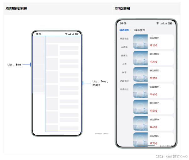
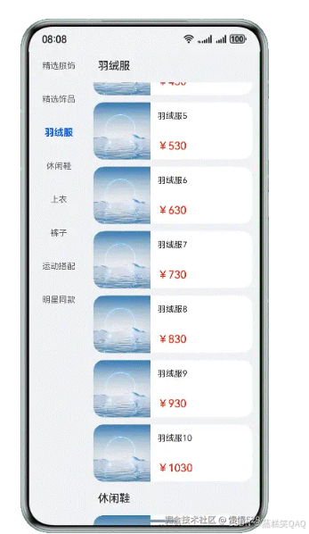
通过左边一级列表的选择,联动更新右边二级列表的数据,常用于商品分类选择、编辑风格等二级类别选择页面。
本场景以商品分类列表页面为例,分别通过List组件,对左侧分类导航和右侧导航内容进行展示。在进入页面后,点击左侧分类导航,右侧展示对应导航分类详情列表数据;滑动右侧列表内容,列表标题吸顶展示,左侧对应导航内容则高亮显示。
实现原理
左右各用一个List实现,分别设置其[onScrollIndex()]事件,左侧List在回调中判断数据项切换时,调用右侧List滚动到相应类别的对应位置,右侧同理。
开发步骤
- 分别通过List组件构建左侧分类导航数据和右侧分类内容数据。
// 左侧分类导航数据
List({ scroller: this.navTitleScroller }) {
  ForEach(this.categoryList, (item: NavTitleModel, index: number) => {
    ListItem() {
      Text(item.titleName)
        // ...
    }
  }, (item: NavTitleModel) => item.titleName)
}
// ...

// 右侧分类内容数据
List({ scroller: this.goodsListScroller }) {
  ForEach(this.categoryList, (item: NavTitleModel) => {
    ListItemGroup({ space: 12, header: this.goodsHeaderBuilder(item.titleName) }) {
      ForEach(item.goodsList, (goodsItem: GoodsDataModel) => {
        ListItem() {
          Row() {
            Image(goodsItem.imgUrl)
              // ...
            Column() {
              Text(goodsItem.goodsName)
                // ...
              Text('¥' + goodsItem.price)
                // ...
            }
            // ...
          }
          // ...
        }
      }, (goodsItem: GoodsDataModel) => JSON.stringify(goodsItem.goodsId))
    }
  }, (item: NavTitleModel) => JSON.stringify(item.goodsList))
}
- 给左侧导航列表添加点击事件,右侧分类详情列表添加[onScrollIndex()]事件,并调用自定义事件listChange方法,在listChange方法内部根据isGoods变量的值,调用对应列表控制器的[scrollToIndex()]事件,实现导航列表和分类详情数据的联动效果。
// 自定义事件
listChange(index: number, isGoods: boolean) {
  if (this.currentTitleId !== index) {
    this.currentTitleId = index;
    if (isGoods) {
      this.goodsListScroller.scrollToIndex(index); // 控制分类详情内容滑动到指定index
    } else {
      this.navTitleScroller.scrollToIndex(index); // 控制分类导航列表内容滑动到指定index
    }
  }
}
// 左侧分类导航数据
List({ scroller: this.navTitleScroller }) {
  ForEach(this.categoryList, (item: NavTitleModel, index: number) => {
    ListItem() {
      Text(item.titleName)
        // ...
        .onClick(() => {
          this.listChange(index, true); // 调用自定义事件listChange,传入当前索引和标识true
        })
    }
  }, (item: NavTitleModel) => item.titleName)
}
// ...

// 右侧分类内容数据
List({ scroller: this.goodsListScroller }) {
  // ...
}
// ...
.onScrollIndex((index: number) => {
  this.listChange(index, false); // 调用自定义事件listChange,传入当前索引和标识false
})
实现效果

讨论HarmonyOS开发技术,专注于API与组件、DevEco Studio、测试、元服务和应用上架分发等。
更多推荐
 12
12 0
0- 0


 已为社区贡献44条内容

所有评论(0)