鸿蒙5.0&next开发【组件封装开发】UI开发框架
在应用开发中,通常需要对ArkUI组件进行封装以便业务复用,主要包含以下几种ArkUI组件封装复用的典型业务场景
概述
在应用开发中,通常需要对ArkUI组件进行封装以便业务复用,主要包含以下几种ArkUI组件封装复用的典型业务场景:
- [公用组件封装]:公用组件封装主要指对系统组件进行封装使用。公共组件库需要按照UX规范提供的统一组件样式供其他业务团队使用,如登录按钮、弹窗按钮。
- [弹窗组件封装]:弹窗组件封装推荐使用UIContext中获取到的PromptAction对象来实现自定义弹窗,调用方通过PromptAction对象中[openCustomDialog]和[closeCustomDialog]控制弹窗显隐。
- [组件工厂类封装]:组件工厂类封装了全部的组件并统一向外暴露,调用方通过传入不同的参数,从组件工厂类中获取对应的组件。
本文将针对以上业务场景,具体说明各场景及其实现方案。
公用组件封装
场景描述
在应用开发过程中,不同的业务场景可能需要使用相同功能或样式的ArkUI组件。例如,登录页面登录按钮和购物页面结算按钮可能样式相同。该场景常用方法是抽取相同样式的逻辑部分,并将其封装成一个自定义组件到公共组件库中。在业务场景开发时,统一从公共组件库获取封装好的公用组件。
以Button组件为例,当多处业务场景需要使用相同样式的Button组件时,将通用逻辑封装成一个MyButton自定义组件,并在通用逻辑中定制了公共的fontSize和fontColor属性。当需要把MyButton组件以Button扩展组件的形式集成到公共组件库中,提供给外部其他团队使用时,为了使它具备Button的所有基础能力并支持以链式调用的方式使用Button组件原生的属性接口,需要在MyButton组件内穷举所有的Button属性。自定义组件的代码如下:
// src/main/ets/view/CustomImageText.ets
@Component
struct MyButton {
  @Prop text: string = '';
  @Prop stateEffect: boolean = true;
  // 下面穷举所有Button独有属性
  // ...

  build() {
    Button(this.text)
      .fontSize(12)
      .fontColor($r('sys.color.comp_background_list_card'))
      .stateEffect(this.stateEffect) // stateEffect属性的作用是控制默认点击动画
  }
}
在使用MyButton组件时,若需修改组件显示内容text和点击动画效果stateEffect时(其他Button独有的属性用法相同),需要以参数的形式传入:
// src/main/ets/view/CustomImageText.ets
@Component
struct Index {
  build() {
    MyButton({ text: '点击带有动效', stateEffect: true }) // 入参包含MyButton组件中定义的全部 Button独有属性
  }
}
当前方案的缺点如下:
- 使用方式和系统组件不一致:系统组件通过链式调用的方式设置组件属性,该方案自定义组件需要以“参数列表”形式设置组件属性。
- 自定义组件入参过大:若需要使用系统组件的全量属性方法,则需在封装的自定义组件中以入参的形式穷举接收每个属性值。在使用自定义组件时,也需将全量的属性值以参数形式传入。
- 不利于后期维护:当自定义组件中的系统组件属性发生变更时,自定义组件也需要同步适配。
实现原理
为解决上述方案缺点,ArkTS为每个系统组件提供了[attributeModifier]属性方法。该方法将组件属性设置分离到系统提供的[AttributeModifier]接口实现类实例中,通过自定义Class类实现AttributeModifier接口对系统组件属性进行扩展。通过AttributeModifier实现公用组件有如下两种方案:
方案一 :提供方对外提供封装好的自定义组件。
以封装系统组件Button为例,该方案实现步骤如下:
- 提供方在公共组件库中创建公用的自定义组件,该组件支持外部传入attributeModifier属性。
// src/main/ets/pages/CommonComponent.ets
//提供方自定义组件并导出
@Component
export struct MyButton {
  @Prop text: string = '';
  // 接受外部传入的AttributeModifier类实例
  @Prop modifier: AttributeModifier<ButtonAttribute> | null = null;

  build() {
    // AttributeModifier不支持入参为CustomBuilder或Lambda表达式的属性,且不支持事件和手势。此处text只能单独通过入参传递使用。
    Button(this.text)
      // 将入参的AttributeModifier类实例与系统组件绑定
      .attributeModifier(this.modifier)
      .fontSize(20)
      .width(200)
      .height(50)
  }
}
- 使用方自定义AttributeModifier接口实现类,并将该类实例作为参数传入提供方自定义组件。
// src/main/ets/model/AttributeModifier.ets
// 使用方自定义AttributeModifier接口实现类,此处指定泛型为Button组件的属性类ButtonAttribute
class MyButtonModifier implements AttributeModifier<ButtonAttribute> {
  // 私有定义Button组件特有属性
  private stateEffectValue: boolean = false;
  private buttonType: ButtonType = ButtonType.Normal;

  constructor() {
  }
  // 实现组件的普通状态下的样式方法,系统还提供了hover状态和其他状态下的样式方法
  applyNormalAttribute(instance: ButtonAttribute): void {
    instance.stateEffect(this.stateEffectValue);
    instance.type(this.buttonType);
  }

  stateEffect(enable: boolean): MyButtonModifier {
    this.stateEffectValue = enable
    return this;
  }
  // 自定义属性名和系统组件属性名一致,便于链式调用时的一致性
  type(buttonType: ButtonType): MyButtonModifier {
    this.buttonType = buttonType;
    return this;
  }
}

//使用方使用提供方的公用组件MyButton
@Component
struct Index {
  capsuleButtonModifier: MyButtonModifier = new MyButtonModifier().stateEffect(true).type(ButtonType.Capsule)
  circleButtonModifier: MyButtonModifier = new MyButtonModifier().stateEffect(true).type(ButtonType.Circle)
  build() {
    Row() {
      MyButton({ modifier: this.capsuleButtonModifier, text: 'Capsule Button' })
        .margin({ right: 20 })
      MyButton({ modifier: this.circleButtonModifier, text: 'Circle Button' })
    }
    .justifyContent(FlexAlign.Center)
    .width('100%')
    .height('100%')
  }
}
方案二 :提供方对外提供AttributeModifier接口的实现类。
- 提供方创建AttributeModifier接口的实现类。
// src/main/ets/pages/CommonComponent.ets
// 提供方创建自定类Class类,实现系统AttributeModifier接口
export class MyButtonModifier implements AttributeModifier<ButtonAttribute> {
  private buttonType: ButtonType = ButtonType.Normal;
  private stateEffectValue: boolean = false;

  constructor() {
  }

  applyNormalAttribute(instance: ButtonAttribute): void {
    instance.stateEffect(this.stateEffectValue);
    instance.type(this.buttonType);
    // 设置默认样式
    instance.width(200);
    instance.height(50);
    instance.fontSize(20)
  }

  stateEffect(enable: boolean): MyButtonModifier {
    this.stateEffectValue = enable;
    return this;
  }

  type(type: ButtonType): MyButtonModifier {
    this.buttonType = type;
    return this;
  }
}
- 使用方创建提供方的AttributeModifier实现类实例,并作为系统组件attributeModifier属性方法的参数传入。
// src/main/ets/pages/CommonComponent.ets
@Component
struct Index {
  modifier = new MyButtonModifier()
    .stateEffect(true)
    .type(ButtonType.Capsule)

  build() {
    Row() {
      Button('Capsule Button')
        .attributeModifier(this.modifier)
    }
    .width('100%')
    .height('100%')
  }
}
对比两种方案,若需要抽取复用的公用组件为单一类型,如Button或Text,推荐使用方案二。若需要抽取复用的组件为多个系统组件的组合,如组件中包含Image组件和Text组件,则推荐使用方案一。
开发流程
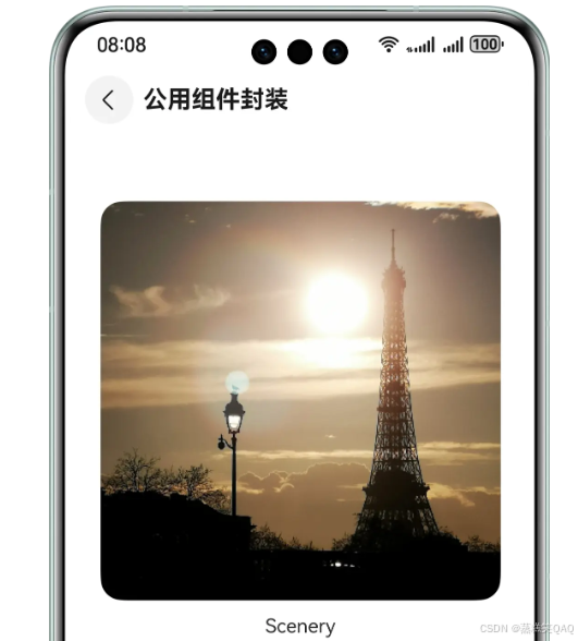
若需抽取一个包含系统组件Image组件和Text组件的公用组件,效果展示如下:
图1 图片和文本组合组件效果
针对固定组合的组件封装采用方案一,实现上述效果的示例代码如下:
- 提供方封装自定义组件CustomImageText并导出。
// src/main/ets/view/CustomImageText.ets
@Component
export struct CustomImageText {
  @Prop imageAttribute: AttributeModifier<ImageAttribute>;
  @Prop textAttribute: AttributeModifier<TextAttribute>;
  @Prop imageSrc: PixelMap | ResourceStr | DrawableDescriptor;
  @Prop text: string;

  build() {
    Column({ space: CommonConstants.BUTTON_SPACING }) {
      Image(this.imageSrc)
        .attributeModifier(this.imageAttribute)
      Text(this.text)
        .attributeModifier(this.textAttribute)
    }
  }
}
- 使用方分别实现Image组件和Text组件的AttributeModifier接口实现类。
// src/main/ets/model/AttributeModifier.ets
// Image组件的AttributeModifier接口实现类
export class ImageModifier implements AttributeModifier<ImageAttribute> {
  private imageWidth: Length = 0;
  private imageHeight: Length = 0;

  constructor(width: Length, height: Length) {
    this.imageWidth = width;
    this.imageHeight = height;
  }

  width(width: Length) {
    this.imageWidth = width;
    return this;
  }

  height(height: Length) {
    this.imageHeight = height;
    return this;
  }

  applyNormalAttribute(instance: ImageAttribute): void {
    instance.width(this.imageWidth);
    instance.height(this.imageHeight);
    instance.borderRadius($r('app.float.padding_l'))
  }
}

// Text组件的AttributeModifier接口实现类
export class TextModifier implements AttributeModifier<TextAttribute> {
  constructor() {
  }

  applyNormalAttribute(instance: TextAttribute): void {
    instance.fontSize($r('app.float.font_size_l'));
  }
}
- 使用方创建Image组件和Text组件的AttributeModifier接口实现类实例,并作为提供方自定义组件CustomImageText的入参传入。
// src/main/ets/pages/CommonComponent.ets
@Component
struct CommonComponent {
  imageAttribute: ImageModifier = new ImageModifier(330, 330);
  textAttribute: TextModifier = new TextModifier();

  build() {
    NavDestination() {
      Column() {
        CustomImageText({
          imageAttribute: this.imageAttribute,
          textAttribute: this.textAttribute,
          imageSrc: $r('app.media.image'),
          text: 'Scenery'
        })
      }
      .margin({ top: $r('app.float.margin_top') })
      .justifyContent(FlexAlign.Start)
      .alignItems(HorizontalAlign.Center)
      .width(CommonConstants.ONE_HUNDRED_PERCENT)
      .height(CommonConstants.ONE_HUNDRED_PERCENT)
    }
    .title(getResourceString($r('app.string.common'), this))
  }
}
弹窗组件封装
场景描述
在应用开发中,通常会遇到自定义弹窗的场景,这些业务场景可能需要实现自定义弹窗的结构和样式。这时提供方可以封装一个传入自定义构建函数的工具类,将类对外导出。使用方可以引入该类,将自定义弹窗结构的@Builder函数作为参数传给封装好的静态类函数中,实现自定义弹窗。
实现原理
通过使用UIContext中获取到的PromptAction对象来实现自定义弹窗工具类的封装。首先通过UIContext实例中的getPromptAction函数获取到promptAction对象,然后通过创建[ComponentContent]定义自定义弹窗的内容,将自定义弹窗内容作为参数传入promptAction对象的openCustomDialog函数中。使用方通过PromptAction对象封装的工具类接口打开弹窗就会显示自定义弹窗的内容,从而实现自定义的弹窗结构与样式。
开发流程
以使用方点击按钮后展示自定义弹窗场景为例,若需实现下图效果,基于promptAction封装弹窗工具类和使用步骤如下:
图2 使用PromptAction封装弹窗效果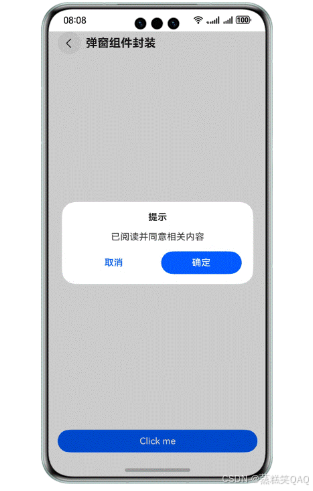
- 使用方通过全局@Builder封装弹窗结构。
// src/main/ets/pages/DialogComponent.ets
@Builder
export function buildText(_obj: Object) {
  Column({ space: CommonConstants.ROW_SPACING }) {
    Text($r('app.string.tips'))
      .fontSize($r('app.float.font_size_l'))
      .fontWeight(FontWeight.Bold)
    Text($r('app.string.content'))
      .fontSize($r('app.float.font_size_l'))
    Row() {
      Button($r('app.string.cancel'))
        .fontColor($r('app.color.blue'))
        .backgroundColor(Color.White)
        .margin({ right: $r('app.float.margin_right') })
        .width(CommonConstants.BUTTON_WIDTH)
        .onClick(() => {
          PopViewUtils.closePopView();
        })
      Button($r('app.string.confirm'))
        .width(CommonConstants.BUTTON_WIDTH)
        .onClick(() => {
          PopViewUtils.closePopView();
        })
    }
    .justifyContent(FlexAlign.Center)
    .width($r('app.float.dialog_width'))
  }
  .width($r('app.float.dialog_width'))
  .padding($r('app.float.padding_l'))
  .justifyContent(FlexAlign.Center)
  .alignItems(HorizontalAlign.Center)
  .backgroundColor(Color.White)
  .borderRadius($r('app.float.border_radius'))
}
- 提供方通过promptAction对象封装弹窗工具类可以分为三步:
- 通过openCustomDialog创建打开弹窗的openDialog函数。
// src/main/ets/model/PopViewUtil.ets
static openDialog<T extends object>(type: PopViewShowType, contentView: WrappedBuilder<[T]>, args: T,
  options?: promptAction.BaseDialogOptions): void {
  let uiContext = AppStorage.get<UIContext>('uiContext');
  if (uiContext) {
    let prompt = uiContext.getPromptAction();
    let componentContent = new ComponentContent(uiContext, contentView, args);
    let customOptions: promptAction.BaseDialogOptions = {
      alignment: options?.alignment || DialogAlignment.Bottom,
    };
    prompt.openCustomDialog(componentContent, customOptions);
    let infoList = PopViewUtils.shareInstance().infoList;
    let info: PopViewModel = {
      com: componentContent,
      popType: type
    };
    infoList[0] = info;
  }
}
- 通过closeCustomDialog创建关闭弹窗的closeDialog函数。
// src/main/ets/model/PopViewUtil.ets
static closeDialog(type: PopViewShowType): void {
  let uiContext = AppStorage.get<UIContext>('uiContext');
  if (uiContext) {
    let prompt = uiContext.getPromptAction();
    let sameTypeList = PopViewUtils.shareInstance().infoList.filter((model) => {
      return model.popType === type;
    })
    let info = sameTypeList[sameTypeList.length - 1];
    if (info.com) {
      PopViewUtils.shareInstance().infoList = PopViewUtils.shareInstance().infoList.filter((model) => {
        return model.com !== info.com;
      })
      prompt.closeCustomDialog(info.com);
    }
  }
}
- 封装对外的打开和关闭弹窗接口函数。
// src/main/ets/model/PopViewUtil.ets
static showPopView<T extends object>(contentView: WrappedBuilder<[T]>, args: T,
  options?: promptAction.BaseDialogOptions): void {
  PopViewUtils.openDialog(PopViewShowType.OPEN, contentView, args, options);
}

static closePopView(): void {
  PopViewUtils.closeDialog(PopViewShowType.OPEN);
}
3.使用方调用弹窗工具类传入封装好的弹窗结构实现自定义弹窗
// src/main/ets/pages/DialogComponent.ets
import { PopViewUtils } from '../model/PopViewUtils';
// ...
@Entry
@Component
struct DialogComponent {
  build() {
    NavDestination() {
      Column() {
        Button('Click me')
          .width(CommonConstants.ONE_HUNDRED_PERCENT)
          .onClick(() => {
            PopViewUtils.showPopView<Object>(wrapBuilder(buildText), new Object(),
              { alignment: DialogAlignment.Center });
          })
      }
      .justifyContent(FlexAlign.End)
      .padding({
        left: $r('app.float.padding'),
        right: $r('app.float.padding'),
        bottom: $r('app.float.padding')
      })
      .width(CommonConstants.ONE_HUNDRED_PERCENT)
      .height(CommonConstants.ONE_HUNDRED_PERCENT)
    }
    .title(getResourceString($r('app.string.dialog'), this))
  }
}
组件工厂类封装
场景描述
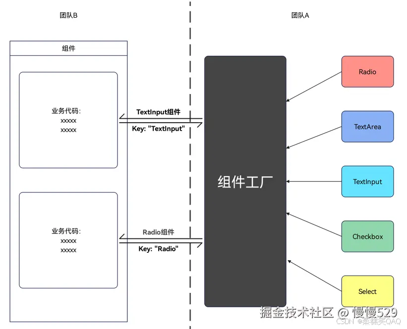
如下图所示,团队A实现了一个组件工厂类并供外部使用,该类封装了多个组件。业务团队B在不同业务需求开发场景下,希望通过组件名从组件工厂类实例获取对应的组件。例如,B团队向工厂实例中里传入组件名参数"Radio",可以获取到对应的Radio组件模板。
图3 组件工厂场景
实现原理
对于该场景,考虑使用Map结构将封装的各个组件存入,使用时通过Map的key值获取相应组件。对于单个组件的传递,目前系统提供了[@Builder]装饰器,该装饰器使得装饰后的函数遵循自定义组件build()函数语法规则。当@Builder装饰的方法作为参数传递使用时,可以将@Builder方法传入wrapBuilder函数中实现组件的传递使用。通过组件工厂的封装和传递,避免了在调用方的build()函数内使用多个if else展示不同组件的写法,实现了简洁的组件封装形式。
开发流程
组件工厂以Map结构存储各种组件,其中key为组件名,value为[WrappedBuilder]对象。该对象支持赋值和传递,是系统提供的wrapBuilder函数的返回值。组件工厂场景的实现主要包含以下步骤:
- 在组件工厂实现方,将需要工厂化的组件通过全局@Builder方法封装。
// src/main/ets/view/FactoryMap.ets
// 单选框
@Builder
function myRadio() {
  Text($r('app.string.radio'))
    .width('100%')
    .fontColor($r('sys.color.mask_secondary'))
  Row() {
    Radio({ value: '1', group: 'radioGroup' })
      .margin({ right: $r('app.float.margin_right') })
    Text('man')
  }
  .width(CommonConstants.ONE_HUNDRED_PERCENT)

  Row() {
    Radio({ value: '0', group: 'radioGroup' })
      .margin({ right: $r('app.float.margin_right') })
    Text('woman')
  }
  .width(CommonConstants.ONE_HUNDRED_PERCENT)
}
// 复选框
@Builder
function myCheckbox() {
  Text($r('app.string.checkbox'))
    .width('100%')
    .fontColor($r('sys.color.mask_secondary'))
  Row() {
    CheckboxGroup({ group: 'checkboxGroup' })
      .checkboxShape(CheckBoxShape.ROUNDED_SQUARE)
    Text('all')
      .margin({ left: $r('app.float.margin_right') })
  }
  .width(CommonConstants.ONE_HUNDRED_PERCENT)

  Row() {
    Checkbox({ name: '1', group: 'checkboxGroup' })
      .shape(CheckBoxShape.ROUNDED_SQUARE)
      .margin({ right: $r('app.float.margin_right') })
    Text('text1')
  }
  .width(CommonConstants.ONE_HUNDRED_PERCENT)

  Row() {
    Checkbox({ name: '0', group: 'checkboxGroup' })
      .shape(CheckBoxShape.ROUNDED_SQUARE)
      .margin({ right: $r('app.float.margin_right') })
    Text('text2')
  }
  .width(CommonConstants.ONE_HUNDRED_PERCENT)
}
- 在组件工厂实现方,将封装好的全局@Builder方法使用wrapBuilder函数包裹,并将返回值作为组件工厂Map的value值存入。全部组件存入后,将组件工厂导出供外部使用。
// src/main/ets/view/FactoryMap.ets
// 定义组件工厂Map
let factoryMap: Map<string, object> = new Map();

// 将需要工厂化的组件存入到组件工厂中
factoryMap.set('Radio', wrapBuilder(myRadio));
factoryMap.set('Checkbox', wrapBuilder(myCheckbox));

// 导出组件工厂
export { factoryMap };
- 在使用方,引入组件工厂并通过key值获取对应的WrappedBuilder对象。
// src/main/ets/ComponentFactory.ets
// 导入组件工厂,路径需按照实际位置导入,此处仅做示例参考
import { factoryMap } from '../view/FactoryMap';
// ...
// 通过组件工厂Map的key值获取对应的WrappedBuilder对象
let myRadio: WrappedBuilder<[]> = factoryMap.get('Radio') as WrappedBuilder<[]>;
let myCheckbox: WrappedBuilder<[]> = factoryMap.get('Checkbox') as WrappedBuilder<[]>;
- 在使用方的组件build方法中,通过调用WrappedBuilder对象的builder方法获取具体组件。
// src/main/ets/ComponentFactory.ets
@Component
struct ComponentFactory {
  build() {
    NavDestination() {
      Column({ space: CommonConstants.BUTTON_SPACING }) {
        // myRadio和myCheckbox是从组件工厂中获取的WrappedBuilder对象
        myRadio.builder();
        myCheckbox.builder();
      }
      .width(CommonConstants.ONE_HUNDRED_PERCENT)
      .padding($r('app.float.padding'))
    }
    .title(getResourceString($r('app.string.factory'), this))
  }
}
说明
使用wrapBuilder方法有以下限制:
- wrapBuilder方法只支持传入全局@Builder方法。
- wrapBuilder方法返回的WrappedBuilder对象的builder属性方法只能在struct内部使用。

讨论HarmonyOS开发技术,专注于API与组件、DevEco Studio、测试、元服务和应用上架分发等。
更多推荐
 18
18 0
0- 0


 已为社区贡献44条内容

所有评论(0)