鸿蒙5.0 APP开发案例分析:自定义键盘开发实践
自定义键盘是一种简易的键盘替换系统默认键盘,允许用户根据实际业务场景和习惯偏好,调整键盘的布局和位置、添加额外的功能键,使输入更加便捷和舒适,从而提升整体的用户体验。同时自定义键盘也可以增强用户输入的安全性,避免敏感信息被截取或者泄露。自定义键盘的实现自定义键盘和系统键盘的切换自定义键盘的布局避让自定义键盘实现防截屏自定义键盘布局实现输入控件绑定自定义键盘布局自定义键盘输入控制自定义键盘光标控制自
往期推文全新看点(文中附带全新鸿蒙5.0全栈学习笔录)
✏️ 鸿蒙应用开发与鸿蒙系统开发哪个更有前景?
✏️ 嵌入式开发适不适合做鸿蒙南向开发?看完这篇你就了解了~
✏️ 对于大前端开发来说,转鸿蒙开发究竟是福还是祸?
✏️ 鸿蒙岗位需求突增!移动端、PC端、IoT到底该怎么选?
✏️ 记录一场鸿蒙开发岗位面试经历~
✏️ 持续更新中……
概述
自定义键盘是一种简易的键盘替换系统默认键盘,允许用户根据实际业务场景和习惯偏好,调整键盘的布局和位置、添加额外的功能键,使输入更加便捷和舒适,从而提升整体的用户体验。同时自定义键盘也可以增强用户输入的安全性,避免敏感信息被截取或者泄露。
本文将从以下几个方面介绍自定义键盘的实现和使用:
- 自定义键盘的实现
- 自定义键盘和系统键盘的切换
- 自定义键盘的布局避让
- 自定义键盘实现防截屏
自定义键盘的实现
自定义键盘的实现包括以下几个步骤:
- 自定义键盘布局实现
- 输入控件绑定自定义键盘布局
- 自定义键盘输入控制
- 自定义键盘光标控制
- 自定义键盘弹出与收起
自定义键盘布局实现
自定义键盘的布局以自定义组件的方式呈现,根据具体业务场景由开发者实现。自定义键盘的高度通过自定义组件根节点的height属性设置,宽度不可设置,默认铺满屏幕。
// entry/src/main/ets/view/CustomKeyboard.ets
@Component
export struct CustomKeyboard {
  // ...

  build() {
    Column() {
      // ...
    }
    // 修改自定义组件根节点的height属性
    .height($r('app.float.keyboard_total_height'))
    // ...
  }
}
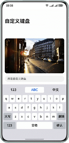
以Grid方式实现数字键盘布局示例:
图1

// entry/src/main/ets/view/NumberKeyboard.ets
@Component
export struct NumberKeyboard {
  @Consume inputText: string;
  @Consume keyBoardController: KeyboardController;
  layoutOptions: GridLayoutOptions = {
    regularSize: [1, 1],
    irregularIndexes: [14, 16],
    onGetIrregularSizeByIndex: (index: number) => {
      if (index === 14) {
        return [2, 1];
      }
      return [1, 2];
    }
  }

  build() {
    Grid(undefined, this.layoutOptions) {
      ForEach(numberKeyboardData, (item: Menu) => {
        GridItem() {
          Button(item.text, { type: ButtonType.Normal })
            .onClick(() => {
              this.inputText = this.keyBoardController.onInput(item.text);
            })
            .fontColor(Color.Black)
            .backgroundColor(item.backgroundColor)
            .borderRadius(Constants.KEYBOARD_BUTTON_RADIUS)
            .fontSize(Constants.KEYBOARD_BUTTON_FONTSIZE_18)
            .padding(0)
            .width(item.width)
            .height(item.height)
        }
      }, (item: string) => JSON.stringify(item))
    }
    .columnsTemplate('1fr 1fr 1fr 1fr 1fr')
    .rowsGap($r('app.float.number_keyboard_grid_gap'))
    .columnsGap($r('app.float.number_keyboard_grid_gap'))
  }
}
输入控件绑定自定义键盘布局
输入控件(TextArea、TextInput、RichEditor、Search)支持通过 customKeyboard 属性绑定自定义键盘布局。绑定自定义键盘后,输入控件获取焦点时,不会拉起系统键盘,而是加载指定的自定义键盘。本文后续以TextInput控件为例进行介绍。
图2

代码示例如下:
build() {
  Column() {
    TextInput({
      placeholder: '绑定自定义键盘',
      text: this.inputText,
      controller: this.textInputController
    })
      // 绑定自定义键盘布局
      .customKeyboard(this.customKeyboard())
      // ...
  }
}

@Builder
customKeyboard() {
  CustomKeyboard()
}
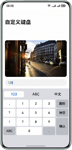
自定义键盘输入控制
自定义键盘可以拦截手势事件,通过对状态变量的修改,实现文本的输入。
图3
以英文键盘为例,监听EnglishButton的onClick事件,修改状态变量。
// entry/src/main/ets/view/EnglishKeyboard.ets
@Component
struct EnglishButton {
  @Consume inputText: string;
  // ...

  build() {
    Button(this.getEnglishText(this.item), { type: ButtonType.Normal })
      // ...
      .onClick(() => {
        // 拦截自定义键盘按钮的点击事件,根据业务场景修改状态变量
        this.inputText = this.keyBoardController.onInput(this.getEnglishText(this.item));
      })
  }
}
通过对状态变量inputText的修改,实现文本输入。
// entry/src/main/ets/view/TextInputComponent.ets
@Component
export struct TextInputComponent {
  @Provide inputText: string = '';
  // ...

  build() {
    Column() {
      TextInput({
        placeholder: '绑定自定义键盘',
        text: this.inputText,
        controller: this.textInputController
      })
      // ...
    }
  }

  // ...
}
自定义键盘光标控制
通过监听TextInput的 onTextSelectionChange 生命周期,获取初始光标位置、文本输入后,调用TextInputController的 caretPosition 方法,设置最终光标位置。
图4

获取光标位置:
// entry/src/main/ets/view/TextInputComponent.ets
TextInput({
  placeholder: '绑定自定义键盘',
  text: this.inputText,
  controller: this.textInputController
})
  // 监听光标位置变化
  .onTextSelectionChange((start: number, end: number) => {
    this.keyBoardController.setCaretPosition(start, end);
  })
  // ...
设置光标位置:
// entry/src/main/ets/model/KeyboardController.ets
onChange(value: string) {
  this.text = value;
  if (this.keyBoardType !== Constants.SYSTEM_KEYBOARD) {
    // 设置光标位置
    this.textInputController?.caretPosition(this.targetCaretPos);
  }
}
自定义键盘弹出与收起
通过对焦点进行控制,可以实现键盘的弹出和收起,参考 软键盘的弹出收起和监听 。
开发者也可以通过TextInputController的stopEditing方法控制键盘关闭,下面的自定义键盘示例中,点击确认按键关闭自定义键盘。
图5
// entry/src/main/ets/model/KeyboardController.ets
onInput(value: string): string {
  switch (value) {
    // ...
    case '确定':
      this.textInputController?.stopEditing();
      break;
    // ...
  }
  return this.text;
}
自定义键盘和系统键盘的切换
当需要实现同一个输入框内可以切换自定义键盘和系统键盘时,可以通过如下方式实现:
Tab栏点击“123”、“ABC”按钮,this.isCustomKeyboardAttach为true,TextInput绑定自定义键盘;点击“中文”按钮,this.isCustomKeyboardAttach为false,切换系统键盘。
图6

// entry/src/main/ets/view/TextInputComponent.ets
TextInput({
  placeholder: '绑定自定义键盘',
  text: this.inputText,
  controller: this.textInputController
})
  .customKeyboard(this.isCustomKeyboardAttach ? this.customKeyboard() : null)
  // ...
自定义键盘的布局避让
使用系统提供的自定义键盘避让功能
为了确保输入框不被自定义键盘挡住,系统默认提供了输入框避让自定义键盘的能力。在TextInput组件的customKeyboard属性设置 supportAvoidance 为true,开启系统提供的自定义键盘避让功能。键盘的避让机制和常见问题的解决方法。
图7

// entry/src/main/ets/view/TextInputComponent.ets
TextInput({
  placeholder: '绑定自定义键盘',
  text: this.inputText,
  controller: this.textInputController
})
  .customKeyboard(this.customKeyboard(), { supportAvoidance: true })
  // ...
系统默认的自定义键盘避让功能只能保证输入框不被遮挡,输入框下方的组件可能会被自定义键盘挡住,如上图中所示,输入框下方的tab栏被自定义键盘挡住。为解决这一问题,需要开发者自己实现自定义键盘的避让功能。
开发者自己实现自定义键盘的避让功能
开发者需要监听自定义键盘根节点的onAreaChange生命周期,获取自定义键盘的高度,根据实际场景设置布局的避让。
图8
监听自定义键盘布局的onAreaChange生命周期,通过newValue.height获取自定义键盘弹出时的高度,根据实际业务场景计算布局避让高度avoidHeight。
// entry/src/main/ets/view/CustomKeyboard.ets
@Component
export struct CustomKeyboard {
  // ...

  build() {
    Column() {
      // ...
    }
    .onAreaChange((oldValue: Area, newValue: Area) => {
      this.customKeyboardHeight = Number(newValue.height);
      let avoidHeight: number = (this.isCustomKeyboardAttach ? this.customKeyboardHeight : this.systemKeyboardHeight)
        - this.bottomRectHeight;
      this.keyBoardController.changeAvoidHeight(avoidHeight);
    })
    // ...
  }
}
通过 emitter 的方式,发送自定义键盘高度变化的通知。
// entry/src/main/ets/model/KeyboardController.ets
// 以公共事件的形式,通知布局高度变化
changeAvoidHeight(value: number) {
  let event: emitter.InnerEvent = {
    eventId: Constants.AVOID_EVENT_ID
  };
  let eventData: emitter.EventData = {
    data: {
      'avoidHeight': value
    }
  };
  emitter.emit(event, eventData);
}
接收到高度变化通知后,根据实际业务场景,设置页面的避让高度。
// entry/src/main/ets/pages/MainPage.ets
@Entry
@Component
struct MainPage {
  @State bottomPadding: number = Constants.MAIN_PAGE_INITIAL_PADDING;

  aboutToAppear(): void {
    let event: emitter.InnerEvent = {
      eventId: Constants.AVOID_EVENT_ID
    };
    emitter.on(event, (eventData: emitter.EventData) => {
      if (eventData.data) {
        let avoidHeight: number = eventData.data['avoidHeight'];
        if (avoidHeight === 0) {
          this.bottomPadding = Constants.MAIN_PAGE_INITIAL_PADDING;
        } else {
          this.bottomPadding = avoidHeight;
        }
      }
    });
  }

  build() {
    Navigation() {
      Column() {
        // ...
      }
      .padding({ bottom: this.bottomPadding })
      // ...
    }
    .mode(NavigationMode.Stack)
    .titleMode(NavigationTitleMode.Full)
    .title($r('app.string.main_page_title'))
  }
}
自定义键盘实现防截屏
用户使用自定义键盘输入敏感信息时,可以设置禁止截屏,有效防止他人在未经许可的情况下获取用户的敏感信息,从而保护用户的隐私安全。

讨论HarmonyOS开发技术,专注于API与组件、DevEco Studio、测试、元服务和应用上架分发等。
更多推荐
 23
23 0
0- 0


 已为社区贡献43条内容

所有评论(0)