HarmonyOS应用开发者的宝藏APP-HMOS代码工坊-组件堆叠滑动折叠效果(二)
目录
- 前言
- 第三部分物品栏
- 基础布局
- 滑动冲突
- 物品卡片透明度效果
- 第四部分
- 分类
- 横向滑动列表
- 计算对应的属性值
- 后记
前言
在前一篇文章中,我们分析了组件堆叠效果的模块划分和实现思路,并且实现了前两个最简单的部分。接下来我们继续实现剩余部分
第三部分物品栏
由于向上滑动的时候需要底部第四部分的商品列表需要被第三部分遮盖,我们同样使用Stack来做父布局,使用zIndex属性来调整Z轴层级来实现覆盖效果。
基础布局
build() {
Stack({alignContent:Alignment.Top}) {
Row(){
Image($r("app.media.user_portrait"))
.width(30)
.aspectRatio(1)
.borderRadius(15)
Blank().height(0)
Image($r("app.media.stack_scan"))
.width(30)
.aspectRatio(1)
}.width("100%").height(50).alignItems(VerticalAlign.Center).padding({left:15,right:15})
Scroll(this.outSideScrollController){
Column(){
//搜索框
Row() {
Image($r('app.media.search'))
.width(20)
.aspectRatio(1)
.margin({ left: 20 })
Text('搜索提示语')
.opacity(0.6)
.fontColor(Color.Black)
.fontColor(Color.Black)
.fontSize(16)
.margin({ left: 10 })
}
.height(this.searchAreaHeight)
.backgroundColor(Color.White)
.width("100%")
.borderRadius(12)
.onClick((_) => {
this.getUIContext().getPromptAction().showToast({ message: "跳转到搜索页面" })
})
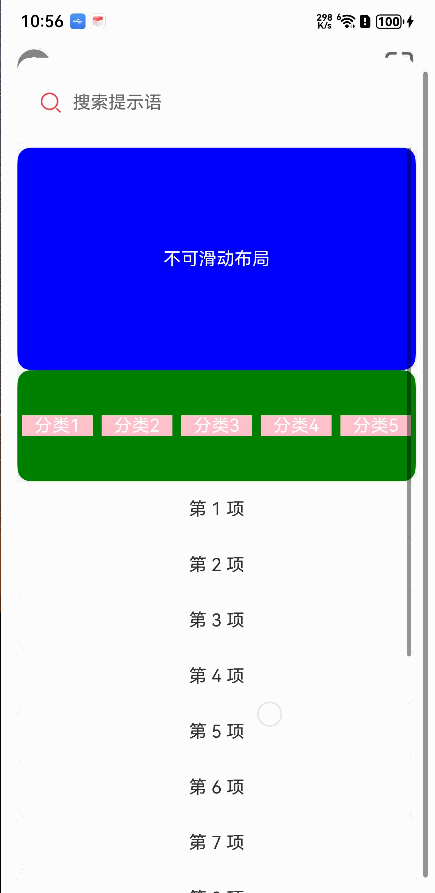
Stack({alignContent:Alignment.Top}){
if(this.showHorizontalList){
Row(){
Text("横向滑动列表").fontColor(Color.White)
}.height(100).width("100%").borderRadius(12).backgroundColor(Color.Red).justifyContent(FlexAlign.Center)
}else{
Row(){
Text("不可滑动布局").fontColor(Color.White)
}.height(200).width("100%").borderRadius(12).backgroundColor(Color.Blue).justifyContent(FlexAlign.Center)
}
Scroll(this.inSideScrollController){
Column(){
Row({space:10}){
Text("分类1").fontColor(Color.White).layoutWeight(1).textAlign(TextAlign.Center).backgroundColor(Color.Pink)
Text("分类2").fontColor(Color.White).layoutWeight(1).textAlign(TextAlign.Center).backgroundColor(Color.Pink)
Text("分类3").fontColor(Color.White).layoutWeight(1).textAlign(TextAlign.Center).backgroundColor(Color.Pink)
Text("分类4").fontColor(Color.White).layoutWeight(1).textAlign(TextAlign.Center).backgroundColor(Color.Pink)
Text("分类5").fontColor(Color.White).layoutWeight(1).textAlign(TextAlign.Center).backgroundColor(Color.Pink)
}.height(100).width("100%").backgroundColor(Color.Green).justifyContent(FlexAlign.SpaceAround)
ForEach(this.fakeProduct,(item:string,index:number)=>{
ListItem(){
Row(){
Text(item)
}.width("100%").height(50).justifyContent(FlexAlign.Center).backgroundColor(Color.White).borderRadius(12)
}
})
}
}.onScrollFrameBegin((offset:number)=>{
let yOffset = this.inSideScrollController.currentOffset().yOffset
return {offsetRemain:offset}
})
}
}.margin({top:50}).height("100%").justifyContent(FlexAlign.Start)
}.padding({left:15,right:15}).height("100%").width("100%")
.onScrollFrameBegin((offset:number,state:ScrollState)=>{
let yOffset = this.outSideScrollController.currentOffset().yOffset
this.searchAreaHeight = 100 - yOffset * 0.6
return {offsetRemain:offset}
})
}.backgroundColor("#f1f1f1")
.height('100%')
.width('100%')
}
滑动冲突
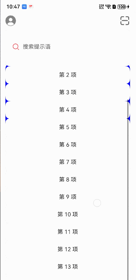
发现了两个个问题:
- 嵌套滑动的滑动冲突
从图上来看,当手指在内部的Scroll滑动时只能滑动内部的Scroll,在外部Scroll滑动时,只能滑动外部的Scroll,这和我们的需求不符合。 - 第三部分的物品卡片没有展示出来。
对于问题1我们可以通过设置nestedScroll属性来解决。
对于问题2我们可以对内部Scroll的直接子组件Colum加个margin属性解决。
            Scroll(this.inSideScrollController){
              Column(){
              //分类
                Row({space:10}){
}.height(100).width("100%").backgroundColor(Color.Green).justifyContent(FlexAlign.SpaceAround).borderRadius(12)
                ForEach(this.fakeProduct,(item:string,index:number)=>{
                  ListItem(){
                    Row(){
                      Text(item)
                    }.width("100%").height(50).justifyContent(FlexAlign.Center).backgroundColor(Color.White).borderRadius(12)
                  }
                })
              }
//和顶部的距离为第三部分物品卡片的高度
.margin({top:200})

            }.nestedScroll({
              scrollForward: NestedScrollMode.PARENT_FIRST,
              scrollBackward: NestedScrollMode.SELF_FIRST
            })
 现在来看效果就正常了。
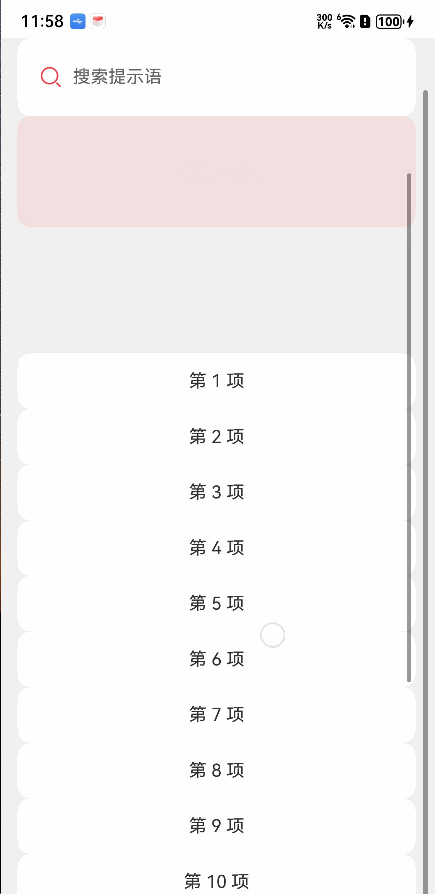
物品卡片透明度效果
为了方便后面的计算,我们定义几个常量和变量
const SEARCH_AREA_HEIGHT = 100
const ITEM_CARDS_AREA_HEIGHT = 200
const HORIZONTAL_LIST_HEIGHT = 100
  outSideScrollController:Scroller = new Scroller()
  inSideScrollController:Scroller = new Scroller()

  @State searchAreaHeight:number = SEARCH_AREA_HEIGHT
  @State showHorizontalList:boolean = false

  @State itemCardsAreaOpacity:number = 1
  @State horizontalListOpacity:number = 0
  @State classifyAreaOpacity:number = 1
然后在横向滑动列表、 不可滑动布局和分类上添加不透明度属性。
在内部Scroll的onScrollFrameBegin事件的回调中,获取滑动距离并且计算不透明度属性
          Stack({alignContent:Alignment.Top}){
            if(this.showHorizontalList){
              Row(){
                Text("横向滑动列表").fontColor(Color.White)
              }.zIndex(1).height(HORIZONTAL_LIST_HEIGHT).width("100%").borderRadius(12).backgroundColor(Color.Red).justifyContent(FlexAlign.Center).opacity(this.horizontalListOpacity)//添加不透明度属性
            }else{
              Row(){
                Text("不可滑动布局").fontColor(Color.White)
              }.height(ITEM_CARDS_AREA_HEIGHT).width("100%").borderRadius(12).backgroundColor(Color.Blue).justifyContent(FlexAlign.Center).opacity(this.itemCardsAreaOpacity)//添加不透明度属性
            }
            Scroll(this.inSideScrollController){
              Column(){
              //分类
                Row({space:10}){
                }.height(100).width("100%").backgroundColor(Color.Green).justifyContent(FlexAlign.SpaceAround).borderRadius(12).opacity(this.classifyAreaOpacity)//添加不透明度属性
                ForEach(this.fakeProduct,(item:string,index:number)=>{
                  ListItem(){
                    Row(){
                      Text(item)
                    }.width("100%").height(50).justifyContent(FlexAlign.Center).backgroundColor(Color.White).borderRadius(12)
                  }
                })
              }.margin({top:ITEM_CARDS_AREA_HEIGHT})

            }.nestedScroll({
              scrollForward: NestedScrollMode.PARENT_FIRST,
              scrollBackward: NestedScrollMode.SELF_FIRST
            }).onScrollFrameBegin((offset:number)=>{
              let yOffset = this.inSideScrollController.currentOffset().yOffset
              console.error(`inSideScroll ${yOffset}`)

             let maxDiff = ITEM_CARDS_AREA_HEIGHT - HORIZONTAL_LIST_HEIGHT
             let diff =maxDiff - yOffset
             //滑动具体超过二者的差值,则展示横向滑动列表;否则展示物品卡片
              if(diff>= 0){
                this.itemCardsAreaOpacity = diff/maxDiff
                this.classifyAreaOpacity = diff/maxDiff
                this.showHorizontalList =false
              }else{
                  //横向滑动列表的不透明度
                this.horizontalListOpacity = -diff/maxDiff
                this.showHorizontalList = true
              }
              return {offsetRemain:offset}
            })
          }
效果看起来也还可以,我们替换一下素材看看
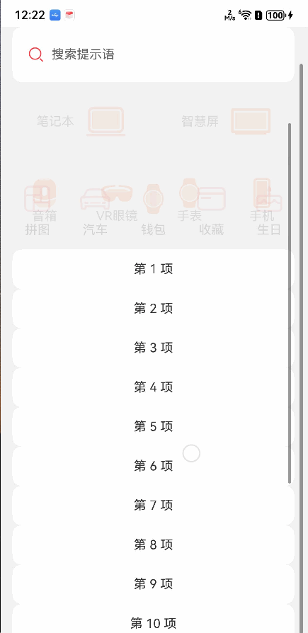
第四部分
接下来我们来实现底部第四部分的分类缩放和横向滑动列表的间距变化。
分类
这里我们做的简单点,分类项的缩放值和不透明度取相同值,就不再额外计算了。如果需要修改效果,根据滑动偏移量重新计算一个值就好了。
 Column({ space: 10 }) {
   Image($r('app.media.ic_gallery_puzzle')).width(40)
     .aspectRatio(1)
     .objectFit(ImageFit.Contain)
   Text("拼图")
     .fontSize(16)
     .fontColor(Color.Black)
     .textAlign(TextAlign.Center)
 }
 .scale({x:this.classifyAreaOpacity,y:this.classifyAreaOpacity})
 .layoutWeight(1)
 .justifyContent(FlexAlign.Center)
这里是其中一个分类项的布局
横向滑动列表
横向滑动列表刚出现时,列表项间距是最大的,随着向上滑动,列表项间距逐渐变小,最终固定为一个最小值。这里我们设置最大间距为50,最小间距为10。同样的在内部Scroll的onScrollFrameBegin的回调中进行计算
const MIN_HORIZONTAL_LIST_SPACE:number = 10
const MAX_HORIZONTAL_LIST_SPACE:number = 50
间距初始值为最大间距
@State horizontalListSpace:number= MAX_HORIZONTAL_LIST_SPACE
重新写一下布局,直接替换为素材。这里的FakeHorizontalData是自定义数据类,包含name和icon属性。
if(this.showHorizontalList){
  Scroll(){
    Row({space:this.horizontalListSpace}){
      ForEach(this.fakeHorizontalDataList,(item:FakeHorizontalData,index:number)=>{
        Column(){
          Image(item.icon).width(40).aspectRatio(1)
            .objectFit(ImageFit.Contain)
          Blank().width(15).height(0)
          Text(item.name).fontSize(16)
        }.width(80).backgroundColor(Color.White).borderRadius(10).height(90).justifyContent(FlexAlign.Center)
      })
    }.justifyContent(FlexAlign.Center)
  }.scrollable(ScrollDirection.Horizontal).zIndex(1).height(HORIZONTAL_LIST_HEIGHT).width("100%").opacity(this.horizontalListOpacity).backgroundColor("#f1f1f1")

}
计算对应的属性值
在内部Scroll的onScrollFrameBegin的回调中进行计算
.onScrollFrameBegin((offset:number)=>{
   let yOffset = this.inSideScrollController.currentOffset().yOffset
   console.error(`inSideScroll ${yOffset}`)

  let maxDiff = (ITEM_CARDS_AREA_HEIGHT - HORIZONTAL_LIST_HEIGHT)
  let diff =maxDiff - yOffset
   if(diff>= 0){
     this.itemCardsAreaOpacity = diff/maxDiff
     this.classifyAreaOpacity = diff/maxDiff
     this.showHorizontalList =false
   }else{
     this.horizontalListOpacity = -diff/maxDiff
     this.showHorizontalList = true


     let calcSpace:number = MAX_HORIZONTAL_LIST_SPACE + diff
     if(calcSpace > MIN_HORIZONTAL_LIST_SPACE){
       this.horizontalListSpace = calcSpace
     }else{
       this.horizontalListSpace = MIN_HORIZONTAL_LIST_SPACE
     }

   }
   return {offsetRemain:offset}
 })
来看下效果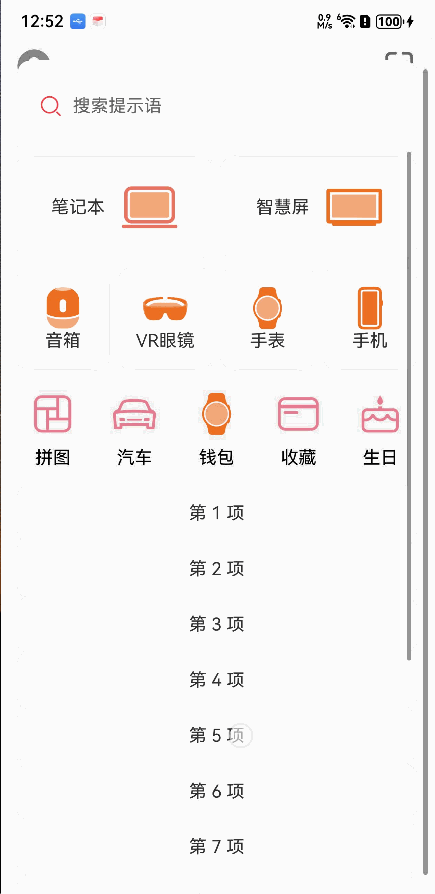
这样我们就大致复刻了HMOS代码工坊应用中的组件堆叠效果。
最下面的商品列表没有实现,没啥难度,自己替换一下就好了
后记
HMOS代码工坊的组件堆叠效果源码在这里 https://gitee.com/harmonyos_samples/component-stack
对比代码后发现,HMOS代码工坊中对于第三部分实现是使用GridCol和GridRow进行实现的。滑动时的效果也比较舒服,自己实现的滑动效果还需要进行数值上的调整。
不过大体来看,效果还算可以
【 更多精彩内容,请关注公众号:【名称:HarmonyOS开发者技术,ID:HarmonyOS_Dev】;也欢迎加入鸿蒙开发者交流群:https://work.weixin.qq.com/gm/48f89e7a4c10206e053e01ad124004a0】

讨论HarmonyOS开发技术,专注于API与组件、DevEco Studio、测试、元服务和应用上架分发等。
更多推荐
 0
0 0
0- 0


 已为社区贡献162条内容

所有评论(0)