最佳实践 - ArkTS 驱动鸿蒙元服务开发:从界面布局到交互逻辑,打造多功能决策类元服务
最佳实践 - ArkTS 驱动鸿蒙元服务开发:从界面布局到交互逻辑,打造多功能决策类元服务
项目目录结构与功能模块说明
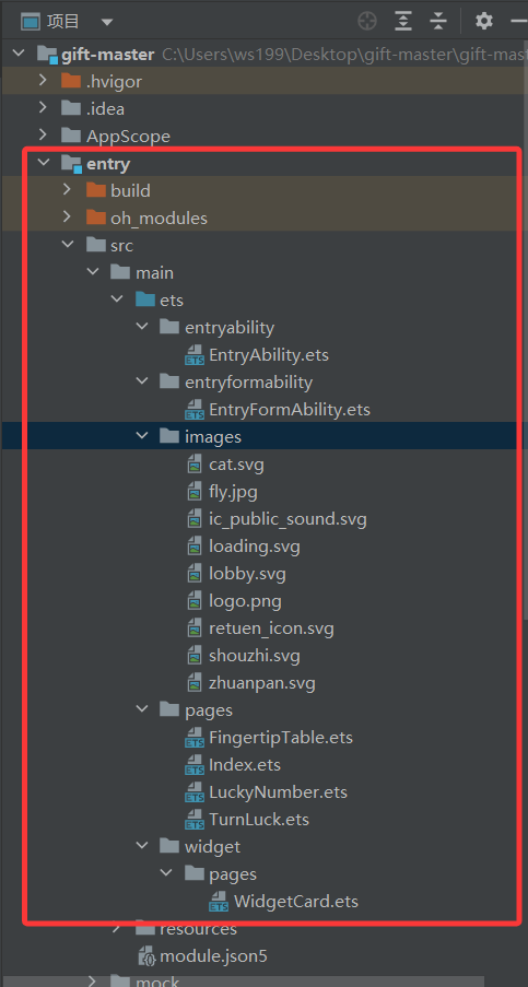
entry/src/main/ets/
├── entryability/    # 应用程序入口能力
│   └── EntryAbility.ets  # 主入口文件
├── entryformability/ # 卡片能力相关
├── images/          # 图片资源文件
├── pages/           # 页面组件
│   ├── Index.ets           # 主页面
│   ├── FingertipTable.ets  # 决策币功能
│   ├── LuckyNumber.ets     # 幸运号码功能
│   └── TurnLuck.ets        # 转出好运功能
└── widget/          # 小组件相关
主页面设计(Index)
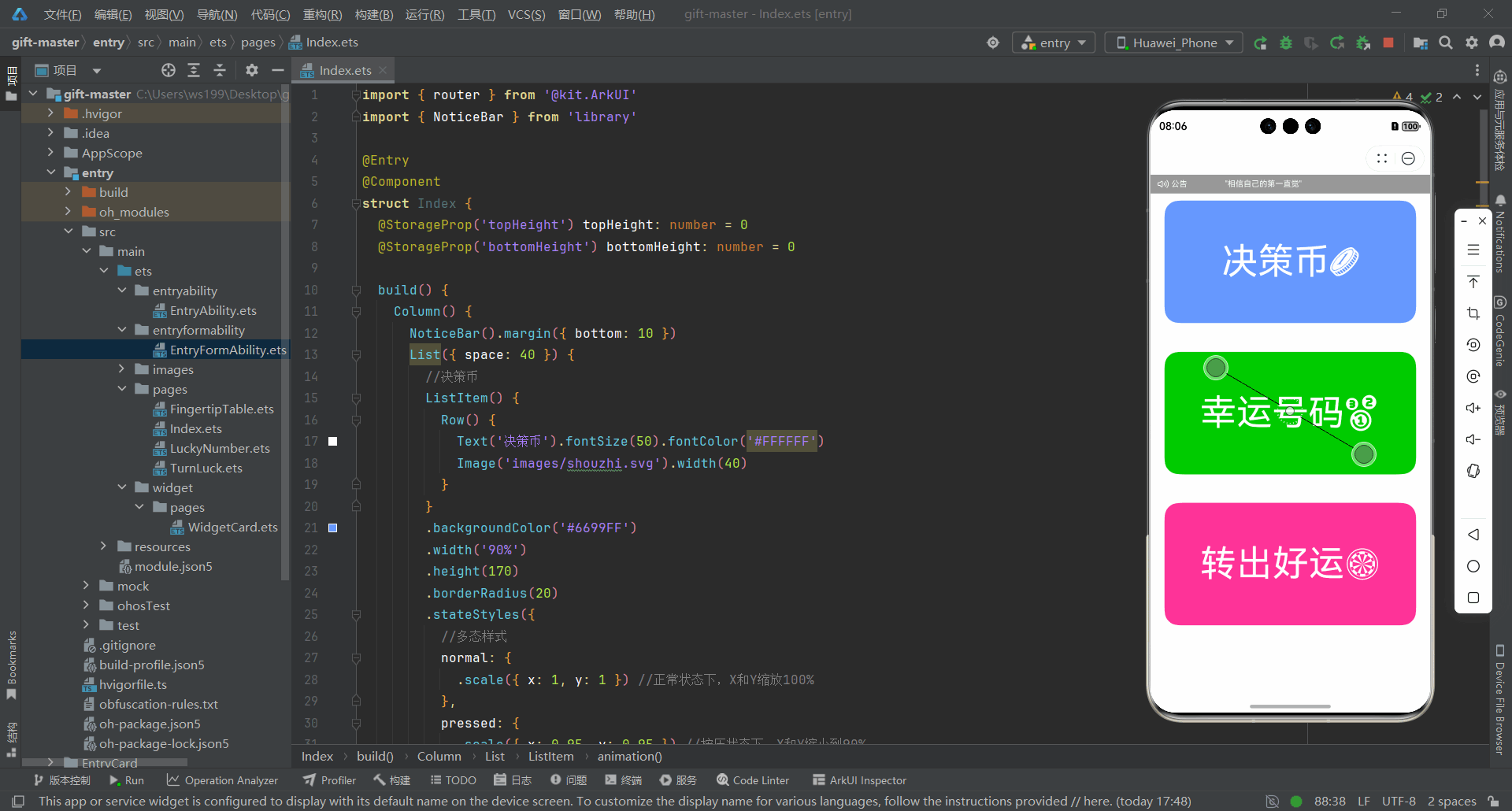
声明式布局:Column + List
响应式状态管理:@StorageProp
统一路由跳转机制:router.pushUrl
交互动画多态样式:stateStyles + animation
布局主体结构
页面外层采用 Column 实现垂直布局,内部通过 List 组件构建 "决策币、幸运号码、转出好运" 功能入口,使用 padding 动态适配顶部与底部安全区域。
Column() {
  NoticeBar().margin({ bottom: 10 })
  List({ space: 40 }) {
    // 子项列表
  }
  .alignListItem(ListItemAlign.Center)
}
.padding({ top: this.topHeight + 51, bottom: this.bottomHeight })
.height('100%')
.width('100%')
功能入口组件封装
每个 ListItem 作为独立功能入口,通过 stateStyles 实现按压缩放动画增强交互体验,以 router.pushUrl() 完成页面的跳转。
ListItem() {
  Row() {
    Text('决策币').fontSize(50).fontColor('#FFFFFF')
    Image('images/shouzhi.svg').width(40)
  }
}
.backgroundColor('#6699FF')
.width('90%')
.height(170)
.borderRadius(20)
.stateStyles({
  normal: { .scale({ x: 1, y: 1 }) },
  pressed: { .scale({ x: 0.95, y: 0.95 }) }
})
.animation({ duration: 200 })
.onClick(_ => {
  router.pushUrl({ url: 'pages/FingertipTable' })
})
多功能模块统一交互逻辑
相同跳转逻辑复用:决策币、幸运号码、转出好运三个功能入口,通过统一的 router.pushUrl() 实现页面导航,保证路由逻辑一致。
router.pushUrl({ url: 'pages/FingertipTable' })
router.pushUrl({ url: 'pages/LuckyNumber' })
router.pushUrl({ url: 'pages/TurnLuck' })
应用入口能力实现(EntryAbility)
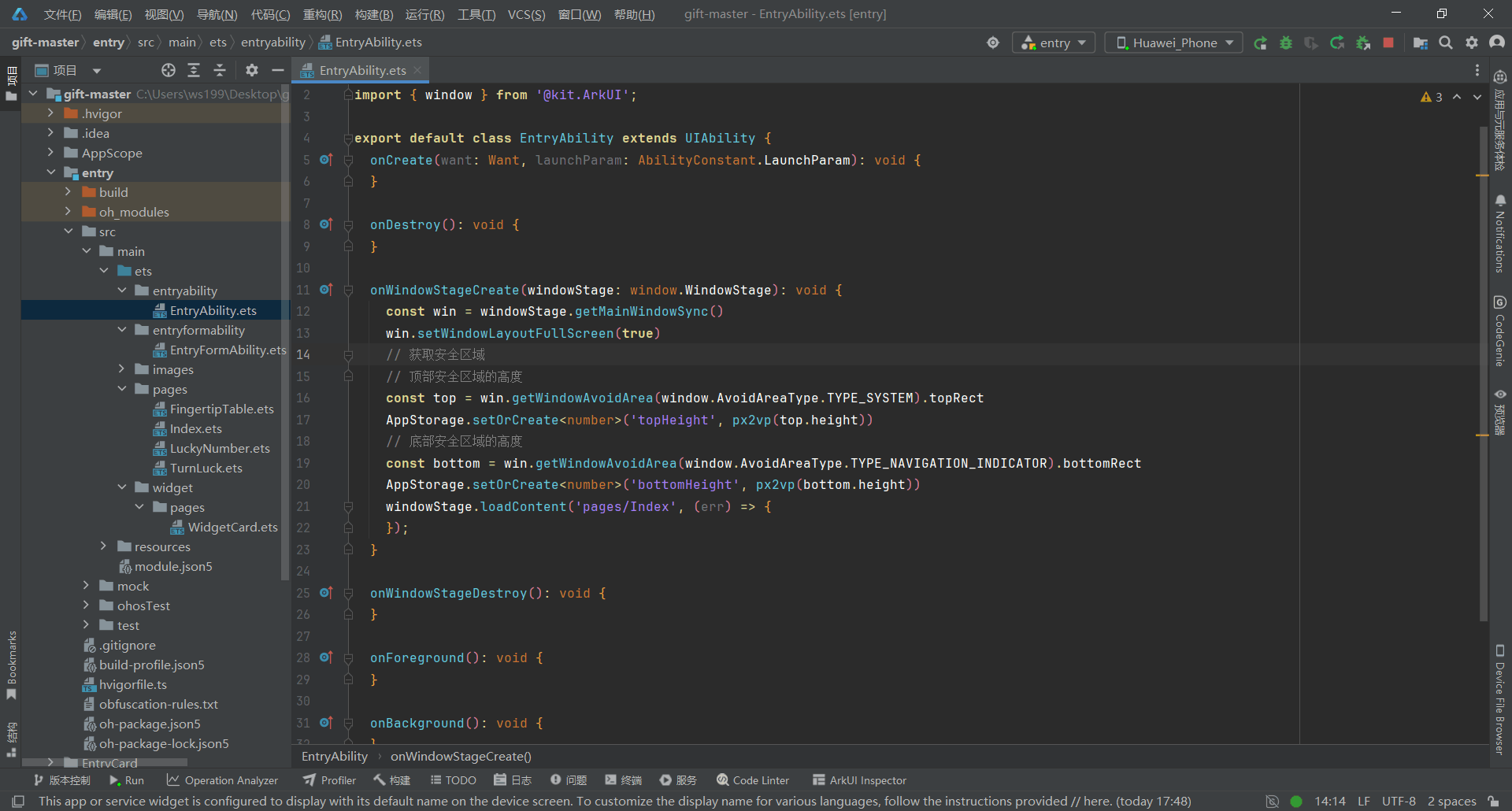
全屏窗口初始化
应用启动时创建主窗口并设置全屏显示
const win = windowStage.getMainWindowSync()
win.setWindowLayoutFullScreen(true)
安全区域适配
动态计算顶部与底部安全区高度并存入全局状态,实现多设备屏幕与系统栏的自适应显示
// 获取系统状态栏(如信号栏、时间栏)等区域的避让范围
const top = win.getWindowAvoidArea(window.AvoidAreaType.TYPE_SYSTEM).topRect
// 将顶部安全区域的高度(单位像素)转换为 vp 并存储到全局状态,用于页面动态适配
AppStorage.setOrCreate<number>('topHeight', px2vp(top.height))

// 获取系统导航指示栏(如手势导航区域)的避让范围
const bottom = win.getWindowAvoidArea(window.AvoidAreaType.TYPE_NAVIGATION_INDICATOR).bottomRect
// 将底部安全区域的高度转换为 vp 并存储到全局状态,用于底部留白或控件布局自适应
AppStorage.setOrCreate<number>('bottomHeight', px2vp(bottom.height))
首页内容加载
窗口创建完成后加载主页面 Index.ets,正式进入应用界面渲染阶段
windowStage.loadContent('pages/Index', (err) => {});
核心功能模块设计与实现
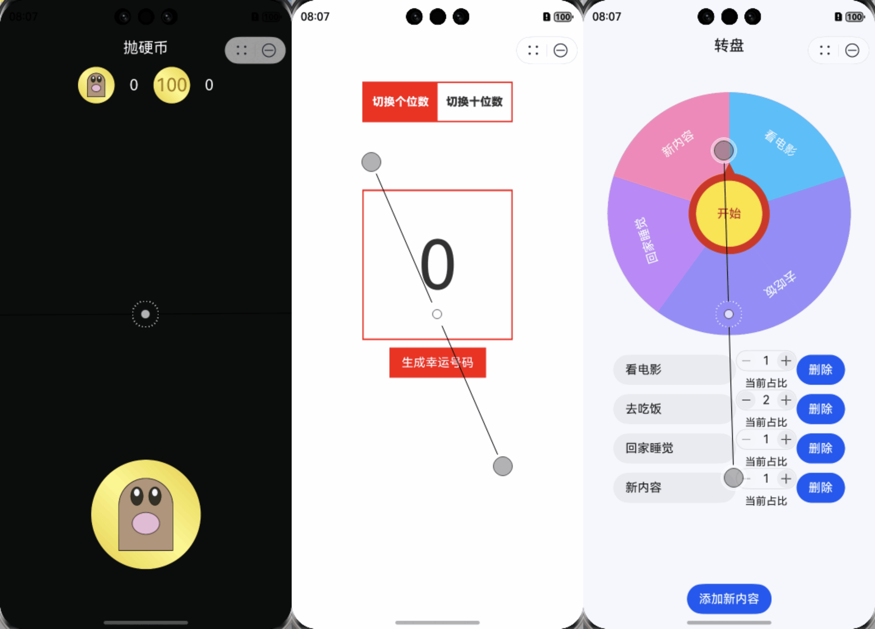
决策币功能(FingertipTable)
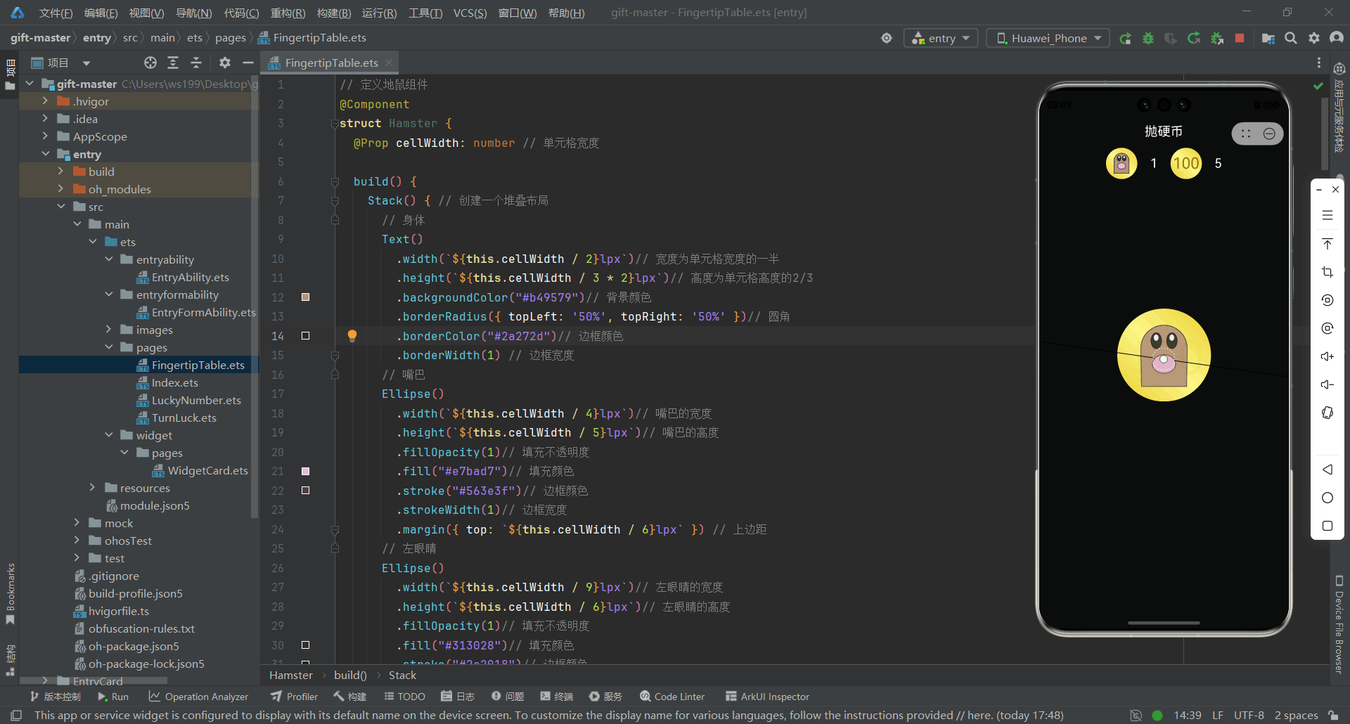
动态硬币翻转动画机制
循环调用 animateToImmediately(),短时间内多次递增旋转角度,实现硬币连续旋转的视觉效果,基于状态驱动的动画更新,让 UI 与数据绑定紧密,不依赖复杂的帧渲染逻辑
.animateToImmediately({
  delay: i * totalAnimationDuration / maxAnimationSteps,
  duration: 100,
}, () => {
  this.rotationAngle += 90; // 每次增加90度旋转
});
双阶段抛掷模拟
双阶段动画链式执行让动作更贴近真实物理效果
- 第一段:硬币上抛,verticalOffset 为负值模拟上升
- 第二段:硬币下落,verticalOffset 回归 0,恢复初始位置
animateToImmediately({
  duration: totalAnimationDuration / 2,
  onFinish: () => {
    animateToImmediately({
      duration: totalAnimationDuration / 2,
      onFinish: () => { /* 落地后逻辑 */ }
    }, () => { this.verticalOffset = 0; });
  }
}, () => {
  this.verticalOffset = -100 * (1 + Math.floor(Math.random() * 5));
});
幸运号码功能(LuckyNumber)
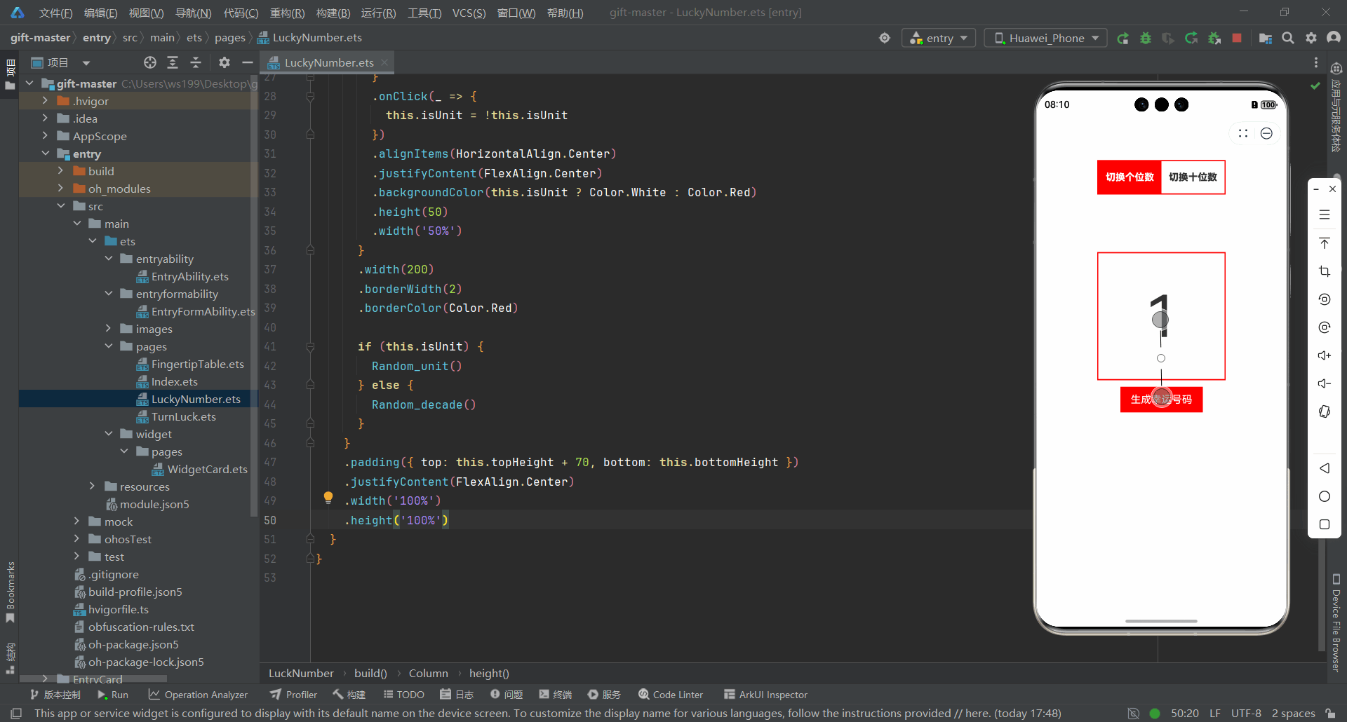
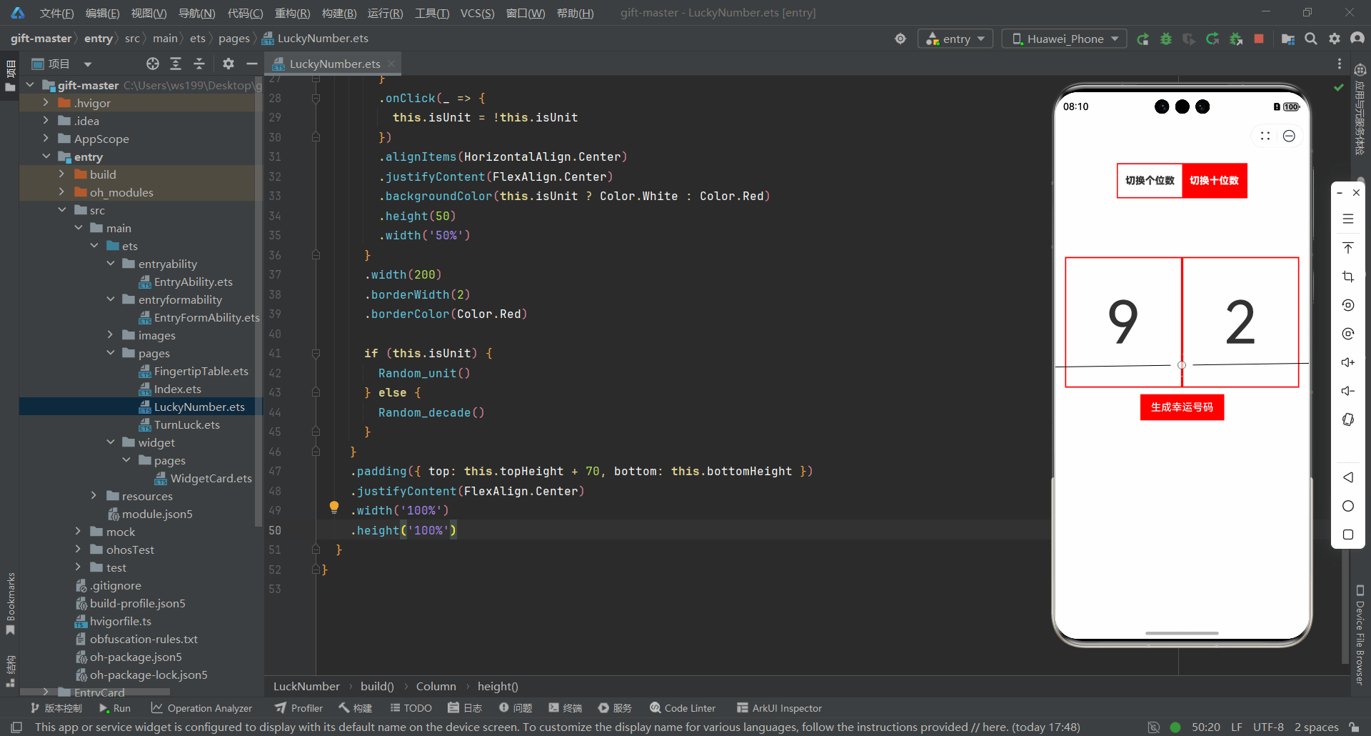
状态与属性声明部分
@StorageProp 保存顶部与底部间距等布局数据在不同组件间共享
@State 控制组件内部动态状态通过 isUnit 判断显示个位数或十位数
@StorageProp('topHeight') topHeight: number = 0
@StorageProp('bottomHeight') bottomHeight: number = 0
@State isUnit: boolean = true
切换按钮逻辑
两个按钮分别对应个位数和十位数,点击任意一个都会切换 isUnit 状态,按钮颜色与文字样式随状态变化而更新,从而实现视觉与逻辑同步的动态切换效果
Row() {
  Column() {
    Text('切换个位数')
      .fontSize(15)
      .fontColor(this.isUnit ? Color.White : '#00000')
      .fontWeight(900)
  }
  .onClick(_ => {
    this.isUnit = !this.isUnit
  })
  .backgroundColor(this.isUnit ? Color.Red : Color.White)
  .height(50)
  .width('50%')

  Column() {
    Text('切换十位数')
      .fontSize(15)
      .fontColor(this.isUnit ? '#00000' : Color.White)
      .fontWeight(900)
  }
  .onClick(_ => {
    this.isUnit = !this.isUnit
  })
  .backgroundColor(this.isUnit ? Color.White : Color.Red)
  .height(50)
  .width('50%')
}
转出好运功能(TurnLuck)
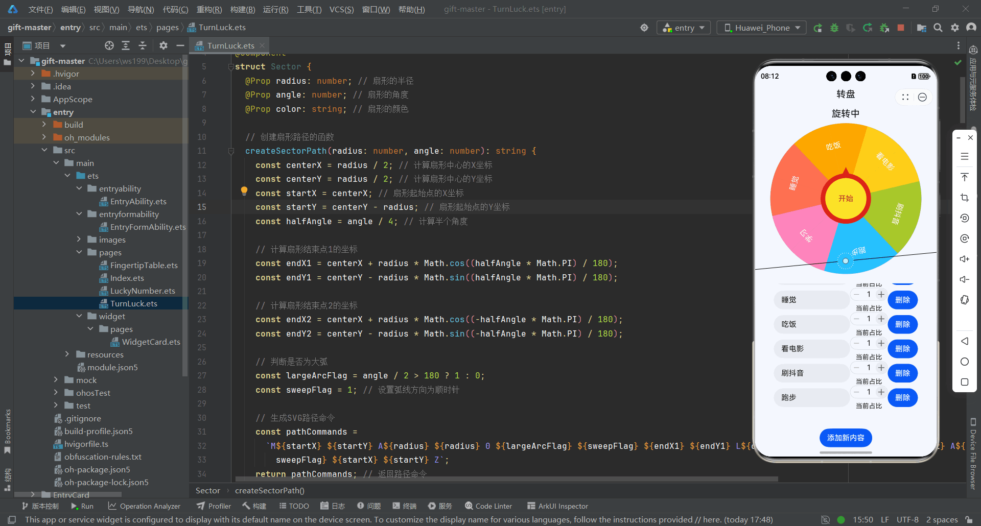
扇形单元格绘制与角度计算
数据驱动转盘的可视化和旋转逻辑
// 计算每个单元格在转盘上的角度和旋转信息
private calculateAngles() {
  // 计算所有单元格比例的总和
  const totalProportion = this.cells.reduce((sum, cell) => sum + cell.proportion, 0);

  // 根据每个单元格的比例计算对应的扇形角度
  this.cells.forEach(cell => {
    cell.angle = (cell.proportion * 360) / totalProportion; // 扇形角度 = 单元格比例占比 * 360°
  });

  let cumulativeAngle = 0; // 用于累加每个单元格的角度,确定起始位置

  // 遍历单元格,设置起始角度、结束角度及旋转角度
  this.cells.forEach(cell => {
    cell.angleStart = cumulativeAngle; // 扇形起始角度
    cumulativeAngle += cell.angle;      // 更新累计角度
    cell.angleEnd = cumulativeAngle;    // 扇形结束角度
    cell.rotate = cumulativeAngle - (cell.angle / 2); // 扇形文本或元素旋转角度,使其居中显示
  });
}
转盘旋转动画与选中逻辑
实现转盘动画和随机选择功能
// “开始”按钮点击事件:触发转盘旋转
Button('开始').onClick(() => {
  // 如果转盘正在旋转,直接返回,避免重复触发
  if (this.isAnimating) return;

  this.selectedName = "";   // 清空当前选中名称
  this.isAnimating = true;  // 标记动画开始

  // 调用动画函数进行旋转
  animateTo({
    duration: 5000,             // 动画持续时间 5 秒
    curve: Curve.EaseInOut,     // 缓入缓出动画曲线
    onFinish: () => {           // 动画结束回调
      this.currentAngle %= 360; // 保持角度在 0~360° 范围内

      // 判断当前角度落在哪个单元格
      for (const cell of this.cells) {
        if (360 - this.currentAngle >= cell.angleStart && 360 - this.currentAngle <= cell.angleEnd) {
          this.selectedName = cell.title; // 设置选中单元格的标题
          break; // 找到目标单元格后退出循环
        }
      }

      this.isAnimating = false; // 动画结束,重置状态
    },
  }, () => {
    // 动画进行中回调:更新当前角度,实现旋转效果
    this.currentAngle += (360 * 5 + Math.floor(Math.random() * 360)); // 随机旋转多圈
  });
});
单元格编辑与动态更新
提供转盘单元格内容和比例的动态管理
// 遍历每个单元格,创建可编辑行
ForEach(this.cells, (item: Cell, index: number) => {
  Row() {
    // 文本输入框:显示并编辑单元格标题
    TextInput({ text: item.title })
      .onChange(value => item.title = value); // 内容变化时更新单元格标题

    // 计数器组件:调整单元格比例
    CounterComponent({
      options: {
        numberOptions: {
          value: item.proportion,          // 初始比例值
          onChange: (v) => {               // 值变化回调
            item.proportion = v;           // 更新单元格比例
            this.calculateAngles();        // 重新计算转盘角度
          }
        }
      }
    });

    // 删除按钮:移除当前单元格
    Button('删除').onClick(() => {
      this.cells.splice(index, 1);       // 从数组中删除
      this.calculateAngles();             // 重新计算转盘角度
    });
  }
});

// 添加新单元格按钮
Button('添加新内容').onClick(() => {
  // 新建单元格,分配颜色并添加到数组
  this.cells.push(new Cell(
    1,
    "新内容",
    this.colorPalette[this.colorIndex++ % this.colorPalette.length]
  ));
  this.calculateAngles(); // 更新转盘角度
});
元服务卡片设计与生命周期管理
- 卡片生命周期管理(EntryFormAbility.ets) :介绍卡片的创建、更新、删除等生命周期方法实现
- 卡片用户界面设计(WidgetCard.ets) :分析卡片的UI结构、组件使用和交互设计
卡片生命周期实现(EntryFormAbility)
import { formBindingData, FormExtensionAbility, formInfo } from '@kit.FormKit';
import { Want } from '@kit.AbilityKit';

// 表单扩展能力类
export default class EntryFormAbility extends FormExtensionAbility {

  // 当添加表单时调用,返回 FormBindingData 对象
  onAddForm(want: Want) {
    let formData = '';
    return formBindingData.createFormBindingData(formData);
  }

  // 当临时表单成功转换为普通表单时调用
  onCastToNormalForm(formId: string) {
    // 可在此处理转换后的逻辑
  }

  // 通知表单提供者更新指定表单
  onUpdateForm(formId: string) {
    // 可在此实现更新表单逻辑
  }

  // 指定表单触发事件时调用
  onFormEvent(formId: string, message: string) {
    // 可在此处理表单事件逻辑
  }

  // 通知表单提供者指定表单已被销毁
  onRemoveForm(formId: string) {
    // 可在此处理表单移除逻辑
  }

  // 获取表单状态时调用,返回 FormState 对象
  onAcquireFormState(want: Want) {
    return formInfo.FormState.READY; // 表单准备就绪状态
  }
}
卡片界面结构与交互设计(WidgetCard)
@Entry
@Component
struct WidgetCard {
  /*
   * 卡片标题文本
   */
  readonly TITLE: string = '开始决策 🫵';

  /*
   * 点击行为类型,例如路由跳转
   */
  readonly ACTION_TYPE: string = 'router';

  /*
   * 目标能力或页面名称
   */
  readonly ABILITY_NAME: string = 'EntryAbility';

  /*
   * 跳转时传递的参数消息
   */
  readonly MESSAGE: string = 'add detail';

  /*
   * 卡片宽度设置
   */
  readonly FULL_WIDTH_PERCENT: string = '100%';

  /*
   * 卡片高度设置
   */
  readonly FULL_HEIGHT_PERCENT: string = '100%';

  build() {
    // 可点击卡片,点击后触发路由或能力调用
    FormLink({
      action: this.ACTION_TYPE,          // 动作类型
      abilityName: this.ABILITY_NAME,    // 目标能力/页面
      params: { message: this.MESSAGE }  // 传递参数
    }) {
      // 卡片内部布局
      Row() {
        Column() {
          // 显示卡片标题
          Text(this.TITLE)
            .fontSize($r('app.float.font_size'))          // 字体大小
            .fontWeight(FontWeight.Medium)               // 字体粗细
            .fontColor($r('app.color.item_title_font'))  // 字体颜色
        }
        .width(this.FULL_WIDTH_PERCENT) // 列宽度填满容器
      }
      .height(this.FULL_HEIGHT_PERCENT)  // 行高度填满容器
    }
  }
}
总结
文章以鸿蒙元服务的决策币、幸运号码、转盘抽奖功能为核心,展示 ArkTS 开发实践:
- 声明式布局搭 UI
- @State 等做响应式管理
- animateToImmediately 与 router 实现动画和导航
覆盖应用入口适配、功能核心逻辑及元服务卡片设计,形成完整开发流程,为鸿蒙元服务开发提供可复用参考
👉如果你也在探索鸿蒙元服务开发,或是想第一时间 get 鸿蒙新特性适配,点击链接加入和开发者们一起交流经验吧!https://work.weixin.qq.com/gm/afdd8c7246e72c0e94abdbd21bc9c5c1

讨论HarmonyOS开发技术,专注于API与组件、DevEco Studio、测试、元服务和应用上架分发等。
更多推荐


 22
22 24
24- 0


 已为社区贡献14条内容

所有评论(0)