ArkUI框架深度解析:构建HarmonyOS应用的现代化UI引擎
#跟着fruge365老师学鸿蒙# #鸿蒙# #harmonyOs# #ArkUI#
ArkUI框架深度解析:构建HarmonyOS应用的现代化UI引擎
引言
在HarmonyOS生态系统中,ArkUI作为新一代声明式UI开发框架,正在重新定义移动应用开发的范式。它不仅提供了高效的开发体验,更通过其独特的架构设计,实现了跨设备的一致性体验。本文将深入探讨ArkUI框架的核心技术、架构设计以及最佳实践。
一、ArkUI框架概述
1.1 什么是ArkUI
ArkUI(方舟UI框架)是HarmonyOS为应用开发者提供的一套UI开发框架,它采用声明式编程范式,支持TypeScript/ArkTS语言,能够帮助开发者更高效地构建用户界面。
ArkUI示意图
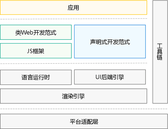
核心特性:
- 声明式语法:采用类似React/Flutter的声明式UI描述方式
- 状态管理:内置强大的响应式状态管理机制
- 组件化开发:丰富的内置组件库和自定义组件能力
- 高性能渲染:基于自研渲染引擎,实现流畅的UI交互
- 跨设备适配:一套代码适配多种设备形态
1.2 ArkUI的技术架构
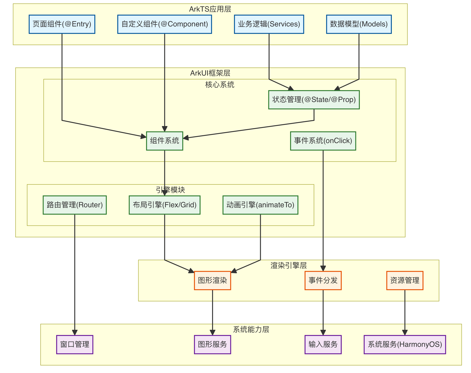
架构层次说明:
第一层:ArkTS应用层(浅蓝色)
- 页面组件:使用@Entry装饰器标记的应用入口页面
- 自定义组件:使用@Component装饰器创建的可复用UI组件
- 业务逻辑:Services层,处理应用的核心业务逻辑
- 数据模型:定义应用的数据结构和类型
第二层:ArkUI框架层(浅绿色)
核心系统:
- 组件系统:提供Text、Button、List等丰富的内置UI组件
- 状态管理:@State、@Prop、@Link等响应式数据绑定机制
- 事件系统:处理onClick、onTouch等用户交互事件
引擎模块:
- 布局引擎:支持Flex、Grid、Stack等多种灵活布局方式
- 动画引擎:提供animateTo、Transition等流畅动画效果
- 路由管理:实现页面导航、跳转和参数传递
第三层:渲染引擎层(浅橙色)
- 图形渲染:高性能UI渲染,支持硬件加速
- 事件分发:处理触摸、手势等交互事件的分发
- 资源管理:负责图片、字体、媒体等资源的加载和缓存
第四层:系统能力层(浅紫色)
- 窗口管理:管理窗口的创建、显示、隐藏等生命周期
- 图形服务:提供底层图形绘制能力,支持2D/3D渲染
- 输入服务:处理触摸、键盘、鼠标等输入设备
- 系统服务:调用HarmonyOS系统底层能力(网络、存储、传感器等)
这种分层架构实现了关注点分离,使得应用开发更加高效,同时保证了良好的性能和跨平台能力。
二、声明式UI开发范式
2.1 基础语法结构
ArkUI采用装饰器和链式调用的方式来描述UI结构:
@Entry
@Component
struct HomePage {
  @State message: string = 'Hello ArkUI'

  build() {
    Column() {
      Text(this.message)
        .fontSize(24)
        .fontWeight(FontWeight.Bold)
        .fontColor(Color.Blue)
        .margin({ top: 20 })

      Button('点击我')
        .width(200)
        .height(50)
        .onClick(() => {
          this.message = '你好,鸿蒙!'
        })
    }
    .width('100%')
    .height('100%')
    .justifyContent(FlexAlign.Center)
    .backgroundColor('#F5F5F5')
  }
}
代码解析:
@Entry:标记应用入口组件@Component:定义自定义组件@State:声明响应式状态变量build():UI构建函数,描述组件树结构
2.2 状态管理机制
ArkUI提供了多层次的状态管理装饰器:
组件内状态管理
@Component
struct Counter {
  @State count: number = 0
  @Prop initialValue: number  // 父组件传入的单向数据
  @Link sharedCount: number   // 父子组件双向同步

  build() {
    Column() {
      Text(`当前计数: ${this.count}`)
      Text(`共享计数: ${this.sharedCount}`)

      Button('增加')
        .onClick(() => {
          this.count++
          this.sharedCount++
        })
    }
  }
}
应用级状态管理
// 全局状态存储
export class AppStorage {
  @StorageLink('userInfo') userInfo: UserInfo = new UserInfo()
  @StorageProp('theme') theme: string = 'light'
}

// 持久化状态
@Component
struct SettingsPage {
  @StorageLink('userPreferences') preferences: Preferences = {}

  aboutToAppear() {
    // 从持久化存储加载数据
    PersistentStorage.PersistProp('userPreferences', {})
  }

  build() {
    // UI构建逻辑
  }
}
状态管理装饰器对比:
| 装饰器 | 作用域 | 数据流向 | 使用场景 |
|---|---|---|---|
| @State | 组件内 | 单向 | 组件私有状态 |
| @Prop | 父→子 | 单向 | 父组件传递数据 |
| @Link | 父↔子 | 双向 | 父子组件数据同步 |
| @Provide/@Consume | 祖先↔后代 | 双向 | 跨层级组件通信 |
| @StorageLink | 全局 | 双向 | 应用级状态共享 |
| @StorageProp | 全局 | 单向 | 只读全局状态 |
三、核心组件系统
3.1 容器组件
ArkUI提供了丰富的布局容器组件:
Column/Row - 线性布局
@Component
struct LinearLayoutDemo {
  build() {
    Column({ space: 10 }) {
      Row() {
        Text('项目1').layoutWeight(1)
        Text('项目2').layoutWeight(2)
        Text('项目3').layoutWeight(1)
      }
      .width('100%')
      .height(60)

      Column() {
        Text('垂直排列1')
        Text('垂直排列2')
        Text('垂直排列3')
      }
      .alignItems(HorizontalAlign.Start)
    }
    .padding(20)
  }
}
Stack - 层叠布局
@Component
struct StackLayoutDemo {
  build() {
    Stack({ alignContent: Alignment.TopStart }) {
      Image($r('app.media.background'))
        .width('100%')
        .height('100%')

      Column() {
        Text('叠加内容')
          .fontSize(20)
          .fontColor(Color.White)
      }
      .width('100%')
      .padding(20)
    }
    .width('100%')
    .height(300)
  }
}
Flex - 弹性布局
@Component
struct FlexLayoutDemo {
  build() {
    Flex({
      direction: FlexDirection.Row,
      wrap: FlexWrap.Wrap,
      justifyContent: FlexAlign.SpaceBetween,
      alignItems: ItemAlign.Center
    }) {
      ForEach([1, 2, 3, 4, 5, 6], (item: number) => {
        Text(`Item ${item}`)
          .width('30%')
          .height(80)
          .backgroundColor('#4A90E2')
          .textAlign(TextAlign.Center)
          .borderRadius(8)
      })
    }
    .width('100%')
    .padding(10)
  }
}
3.2 基础组件
List - 列表组件
interface ListItem {
  id: string
  title: string
  subtitle: string
  icon: Resource
}

@Component
struct ListDemo {
  @State items: ListItem[] = [
    { id: '1', title: '项目一', subtitle: '描述信息', icon: $r('app.media.icon1') },
    { id: '2', title: '项目二', subtitle: '描述信息', icon: $r('app.media.icon2') },
    // 更多数据...
  ]

  build() {
    List({ space: 10 }) {
      ForEach(this.items, (item: ListItem) => {
        ListItem() {
          Row({ space: 15 }) {
            Image(item.icon)
              .width(48)
              .height(48)
              .borderRadius(24)

            Column({ space: 5 }) {
              Text(item.title)
                .fontSize(16)
                .fontWeight(FontWeight.Medium)

              Text(item.subtitle)
                .fontSize(14)
                .fontColor('#999999')
            }
            .alignItems(HorizontalAlign.Start)
            .layoutWeight(1)
          }
          .width('100%')
          .padding(15)
          .backgroundColor(Color.White)
          .borderRadius(8)
        }
      }, (item: ListItem) => item.id)
    }
    .width('100%')
    .height('100%')
    .backgroundColor('#F5F5F5')
    .padding(10)
  }
}
Grid - 网格组件
@Component
struct GridDemo {
  @State gridData: number[] = Array.from({ length: 20 }, (_, i) => i + 1)

  build() {
    Grid() {
      ForEach(this.gridData, (item: number) => {
        GridItem() {
          Column() {
            Image($r('app.media.placeholder'))
              .width('100%')
              .aspectRatio(1)

            Text(`项目 ${item}`)
              .fontSize(14)
              .margin({ top: 8 })
          }
          .width('100%')
          .padding(10)
          .backgroundColor(Color.White)
          .borderRadius(8)
        }
      })
    }
    .columnsTemplate('1fr 1fr 1fr')
    .rowsGap(10)
    .columnsGap(10)
    .padding(10)
    .backgroundColor('#F5F5F5')
  }
}
3.3 自定义组件开发
// 可复用的卡片组件
@Component
export struct CustomCard {
  @Prop title: string = ''
  @Prop subtitle: string = ''
  @Prop icon: Resource = $r('app.media.default_icon')
  @BuilderParam content: () => void  // 插槽内容

  // 样式参数
  private cardBgColor: string = '#FFFFFF'
  private cardRadius: number = 12

  build() {
    Column({ space: 12 }) {
      // 头部
      Row({ space: 12 }) {
        Image(this.icon)
          .width(40)
          .height(40)
          .borderRadius(20)

        Column({ space: 4 }) {
          Text(this.title)
            .fontSize(18)
            .fontWeight(FontWeight.Bold)

          if (this.subtitle) {
            Text(this.subtitle)
              .fontSize(14)
              .fontColor('#666666')
          }
        }
        .alignItems(HorizontalAlign.Start)
        .layoutWeight(1)
      }
      .width('100%')

      // 自定义内容区域
      if (this.content) {
        this.content()
      }
    }
    .width('100%')
    .padding(16)
    .backgroundColor(this.cardBgColor)
    .borderRadius(this.cardRadius)
    .shadow({
      radius: 8,
      color: '#1F000000',
      offsetX: 0,
      offsetY: 2
    })
  }
}

// 使用自定义组件
@Entry
@Component
struct UsageDemo {
  build() {
    Column({ space: 15 }) {
      CustomCard({
        title: '用户信息',
        subtitle: '个人资料管理',
        icon: $r('app.media.user_icon'),
        content: () => {
          Column({ space: 10 }) {
            Text('姓名:张三')
            Text('邮箱:zhangsan@example.com')
            Text('电话:138****8888')
          }
          .alignItems(HorizontalAlign.Start)
          .width('100%')
        }
      })

      CustomCard({
        title: '系统设置',
        subtitle: '应用配置选项',
        icon: $r('app.media.settings_icon'),
        content: () => {
          Column({ space: 10 }) {
            Row() {
              Text('深色模式')
              Blank()
              Toggle({ type: ToggleType.Switch, isOn: false })
            }
            .width('100%')
          }
        }
      })
    }
    .width('100%')
    .padding(15)
    .backgroundColor('#F5F5F5')
  }
}
四、动画与转场
4.1 属性动画
@Component
struct PropertyAnimationDemo {
  @State rotateAngle: number = 0
  @State scaleValue: number = 1
  @State opacity: number = 1

  build() {
    Column({ space: 30 }) {
      Image($r('app.media.logo'))
        .width(100)
        .height(100)
        .rotate({ angle: this.rotateAngle })
        .scale({ x: this.scaleValue, y: this.scaleValue })
        .opacity(this.opacity)
        .animation({
          duration: 1000,
          curve: Curve.EaseInOut,
          iterations: 1,
          playMode: PlayMode.Normal
        })

      Button('执行动画')
        .onClick(() => {
          this.rotateAngle = 360
          this.scaleValue = 1.5
          this.opacity = 0.5

          // 动画结束后重置
          setTimeout(() => {
            this.rotateAngle = 0
            this.scaleValue = 1
            this.opacity = 1
          }, 1000)
        })
    }
    .width('100%')
    .height('100%')
    .justifyContent(FlexAlign.Center)
  }
}
4.2 显式动画
@Component
struct ExplicitAnimationDemo {
  @State positionX: number = 0
  @State bgColor: Color = Color.Blue

  build() {
    Column({ space: 30 }) {
      Row()
        .width(80)
        .height(80)
        .backgroundColor(this.bgColor)
        .borderRadius(40)
        .translate({ x: this.positionX })

      Button('开始动画')
        .onClick(() => {
          animateTo({
            duration: 800,
            curve: Curve.Friction,
            onFinish: () => {
              console.info('动画执行完成')
            }
          }, () => {
            this.positionX = 200
            this.bgColor = Color.Red
          })
        })

      Button('重置')
        .onClick(() => {
          animateTo({ duration: 500 }, () => {
            this.positionX = 0
            this.bgColor = Color.Blue
          })
        })
    }
    .width('100%')
    .height('100%')
    .justifyContent(FlexAlign.Center)
  }
}
4.3 页面转场动画
// 页面A
@Entry
@Component
struct PageA {
  build() {
    Column() {
      Button('跳转到页面B')
        .onClick(() => {
          router.pushUrl({
            url: 'pages/PageB'
          })
        })
    }
    .width('100%')
    .height('100%')
    .justifyContent(FlexAlign.Center)
  }

  // 页面转场配置
  pageTransition() {
    PageTransitionEnter({ duration: 500, curve: Curve.Smooth })
      .slide(SlideEffect.Right)

    PageTransitionExit({ duration: 500, curve: Curve.Smooth })
      .slide(SlideEffect.Left)
  }
}

// 页面B
@Entry
@Component
struct PageB {
  build() {
    Column() {
      Button('返回')
        .onClick(() => {
          router.back()
        })
    }
    .width('100%')
    .height('100%')
    .justifyContent(FlexAlign.Center)
  }

  pageTransition() {
    PageTransitionEnter({ duration: 500, curve: Curve.Smooth })
      .slide(SlideEffect.Left)

    PageTransitionExit({ duration: 500, curve: Curve.Smooth })
      .slide(SlideEffect.Right)
  }
}
五、响应式布局与多设备适配
5.1 响应式布局策略
@Component
struct ResponsiveLayout {
  @State currentBreakpoint: string = 'sm'

  aboutToAppear() {
    // 监听窗口尺寸变化
    let listener = mediaquery.matchMediaSync('(width >= 600vp)')
    listener.on('change', (mediaQueryResult: mediaquery.MediaQueryResult) => {
      if (mediaQueryResult.matches) {
        this.currentBreakpoint = 'md'
      } else {
        this.currentBreakpoint = 'sm'
      }
    })
  }

  build() {
    GridRow({
      columns: { sm: 4, md: 8, lg: 12 },
      gutter: { x: 10, y: 10 },
      breakpoints: {
        value: ['320vp', '600vp', '840vp'],
        reference: BreakpointsReference.WindowSize
      }
    }) {
      GridCol({
        span: { sm: 4, md: 4, lg: 3 },
        offset: { sm: 0, md: 0, lg: 0 }
      }) {
        Column() {
          Text('侧边栏')
        }
        .width('100%')
        .height(200)
        .backgroundColor('#E0E0E0')
      }

      GridCol({
        span: { sm: 4, md: 4, lg: 9 },
        offset: { sm: 0, md: 0, lg: 0 }
      }) {
        Column() {
          Text('主内容区')
        }
        .width('100%')
        .height(200)
        .backgroundColor('#BBDEFB')
      }
    }
    .width('100%')
    .padding(10)
  }
}
5.2 设备特性适配
import deviceInfo from '@ohos.deviceInfo'

@Component
struct DeviceAdaptation {
  @State deviceType: string = ''
  @State screenWidth: number = 0
  @State screenHeight: number = 0

  aboutToAppear() {
    // 获取设备信息
    this.deviceType = deviceInfo.deviceType

    // 获取屏幕尺寸
    let displayClass = display.getDefaultDisplaySync()
    this.screenWidth = displayClass.width
    this.screenHeight = displayClass.height
  }

  @Builder
  buildPhoneLayout() {
    Column() {
      Text('手机布局')
      // 手机专用UI
    }
  }

  @Builder
  buildTabletLayout() {
    Row() {
      Column() {
        Text('平板左侧')
      }
      .width('30%')

      Column() {
        Text('平板右侧')
      }
      .width('70%')
    }
  }

  build() {
    Column() {
      if (this.deviceType === 'phone') {
        this.buildPhoneLayout()
      } else if (this.deviceType === 'tablet') {
        this.buildTabletLayout()
      } else {
        Text('其他设备类型')
      }
    }
    .width('100%')
    .height('100%')
  }
}
六、性能优化最佳实践
6.1 列表性能优化
@Component
struct OptimizedList {
  @State dataSource: number[] = Array.from({ length: 10000 }, (_, i) => i)

  build() {
    List() {
      // 使用LazyForEach实现按需加载
      LazyForEach(new MyDataSource(this.dataSource), (item: number) => {
        ListItem() {
          Row() {
            Text(`Item ${item}`)
              .fontSize(16)
          }
          .width('100%')
          .height(60)
          .padding({ left: 15, right: 15 })
        }
      }, (item: number) => item.toString())
    }
    .width('100%')
    .height('100%')
    .cachedCount(5)  // 缓存列表项数量
    .edgeEffect(EdgeEffect.Spring)
  }
}

// 自定义数据源
class MyDataSource implements IDataSource {
  private dataArray: number[] = []
  private listeners: DataChangeListener[] = []

  constructor(data: number[]) {
    this.dataArray = data
  }

  totalCount(): number {
    return this.dataArray.length
  }

  getData(index: number): number {
    return this.dataArray[index]
  }

  registerDataChangeListener(listener: DataChangeListener): void {
    if (this.listeners.indexOf(listener) < 0) {
      this.listeners.push(listener)
    }
  }

  unregisterDataChangeListener(listener: DataChangeListener): void {
    const pos = this.listeners.indexOf(listener)
    if (pos >= 0) {
      this.listeners.splice(pos, 1)
    }
  }
}
6.2 组件复用优化
// 使用@Reusable装饰器标记可复用组件
@Reusable
@Component
struct ReusableCard {
  @State data: CardData = new CardData()

  // 组件复用时的回调
  aboutToReuse(params: Record<string, Object>) {
    this.data = params.data as CardData
  }

  build() {
    Column() {
      Text(this.data.title)
      Text(this.data.content)
    }
    .width('100%')
    .padding(15)
    .backgroundColor(Color.White)
    .borderRadius(8)
  }
}
6.3 渲染控制优化
@Component
struct RenderOptimization {
  @State showExpensiveComponent: boolean = false
  @State listData: string[] = ['A', 'B', 'C']

  build() {
    Column() {
      // 条件渲染:避免不必要的组件创建
      if (this.showExpensiveComponent) {
        ExpensiveComponent()
      }

      // 使用key优化列表渲染
      List() {
        ForEach(this.listData, (item: string, index: number) => {
          ListItem() {
            Text(item)
          }
        }, (item: string) => item)  // 提供稳定的key
      }

      Button('切换显示')
        .onClick(() => {
          this.showExpensiveComponent = !this.showExpensiveComponent
        })
    }
  }
}

@Component
struct ExpensiveComponent {
  build() {
    // 复杂的UI结构
    Column() {
      Text('这是一个复杂组件')
    }
  }
}
七、实战案例:构建一个完整的应用页面
7.1 项目结构设计
src/
├── pages/
│   ├── HomePage.ets          # 首页
│   ├── DetailPage.ets        # 详情页
│   └── SettingsPage.ets      # 设置页
├── components/
│   ├── common/
│   │   ├── CustomButton.ets  # 通用按钮
│   │   ├── LoadingView.ets   # 加载视图
│   │   └── EmptyView.ets     # 空状态视图
│   └── business/
│       ├── ProductCard.ets   # 产品卡片
│       └── UserProfile.ets   # 用户信息
├── models/
│   ├── Product.ets           # 产品数据模型
│   └── User.ets              # 用户数据模型
├── services/
│   ├── ApiService.ets        # API服务
│   └── StorageService.ets    # 存储服务
└── utils/
    ├── Constants.ets         # 常量定义
    └── DateUtils.ets         # 工具函数
7.2 完整页面实现
// models/Product.ets
export class Product {
  id: string = ''
  name: string = ''
  description: string = ''
  price: number = 0
  imageUrl: Resource = $r('app.media.placeholder')
  rating: number = 0
  stock: number = 0
}

// components/business/ProductCard.ets
@Component
export struct ProductCard {
  @Prop product: Product
  @State isFavorite: boolean = false
  onCardClick?: (product: Product) => void

  build() {
    Column() {
      Stack({ alignContent: Alignment.TopEnd }) {
        Image(this.product.imageUrl)
          .width('100%')
          .height(180)
          .objectFit(ImageFit.Cover)
          .borderRadius({ topLeft: 12, topRight: 12 })

        // 收藏按钮
        Image(this.isFavorite ? $r('app.media.heart_filled') : $r('app.media.heart_outline'))
          .width(24)
          .height(24)
          .margin({ top: 10, right: 10 })
          .onClick(() => {
            this.isFavorite = !this.isFavorite
          })
      }

      Column({ space: 8 }) {
        Text(this.product.name)
          .fontSize(16)
          .fontWeight(FontWeight.Medium)
          .maxLines(2)
          .textOverflow({ overflow: TextOverflow.Ellipsis })

        Text(this.product.description)
          .fontSize(14)
          .fontColor('#666666')
          .maxLines(1)
          .textOverflow({ overflow: TextOverflow.Ellipsis })

        Row() {
          Text(`¥${this.product.price.toFixed(2)}`)
            .fontSize(20)
            .fontColor('#FF6B6B')
            .fontWeight(FontWeight.Bold)

          Blank()

          Row({ space: 4 }) {
            Image($r('app.media.star'))
              .width(16)
              .height(16)
            Text(this.product.rating.toFixed(1))
              .fontSize(14)
              .fontColor('#FFA500')
          }
        }
        .width('100%')

        Row() {
          Text(`库存: ${this.product.stock}`)
            .fontSize(12)
            .fontColor('#999999')
        }
      }
      .width('100%')
      .padding(12)
      .alignItems(HorizontalAlign.Start)
    }
    .width('100%')
    .backgroundColor(Color.White)
    .borderRadius(12)
    .shadow({
      radius: 12,
      color: '#1A000000',
      offsetX: 0,
      offsetY: 4
    })
    .onClick(() => {
      if (this.onCardClick) {
        this.onCardClick(this.product)
      }
    })
  }
}

// pages/HomePage.ets
import router from '@ohos.router'

@Entry
@Component
struct HomePage {
  @State products: Product[] = []
  @State isLoading: boolean = true
  @State searchText: string = ''
  @State selectedCategory: string = '全部'

  private categories: string[] = ['全部', '电子产品', '服装', '食品', '图书']

  aboutToAppear() {
    this.loadProducts()
  }

  async loadProducts() {
    this.isLoading = true

    // 模拟API请求
    setTimeout(() => {
      this.products = this.getMockProducts()
      this.isLoading = false
    }, 1000)
  }

  getMockProducts(): Product[] {
    return [
      {
        id: '1',
        name: '智能手机 Pro Max',
        description: '最新旗舰处理器,超清摄像头',
        price: 6999,
        imageUrl: $r('app.media.phone'),
        rating: 4.8,
        stock: 156
      },
      {
        id: '2',
        name: '无线蓝牙耳机',
        description: '主动降噪,长续航',
        price: 899,
        imageUrl: $r('app.media.earphone'),
        rating: 4.6,
        stock: 342
      },
      // 更多产品...
    ]
  }

  handleProductClick(product: Product) {
    router.pushUrl({
      url: 'pages/DetailPage',
      params: { product: product }
    })
  }

  @Builder
  buildHeader() {
    Column() {
      // 搜索框
      Row() {
        Image($r('app.media.search'))
          .width(20)
          .height(20)
          .margin({ left: 15 })

        TextInput({ placeholder: '搜索商品' })
          .layoutWeight(1)
          .backgroundColor(Color.Transparent)
          .onChange((value: string) => {
            this.searchText = value
          })

        Image($r('app.media.filter'))
          .width(20)
          .height(20)
          .margin({ right: 15 })
      }
      .width('100%')
      .height(50)
      .backgroundColor(Color.White)
      .borderRadius(25)
      .margin({ top: 10, bottom: 10 })

      // 分类标签
      Scroll() {
        Row({ space: 10 }) {
          ForEach(this.categories, (category: string) => {
            Text(category)
              .fontSize(14)
              .padding({ left: 20, right: 20, top: 8, bottom: 8 })
              .backgroundColor(this.selectedCategory === category ? '#4A90E2' : '#F0F0F0')
              .fontColor(this.selectedCategory === category ? Color.White : '#333333')
              .borderRadius(20)
              .onClick(() => {
                this.selectedCategory = category
              })
          })
        }
      }
      .scrollable(ScrollDirection.Horizontal)
      .scrollBar(BarState.Off)
      .width('100%')
    }
    .width('100%')
    .padding({ left: 15, right: 15 })
  }

  @Builder
  buildProductGrid() {
    if (this.isLoading) {
      Column() {
        LoadingProgress()
          .width(50)
          .height(50)
        Text('加载中...')
          .fontSize(14)
          .fontColor('#999999')
          .margin({ top: 10 })
      }
      .width('100%')
      .height('100%')
      .justifyContent(FlexAlign.Center)
    } else {
      Grid() {
        ForEach(this.products, (product: Product) => {
          GridItem() {
            ProductCard({
              product: product,
              onCardClick: (prod: Product) => {
                this.handleProductClick(prod)
              }
            })
          }
        }, (product: Product) => product.id)
      }
      .columnsTemplate('1fr 1fr')
      .rowsGap(15)
      .columnsGap(15)
      .padding(15)
    }
  }

  build() {
    Column() {
      // 顶部导航栏
      Row() {
        Text('商城首页')
          .fontSize(20)
          .fontWeight(FontWeight.Bold)

        Blank()

        Image($r('app.media.cart'))
          .width(24)
          .height(24)
      }
      .width('100%')
      .height(56)
      .padding({ left: 15, right: 15 })
      .backgroundColor(Color.White)

      // 主内容区
      Column() {
        this.buildHeader()

        Scroll() {
          this.buildProductGrid()
        }
        .layoutWeight(1)
        .scrollBar(BarState.Auto)
      }
      .layoutWeight(1)
      .backgroundColor('#F5F5F5')
    }
    .width('100%')
    .height('100%')
  }
}
八、调试与开发工具
8.1 DevEco Studio集成开发环境
核心功能:
- 可视化UI预览:实时预览UI效果,支持多设备预览
- 代码智能提示:ArkTS语法智能补全和错误检查
- 布局检查器:查看组件树结构和属性
- 性能分析器:分析应用性能瓶颈
- 调试工具:断点调试、日志查看、网络监控
8.2 常用调试技巧
@Component
struct DebugDemo {
  @State data: string = 'test'

  build() {
    Column() {
      Text(this.data)
        .onClick(() => {
          // 控制台日志输出
          console.info('点击事件触发')
          console.debug('当前数据:', this.data)
          console.error('错误信息')
          console.warn('警告信息')

          // 使用hilog进行日志记录
          hilog.info(0x0000, 'DebugDemo', 'onClick triggered')
        })
    }
  }

  aboutToAppear() {
    // 生命周期日志
    console.info('组件即将出现')
  }

  aboutToDisappear() {
    console.info('组件即将销毁')
  }
}
九、ArkUI与其他框架对比
9.1 技术特性对比
| 特性 | ArkUI | React Native | Flutter |
|---|---|---|---|
| 编程语言 | ArkTS/TypeScript | JavaScript/TypeScript | Dart |
| UI范式 | 声明式 | 声明式 | 声明式 |
| 渲染引擎 | 自研引擎 | 原生组件 | Skia引擎 |
| 性能 | 高性能 | 中等 | 高性能 |
| 包体积 | 较小 | 较大 | 较大 |
| 热重载 | 支持 | 支持 | 支持 |
| 跨平台 | HarmonyOS生态 | iOS/Android | 全平台 |
| 学习曲线 | 中等 | 低 | 中等 |
9.2 开发体验对比
ArkUI优势:
- 与HarmonyOS深度集成,性能优化更好
- 原生支持多设备适配
- 完善的开发工具链支持
- 类型安全的ArkTS语言
适用场景:
- HarmonyOS应用开发
- 需要多设备适配的应用
- 对性能要求较高的应用
- 企业级应用开发
十、完整项目实战案例
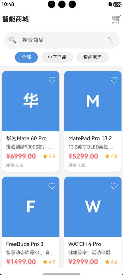
为了帮助读者更好地理解ArkUI框架的实际应用,本文提供了一个完整的、可以实际运行的项目案例:智能商城应用。
10.1 项目概述
这是一个功能完整的电商应用,包含以下核心功能:
- 商品列表浏览(网格布局)
- 实时搜索和分类筛选
- 商品详情查看
- 购物车管理(增删改)
- 价格统计和结算
10.2 技术架构
项目采用分层架构设计:
页面层(Pages)
    ↓
组件层(Components)
    ↓
服务层(Services)
    ↓
模型层(Models)
核心技术栈:
- ArkTS语言
- 声明式UI范式
- 单例模式(服务层)
- 组件化开发
- 响应式状态管理
10.3 项目结构
ArkUI_Demo_Project/
├── entry/src/main/ets/
│   ├── pages/
│   │   ├── Index.ets              # 首页(商品列表)
│   │   ├── DetailPage.ets         # 商品详情页
│   │   └── CartPage.ets           # 购物车页
│   ├── components/
│   │   ├── ProductCard.ets        # 商品卡片组件
│   │   └── CartItemCard.ets       # 购物车项组件
│   ├── models/
│   │   ├── Product.ets            # 商品数据模型
│   │   └── CartItem.ets           # 购物车项模型
│   └── services/
│       ├── ProductService.ets     # 商品服务(单例)
│       └── CartService.ets        # 购物车服务(单例)
10.4 核心功能实现
首页 - 商品列表
功能特性:
- Grid网格布局展示商品
- 搜索框实时筛选
- 分类标签切换
- 购物车数量徽章
- 加载状态和空状态处理
关键代码片段:
@Entry
@Component
struct Index {
  @State products: Product[] = []
  @State filteredProducts: Product[] = []
  @State selectedCategory: string = '全部'
  @State cartCount: number = 0

  private productService: ProductService = ProductService.getInstance()
  private cartService: CartService = CartService.getInstance()

  build() {
    Column() {
      // 顶部导航栏
      Row() {
        Text('智能商城')
          .fontSize(20)
          .fontWeight(FontWeight.Bold)

        Blank()

        // 购物车图标带徽章
        Stack({ alignContent: Alignment.TopEnd }) {
          Text('购物车').fontSize(16)
          if (this.cartCount > 0) {
            Text(`${this.cartCount}`)
              .fontSize(12)
              .backgroundColor('#FF6B6B')
              .borderRadius(10)
          }
        }
      }

      // 商品网格
      Grid() {
        ForEach(this.filteredProducts, (product: Product) => {
          GridItem() {
            ProductCard({
              product: product,
              onCardClick: (prod: Product) => {
                router.pushUrl({
                  url: 'pages/DetailPage',
                  params: { productId: prod.id }
                })
              }
            })
          }
        })
      }
      .columnsTemplate('1fr 1fr')
      .rowsGap(15)
      .columnsGap(15)
    }
  }
}
商品详情页
功能特性:
- 商品完整信息展示
- 数量选择器(+/-按钮)
- 加入购物车
- 立即购买
- Toast提示反馈
关键实现:
@Entry
@Component
struct DetailPage {
  @State product: Product | undefined = undefined
  @State quantity: number = 1

  private cartService: CartService = CartService.getInstance()

  aboutToAppear() {
    const params = router.getParams() as Record<string, Object>
    const productId = params['productId'] as string
    this.product = ProductService.getInstance().getProductById(productId)
  }

  handleAddToCart() {
    if (this.product) {
      this.cartService.addToCart(this.product, this.quantity)
      // 注意:duration参数已弃用,使用默认时长
      promptAction.showToast({
        message: '已添加到购物车'
      })
    }
  }

  build() {
    Column() {
      // 商品图片
      // 商品信息
      // 数量选择器
      Row({ space: 15 }) {
        Button('-')
          .onClick(() => {
            if (this.quantity > 1) this.quantity--
          })
        Text(`${this.quantity}`)
        Button('+')
          .onClick(() => {
            if (this.quantity < this.product.stock) this.quantity++
          })
      }

      // 底部操作按钮
      Row({ space: 10 }) {
        Button('加入购物车')
          .onClick(() => this.handleAddToCart())
        Button('立即购买')
          .onClick(() => {
            this.handleAddToCart()
            router.pushUrl({ url: 'pages/CartPage' })
          })
      }
    }
  }
}
购物车页面
功能特性:
- 购物车商品列表
- 数量增减控制
- 删除商品
- 清空购物车
- 实时价格统计
- 结算确认对话框
关键实现:
@Entry
@Component
struct CartPage {
  @State cartItems: CartItem[] = []
  @State totalPrice: number = 0
  @State totalCount: number = 0

  private cartService: CartService = CartService.getInstance()

  loadCartData() {
    this.cartItems = this.cartService.getCartItems()
    this.totalPrice = this.cartService.getTotalPrice()
    this.totalCount = this.cartService.getTotalCount()
  }

  handleCheckout() {
    if (this.cartItems.length === 0) {
      promptAction.showToast({
        message: '购物车为空'
      })
      return
    }

    promptAction.showDialog({
      title: '确认结算',
      message: `共 ${this.totalCount} 件商品,总计 ¥${this.totalPrice.toFixed(2)}`,
      buttons: [
        { text: '取消', color: '#999999' },
        { text: '确认', color: '#4A90E2' }
      ]
    }).then((result) => {
      if (result.index === 1) {
        this.cartService.clearCart()
        this.loadCartData()
        // 注意:showToast的duration参数已弃用
        promptAction.showToast({
          message: '订单提交成功!'
        })
      }
    })
  }

  build() {
    Column() {
      // 购物车列表
      List({ space: 10 }) {
        ForEach(this.cartItems, (item: CartItem) => {
          ListItem() {
            CartItemCard({
              cartItem: item,
              onQuantityChange: (id, qty) => {
                this.cartService.updateQuantity(id, qty)
                this.loadCartData()
              },
              onRemove: (id) => {
                this.cartService.removeFromCart(id)
                this.loadCartData()
              }
            })
          }
        })
      }

      // 底部结算栏
      Row() {
        Column() {
          Text('合计')
          Text(`¥${this.totalPrice.toFixed(2)}`)
            .fontSize(24)
            .fontColor('#FF6B6B')
        }
        Blank()
        Button(`结算 (${this.totalCount})`)
          .onClick(() => this.handleCheckout())
      }
    }
  }
}
10.5 服务层设计
商品服务(单例模式)
export class ProductService {
  private static instance: ProductService

  static getInstance(): ProductService {
    if (!ProductService.instance) {
      ProductService.instance = new ProductService()
    }
    return ProductService.instance
  }

  getAllProducts(): Product[] {
    return [
      new Product('1', '华为Mate 60 Pro', '搭载麒麟9000S芯片', 6999, 'phone1', 4.9, 256, '电子产品'),
      new Product('2', 'MatePad Pro 13.2', '13.2英寸OLED柔性屏', 5299, 'tablet1', 4.8, 128, '电子产品'),
      // 更多商品...
    ]
  }

  getProductsByCategory(category: string): Product[] {
    return category === '全部'
      ? this.getAllProducts()
      : this.getAllProducts().filter(p => p.category === category)
  }

  searchProducts(keyword: string): Product[] {
    const lowerKeyword = keyword.toLowerCase()
    return this.getAllProducts().filter(p =>
      p.name.toLowerCase().includes(lowerKeyword) ||
      p.description.toLowerCase().includes(lowerKeyword)
    )
  }
}
购物车服务(单例模式)
export class CartService {
  private static instance: CartService
  private cartItems: CartItem[] = []

  static getInstance(): CartService {
    if (!CartService.instance) {
      CartService.instance = new CartService()
    }
    return CartService.instance
  }

  addToCart(product: Product, quantity: number = 1): void {
    const existingItem = this.cartItems.find(item => item.product.id === product.id)
    if (existingItem) {
      existingItem.quantity += quantity
    } else {
      this.cartItems.push(new CartItem(product, quantity))
    }
  }

  updateQuantity(productId: string, quantity: number): void {
    const item = this.cartItems.find(item => item.product.id === productId)
    if (item) {
      if (quantity <= 0) {
        this.removeFromCart(productId)
      } else {
        item.quantity = quantity
      }
    }
  }

  getTotalPrice(): number {
    return this.cartItems.reduce((total, item) => total + item.getTotalPrice(), 0)
  }

  getTotalCount(): number {
    return this.cartItems.reduce((total, item) => total + item.quantity, 0)
  }
}
10.6 组件化开发
商品卡片组件
@Component
export struct ProductCard {
  @Prop product: Product
  @State isFavorite: boolean = false
  onCardClick?: (product: Product) => void

  build() {
    Column() {
      // 商品图片区域
      Stack({ alignContent: Alignment.TopEnd }) {
        // 使用颜色块代替真实图片
        Column()
          .width('100%')
          .height(180)
          .backgroundColor(this.getColorByCategory(this.product.category))
          .borderRadius({ topLeft: 12, topRight: 12 })

        // 显示商品名称首字母
        Column() {
          Text(this.product.name.substring(0, 1))
            .fontSize(48)
            .fontColor(Color.White)
            .fontWeight(FontWeight.Bold)
        }
        .width('100%')
        .height(180)
        .justifyContent(FlexAlign.Center)

        // 收藏按钮
        Text(this.isFavorite ? '已收藏' : '收藏')
          .fontSize(14)
          .fontColor(this.isFavorite ? '#FF6B6B' : Color.White)
          .margin({ top: 10, right: 10 })
          .onClick(() => {
            this.isFavorite = !this.isFavorite
          })
      }

      // 商品信息
      Column({ space: 8 }) {
        Text(this.product.name)
          .fontSize(16)
          .fontWeight(FontWeight.Medium)
          .maxLines(2)
          .textOverflow({ overflow: TextOverflow.Ellipsis })
          .width('100%')

        Text(this.product.description)
          .fontSize(14)
          .fontColor('#666666')
          .maxLines(1)
          .textOverflow({ overflow: TextOverflow.Ellipsis })
          .width('100%')

        Row() {
          Text(`¥${this.product.price.toFixed(2)}`)
            .fontSize(20)
            .fontColor('#FF6B6B')
            .fontWeight(FontWeight.Bold)

          Blank()

          Row({ space: 4 }) {
            Text('评分')
              .fontSize(12)
              .fontColor('#FFA500')
            Text(this.product.rating.toFixed(1))
              .fontSize(14)
              .fontColor('#FFA500')
          }
        }
        .width('100%')

        Row() {
          Text(`库存: ${this.product.stock}`)
            .fontSize(12)
            .fontColor('#999999')
        }
      }
      .width('100%')
      .padding(12)
      .alignItems(HorizontalAlign.Start)
    }
    .width('100%')
    .backgroundColor(Color.White)
    .borderRadius(12)
    .shadow({
      radius: 12,
      color: '#1A000000',
      offsetX: 0,
      offsetY: 4
    })
    .onClick(() => {
      if (this.onCardClick) {
        this.onCardClick(this.product)
      }
    })
  }

  // 根据分类返回不同颜色(ArkTS规范:使用条件判断代替对象索引)
  private getColorByCategory(category: string): string {
    if (category === '电子产品') {
      return '#4A90E2'
    } else if (category === '智能家居') {
      return '#50C878'
    } else if (category === '服装') {
      return '#FF6B9D'
    } else if (category === '食品') {
      return '#FFA500'
    } else if (category === '图书') {
      return '#9B59B6'
    } else {
      return '#95A5A6'
    }
  }
}
10.7 项目特色
1. 完整性
- 包含完整的项目结构和配置
- 所有代码可以直接运行
- 无需额外配置
2. 实用性
- 真实的业务场景
- 完整的功能流程
- 可作为实际项目的基础
3. 规范性
- 清晰的代码结构
- 良好的命名规范
- 详细的注释说明
4. 可扩展性
- 模块化设计
- 易于添加新功能
- 便于二次开发
10.8 ArkTS编程规范与最佳实践
在实际开发中,遵循ArkTS编程规范非常重要。以下是基于实际项目总结的关键规范:
1. 避免使用对象字面量索引访问
错误写法:
private getColorByCategory(category: string): string {
  const colorMap = {
    '电子产品': '#4A90E2',
    '智能家居': '#50C878'
  }
  return colorMap[category] || '#95A5A6'  // 编译错误
}
错误信息:
Object literal must correspond to some explicitly declared class or interfaceIndexed access is not supported for fields
正确写法:
private getColorByCategory(category: string): string {
  if (category === '电子产品') {
    return '#4A90E2'
  } else if (category === '智能家居') {
    return '#50C878'
  } else if (category === '服装') {
    return '#FF6B9D'
  } else {
    return '#95A5A6'
  }
}
原因: ArkTS不支持动态对象索引访问,需要使用显式的条件判断。
2. 空值安全检查
错误写法:
Button('+')
  .enabled(this.quantity < this.product.stock)  // product可能为undefined
  .onClick(() => {
    if (this.quantity < this.product.stock) {
      this.quantity++
    }
  })
错误信息:
Object is possibly 'undefined'
正确写法:
Button('+')
  .enabled(this.product ? this.quantity < this.product.stock : false)
  .onClick(() => {
    if (this.product && this.quantity < this.product.stock) {
      this.quantity++
    }
  })
原因: TypeScript严格模式下,需要对可能为undefined的对象进行空值检查。
3. API弃用警告处理
已弃用的API:
promptAction.showToast({
  message: '操作成功',
  duration: 2000  // duration参数已弃用
})
警告信息:
'showToast' has been deprecated
推荐写法:
promptAction.showToast({
  message: '操作成功'
  // 不再使用duration参数,使用系统默认时长
})
4. 类型声明规范
推荐写法:
// 明确声明类型
@State products: Product[] = []
@State isLoading: boolean = true
@State searchText: string = ''

// 函数参数和返回值类型
handleSearch(text: string): void {
  this.searchText = text
}

// 回调函数类型
onCardClick?: (product: Product) => void
5. 组件导出规范
正确的组件导出:
@Component
export struct ProductCard {
  @Prop product: Product

  build() {
    // UI构建
  }
}
注意事项:
- 使用
export struct导出组件 - 使用
export class导出类 - 确保导出的类型与使用时一致
6. 状态管理最佳实践
推荐模式:
@Entry
@Component
struct Index {
  // 组件内部状态
  @State private isLoading: boolean = true

  // 服务实例(单例)
  private productService: ProductService = ProductService.getInstance()

  // 生命周期方法
  aboutToAppear() {
    this.loadData()
  }

  onPageShow() {
    this.refreshData()
  }
}
7. 错误处理规范
完善的错误处理:
handleCheckout() {
  // 前置条件检查
  if (this.cartItems.length === 0) {
    promptAction.showToast({
      message: '购物车为空'
    })
    return
  }

  // 业务逻辑
  promptAction.showDialog({
    title: '确认结算',
    message: `共 ${this.totalCount} 件商品`,
    buttons: [
      { text: '取消', color: '#999999' },
      { text: '确认', color: '#4A90E2' }
    ]
  }).then((result) => {
    if (result.index === 1) {
      // 执行结算
      this.performCheckout()
    }
  }).catch((error) => {
    // 错误处理
    console.error('结算失败:', error)
  })
}
8. 性能优化建议
列表渲染优化:
Grid() {
  ForEach(this.products, (product: Product) => {
    GridItem() {
      ProductCard({ product: product })
    }
  }, (product: Product) => product.id)  // 提供唯一key
}
.cachedCount(5)  // 缓存列表项
条件渲染优化:
if (this.isLoading) {
  LoadingProgress()
} else if (this.products.length === 0) {
  EmptyView()
} else {
  ProductList()
}
9. 常见编译错误及解决方案
| 错误信息 | 原因 | 解决方案 |
|---|---|---|
arkts-no-untyped-obj-literals |
使用了未声明类型的对象字面量 | 使用显式类型声明或条件判断 |
arkts-no-props-by-index |
使用索引访问对象属性 | 改用条件判断或Map类型 |
Object is possibly 'undefined' |
未进行空值检查 | 添加 ?. 或 && 空值检查 |
Type 'X' is not assignable to type 'Y' |
类型不匹配 | 检查类型声明,确保类型一致 |
参考资源
官方文档
- HarmonyOS开发者官网:https://developer.harmonyos.com/
- ArkUI开发指南:https://developer.huawei.com/consumer/cn/doc/harmonyos-guides-V14/arkts-ui-development-V14
- ArkTS语言基础:https://developer.harmonyos.com/cn/docs/documentation/doc-guides-V3/arkts-get-started-0000001504769321-V3
API参考
- ArkUI组件参考:https://developer.harmonyos.com/cn/docs/documentation/doc-references-V3/ts-components-summary-0000001478181369-V3
- ArkTS API参考:https://developer.huawei.com/consumer/cn/doc/harmonyos-references-V2/development-intro-0000001478061813-V2
- 状态管理API:https://developer.huawei.com/consumer/cn/doc/harmonyos-references-V2/arkts-state-management-0000001504151156-V2
开发工具
- DevEco Studio下载:https://developer.harmonyos.com/cn/develop/deveco-studio
- SDK下载与配置:https://developer.harmonyos.com/cn/docs/documentation/doc-guides-V3/environment_config-0000001052902427-V3

讨论HarmonyOS开发技术,专注于API与组件、DevEco Studio、测试、元服务和应用上架分发等。
更多推荐
 24
24 24
24- 0


 已为社区贡献9条内容

所有评论(0)