多设备适配:打造无缝全场景用户体验的技术实践
#跟着fruge365老师学鸿蒙# #鸿蒙# #harmonyOs# #多设备#
多设备适配:打造无缝全场景用户体验的技术实践
引言
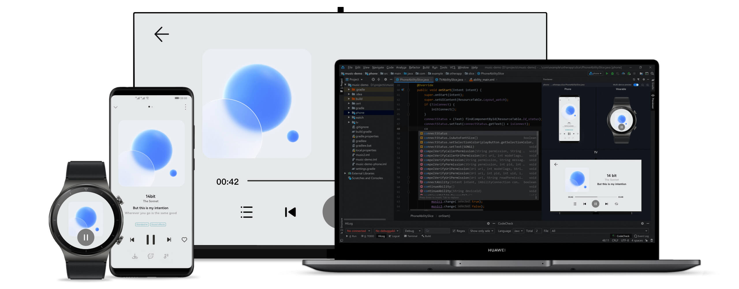
万物互联时代,设备形态从手机、平板延伸至智慧屏、穿戴设备,多设备适配成为开发核心挑战。实际开发中,常遇代码在手机正常、平板按钮错位,或折叠屏折叠后功能遮挡等问题。HarmonyOS 的 “一次开发,多端部署” 能力为解决此类问题提供方案,本文聚焦适配核心技术与实战经验。
官方概述
分布式技术打破硬件边界,而多设备适配需应对不同屏幕与硬件差异,开发成本较高。HarmonyOS“一次开发,多端部署” 能力,支持基于一种设计高效构建多端应用。
参考文档:
一、多设备适配的本质与挑战
“一多” 能力核心
-
定义:一套代码工程,一次开发上架,多端按需部署。
-
价值:降低开发成本(避免多端代码同步问题)、提升效率(某电商应用开发周期缩短 40%)、统一体验、支持跨设备协同(如导航从手机流转到车机)。
核心问题与方案
| 问题类型 | 具体挑战 | HarmonyOS 解决方案 |
|---|---|---|
| 页面适配 | 屏幕尺寸 / 分辨率差异、显示比例变化 | 响应式布局、断点系统、资源限定词 |
| 功能兼容 | 硬件能力差异、交互方式多样(触摸 / 遥控器) | 设备能力查询、条件编译、运行时检测 |
1.1 适配核心挑战
-
屏幕差异:1.4 英寸手表到 100 英寸智慧屏,固定布局易致小屏拥挤、大屏留白。
-
像素密度:DPI 跨度 120-640+,固定 px 单位会导致高 DPI 设备按钮过小。
-
交互多样:智慧屏仅支持触摸会致遥控器无法操作,穿戴设备无 GPS 需隐藏轨迹功能。
-
场景差异:手机适合碎片化浏览,平板侧重深度阅读,需差异化信息架构。
二、多设备适配技术体系
HarmonyOS 适配技术栈核心包括:布局能力、交互归一、能力适配。
2.1 响应式布局设计
基于 ArkUI 声明式框架,解决 “一套布局走天下” 问题。
1. 弹性布局(相对单位)
用百分比 /vp 单位避免元素溢出,示例:
@Component

struct FlexibleLayout {

  build() {

    Row() {

      Column().width('30%').backgroundColor('#FFE4E1')

      Column().width('70%').backgroundColor('#E0FFFF')

    }.width('100%').height('100%')

  }

}
2. 栅格系统(12 列动态调整)
适配不同屏幕内容排列,示例:
@Component

struct GridLayout {

  build() {

    GridRow({

      columns: { xs: 4, sm: 8, md: 12, lg: 12 },

      breakpoints: { value: \['320vp', '600vp', '840vp'] },

      gutter: { x: 16, y: 16 }

    }) {

      // 超小屏占满,中大屏三分之一

      GridCol({ span: { xs: 4, sm: 4, md: 4, lg: 4 } }) { Card() { Text('卡片 1') } }

      GridCol({ span: { xs: 4, sm: 4, md: 4, lg: 4 } }) { Card() { Text('卡片 2') } }

    }.width('100%')

  }

}
2.2 断点系统
按屏幕宽度分类,实现差异化布局。
1. 标准断点
enum BreakpointSize {

  XS = 'xs'(0-320vp,手表), SM = 'sm'(320-600vp,手机竖屏),

  MD = 'md'(600-840vp,手机横屏), LG = 'lg'(840vp+,平板)

}
2. 动态监听(状态保存)
import mediaQuery from '@ohos.mediaQuery'
@Entry
@Component
struct ResponsiveApp {
  @StorageLink('currentBreakpoint') currentBreakpoint: string = 'md'
  private smListener = mediaQuery.matchMediaSync('(320vp<=width<600vp)')
  aboutToAppear() {
  this.smListener.on('change', (res) => {
  if (res.matches) AppStorage.setOrCreate('currentBreakpoint', 'sm')
  })
  }
  aboutToDisappear() { this.smListener.off('change') } // 避免内存泄漏
  build() {
  Column() {
  // 小屏单列、大屏三列+侧边栏
  if (this.currentBreakpoint === 'xs' || this.currentBreakpoint === 'sm') {
  List() { /\* 单列列表 \*/ }
  } else {
  Row() { Sidebar().width(240); Grid() { /\* 三列网格 \*/ } }
  }
  }
  }
}
2.3 资源限定词系统
按设备类型管理资源,目录结构示例:
resources/

  base/          # 默认资源(icon.png)

  phone/         # 手机资源

  tablet/        # 平板资源(icon\_large.png)

  wearable/      # 穿戴资源(icon\_small.png)
使用示例:
@Component

struct ResourceExample {

  build() {

    Column() {

      // 自动匹配设备资源

      Image(\$r('app.media.icon')).width(100).height(100)

      Text(\$r('app.string.welcome\_message')).fontSize(20)

    }

  }

}
2.4 像素密度适配
用 vp/fp 单位自动适配 DPI,示例:
@Component

struct DensityAdaptation {

  build() {

    Column() {

      Text('标题').fontSize(24) // fp单位

      Image(\$r('app.media.avatar')).width('80vp').height('80vp') // vp单位

    }

  }

}
三、典型场景适配方案
3.1 导航模式适配
@Component

struct AdaptiveNavigation {

  @StorageLink('currentBreakpoint') currentBreakpoint: string = 'md'

  build() {

    Column() {

      if (this.currentBreakpoint === 'lg') {

        Row() { NavigationRail().width(240); ContentArea() } // 大屏侧边栏

      } else if (this.currentBreakpoint === 'md') {

        Column() { TabBar().height(56); ContentArea() } // 中屏顶部标签

      } else {

        Column() { ContentArea(); BottomTabBar().height(56) } // 小屏底部导航

      }

    }

  }

}
3.2 折叠屏适配(状态防抖)
import window from '@ohos.window'

@Entry

@Component

struct FoldableAdaptation {

  @State isFolded: boolean = false

  async aboutToAppear() {

    const mainWindow = await window.getLastWindow(getContext(this))

    this.isFolded = mainWindow.getFoldStatus() === window.FoldStatus.FOLD\_STATUS\_FOLDED

    // 防抖处理状态切换

    mainWindow.on('foldStatusChange', debounce((status) => {

      this.isFolded = status === window.FoldStatus.FOLD\_STATUS\_FOLDED

    }, 100))

  }

  build() {

    Column() {

      // 折叠紧凑布局、展开双栏布局

      this.isFolded ? CompactLayout() : Row() { MasterPanel(); DetailPanel() }

    }

  }

}
3.3 输入方式适配
@Component

struct InputAdaptation {

  @StorageLink('currentBreakpoint') currentBreakpoint: string = 'md'

  @State searchText: string = ''

  build() {

    Column() {

      Row({ space: 12 }) {

        TextInput({ placeholder: '搜索', text: this.searchText })

          .layoutWeight(1)

          .onSubmit(() => {

            // 大屏支持回车搜索

            if (this.currentBreakpoint === 'lg') this.performSearch()

          })

        // 小屏显示搜索按钮

        Button('搜索')

          .visibility(this.currentBreakpoint === 'lg' ? Visibility.None : Visibility.Visible)

      }

    }

  }

  performSearch() { console.info(\`搜索: \${this.searchText}\`) }

}
四、性能优化策略
4.1 按需加载资源
@Component

struct LazyResourceLoading {

  @StorageLink('currentBreakpoint') currentBreakpoint: string = 'md'

  private getImageResource() {

    // 大屏高清图、小屏小尺寸图

    return this.currentBreakpoint === 'lg' ? \$r('app.media.image\_large') : \$r('app.media.image\_small')

  }

  build() {

    Image(this.getImageResource()).width('100%').objectFit(ImageFit.Cover)

  }

}
4.2 条件渲染
@Component

struct ConditionalRender {

  @StorageLink('currentBreakpoint') currentBreakpoint: string = 'md'

  build() {

    Column() {

      MainContent() // 核心内容全设备显示

      // 大屏显示高级功能

      if (this.currentBreakpoint === 'lg') AdvancedFeaturePanel()

    }

  }

}
五、实战案例:天气查询元服务
项目核心
-
免安装元服务,支持手机 / 平板适配
-
响应式天气卡片,自动调整布局
首页适配实现
@Entry

@Component

struct Index {

  @State city: string = '北京'; @State temperature: string = '--°C'

  @State isLoading: boolean = true

  async aboutToAppear() { await this.loadWeatherData() }

  async loadWeatherData() {

    // 简化:获取天气数据逻辑

  }

  build() {

    Column() {

      Column({ space: 16 }) {

        // 标题栏

        Row() { Text('天气').fontSize(20).fontColor(Color.White); Blank() }

        // 加载/数据展示

        this.isLoading ? LoadingProgress() : Row({ space: 12 }) {

          Text(this.temperature).fontSize(56)

          Text(this.weather).fontSize(20)

        }

        // 44vp高按钮确保可点击

        Button('查看详情').width('80%').height(44).onClick(() => { /\* 跳转详情 \*/ })

      }

      .width('100%').padding(24).linearGradient(/\* 渐变背景 \*/)

    }.width('100%').height('100%').padding(16)

  }

}
六、常见问题与解决方案
| 问题类型 | 解决方案 |
|---|---|
| 布局错乱 | 用相对单位、LayoutWeight,测试边界尺寸 |
| 性能卡顿 | 长列表用 LazyForEach,低性能设备禁用复杂动画 |
| 图片适配 | 多分辨率资源 + ImageFit 属性 |
| 文本截断 | maxLines(2)+textOverflow(Ellipsis) |
参考资源
-
官方文档:HarmonyOS 应用开发指南
-
工具支持:DevEco Studio 使用指南
-
社区资源:HarmonyOS 开发者社区、Codelabs 实践教程
本文由技术博客原创,转载请注明出处

讨论HarmonyOS开发技术,专注于API与组件、DevEco Studio、测试、元服务和应用上架分发等。
更多推荐


 24
24 23
23- 0


 已为社区贡献7条内容

所有评论(0)