智慧屏和智能穿戴开发:容器组件swiper
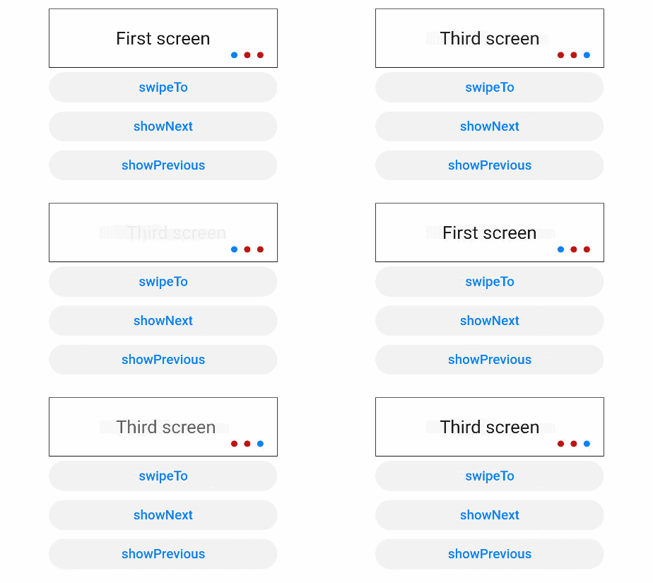
HarmonyOS应用开发文档更新修改说明:swiper组件补充示例代码和示例效果图,方便开发者掌握该组件的使用方式。
滑动容器,提供切换子组件显示的能力。
支持设备
|
智慧屏 |
智能穿戴 |
|---|---|
|
支持 |
支持 |
权限列表
无
子组件
支持除<list>之外的子组件。
属性
|
名称 |
类型 |
默认值 |
必填 |
描述 |
|---|---|---|---|---|
|
index |
number |
0 |
否 |
当前在容器中显示的子组件的索引值。 |
|
autoplay |
boolean |
false |
否 |
子组件是否自动播放。 |
|
interval |
number |
3000 |
否 |
使用自动播放时播放的时间间隔,单位为ms。 |
|
indicator |
boolean |
true |
否 |
是否启用导航点指示器,默认true。 |
|
indicatormask |
boolean |
false |
否 |
是否采用指示器蒙版,设置为true时,指示器会有渐变蒙版出现。 |
|
loop |
boolean |
true |
否 |
是否开启循环轮播。 |
|
duration |
number |
- |
否 |
子组件切换的动画时长。 |
|
vertical |
boolean |
false |
否 |
是否为纵向滑动,纵向滑动时采用纵向的指示器。 |
|
id |
string |
- |
否 |
组件的唯一标识。 |
|
style |
string |
- |
否 |
组件的样式声明。 |
|
class |
string |
- |
否 |
组件的样式类,用于引用样式表。 |
|
ref |
string |
- |
否 |
用来指定指向子元素或子组件的引用信息,该引用将注册到父组件的$refs 属性对象上。 |
|
disabled |
boolean |
false |
否 |
当前组件是否被禁用,在禁用场景下,组件将无法响应用户交互。 |
|
focusable |
boolean |
true |
否 |
当前组件是否可以获取焦点。 当focusable设置为true时,可否获焦依赖于是否拥有可获焦的子组件;设置为false时,本身及其子组件都不能获焦。 |
|
data |
string |
- |
否 |
给当前组件设置data属性,进行相应的数据存储和读取。 |
事件
|
名称 |
参数 |
描述 |
|---|---|---|
|
change |
{ index: currentIndex } |
当前显示的组件索引变化时触发该事件。 |
|
rotation |
{ value: rotationValue } |
智能穿戴表冠旋转事件触发时的回调。 |
|
touchstart |
手指刚触摸屏幕时触发该事件。 |
|
|
touchmove |
手指触摸屏幕后移动时触发该事件。 |
|
|
touchcancel |
手指触摸屏幕中动作被打断时触发该事件。 |
|
|
touchend |
手指触摸结束离开屏幕时触发该事件。 |
|
|
click |
- |
点击动作触发该事件。 |
|
longpress |
- |
长按动作触发该事件。 |
|
focus |
- |
获得焦点时触发该事件,span组件无法获取焦点。 |
|
blur |
- |
失去焦点时触发该事件,span组件无法失去焦点。 |
|
key |
智慧屏特有的按键事件,当用户操作遥控器按键时触发。
|
样式
|
名称 |
类型 |
默认值 |
必填 |
描述 |
|---|---|---|---|---|
|
indicator-color |
<color> |
- |
否 |
导航点指示器的填充颜色。 |
|
indicator-selected-color |
<color> |
智慧屏:#ffffffff 智能穿戴:#ffffffff |
否 |
导航点指示器选中的颜色。 |
|
indicator-size |
<length> |
4px |
否 |
导航点指示器的直径大小。 |
|
indicator-top|left|right|bottom |
<length> | <percentage> |
- |
否 |
导航点指示器在swiper中的相对位置。 |
|
width |
<length> | <percentage> |
- |
否 |
设置组件自身的宽度。 缺省时使用元素自身内容需要的宽度。 |
|
height |
<length> | <percentage> |
- |
否 |
设置组件自身的高度。 缺省时使用元素自身内容需要的高度。 |
|
padding |
<length> |
0 |
否 |
使用简写属性设置所有的内边距属性。 该属性可以有1到4个值: |
|
padding-[left|top|right|bottom] |
<length> |
0 |
否 |
设置左、上、右、下内边距属性。 |
|
padding-[start|end] |
<length> |
0 |
否 |
设置起始和末端内边距属性。 |
|
margin |
<length> |
0 |
否 |
使用简写属性设置所有的外边距属性,该属性可以有1到4个值。 |
|
margin-[left|top|right|bottom] |
<length> |
0 |
否 |
设置左、上、右、下外边距属性。 |
|
margin-[start|end] |
<length> |
0 |
否 |
设置起始和末端外边距属性。 |
|
border |
- |
0 |
否 |
使用简写属性设置所有的边框属性,包含边框的宽度,样式,颜色属性,顺序设置为border-width、border-style、border-color,不设置时,各属性值为默认值。 |
|
border-style |
string |
solid |
否 |
使用简写属性设置所有边框的样式,可选值为:
|
|
border-[left|top|right|bottom]-style |
string |
solid |
否 |
分别设置左、上、右、下四个边框的样式,可选值为dotted、dashed、solid。 |
|
border-[left|top|right|bottom] |
- |
- |
否 |
使用简写属性设置对应位置的边框属性,包含边框的宽度,样式,颜色属性,顺序设置为border-width、border-style、border-color,不设置的值为默认值。 |
|
border-width |
<length> |
0 |
否 |
使用简写属性设置元素的所有边框宽度,或者单独为各边边框设置宽度。 |
|
border-[left|top|right|bottom]-width |
<length> |
0 |
否 |
分别设置左、上、右、下四个边框的宽度。 |
|
border-color |
<color> |
black |
否 |
使用简写属性设置元素的所有边框颜色,或者单独为各边边框设置颜色。 |
|
border-[left|top|right|bottom]-color |
<color> |
black |
否 |
分别设置左、上、右、下四个边框的颜色。 |
|
border-radius |
<length> |
- |
否 |
border-radius属性是设置元素的外边框圆角半径。设置border-radius时不能单独设置某一个方向的border-[left|top|right|bottom]-width,border-[left|top|right|bottom]-color ,border-[left|top|right|bottom]-style,如果要设置color、width和style,需要将四个方向一起设置(border-width、border-color、border-style)。 |
|
border-[top|bottom]-[left|right]-radius |
<length> |
- |
否 |
分别设置左上,右上,右下和左下四个角的圆角半径。 |
|
background |
<linear-gradient> |
- |
否 |
仅支持设置渐变样式,与background-color、background-image不兼容。 |
|
background-color |
<color> |
- |
否 |
设置背景颜色。 |
|
background-image |
string |
- |
否 |
设置背景图片。与background-color、background不兼容;支持网络图片资源和本地图片资源地址。 |
|
background-size |
|
auto |
否 |
设置背景图片的大小。 |
|
background-repeat |
string |
repeat |
否 |
针对重复背景图像样式进行设置,背景图像默认在水平和垂直方向上重复。
|
|
background-position |
|
0px 0px |
否 |
|
|
opacity |
number |
1 |
否 |
元素的透明度,取值范围为0到1,1表示为不透明,0表示为完全透明。 |
|
display |
string |
flex |
否 |
确定一个元素所产生的框的类型,可选值为:
|
|
visibility |
string |
visible |
否 |
是否显示元素所产生的框。不可见的框会占用布局(将'display'属性设置为'none'来完全去除框),可选值为:
|
|
flex |
number |
- |
否 |
规定当前组件如何适应父组件中的可用空间。它作为一个简写属性,用来设置组件的flex-grow。
|
|
flex-grow |
number |
0 |
否 |
设置组件的拉伸样式,指定父组件容器主轴方向上剩余空间(容器本身大小减去所有flex子元素占用的大小)的分配权重。0为不伸展。
|
|
flex-shrink |
number |
1 |
否 |
设置组件的收缩样式,元素仅在默认宽度之和大于容器的时候才会发生收缩,0为不收缩。
|
|
flex-basis |
<length> |
- |
否 |
设置组件在主轴方向上的初始大小。
|
|
position |
string |
relative |
否 |
设置元素的定位类型,不支持动态变更。
|
|
[left|top|right|bottom] |
<length> |
- |
否 |
left|top|right|bottom需要配合position样式使用,来确定元素的偏移位置。
|
方法
|
名称 |
参数 |
描述 |
|---|---|---|
|
swipeTo |
{ index: number(指定位置) } |
切换到index位置的子组件。 |
|
showNext |
无 |
显示下一个子组件。 |
|
showPrevious |
无 |
显示上一个子组件。 |
示例
<!-- xxx.hml -->
<div class="container">
  <swiper class="swiper" id="swiper" index="0" indicator="true" loop="true" digital="false">
    <div class = "swiperContent" >
      <text class = "text" value="First screen"></text>
    </div>
    <div class = "swiperContent">
      <text class = "text" value="Second screen"></text>
    </div>
    <div class = "swiperContent">
      <text class = "text" value="Third screen"></text>
    </div>
  </swiper>
  <input class="button" type="button" value="swipeTo" onclick="swipeTo"></input>
  <input class="button" type="button" value="showNext" onclick="showNext"></input>
  <input class="button" type="button" value="showPrevious" onclick="showPrevious"></input>
</div>
/* xxx.css */
.container {
flex-direction: column;
width: 100%;
height: 100%;
align-items: center;
}
.swiper {
flex-direction: column;
align-content: center;
align-items: center;
width: 70%;
height: 130px;
border: 1px solid #000000;
indicator-color: #cf2411;
indicator-size: 14px;
indicator-bottom: 20px;
indicator-right: 30px;
margin-top: 100px;
}
.swiperContent {
height: 100%;
justify-content: center;
}
.button {
width: 70%;
margin: 10px;
}
.text {
font-size: 40px;
}// xxx.js
export default {
swipeTo(e) {
this.$element('swiper').swipeTo({index: 2});
},
showNext(type) {
this.$element('swiper').showNext();
},
showPrevious(e) {
this.$element('swiper').showPrevious();
}
}

讨论HarmonyOS开发技术,专注于API与组件、DevEco Studio、测试、元服务和应用上架分发等。
更多推荐
 0
0 0
0- 0


 已为社区贡献25条内容

所有评论(0)