HarmonyOS ArkTS 组件进阶 - AlphabetIndexer 自学指南
1. AlphabetIndexer 是什么?
AlphabetIndexer 是 ArkUI 信息展示类组件中的 索引条组件,典型场景是:
- 通讯录按 A~Z 快速定位联系人;
- 城市选择列表按拼音首字母定位;
- 歌曲/视频列表按首字母快速跳转;
- 任意「长列表 + 字母索引」的导航场景。
特点简单总结一下:
- 只能联动另一侧的容器组件(常见是
List/Grid); - 支持弹窗 展示一级/二级索引(如:A →「安、艾、奥」等列表);
- 支持 自动折叠模式(索引项很多时自动压缩呈现);
- 支持 背景模糊、圆角、触控振动反馈 等 UI 细节。
支持:从 API 7 起引入,API 11、12、18 逐步增强(元服务、多级索引、自动折叠等能力)。
2. 核心接口概览
2.1 组件创建
AlphabetIndexer(options: AlphabetIndexerOptions)
AlphabetIndexerOptions 常用字段(简化版):
| 字段名 | 类型 | 必填 | 说明 |
|---|---|---|---|
arrayValue |
Array<string> |
是 | 索引条显示的字符串数组,每个元素一个索引项,比如 ['#','A','B',...,'Z'] |
selected |
number |
否 | 初始选中的索引下标,支持 $$ 双向绑定 |
⚠️ 注意:
arrayValue的顺序要与你的业务列表逻辑保持一致,否则跳转会「错位」。
2.2 样式相关常用属性
下面列的是日常开发最常用的一批属性,方便你查表式使用:
AlphabetIndexer({ arrayValue, selected })
  // 文本颜色 & 字体
  .color(value: ResourceColor)                  // 未选中项文字颜色
  .selectedColor(value: ResourceColor)          // 选中项文字颜色
  .popupColor(value: ResourceColor)             // 弹窗一级索引文字颜色
  .font(value: Font)                            // 未选中项字体
  .selectedFont(value: Font)                    // 选中项字体
  .popupFont(value: Font)                       // 弹窗一级索引字体

  // 尺寸 & 对齐
  .itemSize(value: string | number)             // 单个索引项大小(正方形边长,vp)
  .alignStyle(value: IndexerAlign, offset?)     // 弹窗相对索引条左右对齐 + 间距
  .popupPosition(value: Position)               // 弹窗位置(相对索引条上边框中点)

  // 背景 & 圆角
  .selectedBackgroundColor(value: ResourceColor)     // 选中项背景色
  .popupBackground(value: ResourceColor)             // 弹窗背景色
  .popupItemBackgroundColor(value: ResourceColor)    // 弹窗二级索引项背景色
  .itemBorderRadius(value: number)                   // 索引条每一格圆角
  .popupItemBorderRadius(value: number)              // 弹窗里每一格圆角
  .popupBackgroundBlurStyle(value: BlurStyle)        // 弹窗背景模糊材质
  .popupTitleBackground(value: ResourceColor)        // 弹窗一级索引背景

  // 行为控制
  .usingPopup(value: boolean)                   // 是否展示弹窗
  .autoCollapse(value: boolean)                 // 是否开启自适应折叠模式
  .enableHapticFeedback(value: boolean)         // 是否启用触控振动反馈
提示:
width="auto"时索引条宽度会随 最长索引项宽度 自适应;padding默认是4vp;- 字体缩放
maxFontScale/minFontScale强制为 1,不跟随系统字体大小变化。
2.3 事件与回调
// 常用事件
.onSelect((index: number) => void)                         // 索引项选中
.onRequestPopupData((index: number) => Array<string>)      // 请求二级索引内容
.onPopupSelect((index: number) => void)                    // 弹窗二级索引被选中
三个类型别名(API 18+):
type OnAlphabetIndexerSelectCallback = (index: number) => void
type OnAlphabetIndexerPopupSelectCallback = (index: number) => void
type OnAlphabetIndexerRequestPopupDataCallback = (index: number) => Array<string>
usingPopup(true)时,onRequestPopupData会在索引项被选中时触发,返回的字符串数组会 竖排显示在弹窗中,最多显示 5 条,超过可上下滑动。
2.4 对齐方式枚举 IndexerAlign
enum IndexerAlign {
  Left,     // 弹窗在索引条一侧
  Right,    // 弹窗在索引条另一侧
  START,    // 跟随 LTR/RTL 方向的开始侧
  END       // 跟随 LTR/RTL 方向的结束侧
}
在国际化场景(LTR/RTL)下,用
START/END可以避免你手动切换 Left/Right。
3. 最小可用示例:先能跑起来
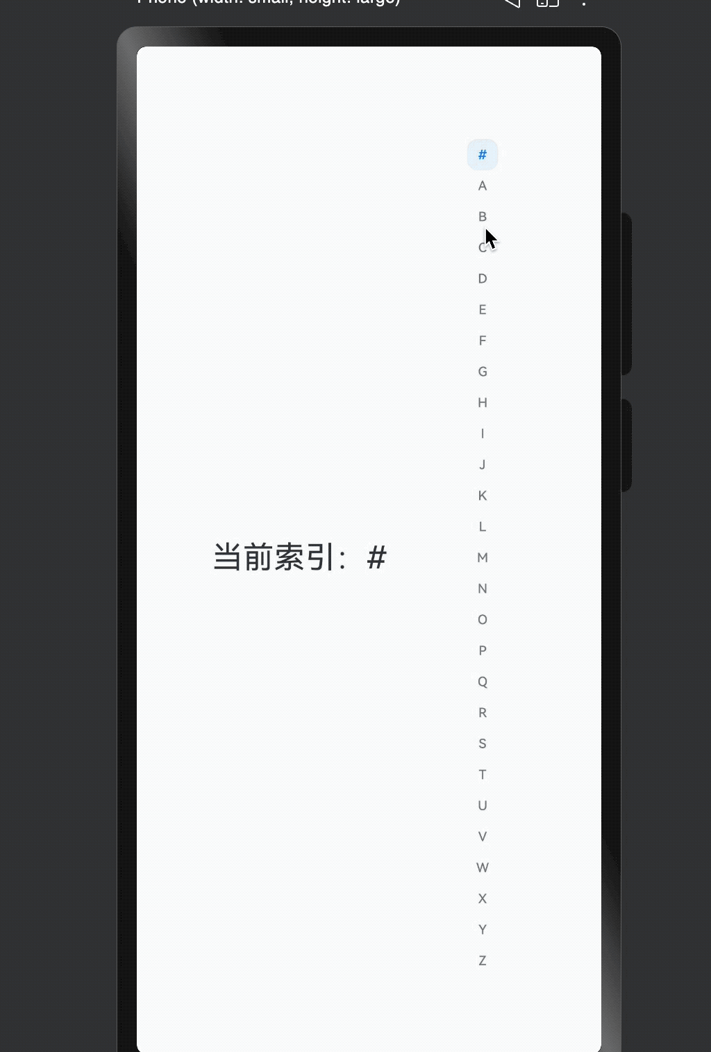
下面先给一个最小可跑版本(不带二级索引、不带各种炫酷效果),你可以先在 demo 工程里试一把。
// xxx.ets
@Entry
@Component
struct SimpleAlphabetIndexerSample {
  private indexes: string[] = ['#', 'A', 'B', 'C', 'D', 'E', 'F', 'G',
    'H', 'I', 'J', 'K', 'L', 'M', 'N',
    'O', 'P', 'Q', 'R', 'S', 'T', 'U',
    'V', 'W', 'X', 'Y', 'Z'];

  @State currentIndex: number = 0;

  build() {
    Row() {
      // 左边可以是 List / Grid,这里先用简单的占位
      Column() {
        Text(`当前索引:${this.indexes[this.currentIndex]}`)
          .fontSize(24)
          .margin(10)
      }
      .width('70%')

      // 右侧是 AlphabetIndexer
      AlphabetIndexer({ arrayValue: this.indexes, selected: this.currentIndex })
        .usingPopup(false)
        .itemSize(24)
        .selectedColor(0xFF007DFF)
        .selectedBackgroundColor(0x1A007DFF)
        .onSelect((index: number) => {
          this.currentIndex = index;
          console.info(`Selected index: ${this.indexes[index]}`);
        })
    }
    .width('100%')
    .height('100%')
  }
}
这个最小例子主要让你熟悉:
- 如何传入
arrayValue; - 如何用
selected+onSelect做一个最基本的「选中反馈」。
接下来,我们用完整例子演示 联动 List,弹窗展示二级索引,自动折叠 和 模糊材质。
4. 示例一:联动 List + 自定义弹窗内容
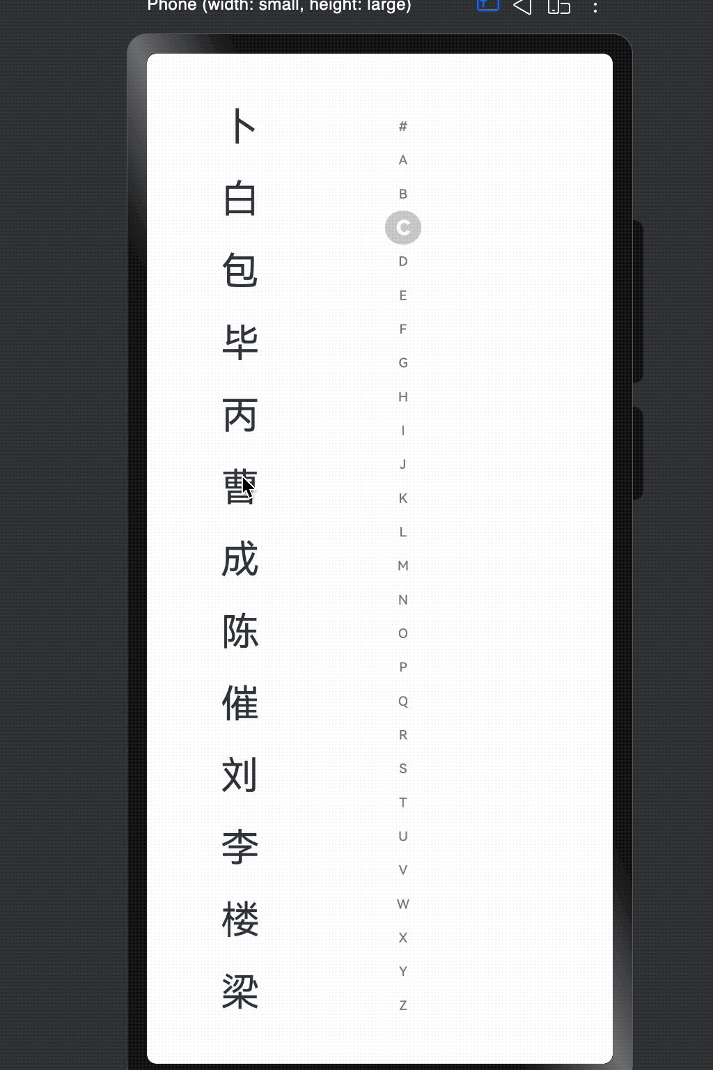
这个例子主要展示:
- 左边
List展示联系人姓氏; - 右边
AlphabetIndexer做 A~Z 索引; onRequestPopupData根据当前字母动态返回二级索引列表(如「安、卜、白…」)。
// xxx.ets
@Entry
@Component
struct AlphabetIndexerSample1 {
  private arrayA: string[] = ['安'];
  private arrayB: string[] = ['卜', '白', '包', '毕', '丙'];
  private arrayC: string[] = ['曹', '成', '陈', '催'];
  private arrayL: string[] = ['刘', '李', '楼', '梁', '雷', '吕', '柳', '卢'];

  private value: string[] = ['#', 'A', 'B', 'C', 'D', 'E', 'F', 'G',
    'H', 'I', 'J', 'K', 'L', 'M', 'N',
    'O', 'P', 'Q', 'R', 'S', 'T', 'U',
    'V', 'W', 'X', 'Y', 'Z'];

  build() {
    Stack({ alignContent: Alignment.Start }) {
      Row() {
        // 左侧 List:模拟按首字母分组的联系人列表
        List({ space: 20, initialIndex: 0 }) {
          ForEach(this.arrayA, (item: string) => {
            ListItem() {
              Text(item)
                .width('80%')
                .height('5%')
                .fontSize(30)
                .textAlign(TextAlign.Center)
            }
          }, (item: string) => item)

          ForEach(this.arrayB, (item: string) => {
            ListItem() {
              Text(item)
                .width('80%')
                .height('5%')
                .fontSize(30)
                .textAlign(TextAlign.Center)
            }
          }, (item: string) => item)

          ForEach(this.arrayC, (item: string) => {
            ListItem() {
              Text(item)
                .width('80%')
                .height('5%')
                .fontSize(30)
                .textAlign(TextAlign.Center)
            }
          }, (item: string) => item)

          ForEach(this.arrayL, (item: string) => {
            ListItem() {
              Text(item)
                .width('80%')
                .height('5%')
                .fontSize(30)
                .textAlign(TextAlign.Center)
            }
          }, (item: string) => item)
        }
        .width('50%')
        .height('100%')

        // 右侧 AlphabetIndexer:开启弹窗 & 自定义样式
        AlphabetIndexer({ arrayValue: this.value, selected: 0 })
          .autoCollapse(false)                        // 关闭自适应折叠模式
          .enableHapticFeedback(false)                // 关闭触控振动
          .selectedColor(0xFFFFFF)                    // 选中项文本颜色
          .popupColor(0xFFFAF0)                       // 弹窗一级索引文本颜色
          .selectedBackgroundColor(0xCCCCCC)          // 选中项背景色
          .popupBackground(0xD2B48C)                  // 弹窗背景色
          .usingPopup(true)                           // 选中时显示弹窗
          .selectedFont({ size: 16, weight: FontWeight.Bolder })
          .popupFont({ size: 30, weight: FontWeight.Bolder })
          .itemSize(28)                               // 索引项尺寸
          .alignStyle(IndexerAlign.Left)              // 弹窗在索引条一侧
          .popupItemBorderRadius(24)                  // 弹窗项圆角
          .itemBorderRadius(14)                       // 索引项圆角
          .popupBackgroundBlurStyle(BlurStyle.NONE)   // 关闭背景模糊
          .popupTitleBackground(0xCCCCCC)             // 弹窗一级索引背景
          .popupSelectedColor(0x00FF00)               // 弹窗二级索引选中文本颜色
          .popupUnselectedColor(0x0000FF)             // 弹窗二级索引未选中文本颜色
          .popupItemFont({ size: 30, style: FontStyle.Normal })
          .popupItemBackgroundColor(0xCCCCCC)
          .onSelect((index: number) => {
            console.info(this.value[index] + ' Selected!');
            // 一般这里会配合 List 滚动到对应分组
          })
          .onRequestPopupData((index: number) => {
            // 字母 → 二级索引内容的映射
            if (this.value[index] == 'A') {
              return this.arrayA;
            } else if (this.value[index] == 'B') {
              return this.arrayB;
            } else if (this.value[index] == 'C') {
              return this.arrayC;
            } else if (this.value[index] == 'L') {
              return this.arrayL;
            } else {
              // 其它字母只显示一级索引
              return [];
            }
          })
          .onPopupSelect((index: number) => {
            console.info('onPopupSelected:' + index);
            // 可在这里根据二级索引定位到更具体的位置
          })
      }
      .width('100%')
      .height('100%')
    }
  }
}
使用要点小结:
usingPopup(true)+onRequestPopupData是做「二级索引」的关键;- 当返回空数组时,弹窗只显示一级索引(如仅一个「A」)。
5. 示例二:开启自适应折叠模式
当索引项很多时(比如 26 个字母 + #),在手机上全显示会比较挤。autoCollapse(true) 可以让系统根据 索引数量 + 高度 自动选择:
- 全显示;
- 短折叠;
- 长折叠。
下面这个示例支持「切换折叠模式」以及「动态调整索引条高度」:
// xxx.ets
@Entry
@Component
struct AlphabetIndexerSample2 {
  private arrayA: string[] = ['安'];
  private arrayB: string[] = ['卜', '白', '包', '毕', '丙'];
  private arrayC: string[] = ['曹', '成', '陈', '催'];
  private arrayJ: string[] = ['嘉', '贾'];

  private value: string[] = ['#', 'A', 'B', 'C', 'D', 'E', 'F', 'G',
    'H', 'I', 'J', 'K', 'L', 'M', 'N',
    'O', 'P', 'Q', 'R', 'S', 'T', 'U',
    'V', 'W', 'X', 'Y', 'Z'];

  @State isNeedAutoCollapse: boolean = false;
  @State indexerHeight: string = '75%';

  build() {
    Stack({ alignContent: Alignment.Start }) {
      Row() {
        // 左侧 List:模拟数据
        List({ space: 20, initialIndex: 0 }) {
          ForEach(this.arrayA, (item: string) => {
            ListItem() {
              Text(item)
                .width('80%')
                .height('5%')
                .fontSize(30)
                .textAlign(TextAlign.Center)
            }
          }, (item: string) => item)

          ForEach(this.arrayB, (item: string) => {
            ListItem() {
              Text(item)
                .width('80%')
                .height('5%')
                .fontSize(30)
                .textAlign(TextAlign.Center)
            }
          }, (item: string) => item)

          ForEach(this.arrayC, (item: string) => {
            ListItem() {
              Text(item)
                .width('80%')
                .height('5%')
                .fontSize(30)
                .textAlign(TextAlign.Center)
            }
          }, (item: string) => item)

          ForEach(this.arrayJ, (item: string) => {
            ListItem() {
              Text(item)
                .width('80%')
                .height('5%')
                .fontSize(30)
                .textAlign(TextAlign.Center)
            }
          }, (item: string) => item)
        }
        .width('50%')
        .height('100%')

        Column() {
          // 上半部分:索引条本体
          Column() {
            AlphabetIndexer({ arrayValue: this.value, selected: 0 })
              .autoCollapse(this.isNeedAutoCollapse)  // 是否开启折叠
              .height(this.indexerHeight)             // 动态控制索引条高度
              .enableHapticFeedback(false)
              .selectedColor(0xFFFFFF)
              .popupColor(0xFFFAF0)
              .selectedBackgroundColor(0xCCCCCC)
              .popupBackground(0xD2B48C)
              .usingPopup(true)
              .selectedFont({ size: 16, weight: FontWeight.Bolder })
              .popupFont({ size: 30, weight: FontWeight.Bolder })
              .itemSize(28)
              .alignStyle(IndexerAlign.Right)
              .popupTitleBackground("#D2B48C")
              .popupSelectedColor(0x00FF00)
              .popupUnselectedColor(0x0000FF)
              .popupItemFont({ size: 30, style: FontStyle.Normal })
              .popupItemBackgroundColor(0xCCCCCC)
              .onSelect((index: number) => {
                console.info(this.value[index] + ' Selected!');
              })
              .onRequestPopupData((index: number) => {
                if (this.value[index] == 'A') {
                  return this.arrayA;
                } else if (this.value[index] == 'B') {
                  return this.arrayB;
                } else if (this.value[index] == 'C') {
                  return this.arrayC;
                } else if (this.value[index] == 'J') {
                  return this.arrayJ;
                } else {
                  return [];
                }
              })
              .onPopupSelect((index: number) => {
                console.info('onPopupSelected:' + index);
              })
          }
          .height('80%')
          .justifyContent(FlexAlign.Center)

          // 下半部分:控制按钮
          Column() {
            Button('切换成折叠模式')
              .margin('5vp')
              .onClick(() => {
                this.isNeedAutoCollapse = true;
              })
            Button('切换索引条高度到30%')
              .margin('5vp')
              .onClick(() => {
                this.indexerHeight = '30%';
              })
            Button('切换索引条高度到70%')
              .margin('5vp')
              .onClick(() => {
                this.indexerHeight = '70%';
              })
          }
          .height('20%')
        }
        .width('50%')
        .justifyContent(FlexAlign.Center)
      }
      .width('100%')
      .height(720)
    }
  }
}
关于
autoCollapse的折叠规则要点(逻辑简化版本):
- 如果首项是
"#":判断时会 先去掉首项 再看数量;- 9 个以内:全显示;
- 9~13 个:根据高度自适应选择全显示或「短折叠」;
- 13 个以上:根据高度在「短折叠 / 长折叠」中自适应。
6. 示例三:弹窗背景模糊材质
在更偏「设计感」的页面上,通常会需要 毛玻璃弹窗效果。popupBackgroundBlurStyle 就是用来控制弹窗的背景模糊材质的。
下面这个示例:
- 用按钮切换两种模糊材质;
- 背景是一张图片(记得换成自己的资源)。
// xxx.ets
@Entry
@Component
struct AlphabetIndexerSample3 {
  private arrayA: string[] = ['安'];
  private arrayB: string[] = ['卜', '白', '包', '毕', '丙'];
  private arrayC: string[] = ['曹', '成', '陈', '催'];
  private arrayL: string[] = ['刘', '李', '楼', '梁', '雷', '吕', '柳', '卢'];

  private value: string[] = ['#', 'A', 'B', 'C', 'D', 'E', 'F', 'G',
    'H', 'I', 'J', 'K', 'L', 'M', 'N',
    'O', 'P', 'Q', 'R', 'S', 'T', 'U',
    'V', 'W', 'X', 'Y', 'Z'];

  @State customBlurStyle: BlurStyle = BlurStyle.NONE;

  build() {
    Stack({ alignContent: Alignment.Start }) {
      Row() {
        // 左侧 List:依旧是一些示例数据
        List({ space: 20, initialIndex: 0 }) {
          ForEach(this.arrayA, (item: string) => {
            ListItem() {
              Text(item)
                .width('80%')
                .height('5%')
                .fontSize(30)
                .textAlign(TextAlign.Center)
            }
          }, (item: string) => item)

          ForEach(this.arrayB, (item: string) => {
            ListItem() {
              Text(item)
                .width('80%')
                .height('5%')
                .fontSize(30)
                .textAlign(TextAlign.Center)
            }
          }, (item: string) => item)

          ForEach(this.arrayC, (item: string) => {
            ListItem() {
              Text(item)
                .width('80%')
                .height('5%')
                .fontSize(30)
                .textAlign(TextAlign.Center)
            }
          }, (item: string) => item)

          ForEach(this.arrayL, (item: string) => {
            ListItem() {
              Text(item)
                .width('80%')
                .height('5%')
                .fontSize(30)
                .textAlign(TextAlign.Center)
            }
          }, (item: string) => item)
        }
        .width('30%')
        .height('100%')

        Column() {
          // 上半部分:切换模糊材质的按钮
          Column() {
            Text('切换模糊材质: ')
              .fontSize(24)
              .fontColor(0xcccccc)
              .width('100%')
            Button('COMPONENT_REGULAR')
              .margin('5vp')
              .width(200)
              .onClick(() => {
                this.customBlurStyle = BlurStyle.COMPONENT_REGULAR;
              })
            Button('BACKGROUND_THIN')
              .margin('5vp')
              .width(200)
              .onClick(() => {
                this.customBlurStyle = BlurStyle.BACKGROUND_THIN;
              })
          }
          .height('20%')

          // 下半部分:索引条 + 模糊弹窗
          Column() {
            AlphabetIndexer({ arrayValue: this.value, selected: 0 })
              .usingPopup(true)
              .alignStyle(IndexerAlign.Left)
              .popupItemBorderRadius(24)
              .itemBorderRadius(14)
              .popupBackgroundBlurStyle(this.customBlurStyle) // 核心点
              .popupTitleBackground(0xCCCCCC)
              .onSelect((index: number) => {
                console.info(this.value[index] + ' Selected!');
              })
              .onRequestPopupData((index: number) => {
                if (this.value[index] == 'A') {
                  return this.arrayA;
                } else if (this.value[index] == 'B') {
                  return this.arrayB;
                } else if (this.value[index] == 'C') {
                  return this.arrayC;
                } else if (this.value[index] == 'L') {
                  return this.arrayL;
                } else {
                  return [];
                }
              })
              .onPopupSelect((index: number) => {
                console.info('onPopupSelected:' + index);
              })
          }
          .height('80%')
        }
        .width('70%')
      }
      .width('100%')
      .height('100%')
      // 注意替换为你工程中的图片资源
      .backgroundImage($r('app.media.image'))
    }
  }
}
小 Tips:
- 模糊效果会叠加在
popupBackground上,所以颜色看起来会和你写的不完全一样;- 如果不想要毛玻璃效果,可以设为
BlurStyle.NONE。
7. 实战开发中的常见坑 & 小技巧
-
索引项太多 vs 高度不够
itemSize是索引项区域的正方形边长;- 实际大小会被组件宽高和
padding限制; - 当高度不够时,建议开启
autoCollapse(true),否则界面会很挤。
-
二级索引内容过多
onRequestPopupData返回的字符串数组 最多显示 5 行,超出可以滑动,但不宜塞太多;- 建议二级列表只放「常用/命中率高」的条目,避免弹窗太长影响体验。
-
触控反馈别忘了权限
-
enableHapticFeedback(true)时,需要在module.json5里配置振动权限:"requestPermissions": [ { "name": "ohos.permission.VIBRATE" } ] -
否则有的机型上会没有振动效果或直接报权限问题。
-
-
国际化 & RTL 支持
-
如果你的应用要支持 RTL 语言(如阿拉伯语),对齐方式尽量用
START/END:.alignStyle(IndexerAlign.START) -
这样在 LTR/RTL 场景下会自动切换索引条左/右侧。
-
-
联动 List 记得加「滚动定位」
onSelect里除了打印日志,一般会调用List的scrollToIndex或position绑定;- 做到「按字母 → 左侧列表跳到对应分组」才是完整体验。
-
宽度自适应的使用
- 当
width('auto')时,宽度会跟随最长索引文本宽度变化; - 如果你用的是多字母组合(比如「热门」、「最近」),注意可能导致索引条变宽,对布局有影响。
- 当
如果你后面打算写 通讯录、城市选择、音乐/视频列表 之类的实战 demo,可以直接在上面的三个示例基础上改数据结构,把 List 的滚动联动补齐,就已经是一份很完整的 ArkUI 索引条实战工程了。

讨论HarmonyOS开发技术,专注于API与组件、DevEco Studio、测试、元服务和应用上架分发等。
更多推荐


 0
0 0
0- 0


 已为社区贡献23条内容

所有评论(0)