HarmonyOS ArkTS 组件进阶 - Polygon 自学指南
1. Polygon 是什么?能用来干嘛?
Polygon 是 ArkUI 图形绘制能力里的 多边形绘制组件,可以在一个给定的矩形区域内,根据一组点坐标,绘制任意多边形轮廓,并支持:
- 填充颜色 / 透明度;
- 描边颜色 / 粗细 / 虚线 / 拐角样式;
- 抗锯齿控制;
attributeModifier动态修改属性(API 18+),updateConstructorParams(API 20+)。
典型使用场景:
- 自定义图表元素(雷达图、多边形图例、热点区域);
- UI 装饰图形(角标、多边形标签、波浪块、菱形背景);
- 游戏 / 可视化里简单几何图形的快速绘制;
- 配合手势实现自定义选区(多边形区域选中高亮等)。
基础信息:
-
组件名:
Polygon -
子组件:无(它只负责画图,不是容器)
-
支持版本:
- 从 API 7 开始支持;
- 卡片能力:API 9+;
- 元服务 API:API 11+;
PolygonOptions标准化:API 18+;AttributeUpdater.updateConstructorParams:API 20+。
2. 快速上手:三角形 / 矩形 / 五边形
先用最短的代码跑起来,感受一下 Polygon 的基本用法。
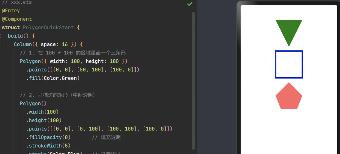
// xxx.ets
@Entry
@Component
struct PolygonQuickStart {
  build() {
    Column({ space: 16 }) {
      // 1. 在 100 * 100 的区域里画一个三角形
      Polygon({ width: 100, height: 100 })
        .points([[0, 0], [50, 100], [100, 0]])
        .fill(Color.Green)

      // 2. 只描边的矩形(中间透明)
      Polygon()
        .width(100)
        .height(100)
        .points([[0, 0], [0, 100], [100, 100], [100, 0]])
        .fillOpacity(0)       // 填充透明
        .strokeWidth(5)
        .stroke(Color.Blue)   // 只有边框

      // 3. 半透明填充的五边形
      Polygon({ width: 100, height: 100 })
        .points([[50, 0], [0, 50], [20, 100], [80, 100], [100, 50]])
        .fill(Color.Red)
        .fillOpacity(0.6)
    }
    .width('100%')
    .margin({ top: 16 })
  }
}
这里你已经看到 Polygon 的几个核心元素:
- 创建时可以给
width/height(也可以后面.width()/.height()设); - 用
points提供一组二维坐标,系统会自动把最后一点和第一点连起来; - 用
fill/fillOpacity控制填充,用stroke相关属性控制边框。
3. 构造函数 & PolygonOptions
3.1 构造函数
Polygon(options?: PolygonOptions)
options可以不传:Polygon();- 传的话一般用来给
width/height赋初值。
3.2 PolygonOptions 关键字段
从 API 18 开始,PolygonOptions 规范成对象形式,常用的就是这俩:
interface PolygonOptions {
  width?: Length   // ≥ 0,默认 0,单位 vp
  height?: Length  // ≥ 0,默认 0,单位 vp
}
注意点:
-
默认
width = 0,height = 0→ 图形是看不见的; -
Length既可以是number也可以是string或资源:100、'100'、$r('app.string.xxx')都可以;
-
异常值(
undefined/null/NaN/Infinity)会退回默认值 0。
小习惯:
一般我会直接写Polygon({ width: 120, height: 80 }),
或者用.width('80%')这类相对布局方式配合父容器控制。
4. 核心属性速查
Polygon 支持通用属性(宽高、对齐、偏移等),这里重点说图形相关的专有属性。
4.1 points:顶点坐标列表
.points(value: Array<any>)
- 必填,用一个二维数组传入;
- 每个子数组是一个点的
[x, y]坐标; - 坐标单位默认 vp,以 Polygon 自己的宽高为坐标空间基准;
- 默认值是
[](空数组,啥都不画)。
示例:
Polygon({ width: 100, height: 100 })
  .points([[0, 0], [50, 100], [100, 0]])  // 三角形
技巧:
- 不需要手动重复起点,系统会自动闭合最后一点和第一点;
- 点的顺序决定多边形的形状,顺时针 / 逆时针都可以,但乱序会画出「自交」多边形,看起来很怪。
4.2 fill / fillOpacity:填充颜色 & 透明度
.fill(value: ResourceColor)
.fillOpacity(value: number | string | Resource)
-
fill:填充区域颜色- 默认:
Color.Black; - 异常值(
undefined/null/NaN/Infinity)回退到默认。
- 默认:
-
fillOpacity:填充透明度- 取值范围
[0.0, 1.0]; - number/字符串/资源都可以;
- 默认:
1.0(不透明)。
- 取值范围
数值处理规则:
< 0→ 0;> 1→ 1;NaN→ 0;undefined/null/Infinity→ 1。
注意:
同时设置了fill和通用属性foregroundColor时,后设置的属性生效。
4.3 stroke / strokeWidth / strokeOpacity:边框样式
.stroke(value: ResourceColor)
.strokeWidth(value: Length)
.strokeOpacity(value: number | string | Resource)
- 不设置
stroke时,默认透明度为 0 → 看不到边框; - 建议:只要想看见边框,就显式设置
stroke和strokeWidth。
要点:
-
strokeWidth:- 默认
1vp; - ≥ 0,异常值回退默认,
Infinity视为 0;
- 默认
-
strokeOpacity:- 范围
[0.0, 1.0],同fillOpacity规则; - 默认继承
stroke设置的透明度。
- 范围
4.4 strokeDashArray / strokeDashOffset:虚线边框
.strokeDashArray(value: Array<any>)
.strokeDashOffset(value: number | string)
strokeDashArray定义虚线「线段长 / 间隙长」模式;- 单位是 vp;
- 默认
[]→ 实线。
数组规则:
-
空数组:实线;
-
偶数长度:按
[a, b, c, d]循环:- 线段 a → 间隙 b → 线段 c → 间隙 d → 再重复;
-
奇数长度:会自动拼接一次自己再按偶数规则:
[a, b, c]==[a, b, c, a, b, c]。
strokeDashOffset 用来指定「从哪里开始画这段虚线」,可以做滚动 / 动画效果:
Polygon()
  .strokeDashArray([10, 5])
  .strokeDashOffset(5)   // 起点向前偏移 5
注意:
strokeDashOffset异常值按默认 0 处理;- 若为
NaN/Infinity,会导致strokeDashArray失效(退成实线)。
4.5 strokeLineCap / strokeLineJoin / strokeMiterLimit
.strokeLineCap(value: LineCapStyle)
.strokeLineJoin(value: LineJoinStyle)
.strokeMiterLimit(value: number | string)
-
strokeLineCap:边框端点样式- 枚举
LineCapStyle,常用Butt/Round/Square; - 默认:
LineCapStyle.Butt。
- 枚举
-
strokeLineJoin:拐角的连接方式- 枚举
LineJoinStyle,常用Miter/Round/Bevel; - 默认:
LineJoinStyle.Miter。
- 枚举
-
strokeMiterLimit:- 用在
LineJoinStyle.Miter时,控制斜接长度和线宽的比值; - 合法值应 ≥ 1.0;
[0,1)按 1.0 处理;- 其他异常值按默认 4 处理;
Infinity会导致stroke失效。
- 用在
设计建议:
- UI 比较圆润:可以用
strokeLineJoin(LineJoinStyle.Round); - 多边形锐角很多时,慎用无限制的
Miter,否则有长「尖刺」。
4.6 antiAlias:是否开启抗锯齿
.antiAlias(value: boolean)
- 默认:
true(推荐保持开启); - 关闭后绘制性能略好,但边缘会有明显锯齿,一般不建议在 UI 场景关闭;
- 异常值按默认值处理。
5. 实战示例:把 Polygon 用到真实界面里
下面几个例子会更贴近实际场景,而不是纯几何图像。
5.1 绘制一个角标 / Tag 多边形
做一个右上角的「标签」角标,用 Polygon 画一个三角形叠在容器上。
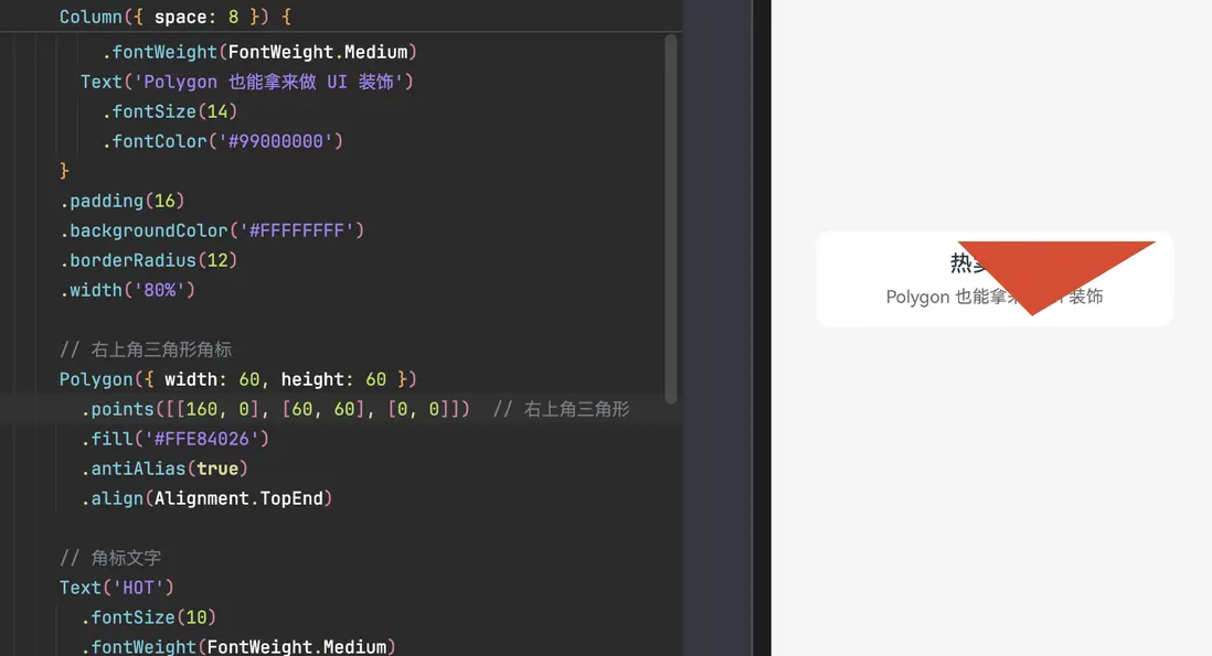
@Entry
@Component
struct CornerTagExample {
  build() {
    Stack() {
      // 主内容卡片
      Column({ space: 8 }) {
        Text('热卖商品')
          .fontSize(18)
          .fontWeight(FontWeight.Medium)
        Text('Polygon 也能拿来做 UI 装饰')
          .fontSize(14)
          .fontColor('#99000000')
      }
      .padding(16)
      .backgroundColor('#FFFFFFFF')
      .borderRadius(12)
      .width('80%')

      // 右上角三角形角标
      Polygon({ width: 60, height: 60 })
        .points([[60, 0], [60, 60], [0, 0]])  // 右上角三角形
        .fill('#FFE84026')
        .antiAlias(true)
        .align(Alignment.TopEnd)

      // 角标文字
      Text('HOT')
        .fontSize(10)
        .fontWeight(FontWeight.Medium)
        .fontColor(Color.White)
        .rotate({ angle: 45 }) // 简单旋转一点
        .align(Alignment.TopEnd)
        .margin({ top: 8, right: 4 })
    }
    .width('100%')
    .height('100%')
    .backgroundColor('#FFF5F5F5')
    .align(Alignment.Center)
  }
}
这个例子说明:
- Polygon 也可以作为 视觉元素 叠加在布局之上;
- 配合
Stack和对齐属性,很容易做角标 / 波浪背景 / 裁切效果。
5.2 不同类型 Length:number / string / Resource
@Entry
@Component
struct PolygonLengthTypeExample {
  build() {
    Column({ space: 10 }) {
      // 1. string 类型('100')
      Polygon({ width: '100', height: '100' })
        .points([[0, 0], [50, 100], [100, 0]])
        .fill('#FF64BB5C')

      // 2. number 类型(100)
      Polygon({ width: 100, height: 100 })
        .points([[0, 0], [0, 100], [100, 100], [100, 0]])
        .fillOpacity(0)
        .strokeWidth(5)
        .stroke(Color.Blue)

      // 3. Resource 类型(需自行在资源中定义宽高字符串)
      Polygon({
        width: $r('app.string.PolygonWidth'),
        height: $r('app.string.PolygonHeight')
      })
        .points([[50, 0], [0, 50], [20, 100], [80, 100], [100, 50]])
        .fill(Color.Red)
        .fillOpacity(0.6)
    }
    .width('100%')
    .margin({ top: 10 })
  }
}
如果你团队习惯把尺寸统一放到资源配置,这种写法就比较自然。
5.3 使用 attributeModifier 动态修改 Polygon 属性(进阶)
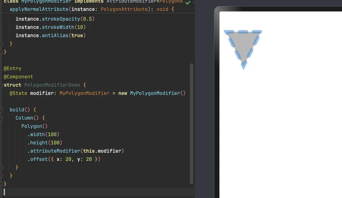
attributeModifier 可以一次性集中修改多个绘制属性,在做主题切换 / 动画时很好用。
// xxx.ets
class MyPolygonModifier implements AttributeModifier<PolygonAttribute> {
  applyNormalAttribute(instance: PolygonAttribute): void {
    // 这里可以把所有「绘制相关」的逻辑集中起来
    instance.points([[0, 0], [50, 100], [100, 0]])
    instance.fill('#707070')
    instance.fillOpacity(0.5)
    instance.stroke('#2787D9')
    instance.strokeDashArray([20])
    instance.strokeDashOffset('15')
    instance.strokeLineCap(LineCapStyle.Round)
    instance.strokeLineJoin(LineJoinStyle.Miter)
    instance.strokeMiterLimit(5)
    instance.strokeOpacity(0.5)
    instance.strokeWidth(10)
    instance.antiAlias(true)
  }
}

@Entry
@Component
struct PolygonModifierDemo {
  @State modifier: MyPolygonModifier = new MyPolygonModifier()

  build() {
    Column() {
      Polygon()
        .width(100)
        .height(100)
        .attributeModifier(this.modifier)
        .offset({ x: 20, y: 20 })
    }
  }
}
优势:
- 把复杂的样式组合统一收口到一个类里,组件树更干净;
- 后续如果要做按主题切换 / 配色调整,只需要换
modifier实例即可。
6. 常见坑 & 调试建议
-
width / height 默认为 0,看不到图形
- 一旦忘了设置宽高,Polygon 就是「隐身」的;
- 建议统一在构造参数里写上宽高或使用百分比布局。
-
points 为空或顺序乱了
[]→ 不会画任何东西;- 点的顺序乱排会导致形状自交,视觉上看起来像 bug。
-
fillOpacity / strokeOpacity 数值超范围
<0会被夹到 0,>1会被夹到 1;- 配合设计稿调试时,不要惊讶「怎么透明度调不动了」。
-
虚线设置失效
strokeDashArray中有非法值 /strokeDashOffset为NaN/Infinity时,会退成实线;- 调试时可以先只用
[10, 5]这类简单数组确认虚线能否正常出现。
-
strokeMiterLimit 乱设
- 在拐角角度很尖的时候,如果
LineJoinStyle.Miter且strokeMiterLimit很大,会产生极长的尖角; - UI 上通常通过改成
Round或调小strokeWidth来避免。
- 在拐角角度很尖的时候,如果
-
抗锯齿关闭导致边缘很糙
- 一般情况下保持
.antiAlias(true)就好; - 真的性能吃紧再考虑关。
- 一般情况下保持
到这里,你基本已经掌握了 Polygon 的「正确打开方式」。
后续可以考虑配合 Path、Polyline、Circle 等其它图形组件,做一些更完整的自定义图表 / 卡片背景 / 装饰 UI,Polygon 在其中是非常好用的一块「几何积木」。

讨论HarmonyOS开发技术,专注于API与组件、DevEco Studio、测试、元服务和应用上架分发等。
更多推荐

 0
0 0
0- 0


 已为社区贡献24条内容

所有评论(0)