鸿蒙API14开发【边框设置】ArkUI
设置组件边框样式。
说明:
从API Version 7开始支持。后续版本如有新增内容,则采用上角标单独标记该内容的起始版本。
border
border(value: BorderOptions)
设置边框样式。
卡片能力: 从API version 9开始,该接口支持在ArkTS卡片中使用。
原子化服务API: 从API version 11开始,该接口支持在原子化服务中使用。
系统能力: SystemCapability.ArkUI.ArkUI.Full
参数:
| 参数名 | 类型 | 必填 | 说明 |
|---|---|---|---|
| value | [BorderOptions] | 是 | 统一边框样式设置接口。 说明: 边框宽度默认值为0,即不显示边框。 从API Version 9开始,父节点的border显示在子节点内容之上。 |
borderStyle
borderStyle(value: BorderStyle | EdgeStyles)
设置元素的边框线条样式。
卡片能力: 从API version 9开始,该接口支持在ArkTS卡片中使用。
原子化服务API: 从API version 11开始,该接口支持在原子化服务中使用。
系统能力: SystemCapability.ArkUI.ArkUI.Full
参数:
| 参数名 | 类型 | 必填 | 说明 |
|---|---|---|---|
| value | [BorderStyle] | [EdgeStyles]9+ | 是 |
borderWidth
borderWidth(value: Length | EdgeWidths | LocalizedEdgeWidths)
设置边框的宽度。
卡片能力: 从API version 9开始,该接口支持在ArkTS卡片中使用。
原子化服务API: 从API version 11开始,该接口支持在原子化服务中使用。
系统能力: SystemCapability.ArkUI.ArkUI.Full
参数:
| 参数名 | 类型 | 必填 | 说明 |
|---|---|---|---|
| value | [Length] | [EdgeWidths]9+ | [LocalizedEdgeWidths]12+ |
borderColor
borderColor(value: ResourceColor | EdgeColors | LocalizedEdgeColors)
设置边框的颜色。
卡片能力: 从API version 9开始,该接口支持在ArkTS卡片中使用。
原子化服务API: 从API version 11开始,该接口支持在原子化服务中使用。
系统能力: SystemCapability.ArkUI.ArkUI.Full
参数:
| 参数名 | 类型 | 必填 | 说明 |
|---|---|---|---|
| value | [ResourceColor] | [EdgeColors]9+ | [LocalizedEdgeColors]12+ |
borderRadius
borderRadius(value: Length | BorderRadiuses | LocalizedBorderRadiuses)
设置边框的圆角。圆角大小受组件尺寸限制,最大值为组件宽或高的一半。
卡片能力: 从API version 9开始,该接口支持在ArkTS卡片中使用。
原子化服务API: 从API version 11开始,该接口支持在原子化服务中使用。
系统能力: SystemCapability.ArkUI.ArkUI.Full
参数:
| 参数名 | 类型 | 必填 | 说明 |
|---|---|---|---|
| value | [Length] | [BorderRadiuses]9+ | [LocalizedBorderRadiuses]12+ |
BorderOptions对象说明
卡片能力: 从API version 9开始,该接口支持在ArkTS卡片中使用。
原子化服务API: 从API version 11开始,该接口支持在原子化服务中使用。
| 名称 | 参数类型 | 必填 | 描述 |
|---|---|---|---|
| width | [Length] | [EdgeWidths]9+ | [LocalizedEdgeWidths]12+ |
| color | [ResourceColor] | [EdgeColors]9+ | [LocalizedEdgeColors]12+ |
| radius | [Length] | [BorderRadiuses]9+ | [LocalizedBorderRadiuses]12+ |
| style | [BorderStyle] | [EdgeStyles]9+ | 否 |
| dashGap12+ | [LengthMetrics] | [EdgeWidths] | [LocalizedEdgeWidths] |
| dashWidth12+ | [LengthMetrics] | [EdgeWidths] | [LocalizedEdgeWidths] |
EdgeWidths9+对象说明
引入该对象时,至少传入一个参数。
卡片能力: 从API version 9开始,该接口支持在ArkTS卡片中使用。
原子化服务API: 从API version 11开始,该接口支持在原子化服务中使用。
| 名称 | 参数类型 | 必填 | 描述 |
|---|---|---|---|
| left | [Length] | 否 | 左侧边框宽度。 |
| right | [Length] | 否 | 右侧边框宽度。 |
| top | [Length] | 否 | 上侧边框宽度。 |
| bottom | [Length] | 否 | 下侧边框宽度。 |
LocalizedEdgeWidths12+对象说明
边框宽度类型,用于描述组件边框不同方向的宽度。 引入该对象时,至少传入一个参数。
卡片能力: 从API version 12开始,该接口支持在ArkTS卡片中使用。
| 名称 | 参数类型 | 必填 | 描述 |
|---|---|---|---|
| start | [LengthMetrics] | 否 | 左侧边框宽度。 从右至左显示语言模式下为右侧边框宽度。 |
| end | [LengthMetrics] | 否 | 右侧边框宽度。 从右至左显示语言模式下为左侧边框宽度。 |
| top | [LengthMetrics] | 否 | 上侧边框宽度。 |
| bottom | [LengthMetrics] | 否 | 下侧边框宽度。 |
EdgeColors9+对象说明
引入该对象时,至少传入一个参数。
卡片能力: 从API version 9开始,该接口支持在ArkTS卡片中使用。
原子化服务API: 从API version 11开始,该接口支持在原子化服务中使用。
| 名称 | 参数类型 | 必填 | 描述 |
|---|---|---|---|
| left | [ResourceColor] | 否 | 左侧边框颜色。 |
| right | [ResourceColor] | 否 | 右侧边框颜色。 |
| top | [ResourceColor] | 否 | 上侧边框颜色。 |
| bottom | [ResourceColor] | 否 | 下侧边框颜色。 |
LocalizedEdgeColors12+对象说明
边框颜色,用于描述组件边框四条边的颜色。
引入该对象时,至少传入一个参数。
卡片能力: 从API version 12开始,该接口支持在ArkTS卡片中使用。
原子化服务API: 从API version 12开始,该接口支持在原子化服务中使用。
| 名称 | 参数类型 | 必填 | 描述 |
|---|---|---|---|
| start | [ResourceColor] | 否 | 左侧边框颜色。 从右至左显示语言模式下为右侧边框颜色。 |
| end | [ResourceColor] | 否 | 右侧边框颜色。 从右至左显示语言模式下为左侧边框颜色。 |
| top | [ResourceColor] | 否 | 上侧边框颜色。 |
| bottom | [ResourceColor] | 否 | 下侧边框颜色。 |
BorderRadiuses9+对象说明
引用该对象时,至少传入一个参数。
卡片能力: 从API version 9开始,该接口支持在ArkTS卡片中使用。
原子化服务API: 从API version 11开始,该接口支持在原子化服务中使用。
| 名称 | 参数类型 | 必填 | 描述 |
|---|---|---|---|
| topLeft | [Length] | 否 | 左上角圆角半径。 |
| topRight | [Length] | 否 | 右上角圆角半径。 |
| bottomLeft | [Length] | 否 | 左下角圆角半径。 |
| bottomRight | [Length] | 否 | 右下角圆角半径。 |
LocalizedBorderRadiuses12+对象说明
圆角类型,用于描述组件边框圆角半径。
引用该对象时,至少传入一个参数。
卡片能力: 从API version 12开始,该接口支持在ArkTS卡片中使用。
原子化服务API: 从API version 12开始,该接口支持在原子化服务中使用。
| 名称 | 参数类型 | 必填 | 描述 |
|---|---|---|---|
| topStart | [LengthMetrics]12+ | 否 | 左上角圆角半径。 从右至左显示语言模式下为右上角圆角半径。 |
| topEnd | [LengthMetrics]12+ | 否 | 右上角圆角半径。 从右至左显示语言模式下为左上角圆角半径。 |
| bottomStart | [LengthMetrics]12+ | 否 | 左下角圆角半径。 从右至左显示语言模式下为右下角圆角半径。 |
| bottomEnd | [LengthMetrics]12+ | 否 | 右下角圆角半径。 从右至左显示语言模式下为左下角圆角半径。 |
EdgeStyles9+对象说明
引入该对象时,至少传入一个参数。
卡片能力: 从API version 9开始,该接口支持在ArkTS卡片中使用。
原子化服务API: 从API version 11开始,该接口支持在原子化服务中使用。
| 名称 | 参数类型 | 必填 | 描述 |
|---|---|---|---|
| left | [BorderStyle] | 否 | 左侧边框样式。 |
| right | [BorderStyle] | 否 | 右侧边框样式。 |
| top | [BorderStyle] | 否 | 上侧边框样式。 |
| bottom | [BorderStyle] | 否 | 下侧边框样式。 |
示例
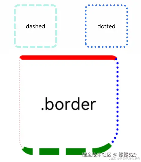
示例1(基本样式用法)
设置边框的宽度、颜色、边框圆角半径以及点、线样式。
// xxx.ets
@Entry
@Component
struct BorderExample {
  build() {
    Column() {
      Flex({ justifyContent: FlexAlign.SpaceAround, alignItems: ItemAlign.Center }) {
        // 线段
        Text('dashed')
          .borderStyle(BorderStyle.Dashed).borderWidth(5).borderColor(0xAFEEEE).borderRadius(10)
          .width(120).height(120).textAlign(TextAlign.Center).fontSize(16)
        // 点线
        Text('dotted')
          .border({ width: 5, color: 0x317AF7, radius: 10, style: BorderStyle.Dotted })
          .width(120).height(120).textAlign(TextAlign.Center).fontSize(16)
      }.width('100%').height(150)

      Text('.border')
        .fontSize(50)
        .width(300)
        .height(300)
        .border({
          width: { left: 3, right: 6, top: 10, bottom: 15 },
          color: { left: '#e3bbbb', right: Color.Blue, top: Color.Red, bottom: Color.Green },
          radius: { topLeft: 10, topRight: 20, bottomLeft: 40, bottomRight: 80 },
          style: {
            left: BorderStyle.Dotted,
            right: BorderStyle.Dotted,
            top: BorderStyle.Solid,
            bottom: BorderStyle.Dashed
          }
        }).textAlign(TextAlign.Center)
    }
  }
}
ts
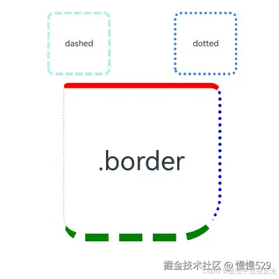
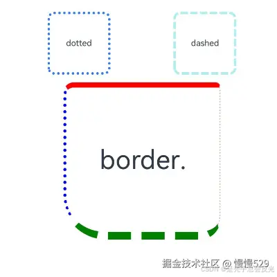
示例2(边框宽度类型和边框颜色)
border属性的width、radius、color属性值使用LocalizedEdgeWidths类型和LocalizedEdgeColors类型。
// xxx.ets
import { LengthMetrics } from '@kit.ArkUI';
@Entry
@Component
struct BorderExample {
  build() {
    Column() {
      Flex({ justifyContent: FlexAlign.SpaceAround, alignItems: ItemAlign.Center }) {
        // 线段
        Text('dashed')
          .borderStyle(BorderStyle.Dashed)
          .borderWidth(5)
          .borderColor(0xAFEEEE)
          .borderRadius(10)
          .width(120)
          .height(120)
          .textAlign(TextAlign.Center)
          .fontSize(16)
        // 点线
        Text('dotted')
          .border({ width: 5, color: 0x317AF7, radius: 10, style: BorderStyle.Dotted })
          .width(120)
          .height(120)
          .textAlign(TextAlign.Center)
          .fontSize(16)
      }.width('100%').height(150)

      Text('.border')
        .fontSize(50)
        .width(300)
        .height(300)
        .border({
          width: {
            start: LengthMetrics.vp(3),
            end: LengthMetrics.vp(6),
            top: LengthMetrics.vp(10),
            bottom: LengthMetrics.vp(15)
          },
          color: { start: '#e3bbbb', end: Color.Blue, top: Color.Red, bottom: Color.Green },
          radius: {
            topStart: LengthMetrics.vp(10),
            topEnd: LengthMetrics.vp(20),
            bottomStart: LengthMetrics.vp(40),
            bottomEnd: LengthMetrics.vp(80)
          },
          style: {
            left: BorderStyle.Dotted,
            right: BorderStyle.Dotted,
            top: BorderStyle.Solid,
            bottom: BorderStyle.Dashed
          }
        })
        .textAlign(TextAlign.Center)
    }
  }
}
ts
从左至右显示语言示例图
从右至左显示语言示例图

讨论HarmonyOS开发技术,专注于API与组件、DevEco Studio、测试、元服务和应用上架分发等。
更多推荐

 18
18 0
0- 0


 已为社区贡献482条内容

所有评论(0)