HarmonyOS-弹窗
当现有组件不满⾜要求时, 可考虑⾃定义弹窗, ⾃定义弹窗允许开发者⾃定义弹窗内容和样式。例如。
HarmonyOS-弹窗
概述
弹窗是移动应⽤中常见的⼀种⽤户界⾯元素, 常⽤于显示⼀些重要的信息 、提示⽤户进⾏操作或 收集⽤户输⼊ 。ArkTS提供了多种内置的弹窗供开发者使⽤ , 除此之外还⽀持⾃定义弹窗 ,来满 ⾜各种不同的需求。
一、选择器弹窗
在鸿蒙(HarmonyOS)的 ArkUI 框架中,选择器弹窗(Picker Dialog)是常用的交互组件,用于帮助用户从预定义列表中选择特定值。以下是几种常见内置选择器及其实现方式的说明:
1.文本选择器(TextPickerDialog)
用途:从文本列表中选择一个值(如性别、城市等)
示例代码:
import promptAction from '@ohos.promptAction'

@Entry
@Component
struct TextInputTest {

  @State city:string = ''
  @State index:number = 0

  build() {
    Column({space: 20}){
      Row({space: 20}){
        TextInput({placeholder: '请选择所在城市', text: this.city})
          .width(150)
          .onClick(()=>{
            TextPickerDialog.show({
              range: ['长沙', '株洲', '湘潭'],
              selected: this.index,
              onAccept: (result: TextPickerResult)=>{
                // console.log(result.value as string)
                this.city = result.value as string
                this.index = result.index as number
              }
            })
          })
      }
    }.width('100%').height('100%').justifyContent(FlexAlign.Center)
  }
}
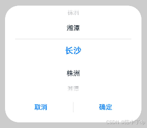
效果:弹窗显示垂直滚动的文本列表,用户滑动选择后点击确认。
2. 日期选择器(DatePickerDialog)
用途:选择年、月、日(如生日、日程日期)。
示例代码:
import promptAction from '@ohos.promptAction'

@Entry
@Component
struct DateInputTest {

  @State birthday:Date = new Date()

  build() {
    Column({space: 20}){
      Row({space: 20}){
        TextInput({placeholder: '请选择出生年月', text: this.birthday.toString()})
          .width(150)
          .onClick(()=>{
            DatePickerDialog.show({
              start: new Date('1900-01-01'),
              end: new Date('2025-2-26'),
              selected: this.birthday,
              onAccept: (result: DatePickerResult)=>{
                this.birthday.setFullYear(result.year, result.month, result.day)
              }
            })
          })
      }
    }.width('100%').height('100%').justifyContent(FlexAlign.Center)
  }
}
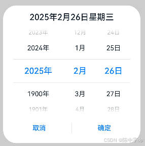
日期选择器的 start 和 end 范围需合理设置,避免无效日期。
效果:弹窗显示年、月、日的联动滚动选择器。
3. 时间选择器(TimePickerDialog)
用途:选择小时、分钟(如闹钟时间)。
示例代码:
// TextInput({placeholder: '请选择时间'})
//   .width(150)
//   .onClick(()=>{
//     TimePickerDialog.show({
//       useMilitaryTime: true,
//       onAccept: (result: TimePickerResult)=>{
//         // 考试系统
//         console.log(`${result.hour}, ${result.minute}, ${result.second}`)
//       }
//     })
//   })
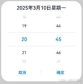
效果:弹窗显示小时和分钟的滚动选择器,支持滑动调整时间。
二、自定义弹窗
当现有组件不满⾜要求时, 可考虑⾃定义弹窗, ⾃定义弹窗允许开发者⾃定义弹窗内容和样式。 例如
1. 创建自定义弹窗组件
使用 @CustomDialog 装饰器定义一个弹窗组件,并在其中声明弹窗的 UI 结构。
@CustomDialog //自定义弹窗组件
struct InputCustomDialog {
	 // 弹窗控制器(用于控制显示/隐藏)
  customDialogController:CustomDialogController = new CustomDialogController({
    builder: InputCustomDialog()
  })
  value:string = ''
  // 定义方法属性,需要设置参数和返回值类型
  confirm:(value:string)=>void = ()=>{}

  build() {
    Column({space: 20}){
      Text('请输入你的答案').fontSize(25).fontWeight(FontWeight.Bold)
      TextInput({placeholder: '请输入数字', text: this.value})
        .type(InputType.Number)
        .onChange((value:string)=>{
          this.value = value
        })
      Row({space: 30}){
        Button('取消').onClick(()=>{
          this.customDialogController.close()
        })
        Button('确认').onClick(()=>{
          //1、将值传入answer中
          this.confirm(this.value)
          //2、关闭自定义弹窗
          this.customDialogController.close()
        })
      }
    }.width('100%').height(200).padding(20)
  }
}
2. 在页面中调用自定义弹窗
通过 CustomDialogController 控制弹窗的显示和隐藏。
@Entry
@Component
struct CustomDialogTest {
@State answer:string = '?'
// 创建弹窗控制器
customDialogController:CustomDialogController = new CustomDialogController({
builder: InputCustomDialog({ // 绑定自定义弹窗组件
confirm: (value:string)=>{// 关闭回调
this.answer = value
}
})
})
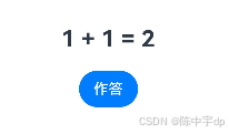
build() {
Column({space: 20}){
Row(){
Text('1 + 1 = ').fontSize(25).fontWeight(FontWeight.Bold)
Text(this.answer).fontSize(25).fontWeight(FontWeight.Bold)
}
Button('作答').onClick(()=>{
this.customDialogController.open()// 显示弹窗
})
}.width('100%').height('100%').margin({top:150})
}
}
注:
/*
 * 1、如果希望自定义弹窗效果,需要在结构之外定义一个被@CustomDialog装饰器修饰的类型
 * 2、被@CustomDialog修饰的类型,必须有一个CustomDialogController类型的属性
 *  CustomDialogController:
 *    open() 显示自定义弹窗
 *    close() 关闭自定义弹窗
 *    没有无参构造,创建对象的时候需要传入一个CustomDialogControllerOptions类型的参数
 *    CustomDialogControllerOptions只有一个必选的参数叫做builder,类型是any
 *    builder的值必须是自定义弹窗对象,也就是自己本身的对象
 *    因为CustomDialogController就是用于控制自己本身这个对象的显示和关闭的
 * 3、在需要被调用的位置,创建CustomDialogController对象
 * 4、使用对象的open()方法显示自定义弹窗组件
 * 5、如果需要从【自定义弹窗组件】中将数据传入【调用位置】需要使用回调函数方式进行数据传递
 *
 * */
三、操作列表弹框
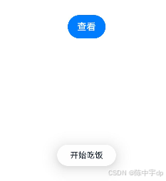
ActionSheet(操作列表弹窗) 是一种常见的交互组件,用于从底部弹出选项列表供用户选择(如分享、删除等操作),简单的操作列表如下:
ActionSheet.show({
  title: '选择',
  message: '消息',
  sheets: [
    {
      title: '吃饭',
      icon: $r('app.media.img_flower'),
      action: ()=>{
        promptAction.showToast({
          message: '开始吃饭'
        })
      }
    },
    {
      title: '睡觉',
      icon: $r('app.media.img_flower'),
      action: ()=>{
        promptAction.showToast({
          message: '开始睡觉'
        })
      }
    },
    {
      title: '打豆豆',
      icon: $r('app.media.img_flower'),
      action: ()=>{
        promptAction.showToast({
          message: '开始打豆豆'
        })
      }
    }
  ]
})
      icon: $r('app.media.img_flower'),
      action: ()=>{
        promptAction.showToast({
          message: '开始打豆豆'
        })
      }
    }
  ]
})

ActionSheet 组件也通过 @CustomDialog 实现的 ActionSheet 弹窗,可以灵活适配各种业务场景,且样式与交互均可完全自定义。完整代码可参考 ArkUI 官方文档。

讨论HarmonyOS开发技术,专注于API与组件、DevEco Studio、测试、元服务和应用上架分发等。
更多推荐

 18
18 0
0- 0


 已为社区贡献2条内容

所有评论(0)