ArkUI之常见组件的使用(下)
5.多选框(Checkbox ,CheckboxGroup )控制单个或者多个选项的选中状态,就可以使用 多选框组件。
5.多选框(Checkbox ,CheckboxGroup )
控制单个或者多个选项的选中状态,就可以使用 多选框组件
1.Checkbox:多选框组件
参数CheckboxOptions说明
|
名称 |
类型 |
必填 |
描述 |
|
name |
string |
否 |
用于指定多选框名称。一般结合CheckboxGroup一起使用 |
|
group |
string |
否 |
用于指定多选框所属群组的名称(即所属CheckboxGroup的名称)。 |
常用属性
|
名称 |
参数类型 |
描述 |
|
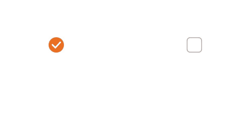
select |
boolean |
设置多选框是否选中。 默认值:false 从API version 9开始,该接口支持在ArkTS卡片中使用。 从API version 10开始,该属性支持$$ 双向绑定变量。 |
|
selectedColor |
设置多选框选中状态颜色。 |
|
|
unselectedColor |
设置多选框非选中状态边框颜色。 |
|
|
shape |
设置CheckBox组件形状, 包括圆形和圆角方形。 说明: 默认值:CheckBoxShape.CIRCLE。 |
|
|
mark |
设置多选框内部图标样式。 |
示例1
// xxx.ets
@Entry
@Component
struct CheckboxExample {
build() {
Flex({ justifyContent: FlexAlign.SpaceAround }) {
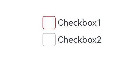
Checkbox({ name: 'checkbox1', group: 'checkboxGroup' })
.select(true)
.selectedColor(0xed6f21)
.shape(CheckBoxShape.CIRCLE)
.onChange((value: boolean) => {
console.info('Checkbox1 change is' + value)
})
Checkbox({ name: 'checkbox2', group: 'checkboxGroup' })
.select(false)
.selectedColor(0x39a2db)
.shape(CheckBoxShape.ROUNDED_SQUARE)
.onChange((value: boolean) => {
console.info('Checkbox2 change is' + value)
})
}
}
}
示例2
// xxx.ets
@Entry
@Component
struct Index {

  build() {
    Row() {
      Column() {
        Flex({ justifyContent: FlexAlign.Center, alignItems: ItemAlign.Center }) {
          Checkbox({ name: 'checkbox1', group: 'checkboxGroup' })
            .selectedColor(Color.Pink)//设置多选框选中状态颜色。
            .shape(CheckBoxShape.CIRCLE)//设置CheckBox组件形状, 包括圆形和圆角方形。
            .onChange((value: boolean) => {
              console.info('Checkbox1 change is'+ value)
            })
            //设置多选框内部图标样式。
            .mark({
              strokeColor:Color.Blue,//内部图标颜色。
              size: 50,//内部图标大小,单位vp。
              strokeWidth: 5//内部图标粗细,单位vp
            })
            .unselectedColor(Color.Red)//设置多选框非选中状态边框颜色。
            .width(30)
            .height(30)
            // .backgroundColor("#ccc")
          Text('Checkbox1').fontSize(20)
        }
        Flex({ justifyContent: FlexAlign.Center, alignItems: ItemAlign.Center }) {
          Checkbox({ name: 'checkbox2', group: 'checkboxGroup' })
            .selectedColor(0x39a2db)
            .shape(CheckBoxShape.ROUNDED_SQUARE)
            .onChange((value: boolean) => {
              console.info('Checkbox2 change is' + value)
            })
            .width(30)
            .height(30)
          Text('Checkbox2').fontSize(20)
        }
      }
      .width('100%')
    }
    .height('100%')
  }
}
2.CheckboxGroup:多选框组,控制多个多选框
如果要控制多个 Checkbox 的选中状态,可以通过CheckBoxGroup来实现
CheckboxGroup(options?: CheckboxGroupOptions)

// CheckboxGroup 和 Checkbox 的组名一致,即可实现全选和反选
CheckboxGroup({
  group: '组名'
})

Checkbox({
  group: '组名',
})
Checkbox({
  group: '组名',
})
Checkbox({
  group: '组名',
})
参数说明(CheckboxGroupOptions)
|
名称 |
类型 |
必填 |
说明 |
|
group |
string |
否 |
群组名称。 说明: 多个相同群组名称的CheckboxGroup,仅第一个CheckboxGroup生效。 |
常用属性
|
名称 |
参数类型 |
描述 |
|
selectAll |
boolean |
设置是否全选。 默认值:false,若同组的Checkbox 设置了select属性,则Checkbox的优先级高。 该属性支持$$ ,双向绑定变量。 |
|
selectedColor |
设置被选中或部分选中状态的颜色。 |
|
|
unselectedColor |
设置非选中状态边框颜色。 |
事件
|
名称 |
功能描述 |
|
onChange (callback: (event: CheckboxGroupResult ) => void ) |
CheckboxGroup的选中状态或群组内的Checkbox的选中状态发生变化时,触发回调。 |
CheckboxGroupResult对象说明
|
名称 |
类型 |
描述 |
|
name |
Array<string> |
群组内所有被选中的多选框名称。name 属性 |
|
status |
选中状态。 |
@Entry
@Component
struct Page05_CheckboxGroup {
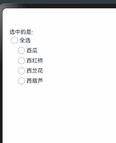
fruits: string[] = ['西瓜', '西红柿', '西兰花', '西葫芦']
@State selectedKeys: string [] = []
build() {
Column() {
Text('选中的是:' + this.selectedKeys)
Row() {
CheckboxGroup({
group: 'food'//设置群组名字
})
.onChange((event: CheckboxGroupResult) => {
//获取选中的name属性与状态
console.log('event:', JSON.stringify(event))
this.selectedKeys = event.name
})
Text('全选')
}
Column() {
ForEach(this.fruits, (item: string, index: number) => {
Row() {
Checkbox({
name: item,
group: 'food'//与复选框组名字一致CheckboxGroup就可以调用它
})
Text(item)
}
})
}
.padding({ left: 20 })
.alignItems(HorizontalAlign.Start)
}
.padding(20)
.alignItems(HorizontalAlign.Start)
}
}
6.滚动与页面下拉组件
1.Scroll 滚动
可滚动的容器组件,当子组件的布局尺寸超过父组件的尺寸时,内容可以滚动。
// xxx.ets
import { curves } from '@kit.ArkUI'
@Entry
@Component
struct ScrollExample {
scroller: Scroller = new Scroller()
private arr: number[] = [0, 1, 2, 3, 4, 5, 6, 7, 8, 9]
build() {
Stack({ alignContent: Alignment.TopStart }) {
Scroll(this.scroller) {
Column() {
ForEach(this.arr, (item: number) => {
Text(item.toString())
.width('90%')
.height(150)
.backgroundColor(0xFFFFFF)
.borderRadius(15)
.fontSize(16)
.textAlign(TextAlign.Center)
.margin({ top: 10 })
}, (item: string) => item)
}.width('100%')
}
.scrollable(ScrollDirection.Vertical) // 滚动方向纵向
.scrollBar(BarState.On) // 滚动条常驻显示
.scrollBarColor(Color.Gray) // 滚动条颜色
.scrollBarWidth(10) // 滚动条宽度
.friction(0.6)// 摩擦系数,值越大,滑动越快
.edgeEffect(EdgeEffect.None)// 滑动边缘效果
.onWillScroll((xOffset: number, yOffset: number, scrollState: ScrollState) => {
console.info(xOffset + ' ' + yOffset)
})// 滑动时触发
.onScrollEdge((side: Edge) => {
console.info('To the edge')
})// 滑动到边缘时触发
.onScrollStop(() => {
console.info('Scroll Stop')
})// 滑动停止时触发
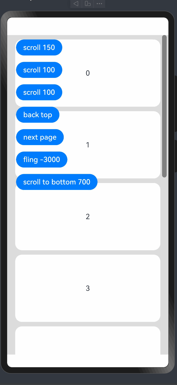
Button('scroll 150')
.height('5%')
.onClick(() => { // 点击后下滑指定距离150.0vp
this.scroller.scrollBy(0, 150)
})
.margin({ top: 10, left: 20 })
Button('scroll 100')
.height('5%')
.onClick(() => { // 点击后滑动到指定位置,即下滑100.0vp的距离
const yOffset: number = this.scroller.currentOffset().yOffset;
this.scroller.scrollTo({ xOffset: 0, yOffset: yOffset + 100 })
})
.margin({ top: 60, left: 20 })
Button('scroll 100')
.height('5%')
.onClick(() => { // 点击后滑动到指定位置,即下滑100.0vp的距离,滑动过程配置有动画
let curve = curves.interpolatingSpring(10, 1, 228, 30) //创建一个阶梯曲线
const yOffset: number = this.scroller.currentOffset().yOffset;
this.scroller.scrollTo({ xOffset: 0, yOffset: yOffset + 100, animation: { duration: 1000, curve: curve } })
})
.margin({ top: 110, left: 20 })
Button('back top')
.height('5%')
.onClick(() => { // 点击后回到顶部
this.scroller.scrollEdge(Edge.Top)
})
.margin({ top: 160, left: 20 })
Button('next page')
.height('5%')
.onClick(() => { // 点击后滑到下一页
this.scroller.scrollPage({ next: true ,animation: true })
})
.margin({ top: 210, left: 20 })
Button('fling -3000')
.height('5%')
.onClick(() => { // 点击后触发初始速度为-3000vp/s的惯性滚动
this.scroller.fling(-3000)
})
.margin({ top: 260, left: 20 })
Button('scroll to bottom 700')
.height('5%')
.onClick(() => { // 点击后滑到下边缘,速度值是700vp/s
this.scroller.scrollEdge(Edge.Bottom, { velocity: 700 })
})
.margin({ top: 310, left: 20 })
}.width('100%').height('100%').backgroundColor(0xDCDCDC)
}
}2.Refresh下拉刷新容器组件
可以进行页面下拉操作并显示刷新动效的容器组件。
@Entry
@Component
struct Index {
  // 1. 控制Refresh组件的下拉动画效果的,true:打开下拉刷新效果 false:关闭下拉刷新效果
  @State isrefreshing: boolean = false

  build() {
    Column() {
      Refresh({ refreshing: $$this.isrefreshing }) {
        List({ space: 5 }) {
          ForEach([1, 2, 3, 4, 5, 6, 7, 8], () => {
            ListItem() {
              Row() {
              }.height(100).width('100%').backgroundColor(Color.Pink)
            }
          })
        }
      }
      // 只要一下拉就会触发这个事件
      .onRefreshing(() => {
        // AlertDialog.show({ message: 'ok' })
        setTimeout(() => {
          this.isrefreshing = false // 关闭刷新
        }, 3000)

      })
    }
    .height('100%')
    .width('100%')
  }
}
3.WaterFlow(瀑布流)
7.进度条 (Progress)
Progress是进度条显示组件,显示内容通常为目标操作的当前进度。具体用法请参考Progress。
1. 创建进度条
Progress通过调用接口来创建,接口调用形式如下:
Progress(options: {value: number, total?: number, type?: ProgressType})其中,value用于设置初始进度值,total用于设置进度总长度,type用于设置Progress样式。
Progress({ value: 24, total: 100, type: ProgressType.Linear }) // 创建一个进度总长为100,初始进度值为24的线性进度条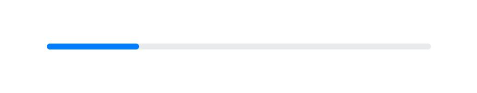
2. 设置进度条样式
Progress有5种可选类型,通过ProgressType可以设置进度条样式,ProgressType类型包括:ProgressType.Linear(线性样式)、 ProgressType.Ring(环形无刻度样式)、ProgressType.ScaleRing(环形有刻度样式)、ProgressType.Eclipse(圆形样式)和ProgressType.Capsule(胶囊样式)。
线性样式进度条(默认类型)
- 说明
从API version9开始,组件高度大于宽度时,自适应垂直显示;组件高度等于宽度时,保持水平显示。
Progress({ value: 20, total: 100, type: ProgressType.Linear }).width(200).height(50)
Progress({ value: 20, total: 100, type: ProgressType.Linear }).width(50).height(200)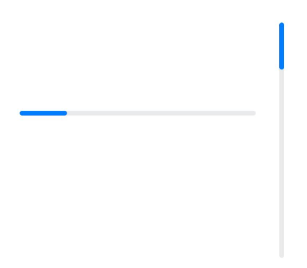
- 环形无刻度样式进度条
// 从左往右,1号环形进度条,默认前景色为蓝色渐变,默认strokeWidth进度条宽度为2.0vp
Progress({ value: 40, total: 150, type: ProgressType.Ring }).width(100).height(100)
// 从左往右,2号环形进度条
Progress({ value: 40, total: 150, type: ProgressType.Ring }).width(100).height(100)
  .color(Color.Grey)    // 进度条前景色为灰色
  .style({ strokeWidth: 15})    // 设置strokeWidth进度条宽度为15.0vp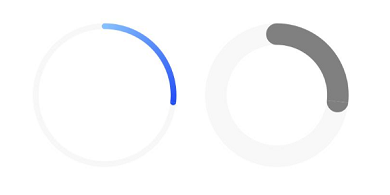
- 环形有刻度样式进度条
Progress({ value: 20, total: 150, type: ProgressType.ScaleRing }).width(100).height(100)
  .backgroundColor(Color.Black)
  .style({ scaleCount: 20, scaleWidth: 5 })    // 设置环形有刻度进度条总刻度数为20,刻度宽度为5vp
Progress({ value: 20, total: 150, type: ProgressType.ScaleRing }).width(100).height(100)
  .backgroundColor(Color.Black)
  .style({ strokeWidth: 15, scaleCount: 20, scaleWidth: 5 })    // 设置环形有刻度进度条宽度15,总刻度数为20,刻度宽度为5vp
Progress({ value: 20, total: 150, type: ProgressType.ScaleRing }).width(100).height(100)
  .backgroundColor(Color.Black)
  .style({ strokeWidth: 15, scaleCount: 20, scaleWidth: 3 })    // 设置环形有刻度进度条宽度15,总刻度数为20,刻度宽度为3vp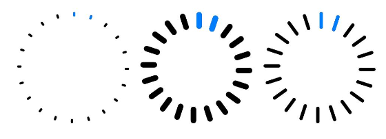
- 圆形样式进度条
// 从左往右,1号圆形进度条,默认前景色为蓝色
Progress({ value: 10, total: 150, type: ProgressType.Eclipse }).width(100).height(100)
// 从左往右,2号圆形进度条,指定前景色为灰色
Progress({ value: 20, total: 150, type: ProgressType.Eclipse }).color(Color.Grey).width(100).height(100)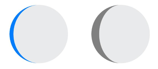
胶囊样式进度条
- 说明
-
- 头尾两端圆弧处的进度展示效果与ProgressType.Eclipse样式相同。
- 中段处的进度展示效果为矩形状长条,与ProgressType.Linear线性样式相似。
- 组件高度大于宽度的时候自适应垂直显示。
Progress({ value: 10, total: 150, type: ProgressType.Capsule }).width(100).height(50)
Progress({ value: 20, total: 150, type: ProgressType.Capsule }).width(50).height(100).color(Color.Grey)
Progress({ value: 50, total: 150, type: ProgressType.Capsule }).width(50).height(100).color(Color.Blue).backgroundColor(Color.Black)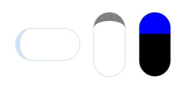
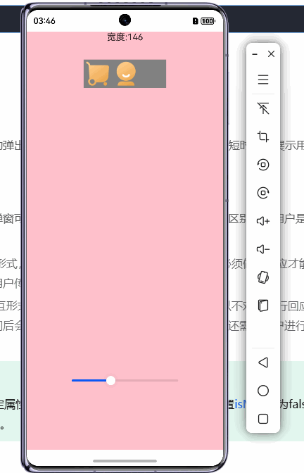
8.滑动条(Slider)
滑动条组件,通常用于快速调节设置值,如音量调节、亮度调节等应用场景。
@Entry
@Component
export struct Demo {
  @State rate: number = 100
  // 底部滑块,可以通过拖拽滑块改变容器尺寸
  @Builder
  slider() {
    Slider({
      value: this.rate,//当前进度值。
      min: 0,
      max: 400,
      style: SliderStyle.OutSet//	设置Slider的滑块与滑轨显示样式。

    })
      .blockColor(Color.White)
      .width('60%')
      .height(50)
      .onChange((value: number) => {
        this.rate = value
      })
      .position({ x: '20%', y: '80%' })
  }
  build() {
    Column(){
    Text('宽度:'+this.rate.toFixed(0)).margin({bottom:30})
      Row(){
      Image($r("app.media.ic_tabbar_icon_0_selected")).width(50).displayPriority(1)
        Image($r("app.media.ic_tabbar_icon_1_selected")).width(50).displayPriority(2)
        Image($r("app.media.ic_tabbar_icon_2_selected")).width(50).displayPriority(3)
        Image($r("app.media.ic_tabbar_icon_3_selected")).width(50).displayPriority(4)

      }.width(this.rate).backgroundColor(Color.Gray)
    this.slider()
    }.width('100%').height("100%").backgroundColor(Color.Pink)
  }
}
9.帧动画组件(ImageAnimator)
提供帧动画组件来实现逐帧播放图片的能力,可以配置需要播放的图片列表,每张图片可以配置时长。
@Component
export struct MkLoading {
  // 宽度可以由外部传入
  loadingWidth: number = 80

  build() {
    ImageAnimator()
      .images([
        { src: $r('app.media.loading_01') },
        { src: $r('app.media.loading_02') },
        { src: $r('app.media.loading_03') },
        { src: $r('app.media.loading_04') }
      ])
      .state(AnimationStatus.Running)
      .duration(199)
      .iterations(-1)
      .width(this.loadingWidth)
      .aspectRatio(3)
  }
}
// 其余略
// 加载效果
@State isLoading: boolean = false
async aboutToAppear() {
this.isLoading = true
await this.getData()
this.isLoading = false
}
build(){
if (this.isLoading == true) {
MkLoading()
} else {
// 页面 UI
Scroll(){
}
// 显示的淡入效果
.transition(TransitionEffect.OPACITY.animation({ duration: 200 }))
}
}

讨论HarmonyOS开发技术,专注于API与组件、DevEco Studio、测试、元服务和应用上架分发等。
更多推荐


 22
22 0
0- 0


 已为社区贡献24条内容

所有评论(0)