Harmony OS Next应用开发基础篇(二)-基础布局
本文探讨了鸿蒙中的基础布局概念。指出基础布局用于组织和安排界面元素,决定组件在屏幕上的排列与分布。鸿蒙提供了如线性布局、相对布局、位置布局等多种基础布局方式,各自具有不同的排列规则,开发者合理选择和运用可创建出适配不同屏幕尺寸的优质用户界面。
各位小伙伴们我们又见面了,我就是鸿蒙开天组,下面让我们进入今天的学习,Harmony OS Next应用开发基础篇-基础布局
在鸿蒙操作中,基础布局(Basic Layout)是用于组织和安排界面元素的结构方式。
它决定了组件在屏幕上的排列和分布规则。鸿蒙提供了多种基础布局方式,如线性布局(DirectionalLayout)、相对布局(RelativeLayout)、位置布局(PositionLayout)等。
线性布局可以使组件按照水平或垂直方向依次排列;相对布局通过组件之间的相对位置关系来确定组件的位置;位置布局则通过指定组件的绝对坐标来放置组件。
合理选择和使用基础布局能够帮助开发者创建出结构清晰、美观且适配不同屏幕尺寸的用户界面。
设计资源-图标库
HarmonyOS 图标库为 HarmonyOS 开发者提供丰富的在线图标资源,涵盖多种使用场景以及风格分类,提供灵活的颜色、大小和格式定义,满足不同角色的下载需求
进入图标库网站,下载 SVG 格式,存储到工程目录:resources/base/media/
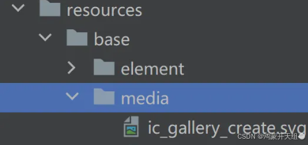
HarmonyOS 图标默认命名以 ic_ 开头,其他图标库下载的图标素材建议修改为与 HarmonyOS 命名规则相同。
使用图标
使用 Image 组件显示图标,添加 fillColor() 属性修改图标颜色 (Image导入图片请自行更换)
@Entry
@Component
struct Index {

  build() {
    Column() {
      Image($r('app.media.ic_gallery_create'))
        .width(30)
        .aspectRatio(1)
        .fillColor('#f60')
    }
      .padding(20)
  }
}
布局属性
|
属性 |
描述 |
|
padding |
内边距 |
|
margin |
外边距 |
|
border |
边框线 |
|
borderRadius |
边框圆角 |
内边距 padding
作用:在组件内添加间距,拉开内容与组件边缘之间的距离
属性:数字 或 对象{}
- 数字:上下左右内边距相同
- 对象{}:配合 left、right、top、bottom 单独设置某个方向内边距
外边距 margin
作用:在组件外面添加间距,拉开两个组件之间的距离
属性:margin
属性:数字 或 对象{}
- 数字:上下左右边外距相同
- 对象{}:配合 left、right、top、bottom 单独设置某个方向外边距
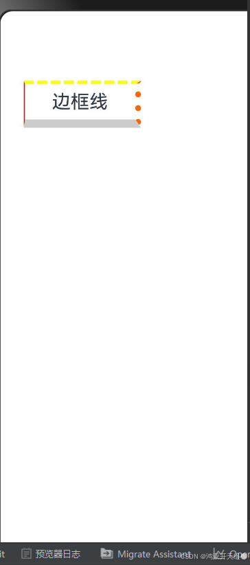
边框属性
2.4.1. 四个方向边框相同
属性:border()
参数:{width?: 数字, color?: '', style?: BorderStyle},
- width:边框宽度,边框宽度默认值为0,即不显示边框
- color:边框颜色
- style:边框样式,
BorderStyle为枚举类型
-
- Solid:实线(默认)
- Dashed:虚线
- Dotted:点线
四个方向边框不同
书写方法
.border({
  width: {},
  color: {},
  style: {}
})
width、color、style 均可以通过top、right、bottom、left设置各个方向边框外观
下面展示一个案例来理解:
@Entry
@Component
struct Index {
  build() {
    Column() {
      Text('边框线')
        .width(100)
        .height(40)
        .textAlign(TextAlign.Center)// 边框 - 四个方向效果不同
        .border({
          width: {
            left: 1,
            top: 3,
            right: 5,
            bottom: 7
          },
          color: {
            left: 'red',
            top: '#ff0',
            right: '#f60',
            bottom: '#ccc'
          },
          style: { top: BorderStyle.Dashed, right: BorderStyle.Dotted }
        })
    }
    .padding(20)
  }
}
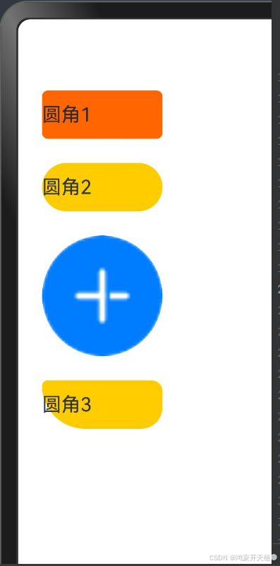
边框圆角
属性:borderRadius(圆角半径)
参数:数值 或 { }
- topLeft:左上角
- topRight:右上角
- bottomLeft:左下角
- bottomRight:右下角
下面展示一个案例来理解:
@Entry
@Component
struct Index {
  build() {
    Column({space: 20}) {
      Text('圆角1')
        .width(100)
        .height(40)
        .backgroundColor('#f60')
        .borderRadius(5)

      // 胶囊状 圆角半径 = 高度 / 2
      Text('圆角2')
        .width(100)
        .height(40)
        .backgroundColor('#fc0')
        .borderRadius(20)

      // 正圆 圆角半径 = 正方形尺寸 / 2
      Image($r('app.media.avatar'))
        .width(100)
        .aspectRatio(1)
        .borderRadius(50)

      // 四个角半径不同写法
      Text('圆角3')
        .width(100)
        .height(40)
        .backgroundColor('#fc0')
        .borderRadius({
          topLeft: 5,
          topRight: 10,
          bottomRight: 20,
          bottomLeft: 40
        })

    }
    .padding(20)
  }
}
背景属性
|
属性 |
描述 |
|
backgroundColor |
背景色 |
|
backgroundImage |
背景图 |
|
backgroundImageSize |
背景图尺寸 |
|
backgroundImagePosition |
背景图位置 |
backgroundColor
设置组件的背景色
注:组件添加宽高属性或有内容才能观察到背景色
backgroundImage
属性:backgroundImage(背景图地址, 背景图平铺方式 ImageRepeat)
背景图平铺方式:(可省略)
- NoRepeat:不平铺,默认值
- X:水平平铺
- Y:垂直平铺
- XY:水平垂直均平铺
backgroundImageSize
作用:背景图缩放
属性:backgroundImageSize
参数:
- 设置背景图宽高尺寸:
{width: 数值, height: 数值}(只设置宽或高,另一个尺寸等比例缩放) - 枚举
ImageSize:
-
- Cover:等比例缩放背景图至图片完全覆盖组件范围
- Contain:等比例缩放背景图,当宽或高与组件尺寸相同则停止缩放
- Auto:默认,原图尺寸
backgroundImagePosition
作用:调整背景图在组件内的显示位置,默认显示位置为组件左上角
属性:backgroundImagePosition()
参数:
- 位置坐标:
{x: 位置, y: 位置} - 枚举
Alignment
|
名称 |
描述 |
|
TopStart |
顶部起始端(默认位置) |
|
Top |
顶部横向居中 |
|
TopEnd |
顶部尾端 |
|
Start |
起始端纵向居中 |
|
Center |
居中 |
|
End |
尾端纵向居中 |
|
BottomStart |
底部起始端 |
|
Bottom |
底部横向居中 |
|
BottomEnd |
底部尾端 |
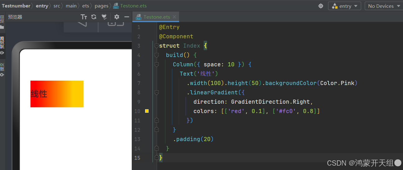
颜色渐变
作用:设置组件颜色渐变效果
分类:线性渐变 和 径向渐变
线性渐变
属性:linearGradient()
参数:
{
	angle?:  线性渐变的起始角度,
	direction?: 线性渐变的方向,
	colors: [[颜色1, 颜色1所处位置], [颜色2, 颜色2所处位置], ......],
	repeating?: 是否重复着色
}angle:线性渐变的起始角度。0点方向顺时针旋转为正向角度,默认值:180direction: 线性渐变的方向,设置 angle 后不生效,值为 枚举类型GradientDirection
-
- Left:从右向左
- Top:从下向上
- Right:从左向右
- Bottom:从上向下
- LeftTop:从右下 到 左上
- LeftBottom:从右上 到 左下
- RightTop:从左下 到 右上
- RightBottom:从左上 到 右下
下面展示一个案例来理解:
@Entry
@Component
struct Index {
  build() {
    Column({ space: 10}) {
      Text('线性')
        .width(100).height(50).backgroundColor(Color.Pink)
        .linearGradient({
          direction: GradientDirection.Right,
          colors: [['red', 0.1], ['#fc0', 0.8]]
        })
    }
      .padding(20)
  }
}
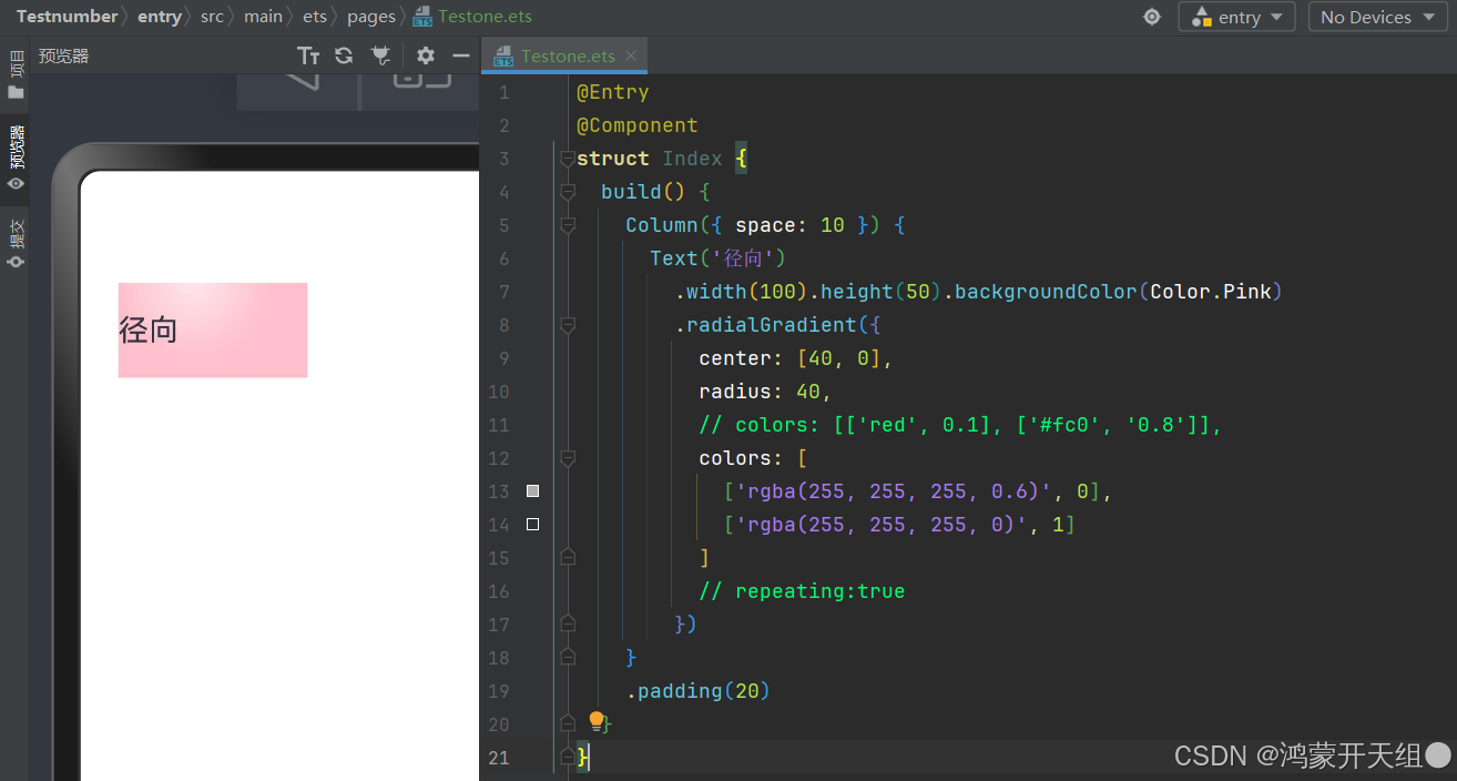
径向渐变
属性:radialGradient()
参数:
{
	center:  径向渐变的中心点坐标,
	radius: 径向渐变的半径,
	colors: [[颜色1, 颜色1所处位置], [颜色2, 颜色2所处位置], ......],
	repeating?: 是否重复着色
}center:径向渐变的中心点,即相对于当前组件左上角的坐标,写法[x坐标, y坐标]
下面展示一个案例来理解:
@Entry
@Component
struct Index {
  build() {
    Column({ space: 10}) {
      Text('径向')
        .width(100).height(50).backgroundColor(Color.Pink)
        .radialGradient({
          center: [40, 0],
          radius: 40,
          // colors: [['red', 0.1], ['#fc0', '0.8']],
          colors: [
            ['rgba(255, 255, 255, 0.6)', 0],
            ['rgba(255, 255, 255, 0)', 1]
          ]
          // repeating:true
        })
    }
      .padding(20)
  }
}
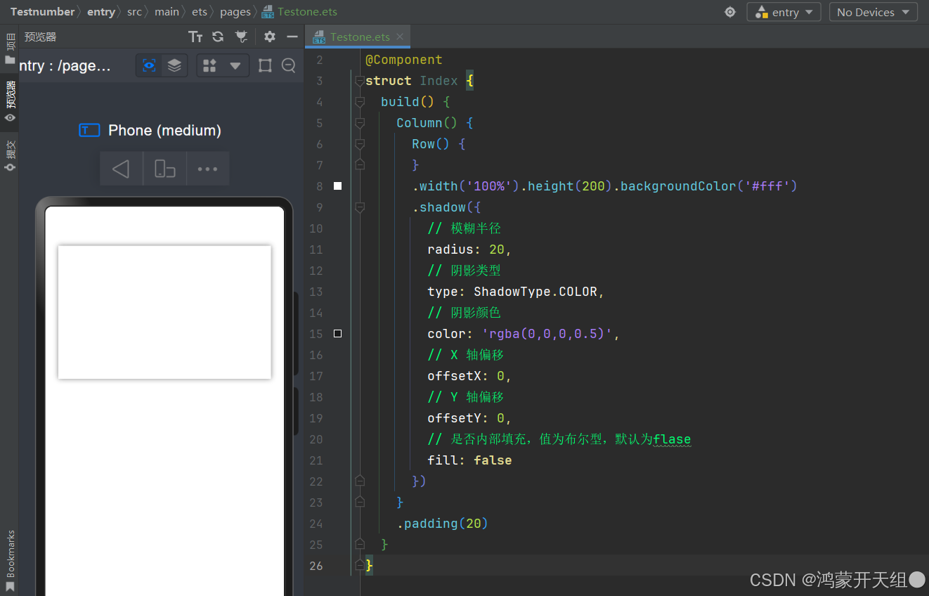
阴影
作用:为组件添加阴影效果
属性:shadow()
参数:{}
{
  radius: 模糊半径,
  type?: 阴影类型,
  color?: 阴影颜色,
  offsetX?: X轴偏移,
  offsetY?: Y轴偏移,
  fill?: 是否内部填充
}
下面展示一个案例来理解:
@Entry
@Component
struct Index {
  build() {
    Column() {
      Row() {}
        .width('100%').height(200).backgroundColor('#fff')
        .shadow({
          // 模糊半径
          radius: 20,
          // 阴影类型
          type: ShadowType.COLOR,
          // 阴影颜色
          color: 'rgba(0,0,0,0.5)',
          // X 轴偏移
          offsetX: 0,
          // Y 轴偏移
          offsetY: 0,
          // 是否内部填充,值为布尔型,默认为flase
          fill: false
        })
    }
      .padding(20)
  }
}
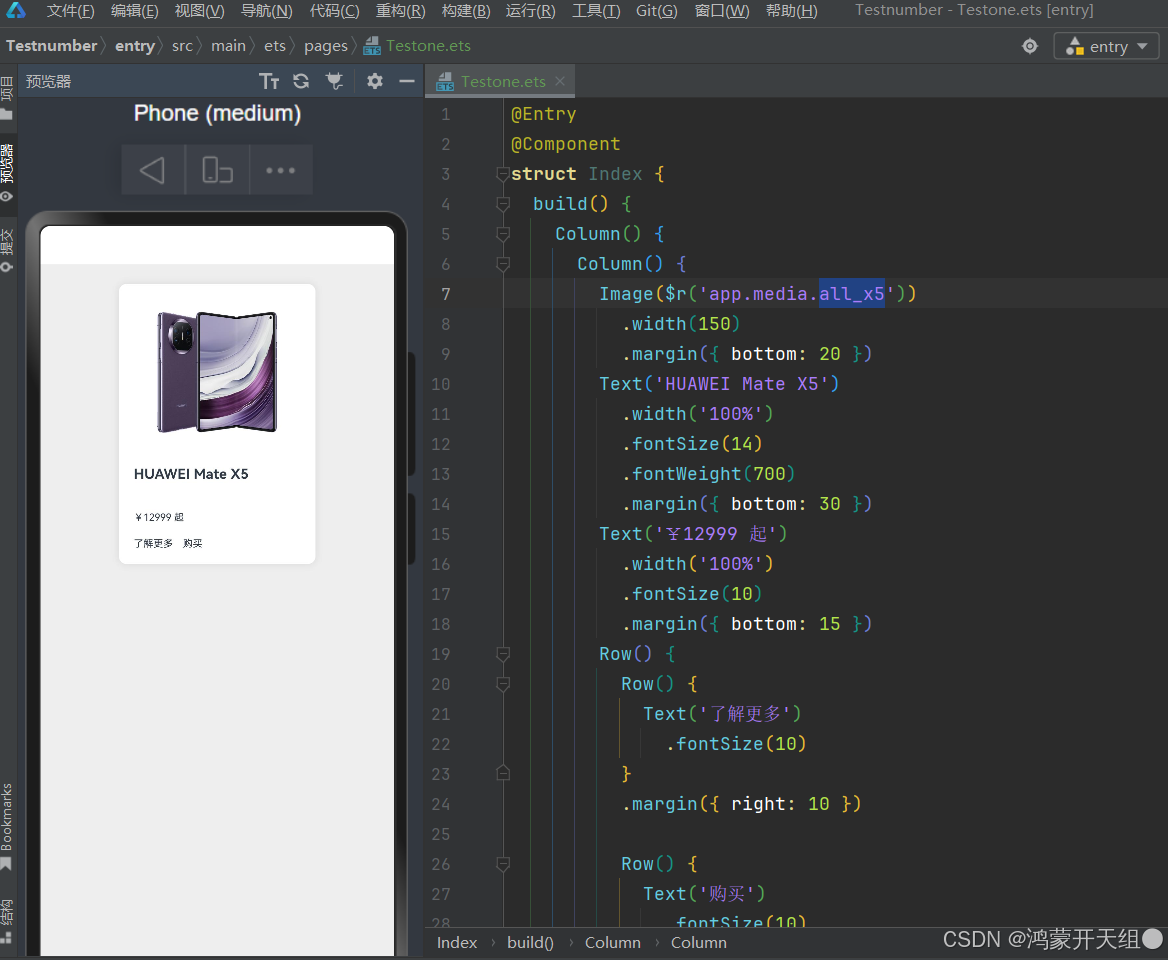
下面我们综合制作一个案例:
@Entry
@Component
struct Index {
build() {
Column() {
Column() {
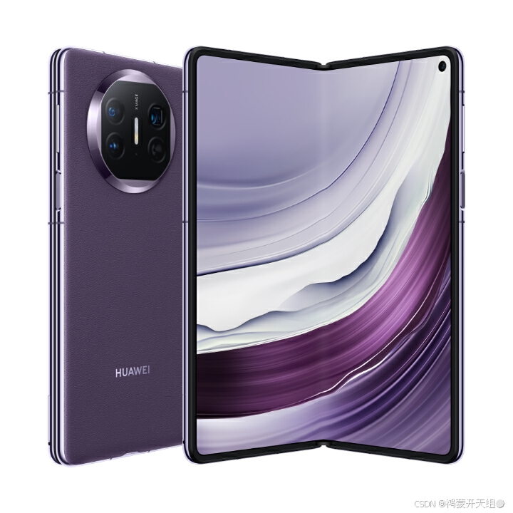
Image($r('app.media.all_x5'))
.width(150)
.margin({ bottom: 20 })
Text('HUAWEI Mate X5')
.width('100%')
.fontSize(14)
.fontWeight(700)
.margin({ bottom: 30 })
Text('¥12999 起')
.width('100%')
.fontSize(10)
.margin({ bottom: 15 })
Row() {
Row() {
Text('了解更多')
.fontSize(10)
}
.margin({ right: 10 })
Row() {
Text('购买')
.fontSize(10)
}
}
.width('100%')
}
.width(200)
.backgroundColor('#fff')
.padding(15)
.margin(20)
.shadow({
radius: 20,
color: '#1a000000'
})
.borderRadius(8)
}
.width('100%')
.height('100%')
.backgroundColor('#eee')
}
}
以上是关于鸿蒙基础篇-基础布局综合的一些内容,方便大家学习,至此,关于鸿蒙基础篇 -基础布局 综合的内容就介绍到这里,愿您能学以致用,开发出精彩的鸿蒙应用!
素材:
1. all_x5
以上内容仅供学习交流,如有违法或者侵权可以联系删除。

讨论HarmonyOS开发技术,专注于API与组件、DevEco Studio、测试、元服务和应用上架分发等。
更多推荐
 27
27 0
0- 0


 已为社区贡献20条内容

所有评论(0)