鸿蒙next开发:UI开发-添加组件(显示图片 (Image))
本文详细介绍了鸿蒙系统中Image组件的使用,涵盖了图片的加载、显示、缓存及高级功能。
往期鸿蒙全套实战文章必看:(附带鸿蒙全栈学习资料)
显示图片 (Image)
开发者经常需要在应用中显示一些图片,例如:按钮中的icon、网络图片、本地图片等。在应用中显示图片需要使用Image组件实现,Image支持多种图片格式,包括png、jpg、bmp、svg、gif和heif。
Image通过调用接口来创建,接口调用形式如下:
Image(src: PixelMap | ResourceStr | DrawableDescriptor)该接口通过图片数据源获取图片,支持本地图片和网络图片的渲染展示。
加载图片资源
Image支持加载存档图、多媒体像素图和可绘制描述符三种类型。
存档图类型数据源
存档图类型的数据源可以分为本地资源、网络资源、Resource资源、媒体库资源和base64。
-
本地资源
创建文件夹,将本地图片放入ets文件夹下的任意位置。
Image组件引入本地图片路径,即可显示图片(根目录为ets文件夹)。
Image('images/view.jpg')
.width(200)
加载本地图片过程中,如果对图片进行修改或者替换,可能会引起应用崩溃。因此需要覆盖图片文件时,应该先删除该文件再重新创建一个同名文件。
-
网络资源
引入网络图片需申请权限ohos.permission.INTERNET。此时,Image组件的src参数为网络图片的链接。
当前Image组件仅支持加载简单网络图片。
Image组件首次加载网络图片时,需要请求网络资源,非首次加载时,默认从缓存中直接读取图片,更多图片缓存设置请参考setImageCacheCount、setImageRawDataCacheSize、setImageFileCacheSize。但是,这三个图片缓存接口并不灵活,且后续不继续演进,对于复杂情况,更推荐使用ImageKnife。
网络图片必须支持RFC 9113标准,否则会导致加载失败。如果下载的网络图片大于10MB或一次下载的网络图片数量较多,建议使用HTTP工具提前预下载,提高图片加载性能,方便应用侧管理数据。
在显示网络图片时,Image 组件会将下载与缓存功能剥离至缓存下载模块进行统一管理。缓存下载模块提供独立的预下载接口,允许应用开发者在创建Image组件前预下载所需图片。组件创建后,通过向缓存下载模块请求数据,从而优化了Image组件的显示流程。网络缓存的位置位于应用根目录下的cache目录中。
Image('https://www.example.com/example.JPG') // 实际使用时请替换为真实地址 -
Resource资源
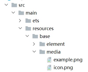
使用资源格式可以跨包/跨模块引入图片,resources文件夹下的图片都可以通过$r资源接口读取到并转换到Resource格式。
图1 resources
调用方式:
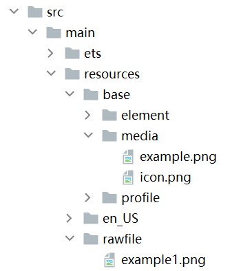
Image($r('app.media.icon'))还可以将图片放在rawfile文件夹下。
图2 rawfile
调用方式:
Image($rawfile('example1.png')) -
媒体库file://data/storage
支持file://路径前缀的字符串,用于访问通过选择器提供的图片路径。
-
调用接口获取图库的照片url。
import { photoAccessHelper } from '@kit.MediaLibraryKit'; import { BusinessError } from '@kit.BasicServicesKit'; @Entry @Component struct Index { @State imgDatas: string[] = []; // 获取照片url集 getAllImg() { try { let PhotoSelectOptions:photoAccessHelper.PhotoSelectOptions = new photoAccessHelper.PhotoSelectOptions(); PhotoSelectOptions.MIMEType = photoAccessHelper.PhotoViewMIMETypes.IMAGE_TYPE; PhotoSelectOptions.maxSelectNumber = 5; let photoPicker:photoAccessHelper.PhotoViewPicker = new photoAccessHelper.PhotoViewPicker(); photoPicker.select(PhotoSelectOptions).then((PhotoSelectResult:photoAccessHelper.PhotoSelectResult) => { this.imgDatas = PhotoSelectResult.photoUris; console.info('PhotoViewPicker.select successfully, PhotoSelectResult uri: ' + JSON.stringify(PhotoSelectResult)); }).catch((err:Error) => { let message = (err as BusinessError).message; let code = (err as BusinessError).code; console.error(`PhotoViewPicker.select failed with. Code: ${code}, message: ${message}`); }); } catch (err) { let message = (err as BusinessError).message; let code = (err as BusinessError).code; console.error(`PhotoViewPicker failed with. Code: ${code}, message: ${message}`); } } // aboutToAppear中调用上述函数,获取图库的所有图片url,存在imgDatas中 async aboutToAppear() { this.getAllImg(); } // 使用imgDatas的url加载图片。 build() { Column() { Grid() { ForEach(this.imgDatas, (item:string) => { GridItem() { Image(item) .width(200) } }, (item:string):string => JSON.stringify(item)) } }.width('100%').height('100%') } } -
从媒体库获取的url格式通常如下。
Image('file://media/Photos/5')
.width(200)
-
-
base64
路径格式为data:image/[png|jpeg|bmp|webp|heif];base64,[base64 data],其中[base64 data]为Base64字符串数据。
Base64格式字符串可用于存储图片的像素数据,在网页上使用较为广泛。
多媒体像素图
PixelMap是图片解码后的像素图。以下示例将加载的网络图片返回的数据解码成PixelMap格式,再显示在Image组件上。
-
创建PixelMap状态变量。
@State image: PixelMap | undefined = undefined; -
引用多媒体。
(1) 引用网络权限与媒体库权限。
import { http } from '@kit.NetworkKit';
import { image } from '@kit.ImageKit';
import { BusinessError } from '@kit.BasicServicesKit';
(2) 填写网络图片地址。
let OutData: http.HttpResponse http.createHttp().request("https://www.example.com/xxx.png", (error: BusinessError, data: http.HttpResponse) => { if (error) { console.error(`http request failed with. Code: ${error.code}, message: ${error.message}`); } else { OutData = data } } ) -
将网络地址成功返回的数据,编码转码成pixelMap的图片格式。
let code: http.ResponseCode | number = OutData.responseCode; if (http.ResponseCode.OK === code) { let imageData: ArrayBuffer = OutData.result as ArrayBuffer; let imageSource: image.ImageSource = image.createImageSource(imageData); class tmp { height: number = 100; width: number = 100; } let si: tmp = new tmp() let options: Record<string, number | boolean | tmp> = { 'alphaType': 0, // 透明度 'editable': false, // 是否可编辑 'pixelFormat': 3, // 像素格式 'scaleMode': 1, // 缩略值 'size': { height: 100, width: 100 } } // 创建图片大小 class imagetmp { image: PixelMap | undefined = undefined; set(val: PixelMap) { this.image = val; } } imageSource.createPixelMap(options).then((pixelMap: PixelMap) => { let im = new imagetmp(); im.set(pixelMap); }) } -
显示图片。
class htp{ httpRequest: Function | undefined = undefined; set(){ if(this.httpRequest){ this.httpRequest(); } } } Button("获取网络图片") .onClick(() => { let sethtp = new htp(); sethtp.set(); }) Image(this.image).height(100).width(100)同时,也可以传入pixelMap创建PixelMapDrawableDescriptor对象,用来显示图片。
import { DrawableDescriptor, PixelMapDrawableDescriptor } from '@kit.ArkUI';
class htp{
  httpRequest: Function | undefined = undefined;
  set(){
    if(this.httpRequest){
      this.httpRequest();
    }
  }
}
Button("获取网络图片")
  .onClick(() => {
    let sethtp = new htp();
    sethtp.set();
    this.drawablePixelMap = new PixelMapDrawableDescriptor(this.image);
  })
Image(this.drawablePixelMap).height(100).width(100)
可绘制描述符
DrawableDescriptor是ArkUI提供的一种高级图片抽象机制,它通过将图片资源封装为可编程对象,实现了传统Image组件难以实现的动态组合与运行时控制功能。开发者可利用它实现图片的分层叠加(如徽章图标)、动态属性调整(如颜色滤镜)、复杂动画序列等高级效果,适用于需要灵活控制图片展现或实现复杂视觉交互的场景。
-
引入模块。
import { DrawableDescriptor, PixelMapDrawableDescriptor, LayeredDrawableDescriptor, AnimatedDrawableDescriptor, AnimationOptions } from '@kit.ArkUI'; -
创建DrawableDescriptor对象。
// 声明DrawableDescriptor对象 @State pixmapDesc: DrawableDescriptor | null = null; @State pixelMapDesc: PixelMapDrawableDescriptor | null = null; @State layeredDesc: LayeredDrawableDescriptor | null = null; @State animatedDesc: AnimatedDrawableDescriptor | null = null; // 动画配置 private animationOptions: AnimationOptions = { duration: 1000, // 总时长1秒 iterations: -1 // 无限循环 }; async aboutToAppear() { const resManager = getContext().resourceManager; // 创建普通DrawableDescriptor this.pixmapDesc = (await resManager.getDrawableDescriptor($r('app.media.app_icon').id)) as DrawableDescriptor; // 创建PixelMapDrawableDescriptor const pixelMap = await this.getPixmapFromMedia($r('app.media.app_icon')); this.pixelMapDesc = new PixelMapDrawableDescriptor(pixelMap); // 创建分层图标 const foreground = await this.getDrawableDescriptor($r('app.media.foreground')); const background = await this.getDrawableDescriptor($r('app.media.background')); this.layeredDesc = new LayeredDrawableDescriptor(foreground, background); // 创建动画图片(需加载多张图片) const frame1 = await this.getPixmapFromMedia($r('app.media.startIcon')); const frame2 = await this.getPixmapFromMedia($r('app.media.app_icon')); const frame3 = await this.getPixmapFromMedia($r('app.media.background')); this.animatedDesc = new AnimatedDrawableDescriptor([frame1, frame2, frame3], this.animationOptions); } -
封装辅助方法。
以下是为简化DrawableDescriptor创建过程而封装的辅助方法。
// 辅助方法:从资源获取PixelMap private async getPixmapFromMedia(resource: Resource): Promise<image.PixelMap> { const unit8Array = await getContext().resourceManager.getMediaContent({ bundleName: resource.bundleName, moduleName: resource.moduleName, id: resource.id }); const imageSource = image.createImageSource(unit8Array.buffer.slice(0, unit8Array.buffer.byteLength)); const pixelMap = await imageSource.createPixelMap({ desiredPixelFormat: image.PixelMapFormat.RGBA_8888 }); await imageSource.release(); return pixelMap; } // 辅助方法:获取DrawableDescriptor private async getDrawableDescriptor(resource: Resource): Promise<DrawableDescriptor> { const resManager = getContext().resourceManager; return (await resManager.getDrawableDescriptor(resource.id)) as DrawableDescriptor; } -
显示图片。
// 显示普通图片
Image(this.pixmapDesc)
  .width(100)
  .height(100)
  .border({ width: 1, color: Color.Black })
// 显示PixelMap图片
Image(this.pixelMapDesc)
  .width(100)
  .height(100)
  .border({ width: 1, color: Color.Red })
// 显示分层图标
if (this.layeredDesc) {
  Image(this.layeredDesc)
    .width(100)
    .height(100)
    .border({ width: 1, color: Color.Blue })
}
// 显示动画图片
if (this.animatedDesc) {
  Image(this.animatedDesc)
    .width(200)
    .height(200)
    .margin({ top: 20 })
}
显示矢量图
Image组件可显示矢量图(svg格式的图片)。
如果SVG图片没有原始大小,需要给Image组件设置宽高,否则不显示。如果SVG图片通过image标签引用本地其他图片,被引用的图片不支持svg格式和gif格式。
svg格式的图片可以使用fillColor属性改变图片的绘制颜色。
Image($r('app.media.cloud'))
  .width(50)
  .fillColor(Color.Blue)
图3 原始图片

图4 设置绘制颜色后的svg图片

矢量图引用位图
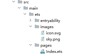
如果Image加载的Svg图源中包含对本地位图的引用,则Svg图源的路径应当设置为以ets为根目录的工程路径,同时,本地位图的路径应设置为与Svg图源同级的相对路径。
Image加载的Svg图源路径设置方法如下所示:
Image("images/icon.svg")
  .width(50)
  .height(50)
Svg图源通过<image>标签的xlink:href属性指定本地位图路径,本地位图路径设置为跟Svg图源同级的相对路径:
<svg width="200" height="200">
  <image width="200" height="200" xlink:href="sky.png"></image>
</svg>
文件工程路径示例如图:
添加属性
给Image组件设置属性可以使图片显示更灵活,达到一些自定义的效果。以下是几个常用属性的使用示例,完整属性信息详见Image。
设置图片缩放类型
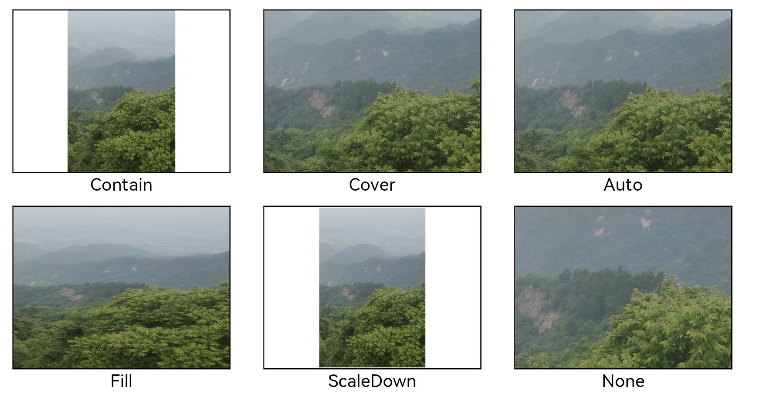
通过objectFit属性使图片缩放到高度和宽度确定的框内。
@Entry
@Component
struct MyComponent {
  scroller: Scroller = new Scroller();


  build() {
    Scroll(this.scroller) {
      Column() {
        Row() {
          Image($r('app.media.img_2'))
            .width(200)
            .height(150)
            .border({ width: 1 })
              // 保持宽高比进行缩小或者放大,使得图片完全显示在显示边界内。
            .objectFit(ImageFit.Contain)
            .margin(15)
            .overlay('Contain', { align: Alignment.Bottom, offset: { x: 0, y: 20 } })
          Image($r('app.media.ic_img_2'))
            .width(200)
            .height(150)
            .border({ width: 1 })
              // 保持宽高比进行缩小或者放大,使得图片两边都大于或等于显示边界。
            .objectFit(ImageFit.Cover)
            .margin(15)
            .overlay('Cover', { align: Alignment.Bottom, offset: { x: 0, y: 20 } })
          Image($r('app.media.img_2'))
            .width(200)
            .height(150)
            .border({ width: 1 })
              // 自适应显示。
            .objectFit(ImageFit.Auto)
            .margin(15)
            .overlay('Auto', { align: Alignment.Bottom, offset: { x: 0, y: 20 } })
        }


        Row() {
          Image($r('app.media.img_2'))
            .width(200)
            .height(150)
            .border({ width: 1 })
              // 不保持宽高比进行放大缩小,使得图片充满显示边界。
            .objectFit(ImageFit.Fill)
            .margin(15)
            .overlay('Fill', { align: Alignment.Bottom, offset: { x: 0, y: 20 } })
          Image($r('app.media.img_2'))
            .width(200)
            .height(150)
            .border({ width: 1 })
              // 保持宽高比显示,图片缩小或者保持不变。
            .objectFit(ImageFit.ScaleDown)
            .margin(15)
            .overlay('ScaleDown', { align: Alignment.Bottom, offset: { x: 0, y: 20 } })
          Image($r('app.media.img_2'))
            .width(200)
            .height(150)
            .border({ width: 1 })
              // 保持原有尺寸显示。
            .objectFit(ImageFit.None)
            .margin(15)
            .overlay('None', { align: Alignment.Bottom, offset: { x: 0, y: 20 } })
        }
      }
    }
  }
}
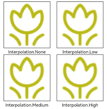
图片插值
当原图分辨率较低并且放大显示时,图片会模糊出现锯齿。这时可以使用interpolation属性对图片进行插值,使图片显示得更清晰。
@Entry
@Component
struct Index {
  build() {
    Column() {
      Row() {
        Image($r('app.media.grass'))
          .width('40%')
          .interpolation(ImageInterpolation.None)
          .borderWidth(1)
          .overlay("Interpolation.None", { align: Alignment.Bottom, offset: { x: 0, y: 20 } })
          .margin(10)
        Image($r('app.media.grass'))
          .width('40%')
          .interpolation(ImageInterpolation.Low)
          .borderWidth(1)
          .overlay("Interpolation.Low", { align: Alignment.Bottom, offset: { x: 0, y: 20 } })
          .margin(10)
      }.width('100%')
      .justifyContent(FlexAlign.Center)


      Row() {
        Image($r('app.media.grass'))
          .width('40%')
          .interpolation(ImageInterpolation.Medium)
          .borderWidth(1)
          .overlay("Interpolation.Medium", { align: Alignment.Bottom, offset: { x: 0, y: 20 } })
          .margin(10)
        Image($r('app.media.grass'))
          .width('40%')
          .interpolation(ImageInterpolation.High)
          .borderWidth(1)
          .overlay("Interpolation.High", { align: Alignment.Bottom, offset: { x: 0, y: 20 } })
          .margin(10)
      }.width('100%')
      .justifyContent(FlexAlign.Center)
    }
    .height('100%')
  }
}
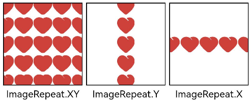
设置图片重复样式
通过objectRepeat属性设置图片的重复样式方式,重复样式请参考ImageRepeat枚举说明。
@Entry
@Component
struct MyComponent {
  build() {
    Column({ space: 10 }) {
      Row({ space: 5 }) {
        Image($r('app.media.ic_public_favor_filled_1'))
          .width(110)
          .height(115)
          .border({ width: 1 })
          .objectRepeat(ImageRepeat.XY)
          .objectFit(ImageFit.ScaleDown)
          // 在水平轴和竖直轴上同时重复绘制图片
          .overlay('ImageRepeat.XY', { align: Alignment.Bottom, offset: { x: 0, y: 20 } })
        Image($r('app.media.ic_public_favor_filled_1'))
          .width(110)
          .height(115)
          .border({ width: 1 })
          .objectRepeat(ImageRepeat.Y)
          .objectFit(ImageFit.ScaleDown)
          // 只在竖直轴上重复绘制图片
          .overlay('ImageRepeat.Y', { align: Alignment.Bottom, offset: { x: 0, y: 20 } })
        Image($r('app.media.ic_public_favor_filled_1'))
          .width(110)
          .height(115)
          .border({ width: 1 })
          .objectRepeat(ImageRepeat.X)
          .objectFit(ImageFit.ScaleDown)
          // 只在水平轴上重复绘制图片
          .overlay('ImageRepeat.X', { align: Alignment.Bottom, offset: { x: 0, y: 20 } })
      }
    }.height(150).width('100%').padding(8)
  }
}
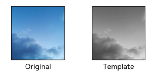
设置图片渲染模式
通过renderMode属性设置图片的渲染模式为原色或黑白。
@Entry
@Component
struct MyComponent {
  build() {
    Column({ space: 10 }) {
      Row({ space: 50 }) {
        Image($r('app.media.example'))
          // 设置图片的渲染模式为原色
          .renderMode(ImageRenderMode.Original)
          .width(100)
          .height(100)
          .border({ width: 1 })
            // overlay是通用属性,用于在组件上显示说明文字
          .overlay('Original', { align: Alignment.Bottom, offset: { x: 0, y: 20 } })
        Image($r('app.media.example'))
          // 设置图片的渲染模式为黑白
          .renderMode(ImageRenderMode.Template)
          .width(100)
          .height(100)
          .border({ width: 1 })
          .overlay('Template', { align: Alignment.Bottom, offset: { x: 0, y: 20 } })
      }
    }.height(150).width('100%').padding({ top: 20,right: 10 })
  }
}
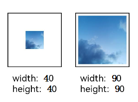
设置图片解码尺寸
通过sourceSize属性设置图片解码尺寸,降低图片的分辨率。
原图尺寸为1280*960,该示例将图片解码为40*40和90*90。
@Entry
@Component
struct Index {
  build() {
    Column() {
      Row({ space: 50 }) {
        Image($r('app.media.example'))
          .sourceSize({
            width: 40,
            height: 40
          })
          .objectFit(ImageFit.ScaleDown)
          .aspectRatio(1)
          .width('25%')
          .border({ width: 1 })
          .overlay('width:40 height:40', { align: Alignment.Bottom, offset: { x: 0, y: 40 } })
        Image($r('app.media.example'))
          .sourceSize({
            width: 90,
            height: 90
          })
          .objectFit(ImageFit.ScaleDown)
          .width('25%')
          .aspectRatio(1)
          .border({ width: 1 })
          .overlay('width:90 height:90', { align: Alignment.Bottom, offset: { x: 0, y: 40 } })
      }.height(150).width('100%').padding(20)
    }
  }
}
为图片添加滤镜效果
通过colorFilter修改图片的像素颜色,为图片添加滤镜。
@Entry
@Component
struct Index {
  build() {
    Column() {
      Row() {
        Image($r('app.media.example'))
          .width('40%')
          .margin(10)
        Image($r('app.media.example'))
          .width('40%')
          .colorFilter(
            [1, 1, 0, 0, 0,
             0, 1, 0, 0, 0,
             0, 0, 1, 0, 0,
             0, 0, 0, 1, 0])
          .margin(10)
      }.width('100%')
      .justifyContent(FlexAlign.Center)
    }
  }
}
同步加载图片
一般情况下,图片加载流程会异步进行,以避免阻塞主线程,影响UI交互。但是特定情况下,图片刷新时会出现闪烁,这时可以使用syncLoad属性,使图片同步加载,从而避免出现闪烁。不建议图片加载较长时间时使用,会导致页面无法响应。
Image($r('app.media.icon'))
  .syncLoad(true)
事件调用
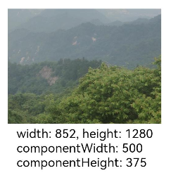
通过在Image组件上绑定onComplete事件,图片加载成功后可以获取图片的必要信息。如果图片加载失败,也可以通过绑定onError回调来获得结果。
@Entry
@Component
struct MyComponent {
  @State widthValue: number = 0;
  @State heightValue: number = 0;
  @State componentWidth: number = 0;
  @State componentHeight: number = 0;


  build() {
    Column() {
      Row() {
        Image($r('app.media.ic_img_2'))
          .width(200)
          .height(150)
          .margin(15)
          .onComplete(msg => {
            if(msg){
              this.widthValue = msg.width;
              this.heightValue = msg.height;
              this.componentWidth = msg.componentWidth;
              this.componentHeight = msg.componentHeight;
            }
          })
            // 图片获取失败,打印结果
          .onError(() => {
            console.info('load image fail')
          })
          .overlay('\nwidth: ' + String(this.widthValue) + ', height: ' + String(this.heightValue) + '\ncomponentWidth: ' + String(this.componentWidth) + '\ncomponentHeight: ' + String(this.componentHeight), {
            align: Alignment.Bottom,
            offset: { x: 0, y: 60 }
          })
      }
    }
  }
}


讨论HarmonyOS开发技术,专注于API与组件、DevEco Studio、测试、元服务和应用上架分发等。
更多推荐

 19
19 0
0- 0


 已为社区贡献215条内容

所有评论(0)