HarmonyOS应用开发——ArkTS样式
1.样式语法(链式&枚举)2.样式单位vp和适配3.lmage和资源Resource2.1.案例实操2.2.iconfont 中 svg图片处理4.样式-@Styles 复用5.样式-@Extends 复用6.多态样式-stateStyles
1.样式-语法(链式&枚举)
ArkTS以声明方式组合和扩展组件来描述应用程序的UI;
同时还提供了基本的属性、事件和子组件配置方法,帮助开发者实现应用交互逻辑。
(1)样式属性
- 属性方法以“.” 链式调用的方式配置系统组件的样式和其他属性。
@Entry
@Component
struct Index {
build() {
Text('演示…')
.backgroundColor('red')
.fontSize(50)
.width('100%')
.height(100)
}
}
(2)枚举值
- 对于系统组件,ArkUI还为其属性预定义了一些枚举类型。
@Entry
@Component
struct Index {
build() {
Text('演示…')
.fontSize(50)
.width('100%')
.height(100)
.backgroundColor(Color.Blue)
.textAlign(TextAlign.Center)
.fontColor(Color.White)
}
}
样式相关属性通过链式函数的方式进行设置。
如果类型是枚举的,通过枚举传入对应的值。
注意: 有的属性强烈建议使用枚举(大部分枚举值都是数字,但是数字无法体现代码含义)
有的组件如fontColor可以使用系统自带颜色枚举,也可以使用色值。
2.样式-单位vp和适配
知道 vp 单位,以及适配思想
(1) vp 是什么?virtual pixel
- 屏幕密度相关像素,根据屏幕像素密度转换为屏幕物理像素,当数值不带单位时,默认单位 vp;在实际宽度为1440物理像素的屏幕上,1vp 约等于 3px(物理像素)
在样式中,如果写px,那么px直接表示的是物理像素,也就是分辨率,那么手机分辨率密度各有不同,无法针对这种密度写一个固定值,所以vp会自动根据手机密度去进行适配,所以vp它提供了一种灵活的方式来适应不同屏幕密度的显示效果。
设计图按照1080设计- 换算成360写vp就可以了
上图的意思是,使用这个单位在不同屏幕物理分辨率的实际尺寸一致(A设备1英寸,B设备1英寸)。
(2)之前 vw 、rem 和 rpx 相对于屏幕宽度的单位,可以实现等比例适配,vp 可以吗?
@Entry
@Component
struct StyleCase {
@State message: string = 'Hello World'
build() {
Row() {
Column() {
Text(this.message)
.fontSize(50)
.fontWeight(FontWeight.Bold)
}
.width('100%').alignItems(2)
}.width('100%')
.height('100%')
.onAreaChange((_, newArea) => {
AlertDialog.show({ message: JSON.stringify(newArea) })
})
}
}
运行效果如图:
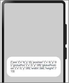
我们发现:不同的设备屏幕的宽度 `vp` 是不一致的,那怎么适配呢?
(3)根据官方的文档,采用:伸缩布局,网格系统,栅格系统进行布局适配。
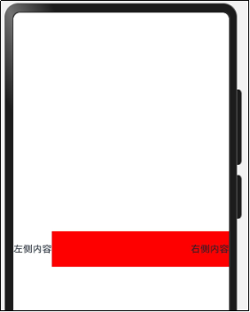
伸缩 layoutWeight(flex: number) 占剩余空间多少份,可以理解成CSS的 flex: 1
我们可以使用layoutWeight属性,让右侧内容去占满剩余宽度。
build() {
Row() {
Text("左侧内容")
Text("右侧内容")
.textAlign(TextAlign.End)
.width('80%')
.height(60)
.backgroundColor('red')
.layoutWeight(1)
}.width('100%')
.height('100%')
}
运行效果如图:
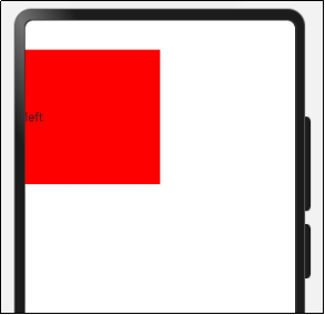
内容等比例缩放-可以使用aspectRatio属性设置宽高比。
设置元素宽高比 aspectRatio(ratio: number)。
如我们如果希望一个元素始终占整个屏幕宽度的50%,且为一个正方形。
Column()
.width('50%')
.height('50%')
.backgroundColor('blue')
.aspectRatio(1)
测试代码如下:
@Entry
@Component
struct AspectRatioCase {
build() {
Text('left')
.width('50%')
// 宽高比例
.aspectRatio(1)
.backgroundColor('red')
}
}
运行效果
vp 是鸿蒙默认单位,和屏幕像素有关,最终表现视觉大小在任何设备一致
鸿蒙一般以伸缩 layoutWeight、网格、栅格进行布局适配,如要等比例缩放可以设置高宽比 aspectRatio
3.Image和资源Resource

项目开发离不开图片-图片在页面中必须使用Image组件。
Image为图片组件,常用于在应用中显示图片。Image支持加载string、PixelMap和Resource类型的数据源,支持png、jpg、bmp、svg和gif类型的图片格式。
使用本地图片-拖一张图片放置到ets目录下-比如assets文件下
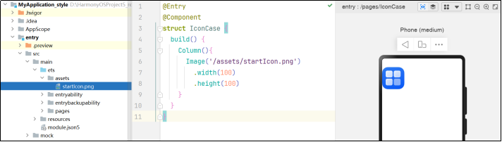
代码如下:
@Entry
@Component
struct IconCase {
build() {
Column(){
Image('/assets/startIcon.png')
.width(100)
.height(100)
}
}
}
使用Resource下的图片-media
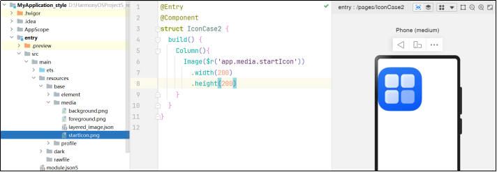
代码如下:
@Entry
@Component
struct IconCase2 {
build() {
Column(){
Image($r('app.media.icon'))
.width(200)
.height(200)
}
}
}
使用Resource下的图片-rawfile
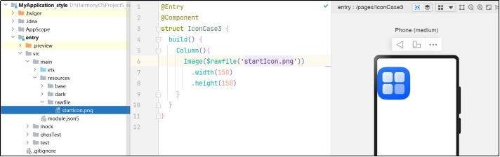
代码如下:
@Entry
@Component
struct IconCase3 {
build() {
Column(){
Image($rawfile('icon.png'))
.width(150)
.height(150)
}
}
}
使用网络图片
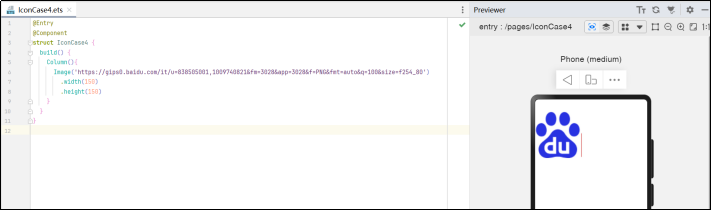
代码如下:
@Entry
@Component
struct IconCase4 {
build() {
Column(){
Image('https://gips0.baidu.com/it/u=838505001,1009740821&fm=3028&app=3028&f=PNG&fmt=auto&q=100&size=f254_80')
.width(150)
.height(150)
}
}
}
尤其注意: 使用网络图片时,在preview中时,可以预览,但是在模拟器和真实项目中,必须申请网络权限
修改module.json5文件
"requestPermissions": [{
"name":"ohos.permission.INTERNET"
}],
2.1. 案例实操
接下来,我们手写一个知乎的评论

设计稿一般是1080px:(这里没有设计稿,提供了一些尺寸)。
- Nav
- 左侧返回按钮24vp高宽背景颜色#f5f5f5,图标12vp尺寸颜色#848484
- 标题18vp
- Comment
- 头像尺寸32vp高宽,右侧间距10vp
- 标题15vp,颜色默认
- 内容16vp,颜色#565656
- 底部12vp,颜色#c3c4c5
代码如下:
@Entry
@Component
struct ZhiHu {
build() {
Column () {
HmNavBar()
HmCommentItem()
}
}
}
@Component
struct HmNavBar {
build() {
Row(){
Row() {
Image($r("app.media.ic_public_back"))
.width(16)
.height(16)
.fillColor('#848484')
}
.justifyContent(FlexAlign.Center)
.width(24)
.aspectRatio(1)
.backgroundColor("#f5f5f5")
.borderRadius(12)
.margin({
left: 15
})
Text("评论回复")
.layoutWeight(1)
.textAlign(TextAlign.Center)
.fontSize(18)
.padding({
right: 39
})
}
.height(40)
.border({
color: '#f4f4f4',
width: {
bottom: 0.5
}
})
}
}
@Component
struct HmCommentItem {
build() {
Row() {
// 左侧头像
Image('https://p6-passport.byteacctimg.com/img/user-avatar/ab07005f9ec8119331b5f92c41c6fc92~90x90.awebp')
.width(32)
.aspectRatio(1)
.borderRadius(16)
// 评论区
Column({ space: 10 }) {
Text("我要写代码")
.fontWeight(FontWeight.Bold)
Text("一套代码工程,一次开发上架,多端按需部署,为用户呈现多设备统一且卓越的使用体验。")
.lineHeight(20)
.fontSize(16)
.fontColor('#565656')
// 底部内容
Row() {
Text("12-11 .ip属地深圳")
.fontSize(12)
.fontColor("#c3c4c5")
Row() {
Image($r("app.media.ic_public_heart"))
.width(12)
.aspectRatio(1)
.fillColor('#c3c4c5') // 填充颜色
.margin({
right: 5
})
Text("1020")
.fontSize(12)
.fontColor("#c3c4c5")
}
}.justifyContent(FlexAlign.SpaceBetween)
.width('100%')
}
.alignItems(HorizontalAlign.Start)
.layoutWeight(1)
.margin({
left: 10
})
}.padding(15)
.alignItems(VerticalAlign.Top)
}
}
2.2. iconfont 中 svg 图片处理
<?xml version="1.0" encoding="UTF-8"?>
<svg xmlns="http://www.w3.org/2000/svg" xmlns:xlink="http://www.w3.org/1999/xlink" width="24" height="24" viewBox="0 0 1024 1024" version="1.1">
<title>Public/ic_public_todo</title>
<defs>
<path d="M747.4176 0 276.6848 474.077867 276.616533 473.975467 238.933333 511.8976 239.035733 511.965867 238.933333 512.068267 276.616533 550.058667 276.718933 549.956267 747.4176 1024 785.066667 986.043733 314.368 511.965867 785.066667 37.922133Z" id="_path-1" fill="#262626"/>
</defs>
<g id="_Public/ic_public_todo" stroke="none" stroke-width="1" fill="none" fill-rule="evenodd">
<mask id="_mask-2" fill="white">
<use xlink:href="#_path-1"/>
</mask>
<use id="_形状结合" fill="#000000" fill-rule="nonzero" xlink:href="#_path-1"/>
</g>
</svg>
只需要将 iconfont 里面图片的 svg 代码中的 path 字段中的 d 属性的值,复制到上面的 path 字段的 d 属性中的即可。
<svg t="1736264680746" class="icon" viewBox="0 0 1024 1024" version="1.1" xmlns="http://www.w3.org/2000/svg" p-id="6249" width="40" height="40"><path d="M747.4176 0 276.6848 474.077867 276.616533 473.975467 238.933333 511.8976 239.035733 511.965867 238.933333 512.068267 276.616533 550.058667 276.718933 549.956267 747.4176 1024 785.066667 986.043733 314.368 511.965867 785.066667 37.922133Z" fill="#272636" p-id="6250"></path></svg>
4.样式-@Styles 复用
注意:Styles和Extend均只支持在当前文件下的全局或者组件内部定义,如果想要在其他文件导出一个公共样式,导出公共使用,ArtTS是不支持的,这种方式还是需要考虑组件复用。
在开发过程中会出现大量代码在进行重复样式设置,@Styles 可以帮我们进行样式复用。
通用属性 通用事件:
(1)在Styles修饰的函数中能够点出来就是通用属性和事件。
(2)Styles修饰的函数不允许传参数。
(1)全局Styles不支持箭头函数语法。
(2)支持 全局 定义和 组件内 定义,同时存在组件内覆盖全局生效。
代码如下:
import promptAction from '@ohos.promptAction'
@Styles function textStyle () {
.width(100)
.height(50)
.backgroundColor(Color.Pink)
.borderRadius(25)
.onClick(() => {
promptAction.showToast({
message: "测试"
})
})
}
@Entry
@Component
struct StyleRepeatCase {
@Styles
textStyle () {
.width(200)
.height(50)
.backgroundColor(Color.Pink)
.borderRadius(25)
.onClick(() => {
promptAction.showToast({
message: "测试~~~"
})
})
}
build() {
Row() {
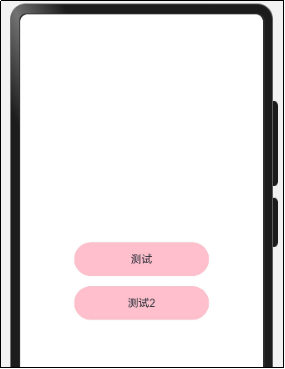
Column({ space: 15 }) {
Text("测试")
.textStyle()
.textAlign(TextAlign.Center)
Text("测试2")
.textStyle()
.textAlign(TextAlign.Center)
}
.width('100%')
}
.height('100%')
}
}
运行效果:
5.样式-@Extends 复用
假设我们就想针对 Text进行字体和样式的复用,此时可以使用Extend来修饰一个全局的方法。
- 使用 @Extend 装饰器修饰的函数只能是全局
- 函数可以进行传参,如果参数是状态变量,状态更新后会刷新UI
- 且参数可以是一个函数,实现复用事件且可处理不同逻辑
// 全局 原生组件 参数
// ↓ ↓ ↓
@Extend(Text) function textInputAll (callback?: () => void) {
.width(100)
.height(50)
.backgroundColor(Color.Pink)
.borderRadius(25)
.textAlign(TextAlign.Center)
.fontColor(Color.White)
.onClick(() => {
callback && callback()
})
}
需求:把 Text 改成按钮样式,且绑定 click 事件执行不同逻辑
代码如下:
@Entry
@Component
struct ExtendCase {
build() {
Row() {
Column({ space: 20 }) {
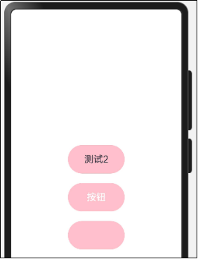
Text("测试2")
.text2Style()
Button("按钮")
.btnStyle()
TextInput()
.inputStyle()
}
.width('100%')
}
.height('100%')
}
}
@Extend(Text) function text2Style () {
.width(120)
.height(60)
.borderRadius(30)
.backgroundColor(Color.Pink)
.textAlign(TextAlign.Center)
.fontSize(20)
}
@Extend(Button) function btnStyle () {
.width(120)
.height(60)
.borderRadius(30)
.backgroundColor(Color.Pink)
.fontSize(20)
}
@Extend(TextInput) function inputStyle () {
.width(120)
.height(60)
.borderRadius(30)
.backgroundColor(Color.Pink)
.textAlign(TextAlign.Center)
.fontSize(20)
}
运行效果:
6.多态样式-stateStyles
@Styles和@Extend仅仅应用于静态页面的样式复用,stateStyles可以依据组件的内部状态的不同,快速设置不同样式。这就是我们本章要介绍的内容stateStyles(又称为:多态样式)。
ArkUI 提供以下四种状态:
- focused:获焦态
- normal:正常态
- pressed:按压态
- disabled:不可用态
准备一个扩展样式。
@Extend(Text) function textStyle() {
.width(100)
.height(40)
.textAlign(TextAlign.Center)
.borderRadius(20)
.backgroundColor(Color.Gray)
.fontColor(Color.White)
}
@Entry
@Component
struct Index {
build() {
Column(){
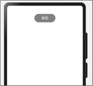
Text('按钮').textStyle()
}
.width('100%')
.height('100%')
}
}
运行效果:
我们想要在按压Text的时候 给它一个扩大两倍的效果。
代码如下:
@Extend(Text)
function textStateStyle() {
.width(100)
.height(40)
.textAlign(TextAlign.Center)
.borderRadius(20)
.backgroundColor(Color.Gray)
.fontColor(Color.White)
}
@Entry
@Component
struct StateStylesCase {
@State message: string = 'Hello World'
@State textEnable: boolean = true
@Styles
pressStyle() {
.width(200)
.height(80)
.borderRadius(40)
.backgroundColor(Color.Pink)
}
@Styles
disableStyle() {
.backgroundColor(Color.Red)
}
@Styles
inputFocusStyle() {
.border({
color: Color.Red,
width: 1
})
}
@Styles
inputNormalStyle (){
.border({
color: Color.Red,
width: 0
})
}
build() {
Row() {
Column({ space: 20 }) {
Row() {
TextInput()
.height(40)
.stateStyles({
focused: this.inputFocusStyle,
normal: this.inputNormalStyle
})
}.padding({
left: 10,
right: 10
})
Row() {
TextInput()
.height(40)
.stateStyles({
focused: this.inputFocusStyle,
normal: this.inputNormalStyle
})
}.padding({
left: 10,
right: 10
})
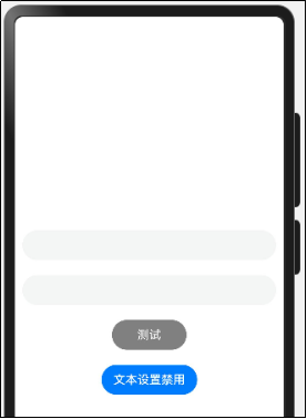
Text("测试")
.textStateStyle()
.stateStyles({
pressed: this.pressStyle,
disabled: this.disableStyle
}).enabled(this.textEnable)
Button("文本设置禁用")
.onClick(() => {
this.textEnable = !this.textEnable
})
}
.width('100%')
}
.height('100%')
}
}
运行效果:
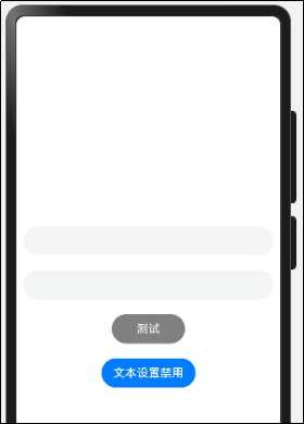
目前版本的编辑工具里不能设置通用属性之外的样式,比如fontColor 和TextAlign不可设置-会有异常。
禁用状态样式
build() {
Row() {
Column({ space: 15 }) {
Text("登录")
.textStyle()
.stateStyles({
pressed: this.textStylePressed,
disabled: {
.backgroundColor('#ccc')
}
}).enabled(!this.disable)
Button("文本禁用/开启")
.onClick(() => {
this.disable = !this.disable
})
}
.width('100%')
}
.height('100%')
}
获焦状态
(1)获焦状态最好使用TextInput来测试
(2)坑点- 要同时设置TextInput的normal和focus属性
TextInput()
.stateStyles({
normal: {
.border({
width: 0,
color: 'red'
})
},
focused: {
.border({
width: 1,
color: 'red'
})
}
})
TextInput()
.stateStyles({
focused: {
.border({
width: 1,
color: 'red'
})
},
normal: {
.border({
width: 0,
color: 'red'
})
},
})
总体代码如下:
@Extend(Text)
function textStateStyle2() {
.width(100)
.height(40)
.textAlign(TextAlign.Center)
.borderRadius(20)
.backgroundColor(Color.Gray)
.fontColor(Color.White)
}
@Entry
@Component
struct StateStylesCase2 {
@State message: string = 'Hello World'
@State textEnable: boolean = true
@Styles
pressStyle() {
.width(200)
.height(80)
.borderRadius(40)
.backgroundColor(Color.Pink)
}
@Styles
disableStyle() {
.backgroundColor(Color.Red)
}
@Styles
inputFocusStyle() {
.border({
color: Color.Red,
width: 1
})
}
@Styles
inputNormalStyle (){
.border({
color: Color.Red,
width: 0
})
}
build() {
Row() {
Column({ space: 20 }) {
Row() {
TextInput()
.height(40)
.stateStyles({
focused: this.inputFocusStyle,
normal: this.inputNormalStyle
})
}.padding({
left: 10,
right: 10
})
Row() {
TextInput()
.height(40)
.stateStyles({
focused: this.inputFocusStyle,
normal: this.inputNormalStyle
})
}.padding({
left: 10,
right: 10
})
Text("测试")
.textStateStyle2()
.stateStyles({
pressed: this.pressStyle,
disabled: this.disableStyle
}).enabled(this.textEnable)
Button("文本设置禁用")
.onClick(() => {
this.textEnable = !this.textEnable
})
}
.width('100%')
}
.height('100%')
}
}
运行效果:
欢迎加入课程班级,考取鸿蒙认证:
https://developer.huawei.com/consumer/cn/training/classDetail/d43582bb30b34f548c16c127cb3be104?type=1?ha_source=hmosclass&ha_sourceId=89000248

讨论HarmonyOS开发技术,专注于API与组件、DevEco Studio、测试、元服务和应用上架分发等。
更多推荐

 7
7 0
0- 0


 已为社区贡献57条内容

所有评论(0)