HarmonyOS ArkUI 滚动组件实战:Scroller 与嵌套滑动完全指南
本文详细介绍了HarmonyOS ArkUI开发中的滚动交互实现方法,重点讲解了Scroller控制器和nestedScroll嵌套滑动模式的应用。文章通过京东秒杀等实际案例,展示了从基础滚动控制到复杂布局实现的完整开发流程,包括Scroller的创建绑定、常用API、返回顶部按钮实现,以及嵌套滚动模式下解决父子组件滚动冲突的技巧。特别针对电商类应用常见的"顶部广告+标题+列表"
✨家人们记得点个账号关注,会持续发布大前端领域技术文章💕 🍃
引言
在 HarmonyOS ArkUI 开发中,滚动交互是提升页面体验的核心功能。本文将聚焦 Scroller 滚动控制器 和 nestedScroll 嵌套滑动模式,结合京东秒杀等实际场景,通过语法解析、案例实战和进阶技巧,帮你快速掌握滚动交互的开发精髓。
目录
- Scroller 核心用法:滚动控制全解析
- nestedScroll 嵌套滑动:解决复杂布局滚动冲突
- 实战场景:从基础滚动到京东秒杀布局复刻
- 进阶技巧与注意事项
一、Scroller 核心用法:滚动控制全解析
Scroller 是 ArkUI 中用于控制滚动组件(List、Scroll、Grid 等)的核心控制器,通过「创建对象 → 绑定组件 → 调用方法」三步即可实现灵活的滚动控制。
1. 基础语法
// 1. 创建 Scroller 实例
private scroller: Scroller = new Scroller()

// 2. 与滚动组件绑定(以 List 和 Scroll 为例)
List({ scroller: this.scroller }) {
  // 列表内容
}

Scroll(this.scroller) {
  // 滚动容器内容
}

// 3. 调用滚动控制方法(常用核心方法)
this.scroller.scrollToIndex(0) // 滚动到指定索引
this.scroller.scrollTo({ xOffset: 0, yOffset: 0, animation: true }) // 滚动到指定坐标
this.scroller.currentOffset() // 获取当前滚动偏移量
this.scroller.scrollToBottom() // 滚动到底部
2. 经典场景:滚动显示「返回顶部」按钮
当页面滚动超过一定距离时,显示「返回顶部」按钮,点击快速回到页面顶端,是 App 常见交互模式。
@Entry
@Component
struct ScrollToTopDemo {
  // 模拟列表数据
  @State dataList: string[] = 'ABCDEFGHIJKLMNOPQRSTUVWXYZ'.split('')
  // 控制返回顶部按钮显示
  @State showBackTop: boolean = false
  // 创建 Scroller 实例
  private scroller: Scroller = new Scroller()

  build() {
    Column() {
      // 滚动列表
      List({ scroller: this.scroller }) {
        ForEach(this.dataList, (item: string, index: number) => {
          ListItem() {
            Text(`列表项 ${item}`)
              .width('100%')
              .height(100)
              .fontSize(24)
              .backgroundColor('#f0f0f0')
              .textAlign(TextAlign.Center)
              .lineHeight(100)
          }
          .margin({ bottom: 5 })
        })
      }

      // 返回顶部按钮(滚动超过 100vp 显示)
      if (this.showBackTop) {
        Button('返回顶部')
          .position({ x: '75%', y: '85%' })
          .backgroundColor('#1890ff')
          .fontColor(Color.White)
          .padding({ left: 15, right: 15, top: 8, bottom: 8 })
          .borderRadius(20)
          .onClick(() => {
            // 带动画滚动到顶部
            this.scroller.scrollTo({ xOffset: 0, yOffset: 0, animation: true })
          })
      }
    }
    .width('100%')
    .height('100%')
    .onScrollStop(() => {
      // 滚动停止后判断偏移量,控制按钮显示
      const offset = this.scroller.currentOffset()
      this.showBackTop = offset.yOffset >= 100
    })
  }
}
3. 关键 API 说明
| 方法名 | 功能描述 | 参数说明 |
|---|---|---|
| scrollToIndex(index: number) | 滚动到指定索引位置 | index:目标项索引(适用于 List/Grid) |
| scrollTo(options: ScrollToOptions) | 滚动到指定坐标 | xOffset:水平偏移量,yOffset:垂直偏移量,animation:是否启用动画 |
| currentOffset() | 获取当前滚动偏移量 | 返回 {xOffset: number, yOffset: number} |
| scrollToBottom() | 滚动到底部 | 无 |
| scrollToTop() | 滚动到顶部 | 无 |
二、nestedScroll 嵌套滑动:解决复杂布局滚动冲突💕
在复杂布局中(如「顶部广告 + 标题 + 列表」),容易出现滚动冲突。nestedScroll 嵌套滑动模式通过设置父子组件的滚动优先级,实现流畅的联动滚动。
1. 核心概念
nestedScroll 用于配置滚动组件与父组件的联动规则,通过 NestedScrollOptions 指定两个方向的滚动模式:
scrollForward:向末尾端滚动(上拉)时的规则scrollBackward:向起始端滚动(下拉)时的规则
2. 嵌套滚动模式枚举(NestedScrollMode)
2. 嵌套滚动模式枚举(NestedScrollMode)
| 模式 | 说明 |
|---|---|
| SELF_ONLY | 仅自身滚动,不与父组件联动 |
| SELF_FIRST | 自身先滚动,滚动到边缘后触发父组件滚动 |
| PARENT_FIRST | 父组件先滚动,滚动到边缘后触发自身滚动 |
| PARALLEL | 自身与父组件同时滚动 |
3. 基础案例:简单嵌套滚动布局
@Entry
@Component
struct NestedScrollBasicDemo {
build() {
// 父滚动组件(必须包含滚动能力)
Scroll() {
Column() {
// 顶部广告区
Text('京东秒杀 · 限时特惠')
.width('100%')
.height(100)
.backgroundColor(Color.Red)
.fontColor(Color.White)
.fontSize(28)
.textAlign(TextAlign.Center)
.lineHeight(100)
// 分类标题区
Text('热门商品')
.width('100%')
.height(50)
.backgroundColor('#f5f5f5')
.fontSize(20)
.padding({ left: 15 })
.lineHeight(50)
// 子滚动列表(商品列表)
List() {
ForEach('1234567890'.split(''), (item: string) => {
ListItem() {
Text(`商品 ${item}`)
.width('100%')
.height(80)
.fontSize(22)
.padding({ left: 15 })
.lineHeight(80)
}
.divider({ strokeWidth: 1, color: '#eee' })
})
}
// 关键配置:嵌套滚动规则
.nestedScroll({
scrollForward: NestedScrollMode.PARENT_FIRST, // 上拉时父先滚
scrollBackward: NestedScrollMode.SELF_FIRST // 下拉时子先滚
})
// 高度计算:占满剩余可视区域
.height('calc(100% - 50vp)')
}
}
.width('100%')
.height('100%')
}
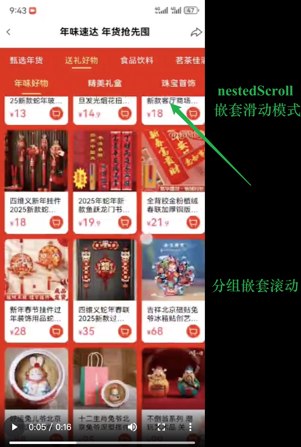
}三、实战场景:复刻京东秒杀嵌套滚动布局
京东秒杀页面的核心布局是「顶部轮播 + 分类标题 + 商品列表」,结合嵌套滚动和分组吸顶,实现专业级交互效果。
实战代码:带分组吸顶的嵌套滚动
@Entry
@Component
struct JDSeckillDemo {
  // 模拟商品分组数据(A-F 分组)
  @State groups: string[] = 'ABCDEF'.split('')
  // 每组商品数据
  @State goodsList: string[] = '123456'.split('')

  // 分组标题构建器(吸顶效果)
  @Builder GroupHeader(title: string) {
    Text(title)
      .fontSize(20)
      .fontWeight(FontWeight.Bold)
      .backgroundColor('#fff1f3f5')
      .width('100%')
      .padding({ left: 15, top: 8, bottom: 8 })
  }

  build() {
    // 父滚动容器
    Scroll() {
      Column() {
        // 1. 顶部广告区(模拟轮播图)
        Text('京东秒杀 · 限量开抢')
          .width('100%')
          .height(120)
          .backgroundColor('#e1251b')
          .fontColor(Color.White)
          .fontSize(32)
          .textAlign(TextAlign.Center)
          .lineHeight(120)

        // 2. 固定标题区
        Text('今日爆款好物')
          .width('100%')
          .height(60)
          .backgroundColor('#fff')
          .fontSize(24)
          .fontWeight(FontWeight.Bold)
          .padding({ left: 15 })
          .lineHeight(60)
          .shadow({ radius: 3, color: '#00000010' })

        // 3. 商品列表(带分组吸顶)
        List() {
          ForEach(this.groups, (group: string) => {
            // 分组容器(吸顶效果)
            ListItemGroup({ header: this.GroupHeader(group) })
              .sticky(StickyStyle.Header) // 分组标题吸顶
              .divider({ strokeWidth: 1, color: '#eee' }) {
                // 每组商品项
                ForEach(this.goodsList, (goods: string) => {
                  ListItem() {
                    Column() {
                      Text(`分组${group} · 商品${goods}`)
                        .fontSize(22)
                        .padding({ left: 15 })
                      Text('限时价 ¥9.9 已抢40%')
                        .fontSize(16)
                        .fontColor('#e1251b')
                        .padding({ left: 15, top: 5 })
                    }
                    .width('100%')
                    .height(100)
                    .justifyContent(FlexAlign.Center)
                  }
                  .divider({ strokeWidth: 1, color: '#f5f5f5' })
                })
              }
          })
        }
        // 嵌套滚动核心配置
        .nestedScroll({
          scrollForward: NestedScrollMode.PARENT_FIRST, // 上拉时先滚父容器(露出更多商品)
          scrollBackward: NestedScrollMode.SELF_FIRST   // 下拉时先滚子列表(吸顶标题不消失)
        })
        // 高度计算:占满剩余可视区域
        .height('calc(100% - 60vp)')
      }
    }
    .width('100%')
    .height('100%')
    .backgroundColor('#fafafa')
  }
}
效果说明
- 下拉时:商品列表先滚动,分组标题保持吸顶,直到列表滚动到顶部后,父容器才开始滚动(露出完整广告区)。
- 上拉时:父容器先滚动(隐藏广告区),直到父容器滚动到边缘后,商品列表开始滚动,实现无缝衔接。
实战代码2:京东效果&代码

@Entry
@Component
struct Index {
  build() {
    Column() {
      // 广告
      Text().width('100%').height(100).backgroundColor(Color.Red)
      // 标题
      Text().width('100%').height(50).backgroundColor(Color.Black)
      // 列表
      List() {
        ForEach('0123456789abcdefg'.split(''), (item:string) => {
          ListItem() {
            Text(item).height(50).fontSize(30)
          }
        })
      }.layoutWeight(1).divider({strokeWidth:2,color:Color.Red})
    }
  }
}
@Entry
@Component
struct Index {
build() {
// 步骤1⭐️:父必须写滚动条
Scroll() {
Column() {
// 广告
Text().width('100%').height(100).backgroundColor(Color.Red)
// 标题
Text().width('100%').height(50).backgroundColor(Color.Black)
// 列表
List() {
ForEach('0123456789abcdefg'.split(''), (item:string) => {
ListItem() {
Text(item).height(50).fontSize(30)
}
})
}.divider({strokeWidth:2,color:Color.Red})
// .layoutWeight(1) px固定像素单位、vp是鸿蒙自适应单位
.height('calc(100% - 50vp)')
// 步骤2⭐️:不写剩余空间 而是改成100% 减去 最终你想展示多少的高度 (最终想展示标题)
// - 目的1:没滚动的时候 - 让父有滚动条
// - 目的2:滚动的时候 - 标题+列表刚好展示铺满可视范围
// 步骤3⭐️:向前向后滚动模式 -> 实现与父组件的滚动联动
.nestedScroll({
scrollForward: NestedScrollMode.PARENT_FIRST, // 上拉
scrollBackward: NestedScrollMode.SELF_FIRST // 下拉
// 不管父-SELF_ONLY、SELF_FIRST-到边缘管父、PARENT_FIRST-到边缘管子、PARALLEL-父子同时
// 详细 https://developer.huawei.com/consumer/cn/doc/harmonyos-references-V13/ts-appendix-enums-V13#nestedscrollmode10
})
}
}
}
}实战代码3:某商城活动页效果&代码
http://tmp00002.zhaodashen.cn/hm_449_1736430227.mp4
@Entry
@Component
struct Index {

  @Builder GroupTitleBuilder(text: string) {
    // 列表分组的头部组件,对应联系人分组A、B等位置的组件
    Text(text)
      .fontSize(20)
      .backgroundColor('#fff1f3f5')
      .width('100%')
      .padding(5)
  }

  build() {
    // 步骤1⭐️:父必须写滚动条
    Scroll() {
      Column() {
        // 广告
        Text().width('100%').height(100).backgroundColor(Color.Red)
        // 标题
        Text().width('100%').height(50).backgroundColor(Color.Black)
        // 列表
        List() {

          // 分组
          ForEach('ABCDEF'.split(''), (title:string) => {
            ListItemGroup({ header: this.GroupTitleBuilder(title) }) {
              // 每个分组下面的内容(咱们这里每个分组内容一样)
              ForEach('123456'.split(''), (item:string) => {
                ListItem() {
                  Text(item).height(50).fontSize(30)
                }
              })
              // 每个分组下面的内容(咱们这里每个分组内容一样)
            }.divider({strokeWidth:2,color:Color.Red})
          })
          // 分组

        }.sticky(StickyStyle.Header)
        // .layoutWeight(1)  px固定像素单位、vp是鸿蒙自适应单位
        .height('calc(100% - 50vp)')
        // 步骤2⭐️:不写剩余空间 而是改成100% 减去 最终你想展示多少的高度 (最终想展示标题)
        // - 目的1:没滚动的时候 - 让父有滚动条
        // - 目的2:滚动的时候 - 标题+列表刚好展示铺满可视范围
        // 步骤3⭐️:向前向后滚动模式 -> 实现与父组件的滚动联动
        .nestedScroll({
          scrollForward: NestedScrollMode.PARENT_FIRST, // 上拉
          scrollBackward: NestedScrollMode.SELF_FIRST   // 下拉
          // 不管父-SELF_ONLY、SELF_FIRST-到边缘管父、PARENT_FIRST-到边缘管子、PARALLEL-父子同时
          // 详细 https://developer.huawei.com/consumer/cn/doc/harmonyos-references-V13/ts-appendix-enums-V13#nestedscrollmode10
        })
      }
    }
  }
}
四、进阶技巧与注意事项
1. 性能优化
- 避免在
onScroll等高频回调中执行复杂逻辑,优先使用onScrollStop处理滚动后的状态更新。 - 滚动组件的子项建议使用固定高度,或通过
layoutWeight合理分配空间,避免动态高度导致的滚动卡顿。
2. 常见问题解决
- 滚动冲突:通过
nestedScroll明确父子组件滚动优先级,避免同时触发多个滚动。 - 吸顶失效:确保
ListItemGroup的sticky属性设置为StickyStyle.Header,且父容器没有设置overflow: Hidden。 - 偏移量计算错误:
currentOffset()返回的是组件内容的滚动偏移,需注意父容器的 padding 和 margin 影响。
3. 扩展用法
- 结合
edgeEffect设置滚动边缘效果(弹簧效果EdgeEffect.Spring或阴影效果EdgeEffect.Fade)。 - 通过
scrollBar、scrollBarColor、scrollBarWidth自定义滚动条样式。
总结
本文详细讲解了 Scroller 控制器的基础用法和 nestedScroll 嵌套滚动模式,通过实战案例覆盖了从简单返回顶部到京东秒杀复杂布局的开发场景。掌握这些技能后,你可以轻松实现各类滚动交互,提升 HarmonyOS 应用的用户体验。
建议在实际开发中结合官方文档,根据具体场景灵活调整滚动规则和样式,让滚动交互更贴合用户习惯。如果需要进一步优化嵌套滚动的动画效果或实现更复杂的滚动逻辑,可以留言交流!
✨家人们点个csdn账号关注,会持续发布大前端领域技术文章💕 🍃
✨家人们点个csdn账号关注,会持续发布大前端领域技术文章💕 🍃
✨家人们点个csdn账号关注,会持续发布大前端领域技术文章💕 🍃
^_^ 点关注、不迷路、主播带你学技术 (๑′ᴗ‵๑)I Lᵒᵛᵉᵧₒᵤ❤

讨论HarmonyOS开发技术,专注于API与组件、DevEco Studio、测试、元服务和应用上架分发等。
更多推荐


 23
23 0
0- 0


 已为社区贡献27条内容

所有评论(0)