HarmonyOS应用开发——ArkTS组件
1.组件-什么是ArkTS2.组件结构3.系统组件(ArkUl)4.组件事件5.组件状态
1.组件-什么是ArkTS
ArkTS是HarmonyOS优选的主力应用开发语言。ArkTS围绕应用开发在TypeScript(简称TS)生态基础上做了进一步扩展,继承了TS的所有特性,是TS的超集。
说明: 也就是前端开发过程中所有的js/ts语法大部分支持的,比如es6中的箭头函数-模板字符串-promise-async/await-数组对象方法。
注意: 根据Next版本的内部沟通,下一版本的ArkTs对类型最了更一步的限制。
https://developer.huawei.com/consumer/cn/doc/harmonyos-guides-V5/typescript-to-arkts-migration-V5
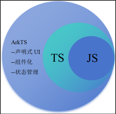
这里注意:ArtTS绝不是TS。
①TS在前端中虽然有类型约束,但是他会编译成js去运行。
②ArtTS编译后直接映射字节码-编译过程带类型。
扩展能力如下:
①基本语法
-
- 定义声明式UI、自定义组件、动态扩展UI元素;
- 提供ArkUI系统组件,提供组件事件、方法、属性;
- 共同构成 UI 开发主体。
②状态管理
-
- 组件状态、组件数据共享、应用数据共享、设备共享;
③渲染控制
-
- 条件渲染、循环渲染、数据懒加载;
声明式UI
- https://developer.huawei.com/consumer/cn/doc/harmonyos-guides-V5/arkts-declarative-ui-description-V5
总结:
①AktTS提供原有前端范畴内的一切TypeScript和JavaScript的类型及方法支持。
②不是所有都支持- 比如解构不支持(Next版本)。
③ArkTS采用声明式UI的方法来绘制页面,设置属性,绑定事件。
2.组件结构
接下来,我们来解析我们的UI的结构。
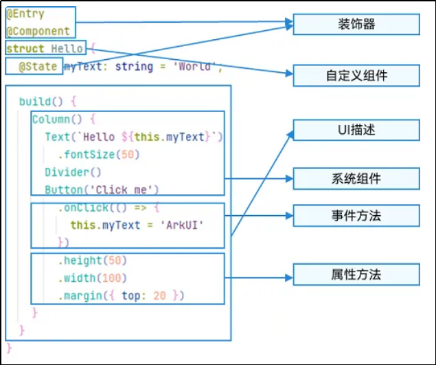
ArkTS通过装饰器 @Component 和 @Entry 装饰 struct 关键字声明的数据结构,构成一个自定义组件。
自定义组件中提供了一个 build 函数,开发者需在该函数内以链式调用的方式进行基本的 UI 描述,UI 描述的方法请参考 UI 描述规范。
(1)struct-自定义组件基于struct实现
要想实现一段UI的描述,必须使用struct关键字来声明- 注意不能有继承关系-组件名不能系统组件名重名。
语法: struct 组件名 {}。
@Component
struct Index {
}
@CustomDialog
struct Index2 {
}
struct关键字声明的UI描述-必须被@Component或者@CustomDialog修饰。
(2)Component修饰符
Component装饰器只能修饰struct关键字声明的结构,被修饰后的struct具备组件的描述(渲染)能力。
(3)build函数
用于定义组件的UI描述,一个struct结构必须实现build函数。
@Component
struct MyComponent {
build() {
}
}
build函数是组件(Component)必须提供以及实现的一个函数,build函数可以没有内容,如果有的话,必须有且只有一个容器组件(可以放置子组件的组件)- 只有entry里面有限制- component里面没有限制。
常见容器组件- Flex-Column-Row-List-Grid-Panel。
(4)entry修饰符
entry将自定义组件定义为UI页面的入口,也就是我们原来前端常说的一个页面,最多可以使用entry装饰一个自定义组件(在一个ets文件中)-如下面的代码就是不被允许的。
// 错误示例
@Entry
@Component
struct Index {
build() {
}
}
@Entry
@Component
struct Index2 {
build() {
}
}
entry修饰的组件,最终会被注册,具体文件位置-
main/resources/base/profile/main_pages.json。
①自动注册-新建组件时,采用新建Page的方式。
②手动注册-新建一个ets文件,自己在main_pages.json中手动添加路径。
注意:
如果手动删除了某一个带entry的组件,你需要手动去main_page中去删除该路径,否则编译会报错。
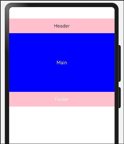
(5)组件复用
在很多情况下,由于业务的复杂度,经常会将一个大的业务拆成若干个组件,进行组装,这里我们非常灵活的复用组件,比如:
可以把上图抽象成三个组件- Header- Main- Footer。
@Entry
@Component
struct Index {
@State message: string = 'Hello World'
build() {
// 它的子组件都会以纵向方式排列
Column() {
Header()
Main()
Footer()
}
}
}
@Component
struct Header {
build() {
Row(){
Text("Header")
}
.width('100%')
.height(50)
.backgroundColor(Color.Pink)
.justifyContent(FlexAlign.Center)
}
}
@Component
struct Main {
build() {
Row(){
Text("Main")
.fontColor(Color.White)
}
.width('100%')
.height(200)
.backgroundColor(Color.Blue)
.justifyContent(FlexAlign.Center)
}
}
@Component
struct Footer {
build() {
Row(){
Text("Footer")
.fontColor(Color.White)
}
.width('100%')
.height(50)
.backgroundColor(Color.Pink)
.justifyContent(FlexAlign.Center)
}
}
运行效果,如图所示
总结:
- 一个UI描述必须使用struct来声明,不能继承。
- struct必须被Component或者CustomDialog修饰。
- struct必须实现build方法,build方法可以没有元素,但是有的话有且只有一个可容纳子组件的容器组件(entry修饰的组件)。
- entry修饰符表示该组件是页面级组件,一个文件中只允许修饰一个struct组件。
- 采用分拆组件的形式可以有效解解耦我们的业务。
3.系统组件(ArkUI)
常用系统组件:
Button Text Column Row Flex Stack Scroll List TextInput Image 更多组件。
组件使用:
- Text 文本组件-(Span子组件)
- Column 列组件,纵向排列,Flex布局主轴是Y (任意子组件)
- Row 行组件,横向向排列,Flex布局主轴是X (任意子组件)
- Flex 以弹性方式布局子组件的容器组件。(存在二次布局,官方推荐有性能要求,使用Column和Row代替) (任意子组件)
- Button 按钮组件 (单子组件)
- TextInput 输入框组件 (无子组件)
- Image (无子组件)
- Button (单个子组件)
- List (限制ListItem子组件)
- Scroll (限制单个子组件)
组件使用语法:
- 使用组件采用 组件名() 的语法
- 有构造参数采用 组件名(参数)的语法
- 组件里放置子组件采用 组件名() { 子组件的语法 } 的链式语法
- 组件设置属性采用 组件名().width().height() 的语法
- 组件又有属性又有子组件采用 组件名(){ ... 子组件 }.width().height() 的语法
接下来,我们来实现一个布局的小例子测试一下我们的能力。
(1)横向布局
实现效果:
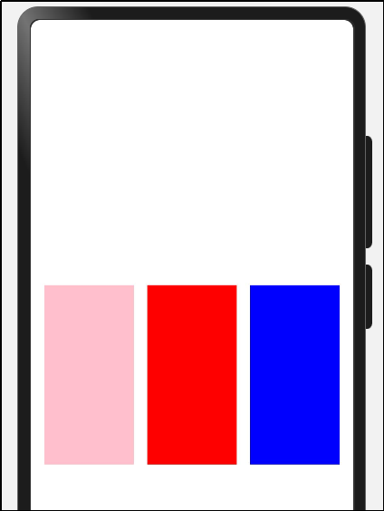
代码实现:
@Entry
@Component
struct Index {
@State message: string = 'Hello World'
build() {
Row() {
Column() {
Row({ space:15 }) {
Column()
.width(100)
.height(200)
.backgroundColor(Color.Pink)
Column()
.width(100)
.height(200)
.backgroundColor(Color.Red)
Column()
.width(100)
.height(200)
.backgroundColor(Color.Blue)
}
.width('100%')
.justifyContent(FlexAlign.Center)
}
.width('100%')
}
.height('100%')
}
}
(2)纵向布局
实现效果:
代码实现:
@Entry
@Component
struct Index {
build() {
Column() {
RowCase()
ColumnCase()
}.height('100%').backgroundColor(Color.Grey)
}
}
@Component
struct RowCase {
build() {
Row() {
Column().height(150).width(100).backgroundColor(Color.Pink)
Column().height(150).width(100).backgroundColor(Color.Red)
Column().height(150).width(100).backgroundColor(Color.Blue)
}
.width('100%')
.alignItems(VerticalAlign.Top)
.justifyContent(FlexAlign.SpaceAround)
}
}
@Component
struct ColumnCase {
build() {
Column() {
Column().height(100).width(150).backgroundColor(Color.Pink)
Column().height(100).width(150).backgroundColor(Color.Red)
Column().height(100).width(150).backgroundColor(Color.Blue)
}.height(400).width('100%').justifyContent(FlexAlign.SpaceEvenly)
}
}
(3)Flex横纵向
实现效果:
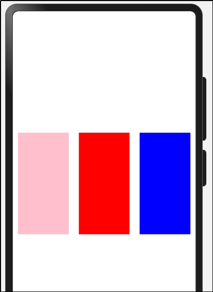
代码实现:
@Entry
@Component
struct Index {
@State message: string = 'Hello World'
build() {
Scroll() {
Row() {
Column() {
Flex({ direction: FlexDirection.Row, justifyContent: FlexAlign.SpaceAround }) {
Column()
.width(100)
.height(200)
.backgroundColor(Color.Pink)
Column()
.width(100)
.height(200)
.backgroundColor(Color.Red)
Column()
.width(100)
.height(200)
.backgroundColor(Color.Blue)
}
.margin({
top: 200
})
}
.width('100%')
}
}
}
}
在arkUI中,我们的内容如果超过了屏幕显示,则不会显示滚动条,需要使用Scroll来包裹。
需要注意的是: 该组件滚动的前提是主轴方向大小小于内容大小。子组件不要设置高度,否则不能滚动。
4.组件事件
监听原生组件的事件和设置属性的方式是一样的都是链式调用,值得注意的是,我们注册事件都要使用箭头函数的写法,HarmonyOS 5.0版本会有对于匿名函数function的限制。
尝试给一个TextInput和一个按钮注册一个值改变事件和点击事件。
(1)事件定义
实现效果:
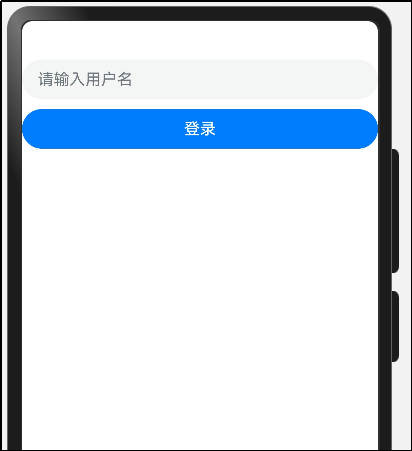
点击登录后的效果:
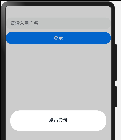
代码实现:
@Entry
@Component
struct Index {
build() {
Column({ space: 10 }) {
TextInput({ placeholder: '请输入用户名' })
.onChange((value) => {
AlertDialog.show({ message: value })
})
Button('登录').width('100%').onClick((event: ClickEvent) => {
AlertDialog.show({ message: '点击登录' })
})
}
.width('100%')
.height('100%')
}
}
请注意:在注册事件中的逻辑务必使用箭头函数 () => {},极不推荐 function() {}。
①因为function中this指向为undefind
②HarmonyOS 5.0不再支持funtion匿名函数声明
③箭头函数中的this指向当前struct实例,可以方便的调用方法和获取属性
当我们事件处理逻辑比较复杂,写在UI描述中无法抽提的时候,我们可以在struct结构体中定义。
(2)属性定义
当我们需要在组件中记录一些状态时,变量应该显示的在struct中声明,并注明类型,比如-登录账户和密码。
struct Event {
loginName: string = ""
password: string = ""
}
我们看代码示例时,会发现 public和private关键字,
如果不写或者写public 表示该属性可被外界即父组件赋值,
如果写private表示该属性只会被该组件的this获取。
下面实现一个简单的登录过程:
示例代码:
@Entry
@Component
struct Index {
username: string = ''
pwd: string = ''
login(){
AlertDialog.show({ message: `username: ${this.username}-pwd: ${this.pwd}` })
}
build() {
Column({ space: 10 }) {
TextInput({ placeholder: '请输入用户名' })
.onChange((value) => {
this.username = value
console.log('i-log', value)
})
TextInput({ placeholder: '请输入密码' })
.type(InputType.Password)
.onChange((value) => {
this.pwd = value
console.log('i-log', value)
})
Button('登录').width('100%').onClick((event: ClickEvent) => {
this.login()
})
}
.width('100%')
.height('100%')
}
}
说明
promptAction和AlertDailog都可以弹出提示 promptAction需要引入包,AlertDialog不需要引入就可以直接使用。
再加一个小需求,当用户名和密码为空时,不让用户点按钮。
代码如下:
@Entry
@Component
struct Index {
username: string = ''
pwd: string = ''
login(){
AlertDialog.show({ message: `username: ${this.username}-pwd: ${this.pwd}` })
}
isSubmitFn(): boolean{
return this.username != '' && this.pwd != ''
}
build() {
Column({ space: 10 }) {
TextInput({ placeholder: '请输入用户名' })
.onChange((value) => {
this.username = value
console.log('i-log', value)
})
TextInput({ placeholder: '请输入密码' })
.type(InputType.Password)
.onChange((value) => {
this.pwd = value
console.log('i-log', value)
})
Button('登录')
.enabled(this.isSubmitFn())
.width('100%').onClick((event: ClickEvent) => {
this.login()
})
}
.width('100%')
.height('100%')
}
}
我们发现,好像没有变化!!!为什么? 因为我们定义的变量是非响应式数据,值的变化无法导致build函数重新执行, 这就需要引出State修饰符了。
响应式数据- 数据驱动视图更新。
5.组件状态
@State装饰的变量,或称为状态变量,一旦变量拥有了状态属性,就和自定义组件的渲染绑定起来。当状态改变时,UI会发生对应的渲染改变。
如何使用 @State 定义一个状态变量?
(1)组件变量,不具备驱动UI更新能力。
@State
username: string = ''
@State
pwd: string = ''
加上该修饰符后,你惊奇的发现按钮随着数据的变化在变化,因为我们在值改变的时候赋值,造成了build的重新执行,isSubmitFn 函数会重新执行,来保证我们状态的变化。
需要注意的是,State修饰的类型包括:
Object、class、string、number、boolean、enum类型,以及这些类型的数组。类型必须被指定。不支持any,不支持简单类型和复杂类型的联合类型,不允许使用undefined和null。
接下来,我们完成一个数据修改的案例,来看下state的特性。
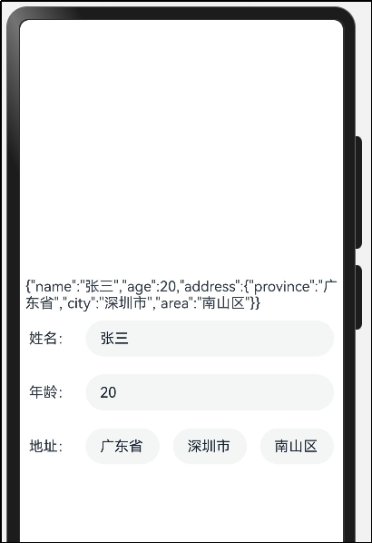
步骤1:先声明一个User类,interface是ArkTS主推的定义对象类型的形式。
interface Address{
province: string
city: string
area: string
}
interface User {
name: string
age: number
address: Address
}
完整代码如下:
interface Address{
province: string
city: string
area: string
}
interface User {
name: string
age: number
address: Address
}
@Entry
@Component
struct StateCase {
@State user: Partial<User> = {
name: '张三',
age: 20,
address: {
province: '广东省',
city: '深圳市',
area: '南山区'
}
}
build() {
Row() {
Column() {
Text(JSON.stringify(this.user))
Row({ space: 15 }) {
Text("姓名:")
TextInput({ text: this.user.name }).layoutWeight(1)
}.padding(10)
Row({ space: 15 }) {
Text("年龄:")
TextInput({ text: this.user.age?.toString() }).layoutWeight(1)
}.padding(10)
Row({ space: 15 }) {
Text("地址:")
TextInput({ text: this.user.address?.province }).layoutWeight(1)
TextInput({ text: this.user.address?.city }).layoutWeight(1)
TextInput({ text: this.user.address?.area }).layoutWeight(1)
}.padding(10)
}
.width('100%')
}
.height('100%')
}
}
点击修改数据按钮,设置新数据
运行效果:
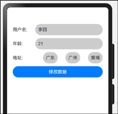
点击修改数据,可以修改用户名
代码如下:
interface IAddress{
province: string
city: string
area: string
}
interface IUserInfo{
username: string
age: number
address: IAddress
}
export class IAddressModel implements IAddress {
province: string = ''
city: string = ''
area: string = ''
constructor(model: IAddress) {
this.province = model.province
this.city = model.city
this.area = model.area
}
}
export class IUserInfoModel implements IUserInfo {
username: string = ''
age: number = 0
address: IAddress = new IAddressModel({} as IAddress)
constructor(model: IUserInfo) {
this.username = model.username
this.age = model.age
this.address = model.address
}
}
@Entry
@Component
struct StateCase2 {
@State
userInfo: IUserInfoModel = new IUserInfoModel({
username: '李四',
age: 21,
address: new IAddressModel({
province: '广东',
city: '广州',
area: '黄埔'
})
})
build() {
Column({space: 10}) {
Row() {
Text('用户名:')
.width(80)
Text(this.userInfo.username).layoutWeight(1)
.borderRadius(40)
.backgroundColor('#ccc')
.height(40)
.padding({ left: 10, right: 10 })
}
.width('100%')
.justifyContent(FlexAlign.SpaceBetween)
Row() {
Text('年龄:')
.width(80)
Text(this.userInfo.age.toString()).layoutWeight(1)
.borderRadius(40)
.backgroundColor('#ccc')
.height(40)
.padding({ left: 10, right: 10 })
}
.width('100%')
.justifyContent(FlexAlign.SpaceBetween)
Row() {
Text('地址:')
.width(80)
Text(this.userInfo.address.province)
.borderRadius(40)
.backgroundColor('#ccc')
.height(40)
.padding({ left: 10, right: 10 })
Text(this.userInfo.address.city)
.borderRadius(40)
.backgroundColor('#ccc')
.height(40)
.padding({ left: 10, right: 10 })
Text(this.userInfo.address.area)
.borderRadius(40)
.backgroundColor('#ccc')
.height(40)
.padding({ left: 10, right: 10 })
}
.width('100%')
.justifyContent(FlexAlign.SpaceBetween)
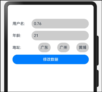
Button('修改数据').width('100%').onClick((event: ClickEvent) => {
this.userInfo.username = Math.random().toFixed(2)
})
}
.padding(20)
.width('100%')
.height('100%')
}
}
大家发现,如果state是一个对象,我们改第一层的数据没问题,但是第二层的数据不触发更新,怎么办?
我们依然可以改第一层的数据。如:
this.userInfo.address.area = '天河'
代码如下:
interface IAddress{
province: string
city: string
area: string
}
interface IUserInfo{
username: string
age: number
address: IAddress
}
export class IAddressModel implements IAddress {
province: string = ''
city: string = ''
area: string = ''
constructor(model: IAddress) {
this.province = model.province
this.city = model.city
this.area = model.area
}
}
export class IUserInfoModel implements IUserInfo {
username: string = ''
age: number = 0
address: IAddress = new IAddressModel({} as IAddress)
constructor(model: IUserInfo) {
this.username = model.username
this.age = model.age
this.address = model.address
}
}
@Entry
@Component
struct StateCase3 {
@State
userInfo: IUserInfoModel = new IUserInfoModel({
username: 'mark',
age: 21,
address: new IAddressModel({
province: '广东',
city: '广州',
area: '黄埔'
})
})
build() {
Column({space: 10}) {
Row() {
Text('用户名:')
.width(80)
Text(this.userInfo.username).layoutWeight(1)
.borderRadius(40)
.backgroundColor('#ccc')
.height(40)
.padding({ left: 10, right: 10 })
}
.width('100%')
.justifyContent(FlexAlign.SpaceBetween)
Row() {
Text('年龄:')
.width(80)
Text(this.userInfo.age.toString()).layoutWeight(1)
.borderRadius(40)
.backgroundColor('#ccc')
.height(40)
.padding({ left: 10, right: 10 })
}
.width('100%')
.justifyContent(FlexAlign.SpaceBetween)
Row() {
Text('地址:')
.width(80)
Text(this.userInfo.address.province)
.borderRadius(40)
.backgroundColor('#ccc')
.height(40)
.padding({ left: 10, right: 10 })
Text(this.userInfo.address.city)
.borderRadius(40)
.backgroundColor('#ccc')
.height(40)
.padding({ left: 10, right: 10 })
Text(this.userInfo.address.area)
.borderRadius(40)
.backgroundColor('#ccc')
.height(40)
.padding({ left: 10, right: 10 })
}
.width('100%')
.justifyContent(FlexAlign.SpaceBetween)
Button('修改数据').width('100%').onClick((event: ClickEvent) => {
this.userInfo.username = Math.random().toFixed(2)
this.userInfo.address.area = '天河'
})
}
.padding(20)
.width('100%')
.height('100%')
}
}
欢迎加入课程班级,考取鸿蒙认证:
https://developer.huawei.com/consumer/cn/training/classDetail/d43582bb30b34f548c16c127cb3be104?type=1?ha_source=hmosclass&ha_sourceId=89000248

讨论HarmonyOS开发技术,专注于API与组件、DevEco Studio、测试、元服务和应用上架分发等。
更多推荐


 21
21 0
0- 0


 已为社区贡献28条内容

所有评论(0)