从入门小白到精通,玩转React Native鸿蒙跨平台开发:Alert提示对话框
Python 的方法解析顺序是基于 C3,这是为 Dylan 编程语言(http://opendylan.org)构建的。在早期版本的 Python 中,所有类并没有一个共同的祖先 object。这里 L[MyClass]是 MyClass 类的线性化,而 merge 是合并多个线性化结果的具体。在 Python 2 中,如果使用的是旧式类(不继承自 object),仍然存在这样的算法。例如,在(
Alert
启动一个提示对话框,包含对应的标题和信息。
你还可以指定一系列的按钮,点击对应的按钮会调用对应的 onPress 回调并且关闭提示框。默认情况下,对话框会仅有一个’确定’按钮。
在React Native中,Alert 组件是用来显示一个原生样式的对话框,通常用来向用户展示信息、警告或者请求输入。Alert 组件是 react-native 库的一部分,因此在使用前需要确保你的项目中已经正确安装并引入了 react-native。
- 引入 Alert
首先,你需要从 react-native 包中引入 Alert 组件:
import { Alert } from 'react-native';
- 使用 Alert
显示一个简单的警告框
Alert.alert(
  'Alert Title',
  'My Alert Msg',
  [
    {text: 'Cancel', onPress: () => console.log('Cancel Pressed'), style: 'cancel'},
    {text: 'OK', onPress: () => console.log('OK Pressed')},
  ],
  { cancelable: false }
);
参数解释:
- title (
string): 对话框的标题。 - message (
string): 对话框的内容文本。 - buttons (
array): 一个按钮数组,每个按钮是一个对象,包含以下属性:- text (
string): 按钮的文本。 - onPress (
function): 点击按钮时触发的回调函数。 - style (
string, optional): 按钮的样式,可选值有'default','cancel','destructive'。默认是'default'。
- text (
- options (
object, optional): 对话框的其他选项,例如:- cancelable (
boolean): 是否可以点击背景来取消对话框,默认为true。 - onDismiss (
function, optional): 对话框被关闭时触发的回调函数。
- cancelable (
- 显示一个带有输入框的警告框
如果你想让用户输入一些信息,可以使用带有输入框的警告框:
Alert.prompt(
  'Prompt Title',
  'Enter your name',
  [
    {text: 'Cancel', onPress: () => console.log('Cancel Pressed'), style: 'cancel'},
    {text: 'OK', onPress: (name) => alert(`Name is ${name}`)},
  ],
  'plain-text', // inputType, 可以是 'plain-text', 'secure-text', 'login-password' 等
  '', // defaultValue, 输入框的默认值
  'keyboardType' // keyboardType, 可以是 'default', 'email-address', 'numeric', 等
);
- 使用 Alert 的高级功能
自定义样式和布局(Android)
对于 Android,你可以通过传递一个 style 属性来自定义对话框的样式:
Alert.alert(
  'Alert Title',
  'My Alert Msg',
  [...], // buttons array
  { cancelable: false, style: 'default' } // 或者 'default', 'cancelableOverlay' (Android only)
);
- 处理异步操作和用户输入
当你在 onPress 回调中执行异步操作(如网络请求)时,确保正确处理 Promise 或使用 async/await:
{text: 'OK', onPress: async () => {
  try {
    const response = await fetch('https://example.com/api/data');
    const data = await response.json();
    console.log(data);
  } catch (error) {
    console.error('Error fetching data:', error);
  }
}}
通过以上步骤,你可以在React Native应用中灵活地使用 Alert 组件来提升用户体验。
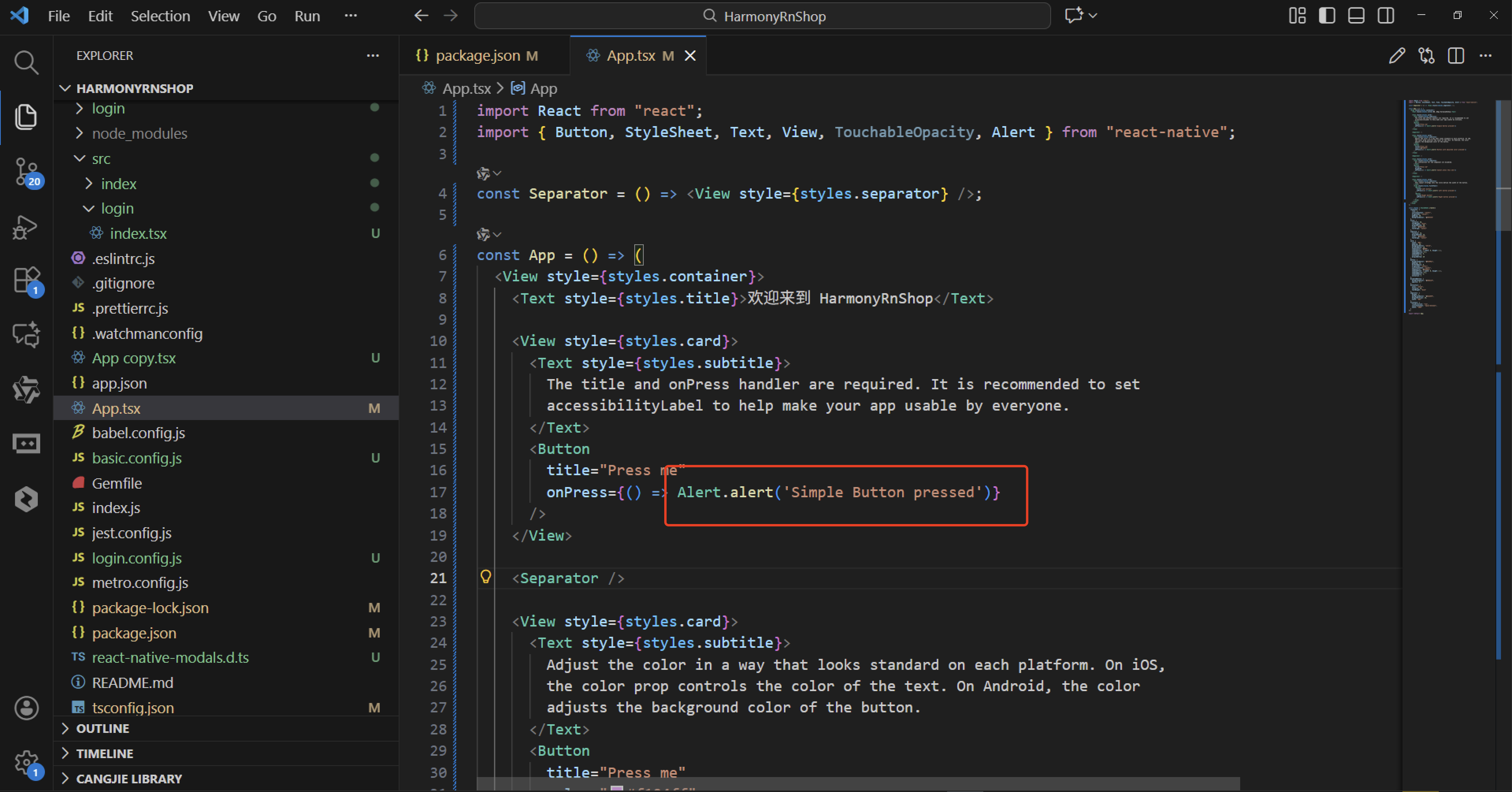
import React from "react";
import { Button, StyleSheet, Text, View, TouchableOpacity, Alert } from "react-native";

const Separator = () => <View style={styles.separator} />;

const App = () => (
  <View style={styles.container}>
    <Text style={styles.title}>欢迎来到 HarmonyRnShop</Text>

    <View style={styles.card}>
      <Text style={styles.subtitle}>
        The title and onPress handler are required. It is recommended to set
        accessibilityLabel to help make your app usable by everyone.
      </Text>
      <Button
        title="Press me"
        onPress={() => Alert.alert('Simple Button pressed')}
      />
    </View>

    <Separator />

    <View style={styles.card}>
      <Text style={styles.subtitle}>
        Adjust the color in a way that looks standard on each platform. On iOS,
        the color prop controls the color of the text. On Android, the color
        adjusts the background color of the button.
      </Text>
      <Button
        title="Press me"
        color="#f194ff"
        onPress={() => Alert.alert('Button with adjusted color pressed')}
      />
    </View>

    <Separator />

    <View style={styles.card}>
      <Text style={styles.subtitle}>
        All interaction for the component are disabled.
      </Text>
      <Button
        title="Press me"
        disabled
        onPress={() => Alert.alert('Cannot press this one')}
      />
    </View>

    <Separator />

    <View style={styles.card}>
      <Text style={styles.subtitle}>
        This layout strategy lets the title define the width of the button.
      </Text>
      <View style={styles.fixToText}>
        <Button
          title="Left button"
          onPress={() => Alert.alert('Left button pressed')}
        />
        <Button
          title="Right button"
          onPress={() => Alert.alert('Right button pressed')}
        />
      </View>
    </View>
  </View>
);

const styles = StyleSheet.create({
  container: {
    flex: 1,
    justifyContent: "center",
    alignItems: "center",
    padding: 20,
    backgroundColor: "#f0f4f8"
  },
  title: {
    fontSize: 28,
    fontWeight: "bold",
    marginBottom: 30,
    color: "#2d3748",
    textAlign: "center"
  },
  subtitle: {
    fontSize: 16,
    marginBottom: 15,
    color: "#4a5568",
    textAlign: "center"
  },
  card: {
    width: "90%",
    padding: 20,
    backgroundColor: "white",
    borderRadius: 10,
    shadowColor: "#000",
    shadowOffset: { width: 0, height: 2 },
    shadowOpacity: 0.1,
    shadowRadius: 6,
    elevation: 3,
    marginBottom: 20
  },
  button: {
    backgroundColor: "#4299e1",
    padding: 15,
    borderRadius: 8,
    alignItems: "center",
    justifyContent: "center",
    shadowColor: "#4299e1",
    shadowOffset: { width: 0, height: 2 },
    shadowOpacity: 0.3,
    shadowRadius: 4,
    elevation: 2
  },
  disabledButton: {
    backgroundColor: "#a0aec0",
    opacity: 0.7
  },
  buttonText: {
    color: "white",
    fontSize: 16,
    fontWeight: "bold"
  },
  separator: {
    height: 1,
    backgroundColor: "#e2e8f0",
    marginVertical: 10,
    width: "80%"
  },
  fixToText: {
    flexDirection: "row",
    justifyContent: "space-between",
    width: "100%"
  }
});

export default App;
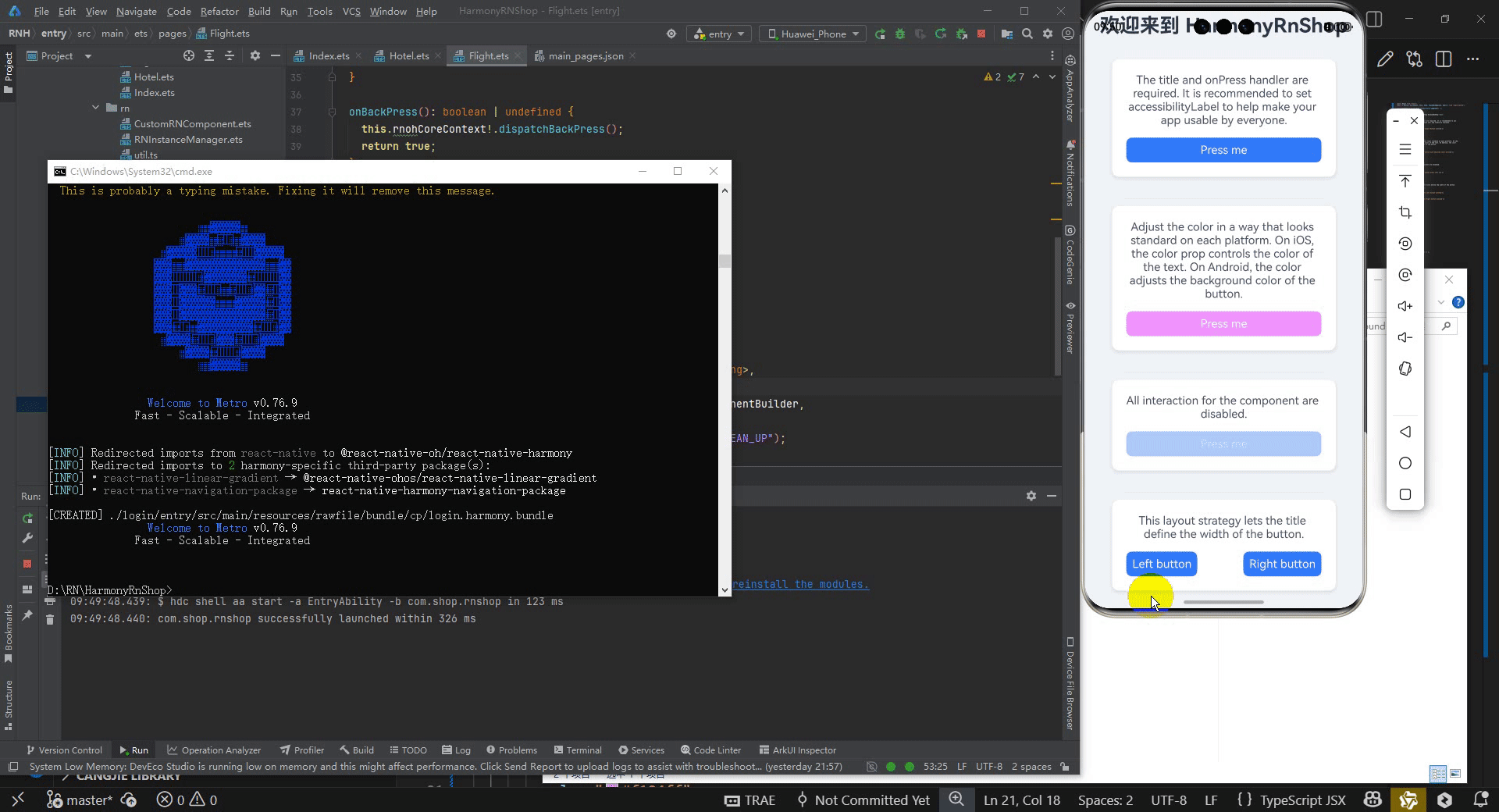
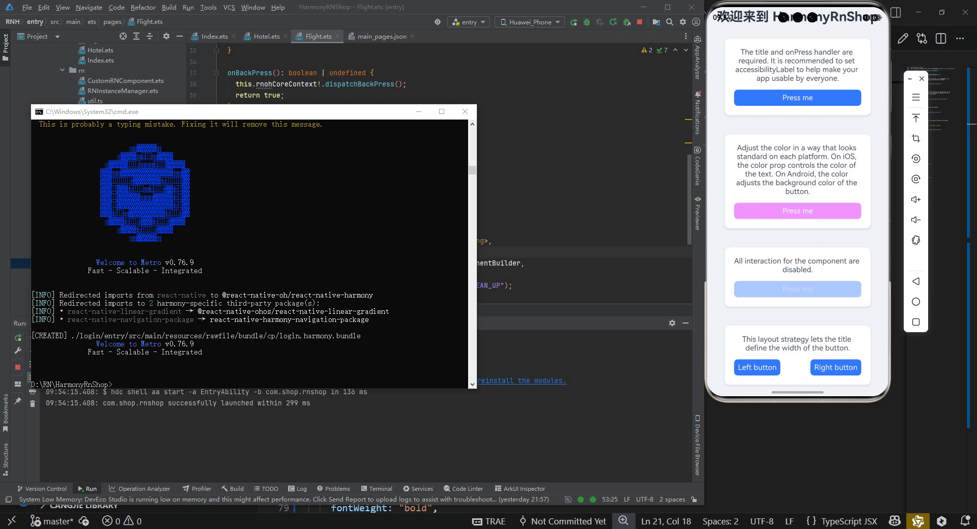
这段React Native代码展示了一个完整的移动应用界面,主要围绕Button组件的各种用法和样式设计展开。代码中使用了函数式组件和箭头函数的简洁语法来构建界面结构,通过StyleSheet创建了统一的外观样式系统。界面布局采用卡片式设计,每个卡片包含说明文本和对应的按钮演示。
在Button组件使用方面,展示了基础按钮功能、自定义颜色属性、禁用状态控制以及并排布局等多种场景。每个按钮都绑定了Alert.alert事件处理函数,用于展示用户交互反馈。样式设计上注重了视觉层次,使用了阴影效果、圆角边框和精心挑选的配色方案来提升用户体验。
代码组织体现了组件化开发思想,Separator组件作为分隔符被复用,样式定义集中管理保证了一致性。整体代码结构清晰,展示了React Native开发中常用的界面构建模式和样式处理技巧。
在鸿蒙OpenHarmony机型上最多能指定三个按钮,这三个按钮分别具有“中间态”、“消极态”和“积极态”的概念:
如果你只指定一个按钮,则它具有“积极态”的属性(比如“确定”);两个按钮,则分别是“消极态”和“积极态”(比如“取消”和“确定”);三个按钮则意味着“中间态”、“消极态”和“积极态”(比如“稍候再说”,“取消”,“确定”)。
在 鸿蒙OpenHarmony机型上可以通过点击提示框的外面来取消提示框,但这一行为默认没有启用。你可以在Options中提供一个额外参数来启用这一行为:{ cancelable: true }。
还可以通过在options中添加onDismiss回调函数来捕获用户的取消操作:{ onDismiss: () => {} }。
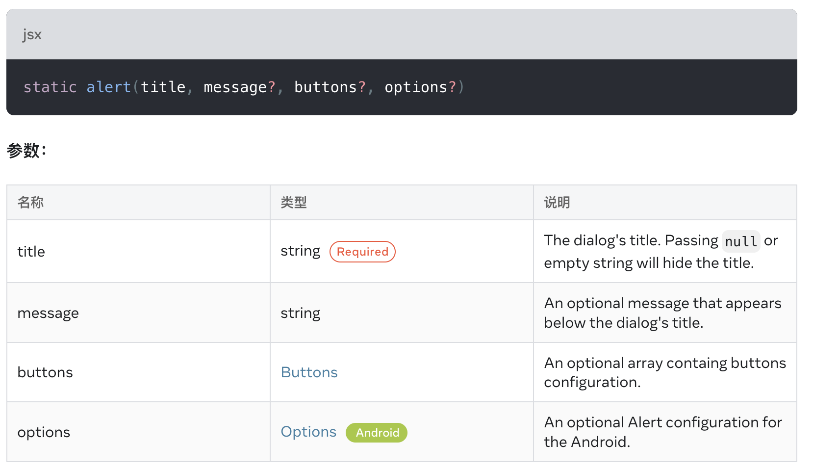
alert()
static alert(title, message?, buttons?, options?)
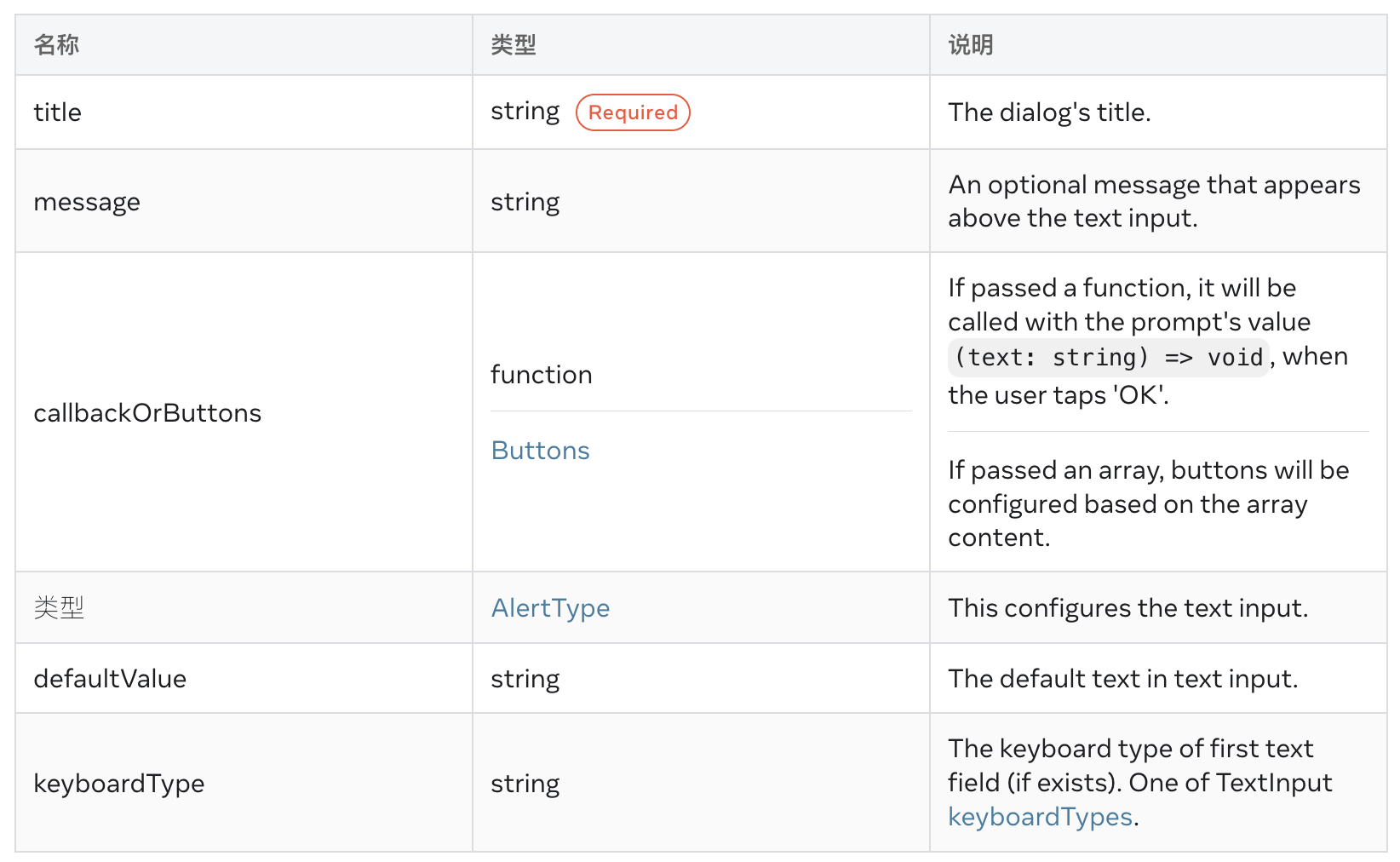
prompt() iOS
static prompt(title, message?, callbackOrButtons?, type?, defaultValue?, keyboardType?)
Create and display a prompt to enter some text in form of Alert.
打包
接下来通过打包命令npn run harmony将reactNative的代码打包成为bundle,这样可以进行在开源鸿蒙OpenHarmony中进行使用。
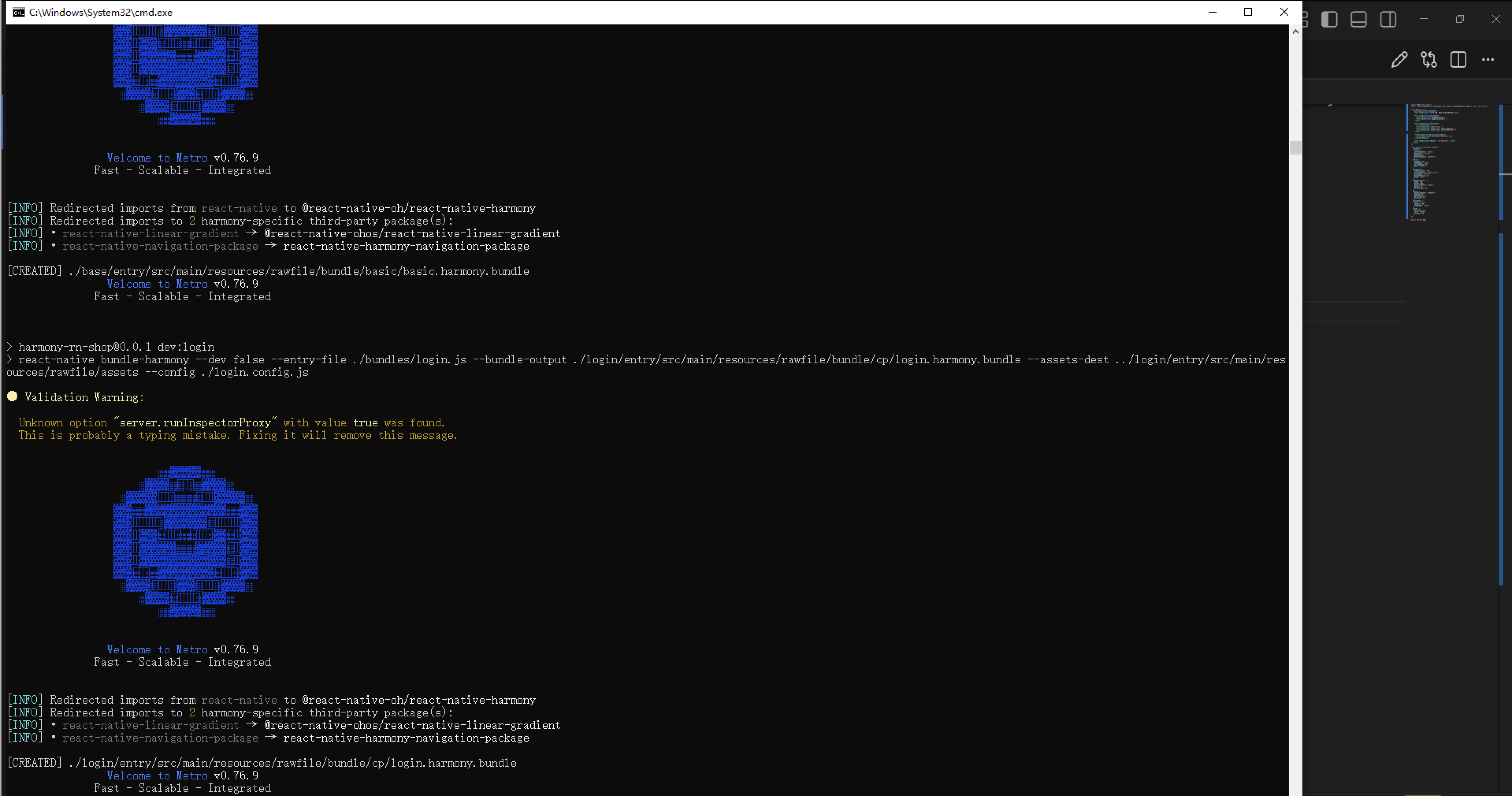
最后运行效果图如下显示:

讨论HarmonyOS开发技术,专注于API与组件、DevEco Studio、测试、元服务和应用上架分发等。
更多推荐


 23
23 0
0- 0


 已为社区贡献27条内容

所有评论(0)