React Native跨平台技术在开源鸿蒙中记录存储(AsyncStorage 或远程数据库)和进度条展示(ProgressBarHarmony / ProgressViewHarmony)使用
React Native 开发鸿蒙组件及在线教育平台实现摘要 本文介绍了使用 React Native 开发兼容鸿蒙系统的在线教育平台的关键步骤。主要内容包括: 项目初始化:使用 React Native CLI 创建基础项目结构 鸿蒙适配: 使用 HarmonyOS React Native SDK 配置 build.gradle 支持鸿蒙环境 通过 NativeModules 调用鸿蒙特有 A
React Native 开发鸿蒙组件及在线教育平台的实现是一个复杂的项目,通常涉及多个模块和组件的协同工作。由于你提到了“鸿组件”和“在线教育平台分析”,我会假设你需要一个基于 React Native 的跨平台应用,能够在鸿蒙系统上运行,并具备在线教育平台的基本功能(如课程展示、学习进度跟踪、用户管理等)。
以下是开发此类应用的关键步骤和代码结构建议:
1. 项目初始化
首先,使用 React Native CLI 或 Expo 初始化项目:
npx react-native init OnlineEducationApp
2. 鸿蒙适配
为了确保应用能在鸿蒙系统上运行,需关注以下几点:
- 使用鸿蒙支持的 React Native 版本(HarmonyOS React Native SDK)。
- 配置 build.gradle 文件以支持鸿蒙环境。
- 使用鸿蒙特有的 API(如分布式能力)时,需调用鸿蒙原生模块。
3. 核心功能模块
a. 用户认证模块
- 登录/注册页面
- 用户信息存储(可集成 Firebase 或本地存储)
// 示例:用户登录功能
const handleLogin = async (email, password) => {
  try {
    const response = await auth().signInWithEmailAndPassword(email, password);
    console.log('User signed in!', response.user);
  } catch (error) {
    console.error('Login failed:', error.message);
  }
};
b. 课程展示模块
- 课程列表(FlatList 或 SectionList)
- 课程详情页(包含视频播放、课件下载等)
// 示例:课程列表渲染
<FlatList
  data={courses}
  renderItem={({ item }) => (
    <CourseCard
      title={item.title}
      description={item.description}
      onPress={() => navigation.navigate('CourseDetail', { courseId: item.id })}
    />
  )}
  keyExtractor={(item) => item.id.toString()}
/>
c. 学习进度跟踪
- 学习记录存储(AsyncStorage 或远程数据库)
- 进度条展示(ProgressBarHarmony / ProgressViewHarmony)
// 示例:更新学习进度
const updateProgress = async (courseId, progress) => {
  try {
    await AsyncStorage.setItem(`progress_${courseId}`, JSON.stringify(progress));
  } catch (error) {
    console.error('Failed to save progress:', error);
  }
};
d. 数据分析模块
- 用户行为分析(如观看时长、完成率)
- 图表展示(可使用 react-native-chart-kit)
// 示例:展示学习数据图表
<BarChart
  data={{
    labels: ['周一', '周二', '周三', '周四', '周五'],
    datasets: [{ data: [20, 45, 28, 80, 99] }],
  }}
  width={Dimensions.get('window').width - 20}
  height={220}
  chartConfig={chartConfig}
/>
- 鸿蒙特有功能集成
如果需要利用鸿蒙系统的分布式能力或其他特性,可通过原生模块桥接实现:
- 创建鸿蒙原生模块(Java/Kotlin)
- 通过 React Native 的 NativeModules 调用
- 依赖管理
确保项目依赖项正确配置,例如:
"dependencies": {
  "react": "18.2.0",
  "react-native": "0.72.0",
  "react-native-chart-kit": "^6.12.0",
  "@react-navigation/native": "^6.1.0",
  "@react-navigation/stack": "^6.3.0"
}
- 项目结构建议
OnlineEducationApp/
├── src/
│   ├── components/       # 公共组件(如 CourseCard、ProgressBar)
│   ├── screens/          # 页面(如 LoginScreen、HomeScreen)
│   ├── services/         # 数据服务(API 请求、本地存储)
│   └── utils/            # 工具函数(如时间格式化)
├── App.js               # 应用入口
└── package.json         # 依赖配置
- 部署与测试
- 使用鸿蒙 DevEco Studio 进行调试和打包。
- 测试跨平台兼容性(Harmony、Harmony、鸿蒙)。
以上是开发 React Native 鸿蒙组件及在线教育平台的核心思路和代码示例。若需更详细的模块实现或特定功能(如视频播放、离线缓存),可进一步细化需求。
真实场景案例场景演示:
// app.tsx
import React, { useState } from 'react';
import { SafeAreaView, View, Text, StyleSheet, TouchableOpacity, ScrollView, Modal } from 'react-native';
// 图标库(使用文本替代SVG)
const ICONS = {
home: '🏠',
career: '💼',
goals: '🎯',
skills: '💪',
timeline: '📅',
info: 'ℹ',
close: '✕',
up: '📈',
network: '🌐',
education: '🎓',
experience: '🏆',
plan: '📝',
progress: '📊',
mentor: '👨🏫'
};
// 职业发展数据
const CAREER_DATA = [
{ id: 1, title: '初级工程师', level: 1, duration: '0-2年', description: '学习基础技能,积累经验' },
{ id: 2, title: '中级工程师', level: 2, duration: '2-5年', description: '承担责任,提升技术深度' },
{ id: 3, title: '高级工程师', level: 3, duration: '5-8年', description: '技术专家,指导他人' },
{ id: 4, title: '技术主管', level: 4, duration: '8-10年', description: '团队管理,技术决策' }
];
const CareerPlan: React.FC = () => {
const [selectedCareer, setSelectedCareer] = useState<any>(null);
const [modalVisible, setModalVisible] = useState(false);
const [infoModalVisible, setInfoModalVisible] = useState(false);
const [activeTab, setActiveTab] = useState('home');
// 渲染图标
const renderIcon = (iconName: string, style: any) => {
return (
<Text style={[styles.iconText, style]}>
{ICONS[iconName as keyof typeof ICONS] || '□'}
</Text>
);
};
// 显示职业详情
const showCareerDetails = (career: any) => {
setSelectedCareer(career);
setModalVisible(true);
};
return (
<SafeAreaView style={styles.container}>
<View style={styles.header}>
<Text style={styles.title}>💼 职业发展规划</Text>
<Text style={styles.subtitle}>规划您的职业发展路径</Text>
<TouchableOpacity
style={styles.infoButton}
onPress={() => setInfoModalVisible(true)}
>
{renderIcon('info', styles.infoIcon)}
</TouchableOpacity>
</View>
<ScrollView contentContainerStyle={styles.content}>
{activeTab === 'home' && (
<View>
<View style={styles.welcomeCard}>
<Text style={styles.welcomeTitle}>欢迎来到职业规划中心</Text>
<Text style={styles.welcomeText}>制定您的职业发展计划,实现事业目标</Text>
</View>
<View style={styles.sectionTitleContainer}>
<Text style={styles.sectionTitle}>职业发展路径</Text>
<Text style={styles.sectionSubtitle}>4个发展阶段</Text>
</View>
<View style={styles.careerList}>
{CAREER_DATA.map((career) => (
<TouchableOpacity
key={career.id}
style={styles.careerCard}
onPress={() => showCareerDetails(career)}
>
<View style={styles.levelIndicator}>
<Text style={styles.levelText}>{career.level}</Text>
</View>
<View style={styles.careerInfo}>
<Text style={styles.careerTitle}>{career.title}</Text>
<Text style={styles.careerDuration}>{career.duration}</Text>
<Text style={styles.careerDescription}>{career.description}</Text>
</View>
<TouchableOpacity
style={styles.careerButton}
onPress={() => showCareerDetails(career)}
>
<Text style={styles.careerButtonText}>查看详情</Text>
</TouchableOpacity>
</TouchableOpacity>
))}
</View>
</View>
)}
{activeTab === 'goals' && (
<View style={styles.tabContent}>
<Text style={styles.tabTitle}>职业目标</Text>
<View style={styles.goalsCard}>
<View style={styles.goalItem}>
<Text style={styles.goalIcon}>{renderIcon('up', {})}</Text>
<Text style={styles.goalText}>短期目标:1年内晋升为中级工程师</Text>
</View>
<View style={styles.goalItem}>
<Text style={styles.goalIcon}>{renderIcon('up', {})}</Text>
<Text style={styles.goalText}>中期目标:3年内成为技术专家</Text>
</View>
<View style={styles.goalItem}>
<Text style={styles.goalIcon}>{renderIcon('up', {})}</Text>
<Text style={styles.goalText}>长期目标:5年内担任技术主管</Text>
</View>
</View>
</View>
)}
{activeTab === 'skills' && (
<View style={styles.tabContent}>
<Text style={styles.tabTitle}>技能发展</Text>
<View style={styles.skillsCard}>
<View style={styles.skillItem}>
<Text style={styles.skillIcon}>{renderIcon('network', {})}</Text>
<Text style={styles.skillText}>技术能力</Text>
<Text style={styles.skillLevel}>高级</Text>
</View>
<View style={styles.skillItem}>
<Text style={styles.skillIcon}>{renderIcon('network', {})}</Text>
<Text style={styles.skillText}>沟通能力</Text>
<Text style={styles.skillLevel}>中级</Text>
</View>
<View style={styles.skillItem}>
<Text style={styles.skillIcon}>{renderIcon('network', {})}</Text>
<Text style={styles.skillText}>领导力</Text>
<Text style={styles.skillLevel}>初级</Text>
</View>
</View>
</View>
)}
</ScrollView>
<View style={styles.tabBar}>
<TouchableOpacity
style={[styles.tabButton, activeTab === 'home' && styles.activeTab]}
onPress={() => setActiveTab('home')}
>
{renderIcon('home', styles.tabIcon)}
<Text style={[styles.tabText, activeTab === 'home' && styles.activeTabText]}>首页</Text>
</TouchableOpacity>
<TouchableOpacity
style={[styles.tabButton, activeTab === 'goals' && styles.activeTab]}
onPress={() => setActiveTab('goals')}
>
{renderIcon('goals', styles.tabIcon)}
<Text style={[styles.tabText, activeTab === 'goals' && styles.activeTabText]}>目标</Text>
</TouchableOpacity>
<TouchableOpacity
style={[styles.tabButton, activeTab === 'skills' && styles.activeTab]}
onPress={() => setActiveTab('skills')}
>
{renderIcon('skills', styles.tabIcon)}
<Text style={[styles.tabText, activeTab === 'skills' && styles.activeTabText]}>技能</Text>
</TouchableOpacity>
</View>
{/* 职业详情模态框 */}
<Modal
animationType="slide"
transparent={true}
visible={modalVisible}
onRequestClose={() => setModalVisible(false)}
>
<View style={styles.modalOverlay}>
<View style={styles.modalContent}>
<View style={styles.modalHeader}>
<Text style={styles.modalTitle}>{selectedCareer?.title} 详情</Text>
<TouchableOpacity onPress={() => setModalVisible(false)}>
<Text style={styles.closeButton}>{renderIcon('close', {})}</Text>
</TouchableOpacity>
</View>
{selectedCareer && (
<ScrollView style={styles.modalBody}>
<View style={styles.detailItem}>
<Text style={styles.detailLabel}>发展阶段:</Text>
<Text style={styles.detailValue}>{selectedCareer.level}</Text>
</View>
<View style={styles.detailItem}>
<Text style={styles.detailLabel}>持续时间:</Text>
<Text style={styles.detailValue}>{selectedCareer.duration}</Text>
</View>
<View style={styles.detailItem}>
<Text style={styles.detailLabel}>主要职责:</Text>
<Text style={styles.detailValue}>{selectedCareer.description}</Text>
</View>
<View style={styles.detailItem}>
<Text style={styles.detailLabel}>所需技能:</Text>
<Text style={styles.detailValue}>根据具体岗位而定</Text>
</View>
<View style={styles.detailItem}>
<Text style={styles.detailLabel}>发展目标:</Text>
<Text style={styles.detailValue}>达到该阶段预期目标</Text>
</View>
<View style={styles.actionButtons}>
<TouchableOpacity style={styles.actionButton}>
<Text style={styles.actionButtonText}>设置提醒</Text>
</TouchableOpacity>
<TouchableOpacity style={styles.actionButton}>
<Text style={styles.actionButtonText}>制定计划</Text>
</TouchableOpacity>
</View>
</ScrollView>
)}
</View>
</View>
</Modal>
{/* 应用说明模态框 */}
<Modal
animationType="slide"
transparent={true}
visible={infoModalVisible}
onRequestClose={() => setInfoModalVisible(false)}
>
<View style={styles.modalOverlay}>
<View style={styles.infoModalContent}>
<View style={styles.modalHeader}>
<Text style={styles.modalTitle}>职业发展规划助手</Text>
<TouchableOpacity onPress={() => setInfoModalVisible(false)}>
<Text style={styles.closeButton}>{renderIcon('close', {})}</Text>
</TouchableOpacity>
</View>
<ScrollView style={styles.infoModalBody}>
<Text style={styles.infoTitle}>功能介绍</Text>
<Text style={styles.infoText}>
• 职业发展路径规划{'\n'}
• 目标设定与追踪{'\n'}
• 技能评估与发展{'\n'}
• 时间线管理
</Text>
<Text style={styles.infoSubtitle}>规划建议</Text>
<Text style={styles.infoText}>
• 设定短期和长期目标{'\n'}
• 持续学习新技能{'\n'}
• 建立行业人脉{'\n'}
• 定期评估进展
</Text>
<Text style={styles.infoSubtitle}>成功要素</Text>
<Text style={styles.infoText}>
• 明确职业方向{'\n'}
• 不断提升技能{'\n'}
• 积极寻找机会{'\n'}
• 寻找导师指导
</Text>
</ScrollView>
</View>
</View>
</Modal>
</SafeAreaView>
);
};
const styles = StyleSheet.create({
container: {
flex: 1,
backgroundColor: '#f0f7ff',
},
header: {
paddingTop: 30,
paddingBottom: 20,
paddingHorizontal: 20,
backgroundColor: '#ffffff',
borderBottomWidth: 1,
borderBottomColor: '#c7d9f0',
flexDirection: 'row',
justifyContent: 'space-between',
alignItems: 'center',
},
title: {
fontSize: 22,
fontWeight: 'bold',
color: '#1e40af',
},
subtitle: {
fontSize: 13,
color: '#1e3a8a',
marginTop: 4,
},
infoButton: {
width: 36,
height: 36,
borderRadius: 18,
backgroundColor: '#c7d9f0',
alignItems: 'center',
justifyContent: 'center',
},
infoIcon: {
fontSize: 20,
color: '#1e3a8a',
},
iconText: {
fontSize: 20,
},
content: {
padding: 16,
paddingBottom: 80, // 为底部标签栏留出空间
},
welcomeCard: {
backgroundColor: '#dbeafe',
borderRadius: 16,
padding: 20,
marginBottom: 20,
elevation: 4,
shadowColor: '#000',
shadowOffset: { width: 0, height: 2 },
shadowOpacity: 0.1,
shadowRadius: 8,
},
welcomeTitle: {
fontSize: 18,
fontWeight: 'bold',
color: '#1e40af',
marginBottom: 8,
},
welcomeText: {
fontSize: 14,
color: '#1e3a8a',
},
sectionTitleContainer: {
marginBottom: 15,
},
sectionTitle: {
fontSize: 18,
fontWeight: 'bold',
color: '#1e40af',
marginBottom: 5,
},
sectionSubtitle: {
fontSize: 14,
color: '#1e3a8a',
},
careerList: {
// Career list styles
},
careerCard: {
backgroundColor: '#ffffff',
borderRadius: 12,
padding: 15,
marginBottom: 12,
flexDirection: 'row',
alignItems: 'center',
elevation: 2,
shadowColor: '#000',
shadowOffset: { width: 0, height: 1 },
shadowOpacity: 0.1,
shadowRadius: 4,
},
levelIndicator: {
width: 40,
height: 40,
borderRadius: 20,
backgroundColor: '#dbeafe',
alignItems: 'center',
justifyContent: 'center',
marginRight: 15,
},
levelText: {
fontSize: 16,
fontWeight: 'bold',
color: '#1e40af',
},
careerInfo: {
flex: 1,
},
careerTitle: {
fontSize: 16,
fontWeight: 'bold',
color: '#1e40af',
},
careerDuration: {
fontSize: 14,
color: '#1e3a8a',
marginTop: 4,
},
careerDescription: {
fontSize: 14,
color: '#374151',
marginTop: 4,
},
careerButton: {
backgroundColor: '#3b82f6',
paddingHorizontal: 15,
paddingVertical: 8,
borderRadius: 8,
},
careerButtonText: {
color: '#ffffff',
fontWeight: 'bold',
},
tabContent: {
// Tab content styles
},
tabTitle: {
fontSize: 20,
fontWeight: 'bold',
color: '#1e40af',
marginBottom: 15,
},
goalsCard: {
backgroundColor: '#ffffff',
borderRadius: 16,
padding: 20,
marginBottom: 15,
elevation: 4,
shadowColor: '#000',
shadowOffset: { width: 0, height: 2 },
shadowOpacity: 0.1,
shadowRadius: 8,
},
goalItem: {
flexDirection: 'row',
alignItems: 'center',
marginBottom: 15,
},
goalIcon: {
fontSize: 24,
marginRight: 15,
},
goalText: {
fontSize: 14,
color: '#1e3a8a',
flex: 1,
},
skillsCard: {
backgroundColor: '#ffffff',
borderRadius: 16,
padding: 20,
marginBottom: 15,
elevation: 4,
shadowColor: '#000',
shadowOffset: { width: 0, height: 2 },
shadowOpacity: 0.1,
shadowRadius: 8,
},
skillItem: {
flexDirection: 'row',
alignItems: 'center',
marginBottom: 15,
},
skillIcon: {
fontSize: 24,
marginRight: 15,
},
skillText: {
fontSize: 14,
color: '#1e3a8a',
flex: 1,
},
skillLevel: {
fontSize: 14,
color: '#3b82f6',
fontWeight: 'bold',
},
tabBar: {
flexDirection: 'row',
backgroundColor: '#ffffff',
borderTopWidth: 1,
borderTopColor: '#c7d9f0',
paddingVertical: 10,
position: 'absolute',
bottom: 0,
left: 0,
right: 0,
},
tabButton: {
flex: 1,
alignItems: 'center',
paddingVertical: 8,
},
activeTab: {
backgroundColor: '#dbeafe',
borderRadius: 10,
marginHorizontal: 8,
},
tabIcon: {
fontSize: 20,
marginBottom: 4,
},
tabText: {
fontSize: 12,
color: '#1e3a8a',
},
activeTabText: {
color: '#1e40af',
fontWeight: 'bold',
},
modalOverlay: {
flex: 1,
backgroundColor: 'rgba(0, 0, 0, 0.5)',
justifyContent: 'center',
alignItems: 'center',
},
modalContent: {
backgroundColor: '#ffffff',
width: '90%',
height: '60%',
borderRadius: 20,
overflow: 'hidden',
},
infoModalContent: {
backgroundColor: '#ffffff',
width: '90%',
height: '50%',
borderRadius: 20,
overflow: 'hidden',
},
modalHeader: {
flexDirection: 'row',
justifyContent: 'space-between',
alignItems: 'center',
padding: 20,
borderBottomWidth: 1,
borderBottomColor: '#c7d9f0',
backgroundColor: '#f0f7ff',
},
modalTitle: {
fontSize: 20,
fontWeight: 'bold',
color: '#1e40af',
},
closeButton: {
fontSize: 30,
color: '#93c5fd',
fontWeight: '200',
},
modalBody: {
flex: 1,
padding: 20,
},
infoModalBody: {
flex: 1,
padding: 20,
},
detailItem: {
marginBottom: 15,
},
detailLabel: {
fontSize: 14,
color: '#1e40af',
fontWeight: '600',
marginBottom: 4,
},
detailValue: {
fontSize: 14,
color: '#1e3a8a',
backgroundColor: '#f0f7ff',
padding: 10,
borderRadius: 6,
},
actionButtons: {
flexDirection: 'row',
justifyContent: 'space-between',
marginTop: 20,
},
actionButton: {
backgroundColor: '#3b82f6',
paddingHorizontal: 15,
paddingVertical: 10,
borderRadius: 8,
flex: 1,
marginHorizontal: 5,
},
actionButtonText: {
color: '#ffffff',
fontWeight: 'bold',
textAlign: 'center',
},
infoTitle: {
fontSize: 20,
fontWeight: 'bold',
color: '#1e40af',
marginBottom: 15,
textAlign: 'center',
},
infoText: {
fontSize: 15,
color: '#1e3a8a',
lineHeight: 22,
marginBottom: 15,
},
infoSubtitle: {
fontSize: 17,
fontWeight: 'bold',
color: '#1e40af',
marginBottom: 10,
},
});
export default CareerPlan;
这段代码是一个React Native应用的职业发展规划界面,展示了职业发展路径、目标设定和技能发展三个主要功能模块。
从鸿蒙角度分析,虽然这是React Native代码,但华为鸿蒙系统对React Native有良好的支持。在鸿蒙环境下运行此代码需要注意以下几点:
鸿蒙系统兼容性:代码使用了React Native标准组件如SafeAreaView、ScrollView、TouchableOpacity等,这些在鸿蒙系统上都能正常运行。鸿蒙通过ArkTS和ArkUI提供了类似的能力,但在React Native框架下仍使用原有API。
状态管理机制:useState钩子用于管理组件状态(选中的职业、模态框可见性、活动标签),这与鸿蒙的@State装饰器概念相似,都是响应式状态管理。
UI渲染原理:职业发展数据通过map函数渲染成列表项,每个职业卡片包含等级指示器、信息展示和操作按钮。在鸿蒙环境中,这种动态列表渲染同样适用。
图标渲染函数:renderIcon方法根据图标名称返回对应符号,这是一种简单的图标系统实现方式,在鸿蒙开发中也可以采用类似的自定义图标处理。
导航结构:通过activeTab状态控制不同内容区域的显示,实现了底部tab切换效果,符合鸿蒙应用常见的导航模式。
样式适配:虽然未显示具体样式定义,但React Native的StyleSheet在鸿蒙平台上也能良好工作,确保UI在不同设备上正确显示。
若要在鸿蒙生态中实现类似功能,可以考虑使用HarmonyOS的ArkTS和ArkUI框架,利用Column、Row、ForEach等声明式组件构建界面,通过@State管理状态变化,实现相同的职业规划应用功能。
打包
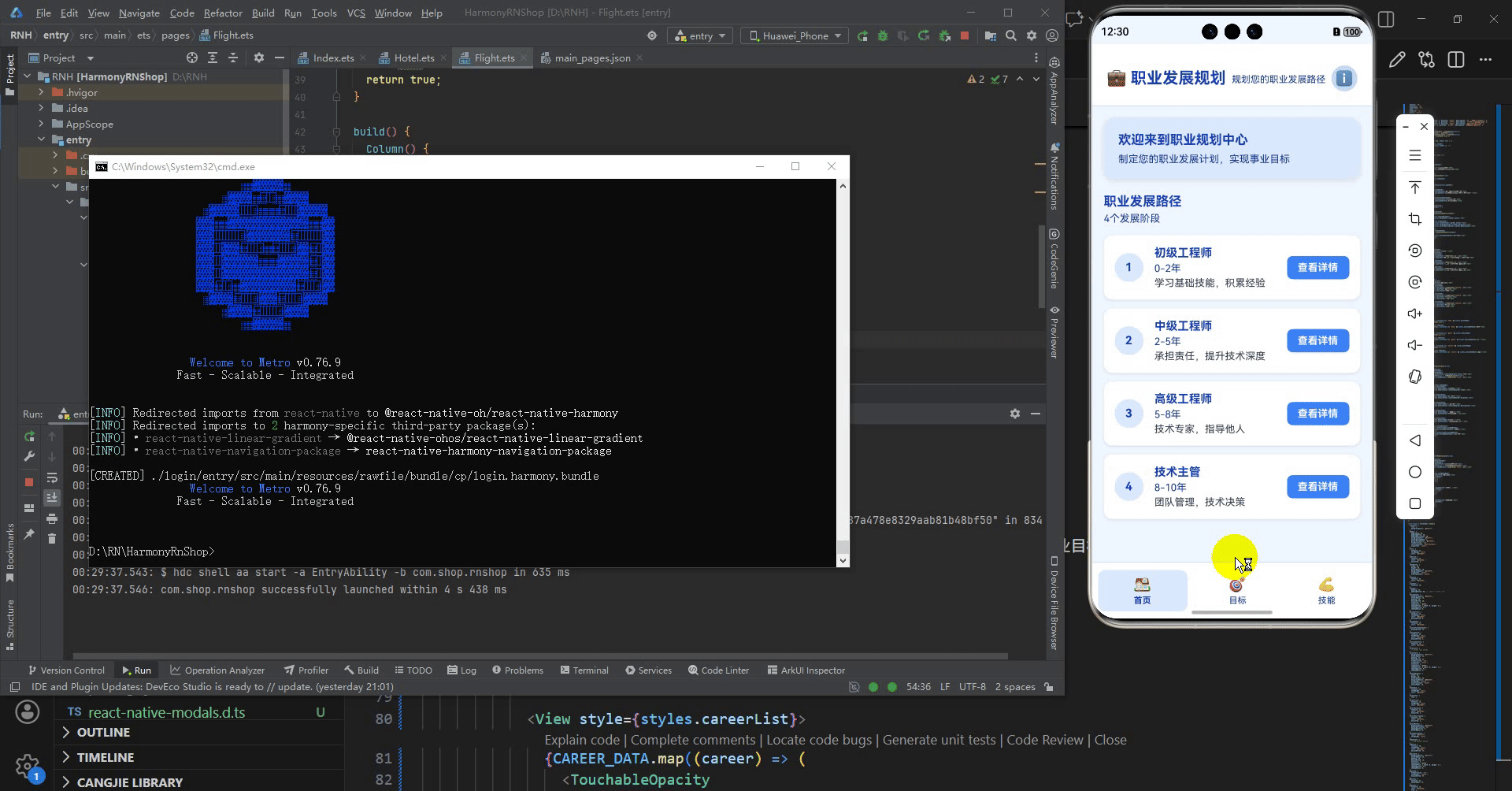
接下来通过打包命令npn run harmony将reactNative的代码打包成为bundle,这样可以进行在开源鸿蒙OpenHarmony中进行使用。

打包之后再将打包后的鸿蒙OpenHarmony文件拷贝到鸿蒙的DevEco-Studio工程目录去:

最后运行效果图如下显示:
欢迎大家加入开源鸿蒙跨平台开发者社区,一起共建开源鸿蒙跨平台生态。

讨论HarmonyOS开发技术,专注于API与组件、DevEco Studio、测试、元服务和应用上架分发等。
更多推荐


 9
9 0
0- 0


 已为社区贡献23条内容

所有评论(0)