鸿蒙API13开发【按钮与选择SegmentButton】ArkTS组件
分段按钮组件,包含页签类分段按钮、单选类分段按钮、多选类分段按钮。
分段按钮组件,包含页签类分段按钮、单选类分段按钮、多选类分段按钮。
说明
该组件及其子组件从 API Version 11 开始支持。后续版本如有新增内容,则采用上角标单独标记该内容的起始版本。
导入模块
import { SegmentButton, SegmentButtonOptions, SegmentButtonItemOptionsArray } from '@kit.ArkUI';
子组件
无
SegmentButton
SegmentButton({ options: SegmentButtonOptions, selectedIndexes: number[], onItemClicked?: Callback })
装饰器类型: @Component
元服务API: 从API version 12开始,该接口支持在元服务中使用。
系统能力: SystemCapability.ArkUI.ArkUI.Full
| 名称 | 类型 | 必填 | 装饰器类型 | 说明 |
|---|---|---|---|---|
| options | [SegmentButtonOptions] | 是 | @ObjectLink | 分段按钮选项。 |
| selectedIndexes | number[] | 是 | @Link | 分段按钮的选中项编号,第一项的编号为0,之后顺序增加。**说明:**selectedIndexes使用[@Link装饰器:父子双向同步],仅支持有效的按钮编号(第一个按钮编号为0,之后按顺序累加),如没有选中项可传入空数组[]。 |
| onItemClicked13+ | Callback | 否 | - | 当分段按钮选项被点击时触发的回调函数,回调入参为被点击的选项下标。元服务API: 从API version 13开始,该接口支持在元服务中使用。 |
说明
分段按钮组件不支持通用属性。分段按钮组件使用当前区域可使用的最大宽度做为组件宽度,并且根据按钮个数平均分配每个按钮宽度;分段按钮组件高度根据按钮内容(文本及图片)自动适应,其最小高度为28vp。
SegmentButtonOptions
分段按钮选项类,用于为分段按钮提供初始数据和自定义属性。
属性
装饰器类型: @Observed
元服务API: 从API version 12开始,该接口支持在元服务中使用。
系统能力: SystemCapability.ArkUI.ArkUI.Full
| 名称 | 类型 | 必填 | 说明 |
|---|---|---|---|
| type | ‘tab’ | ‘capsule’ | 是 |
| multiply | boolean | 是 | 是否可以多选。**说明:**页签类分段按钮只支持单选,设置multiply为true不生效。 |
| buttons | [SegmentButtonItemOptionsArray] | 是 | 按钮信息,包括图标和文本信息。 |
| fontColor | [ResourceColor] | 是 | 按钮未选中态的文本颜色。默认值:$r(‘sys.color.ohos_id_color_text_secondary’) |
| selectedFontColor | [ResourceColor] | 是 | 按钮选中态的文本颜色。type为"tab"时,默认值为 r ( ′ s y s . c o l o r . o h o s i d c o l o r t e x t p r i m a r y ′ ) 。 t y p e 为 " c a p s u l e " 时,默认值为 r('sys.color.ohos_id_color_text_primary')。type为"capsule"时,默认值为 r(′sys.color.ohosidcolortextprimary′)。type为"capsule"时,默认值为r(‘sys.color.ohos_id_color_foreground_contrary’)。 |
| fontSize | [DimensionNoPercentage] | 是 | 按钮未选中态的字体大小(不支持百分比设置)。默认值:$r(‘sys.float.ohos_id_text_size_body2’) |
| selectedFontSize | [DimensionNoPercentage] | 是 | 按钮选中态的字体大小(不支持百分比设置)。默认值:$r(‘sys.float.ohos_id_text_size_body2’) |
| fontWeight | [FontWeight] | 是 | 按钮未选中态的字体粗细。默认值:FontWeight.Regular |
| selectedFontWeight | [FontWeight] | 是 | 按钮选中态的字体粗细。默认值:FontWeight.Medium。 |
| backgroundColor | [ResourceColor] | 是 | 底板颜色。默认值:$r(‘sys.color.ohos_id_color_button_normal’) |
| selectedBackgroundColor | [ResourceColor] | 是 | 按钮选中态底板颜色。type为"tab"时,默认值为 r ( ′ s y s . c o l o r . o h o s i d c o l o r f o r e g r o u n d c o n t r a r y ′ ) 。 t y p e 为 " c a p s u l e " 时,默认值为 r('sys.color.ohos_id_color_foreground_contrary')。type为"capsule"时,默认值为 r(′sys.color.ohosidcolorforegroundcontrary′)。type为"capsule"时,默认值为r(‘sys.color.ohos_id_color_emphasize’)。 |
| imageSize | [SizeOptions] | 是 | 图片尺寸,默认值:{ width: 24, height: 24 }。**说明:**imageSize属性对仅图标按钮和图标+文本按钮生效,对仅文字按钮无效果。 |
| buttonPadding | [Padding] | [Dimension] | 是 |
| textPadding | [Padding] | [Dimension] | 是 |
| localizedButtonPadding12+ | [LocalizedPadding] | 否 | 按钮内边距,默认值:仅图标按钮和仅文字按钮{ top: LengthMetrics.vp(4), end: LengthMetrics.vp(8), bottom: LengthMetrics.vp(4), start: LengthMetrics.vp(8) },图标+文本按钮{ top: LengthMetrics.vp(6), end: LengthMetrics.vp(8), bottom: LengthMetrics.vp(6), start: LengthMetrics.vp(8) }。 |
| localizedTextPadding12+ | [LocalizedPadding] | 否 | 文本内边距。默认值:0 |
| direction12+ | [Direction] | 否 | 布局方向。默认值:Direction.Auto |
| backgroundBlurStyle | [BlurStyle] | 是 | 背景模糊材质。默认值:BlurStyle.NONE |
constructor
constructor(options: TabSegmentButtonOptions | CapsuleSegmentButtonOptions)
构造函数。
元服务API: 从API version 12开始,该接口支持在元服务中使用。
系统能力: SystemCapability.ArkUI.ArkUI.Full
| 名称 | 类型 | 必填 | 说明 |
|---|---|---|---|
| options | [TabSegmentButtonOptions] | [CapsuleSegmentButtonOptions] | 是 |
tab
static tab(options: TabSegmentButtonConstructionOptions): SegmentButtonOptions
创建页签类的SegmentButtonOptions。
元服务API: 从API version 12开始,该接口支持在元服务中使用。
系统能力: SystemCapability.ArkUI.ArkUI.Full
| 名称 | 类型 | 必填 | 说明 |
|---|---|---|---|
| options | [TabSegmentButtonConstructionOptions] | 是 | 页签类分段按钮信息。 |
返回值:
| 类型 | 说明 |
|---|---|
| [SegmentButtonOptions] | 分段按钮选项。 |
capsule
static capsule(options: CapsuleSegmentButtonConstructionOptions): SegmentButtonOptions
创建单选类/多选类的SegmentButtonOptions。
元服务API: 从API version 12开始,该接口支持在元服务中使用。
系统能力: SystemCapability.ArkUI.ArkUI.Full
| 名称 | 类型 | 必填 | 说明 |
|---|---|---|---|
| options | [CapsuleSegmentButtonConstructionOptions] | 是 | 单选类/多选类分段按钮信息。 |
返回值:
| 类型 | 说明 |
|---|---|
| [SegmentButtonOptions] | 分段按钮选项。 |
DimensionNoPercentage
type DimensionNoPercentage = PX | VP | FP | LPX | Resource
不支持百分比类型的长度的联合类型。
元服务API: 从API version 12开始,该接口支持在元服务中使用。
系统能力: SystemCapability.ArkUI.ArkUI.Full
| 类型 | 说明 |
|---|---|
| [PX] | 长度类型,用于描述以px像素单位为单位的长度。 |
| [VP] | 长度类型,用于描述以vp像素单位为单位的长度。 |
| [FP] | 长度类型,用于描述以fp像素单位为单位的长度。 |
| [LPX] | 长度类型,用于描述以lpx像素单位为单位的长度。 |
| [Resource] | 资源引用类型,用于设置组件属性的值。 |
CommonSegmentButtonOptions
用于定义分段按钮组件可自定义的属性。
元服务API: 从API version 12开始,该接口支持在元服务中使用。
系统能力: SystemCapability.ArkUI.ArkUI.Full
属性
| 名称 | 类型 | 必填 | 说明 |
|---|---|---|---|
| fontColor | [ResourceColor] | 否 | 按钮未选中态的文本颜色。默认值:$r(‘sys.color.ohos_id_color_text_secondary’) |
| selectedFontColor | [ResourceColor] | 否 | 按钮选中态的文本颜色。type为"tab"时,默认值为 r ( ′ s y s . c o l o r . o h o s i d c o l o r t e x t p r i m a r y ′ ) 。 t y p e 为 " c a p s u l e " 时,默认值为 r('sys.color.ohos_id_color_text_primary')。type为"capsule"时,默认值为 r(′sys.color.ohosidcolortextprimary′)。type为"capsule"时,默认值为r(‘sys.color.ohos_id_color_foreground_contrary’)。 |
| fontSize | [DimensionNoPercentage] | 否 | 按钮未选中态的字体大小(不支持百分比设置)。默认值:$r(‘sys.float.ohos_id_text_size_body2’) |
| selectedFontSize | [DimensionNoPercentage] | 否 | 按钮选中态的字体大小(不支持百分比设置)。默认值:$r(‘sys.float.ohos_id_text_size_body2’) |
| fontWeight | [FontWeight] | 否 | 按钮未选中态的字体粗细。默认值:FontWeight.Regular |
| selectedFontWeight | [FontWeight] | 否 | 按钮选中态的字体粗细。默认值:FontWeight.Medium。 |
| backgroundColor | [ResourceColor] | 否 | 底板颜色。默认值:$r(‘sys.color.ohos_id_color_button_normal’) |
| selectedBackgroundColor | [ResourceColor] | 否 | 按钮选中态底板颜色。type为"tab"时,默认值为 r ( ′ s y s . c o l o r . o h o s i d c o l o r f o r e g r o u n d c o n t r a r y ′ ) 。 t y p e 为 " c a p s u l e " 时,默认值为 r('sys.color.ohos_id_color_foreground_contrary')。type为"capsule"时,默认值为 r(′sys.color.ohosidcolorforegroundcontrary′)。type为"capsule"时,默认值为r(‘sys.color.ohos_id_color_emphasize’)。 |
| imageSize | [SizeOptions] | 否 | 图片尺寸,默认值:{ width: 24, height: 24 }。**说明:**imageSize属性对仅图标按钮和图标+文本按钮生效,对仅文字按钮无效果。 |
| buttonPadding | [Padding] | [Dimension] | 否 |
| textPadding | [Padding] | [Dimension] | 否 |
| localizedButtonPadding12+ | [LocalizedPadding] | 否 | 按钮内边距,默认值:仅图标按钮和仅文字按钮{ top: LengthMetrics.vp(4), end: LengthMetrics.vp(8), bottom: LengthMetrics.vp(4), start: LengthMetrics.vp(8) },图标+文本按钮{ top: LengthMetrics.vp(6), end: LengthMetrics.vp(8), bottom: LengthMetrics.vp(6), start: LengthMetrics.vp(8) }。 |
| localizedTextPadding12+ | [LocalizedPadding] | 否 | 文本内边距。默认值:0 |
| direction12+ | [Direction] | 否 | 布局方向。默认值:Direction.Auto |
| backgroundBlurStyle | [BlurStyle] | 否 | 背景模糊材质。默认值:BlurStyle.NONE |
TabSegmentButtonConstructionOptions
用于构建页签类的SegmentButtonOptions对象。
继承[CommonSegmentButtonOptions]。
元服务API: 从API version 12开始,该接口支持在元服务中使用。
系统能力: SystemCapability.ArkUI.ArkUI.Full
属性
| 名称 | 类型 | 必填 | 说明 |
|---|---|---|---|
| buttons | [ItemRestriction]<[SegmentButtonTextItem]> | 是 | 按钮信息。 |
CapsuleSegmentButtonConstructionOptions
用于构建单选类/多选类的SegmentButtonOptions对象。
继承[CommonSegmentButtonOptions]。
元服务API: 从API version 12开始,该接口支持在元服务中使用。
系统能力: SystemCapability.ArkUI.ArkUI.Full
属性
| 名称 | 类型 | 必填 | 说明 |
|---|---|---|---|
| buttons | [SegmentButtonItemTuple] | 是 | 按钮信息。 |
| multiply | boolean | 否 | 是否可以多选,默认值:false。 |
ItemRestriction
type ItemRestriction = [T, T, T?, T?, T?]
用于保存按钮信息的元组。
元服务API: 从API version 12开始,该接口支持在元服务中使用。
系统能力: SystemCapability.ArkUI.ArkUI.Full
| 类型 | 说明 |
|---|---|
| [T, T, T?, T?, T?] | 表示包含2~5个相同类型元素的元组。 |
说明
分段按钮组件仅支持2到5个按钮。
SegmentButtonItemTuple
type SegmentButtonItemTuple = ItemRestriction | ItemRestriction | ItemRestriction
用于保存按钮信息的元组的联合类型。
元服务API: 从API version 12开始,该接口支持在元服务中使用。
系统能力: SystemCapability.ArkUI.ArkUI.Full
| 类型 | 说明 |
|---|---|
| [ItemRestriction]<[SegmentButtonTextItem]> | 仅文本按钮信息的元组。 |
| [ItemRestriction]<[SegmentButtonIconItem]> | 仅图标按钮信息的元组。 |
| [ItemRestriction]<[SegmentButtonIconTextItem]> | 图标+文本按钮信息的元组。 |
SegmentButtonItemArray
type SegmentButtonItemArray = Array | Array | Array
用于保存按钮信息的数组的联合类型。
元服务API: 从API version 12开始,该接口支持在元服务中使用。
系统能力: SystemCapability.ArkUI.ArkUI.Full
| 类型 | 说明 |
|---|---|
| Array<[SegmentButtonTextItem]> | 仅文本按钮信息的数组。 |
| Array<[SegmentButtonIconItem]> | 仅图标按钮信息的数组。 |
| Array<[SegmentButtonIconTextItem]> | 图标+文本按钮信息的数组。 |
SegmentButtonItemOptionsArray
用于保存按钮信息的数组。
装饰器类型: @Observed
说明
分段按钮组件仅支持2到5个按钮,SegmentButtonItemOptionsArray只保存2到5个按钮信息。
constructor
constructor(elements: SegmentButtonItemTuple)
构造函数。
元服务API: 从API version 12开始,该接口支持在元服务中使用。
系统能力: SystemCapability.ArkUI.ArkUI.Full
参数:
| 参数名 | 类型 | 必填 | 说明 |
|---|---|---|---|
| elements | [SegmentButtonItemTuple] | 是 | 按钮信息。 |
push
push(…items: SegmentButtonItemArray): number
在数组末尾添加新的元素,返回添加元素后数组的长度。
元服务API: 从API version 12开始,该接口支持在元服务中使用。
系统能力: SystemCapability.ArkUI.ArkUI.Full
参数:
| 参数名 | 类型 | 必填 | 说明 |
|---|---|---|---|
| items | [SegmentButtonItemArray] | 是 | 被添加的按钮信息数组。 |
返回值:
| 类型 | 说明 |
|---|---|
| number | 添加元素后数组的长度。 |
说明
分段按钮组件仅支持2到5个按钮,SegmentButtonItemOptionsArray只保存2到5个按钮信息,当超过按钮信息个数限制此方法无效。
pop
pop(): SegmentButtonItemOptions | undefined
移除数组末尾最后一个元素,返回被移除的元素。
元服务API: 从API version 12开始,该接口支持在元服务中使用。
系统能力: SystemCapability.ArkUI.ArkUI.Full
返回值:
| 类型 | 说明 |
|---|---|
| [SegmentButtonItemOptions] | undefined |
说明
分段按钮组件仅支持2到5个按钮,SegmentButtonItemOptionsArray只保存2到5个按钮信息,当超过按钮信息个数限制此方法无效。
shift
shift(): SegmentButtonItemOptions | undefined
移除数组开头第一个元素,返回被移除的元素。
元服务API: 从API version 12开始,该接口支持在元服务中使用。
系统能力: SystemCapability.ArkUI.ArkUI.Full
返回值:
| 类型 | 说明 |
|---|---|
| [SegmentButtonItemOptions] | undefined |
说明
分段按钮组件仅支持2到5个按钮,SegmentButtonItemOptionsArray只保存2到5个按钮信息,当超过按钮信息个数限制此方法无效。
unshift
unshift(…items: SegmentButtonItemArray): number
在数组开头添加新的元素,返回添加元素后数组的长度。
元服务API: 从API version 12开始,该接口支持在元服务中使用。
系统能力: SystemCapability.ArkUI.ArkUI.Full
参数:
| 参数名 | 类型 | 必填 | 说明 |
|---|---|---|---|
| items | [SegmentButtonItemArray] | 是 | 添加的按钮信息数组。 |
返回值:
| 类型 | 说明 |
|---|---|
| number | 添加元素后数组的长度。 |
说明
分段按钮组件仅支持2到5个按钮,SegmentButtonItemOptionsArray只保存2到5个按钮信息,当超过按钮信息个数限制此方法无效。
splice
splice(start: number, deleteCount: number, …items: SegmentButtonItemOptions[]): SegmentButtonItemOptions[]
在数组中,删除从start位置开始的deleteCount数量的元素,并插入items中的元素,返回一个包含了被删除的元素的数组。
元服务API: 从API version 12开始,该接口支持在元服务中使用。
系统能力: SystemCapability.ArkUI.ArkUI.Full
参数:
| 参数名 | 类型 | 必填 | 说明 |
|---|---|---|---|
| start | number | 是 | 删除元素的起始位置。 |
| deleteCount | number | 是 | 删除元素的数量。 |
| items | [SegmentButtonItemOptions][] | 否 | 插入元素数组。 |
返回值:
| 类型 | 说明 |
|---|---|
| [SegmentButtonItemOptions][] | 返回包含了被删除的元素的数组。 |
说明
分段按钮组件仅支持2到5个按钮,SegmentButtonItemOptionsArray只保存2到5个按钮信息,当超过按钮信息个数限制此方法无效。
create
static create(elements: SegmentButtonItemTuple): SegmentButtonItemOptionsArray
创建一个SegmentButtonItemOptionsArray对象。
元服务API: 从API version 12开始,该接口支持在元服务中使用。
系统能力: SystemCapability.ArkUI.ArkUI.Full
参数:
| 参数名 | 类型 | 必填 | 说明 |
|---|---|---|---|
| elements | [SegmentButtonItemTuple] | 是 | 按钮信息。 |
返回值:
| 类型 | 说明 |
|---|---|
| [SegmentButtonItemOptionsArray] | 创建的SegmentButtonItemOptionsArray对象。 |
TabSegmentButtonOptions
页签类分段按钮选项。继承自[TabSegmentButtonConstructionOptions]。
元服务API: 从API version 12开始,该接口支持在元服务中使用。
系统能力: SystemCapability.ArkUI.ArkUI.Full
| 名称 | 类型 | 必填 | 说明 |
|---|---|---|---|
| type | ‘tab’ | 是 | 类型为页签类分段按钮。 |
CapsuleSegmentButtonOptions
单选类/多选类分段按钮选项。继承自[CapsuleSegmentButtonConstructionOptions]。
元服务API: 从API version 12开始,该接口支持在元服务中使用。
系统能力: SystemCapability.ArkUI.ArkUI.Full
| 名称 | 类型 | 必填 | 说明 |
|---|---|---|---|
| type | ‘capsule’ | 是 | 类型为单选类/多选类分段按钮。 |
SegmentButtonTextItem
仅文本按钮信息。
系统能力: SystemCapability.ArkUI.ArkUI.Full
| 名称 | 类型 | 必填 | 说明 |
|---|---|---|---|
| text | [ResourceStr] | 是 | 按钮文本。元服务API: 从API version 12开始,该接口支持在元服务中使用。 |
| accessibilityLevel13+ | string | 否 | 无障碍重要性,用于控制当前组件是否可被无障碍辅助服务所识别。支持的值为:“auto”:当前组件不可被无障碍辅助服务所识别。“yes”:当前组件可被无障碍辅助服务所识别。“no”:当前组件不可被无障碍辅助服务所识别。“no-hide-descendants”:当前组件及其所有子组件不可被无障碍辅助服务所识别。默认值:“auto”。元服务API: 从API version 13开始,该接口支持在元服务中使用。 |
| accessibilityDescription13+ | [ResourceStr] | 否 | 无障碍说明,用于为用户进一步说明当前组件,开发人员可为组件的该属性设置相对较详细的解释文本,帮助用户理解将要执行的操作。如帮助用户理解将要执行的操作可能导致什么后果,尤其是当这些后果无法从组件本身属性与无障碍文本中了解到时。若组件既拥有文本属性又拥有无障碍说明属性,则组件被选中时,先播报组件的文本属性,再播报无障碍说明属性的内容。元服务API: 从API version 13开始,该接口支持在元服务中使用。 |
SegmentButtonIconItem
仅图标按钮信息。
系统能力: SystemCapability.ArkUI.ArkUI.Full
| 名称 | 类型 | 必填 | 说明 |
|---|---|---|---|
| icon | [ResourceStr] | 是 | 未选中态的按钮图标。元服务API: 从API version 12开始,该接口支持在元服务中使用。 |
| iconAccessibilityText13+ | [ResourceStr] | 否 | 未选中态按钮图标的无障碍文本。元服务API: 从API version 13开始,该接口支持在元服务中使用。 |
| selectedIcon | [ResourceStr] | 是 | 选中态的按钮图标。元服务API: 从API version 12开始,该接口支持在元服务中使用。 |
| selectedIconAccessibilityText13+ | [ResourceStr] | 否 | 选中态按钮图标的无障碍文本。元服务API: 从API version 13开始,该接口支持在元服务中使用。 |
| accessibilityLevel13+ | string | 否 | 无障碍重要性,用于控制当前组件是否可被无障碍辅助服务所识别。支持的值为:“auto”:当前组件不可被无障碍辅助服务所识别。“yes”:当前组件可被无障碍辅助服务所识别。“no”:当前组件不可被无障碍辅助服务所识别。“no-hide-descendants”:当前组件及其所有子组件不可被无障碍辅助服务所识别。默认值:“auto”。元服务API: 从API version 13开始,该接口支持在元服务中使用。 |
| accessibilityDescription13+ | [ResourceStr] | 否 | 无障碍说明,用于为用户进一步说明当前组件,开发人员可为组件的该属性设置相对较详细的解释文本,帮助用户理解将要执行的操作。如帮助用户理解将要执行的操作可能导致什么后果,尤其是当这些后果无法从组件本身属性与无障碍文本中了解到时。若组件既拥有文本属性又拥有无障碍说明属性,则组件被选中时,先播报组件的文本属性,再播报无障碍说明属性的内容。元服务API: 从API version 13开始,该接口支持在元服务中使用。 |
说明
未选中态图标icon与选中态图标selectedIcon都需要被设置,单独设置不生效。
SegmentButtonIconTextItem
图标+文本按钮信息。
系统能力: SystemCapability.ArkUI.ArkUI.Full
属性
| 名称 | 类型 | 必填 | 说明 |
|---|---|---|---|
| icon | [ResourceStr] | 是 | 未选中态的按钮图标。元服务API: 从API version 12开始,该接口支持在元服务中使用。 |
| iconAccessibilityText13+ | [ResourceStr] | 否 | 未选中态按钮图标的无障碍文本。元服务API: 从API version 13开始,该接口支持在元服务中使用。 |
| selectedIcon | [ResourceStr] | 是 | 选中态的按钮图标。元服务API: 从API version 12开始,该接口支持在元服务中使用。 |
| selectedIconAccessibilityText13+ | [ResourceStr] | 否 | 选中态按钮图标的无障碍文本。元服务API: 从API version 13开始,该接口支持在元服务中使用。 |
| text | [ResourceStr] | 是 | 按钮文本。元服务API: 从API version 12开始,该接口支持在元服务中使用。 |
| accessibilityLevel13+ | string | 否 | 无障碍重要性,用于控制当前组件是否可被无障碍辅助服务所识别。支持的值为:“auto”:当前组件不可被无障碍辅助服务所识别。“yes”:当前组件可被无障碍辅助服务所识别。“no”:当前组件不可被无障碍辅助服务所识别。“no-hide-descendants”:当前组件及其所有子组件不可被无障碍辅助服务所识别。默认值:“auto”。元服务API: 从API version 13开始,该接口支持在元服务中使用。 |
| accessibilityDescription13+ | [ResourceStr] | 否 | 无障碍说明,用于为用户进一步说明当前组件,开发人员可为组件的该属性设置相对较详细的解释文本,帮助用户理解将要执行的操作。如帮助用户理解将要执行的操作可能导致什么后果,尤其是当这些后果无法从组件本身属性与无障碍文本中了解到时。若组件既拥有文本属性又拥有无障碍说明属性,则组件被选中时,先播报组件的文本属性,再播报无障碍说明属性的内容。元服务API: 从API version 13开始,该接口支持在元服务中使用。 |
说明
未选中态图标icon与选中态图标selectedIcon都需要被设置,单独设置不生效。
SegmentButtonItemOptions
分段按钮中按钮的选项。
装饰器类型: @Observed
系统能力: SystemCapability.ArkUI.ArkUI.Full
属性
| 名称 | 类型 | 必填 | 说明 |
|---|---|---|---|
| icon | [ResourceStr] | 否 | 未选中态的按钮图标。元服务API: 从API version 12开始,该接口支持在元服务中使用。 |
| iconAccessibilityText13+ | [ResourceStr] | 否 | 未选中态按钮图标的无障碍文本。元服务API: 从API version 13开始,该接口支持在元服务中使用。 |
| selectedIcon | [ResourceStr] | 否 | 选中态的按钮图标。元服务API: 从API version 12开始,该接口支持在元服务中使用。 |
| selectedIconAccessibilityText13+ | [ResourceStr] | 否 | 选中态按钮图标的无障碍文本。元服务API: 从API version 13开始,该接口支持在元服务中使用。 |
| text | [ResourceStr] | 否 | 按钮文本。元服务API: 从API version 12开始,该接口支持在元服务中使用。 |
| accessibilityLevel13+ | string | 否 | 无障碍重要性,用于控制当前组件是否可被无障碍辅助服务所识别。支持的值为:“auto”:当前组件不可被无障碍辅助服务所识别。“yes”:当前组件可被无障碍辅助服务所识别。“no”:当前组件不可被无障碍辅助服务所识别。“no-hide-descendants”:当前组件及其所有子组件不可被无障碍辅助服务所识别。默认值:“auto”。元服务API: 从API version 13开始,该接口支持在元服务中使用。 |
| accessibilityDescription13+ | ResourceStr | 否 | 无障碍说明,用于为用户进一步说明当前组件,开发人员可为组件的该属性设置相对较详细的解释文本,帮助用户理解将要执行的操作。如帮助用户理解将要执行的操作可能导致什么后果,尤其是当这些后果无法从组件本身属性与无障碍文本中了解到时。若组件既拥有文本属性又拥有无障碍说明属性,则组件被选中时,先播报组件的文本属性,再播报无障碍说明属性的内容。元服务API: 从API version 13开始,该接口支持在元服务中使用。 |
constructor
constructor(options: SegmentButtonItemOptionsConstructorOptions)
构造函数。
元服务API: 从API version 12开始,该接口支持在元服务中使用。
系统能力: SystemCapability.ArkUI.ArkUI.Full
参数:
| 参数名 | 类型 | 必填 | 说明 |
|---|---|---|---|
| options | [SegmentButtonItemOptionsConstructorOptions] | 是 | 分段按钮按钮选项。 |
SegmentButtonItemOptionsConstructorOptions
SegmentButtonItemOptions的构造参数。
系统能力: SystemCapability.ArkUI.ArkUI.Full
属性
| 名称 | 类型 | 必填 | 说明 |
|---|---|---|---|
| icon | [ResourceStr] | 否 | 未选中态的按钮图标。元服务API: 从API version 12开始,该接口支持在元服务中使用。 |
| iconAccessibilityText13+ | [ResourceStr] | 否 | 未选中态按钮图标的无障碍文本。元服务API: 从API version 13开始,该接口支持在元服务中使用。 |
| selectedIcon | [ResourceStr] | 否 | 选中态的按钮图标。元服务API: 从API version 12开始,该接口支持在元服务中使用。 |
| selectedIconAccessibilityText13+ | [ResourceStr] | 否 | 选中态按钮图标的无障碍文本。元服务API: 从API version 13开始,该接口支持在元服务中使用。 |
| text | [ResourceStr] | 否 | 按钮文本。元服务API: 从API version 12开始,该接口支持在元服务中使用。 |
| accessibilityLevel13+ | string | 否 | 无障碍重要性,用于控制当前组件是否可被无障碍辅助服务所识别。支持的值为:“auto”:当前组件不可被无障碍辅助服务所识别。“yes”:当前组件可被无障碍辅助服务所识别。“no”:当前组件不可被无障碍辅助服务所识别。“no-hide-descendants”:当前组件及其所有子组件不可被无障碍辅助服务所识别。默认值:“auto”。元服务API: 从API version 13开始,该接口支持在元服务中使用。 |
| accessibilityDescription13+ | [ResourceStr] | 否 | 无障碍说明,用于为用户进一步说明当前组件,开发人员可为组件的该属性设置相对较详细的解释文本,帮助用户理解将要执行的操作。如帮助用户理解将要执行的操作可能导致什么后果,尤其是当这些后果无法从组件本身属性与无障碍文本中了解到时。若组件既拥有文本属性又拥有无障碍说明属性,则组件被选中时,先播报组件的文本属性,再播报无障碍说明属性的内容。元服务API: 从API version 13开始,该接口支持在元服务中使用。 |
示例
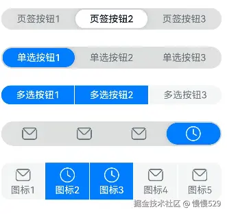
示例1(设置分段按钮的类型)
该示例通过配置SegmentButtonOptions的tab和capsule创建两种不同类型的分段按钮。
// xxx.ets
import {
  ItemRestriction,
  SegmentButton,
  SegmentButtonItemTuple,
  SegmentButtonOptions,
  SegmentButtonTextItem
} from '@kit.ArkUI';

@Entry
@Component
struct Index {
  @State tabOptions: SegmentButtonOptions = SegmentButtonOptions.tab({
    buttons: [{ text: '页签按钮1' }, { text: '页签按钮2' }, {
      text: '页签按钮3'
    }] as ItemRestriction<SegmentButtonTextItem>,
    backgroundBlurStyle: BlurStyle.BACKGROUND_THICK
  })
  @State singleSelectCapsuleOptions: SegmentButtonOptions = SegmentButtonOptions.capsule({
    buttons: [{ text: '单选按钮1' }, { text: '单选按钮2' }, { text: '单选按钮3' }] as SegmentButtonItemTuple,
    multiply: false,
    backgroundBlurStyle: BlurStyle.BACKGROUND_THICK
  })
  @State multiplySelectCapsuleOptions: SegmentButtonOptions = SegmentButtonOptions.capsule({
    buttons: [{ text: '多选按钮1' }, { text: '多选按钮2' }, { text: '多选按钮3' }] as SegmentButtonItemTuple,
    multiply: true
  })
  @State iconCapsuleOptions: SegmentButtonOptions = SegmentButtonOptions.capsule({
    buttons: [
      { icon: $r('sys.media.ohos_ic_public_email'), selectedIcon: $r('sys.media.ohos_ic_public_clock') },
      { icon: $r('sys.media.ohos_ic_public_email'), selectedIcon: $r('sys.media.ohos_ic_public_clock') },
      { icon: $r('sys.media.ohos_ic_public_email'), selectedIcon: $r('sys.media.ohos_ic_public_clock') },
      { icon: $r('sys.media.ohos_ic_public_email'), selectedIcon: $r('sys.media.ohos_ic_public_clock') }
    ] as SegmentButtonItemTuple,
    multiply: false,
    backgroundBlurStyle: BlurStyle.BACKGROUND_THICK
  })
  @State iconTextCapsuleOptions: SegmentButtonOptions = SegmentButtonOptions.capsule({
    buttons: [
      { text: '图标1', icon: $r('sys.media.ohos_ic_public_email'), selectedIcon: $r('sys.media.ohos_ic_public_clock') },
      { text: '图标2', icon: $r('sys.media.ohos_ic_public_email'), selectedIcon: $r('sys.media.ohos_ic_public_clock') },
      { text: '图标3', icon: $r('sys.media.ohos_ic_public_email'), selectedIcon: $r('sys.media.ohos_ic_public_clock') },
      { text: '图标4', icon: $r('sys.media.ohos_ic_public_email'), selectedIcon: $r('sys.media.ohos_ic_public_clock') },
      { text: '图标5', icon: $r('sys.media.ohos_ic_public_email'), selectedIcon: $r('sys.media.ohos_ic_public_clock') }
    ] as SegmentButtonItemTuple,
    multiply: true
  })
  @State tabSelectedIndexes: number[] = [1]
  @State singleSelectCapsuleSelectedIndexes: number[] = [0]
  @State multiplySelectCapsuleSelectedIndexes: number[] = [0, 1]
  @State singleSelectIconCapsuleSelectedIndexes: number[] = [3]
  @State multiplySelectIconTextCapsuleSelectedIndexes: number[] = [1, 2]

  build() {
    Row() {
      Column() {
        Column({ space: 25 }) {
          SegmentButton({ options: this.tabOptions,
            selectedIndexes: $tabSelectedIndexes })
          SegmentButton({ options: this.singleSelectCapsuleOptions,
            selectedIndexes: $singleSelectCapsuleSelectedIndexes })
          SegmentButton({
            options: this.multiplySelectCapsuleOptions,
            selectedIndexes: $multiplySelectCapsuleSelectedIndexes })
          SegmentButton({ options: this.iconCapsuleOptions,
            selectedIndexes: $singleSelectIconCapsuleSelectedIndexes })
          SegmentButton({ options: this.iconTextCapsuleOptions,
            selectedIndexes: $multiplySelectIconTextCapsuleSelectedIndexes })
        }.width('90%')
      }.width('100%')
    }.height('100%')
  }
}
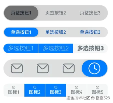
示例2(设置分段按钮样式)
该示例通过配置CommonSegmentButtonOptions实现了自定义分段按钮的文本以及背板样式。
// xxx.ets
import {
  ItemRestriction,
  SegmentButton,
  SegmentButtonItemTuple,
  SegmentButtonOptions,
  SegmentButtonTextItem
} from '@kit.ArkUI';

@Entry
@Component
struct Index {
  @State tabOptions: SegmentButtonOptions = SegmentButtonOptions.tab({
    buttons: [{ text: '页签按钮1' }, { text: '页签按钮2' }, {
      text: '页签按钮3'
    }] as ItemRestriction<SegmentButtonTextItem>,
    backgroundColor: 'rgb(213,213,213)',
    selectedBackgroundColor: 'rgb(112,112,112)',
    textPadding: {
      top: 10,
      right: 10,
      bottom: 10,
      left: 10
    },
  })
  @State singleSelectCapsuleOptions: SegmentButtonOptions = SegmentButtonOptions.capsule({
    buttons: [{ text: '单选按钮1' }, { text: '单选按钮2' }, { text: '单选按钮3' }] as SegmentButtonItemTuple,
    multiply: false,
    fontColor: 'rgb(0,74,175)',
    selectedFontColor: 'rgb(247,247,247)',
    backgroundBlurStyle: BlurStyle.BACKGROUND_THICK
  })
  @State multiplySelectCapsuleOptions: SegmentButtonOptions = SegmentButtonOptions.capsule({
    buttons: [{ text: '多选按钮1' }, { text: '多选按钮2' }, { text: '多选按钮3' }] as SegmentButtonItemTuple,
    multiply: true,
    fontSize: 18,
    selectedFontSize: 18,
    fontWeight: FontWeight.Bolder,
    selectedFontWeight: FontWeight.Lighter,
  })
  @State iconCapsuleOptions: SegmentButtonOptions = SegmentButtonOptions.capsule({
    buttons: [
      { icon: $r('sys.media.ohos_ic_public_email'), selectedIcon: $r('sys.media.ohos_ic_public_clock') },
      { icon: $r('sys.media.ohos_ic_public_email'), selectedIcon: $r('sys.media.ohos_ic_public_clock') },
      { icon: $r('sys.media.ohos_ic_public_email'), selectedIcon: $r('sys.media.ohos_ic_public_clock') },
      { icon: $r('sys.media.ohos_ic_public_email'), selectedIcon: $r('sys.media.ohos_ic_public_clock') }
    ] as SegmentButtonItemTuple,
    multiply: false,
    imageSize: { width: 40, height: 40 },
    buttonPadding: {
      top: 6,
      right: 10,
      bottom: 6,
      left: 10
    },
    backgroundBlurStyle: BlurStyle.BACKGROUND_THICK
  })
  @State iconTextCapsuleOptions: SegmentButtonOptions = SegmentButtonOptions.capsule({
    buttons: [
      { text: '图标1', icon: $r('sys.media.ohos_ic_public_email'), selectedIcon: $r('sys.media.ohos_ic_public_clock') },
      { text: '图标2', icon: $r('sys.media.ohos_ic_public_email'), selectedIcon: $r('sys.media.ohos_ic_public_clock') },
      { text: '图标3', icon: $r('sys.media.ohos_ic_public_email'), selectedIcon: $r('sys.media.ohos_ic_public_clock') },
      { text: '图标4', icon: $r('sys.media.ohos_ic_public_email'), selectedIcon: $r('sys.media.ohos_ic_public_clock') },
      { text: '图标5', icon: $r('sys.media.ohos_ic_public_email'), selectedIcon: $r('sys.media.ohos_ic_public_clock') }
    ] as SegmentButtonItemTuple,
    multiply: true,
    imageSize: { width: 10, height: 10 },
  })
  @State tabSelectedIndexes: number[] = [0]
  @State singleSelectCapsuleSelectedIndexes: number[] = [0]
  @State multiplySelectCapsuleSelectedIndexes: number[] = [0, 1]
  @State singleSelectIconCapsuleSelectedIndexes: number[] = [3]
  @State multiplySelectIconTextCapsuleSelectedIndexes: number[] = [1, 2]

  build() {
    Row() {
      Column() {
        Column({ space: 20 }) {
          SegmentButton({ options: this.tabOptions, selectedIndexes: $tabSelectedIndexes })
          SegmentButton({
            options: this.singleSelectCapsuleOptions,
            selectedIndexes: $singleSelectCapsuleSelectedIndexes
          })
          SegmentButton({
            options: this.multiplySelectCapsuleOptions,
            selectedIndexes: $multiplySelectCapsuleSelectedIndexes
          })
          SegmentButton({
            options: this.iconCapsuleOptions,
            selectedIndexes: $singleSelectIconCapsuleSelectedIndexes
          })
          SegmentButton({
            options: this.iconTextCapsuleOptions,
            selectedIndexes: $multiplySelectIconTextCapsuleSelectedIndexes
          })
        }.width('90%')
      }.width('100%')
    }.height('100%')
  }
}
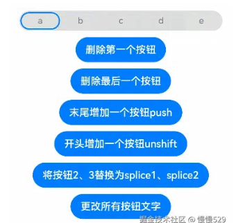
示例3(分段按钮数组处理)
该示例通过pop、shift、unshift等函数实现分段按钮数组的新增、删除等操作。
import {
  SegmentButton,
  SegmentButtonOptions,
  SegmentButtonItemOptionsArray,
  SegmentButtonItemTuple,
  SegmentButtonItemOptions
} from '@kit.ArkUI';

@Entry
@Component
struct Index {
  @State singleSelectCapsuleOptions: SegmentButtonOptions = SegmentButtonOptions.capsule({
    buttons: [{ text: '1' }, { text: '2' }, { text: '3' },
      { text: '4' }, { text: '5' }] as SegmentButtonItemTuple,
    multiply: false,
    backgroundBlurStyle: BlurStyle.BACKGROUND_THICK
  })
  @State capsuleSelectedIndexes: number[] = [0]

  build() {
    Row() {
      Column() {
        Column({ space: 10 }) {
          SegmentButton({ options: this.singleSelectCapsuleOptions,
            selectedIndexes: $capsuleSelectedIndexes })
          Button("删除第一个按钮")
            .onClick(() => {
              this.singleSelectCapsuleOptions.buttons.shift()
            })
          Button("删除最后一个按钮")
            .onClick(() => {
              this.singleSelectCapsuleOptions.buttons.pop()
            })
          Button("末尾增加一个按钮push")
            .onClick(() => {
              this.singleSelectCapsuleOptions.buttons.push({ text: 'push' })
            })
          Button("开头增加一个按钮unshift")
            .onClick(() => {
              this.singleSelectCapsuleOptions.buttons.unshift(({ text: 'unshift' }))
            })
          Button("将按钮2、3替换为splice1、splice2")
            .onClick(() => {
              this.singleSelectCapsuleOptions.buttons.splice(1, 2, new SegmentButtonItemOptions({
                text: 'splice1'
              }), new SegmentButtonItemOptions({ text: 'splice2' }))
            })
          Button("更改所有按钮文字")
            .onClick(() => {
              this.singleSelectCapsuleOptions.buttons =
              SegmentButtonItemOptionsArray.create([{ text: 'a' }, { text: 'b' },
                { text: 'c' }, { text: 'd' }, { text: 'e' }])
            })
        }.width('90%')
      }.width('100%')
    }.height('100%')
  }
}
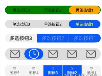
示例4(设置镜像效果)
该示例通过配置direction设置分段按钮的布局方向,实现镜像效果。
// xxx.ets
import { LengthMetrics, SegmentButton, SegmentButtonOptions } from '@kit.ArkUI'


@Entry
@Component
struct Index {
  @State tabOptions: SegmentButtonOptions = SegmentButtonOptions.tab({
    buttons: [{ text: '页签按钮1' }, { text: '页签按钮2' }, {
      text: '页签按钮3'
    }],
    direction: Direction.Rtl,
    backgroundColor: Color.Green,
    selectedBackgroundColor: Color.Orange,
    localizedTextPadding: {
      end: LengthMetrics.vp(10),
      start: LengthMetrics.vp(10)
    },
  })
  @State singleSelectCapsuleOptions: SegmentButtonOptions = SegmentButtonOptions.capsule({
    buttons: [{ text: '单选按钮1' }, { text: '单选按钮2' }, { text: '单选按钮3' }],
    multiply: false,
    direction: Direction.Rtl,
    fontColor: Color.Black,
    selectedFontColor: Color.Yellow,
    backgroundBlurStyle: BlurStyle.BACKGROUND_THICK
  })
  @State multiplySelectCapsuleOptions: SegmentButtonOptions = SegmentButtonOptions.capsule({
    buttons: [{ text: '多选按钮1' }, { text: '多选按钮2' }, { text: '多选按钮3' }],
    multiply: true,
    direction: Direction.Rtl,
    fontSize: 18,
    selectedFontSize: 18,
    fontWeight: FontWeight.Bolder,
    selectedFontWeight: FontWeight.Lighter,
  })
  @State iconCapsuleOptions: SegmentButtonOptions = SegmentButtonOptions.capsule({
    buttons: [
      { icon: $r('sys.media.ohos_ic_public_email'), selectedIcon: $r('sys.media.ohos_ic_public_clock') },
      { icon: $r('sys.media.ohos_ic_public_email'), selectedIcon: $r('sys.media.ohos_ic_public_clock') },
      { icon: $r('sys.media.ohos_ic_public_email'), selectedIcon: $r('sys.media.ohos_ic_public_clock') },
      { icon: $r('sys.media.ohos_ic_public_email'), selectedIcon: $r('sys.media.ohos_ic_public_clock') },
      { icon: $r('sys.media.ohos_ic_public_email'), selectedIcon: $r('sys.media.ohos_ic_public_clock') }
    ],
    multiply: false,
    direction: Direction.Rtl,
    imageSize: { width: 40, height: 40 },
    localizedButtonPadding: {
      end: LengthMetrics.vp(10),
      start: LengthMetrics.vp(10)
    },
    backgroundBlurStyle: BlurStyle.BACKGROUND_THICK
  })
  @State iconTextCapsuleOptions: SegmentButtonOptions = SegmentButtonOptions.capsule({
    buttons: [
      { text: '图标1', icon: $r('sys.media.ohos_ic_public_email'), selectedIcon: $r('sys.media.ohos_ic_public_clock') },
      { text: '图标2', icon: $r('sys.media.ohos_ic_public_email'), selectedIcon: $r('sys.media.ohos_ic_public_clock') },
      { text: '图标3', icon: $r('sys.media.ohos_ic_public_email'), selectedIcon: $r('sys.media.ohos_ic_public_clock') },
      { text: '图标4', icon: $r('sys.media.ohos_ic_public_email'), selectedIcon: $r('sys.media.ohos_ic_public_clock') },
      { text: '图标5', icon: $r('sys.media.ohos_ic_public_email'), selectedIcon: $r('sys.media.ohos_ic_public_clock') }
    ],
    multiply: true,
    direction: Direction.Rtl,
    imageSize: { width: 10, height: 10 },
  })
  @State tabSelectedIndexes: number[] = [0]
  @State singleSelectCapsuleSelectedIndexes: number[] = [0]
  @State multiplySelectCapsuleSelectedIndexes: number[] = [0, 1]
  @State singleSelectIconCapsuleSelectedIndexes: number[] = [3]
  @State multiplySelectIconTextCapsuleSelectedIndexes: number[] = [1, 2]

  build() {
    Row() {
      Column() {
        Column({ space: 20 }) {
          SegmentButton({ options: this.tabOptions, selectedIndexes: $tabSelectedIndexes })
          SegmentButton({
            options: this.singleSelectCapsuleOptions,
            selectedIndexes: $singleSelectCapsuleSelectedIndexes
          })
          SegmentButton({
            options: this.multiplySelectCapsuleOptions,
            selectedIndexes: $multiplySelectCapsuleSelectedIndexes
          })
          SegmentButton({
            options: this.iconCapsuleOptions,
            selectedIndexes: $singleSelectIconCapsuleSelectedIndexes
          })
          SegmentButton({
            options: this.iconTextCapsuleOptions,
            selectedIndexes: $multiplySelectIconTextCapsuleSelectedIndexes
          })
        }.width('90%')
      }.width('100%')
    }.height('100%')
  }
}
示例5(设置无障碍朗读)
该示例通配置accessibilityLevel、selectedIconAccessibilityText等属性实现了分段按钮的无障碍朗读功能。
// xxx.ets
import {
  ItemRestriction,
  SegmentButton,
  SegmentButtonItemTuple,
  SegmentButtonOptions,
  SegmentButtonTextItem,
  SegmentButtonItemOptions
} from '@kit.ArkUI';

@Entry
@Component
struct Index {
  @State tabOptions: SegmentButtonOptions = SegmentButtonOptions.tab({
    buttons: [{ text: '页签按钮1', accessibilityLevel: 'yes', accessibilityDescription: '页签按钮1 新手提醒' },
      { text: '页签按钮2', accessibilityLevel: 'yes', accessibilityDescription: '页签按钮2 新手提醒' },
      { text: '页签按钮3', accessibilityLevel: 'yes', accessibilityDescription: '页签按钮3 新手提醒'
    }] as ItemRestriction<SegmentButtonTextItem>,
    backgroundBlurStyle: BlurStyle.BACKGROUND_THICK
  })
  @State iconCapsuleOptions: SegmentButtonOptions = SegmentButtonOptions.capsule({
    buttons: [
      { icon: $r('sys.media.ohos_ic_public_email'), iconAccessibilityText: '未选中图标无障碍文本',
        selectedIcon: $r('sys.media.ohos_ic_public_clock'), selectedIconAccessibilityText: '选中图标无障碍文本',
      accessibilityLevel: 'yes', accessibilityDescription: 'SegmentButtonIconItem 新手提醒'},
      { icon: $r('sys.media.ohos_ic_public_email'), iconAccessibilityText: '未选中图标无障碍文本',
        selectedIcon: $r('sys.media.ohos_ic_public_clock'), selectedIconAccessibilityText: '选中图标无障碍文本',
        accessibilityLevel: 'yes', accessibilityDescription: 'SegmentButtonIconItem 新手提醒'},
      { icon: $r('sys.media.ohos_ic_public_email'), iconAccessibilityText: '未选中图标无障碍文本',
        selectedIcon: $r('sys.media.ohos_ic_public_clock'), selectedIconAccessibilityText: '选中图标无障碍文本',
        accessibilityLevel: 'yes', accessibilityDescription: 'SegmentButtonIconItem 新手提醒'},
      { icon: $r('sys.media.ohos_ic_public_email'), iconAccessibilityText: '未选中图标无障碍文本',
        selectedIcon: $r('sys.media.ohos_ic_public_clock'), selectedIconAccessibilityText: '选中图标无障碍文本',
        accessibilityLevel: 'yes', accessibilityDescription: 'SegmentButtonIconItem 新手提醒'}
    ] as SegmentButtonItemTuple,
    multiply: false,
    backgroundBlurStyle: BlurStyle.BACKGROUND_THICK
  })
  @State iconTextCapsuleOptions: SegmentButtonOptions = SegmentButtonOptions.capsule({
    buttons: [
      { text: '图标1', icon: $r('sys.media.ohos_ic_public_email'), iconAccessibilityText: '未选中图标无障碍文本',
        selectedIcon: $r('sys.media.ohos_ic_public_clock'), selectedIconAccessibilityText: '选中图标无障碍文本',
        accessibilityLevel: 'yes', accessibilityDescription: 'SegmentButtonIconTextItem 新手提醒'},
      { text: '图标1', icon: $r('sys.media.ohos_ic_public_email'), iconAccessibilityText: '未选中图标无障碍文本',
        selectedIcon: $r('sys.media.ohos_ic_public_clock'), selectedIconAccessibilityText: '选中图标无障碍文本',
        accessibilityLevel: 'yes', accessibilityDescription: 'SegmentButtonIconTextItem 新手提醒'}
    ] as SegmentButtonItemTuple,
    multiply: true
  })
  @State tabSelectedIndexes: number[] = [1]
  @State singleSelectIconCapsuleSelectedIndexes: number[] = [3]
  @State multiplySelectIconTextCapsuleSelectedIndexes: number[] = [1, 2]

  build() {
    Row() {
      Column() {
        Column({ space: 25 }) {
          SegmentButton({ options: this.tabOptions,
            selectedIndexes: $tabSelectedIndexes })
          SegmentButton({ options: this.iconCapsuleOptions,
            selectedIndexes: $singleSelectIconCapsuleSelectedIndexes })
          SegmentButton({ options: this.iconTextCapsuleOptions,
            selectedIndexes: $multiplySelectIconTextCapsuleSelectedIndexes })
          Button("将按钮2、3替换为splice1、splice2")
            .onClick(() => {
              this.iconTextCapsuleOptions.buttons.splice(1, 2, new SegmentButtonItemOptions({
                text: 'splice1', accessibilityLevel: 'yes', accessibilityDescription: 'SegmentButtonItemOptions 新手提醒'
              }), new SegmentButtonItemOptions({ text: 'splice2', icon: $r('sys.media.ohos_ic_public_email'),
                iconAccessibilityText: '未选中图标无障碍文本', selectedIcon: $r('sys.media.ohos_ic_public_clock'),
                selectedIconAccessibilityText: '选中图标无障碍文本', accessibilityLevel: 'yes',
                accessibilityDescription: 'SegmentButtonIconTextItem 新手提醒' }))
            })
        }.width('90%')
      }.width('100%')
    }.height('100%')
  }
}

讨论HarmonyOS开发技术,专注于API与组件、DevEco Studio、测试、元服务和应用上架分发等。
更多推荐


 24
24 0
0- 0


 已为社区贡献823条内容

所有评论(0)