Harmony NEXT开发之ArkUI常用组件
删除按钮Button组件通常用于触发某些操作,可以绑定onClick事件来响应点击操作后的自定义行为。})在用户登录/注册页面,使用按钮进行登录或注册操作。// xxx.ets@Entry@Componentbuild() {Column() {// 需要执行的操作})
目录
文本显示 (Text/Span)
创建文本
具体属性可查看:文档中心
Text可通过以下两种方式来创建:
1、string字符串
Text('我是一段文本')2、引用Resource资源
资源引用类型可以通过$r创建Resource类型对象,文件位置为/resources/base/element/string.json。
Text($r('app.string.module_desc'))
  .baselineOffset(0)
  .fontSize(30)
  .border({ width: 1 })
  .padding(10)
  .width(300)
添加子组件
Span只能作为Text和RichEditor组件的子组件显示文本内容。可以在一个Text内添加多个Span来显示一段信息,例如产品说明书、承诺书等。
- 创建Span。
Span组件需要写到Text组件内,单独写Span组件不会显示信息,Text与Span同时配置文本内容时,Span内容覆盖Text内容。
Text('我是Text') {
  Span('我是Span')
}
.padding(10)
.borderWidth(1)
设置文本装饰线及颜色。
通过decoration设置文本装饰线及颜色。
Text() {
  Span('我是Span1,').fontSize(16).fontColor(Color.Grey)
    .decoration({ type: TextDecorationType.LineThrough, color: Color.Red })
  Span('我是Span2').fontColor(Color.Blue).fontSize(16)
    .fontStyle(FontStyle.Italic)
    .decoration({ type: TextDecorationType.Underline, color: Color.Black })
  Span(',我是Span3').fontSize(16).fontColor(Color.Grey)
    .decoration({ type: TextDecorationType.Overline, color: Color.Green })
}
.borderWidth(1)
.padding(10)- 添加事件。
由于Span组件无尺寸信息,事件仅支持添加点击事件onClick。
Text() {
  Span('I am Upper-span').fontSize(12)
    .textCase(TextCase.UpperCase)
    .onClick(()=>{
      console.info('我是Span——onClick')
    })
}
添加事件
Text组件可以添加通用事件,可以绑定onClick、onTouch等事件来响应操作。
Text('点我')
  .onClick(()=>{
      console.info('我是Text的点击响应事件');
   })
示例
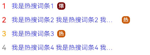
// xxx.ets
@Entry
@Component
struct TextExample {
  build() {
    Column() {
      Row() {
        Text("1").fontSize(14).fontColor(Color.Red).margin({ left: 10, right: 10 })
        Text("我是热搜词条1")
          .fontSize(12)
          .fontColor(Color.Blue)
          .maxLines(1)
          .textOverflow({ overflow: TextOverflow.Ellipsis })
          .fontWeight(300)
        Text("爆")
          .margin({ left: 6 })
          .textAlign(TextAlign.Center)
          .fontSize(10)
          .fontColor(Color.White)
          .fontWeight(600)
          .backgroundColor(0x770100)
          .borderRadius(5)
          .width(15)
          .height(14)
      }.width('100%').margin(5)

      Row() {
        Text("2").fontSize(14).fontColor(Color.Red).margin({ left: 10, right: 10 })
        Text("我是热搜词条2 我是热搜词条2 我是热搜词条2 我是热搜词条2 我是热搜词条2")
          .fontSize(12)
          .fontColor(Color.Blue)
          .fontWeight(300)
          .constraintSize({ maxWidth: 200 })
          .maxLines(1)
          .textOverflow({ overflow: TextOverflow.Ellipsis })
        Text("热")
          .margin({ left: 6 })
          .textAlign(TextAlign.Center)
          .fontSize(10)
          .fontColor(Color.White)
          .fontWeight(600)
          .backgroundColor(0xCC5500)
          .borderRadius(5)
          .width(15)
          .height(14)
      }.width('100%').margin(5)

      Row() {
        Text("3").fontSize(14).fontColor(Color.Orange).margin({ left: 10, right: 10 })
        Text("我是热搜词条3")
          .fontSize(12)
          .fontColor(Color.Blue)
          .fontWeight(300)
          .maxLines(1)
          .constraintSize({ maxWidth: 200 })
          .textOverflow({ overflow: TextOverflow.Ellipsis })
        Text("热")
          .margin({ left: 6 })
          .textAlign(TextAlign.Center)
          .fontSize(10)
          .fontColor(Color.White)
          .fontWeight(600)
          .backgroundColor(0xCC5500)
          .borderRadius(5)
          .width(15)
          .height(14)
      }.width('100%').margin(5)

      Row() {
        Text("4").fontSize(14).fontColor(Color.Grey).margin({ left: 10, right: 10 })
        Text("我是热搜词条4 我是热搜词条4 我是热搜词条4 我是热搜词条4 我是热搜词条4")
          .fontSize(12)
          .fontColor(Color.Blue)
          .fontWeight(300)
          .constraintSize({ maxWidth: 200 })
          .maxLines(1)
          .textOverflow({ overflow: TextOverflow.Ellipsis })
      }.width('100%').margin(5)
    }.width('100%')
  }
}
单选框 (Radio)
具体使用中可参考:文档中心
创建单选框
Radio通过调用接口来创建,接口调用形式如下:
//Radio(options: {value: string, group: string})
Radio({ value: 'Radio1', group: 'radioGroup' })
  .checked(false)
Radio({ value: 'Radio2', group: 'radioGroup' })
  .checked(true)
其中,value是单选框的名称,group是单选框的所属群组名称。checked属性可以设置单选框的状态,状态分别为false和true,设置为true时表示单选框被选中。
除支持通用事件外,Radio还用于选中后触发某些操作,可以绑定onChange事件来响应选中操作后的自定义行为。
通用事件比如:单击事件、鼠标悬浮、焦点事件、拖拽事件等等
  Radio({ value: 'Radio1', group: 'radioGroup' })
    .onChange((isChecked: boolean) => {
      if(isChecked) {
        //需要执行的操作
      }
    })
  Radio({ value: 'Radio2', group: 'radioGroup' })
    .onChange((isChecked: boolean) => {
      if(isChecked) {
        //需要执行的操作
      }
    })
声音模式案例
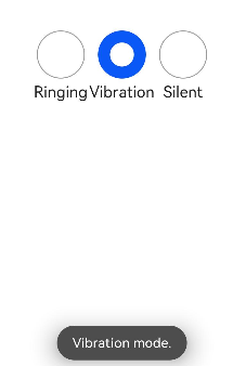
// xxx.ets
import { promptAction } from '@kit.ArkUI';

@Entry
@Component
struct RadioExample {
  @State Rst:promptAction.ShowToastOptions = {'message': 'Ringing mode.'}
  @State Vst:promptAction.ShowToastOptions = {'message': 'Vibration mode.'}
  @State Sst:promptAction.ShowToastOptions = {'message': 'Silent mode.'}
  build() {
    Row() {
      Column() {
        Radio({ value: 'Radio1', group: 'radioGroup' }).checked(true)
          .height(50)
          .width(50)
          .onChange((isChecked: boolean) => {
            if(isChecked) {
              // 切换为响铃模式
              promptAction.showToast(this.Rst)
            }
          })
        Text('Ringing')
      }
      Column() {
        Radio({ value: 'Radio2', group: 'radioGroup' })
          .height(50)
          .width(50)
          .onChange((isChecked: boolean) => {
            if(isChecked) {
              // 切换为振动模式
              promptAction.showToast(this.Vst)
            }
          })
        Text('Vibration')
      }
      Column() {
        Radio({ value: 'Radio3', group: 'radioGroup' })
          .height(50)
          .width(50)
          .onChange((isChecked: boolean) => {
            if(isChecked) {
              // 切换为静音模式
              promptAction.showToast(this.Sst)
            }
          })
        Text('Silent')
      }
    }.height('100%').width('100%').justifyContent(FlexAlign.Center)
  }
}
按钮 (Button)
按钮类型
胶囊类型(Capsule)、圆形按钮(Circle)和普通按钮(Normal),通过type进行设置。Button做为容器使用时可以通过添加子组件实现包含文字、图片等元素的按钮
Button(options: ButtonOptions):创建可以包含单个子组件的按钮。
Button(label: ResourceStr, options?: ButtonOptions):使用文本内容创建相应的按钮组件,此时Button无法包含子组件。
文本内容默认单行显示。
ButtonOptions对象:
|
名称 |
类型 |
必填 |
描述 |
|
type |
否 |
描述按钮显示样式。 默认值:ButtonType.Capsule 卡片能力: 从API version 9开始,该接口支持在ArkTS卡片中使用。 元服务API: 从API version 11开始,该接口支持在元服务中使用。 |
|
|
stateEffect |
boolean |
否 |
按钮按下时是否开启按压态显示效果,当设置为false时,按压效果关闭。 默认值:true 说明: 当开启按压态显示效果,开发者设置状态样式时,会基于状态样式设置完成后的背景色再进行颜色叠加。 卡片能力: 从API version 9开始,该接口支持在ArkTS卡片中使用。 元服务API: 从API version 11开始,该接口支持在元服务中使用。 |
|
buttonStyle11+ |
否 |
描述按钮的样式和重要程度。 默认值:ButtonStyleMode.EMPHASIZED 说明: 按钮重要程度:强调按钮>普通按钮>文字按钮。 卡片能力: 从API version 11开始,该接口支持在ArkTS卡片中使用。 元服务API: 从API version 12开始,该接口支持在元服务中使用。 |
|
|
controlSize11+ |
否 |
描述按钮的尺寸。 默认值:ControlSize.NORMAL 卡片能力: 从API version 11开始,该接口支持在ArkTS卡片中使用。 元服务API: 从API version 12开始,该接口支持在元服务中使用。 |
|
|
role12+ |
否 |
描述按钮的角色。 默认值:ButtonRole.NORMAL 卡片能力: 从API version 12开始,该接口支持在ArkTS卡片中使用。 元服务API: 从API version 12开始,该接口支持在元服务中使用。 |
//Button(label?: ResourceStr, options?: { type?: ButtonType, stateEffect?: boolean })
Button('Ok', { type: ButtonType.Normal, stateEffect: true })
  .borderRadius(8)
  .backgroundColor(0x317aff)
  .width(90)
  .height(40)
//Button(options?: {type?: ButtonType, stateEffect?: boolean})
Button({ type: ButtonType.Normal, stateEffect: true }) {
  Row() {
    Image($r('app.media.loading')).width(20).height(40).margin({ left: 12 })
    Text('loading').fontSize(12).fontColor(0xffffff).margin({ left: 5, right: 12 })
  }.alignItems(VerticalAlign.Center)
}.borderRadius(8).backgroundColor(0x317aff).width(90).height(40)
上面说过了,Button有三种可选类型,分别为胶囊类型(Capsule)、圆形按钮(Circle)和普通按钮(Normal),可以通过type进行设置,自己可以练习尝试一下。
自定义样式
删除按钮
let MarLeft: Record<string, number> = { 'left': 20 }
Button({ type: ButtonType.Circle, stateEffect: true }) {
  Image($r('app.media.ic_public_delete_filled')).width(30).height(30)
}.width(55).height(55).margin(MarLeft).backgroundColor(0xF55A42)
Button组件通常用于触发某些操作,可以绑定onClick事件来响应点击操作后的自定义行为。
Button('Ok', { type: ButtonType.Normal, stateEffect: true })
  .onClick(()=>{
    console.info('Button onClick')
  })
在用户登录/注册页面,使用按钮进行登录或注册操作。
// xxx.ets
@Entry
@Component
struct ButtonCase2 {
  build() {
    Column() {
      TextInput({ placeholder: 'input your username' }).margin({ top: 20 })
      TextInput({ placeholder: 'input your password' }).type(InputType.Password).margin({ top: 20 })
      Button('Register').width(300).margin({ top: 20 })
        .onClick(() => {
          // 需要执行的操作
        })
    }.padding(20)
  }
}
讨论HarmonyOS开发技术,专注于API与组件、DevEco Studio、测试、元服务和应用上架分发等。
更多推荐


 20
20 0
0- 0


 已为社区贡献22条内容

所有评论(0)