鸿蒙开发——自定义动态输入框
属性类型概述number输入框数量,默认为6个Length每个输入框的宽度,默认为100%Length每个输入框的高度,默认为100%输入框的背景inputTypeInputType键盘类型,默认为InputType.NumberLength输入框之间的间隙,默认为10inputWidthLength输入框整体的宽度Length输入框整体的高度Length圆角边框大小输入框选中边框背景输入框未选中
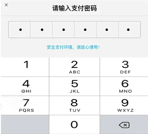
动态的输入框很是常见,比如支付宝或者微信,在你发红包或者转账输入密码的时候,当输入完上一个,自动就切换到了下一个,当然了除了支付密码的场景之外,很多验证码的输入也是通过这种方式实现的,可以说,用的场景很多。
在鸿蒙开发中,如何实现这一效果呢,最重要的解决两个问题,第一个问题是,如何在上一个输入框输入完之后,焦点切换至下一个输入框中,第二个问题是,如何禁止已经输入的输入框的焦点,两个问题解决完之后,其他的就很是简单了。
一、实现效果一览
最终完成的是一个组件,可以在任意的地方进行使用,我简单的写了几个实现的效果,当然了可以根据属性,实现多种且不同的样式。
静态效果
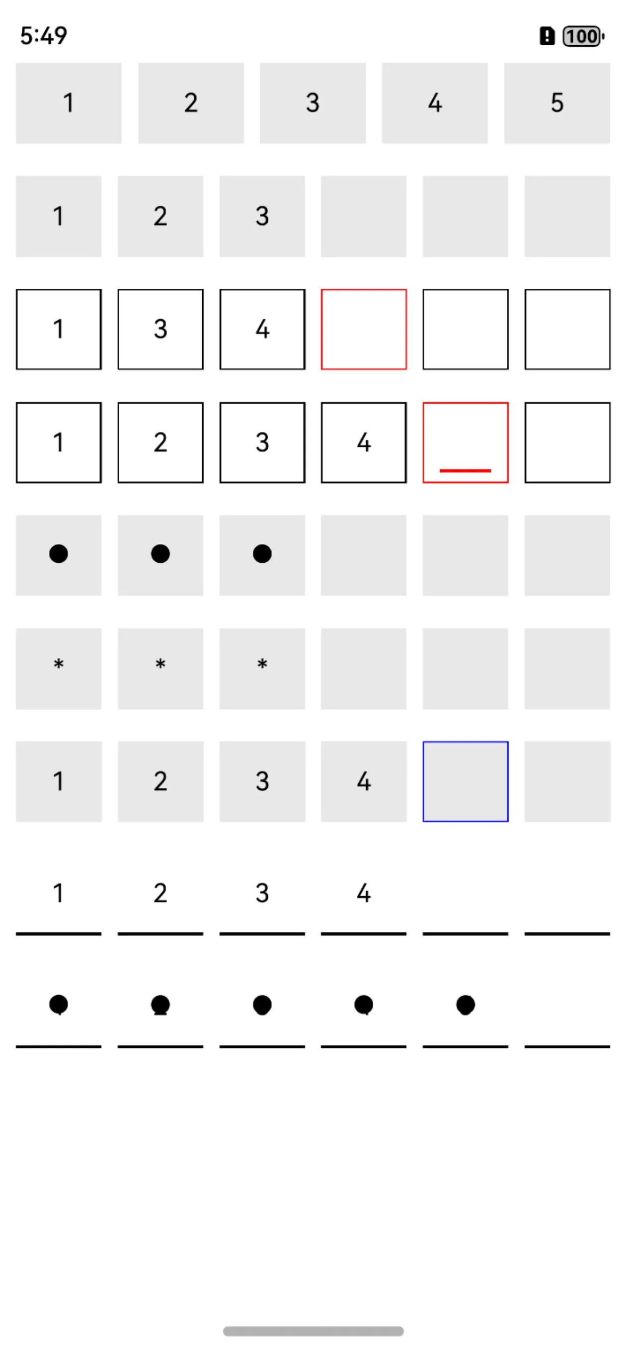
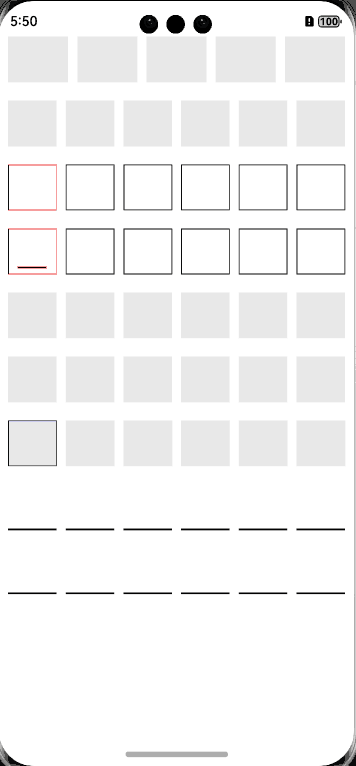
动态效果
二、绘制输入框
输入框没什么好说的,就是使用的TextInput组件,实际的场景中,其输入框的数量肯定是动态的,所以这里使用的是Grid组件展示一行,使用Grid的一个便利之处,除了均分简单配置列之外,还有一点,是方便控制列与列之间的距离;当然了使用其他的组件也没问题的。
Grid() {
      ForEach(this.inputBoxArray, (_: number, index: number) => {
        GridItem() {
          TextInput()
        }
      })
    }.columnsTemplate("1fr ".repeat(this.inputBoxSize).trimEnd())
    .rowsTemplate("1fr")
TextInput组件,除了正常的样式属性之外,我们需要监听输入内容的变化,通过onChange方法即可,在onChange方法中,我们需要做的是,存储每一个输入的内容,用于返回至业务层,当然了还需要判断,当前是否存在内容,如果存在,那么焦点就切换至下一个。
if (value != undefined && value != "" && index < this.inputBoxSize) {
                  this.inputBoxTextArray[this.lastPosition] = value //赋值内容
                  this.inputBoxVisibilityArray[this.lastPosition] = false
                  if (index != this.inputBoxSize - 1) {
                    this.lastPosition = index + 1
                    this.inputBoxVisibilityArray[this.lastPosition] = true
                    this.moveFocus(this.lastPosition)
                  } else {
                    this.inputBoxVisibilityArray[this.lastPosition] = false
                  }
                }
三、如何切换焦点
在绘制TextInput组件的时候,每个组件定义一个id,可以使用FocusController控制器,把焦点移动至下一个id的组件之上。
  /**
   * AUTHOR:AbnerMing
   * INTRODUCE:移动焦点
   * */
  private moveFocus(index: number) {
    this.getUIContext().getFocusController().requestFocus(this.inputViewIds + index)
  }
四、如何禁止焦点
在实际的开发中如果我们动态的取消焦点或者禁止点击等方式实现,会发现输入框确实不可点击,但是会出现软键盘收起再弹出的问题,那么为了解决多输入框使用同一个软键盘,这里我用到了一个浮层,也就是已经输入过的输入框使用透明的浮层覆盖,这样就无法触摸了。
以上只是实现的思路,通过这种思路,可以完成输入框的动态输入。
五、代码使用
1、普通使用
InputBoxView({
  inputBoxSize: 5,
  onChange: (value) => {
    console.log("===输入监听:" + value)
  },
  onInputEnd: (value) => {
    console.log("===输入结果:" + value)
  }
})
2、光标颜色
InputBoxView({
  inputBoxSize: 6,
  caretColor: Color.Red,
  onChange: (value) => {
    console.log("===输入监听:" + value)
  },
  onInputEnd: (value) => {
    console.log("===输入结果:" + value)
  }
})
3、边框模式
InputBoxView({
  inputBoxSize: 6,
  caretColor: Color.Red,
  inputBoxBgColor: Color.Transparent,
  inputBoxBorderWidth: 1,
  isInputBoxBorder: true,
  inputBoxNormalBorderColor: Color.Black,
  inputBoxSelectBorderColor: Color.Red,
  onChange: (value) => {
    console.log("===输入监听:" + value)
  },
  onInputEnd: (value) => {
    console.log("===输入结果:" + value)
  }
})
4、显示底部光标
InputBoxView({
  inputBoxSize: 6,
  caretColor: Color.Red,
  inputBoxBgColor: Color.Transparent,
  inputBoxBorderWidth: 1,
  isInputBoxBorder: true,
  isShowBottomCaret: true, //显示底部光标
  inputBoxNormalBorderColor: Color.Black,
  inputBoxSelectBorderColor: Color.Red,
  onChange: (value) => {
    console.log("===输入监听:" + value)
  },
  onInputEnd: (value) => {
    console.log("===输入结果:" + value)
  }
})
5、圆点
InputBoxView({
  inputBoxSize: 6,
  inputTextType: InputTextType.ROUND,
  onChange: (value) => {
    console.log("===输入监听:" + value)
  },
  onInputEnd: (value) => {
    console.log("===输入结果:" + value)
  }
})
6、星号
InputBoxView({
  inputBoxSize: 6,
  inputTextType: InputTextType.ASTERISK,
  onChange: (value) => {
    console.log("===输入监听:" + value)
  },
  onInputEnd: (value) => {
    console.log("===输入结果:" + value)
  }
})
7、设置边框选择颜色
InputBoxView({
  inputBoxSize: 6,
  inputBoxNormalBorderColor: "#e8e8e8",
  inputBoxSelectBorderColor: Color.Blue,
  inputBoxBorderWidth: 1,
  boxInputHideBgColor: true,
  onChange: (value) => {
    console.log("===输入监听:" + value)
  },
  onInputEnd: (value) => {
    console.log("===输入结果:" + value)
  }
})
8、设置边框下划线方式
InputBoxView({
  inputBoxSize: 6,
  inputBoxBgColor: Color.Transparent,
  inputBoxBorderWidth: { bottom: 2 },
  inputBoxNormalBorderColor: Color.Black,
  inputBoxSelectBorderColor: Color.Black,

  onChange: (value) => {
    console.log("===输入监听:" + value)
  },
  onInputEnd: (value) => {
    console.log("===输入结果:" + value)
  }
})
9、设置边框下划线圆点方式
InputBoxView({
  inputBoxSize: 6,
  inputTextType: InputTextType.ROUND,
  inputBoxBgColor: Color.Transparent,
  inputBoxBorderWidth: { bottom: 2 },
  inputBoxNormalBorderColor: Color.Black,
  inputBoxSelectBorderColor: Color.Black,

  onChange: (value) => {
    console.log("===输入监听:" + value)
  },
  onInputEnd: (value) => {
    console.log("===输入结果:" + value)
  }
})
3、属性介绍
|
属性 |
类型 |
概述 |
|---|---|---|
|
inputBoxSize |
number |
输入框数量,默认为6个 |
|
inputBoxWidth |
Length |
每个输入框的宽度,默认为100% |
|
inputBoxHeight |
Length |
每个输入框的高度,默认为100% |
|
inputBoxBgColor |
ResourceColor |
输入框的背景 |
|
inputType |
InputType |
键盘类型,默认为InputType.Number |
|
inputBoxGap |
Length |
输入框之间的间隙,默认为10 |
|
inputWidth |
Length |
输入框整体的宽度 |
|
inputHeight |
Length |
输入框整体的高度 |
|
inputBoxBorderRadius |
Length |
圆角 |
|
inputBoxBorderWidth |
EdgeWidths/Length/LocalizedEdgeWidths |
边框大小 |
|
inputBoxNormalBorderColor |
ResourceColor |
输入框选中边框背景 |
|
inputBoxSelectBorderColor |
ResourceColor |
输入框未选中边框背景 |
|
inputMarginLeft |
Length |
输入框整体距离左边的距离 |
|
inputMarginRight |
Length |
输入框整体距离右边的距离 |
|
caretColor |
ResourceColor |
光标颜色 |
|
boxCaretWidth |
Length |
光标宽度 |
|
inputFontColor |
ResourceColor |
字体颜色 |
|
inputFontSize |
Length |
字体大小 |
|
inputFontWeight |
umber/FontWeight/string |
字体权重 |
|
inputFontStyle |
FontStyle |
字体样式 |
|
fontFamily |
ResourceStr |
字体列表 |
|
openRowClick |
boolean |
是否打开行点击 |
|
inputTextType |
InputTextType |
显示内容类型 |
|
boxInputHideBgColor |
boolean |
最后的一个背景是否隐藏,默认不隐藏 |
|
isShowBottomCaret |
boolean |
光标是否显示底部,默认不展示 |
|
isInputBoxBorder |
boolean |
是否是边框,默认不是 |
|
onChange |
(value: string) => void |
输入回调监听 |
|
onInputEnd |
(value: string) => void |
输入结束 |
六、相关总结
除了动态的把焦点切换至下一个之外,我们在点击软键盘删除的时候,也需要把输入框的内容清空以及切换焦点至上一个,如何监听软键盘的删除按钮,这个可费了一番功夫,执行onKeyEvent事件,发现只走电脑的按键,模拟器的软键盘不会走,以为是模拟器的问题,切换到真机上,删除按钮也不会走。最后不断地排查,发现了一个方法是必走的,那就是onWillDelete,大家在自己实现的时候,可以使用这个方法,可以少走弯路。
写在最后
如果你觉得这篇内容让你有所收获,我想请你帮我三个小忙~
-
点赞,转发,你们的 『点赞和评论』,是我创造的动力;
-
关注小编,不定期分享技术知识
-
同时请期待后续文章ing🚀


讨论HarmonyOS开发技术,专注于API与组件、DevEco Studio、测试、元服务和应用上架分发等。
更多推荐

 12
12 0
0- 0


 已为社区贡献18条内容

所有评论(0)