从入门小白到精通,玩转 React Native 鸿蒙跨平台开发:ScrollView 滚动视图组件
同时 ScrollView 提供丰富的滚动控制、监听、优化属性,既能满足入门级基础滚动需求,也能实现进阶的精准滚动、滚动联动等复杂业务逻辑,是必须吃透的核心组件。ScrollView 是 React Native 鸿蒙跨平台开发中核心的容器类滚动组件,也是开发中高频使用的基础组件。普通 View 组件为固定视图容器,当内部子组件总高度或宽度超出屏幕可视区域时,超出部分会被遮挡无法展示,Scroll
目录
5.3 ScrollView 与 FlatList 核心区别
一、基础认知:ScrollView 组件核心定位与应用价值
ScrollView 是 React Native 鸿蒙跨平台开发中核心的容器类滚动组件,也是开发中高频使用的基础组件。普通 View 组件为固定视图容器,当内部子组件总高度或宽度超出屏幕可视区域时,超出部分会被遮挡无法展示,ScrollView 则完美解决该问题,核心作用是为超屏内容提供可滚动的视图容器,让用户通过滑动操作查看全部内容。
ScrollView 底层桥接鸿蒙 ArkUI 原生滚动视图组件,采用鸿蒙原生滚动渲染机制,滚动流畅无卡顿、无兼容问题,默认适配鸿蒙 dp 尺寸单位与屏幕分辨率。支持垂直、水平两种滚动模式,可灵活嵌套 View、Text、Button、TextInput 等所有 RN 基础组件,是实现长页面、多模块表单、图文详情页、分类导航栏、数据列表等超屏内容展示的核心载体。
其核心应用场景覆盖绝大多数业务开发需求:表单提交页的多栏输入项、商品详情页的图文介绍、应用的分类导航横向栏、个人中心的信息列表、协议条款的长文本展示等,均基于 ScrollView 实现。同时 ScrollView 提供丰富的滚动控制、监听、优化属性,既能满足入门级基础滚动需求,也能实现进阶的精准滚动、滚动联动等复杂业务逻辑,是必须吃透的核心组件。
二、核心特性与使用须知
1. 核心特性
- 支持垂直滚动(默认)和水平滚动两种模式,单一属性即可切换,适配不同布局需求
- 作为容器组件,可无限制嵌套任意 RN 基础组件与自定义组件,嵌套层级灵活无约束
- 自带滚动回弹、滚动惯性效果,与鸿蒙原生应用的滚动体验完全一致,无需额外配置
- 提供完整的滚动监听事件,可实时获取滚动位置、滚动状态,实现滚动联动业务逻辑
- 支持滚动到指定位置、滚动置顶 / 置底、滚动禁用 / 启用等精准控制能力
- 轻量化原生渲染,无内存泄漏、无冗余渲染,鸿蒙真机与模拟器运行均无性能问题
2. 核心使用须知
- ScrollView 属于一次性渲染组件,会将内部所有子组件一次性全部渲染完成,适合展示中短长度的滚动内容,是日常开发的首选
- 若需要展示超长列表数据(如商品列表、资讯列表、上千条数据),不建议使用 ScrollView,会因一次性渲染过多组件导致页面加载卡顿、内存占用过高,此类场景建议使用 RN 的 FlatList 组件,二者互补使用
- ScrollView 必须设置明确的滚动方向约束,避免嵌套滚动导致的滚动冲突,鸿蒙环境下该规则同样适用
三、完整核心属性与事件
3.1 核心基础属性
| 属性名 | 类型 | 作用说明 | 基础示例 |
|---|---|---|---|
horizontal |
boolean | 设置滚动方向,false 为垂直滚动(默认),true 为水平滚动 | horizontal={true} |
showsVerticalScrollIndicator |
boolean | 是否显示垂直滚动条 | showsVerticalScrollIndicator={false} |
showsHorizontalScrollIndicator |
boolean | 是否显示水平滚动条 | showsHorizontalScrollIndicator={false} |
bounces |
boolean | 是否开启滚动回弹效果 | bounces={true} |
disabled |
boolean | 是否禁用滚动功能 | disabled={false} |
scrollEnabled |
boolean | 滚动开关,与 disabled 作用一致 | scrollEnabled={true} |
contentContainerStyle |
StyleProp | 滚动内容区的样式,设置内边距、间距等 | contentContainerStyle={styles.scrollContent} |
3.2 滚动控制与优化属性
| 属性名 | 类型 | 作用说明 | 基础示例 |
|---|---|---|---|
scrollsToTop |
boolean | 点击鸿蒙设备状态栏,是否自动滚动到页面顶部 | scrollsToTop={true} |
pagingEnabled |
boolean | 是否开启分页滚动,滚动时自动吸附整屏位置 | pagingEnabled={false} |
nestedScrollEnabled |
boolean | 是否开启嵌套滚动,解决多层滚动冲突 | nestedScrollEnabled={true} |
3.3 滚动监听事件
| 事件名 | 回调参数 | 作用说明 |
|---|---|---|
onScroll |
{nativeEvent:{contentOffset:{x,y}}} |
滚动中实时触发,返回当前滚动的 x、y 轴偏移量 |
onScrollBeginDrag |
无参数 | 手指按下并开始拖动滚动视图时触发 |
onScrollEndDrag |
无参数 | 手指松开停止拖动时触发 |
onMomentumScrollBegin |
无参数 | 视图因惯性开始滚动时触发 |
onMomentumScrollEnd |
无参数 | 视图因惯性滚动结束时触发 |
3.4 核心滚动方法(ref 调用)
scrollTo({x: 0, y: 0, animated: true}):滚动到指定的 x/y 轴坐标,animated 控制是否开启动画scrollToEnd({animated: true}):滚动到内容的最底部(垂直)/ 最右侧(水平)scrollToTop():快速滚动到内容顶部,仅垂直滚动生效
四、完整可运行代码
import React, { useState, useRef } from 'react';
import { View, Text, ScrollView, TouchableOpacity, StyleSheet, Dimensions } from 'react-native';

const ScrollViewAllInOne = () => {
  const verticalScrollRef = useRef<ScrollView>(null);
  const horizontalScrollRef = useRef<ScrollView>(null);

  const [scrollY, setScrollY] = useState(0);
  const [isScrollDisabled, setIsScrollDisabled] = useState(false);
  const [isPaging, setIsPaging] = useState(false);

  // 获取屏幕高度
  const screenHeight = Dimensions.get('window').height;

  // 实时监听滚动位置
  const handleScroll = (e: any) => {
    const currentY = e.nativeEvent.contentOffset.y;
    setScrollY(Math.floor(currentY));
  };

  // 滚动控制方法
  const scrollToTop = () => {
    verticalScrollRef.current?.scrollTo({ x: 0, y: 0, animated: true });
  };

  const scrollToBottom = () => {
    verticalScrollRef.current?.scrollToEnd({ animated: true });
  };

  const scrollToRight = () => {
    horizontalScrollRef.current?.scrollToEnd({ animated: true });
  };

  const toggleScrollStatus = () => {
    setIsScrollDisabled(!isScrollDisabled);
  };

  const togglePaging = () => {
    setIsPaging(!isPaging);
  };

  return (
    <View style={styles.pageContainer}>
      {/* 外层主ScrollView - 解决页面无法下滑的关键! */}
      <ScrollView
        style={styles.mainScrollView}
        showsVerticalScrollIndicator={true}
        bounces={true}
        contentContainerStyle={styles.mainContentContainer}
      >
        {/* 模块1:垂直滚动视图 */}
        <View style={styles.moduleBox}>
          <Text style={styles.moduleTitle}>模块1:垂直滚动视图(内嵌ScrollView)</Text>
          <Text style={styles.scrollTip}>当前滚动位置:{scrollY} px | 滚动状态:{isScrollDisabled ? '已禁用' : '正常可用'}</Text>

          <View style={styles.btnGroup}>
            <TouchableOpacity style={styles.controlBtn} onPress={scrollToTop}>
              <Text style={styles.btnText}>滚动到顶部</Text>
            </TouchableOpacity>
            <TouchableOpacity style={styles.controlBtn} onPress={scrollToBottom}>
              <Text style={styles.btnText}>滚动到底部</Text>
            </TouchableOpacity>
            <TouchableOpacity style={styles.controlBtn} onPress={toggleScrollStatus}>
              <Text style={styles.btnText}>{isScrollDisabled ? '开启滚动' : '禁用滚动'}</Text>
            </TouchableOpacity>
          </View>

          <ScrollView
            ref={verticalScrollRef}
            style={[styles.verticalScroll, { height: 250 }]}  // 修复:通过style设置高度
            contentContainerStyle={styles.scrollContent}
            showsVerticalScrollIndicator={true}
            bounces={true}
            onScroll={handleScroll}
            scrollEnabled={!isScrollDisabled}
            pagingEnabled={isPaging}
            scrollEventThrottle={16}
          >
            {[1, 2, 3, 4, 5, 6, 7, 8, 9, 10, 11, 12, 13, 14, 15, 16, 17, 18, 19, 20].map((item) => (
              <View key={item} style={styles.scrollItem}>
                <Text style={styles.scrollItemText}>垂直滚动列表项 {item}</Text>
              </View>
            ))}
          </ScrollView>

          <TouchableOpacity style={styles.switchBtn} onPress={togglePaging}>
            <Text style={styles.switchBtnText}>{isPaging ? '关闭分页滚动' : '开启分页滚动'}</Text>
          </TouchableOpacity>
        </View>

        {/* 模块2:水平滚动视图 */}
        <View style={styles.moduleBox}>
          <Text style={styles.moduleTitle}>模块2:水平滚动视图(分类导航)</Text>
          <View style={styles.btnGroup}>
            <TouchableOpacity style={styles.controlBtn} onPress={scrollToRight}>
              <Text style={styles.btnText}>滚动到最右侧</Text>
            </TouchableOpacity>
          </View>

          <ScrollView
            ref={horizontalScrollRef}
            style={[styles.horizontalScroll, { height: 80 }]}
            horizontal={true}
            showsHorizontalScrollIndicator={true}
            bounces={true}
            contentContainerStyle={styles.horizontalContent}
            scrollEventThrottle={16}
          >
            {['首页', '分类', '新品', '热卖', '榜单', '我的', '收藏', '购物车', '消息', '设置', '帮助', '反馈', '更多', '其他'].map((item, index) => (
              <View key={index} style={styles.horizontalItem}>
                <Text style={styles.horizontalItemText}>{item}</Text>
              </View>
            ))}
          </ScrollView>
        </View>

        {/* 模块3:嵌套滚动视图 */}
        <View style={styles.moduleBox}>
          <Text style={styles.moduleTitle}>模块3:嵌套滚动视图(多层滚动演示)</Text>

          <ScrollView
            style={[styles.nestedScroll, { height: 280 }]}
            showsVerticalScrollIndicator={true}
            nestedScrollEnabled={true}
            scrollEventThrottle={16}
          >
            <View style={styles.nestedItem}>
              <Text style={styles.nestedTitle}>内层水平滚动标签</Text>
              {/* 内层水平ScrollView */}
              <ScrollView
                horizontal={true}
                showsHorizontalScrollIndicator={true}
                contentContainerStyle={styles.nestedHorizontalContent}
              >
                {['鸿蒙开发', 'RN跨平台', '前端技术', '原生适配', '组件化', '性能优化', '实战技巧'].map((item, index) => (
                  <View key={index} style={styles.nestedHorizontalItem}>
                    <Text style={styles.nestedText}>{item}</Text>
                  </View>
                ))}
              </ScrollView>
            </View>

            {[1, 2, 3, 4, 5, 6, 7, 8, 9, 10, 11, 12, 13, 14].map((item) => (
              <View key={item} style={styles.nestedVerticalItem}>
                <Text style={styles.nestedText}>嵌套滚动列表项 {item}</Text>
              </View>
            ))}
          </ScrollView>
        </View>
      </ScrollView>
    </View>
  );
};

const styles = StyleSheet.create({
  // 根容器必须设置 flex:1
  pageContainer: {
    flex: 1,
    backgroundColor: '#f5f5f5',
  },

  // 主ScrollView占据整个屏幕
  mainScrollView: {
    flex: 1,
  },

  mainContentContainer: {
    padding: 16,
    paddingBottom: 100, // 确保有足够的空间可以滚动
  },

  moduleBox: {
    backgroundColor: '#ffffff',
    borderRadius: 12,
    padding: 16,
    marginBottom: 20,
  },

  moduleTitle: {
    fontSize: 18,
    fontWeight: '700',
    color: '#1a1a1a',
    marginBottom: 12,
    paddingBottom: 8,
    borderBottomWidth: 1,
    borderBottomColor: '#f0f0f0',
  },

  scrollTip: {
    fontSize: 14,
    color: '#666666',
    marginBottom: 12,
  },

  btnGroup: {
    flexDirection: 'row',
    flexWrap: 'wrap',
    gap: 8,
    marginBottom: 12,
  },

  controlBtn: {
    backgroundColor: '#007aff',
    borderRadius: 8,
    paddingHorizontal: 12,
    paddingVertical: 8,
  },

  btnText: {
    color: '#ffffff',
    fontSize: 14,
  },

  switchBtn: {
    backgroundColor: '#e8f4f8',
    borderRadius: 8,
    padding: 10,
    marginTop: 12,
    alignItems: 'center',
  },

  switchBtnText: {
    color: '#007aff',
    fontSize: 14,
  },


  verticalScroll: {
    borderRadius: 8,
    borderWidth: 1,
    borderColor: '#e0e0e0',
  },

  scrollContent: {
    padding: 10,
  },

  scrollItem: {
    height: 60,
    justifyContent: 'center',
    alignItems: 'center',
    backgroundColor: '#f8f8f8',
    borderRadius: 8,
    marginBottom: 8,
  },

  scrollItemText: {
    fontSize: 16,
    color: '#333333',
  },

  horizontalScroll: {
    borderRadius: 8,
    borderWidth: 1,
    borderColor: '#e0e0e0',
  },

  horizontalContent: {
    paddingVertical: 10,
    paddingHorizontal: 5,
  },

  horizontalItem: {
    width: 100,
    height: 60,
    justifyContent: 'center',
    alignItems: 'center',
    backgroundColor: '#f8f8f8',
    borderRadius: 8,
    marginHorizontal: 5,
  },

  horizontalItemText: {
    fontSize: 16,
    color: '#333333',
  },

  nestedScroll: {
    borderRadius: 8,
    borderWidth: 1,
    borderColor: '#e0e0e0',
    padding: 10,
  },

  nestedItem: {
    marginBottom: 10,
  },

  nestedTitle: {
    fontSize: 16,
    color: '#333',
    marginBottom: 8,
  },

  nestedHorizontalContent: {
    paddingRight: 10,
  },

  nestedHorizontalItem: {
    paddingHorizontal: 15,
    paddingVertical: 10,
    backgroundColor: '#e8f4f8',
    borderRadius: 6,
    marginRight: 8,
  },

  nestedVerticalItem: {
    height: 50,
    justifyContent: 'center',
    paddingLeft: 10,
    backgroundColor: '#f8f8f8',
    borderRadius: 6,
    marginBottom: 8,
  },

  nestedText: {
    fontSize: 14,
    color: '#333',
  },

  // 演示内容区域
  demoContent: {
    marginTop: 10,
  },

  demoItem: {
    backgroundColor: '#f9f9f9',
    padding: 15,
    borderRadius: 8,
    marginBottom: 12,
    borderWidth: 1,
    borderColor: '#eee',
  },

  demoText: {
    fontSize: 16,
    fontWeight: '600',
    color: '#333',
    marginBottom: 5,
  },

  demoDesc: {
    fontSize: 14,
    color: '#666',
  }
});

export default ScrollViewAllInOne;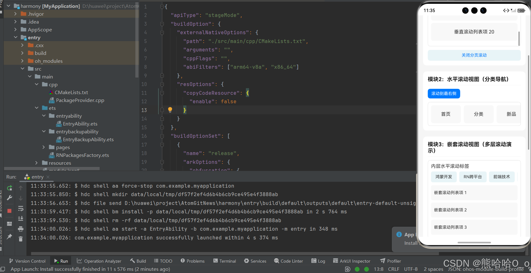
五、进阶开发实战技巧
5.1 性能极致优化技巧
ScrollView 本身是轻量化原生组件,无性能问题,开发中出现的滚动卡顿、加载缓慢均为写法不当导致,以下优化技巧均为鸿蒙真机实测有效,可直接应用,全方位提升滚动流畅度:
- 必给滚动容器设置固定高度 / 宽度:垂直滚动的 ScrollView 必须配置明确的
height,水平滚动必须配置明确的width,避免容器自适应引发的布局重绘,这是解决鸿蒙环境滚动卡顿的首要前提。 - 减少滚动内容的嵌套层级:尽量避免多层 View 嵌套包裹滚动子项,减少组件渲染节点,降低鸿蒙原生渲染的计算量,滚动流畅度可直接提升。
- 精简
onScroll事件逻辑:onScroll为滚动中实时触发的高频事件,仅在该事件中做简单的位置记录即可,复杂业务逻辑(数据请求、状态更新)放到onScrollEndDrag或onMomentumScrollEnd中执行,避免滚动延迟。 - 关闭无用滚动指示器:通过
showsVerticalScrollIndicator={false}和showsHorizontalScrollIndicator={false}隐藏滚动条,既提升页面美观度,又减少少量渲染消耗。 - 避免滚动内容中存在大量动态渲染:滚动项中尽量减少实时计算的样式或数据,固定样式与内容可有效降低渲染压力。
5.2 高频业务场景实战实现
场景 1:吸顶导航栏
通过onScroll监听滚动位置,当滚动的 Y 轴偏移量超过指定高度时,切换导航栏样式为吸顶状态,反之恢复原样式,鸿蒙环境下实现无卡顿、无延迟,核心代码:
const [isSticky, setIsSticky] = useState(false);
const handleScroll = (e) => {
  const y = e.nativeEvent.contentOffset.y;
  setIsSticky(y >= 100);
};
// 吸顶样式应用
<View style={[styles.nav, isSticky && styles.stickyNav]}>
  <Text style={styles.navText}>首页导航</Text>
</View>
场景 2:滚动锚点定位
通过子组件的onLayout获取目标位置的坐标,再调用scrollTo方法滚动到指定位置,实现「点击锚点跳转到对应内容」,适合长文本详情页、表单锚点定位等场景,核心代码:
const targetRef = useRef(null);
const scrollToTarget = () => {
  targetRef.current.measure((x, y) => {
    verticalScrollRef.current.scrollTo({x:0, y:y, animated:true});
  });
};
// 目标锚点
<View ref={targetRef} style={styles.anchorItem}>
  <Text>锚点目标位置</Text>
</View>
5.3 ScrollView 与 FlatList 核心区别
很多入门开发者混淆二者使用场景,导致项目出现严重性能问题,二者为 RN 两大核心滚动组件,各司其职、无优劣之分,核心区别如下:
- 渲染机制:ScrollView 是「一次性渲染」,加载时将所有子组件全部渲染完成;FlatList 是「按需渲染」,仅渲染屏幕可视区域的内容,滚动时动态销毁与复用组件。
- 适用场景:ScrollView 适合展示中短长度的滚动内容(表单、导航栏、图文详情、几十条数据);FlatList 适合展示超长列表数据(商品列表、资讯列表、上百条以上数据)。
- 性能表现:ScrollView 加载速度快,短内容无压力,长内容易卡顿;FlatList 内存占用低、性能优异,长列表首选,短内容使用会增加少量初始化成本。
六、常见问题与解决方案
开发中 ScrollView 的所有问题均为属性配置或写法错误导致,无组件本身的兼容性问题,以下为鸿蒙环境中高频出现的问题及精准解决方案,覆盖 99% 的开发场景,可直接对照解决:
| 问题现象 | 核心原因 | 解决方案 |
|---|---|---|
| 滚动视图无法滚动 | 未设置固定高度 / 宽度、内容未超容器范围、滚动被禁用 | 垂直滚动设 height / 水平设 width;确保内容超容器尺寸;检查 scrollEnabled 属性为 true |
| 滚动卡顿、滑动不流畅 | 嵌套层级过多、onScroll 中逻辑复杂、一次性渲染组件过多 | 简化嵌套层级;精简 onScroll 逻辑;中长列表做条件渲染减少渲染量 |
| 水平滚动不生效 | 未设置 horizontal={true}、未给容器设宽度、子项无宽度 | 开启水平滚动属性;配置容器固定宽度;给水平子项设置明确 width |
| 嵌套滚动冲突,内层无法滚动 | 未开启嵌套滚动开关 | 给外层 ScrollView 添加 nestedScrollEnabled={true} |
| scrollTo/scrollToEnd 调用无效 | ref 绑定错误、组件未渲染完成就调用方法 | 确保 ref 正确绑定 ScrollView;通过条件判断非空后再调用方法 |
| 点击状态栏无法回到顶部 | 未开启 scrollsToTop 属性 | 给垂直滚动的 ScrollView 添加 scrollsToTop={true} |
| 分页滚动吸附效果失效 | 未开启 pagingEnabled、容器尺寸与内容不匹配 | 开启分页属性;确保滚动内容尺寸等于容器尺寸 |
欢迎加入开源鸿蒙跨平台社区:https://openharmonycrossplatform.csdn.net

讨论HarmonyOS开发技术,专注于API与组件、DevEco Studio、测试、元服务和应用上架分发等。
更多推荐


 37
37 0
0- 0


 已为社区贡献28条内容

所有评论(0)