React Native鸿蒙跨平台根据message.isOwn属性决定消息的显示位置和样式,当前用 ref + setTimeout 调用 scrollToEnd,实现“发布消息后滚动到底部”
摘要 本文介绍了一个基于React Native构建的即时聊天应用的技术实现方案。该应用采用函数式组件开发,主要包含消息列表区、快捷回复栏和底部输入框三大部分。消息气泡根据发送者显示左右不同布局,并附带时间戳和状态标记(✓/✓✓/✓✓✓)。关键技术点包括:使用FlatList实现虚拟化滚动,通过ref控制消息发送后自动滚动;快捷回复按钮实现文本快速填充;处理多平台输入法差异和键盘遮挡问题。文中特别
概览
- 页面结构由“聊天头部 → FlatList 消息区 → 快捷回复带横向滚动 → 底部输入栏 → 底部导航”构成,采用函数式组件与本地状态管理,事件驱动新增消息与状态切换。
- 关键交互包括消息气泡的左右对齐与状态勾选显示、发布后滚动定位、快捷回复填充输入、输入栏附件/表情/发送按钮的组合。跨端关注点集中在滚动虚拟化、输入法合成事件、图标一致性和窗口尺寸适配。
气泡与状态映射
- MessageItem 使用 isOwn 控制左右对齐与头像位置,消息文本在气泡中呈现,底部展示时间戳与发送状态勾选(sent → ✓,delivered → ✓✓,read → ✓✓✓)。
- 技术要点:
- 通过 maxWidth: width * 0.7 限制气泡宽度,避免超宽影响布局;横竖屏或分屏场景建议改用 useWindowDimensions 动态适配(鸿蒙端确保窗口事件正确传递到 RN 层)。
- 状态勾选直接映射文本符号,保持可读性且无平台依赖;生产环境可统一使用图标栈替代 emoji,保证不同设备上的视觉一致性。
列表与滚动行为
- 消息区使用 FlatList 虚拟化渲染,keyExtractor 以稳定 id 保证 diff 正确;ListHeaderComponent 显示“今天”分隔。
- 发布后定位:
- 当前用 ref + setTimeout 调用 scrollToEnd,实现“发布消息后滚动到底部”。更稳妥做法是使用 onContentSizeChange 或 InteractionManager.runAfterInteractions,以避免尚未完成布局导致滚动失败。
- 性能建议:
- 将 renderItem 用 useCallback 缓存、MessageItem 使用 React.memo 降低重渲染;数据量增多时可增加 getItemLayout(已知行高场景)提升滚动与定位稳定性。
- 鸿蒙适配:
- FlatList 的滚动物理(回弹、阻尼、惯性)与事件窗口需在适配层映射到 ArkUI 滚动控件,确保手感一致;检验 scrollToEnd 等方法语义的一致性与稳定性。
快捷回复与输入治理
- 快捷回复通过横向 ScrollView 承载一行按钮,onPress 直接回填输入框;这是常见的“预填文案”交互。
- TextInput 多行输入:
- 中文输入法合成(composition)下,onChangeText 的回调时机与内容在 iOS/Android/鸿蒙存在微差异;鸿蒙端需要适配层正确映射 ArkUI 输入法事件,避免中间态被误判为最终文本。
- 键盘遮挡与焦点移动建议使用 KeyboardAvoidingView 或滚动到可视区域策略,提升输入体验的一致性。
状态更新与一致性
- 发布消息 handleSend 使用 setMessages([…messages, newMessage]),点赞/编辑/删除也使用闭包中的 messages 更新;高频交互场景建议改为函数式更新,规避闭包旧值引发的竞态:
- setMessages(prev => [ …prev, newMessage ])
- setMessages(prev => prev.map(…))
- setMessages(prev => prev.filter(…))
- 时间戳格式统一通过 toLocaleTimeString;生产建议抽象为格式器并在三端按 locale 和时区统一显示。
图标与视觉统一
- emoji 图标(📎、📷、🎤 等)适合原型,但在不同系统字体下易出现对齐与色彩差异;建议迁移到统一的矢量/字体图标栈,并在鸿蒙端通过 ArkUI 渲染,保证像素级一致。
- 发送按钮禁用态通过样式表现,提升操作明确性;为提高无障碍体验,建议添加 accessibilityLabel 与“禁用原因”的辅助提示。
概述
本文分析的是一个基于React Native构建的实时聊天应用,集成了消息展示、快捷回复、状态追踪等核心功能。该应用采用了双向消息流布局、动态滚动控制和即时交互反馈,展现了即时通讯类应用的典型技术架构。在鸿蒙OS的跨端适配场景中,这种涉及实时数据更新和复杂界面交互的应用具有重要的技术参考价值。
核心架构设计深度解析
双向消息流布局系统
MessageItem组件实现了经典的双向消息流布局:
const MessageItem = ({ message }: { message: Message }) => {
  return (
    <View style={[styles.messageContainer, message.isOwn ? styles.ownMessage : styles.otherMessage]}>
      {!message.isOwn && (
        <View style={styles.avatar}>
          <Text style={styles.avatarText}>{ICONS.user}</Text>
        </View>
      )}
      <View style={[styles.messageBubble, message.isOwn ? styles.ownBubble : styles.otherBubble]}>
        <Text style={[styles.messageText, message.isOwn ? styles.ownText : styles.otherText]}>
          {message.text}
        </Text>
        <View style={styles.messageFooter}>
          <Text style={styles.timestamp}>{message.timestamp}</Text>
          {message.isOwn && (
            <Text style={styles.sendStatus}>
              {message.status === 'sent' ? '✓' : message.status === 'delivered' ? '✓✓' : '✓✓✓'}
            </Text>
          )}
        </View>
      </View>
      {message.isOwn && (
        <View style={styles.avatar}>
          <Text style={styles.avatarText}>{ICONS.user}</Text>
        </View>
      )}
    </View>
  );
};
这种布局设计采用了条件渲染技术,根据message.isOwn属性决定消息的显示位置和样式。左侧显示对方消息(头像在左),右侧显示自己消息(头像在右)。消息气泡采用不同的背景色和圆角设计,形成了清晰的视觉区分。
在鸿蒙ArkUI体系中,双向布局需要完全重构:
@Component
struct MessageItem {
  @Prop message: Message;

  build() {
    Row() {
      if (!this.message.isOwn) {
        // 对方消息:头像在左
        Column() { Text('👤') }
        Column() {
          Text(this.message.text)
          Row() {
            Text(this.message.timestamp)
            if (this.message.isOwn) {
              Text(this.getStatusIcon())
            }
          }
        }
      } else {
        // 自己消息:头像在右
        Column() {
          Text(this.message.text)
          Row() {
            Text(this.message.timestamp)
            Text(this.getStatusIcon())
          }
        }
        Column() { Text('👤') }
      }
    }
  }

  getStatusIcon(): string {
    switch (this.message.status) {
      case 'sent': return '✓';
      case 'delivered': return '✓✓';
      case 'read': return '✓✓✓';
      default: return '';
    }
  }
}
实时消息管理机制
应用实现了完整的消息生命周期管理:
const [messages, setMessages] = useState<Message[]>([...]);
const [inputText, setInputText] = useState('');
const flatListRef = useRef<FlatList>(null);

const handleSend = () => {
  const newMessage: Message = {
    id: Date.now().toString(),
    text: inputText,
    sender: '我',
    timestamp: new Date().toLocaleTimeString([], { hour: '2-digit', minute: '2-digit' }),
    isOwn: true,
    status: 'sent'
  };

  setMessages([...messages, newMessage]);
  setInputText('');

  // 自动滚动到底部
  setTimeout(() => {
    flatListRef.current?.scrollToEnd({ animated: true });
  }, 100);
};
这种消息管理采用了不可变数据原则,使用展开运算符[…messages, newMessage]添加新消息。Date.now()生成唯一ID,toLocaleTimeString格式化时间显示,setTimeout确保在渲染完成后执行滚动操作。
鸿蒙的实现需要适配其响应式系统:
@State messages: Message[] = [];
@State inputText: string = '';

handleSend() {
  const newMessage: Message = {
    id: Date.now().toString(),
    text: this.inputText,
    sender: '我',
    timestamp: new Date().toLocaleTimeString([], { hour: '2-digit', minute: '2-digit' }),
    isOwn: true,
    status: 'sent'
  };

  this.messages = [...this.messages, newMessage];
  this.inputText = '';

  // 鸿蒙的滚动控制需要不同的实现
  this.scrollToBottom();
}
快捷回复交互系统
QuickReplyButton组件提供了高效的交互方式:
const quickReplies = [
  '好的',
  '现在几点了?',
  '我马上到',
  '谢谢!',
  '稍后回复',
  '哈哈,太好了'
];

const handleQuickReply = (text: string) => {
  setInputText(text);
};

{quickReplies.map((reply, index) => (
  <QuickReplyButton
    key={index}
    text={reply}
    onPress={() => handleQuickReply(reply)}
  />
))}
这种设计通过预设的常用回复短语提升用户体验,水平滚动的ScrollView布局适应了多选项场景。map函数动态生成按钮数组,key属性确保列表渲染性能。
鸿蒙的快捷回复实现:
@State quickReplies: string[] = [
  '好的', '现在几点了?', '我马上到', '谢谢!', '稍后回复', '哈哈,太好了'
];

build() {
  Scroll() {
    Row() {
      ForEach(this.quickReplies, (reply: string) => {
        Button(reply, { type: ButtonType.Normal })
          .onClick(() => this.inputText = reply)
      })
    }
  }
}
跨端适配技术方案
组件映射策略
| React Native组件 | 鸿蒙ArkUI组件 | 关键适配点 |
|---|---|---|
| FlatList | List | 列表实现和滚动控制差异 |
| TextInput | TextInput | 多行文本属性基本一致 |
| TouchableOpacity | Button | 交互反馈机制不同 |
| ScrollView | Scroll | 滚动行为一致 |
样式系统转换
// React Native
ownBubble: {
  backgroundColor: '#3b82f6',
  borderBottomRightRadius: 4,
},
otherBubble: {
  backgroundColor: '#ffffff',
  borderBottomLeftRadius: 4,
  elevation: 1,
}

// 鸿蒙
// 自己消息气泡
Column()
  .backgroundColor('#3b82f6')
  .borderRadius(12)
  .borderRadius({ bottomRight: 4 })

// 对方消息气泡
Column()
  .backgroundColor(Color.White)
  .borderRadius(12)
  .borderRadius({ bottomLeft: 4 })
  .shadow({ radius: 2 })
状态管理迁移
// React Native
const [messages, setMessages] = useState<Message[]>([]);
const [inputText, setInputText] = useState('');

// 鸿蒙
@State messages: Message[] = [];
@State inputText: string = '';
性能优化与最佳实践
列表渲染优化
配置keyExtractor和getItemLayout提升性能:
<FlatList
  ref={flatListRef}
  data={messages}
  keyExtractor={item => item.id}
  getItemLayout={(data, index) => ({
    length: 80, // 预估行高
    offset: 80 * index,
    index,
  })}
  renderItem={({ item }) => <MessageItem message={item} />}
/>
滚动性能优化
使用scrollToEnd的animated参数控制滚动动画:
setTimeout(() => {
  flatListRef.current?.scrollToEnd({ animated: true });
}, 100);
完整代码:
// app.tsx
import React, { useState, useRef } from 'react';
import { SafeAreaView, View, Text, StyleSheet, TouchableOpacity, ScrollView, Dimensions, Alert, TextInput, FlatList } from 'react-native';

// 图标库
const ICONS = {
  send: '🚀',
  user: '👤',
  smile: '😊',
  attach: '📎',
  camera: '📷',
  microphone: '🎤',
  more: '⋯',
  check: '✓',
};

const { width } = Dimensions.get('window');

// 消息类型
type Message = {
  id: string;
  text: string;
  sender: string;
  timestamp: string;
  isOwn: boolean;
  status: 'sent' | 'delivered' | 'read';
};

// 消息项组件
const MessageItem = ({ message }: { message: Message }) => {
  return (
    <View style={[styles.messageContainer, message.isOwn ? styles.ownMessage : styles.otherMessage]}>
      {!message.isOwn && (
        <View style={styles.avatar}>
          <Text style={styles.avatarText}>{ICONS.user}</Text>
        </View>
      )}
      <View style={[styles.messageBubble, message.isOwn ? styles.ownBubble : styles.otherBubble]}>
        <Text style={[styles.messageText, message.isOwn ? styles.ownText : styles.otherText]}>
          {message.text}
        </Text>
        <View style={styles.messageFooter}>
          <Text style={styles.timestamp}>{message.timestamp}</Text>
          {message.isOwn && (
            <Text style={styles.sendStatus}>
              {message.status === 'sent' ? '✓' : message.status === 'delivered' ? '✓✓' : '✓✓✓'}
            </Text>
          )}
        </View>
      </View>
      {message.isOwn && (
        <View style={styles.avatar}>
          <Text style={styles.avatarText}>{ICONS.user}</Text>
        </View>
      )}
    </View>
  );
};

// 快捷回复组件
const QuickReplyButton = ({ text, onPress }: { text: string; onPress: () => void }) => {
  return (
    <TouchableOpacity style={styles.quickReplyButton} onPress={onPress}>
      <Text style={styles.quickReplyText}>{text}</Text>
    </TouchableOpacity>
  );
};

// 主页面组件
const RealTimeChatApp: React.FC = () => {
  const [messages, setMessages] = useState<Message[]>([
    {
      id: '1',
      text: '你好!今天天气不错,适合出去走走。',
      sender: '张三',
      timestamp: '10:30',
      isOwn: false,
      status: 'read'
    },
    {
      id: '2',
      text: '确实,阳光明媚,很舒服。我已经出去晨跑了。',
      sender: '我',
      timestamp: '10:32',
      isOwn: true,
      status: 'read'
    },
    {
      id: '3',
      text: '太棒了!你一般跑多久?',
      sender: '张三',
      timestamp: '10:33',
      isOwn: false,
      status: 'read'
    },
    {
      id: '4',
      text: '通常30分钟,今天跑了40分钟,感觉特别好!',
      sender: '我',
      timestamp: '10:35',
      isOwn: true,
      status: 'read'
    },
    {
      id: '5',
      text: '厉害!我也要开始锻炼了。',
      sender: '张三',
      timestamp: '10:36',
      isOwn: false,
      status: 'read'
    }
  ]);

  const [inputText, setInputText] = useState('');
  const flatListRef = useRef<FlatList>(null);

  const quickReplies = [
    '好的',
    '现在几点了?',
    '我马上到',
    '谢谢!',
    '稍后回复',
    '哈哈,太好了'
  ];

  const handleSend = () => {
    if (inputText.trim() === '') {
      Alert.alert('提示', '请输入消息内容');
      return;
    }

    const newMessage: Message = {
      id: Date.now().toString(),
      text: inputText,
      sender: '我',
      timestamp: new Date().toLocaleTimeString([], { hour: '2-digit', minute: '2-digit' }),
      isOwn: true,
      status: 'sent'
    };

    setMessages([...messages, newMessage]);
    setInputText('');

    // 滚动到底部
    setTimeout(() => {
      flatListRef.current?.scrollToEnd({ animated: true });
    }, 100);
  };

  const handleQuickReply = (text: string) => {
    setInputText(text);
  };

  const handleSendPress = () => {
    handleSend();
  };

  return (
    <SafeAreaView style={styles.container}>
      {/* 头部 */}
      <View style={styles.header}>
        <Text style={styles.title}>实时聊天</Text>
        <TouchableOpacity style={styles.infoButton} onPress={() => Alert.alert('联系人信息', '正在与 张三 聊天')}>
          <Text style={styles.infoText}>{ICONS.user}</Text>
        </TouchableOpacity>
      </View>

      {/* 聊天内容区域 */}
      <FlatList
        ref={flatListRef}
        data={messages}
        keyExtractor={item => item.id}
        renderItem={({ item }) => <MessageItem message={item} />}
        style={styles.chatArea}
        showsVerticalScrollIndicator={false}
        ListHeaderComponent={
          <View style={styles.chatHeader}>
            <Text style={styles.chatHeaderText}>今天</Text>
          </View>
        }
      />

      {/* 快捷回复区域 */}
      <View style={styles.quickRepliesContainer}>
        <ScrollView horizontal showsHorizontalScrollIndicator={false}>
          <View style={styles.quickReplies}>
            {quickReplies.map((reply, index) => (
              <QuickReplyButton
                key={index}
                text={reply}
                onPress={() => handleQuickReply(reply)}
              />
            ))}
          </View>
        </ScrollView>
      </View>

      {/* 输入区域 */}
      <View style={styles.inputContainer}>
        <TouchableOpacity style={styles.attachButton}>
          <Text style={styles.attachIcon}>{ICONS.attach}</Text>
        </TouchableOpacity>

        <TextInput
          style={styles.textInput}
          value={inputText}
          onChangeText={setInputText}
          placeholder="输入消息..."
          multiline
        />

        <TouchableOpacity style={styles.smileButton}>
          <Text style={styles.smileIcon}>{ICONS.smile}</Text>
        </TouchableOpacity>

        <TouchableOpacity
          style={[styles.sendButton, inputText.trim() === '' && styles.sendButtonDisabled]}
          onPress={handleSendPress}
          disabled={inputText.trim() === ''}
        >
          <Text style={styles.sendButtonText}>{ICONS.send}</Text>
        </TouchableOpacity>
      </View>

      {/* 底部导航 */}
      <View style={styles.bottomNav}>
        <TouchableOpacity style={styles.navItem}>
          <Text style={styles.navIcon}>{ICONS.user}</Text>
          <Text style={styles.navText}>联系人</Text>
        </TouchableOpacity>
        <TouchableOpacity style={styles.navItem}>
          <Text style={styles.navIcon}>{ICONS.camera}</Text>
          <Text style={styles.navText}>相机</Text>
        </TouchableOpacity>
        <TouchableOpacity style={[styles.navItem, styles.activeNavItem]}>
          <Text style={styles.navIcon}>{ICONS.microphone}</Text>
          <Text style={styles.navText}>聊天</Text>
        </TouchableOpacity>
        <TouchableOpacity style={styles.navItem}>
          <Text style={styles.navIcon}>{ICONS.more}</Text>
          <Text style={styles.navText}>更多</Text>
        </TouchableOpacity>
      </View>
    </SafeAreaView>
  );
};

const styles = StyleSheet.create({
  container: {
    flex: 1,
    backgroundColor: '#f8fafc',
  },
  header: {
    flexDirection: 'row',
    alignItems: 'center',
    justifyContent: 'space-between',
    padding: 20,
    backgroundColor: '#ffffff',
    borderBottomWidth: 1,
    borderBottomColor: '#e2e8f0',
  },
  title: {
    fontSize: 20,
    fontWeight: 'bold',
    color: '#1e293b',
  },
  infoButton: {
    width: 36,
    height: 36,
    borderRadius: 18,
    backgroundColor: '#f1f5f9',
    alignItems: 'center',
    justifyContent: 'center',
  },
  infoText: {
    fontSize: 18,
    color: '#64748b',
  },
  chatArea: {
    flex: 1,
    padding: 16,
  },
  chatHeader: {
    alignItems: 'center',
    marginVertical: 12,
  },
  chatHeaderText: {
    fontSize: 12,
    color: '#64748b',
    backgroundColor: '#e2e8f0',
    paddingHorizontal: 12,
    paddingVertical: 4,
    borderRadius: 12,
  },
  messageContainer: {
    flexDirection: 'row',
    alignItems: 'flex-end',
    marginBottom: 12,
  },
  ownMessage: {
    justifyContent: 'flex-end',
  },
  otherMessage: {
    justifyContent: 'flex-start',
  },
  avatar: {
    width: 36,
    height: 36,
    borderRadius: 18,
    backgroundColor: '#dbeafe',
    alignItems: 'center',
    justifyContent: 'center',
    marginHorizontal: 8,
  },
  avatarText: {
    fontSize: 18,
    color: '#3b82f6',
  },
  messageBubble: {
    maxWidth: width * 0.7,
    borderRadius: 12,
    padding: 12,
  },
  ownBubble: {
    backgroundColor: '#3b82f6',
    borderBottomRightRadius: 4,
  },
  otherBubble: {
    backgroundColor: '#ffffff',
    borderBottomLeftRadius: 4,
    elevation: 1,
    shadowColor: '#000',
    shadowOffset: { width: 0, height: 1 },
    shadowOpacity: 0.1,
    shadowRadius: 2,
  },
  messageText: {
    fontSize: 16,
    lineHeight: 22,
  },
  ownText: {
    color: '#ffffff',
  },
  otherText: {
    color: '#1e293b',
  },
  messageFooter: {
    flexDirection: 'row',
    justifyContent: 'space-between',
    alignItems: 'center',
    marginTop: 4,
  },
  timestamp: {
    fontSize: 10,
    color: '#94a3b8',
  },
  sendStatus: {
    fontSize: 10,
    color: '#94a3b8',
  },
  quickRepliesContainer: {
    backgroundColor: '#ffffff',
    paddingHorizontal: 16,
    paddingVertical: 8,
    borderBottomWidth: 1,
    borderBottomColor: '#e2e8f0',
  },
  quickReplies: {
    flexDirection: 'row',
  },
  quickReplyButton: {
    backgroundColor: '#f1f5f9',
    paddingHorizontal: 12,
    paddingVertical: 6,
    borderRadius: 16,
    marginRight: 8,
  },
  quickReplyText: {
    fontSize: 12,
    color: '#64748b',
  },
  inputContainer: {
    flexDirection: 'row',
    alignItems: 'flex-end',
    padding: 16,
    backgroundColor: '#ffffff',
    borderTopWidth: 1,
    borderTopColor: '#e2e8f0',
  },
  attachButton: {
    width: 40,
    height: 40,
    borderRadius: 20,
    backgroundColor: '#f1f5f9',
    alignItems: 'center',
    justifyContent: 'center',
    marginRight: 8,
  },
  attachIcon: {
    fontSize: 20,
    color: '#64748b',
  },
  textInput: {
    flex: 1,
    borderWidth: 1,
    borderColor: '#cbd5e1',
    borderRadius: 20,
    paddingVertical: 10,
    paddingHorizontal: 16,
    fontSize: 16,
    color: '#1e293b',
    maxHeight: 100,
    backgroundColor: '#f8fafc',
  },
  smileButton: {
    width: 40,
    height: 40,
    borderRadius: 20,
    backgroundColor: '#f1f5f9',
    alignItems: 'center',
    justifyContent: 'center',
    marginHorizontal: 8,
  },
  smileIcon: {
    fontSize: 20,
    color: '#64748b',
  },
  sendButton: {
    width: 40,
    height: 40,
    borderRadius: 20,
    backgroundColor: '#3b82f6',
    alignItems: 'center',
    justifyContent: 'center',
  },
  sendButtonDisabled: {
    backgroundColor: '#cbd5e1',
  },
  sendButtonText: {
    fontSize: 20,
    color: '#ffffff',
  },
  bottomNav: {
    flexDirection: 'row',
    justifyContent: 'space-around',
    backgroundColor: '#ffffff',
    borderTopWidth: 1,
    borderTopColor: '#e2e8f0',
    paddingVertical: 12,
  },
  navItem: {
    alignItems: 'center',
    flex: 1,
  },
  activeNavItem: {
    paddingBottom: 2,
    borderBottomWidth: 2,
    borderBottomColor: '#3b82f6',
  },
  navIcon: {
    fontSize: 20,
    color: '#94a3b8',
    marginBottom: 4,
  },
  activeNavIcon: {
    color: '#3b82f6',
  },
  navText: {
    fontSize: 12,
    color: '#94a3b8',
  },
  activeNavText: {
    color: '#3b82f6',
    fontWeight: '500',
  },
});

export default RealTimeChatApp;
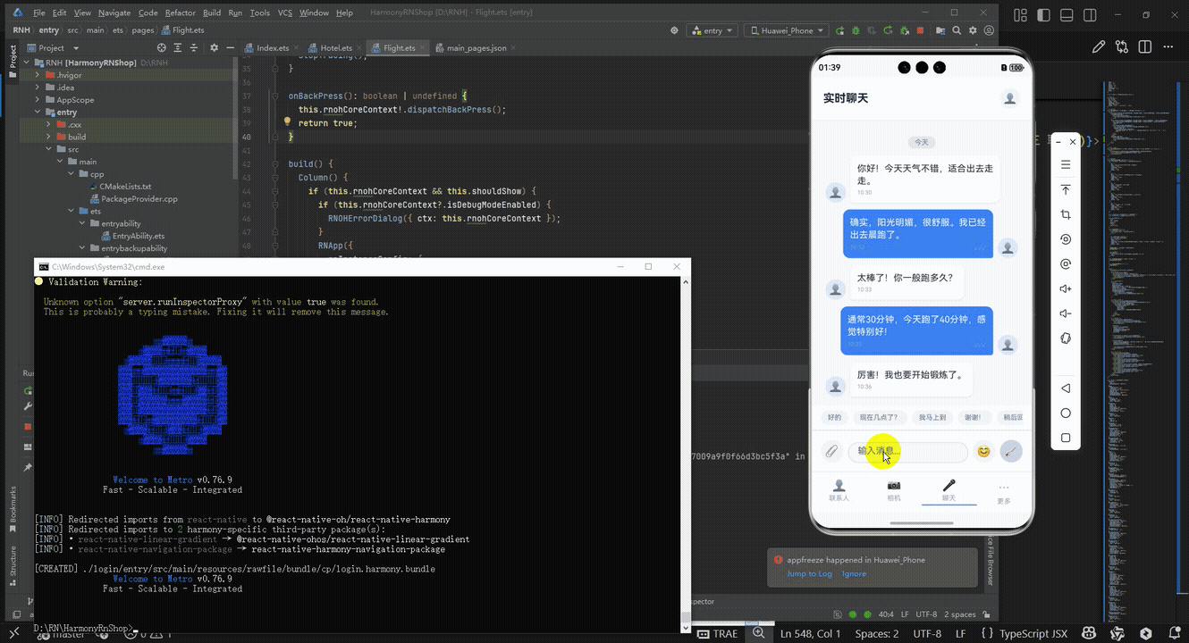
打包
接下来通过打包命令npn run harmony将reactNative的代码打包成为bundle,这样可以进行在开源鸿蒙OpenHarmony中进行使用。

打包之后再将打包后的鸿蒙OpenHarmony文件拷贝到鸿蒙的DevEco-Studio工程目录去:

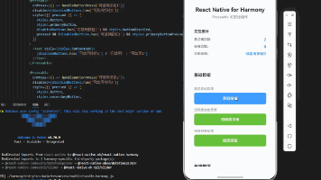
最后运行效果图如下显示:
欢迎大家加入开源鸿蒙跨平台开发者社区,一起共建开源鸿蒙跨平台生态。

讨论HarmonyOS开发技术,专注于API与组件、DevEco Studio、测试、元服务和应用上架分发等。
更多推荐

 19
19 0
0- 0


 已为社区贡献6条内容

所有评论(0)