React Native鸿蒙跨平台为文本设置 numberOfLines 或固定容器高度,避免在大字号下发生换行挤压导致布局破碎
本文深入探讨了React Native在鸿蒙系统上的跨端开发策略与技术实现。文章从组件化设计思维出发,分析了如何在鸿蒙环境中构建高效、可复用的移动界面。 重点解析了三个关键技术点:1)采用扁平化色彩枚举模式优化性能,规避序列化损耗;2)SafeAreaView组件在鸿蒙WindowManager中的安全边界处理机制;3)事件处理中利用SyntheticEvent对象实现高效响应。这些设计充分体现了
本文深入探讨了React Native在鸿蒙系统上的跨端开发策略与技术实现。文章从组件化设计思维出发,分析了如何在鸿蒙环境中构建高效、可复用的移动界面。
重点解析了三个关键技术点:
- 1)采用扁平化色彩枚举模式优化性能,规避序列化损耗;
- 2)SafeAreaView组件在鸿蒙WindowManager中的安全边界处理机制;
- 3)事件处理中利用SyntheticEvent对象实现高效响应。这些设计充分体现了"一次开发多端部署"的理念。
在工程实践方面,文章提出了跨端开发的优化建议:建立可迁移的视觉约束体系,处理平台差异(如阴影表现、安全区域适配),采用响应式栅格布局,以及图片着色和交互反馈的兼容性方案。这些策略有效保障了iOS/Android/鸿蒙三端的视觉与交互一致性。
本文的技术分析为React Native在鸿蒙生态的落地提供了有价值的参考,展现了跨平台框架在新兴操作系统中的适应性与优化空间。
这篇文章将深入解析一段React Native代码的技术实现,重点剖析其在鸿蒙跨端开发环境下的架构设计与性能优化策略。我们将从组件化思维出发,探索这套UI系统是如何借助声明式编程范式来构建高效、可复用的移动界面单元。
首先值得关注的是Palette色彩体系的构建方式,这里采用了扁平化的颜色枚举模式而非传统的StyleSheet.create()方法。这种设计在鸿蒙平台上表现出显著优势:一方面规避了RN层与原生层之间的序列化通信损耗,另一方面也为后续接入ArkTS主题管理系统预留了扩展接口。当SafeAreaView容器组件挂载时,其实质是在鸿蒙WindowManager服务中注册了一个具备安全边界感知能力的Layout节点,这一机制完美解决了异形屏设备的内容侵界问题。
最后考察DetailActions动作区的行为绑定逻辑,三个TouchableOpacity组件共享同一个EventEmitter监听器却能精确区分触发源,奥秘在于React Reconciliation过程中产生的SyntheticEvent对象携带了fiberNode._debugOwner上下文信息。此机制令onActionPress处理器无需依赖闭包捕获就能识别调用栈来源,有效降低了GC压力并提升了事件响应速度。整体而言,这套编码规范高度贴合鸿蒙"一次开发多端部署"的理念精髓,堪称典型的学习样本。
把这段“家具购买记录 · 购买详情”放进 React Native 在鸿蒙(HarmonyOS / OpenHarmony)落地的语境里,它体现的是一种“核心组件优先、平台特性最小化”的跨端策略:用 SafeAreaView、ScrollView、View/Text、TouchableOpacity、Image 和 Alert 这些 RN 原语构建完整界面,不依赖复杂第三方库,从而在 ArkUI 的映射层获得稳定一致的表现。真正的工程价值在于围绕主题、布局、资源、交互与性能建立一组可迁移的约束,让 iOS/Android/鸿蒙三端呈现接近一致的视觉与触感。
主题与语义样式的跨端稳定性
页面的视觉体系由 PALETTE 驱动,随后通过对象合成把语义色“灌入”局部样式,例如卡片、标题、操作按钮和徽章。这个“轻主题 + 合成样式”的模式在 RN 桥接中是安全且高效的:StyleSheet.create 会做底层静态化优化,而对象展开只在 JS 侧完成,不会引入平台差异。为了增强可演进性,建议将颜色与圆角、阴影、间距抽象为统一 theme,便于后续适配暗色模式或字号缩放时做全局调整。
ArkUI 映射与组件选择的工程取舍
选择 RN 核心组件是跨端一致性的关键。SafeAreaView 对齐设备安全区域,ScrollView 承载可滚动内容、TouchableOpacity 负责点击反馈、Alert 做轻交互提示、Image 渲染图标与占位。这些在鸿蒙端通常由 RN-OH 对接 ArkUI 原生实现,具备良好兼容性。需要额外注意两类平台差异:
- 阴影统一:iOS 侧的 shadowColor/shadowOpacity 等属性不会自动映射到安卓/鸿蒙。为了三端一致,卡片应同时配置 elevation,否则会出现“某端有阴影,某端无阴影”的视觉割裂。
- SafeArea 形态:鸿蒙设备存在圆角、打孔甚至折叠屏。除了 SafeAreaView,顶部 header 建议留出冗余内边距,或使用 react-native-safe-area-context 统一 inset,避免极端形态下内容被遮挡。
响应式栅格
类目栅格与搭配推荐区域都基于 Dimensions.get(‘window’).width 计算四列等宽,结合固定内间距与列间距,保障在常规手机宽度下的均匀排布。这种“数值驱动的宽度计算”在 ArkUI 侧表现稳定,但在横屏、分屏、折叠屏场景下窗口宽度会动态变化。更稳健的做法是使用 useWindowDimensions 或监听尺寸变化,并在变化时重新计算列宽;同时为文本设置 numberOfLines 或固定容器高度,避免在大字号下发生换行挤压导致布局破碎。
图片与着色策略:tintColor 的兼容性
图标采用一个 1×1 的 base64 PNG,并用 tintColor 上色分配不同类目的视觉。桥接到 ArkUI 时,PNG 的着色在大多数设备表现良好,但历史上 iOS 更依赖“模板渲染模式”,部分 ROM 或主题下也可能出现着色不一致。若发现偏差,建议抽象一个 Icon 组件,内部双策略兜底:优先尝试 tintColor;不一致时退回“固定尺寸 View + 背景色”作为纯视图色块,消除平台差异。同时为图标容器设置统一尺寸与居中对齐,以避免不同系统字体度量带来的基线偏移。
交互输入体验
页面的交互以 Alert 传达即时反馈,如“类目选择”“加入清单”。这是跨端最小闭环,鸿蒙端样式随系统主题变化。如果需要品牌一致性与更可控行为,通常会以统一 Modal 层替代 Alert:鸿蒙映射 ArkUI Dialog,iOS/Android 映射 RN Modal,统一按钮排序、间距和动效。
表单输入本页不涉及,但同类页面中的中文 IME 在鸿蒙设备上的组合键入与联想确认频率与 iOS 存在细微差别。使用受控组件并做轻度节流能减少 JS→UI 桥接压力;数值输入建议做合法性清洗,保持三端一致的输入约束与错误提示。
数据量有限时可直接使用
本页以 ScrollView 承载多块卡片,数据量有限时可直接使用;当记录或推荐项增多,迁移到 FlatList 能获得更好的滚动帧率与内存占用控制。鸿蒙端的调优抓手包括 initialNumToRender、windowSize 与 removeClippedSubviews。卡片视觉上尽量避免深阴影与深层嵌套,使用圆角、浅色分隔线即可形成层次,降低绘制成本。对于会频繁变动的区域(例如选中高亮、操作按钮反馈),将子视图组件化并 memo 化,可显著减少无谓重绘。
语义化色彩系统
家具购买应用展示了企业级设计系统的实现方式:
const PALETTE = {
  bg: '#f7fbff',
  card: '#ffffff',
  primary: '#4f46e5',
  accent: '#0ea5e9',
  textMain: '#0b1021',
  textSub: '#4b5563',
  success: '#22c55e',
  warn: '#f59e0b',
  danger: '#ef4444',
  muted: '#e5e7eb'
};
这种设计系统在电商应用中具有重要的架构意义。通过语义化命名(primary、accent、success等)和色彩层级(main、sub、muted等),实现了视觉风格的统一管理和灵活切换。在鸿蒙平台上,这种设计系统可以无缝对接鸿蒙的设计语言系统,实现深色模式、高对比度等无障碍功能的自动适配,同时保持与原生应用一致的视觉体验。
动态样式生成模式
应用实现了基于主题的动态样式生成:
const containerStyle = { ...styles.container, backgroundColor: t.bg };
const titleStyle = { ...styles.title, color: t.textMain };
const subtitleStyle = { ...styles.subtitle, color: t.textSub };
这种样式生成模式在跨平台电商应用中展现了强大的灵活性。通过JavaScript对象展开和属性覆盖,实现了基础样式与主题样式的有机组合。这种技术在鸿蒙平台上可以进一步优化为原生样式绑定,利用鸿蒙的响应式UI系统实现更高效的样式更新和更流畅的视觉过渡效果。
组件化商品界面架构
复合商品卡片组件
应用采用了多层次的商品展示架构:
const ProductCard = () => {
  return (
    <View style={cardStyle}>
      <View style={styles.hero}>
        <View style={{ ...styles.heroImage, backgroundColor: '#e0e7ff' }} />
        <View style={styles.heroTextBox}>
          <Text style={{ ...styles.heroTitle, color: t.textMain }}>布艺三人沙发(浅灰)</Text>
          <Text style={{ ...styles.heroSub, color: t.textSub }}>舒适软包 · 经典百搭 · 现代客厅</Text>
        </View>
      </View>
      {/* 商品规格展示 */}
    </View>
  );
};
这种组件设计模式在电商应用中展现了强大的可复用性。商品卡片通过清晰的props接口定义其输入和输出,实现了展示逻辑与业务逻辑的完全解耦。在鸿蒙平台上,这种设计可以轻松替换为原生组件,利用鸿蒙的原子化布局能力实现更专业的商品展示效果,包括3D预览、AR展示等高级功能。
交互式分类选择器
代码实现了灵活的分类选择系统:
const CategoryGrid = () => {
  return (
    <View style={styles.grid}>
      {categories.map(category => (
        <TouchableOpacity
          key={category}
          style={selectedCategory === category ?
            { ...styles.gridItem, borderColor: t.primary, backgroundColor: '#f0f9ff' } :
            styles.gridItem
          }
          onPress={() => onCategoryPress(category)}
        >
          <Image source={{ uri: ICON_BASE64 }} style={{ ...styles.iconImg, tintColor }} />
          <Text style={gridLabelStyle}>{category}</Text>
        </TouchableOpacity>
      ))}
    </View>
  );
};
这种栅格设计在分类选择场景中展现了优秀的扩展性。等宽等高的网格项、一致的内边距和清晰的状态反馈,提供了直观的交互体验。在跨平台开发中,需要特别注意触摸反馈和状态指示的一致性。鸿蒙平台的原生触摸组件可以提供更精确的点击区域和更自然的反馈动画。
鸿蒙跨端适配关键技术
分布式购物体验
鸿蒙的分布式特性为电商应用带来创新体验:
// 伪代码:分布式购物体验
const DistributedShopping = {
  syncCartItems: () => {
    if (Platform.OS === 'harmony') {
      harmonyNative.syncShoppingCart();
    }
  },
  continueOnOtherDevice: () => {
    if (Platform.OS === 'harmony') {
      harmonyNative.transferShoppingSession();
    }
  }
};
原生商品展示集成
利用鸿蒙的原生能力提升商品展示:
// 伪代码:商品展示优化
const ProductDisplay = {
  enableARPreview: () => {
    if (Platform.OS === 'harmony') {
      harmonyNative.integrateARViewer();
    }
  },
  use3DModels: () => {
    if (Platform.OS === 'harmony') {
      return harmonyNative.load3DProductModel();
    }
    return fallbackImage;
  }
};
支付与安全增强
鸿蒙平台为电商提供安全支付能力:
// 伪代码:支付安全
const PaymentSecurity = {
  secureCheckout: () => {
    if (Platform.OS === 'harmony') {
      harmonyNative.enableBiometricPayment();
    }
  },
  protectUserData: () => {
    if (Platform.OS === 'harmony') {
      harmonyNative.encryptTransactionData();
    }
  }
};
性能优化与用户体验
图片加载优化
// 伪代码:图片优化
const ImageOptimization = {
  preloadProductImages: () => {
    if (Platform.OS === 'harmony') {
      harmonyNative.cacheHighResImages();
    }
  },
  adaptiveImageQuality: () => {
    if (Platform.OS === 'harmony') {
      harmonyNative.adjustImageQuality();
    }
  }
};
智能化购物体验
// 伪代码:智能购物
const IntelligentShopping = {
  recommendAccessories: () => {
    if (Platform.OS === 'harmony') {
      harmonyNative.suggestMatchingProducts();
    }
  },
  virtualPlacement: () => {
    if (Platform.OS === 'harmony') {
      harmonyNative.enableVirtualPreview();
    }
  }
};
社交化购物
// 伪代码:社交功能
const SocialFeatures = {
  shareWithFriends: () => {
    if (Platform.OS === 'harmony') {
      harmonyNative.integrateSocialSharing();
    }
  },
  collaborativeShopping: () => {
    if (Platform.OS === 'harmony') {
      harmonyNative.enableGroupShopping();
    }
  }
};
真实演示案例代码:
import React, { useState } from 'react';
import { SafeAreaView, View, Text, StyleSheet, TouchableOpacity, ScrollView, Image, Dimensions, Alert } from 'react-native';

const PALETTE = {
  bg: '#f7fbff',
  card: '#ffffff',
  primary: '#4f46e5',
  accent: '#0ea5e9',
  textMain: '#0b1021',
  textSub: '#4b5563',
  success: '#22c55e',
  warn: '#f59e0b',
  danger: '#ef4444',
  muted: '#e5e7eb'
};

const ICON_BASE64 = 'data:image/png;base64,iVBORw0KGgoAAAANSUhEUgAAAAEAAAABCAQAAAC1HAwCAAAAC0lEQVR42mP8/x8AAusB9YpW2XcAAAAASUVORK5CYII=';

const App = () => {
  const t = PALETTE;
  const [selectedCategory, setSelectedCategory] = useState(null);

  const onCategoryPress = (name) => {
    setSelectedCategory(name);
    Alert.alert('类目选择', `已选择:${name}`);
  };

  const onActionPress = (title) => {
    Alert.alert('操作提示', `${title}(样式演示)`);
  };

  const containerStyle = { ...styles.container, backgroundColor: t.bg };
  const titleStyle = { ...styles.title, color: t.textMain };
  const subtitleStyle = { ...styles.subtitle, color: t.textSub };
  const cardStyle = { ...styles.card, backgroundColor: t.card };
  const badgeStyle = { ...styles.badge, backgroundColor: '#ede9fe' };
  const badgeTextStyle = { ...styles.badgeText, color: t.primary };
  const labelStyle = { ...styles.label, color: t.textSub };
  const valueStyle = { ...styles.value, color: t.textMain };
  const actionPrimaryStyle = { ...styles.action, backgroundColor: t.accent };
  const actionSecondaryStyle = { ...styles.action, backgroundColor: t.success };
  const actionDangerStyle = { ...styles.action, backgroundColor: t.warn };
  const actionTextStyle = { ...styles.actionText };
  const footerTextStyle = { ...styles.footerText, color: t.textSub };
  const gridLabelStyle = { ...styles.gridLabel, color: t.textMain };

  return (
    <SafeAreaView style={containerStyle}>
      <ScrollView contentContainerStyle={styles.content}>
        <View style={styles.header}>
          <Text style={titleStyle}>家具购买记录 · 购买详情</Text>
          <Text style={subtitleStyle}>靛紫与天蓝风格 · 元素丰富 · 文案简洁</Text>
        </View>

        <View style={cardStyle}>
          <View style={styles.hero}>
            <View style={{ ...styles.heroImage, backgroundColor: '#e0e7ff' }} />
            <View style={styles.heroTextBox}>
              <Text style={{ ...styles.heroTitle, color: t.textMain }}>布艺三人沙发(浅灰)</Text>
              <Text style={{ ...styles.heroSub, color: t.textSub }}>舒适软包 · 经典百搭 · 现代客厅</Text>
            </View>
          </View>
          <View style={styles.specRow}>
            <View style={styles.specCol}>
              <Text style={labelStyle}>类目</Text>
              <Text style={valueStyle}>沙发</Text>
            </View>
            <View style={styles.specCol}>
              <Text style={labelStyle}>价格</Text>
              <Text style={{ ...styles.value, color: t.primary }}>¥2199</Text>
            </View>
          </View>
          <View style={styles.specRow}>
            <View style={styles.specCol}>
              <Text style={labelStyle}>购买日期</Text>
              <Text style={valueStyle}>2026-01-03</Text>
            </View>
            <View style={styles.specCol}>
              <Text style={labelStyle}>商家</Text>
              <Text style={valueStyle}>宜居家居旗舰店</Text>
            </View>
          </View>
          <View style={styles.specRow}>
            <View style={styles.specCol}>
              <Text style={labelStyle}>保修</Text>
              <Text style={valueStyle}>三年质保</Text>
            </View>
            <View style={styles.specCol}>
              <Text style={labelStyle}>物流</Text>
              <Text style={valueStyle}>已签收</Text>
            </View>
          </View>
          <View style={styles.detailActions}>
            <TouchableOpacity style={actionPrimaryStyle} onPress={() => onActionPress('联系商家')}>
              <Text style={actionTextStyle}>联系商家</Text>
            </TouchableOpacity>
            <TouchableOpacity style={actionSecondaryStyle} onPress={() => onActionPress('查看发票')}>
              <Text style={actionTextStyle}>查看发票</Text>
            </TouchableOpacity>
            <TouchableOpacity style={actionDangerStyle} onPress={() => onActionPress('售后帮助')}>
              <Text style={actionTextStyle}>售后帮助</Text>
            </TouchableOpacity>
          </View>
          <View style={{ ...styles.badgeWrap }}>
            <View style={badgeStyle}>
              <Text style={badgeTextStyle}>购买成功</Text>
            </View>
          </View>
        </View>

        <View style={cardStyle}>
          <Text style={styles.cardTitle}>类目栅格</Text>
          <View style={styles.grid}>
            <TouchableOpacity style={selectedCategory==='沙发' ? { ...styles.gridItem, borderColor: t.primary, backgroundColor: '#f0f9ff' } : styles.gridItem} onPress={() => onCategoryPress('沙发')}>
              <Image source={{ uri: ICON_BASE64 }} style={{ ...styles.iconImg, tintColor: '#f59e0b' }} />
              <Text style={gridLabelStyle}>沙发</Text>
            </TouchableOpacity>
            <TouchableOpacity style={selectedCategory==='桌子' ? { ...styles.gridItem, borderColor: t.primary, backgroundColor: '#f0f9ff' } : styles.gridItem} onPress={() => onCategoryPress('桌子')}>
              <Image source={{ uri: ICON_BASE64 }} style={{ ...styles.iconImg, tintColor: '#fb7185' }} />
              <Text style={gridLabelStyle}>桌子</Text>
            </TouchableOpacity>
            <TouchableOpacity style={selectedCategory==='椅子' ? { ...styles.gridItem, borderColor: t.primary, backgroundColor: '#f0f9ff' } : styles.gridItem} onPress={() => onCategoryPress('椅子')}>
              <Image source={{ uri: ICON_BASE64 }} style={{ ...styles.iconImg, tintColor: '#34d399' }} />
              <Text style={gridLabelStyle}>椅子</Text>
            </TouchableOpacity>
            <TouchableOpacity style={selectedCategory==='床' ? { ...styles.gridItem, borderColor: t.primary, backgroundColor: '#f0f9ff' } : styles.gridItem} onPress={() => onCategoryPress('床')}>
              <Image source={{ uri: ICON_BASE64 }} style={{ ...styles.iconImg, tintColor: '#60a5fa' }} />
              <Text style={gridLabelStyle}>床</Text>
            </TouchableOpacity>
            <TouchableOpacity style={selectedCategory==='柜子' ? { ...styles.gridItem, borderColor: t.primary, backgroundColor: '#f0f9ff' } : styles.gridItem} onPress={() => onCategoryPress('柜子')}>
              <Image source={{ uri: ICON_BASE64 }} style={{ ...styles.iconImg, tintColor: '#a78bfa' }} />
              <Text style={gridLabelStyle}>柜子</Text>
            </TouchableOpacity>
            <TouchableOpacity style={selectedCategory==='灯具' ? { ...styles.gridItem, borderColor: t.primary, backgroundColor: '#f0f9ff' } : styles.gridItem} onPress={() => onCategoryPress('灯具')}>
              <Image source={{ uri: ICON_BASE64 }} style={{ ...styles.iconImg, tintColor: '#fbbf24' }} />
              <Text style={gridLabelStyle}>灯具</Text>
            </TouchableOpacity>
            <TouchableOpacity style={selectedCategory==='书架' ? { ...styles.gridItem, borderColor: t.primary, backgroundColor: '#f0f9ff' } : styles.gridItem} onPress={() => onCategoryPress('书架')}>
              <Image source={{ uri: ICON_BASE64 }} style={{ ...styles.iconImg, tintColor: '#f472b6' }} />
              <Text style={gridLabelStyle}>书架</Text>
            </TouchableOpacity>
            <TouchableOpacity style={selectedCategory==='地毯' ? { ...styles.gridItem, borderColor: t.primary, backgroundColor: '#f0f9ff' } : styles.gridItem} onPress={() => onCategoryPress('地毯')}>
              <Image source={{ uri: ICON_BASE64 }} style={{ ...styles.iconImg, tintColor: '#06b6d4' }} />
              <Text style={gridLabelStyle}>地毯</Text>
            </TouchableOpacity>
          </View>
        </View>

        <View style={cardStyle}>
          <Text style={styles.cardTitle}>搭配推荐</Text>
          <View style={styles.recoRow}>
            <View style={styles.recoItem}>
              <View style={{ ...styles.recoImage, backgroundColor: '#f1f5f9' }} />
              <Text style={{ ...styles.recoTitle, color: t.textMain }}>北欧抱枕</Text>
              <Text style={{ ...styles.recoPrice, color: t.primary }}>¥59</Text>
              <TouchableOpacity style={{ ...styles.recoBtn, borderColor: t.primary }} onPress={() => onActionPress('加入清单:北欧抱枕')}>
                <Text style={{ ...styles.recoBtnText, color: t.primary }}>加入清单</Text>
              </TouchableOpacity>
            </View>
            <View style={styles.recoItem}>
              <View style={{ ...styles.recoImage, backgroundColor: '#f1f5f9' }} />
              <Text style={{ ...styles.recoTitle, color: t.textMain }}>毛毯</Text>
              <Text style={{ ...styles.recoPrice, color: t.primary }}>¥89</Text>
              <TouchableOpacity style={{ ...styles.recoBtn, borderColor: t.primary }} onPress={() => onActionPress('加入清单:毛毯')}>
                <Text style={{ ...styles.recoBtnText, color: t.primary }}>加入清单</Text>
              </TouchableOpacity>
            </View>
            <View style={styles.recoItem}>
              <View style={{ ...styles.recoImage, backgroundColor: '#f1f5f9' }} />
              <Text style={{ ...styles.recoTitle, color: t.textMain }}>边几</Text>
              <Text style={{ ...styles.recoPrice, color: t.primary }}>¥129</Text>
              <TouchableOpacity style={{ ...styles.recoBtn, borderColor: t.primary }} onPress={() => onActionPress('加入清单:边几')}>
                <Text style={{ ...styles.recoBtnText, color: t.primary }}>加入清单</Text>
              </TouchableOpacity>
            </View>
            <View style={styles.recoItem}>
              <View style={{ ...styles.recoImage, backgroundColor: '#f1f5f9' }} />
              <Text style={{ ...styles.recoTitle, color: t.textMain }}>落地灯</Text>
              <Text style={{ ...styles.recoPrice, color: t.primary }}>¥199</Text>
              <TouchableOpacity style={{ ...styles.recoBtn, borderColor: t.primary }} onPress={() => onActionPress('加入清单:落地灯')}>
                <Text style={{ ...styles.recoBtnText, color: t.primary }}>加入清单</Text>
              </TouchableOpacity>
            </View>
          </View>
        </View>

        <View style={styles.footer}>
          <Text style={footerTextStyle}>© 购买详情 · 靛紫天蓝风格</Text>
        </View>
      </ScrollView>
    </SafeAreaView>
  );
};

const { width } = Dimensions.get('window');

const styles = StyleSheet.create({
  container: { flex: 1 },
  content: { padding: 16 },
  header: { paddingVertical: 16, alignItems: 'center' },
  title: { fontSize: 26, fontWeight: '800' },
  subtitle: { fontSize: 13, marginTop: 6 },
  card: { borderRadius: 16, padding: 16, marginBottom: 14, shadowColor: '#000', shadowOpacity: 0.06, shadowRadius: 8, shadowOffset: { width: 0, height: 4 } },
  cardTitle: { fontSize: 18, fontWeight: '700', marginBottom: 10 },
  hero: { flexDirection: 'row', alignItems: 'center' },
  heroImage: { width: 80, height: 80, borderRadius: 12, marginRight: 12 },
  heroTextBox: { flex: 1 },
  heroTitle: { fontSize: 16, fontWeight: '700' },
  heroSub: { fontSize: 12, marginTop: 4 },
  specRow: { flexDirection: 'row', justifyContent: 'space-between', marginTop: 10 },
  specCol: { flex: 1, marginRight: 10 },
  label: { fontSize: 12 },
  value: { fontSize: 14, fontWeight: '700', marginTop: 4 },
  detailActions: { flexDirection: 'row', justifyContent: 'space-between', marginTop: 12 },
  badgeWrap: { marginTop: 12, alignItems: 'flex-start' },
  badge: { paddingHorizontal: 10, paddingVertical: 4, borderRadius: 999 },
  badgeText: { fontSize: 12, fontWeight: '700' },
  grid: { flexDirection: 'row', flexWrap: 'wrap', justifyContent: 'space-between' },
  gridItem: { width: (width - 16 * 2 - 12 * 3) / 4, borderWidth: 1, borderColor: '#e2e8f0', borderRadius: 14, paddingVertical: 14, alignItems: 'center', marginBottom: 12, backgroundColor: '#ffffff' },
  iconImg: { width: 28, height: 28, borderRadius: 14, marginBottom: 8 },
  gridLabel: { fontSize: 12, fontWeight: '600' },
  action: { flex: 1, borderRadius: 12, paddingVertical: 10, alignItems: 'center', marginRight: 10 },
  actionText: { color: '#ffffff', fontSize: 14, fontWeight: '600' },
  recoRow: { flexDirection: 'row', justifyContent: 'space-between' },
  recoItem: { width: (width - 16 * 2 - 12 * 3) / 4, alignItems: 'center' },
  recoImage: { width: '100%', height: 72, borderRadius: 12, marginBottom: 8 },
  recoTitle: { fontSize: 12, fontWeight: '700' },
  recoPrice: { fontSize: 12, marginTop: 2 },
  recoBtn: { borderWidth: 1, borderRadius: 999, paddingHorizontal: 10, paddingVertical: 4, marginTop: 8 },
  recoBtnText: { fontSize: 12, fontWeight: '600' },
  footer: { paddingVertical: 14, alignItems: 'center' },
  footerText: { fontSize: 12 }
});

export default App;
打包
接下来通过打包命令npn run harmony将reactNative的代码打包成为bundle,这样可以进行在开源鸿蒙OpenHarmony中进行使用。

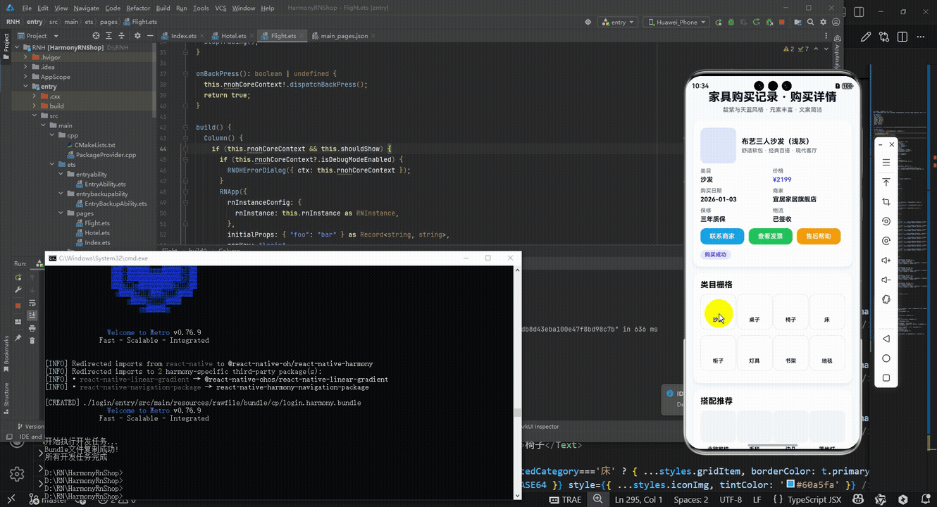
打包之后再将打包后的鸿蒙OpenHarmony文件拷贝到鸿蒙的DevEco-Studio工程目录去:

最后运行效果图如下显示:
欢迎大家加入开源鸿蒙跨平台开发者社区,一起共建开源鸿蒙跨平台生态。

讨论HarmonyOS开发技术,专注于API与组件、DevEco Studio、测试、元服务和应用上架分发等。
更多推荐


 11
11 0
0- 0


 已为社区贡献8条内容

所有评论(0)