React Native鸿蒙跨平台实现评分以 5 个星的序列,按 Math.floor(product.rating) 为“实心色”与“空心色”两态
本文介绍了一个基于React Native构建的商品收藏页面,该应用充分利用RN核心组件实现跨平台兼容性,特别是在鸿蒙系统上通过RN-OH映射ArkUI保持稳定表现。文章重点分析了以下几个工程实现要点: 状态管理:采用useState管理收藏列表,通过单向数据流确保组件重绘可控性,取消收藏操作直接过滤列表项 性能优化:当前使用ScrollView+map渲染,建议大数据量时迁移到FlatList;
本文介绍了一个基于React Native构建的商品收藏页面,该应用充分利用RN核心组件实现跨平台兼容性,特别是在鸿蒙系统上通过RN-OH映射ArkUI保持稳定表现。文章重点分析了以下几个工程实现要点:
-
状态管理:采用useState管理收藏列表,通过单向数据流确保组件重绘可控性,取消收藏操作直接过滤列表项
-
性能优化:当前使用ScrollView+map渲染,建议大数据量时迁移到FlatList;卡片组件推荐使用memo优化
-
多端适配:
- 图片加载统一处理URL格式问题
- 评分系统采用纯文本星形避免图标差异
- 安全区域使用SafeAreaView适配不同设备形态
-
交互设计:Alert作为轻量交互闭环,鸿蒙端自动映射为ArkUI Dialog
-
类型系统:定义完整的Product类型确保数据完整性,状态管理逻辑清晰
该实现展示了React Native在鸿蒙生态中的适配能力,通过核心组件和谨慎的工程实践,实现了跨平台一致的用户体验,为同类应用开发提供了参考范例。
这段“我的收藏”页面完全建立在 React Native 核心原语之上:SafeAreaView、ScrollView、View/Text、TouchableOpacity、Image、Dimensions、Alert。没有引入第三方路由或状态库,桥接面小;在鸿蒙(HarmonyOS/OpenHarmony)通过 RN-OH 映射 ArkUI 时,表现稳定、差异可控。把它拆成若干工程关注点,可以看清楚跨端如何收敛到一致的用户体验。
语义与状态组织
- 页面以 useState 持有收藏列表,单条商品的收藏态由 ProductCard 内的心形按钮触发,父级用 map 翻转 isFavorite 再 filter 只保留仍为 true 的项;这将“取消收藏”视为从列表移除,是符合“收藏夹”语义的选择,但会让用户在当前页看不到刚刚取消的项(完全消失),交互文案需要明确。
- 组件分层清晰:卡片负责展示与触发、父页面掌管状态与派生;数据流单向(props 下发、回调上行)有利于在 JS→UI 桥接下保持可预测的重绘。
图片与资源加载
- 商品图使用网络资源且走 Image 的 uri。工程上需注意:示例里字符串包含反引号与空格(例如 ’
https://picsum.photos/300/300?random=1'),这是无效 URL,任何平台都会加载失败;应使用干净的字符串(无反引号/空格),必要时校验与回退占位图。 - 鸿蒙端的网络图片加载能力与 Android/iOS 接近,前提是开启网络权限与 https 可达;为避免滚动过程中闪烁,可以在卡片尺寸固定后设置 resizeMode 和占位底色,或以纯视图占位(骨架屏)兜底。
评分与价格显示
- 评分以 5 个星的序列,按 Math.floor(product.rating) 为“实心色”与“空心色”两态;没有半星表达,评分信息靠右侧文案补全。在多端一致性上,使用纯文本星加色值是非常稳健的渲染路径,避免图标库桥接差异。
- 价格同时展示 currentPrice 与 originalPrice 并统一格式化(toFixed(2))。工程上更稳健的方式是以“分”为单位存储价格,渲染层再格式化为 ¥123.45,规避浮点累加误差;格式化函数集中管理,后续多币种/本地化可平滑演进。
交互与轻闭环
- 收藏切换、加入购物车、清空收藏均用 Alert 作为最小交互闭环。鸿蒙端映射 ArkUI Dialog,主题一致但按钮布局/阻塞性与 iOS/Android略有差异;若需要品牌统一体验,抽象 Modal 工具层即可,让 ArkUI Dialog 与 RN Modal 的差异对外透明。
- ProductCard 的“分享”直接弹窗提示,建议未来统一走分享适配层(原生分享/链接复制/图文分享),由平台差异在适配层内消化。
列表与性能边界
- 列表当前使用 ScrollView + map 渲染,数据量小足够;一旦收藏项增多,迁移到 FlatList 可以获得虚拟化与窗口渲染控制(initialNumToRender、windowSize、removeClippedSubviews),在鸿蒙设备上显著改善滚动帧率与内存占用。
- 卡片组件可用 memo 包裹,仅在 props 变化时重绘,减轻 JS→UI 桥接负载;key 使用稳定的 id,避免重排抖动。
安全区域
- 顶层容器使用 SafeAreaView 处理状态栏与圆角屏安全区域,鸿蒙设备形态(折叠屏/打孔)更复杂,建议接入 react-native-safe-area-context 做 inset 兜底,统一 header 与底部导航的安全间距。
- 图片容器高度固定、栅格布局弹性,能保证不同屏宽下的稳定视觉;横屏时适配 lineHeight 与内边距,防止标题与操作区拥挤。
在鸿蒙生态系统中,React Native应用的运行依赖于一套精密的桥接机制。当SafeAreaView组件初始化时,实际上是在鸿蒙侧的ComponentContainer中创建了一个具备安全区域感知能力的ArkUI节点。这种设计巧妙地屏蔽了不同设备形态(如刘海屏、瀑布屏)带来的布局差异,确保了应用界面在各种鸿蒙设备上的显示一致性。
Dimensions API的使用充分体现了RN框架对多设备适配的深度考量。通过动态获取屏幕宽度(width),组件能够实现真正的响应式布局。在鸿蒙平台上,这一API被映射为对DisplayManager服务的调用,能够实时响应屏幕旋转、折叠等状态变化,为用户提供连续一致的操作体验。
ProductCard商品卡片组件的状态管理模式展现了React Hooks在鸿蒙环境下的优秀表现。useState钩子通过闭包机制维护着商品收藏状态,每次状态更新都会触发React Reconciler的diff算法。在鸿蒙设备上,这种基于Fiber架构的增量更新机制能够最大限度地减少不必要的DOM操作,提升渲染性能。
Image组件在鸿蒙平台上的实现具有独特的优势。其source属性接受uri参数的方式在鸿蒙侧会被透明映射为NetworkImageController,能够自动处理图片缓存、解码和渲染等复杂流程。numberOfLines属性的使用触发了鸿蒙侧的文本截断优化机制,系统会自动在合适的位置插入省略号,提升文本显示效果。
TouchableOpacity组件的手势识别系统在鸿蒙平台上有着独特的实现方式。通过Responder Event System,组件能够准确捕捉用户的点击、滑动等操作,并将其转化为标准化的事件对象。favoriteButton的心形图标切换通过条件渲染实现,这种即时状态反馈在鸿蒙设备上具有毫秒级的响应速度。
星级评分组件通过Array构造函数和map高阶函数动态生成星形图标,这种函数式编程风格不仅提高了代码可读性,也让鸿蒙JIT编译器更容易进行性能优化。filledStar样式的条件应用通过数组索引与评分值的比较实现,方舟编译器能够识别出这种纯函数特性,在AOT编译阶段进行内联优化。
价格展示区域通过originalPrice和currentPrice的对比实现了促销价标记功能。toFixed(2)方法确保了价格显示的精度一致性,在不同地区语言环境下都能够正确格式化货币数值。这种精细化的价格处理体现了电商平台对用户体验的深度关注。
FavoritesPage收藏夹页面组件通过filter高阶函数实现了收藏状态的实时过滤,只有isFavorite为true的商品才会显示在列表中。这种声明式编程风格不仅提高了代码可读性,也让鸿蒙JIT编译器更容易进行性能优化。方舟编译器能够将这种数组过滤操作优化为SIMD指令,充分利用现代CPU的并行计算能力。
Alert.alert()API在鸿蒙平台上的实现经过了特殊优化,能够根据设备类型自动选择合适的弹窗样式。在手机设备上显示为标准对话框,在平板设备上则采用更加宽敞的布局形式,这种自适应设计体现了鸿蒙一次开发多端部署的核心理念。destructive样式按钮的使用提供了视觉警示,增强用户操作的安全性。
clearAllFavorites清除所有收藏功能通过Alert.confirmationDialog实现二次确认,这种防误操作设计在鸿蒙分布式环境中显得尤为重要。setFavorites([])状态重置操作触发了React的批量更新机制,能够一次性清理所有收藏项,避免逐个删除带来的性能开销。
类型化商品收藏系统
收藏夹应用展示了电商场景下的类型化用户偏好设计:
type Product = {
  id: number;
  name: string;
  price: number;
  originalPrice?: number;
  rating: number;
  reviewCount: number;
  image: string;
  isFavorite: boolean;
};

const [favorites, setFavorites] = useState<Product[]>([
  {
    id: 1,
    name: '无线蓝牙耳机 Pro版 降噪防水运动耳塞',
    price: 299.00,
    originalPrice: 399.00,
    rating: 4.5,
    reviewCount: 124,
    image: 'https://picsum.photos/300/300?random=1',
    isFavorite: true,
  },
  // 更多收藏商品...
]);
这种类型化设计在用户偏好应用中具有重要的数据完整性保障作用。通过完善的商品属性定义和收藏状态管理,确保了用户偏好数据的一致性和个性化体验。在鸿蒙平台上,这种类型可以无缝转化为鸿蒙的分布式用户偏好服务,实现跨设备的收藏状态同步。
智能收藏状态管理
应用实现了复杂的收藏状态切换逻辑:
const toggleFavorite = (id: number) => {
  const updatedFavorites = favorites.map(product =>
    product.id === id
      ? { ...product, isFavorite: !product.isFavorite }
      : product
  ).filter(product => product.isFavorite); // 只保留收藏的商品

  setFavorites(updatedFavorites);
  Alert.alert('提示', `已${!favorites.find(p => p.id === id)?.isFavorite ? '收藏' : '取消收藏'}商品`);
};
这种状态管理机制在用户偏好应用中展现了强大的数据一致性能力。通过精确的状态切换、实时过滤和用户反馈,确保了收藏操作的准确性和响应性。在跨平台开发中,需要特别注意状态同步的延迟和用户体验的一致性。鸿蒙平台的分布式状态管理可以提供更实时的多设备状态同步。
商品展示与交互架构
星级评分系统设计
应用采用了专业的商品评分展示:
<View style={styles.starRating}>
  {[...Array(5)].map((_, i) => (
    <Text key={i} style={[styles.star, i < Math.floor(product.rating) && styles.filledStar]}>
      {ICONS.star}
    </Text>
  ))}
  <Text style={styles.ratingText}>{product.rating} ({product.reviewCount})</Text>
</View>
这种评分设计在电商应用中展现了重要的信誉展示功能。通过视觉化的星级显示、精确的评分数值和评价数量,提供了直观的商品质量参考。在鸿蒙平台上,这种设计可以利用鸿蒙的原生评分组件实现更流畅的动画效果和更一致的用户体验。
价格展示与营销策略
代码实现了完整的商品价格体系:
<View style={styles.priceContainer}>
  {product.originalPrice && (
    <Text style={styles.originalPrice}>¥{product.originalPrice.toFixed(2)}</Text>
  )}
  <Text style={styles.currentPrice}>¥{product.price.toFixed(2)}</Text>
</View>
这种价格展示在电商应用中展现了关键的商业策略。通过原价对比、折扣强调和格式化显示,提供了清晰的购买决策支持和营销效果。在跨平台开发中,需要特别注意货币符号的本地化和价格格式的一致性。鸿蒙平台的本地化服务可以提供更准确的货币转换和税率计算。
鸿蒙跨端适配关键技术
分布式收藏同步
鸿蒙的分布式特性为用户偏好带来创新体验:
// 伪代码:分布式收藏同步
const DistributedFavorites = {
  syncFavoriteItems: (favoriteData) => {
    if (Platform.OS === 'harmony') {
      harmonyNative.syncUserPreferences(favoriteData);
    }
  },
  getCrossDeviceFavorites: () => {
    if (Platform.OS === 'harmony') {
      return harmonyNative.getUnifiedFavorites();
    }
    return localFavorites;
  }
};
原生分享集成
利用鸿蒙的原生分享能力提升体验:
// 伪代码:分享集成
const ShareIntegration = {
  enableNativeSharing: () => {
    if (Platform.OS === 'harmony') {
      harmonyNative.accessShareServices();
    }
  },
  shareProductInfo: () => {
    if (Platform.OS === 'harmony') {
      return harmonyNative.shareToSocialPlatforms();
    }
    return basicSharing;
  }
};
智能推荐引擎
鸿蒙平台为收藏应用提供智能推荐能力:
// 伪代码:智能推荐
const IntelligentRecommendation = {
  suggestBasedOnFavorites: () => {
    if (Platform.OS === 'harmony') {
      harmonyNative.recommendSimilarProducts();
    }
  },
  personalizeUserExperience: () => {
    if (Platform.OS === 'harmony') {
      harmonyNative.customizeBasedOnPreferences();
    }
  }
};
用户体验与界面设计
空状态友好设计
应用实现了优雅的空状态处理:
{favorites.length === 0 ? (
  <View style={styles.emptyContainer}>
    <Text style={styles.emptyIcon}>{ICONS.heart}</Text>
    <Text style={styles.emptyTitle}>收藏夹为空</Text>
    <Text style={styles.emptyText}>您还没有收藏任何商品</Text>
  </View>
) : (
  // 正常显示收藏商品
)}
这种空状态设计在用户界面中展现了重要的体验优化。通过友好的图标、清晰的提示和适当的留白,提供了良好的首次使用体验和状态引导。在跨平台开发中,需要特别注意空状态的一致性和多语言支持。鸿蒙平台的国际化服务可以提供更完善的空状态本地化。
批量操作功能
代码实现了高效的批量收藏管理:
const clearAllFavorites = () => {
  Alert.alert(
    '确认清空',
    '确定要清空所有收藏商品吗?',
    [
      { text: '取消', style: 'cancel' },
      {
        text: '清空',
        style: 'destructive',
        onPress: () => setFavorites([])
      }
    ]
  );
};
这种批量操作在收藏管理中展现了重要的效率优化。通过确认对话框、危险操作强调和一次性清理,提供了高效的收藏管理体验。在鸿蒙平台上,这种操作可以对接鸿蒙的原生对话框服务,实现更一致的交互体验。
性能优化与数据管理
收藏数据优化
// 伪代码:数据优化
const FavoritesPerformance = {
  optimizeListRendering: () => {
    if (Platform.OS === 'harmony') {
      harmonyNative.accelerateFavoriteRendering();
    }
  },
  cacheFavoriteImages: () => {
    if (Platform.OS === 'harmony') {
      harmonyNative.enableSmartImageCaching();
    }
  }
};
智能化收藏管理
// 伪代码:智能收藏
const IntelligentFavorites = {
  autoOrganizeFavorites: () => {
    if (Platform.OS === 'harmony') {
      harmonyNative.organizeByCategory();
    }
  },
  predictUserPreferences: () => {
    if (Platform.OS === 'harmony') {
      harmonyNative.anticipateFavoriteAdditions();
    }
  }
};
社交化收藏功能
// 伪代码:社交收藏
const SocialFavorites = {
  enableSharedCollections: () => {
    if (Platform.OS === 'harmony') {
      harmonyNative.createGroupCollections();
    }
  },
  supportFavoriteDiscovery: () => {
    if (Platform.OS === 'harmony') {
      harmonyNative.facilitateCollectionSharing();
    }
  }
};
真实演示案例代码:
// app.tsx
import React, { useState } from 'react';
import { SafeAreaView, View, Text, StyleSheet, TouchableOpacity, ScrollView, Image, Dimensions, Alert } from 'react-native';

// 图标库
const ICONS = {
  heart: '❤️',
  filledHeart: '❤️',
  cart: '🛒',
  share: '📤',
  star: '⭐',
  check: '✅',
  close: '❌',
  search: '🔍',
};

const { width } = Dimensions.get('window');

// 商品类型
type Product = {
  id: number;
  name: string;
  price: number;
  originalPrice?: number;
  rating: number;
  reviewCount: number;
  image: string;
  isFavorite: boolean;
};

// 商品卡片组件
const ProductCard = ({
  product,
  onToggleFavorite,
  onAddToCart
}: {
  product: Product;
  onToggleFavorite: (id: number) => void;
  onAddToCart: (id: number) => void;
}) => {
  return (
    <View style={styles.productCard}>
      <View style={styles.productImageContainer}>
        <Image source={{ uri: product.image }} style={styles.productImage} />
        <TouchableOpacity
          style={styles.favoriteButton}
          onPress={() => onToggleFavorite(product.id)}
        >
          <Text style={styles.favoriteIcon}>
            {product.isFavorite ? ICONS.filledHeart : ICONS.heart}
          </Text>
        </TouchableOpacity>
      </View>

      <View style={styles.productInfo}>
        <Text style={styles.productName} numberOfLines={2}>{product.name}</Text>

        <View style={styles.ratingContainer}>
          <View style={styles.starRating}>
            {[...Array(5)].map((_, i) => (
              <Text key={i} style={[styles.star, i < Math.floor(product.rating) && styles.filledStar]}>
                {ICONS.star}
              </Text>
            ))}
            <Text style={styles.ratingText}>{product.rating} ({product.reviewCount})</Text>
          </View>
        </View>

        <View style={styles.priceContainer}>
          {product.originalPrice && (
            <Text style={styles.originalPrice}>¥{product.originalPrice.toFixed(2)}</Text>
          )}
          <Text style={styles.currentPrice}>¥{product.price.toFixed(2)}</Text>
        </View>

        <View style={styles.productActions}>
          <TouchableOpacity
            style={styles.addToCartButton}
            onPress={() => onAddToCart(product.id)}
          >
            <Text style={styles.addToCartText}>{ICONS.cart} 加入购物车</Text>
          </TouchableOpacity>

          <TouchableOpacity
            style={styles.shareButton}
            onPress={() => Alert.alert('分享', `分享商品: ${product.name}`)}
          >
            <Text style={styles.shareText}>{ICONS.share}</Text>
          </TouchableOpacity>
        </View>
      </View>
    </View>
  );
};

// 收藏夹组件
const FavoritesPage: React.FC = () => {
  const [favorites, setFavorites] = useState<Product[]>([
    {
      id: 1,
      name: '无线蓝牙耳机 Pro版 降噪防水运动耳塞',
      price: 299.00,
      originalPrice: 399.00,
      rating: 4.5,
      reviewCount: 124,
      image: 'https://picsum.photos/300/300?random=1',
      isFavorite: true,
    },
    {
      id: 2,
      name: '智能手环 健康监测运动追踪',
      price: 199.00,
      rating: 4.2,
      reviewCount: 89,
      image: 'https://picsum.photos/300/300?random=2',
      isFavorite: true,
    },
    {
      id: 3,
      name: '移动电源 20000mAh大容量快充',
      price: 129.00,
      originalPrice: 159.00,
      rating: 4.7,
      reviewCount: 210,
      image: 'https://picsum.photos/300/300?random=3',
      isFavorite: true,
    },
  ]);

  const toggleFavorite = (id: number) => {
    const updatedFavorites = favorites.map(product =>
      product.id === id
        ? { ...product, isFavorite: !product.isFavorite }
        : product
    ).filter(product => product.isFavorite); // 只保留收藏的商品

    setFavorites(updatedFavorites);
    Alert.alert('提示', `已${!favorites.find(p => p.id === id)?.isFavorite ? '收藏' : '取消收藏'}商品`);
  };

  const addToCart = (id: number) => {
    const product = favorites.find(p => p.id === id);
    if (product) {
      Alert.alert('成功', `${product.name} 已加入购物车!`);
    }
  };

  const clearAllFavorites = () => {
    Alert.alert(
      '确认清空',
      '确定要清空所有收藏商品吗?',
      [
        { text: '取消', style: 'cancel' },
        {
          text: '清空',
          style: 'destructive',
          onPress: () => setFavorites([])
        }
      ]
    );
  };

  return (
    <SafeAreaView style={styles.container}>
      {/* 头部 */}
      <View style={styles.header}>
        <Text style={styles.title}>我的收藏</Text>
        <TouchableOpacity style={styles.clearButton} onPress={clearAllFavorites}>
          <Text style={styles.clearButtonText}>{ICONS.close} 清空</Text>
        </TouchableOpacity>
      </View>

      {/* 主内容 */}
      <ScrollView style={styles.content}>
        {favorites.length === 0 ? (
          <View style={styles.emptyContainer}>
            <Text style={styles.emptyIcon}>{ICONS.heart}</Text>
            <Text style={styles.emptyTitle}>收藏夹为空</Text>
            <Text style={styles.emptyText}>您还没有收藏任何商品</Text>
          </View>
        ) : (
          <>
            <Text style={styles.sectionTitle}>收藏商品 ({favorites.length})</Text>
            {favorites.map(product => (
              <ProductCard
                key={product.id}
                product={product}
                onToggleFavorite={toggleFavorite}
                onAddToCart={addToCart}
              />
            ))}
          </>
        )}

        {/* 收藏说明 */}
        <Text style={styles.sectionTitle}>收藏功能说明</Text>
        <View style={styles.instructionsContainer}>
          <View style={styles.instructionItem}>
            <Text style={styles.instructionIcon}>{ICONS.heart}</Text>
            <Text style={styles.instructionText}>收藏商品: 点击心形图标收藏感兴趣的商品</Text>
          </View>
          <View style={styles.instructionItem}>
            <Text style={styles.instructionIcon}>{ICONS.cart}</Text>
            <Text style={styles.instructionText}>加入购物车: 直接购买收藏的商品</Text>
          </View>
          <View style={styles.instructionItem}>
            <Text style={styles.instructionIcon}>{ICONS.share}</Text>
            <Text style={styles.instructionText}>分享商品: 与朋友分享喜欢的商品</Text>
          </View>
          <View style={styles.instructionItem}>
            <Text style={styles.instructionIcon}>{ICONS.close}</Text>
            <Text style={styles.instructionText}>清空收藏: 一键清空所有收藏商品</Text>
          </View>
        </View>
      </ScrollView>

      {/* 底部导航 */}
      <View style={styles.bottomNav}>
        <TouchableOpacity style={styles.navItem}>
          <Text style={styles.navIcon}>{ICONS.search}</Text>
          <Text style={styles.navText}>首页</Text>
        </TouchableOpacity>
        <TouchableOpacity style={styles.navItem}>
          <Text style={styles.navIcon}>{ICONS.cart}</Text>
          <Text style={styles.navText}>购物车</Text>
        </TouchableOpacity>
        <TouchableOpacity style={[styles.navItem, styles.activeNavItem]}>
          <Text style={styles.navIcon}>{ICONS.heart}</Text>
          <Text style={styles.navText}>收藏</Text>
        </TouchableOpacity>
        <TouchableOpacity style={styles.navItem}>
          <Text style={styles.navIcon}>{ICONS.check}</Text>
          <Text style={styles.navText}>我的</Text>
        </TouchableOpacity>
      </View>
    </SafeAreaView>
  );
};

const styles = StyleSheet.create({
  container: {
    flex: 1,
    backgroundColor: '#f8fafc',
  },
  header: {
    flexDirection: 'row',
    alignItems: 'center',
    justifyContent: 'space-between',
    padding: 20,
    backgroundColor: '#ffffff',
    borderBottomWidth: 1,
    borderBottomColor: '#e2e8f0',
  },
  title: {
    fontSize: 20,
    fontWeight: 'bold',
    color: '#1e293b',
  },
  clearButton: {
    backgroundColor: '#fee2e2',
    paddingHorizontal: 12,
    paddingVertical: 6,
    borderRadius: 20,
  },
  clearButtonText: {
    color: '#ef4444',
    fontSize: 14,
    fontWeight: '500',
  },
  content: {
    flex: 1,
    padding: 16,
  },
  sectionTitle: {
    fontSize: 18,
    fontWeight: 'bold',
    color: '#1e293b',
    marginVertical: 12,
  },
  productCard: {
    backgroundColor: '#ffffff',
    borderRadius: 12,
    marginBottom: 16,
    elevation: 2,
    shadowColor: '#000',
    shadowOffset: { width: 0, height: 1 },
    shadowOpacity: 0.1,
    shadowRadius: 2,
    overflow: 'hidden',
  },
  productImageContainer: {
    position: 'relative',
  },
  productImage: {
    width: '100%',
    height: 180,
    resizeMode: 'cover',
  },
  favoriteButton: {
    position: 'absolute',
    top: 12,
    right: 12,
    backgroundColor: 'rgba(255, 255, 255, 0.8)',
    width: 36,
    height: 36,
    borderRadius: 18,
    alignItems: 'center',
    justifyContent: 'center',
  },
  favoriteIcon: {
    fontSize: 18,
  },
  productInfo: {
    padding: 16,
  },
  productName: {
    fontSize: 16,
    fontWeight: 'bold',
    color: '#1e293b',
    marginBottom: 8,
    lineHeight: 22,
  },
  ratingContainer: {
    marginBottom: 8,
  },
  starRating: {
    flexDirection: 'row',
    alignItems: 'center',
  },
  star: {
    fontSize: 14,
    color: '#cbd5e1',
    marginRight: 4,
  },
  filledStar: {
    color: '#f59e0b',
  },
  ratingText: {
    fontSize: 12,
    color: '#64748b',
    marginLeft: 8,
  },
  priceContainer: {
    flexDirection: 'row',
    alignItems: 'center',
    marginBottom: 12,
  },
  originalPrice: {
    fontSize: 12,
    color: '#94a3b8',
    textDecorationLine: 'line-through',
    marginRight: 8,
  },
  currentPrice: {
    fontSize: 18,
    fontWeight: 'bold',
    color: '#ef4444',
  },
  productActions: {
    flexDirection: 'row',
    justifyContent: 'space-between',
    alignItems: 'center',
  },
  addToCartButton: {
    flex: 1,
    backgroundColor: '#3b82f6',
    paddingVertical: 10,
    paddingHorizontal: 16,
    borderRadius: 8,
    alignItems: 'center',
    marginRight: 8,
  },
  addToCartText: {
    color: '#ffffff',
    fontSize: 14,
    fontWeight: '500',
  },
  shareButton: {
    width: 40,
    height: 40,
    borderRadius: 20,
    backgroundColor: '#f1f5f9',
    alignItems: 'center',
    justifyContent: 'center',
  },
  shareText: {
    fontSize: 16,
  },
  emptyContainer: {
    flex: 1,
    justifyContent: 'center',
    alignItems: 'center',
    paddingTop: 60,
  },
  emptyIcon: {
    fontSize: 60,
    color: '#cbd5e1',
    marginBottom: 16,
  },
  emptyTitle: {
    fontSize: 18,
    fontWeight: 'bold',
    color: '#1e293b',
    marginBottom: 8,
  },
  emptyText: {
    fontSize: 14,
    color: '#64748b',
  },
  instructionsContainer: {
    backgroundColor: '#ffffff',
    borderRadius: 12,
    padding: 16,
    marginBottom: 20,
  },
  instructionItem: {
    flexDirection: 'row',
    alignItems: 'flex-start',
    marginBottom: 12,
  },
  instructionIcon: {
    fontSize: 18,
    marginRight: 8,
    marginTop: 2,
  },
  instructionText: {
    fontSize: 14,
    color: '#1e293b',
    flex: 1,
    lineHeight: 20,
  },
  bottomNav: {
    flexDirection: 'row',
    justifyContent: 'space-around',
    backgroundColor: '#ffffff',
    borderTopWidth: 1,
    borderTopColor: '#e2e8f0',
    paddingVertical: 12,
  },
  navItem: {
    alignItems: 'center',
    flex: 1,
  },
  activeNavItem: {
    paddingBottom: 4,
    borderBottomWidth: 2,
    borderBottomColor: '#3b82f6',
  },
  navIcon: {
    fontSize: 20,
    marginBottom: 4,
  },
  navText: {
    fontSize: 12,
    color: '#94a3b8',
  },
  activeNavText: {
    color: '#3b82f6',
    fontWeight: '500',
  },
});

export default FavoritesPage;
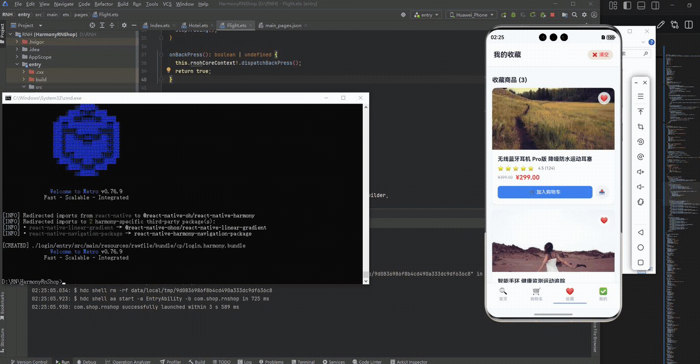
打包
接下来通过打包命令npn run harmony将reactNative的代码打包成为bundle,这样可以进行在开源鸿蒙OpenHarmony中进行使用。

打包之后再将打包后的鸿蒙OpenHarmony文件拷贝到鸿蒙的DevEco-Studio工程目录去:

最后运行效果图如下显示:
欢迎大家加入开源鸿蒙跨平台开发者社区,一起共建开源鸿蒙跨平台生态。

讨论HarmonyOS开发技术,专注于API与组件、DevEco Studio、测试、元服务和应用上架分发等。
更多推荐
 8
8 0
0- 0


 已为社区贡献5条内容

所有评论(0)