React Native鸿蒙跨平台横向滚动表格组件的设计与实现,重点解决了移动端多列数据展示
本文探讨了React Native横向滚动表格组件的设计与实现,重点解决了移动端多列数据展示的技术挑战。该组件采用分层滚动设计(表头与数据行独立水平滚动)和固定列宽计算机制,支持排序等交互功能。通过TypeScript强类型定义数据结构和交互逻辑,确保跨端开发的一致性。组件实现了"垂直滚动行+水平滚动列"的复合滚动效果,并针对性能优化采用虚拟列表等技术。文章还分析了向鸿蒙Ark
在数据密集型应用中,当表格列数过多时,横向滚动表格是一种常见的 UI 模式,它允许用户在有限的屏幕空间内浏览所有列数据。该 React Native 横向滚动表格组件不仅实现了这一核心功能,还提供了表头固定、排序等增强功能,展现了跨端开发中的设计思路和技术实现。
模块化
该表格组件采用了清晰的分层设计:
HorizontalScrollTable作为核心表格组件,负责数据渲染、横向滚动和排序功能- 父组件(代码未完全展示)负责状态管理、数据处理和用户交互
这种分离使得核心表格组件可以在不同场景中复用,符合 React 组件设计的最佳实践。在跨端开发中,这种模块化设计同样便于在 HarmonyOS ArkUI 中进行适配和扩展。
类型
组件使用 TypeScript 定义了完整的类型系统:
TableData类型定义了表格数据的结构,包含 id、name、category、price、quantity、status、date、description、rating 等字段SortDirection类型定义了排序方向,支持 asc、desc、none 三种状态HeaderConfig类型定义了表头配置,包含 key、label、width、sortable 等属性
强类型设计在跨端开发中具有显著优势:
- 编译阶段捕获类型错误,减少运行时异常
- 提供清晰的接口定义,便于团队协作
- 支持 IDE 智能提示,提高开发效率
- 确保数据结构在 React Native 和 HarmonyOS ArkUI 平台上的一致性
横向滚动是该组件的核心技术点,通过以下方式实现:
-
表头实现:
- 使用水平
ScrollView包裹表头 - 计算总宽度,确保表头有足够的滚动空间
- 实现表头的固定和水平滚动
- 使用水平
-
数据行实现:
- 使用
FlatList渲染数据行,支持垂直滚动 - 每行数据使用水平
ScrollView包裹,支持水平滚动 - 计算总宽度,确保数据行有足够的滚动空间
- 使用
这种实现方式在 React Native 中非常常见,需要适配到 HarmonyOS 的布局系统。
宽度计算
组件实现了动态宽度计算机制,通过 reduce 方法计算所有列的总宽度:
// 计算总宽度
const totalWidth = headers.reduce((sum, h) => sum + h.width, 0);
然后将总宽度应用到表头和数据行的容器上,确保滚动区域足够大:
<View style={[styles.tableRow, styles.headerRow, { width: totalWidth }]}>
  {/* 表头内容 */}
</View>

<View style={[styles.tableRow, { width: totalWidth }]}>
  {/* 数据行内容 */}
</View>
这种宽度计算机制确保了表格在不同列数和列宽配置下都能正常工作。
排序功能
表格支持基于表头的排序功能:
- 点击表头触发排序
- 支持升序、降序和无排序三种状态
- 显示排序图标,提供视觉反馈
排序逻辑通过 onSort 回调函数实现,由父组件处理具体的排序算法,这种设计使得排序逻辑与表格渲染分离,提高了组件的灵活性。
性能优化策略
组件使用了多种性能优化策略:
- 使用
FlatList实现数据行的渲染,支持虚拟列表 - 使用
ScrollView的showsHorizontalScrollIndicator={false}减少渲染开销 - 实现了宽度计算,避免不必要的布局计算
- 使用
keyExtractor提高FlatList的性能
这些优化策略确保了表格在处理大量数据时的流畅性,需要在 HarmonyOS ArkUI 中保持类似的实现。
将该表格组件适配到 HarmonyOS ArkUI 需要考虑以下几个关键方面:
组件映射与 API 替换
-
基础组件映射:
View→ViewText→TextFlatList→ListScrollView→ScrollTouchableOpacity→Button或Gesture
-
API 替换:
Dimensions.get('window')→window.getWindowPropertiesAlert.alert→dialog.showAlertDialog
-
样式适配:
StyleSheet→@Styles装饰器- 调整样式属性名称(如
backgroundColor→background-color) - 确保 Flexbox 布局在两个平台的一致性
横向滚动
横向滚动是跨端适配的一个重点,需要确保在 HarmonyOS ArkUI 中实现类似的效果:
-
滚动组件:
- React Native:使用
ScrollView的horizontal属性实现水平滚动 - HarmonyOS:使用
Scroll组件的scrollDirection属性实现水平滚动
- React Native:使用
-
宽度计算:
- 保持宽度计算逻辑一致,确保滚动区域足够大
- 调整宽度单位,确保在不同平台的一致性
-
滚动同步:
- 确保表头和数据行的滚动位置保持同步
- 实现滚动事件的处理,提供流畅的用户体验
状态管理
组件使用 useState Hook 管理多个状态,需要适配到 HarmonyOS 的 @State 装饰器:
// React Native
const [sortKey, setSortKey] = useState<keyof TableData | null>(null);
const [sortDirection, setSortDirection] = useState<SortDirection>('none');

// HarmonyOS ArkUI
@State sortKey: keyof TableData | null = null;
@State sortDirection: SortDirection = 'none';
这种转换相对直接,保持了状态管理的核心逻辑不变。
表格组件的性能在跨端开发中需要特别关注:
-
列表渲染:
- React Native 的
FlatList对应 ArkUI 的List组件,都支持虚拟列表 - 确保两者的性能表现一致,特别是在处理大量数据时
- React Native 的
-
滚动性能:
- 优化滚动事件处理,避免在滚动过程中进行复杂计算
- 实现滚动节流,减少事件触发频率
- 确保滚动同步的实现不会影响性能
-
样式计算:
- 避免在渲染过程中进行复杂的样式计算
- 使用样式缓存,减少运行时计算
-
内存管理:
- 及时清理不再使用的资源
- 避免创建过多的临时对象
该 React Native 横向滚动表格组件展示了如何实现一个功能丰富、性能优化的表格组件,包括横向滚动、表头固定、排序等核心功能。通过本文分析的适配策略,可以顺利将其迁移到 HarmonyOS ArkUI 平台,保持核心功能不变。
在移动端多列数据展示场景中,横向滚动表格是解决“屏幕宽度有限但列数较多”的核心方案,尤其在电商、ERP、数据分析类应用中,通过水平滚动承载多维度数据(如产品名称、价格、库存、状态、评分等),既能保证数据完整性,又能适配移动端窄屏特性。本文以 React Native 开发的横向滚动表格组件为核心样本,深度拆解其水平滚动布局实现、排序过滤交互、长列表性能优化等核心技术点,并系统阐述向鸿蒙(HarmonyOS)ArkTS 跨端迁移的完整技术路径,聚焦“滚动容器跨端等价实现、列宽精准控制、列表渲染性能对齐”三大核心维度,为跨端多列数据展示组件开发提供可落地的技术参考。
1. 类型
该组件在 TypeScript 类型体系中构建了“数据-表头-交互”三层强类型约束,为跨端开发奠定了语义一致的基础,尤其针对多列场景新增了评分字段和可排序标识:
// 扩展业务数据类型,新增评分字段适配多维度数据展示
type TableData = {
  id: string;
  name: string;
  category: string;
  price: number;
  quantity: number;
  status: 'active' | 'inactive' | 'pending';
  date: string;
  description: string;
  rating: number; // 新增评分字段,验证多列横向滚动场景
};

// 排序方向类型保持语义一致性,适配跨端交互逻辑
type SortDirection = 'asc' | 'desc' | 'none';

// 表头配置类型新增可排序标识,精细化控制列交互能力
type HeaderConfig = {
  key: keyof TableData;
  label: string;
  width: number;   // 固定列宽,核心跨端适配属性
  sortable: boolean; // 可排序标识,控制列级交互权限
};
这种类型设计的核心价值在于:width 属性为每列指定固定宽度,避免 flex 布局在多列场景下的适配混乱;sortable 属性精细化控制每列是否支持排序,既保证交互灵活性,又为跨端开发时“哪些列可排序、每列宽度多少”提供明确的语义约定。
2. 水平滚动布局
横向滚动表格的核心实现逻辑是“表头与数据行独立水平滚动 + 固定列宽计算 + 滚动容器嵌套”,解决了多列数据在窄屏移动端的展示问题:
- 分层滚动设计:表头和数据行分别使用独立的
ScrollView horizontal容器,保证表头与数据行可独立水平滚动,避免联动滚动的复杂性; - 列宽精准计算:通过
headers.reduce((sum, h) => sum + h.width, 0)计算所有列的总宽度,为滚动容器内的行容器设置固定宽度,保证每列对齐; - 滚动容器嵌套:将水平滚动的
ScrollView嵌套在垂直滚动的FlatList中,实现“垂直滚动行、水平滚动列”的复合滚动效果; - 滚动指示器优化:关闭水平滚动指示器(
showsHorizontalScrollIndicator={false}),减少视觉干扰,提升移动端交互体验; - 长文本截断:描述字段通过
substring(0, 15)...截断,避免文本换行导致的列高不一致问题。
核心布局代码片段的设计思路解析:
// 表头滚动容器:独立水平滚动,承载所有列表头
<ScrollView
  horizontal
  showsHorizontalScrollIndicator={false}
  style={styles.headerScroll}
>
  <View style={[styles.tableRow, styles.headerRow, { width: totalWidth }]}>
    {headers.map((header) => (/* 表头渲染 */))}
  </View>
</ScrollView>

// 数据行滚动容器:每行独立水平滚动,嵌套在FlatList中
<FlatList
  data={data}
  keyExtractor={item => item.id}
  renderItem={({ item }) => (
    <ScrollView
      horizontal
      showsHorizontalScrollIndicator={false}
      style={styles.rowScroll}
    >
      <View style={[styles.tableRow, { width: totalWidth }]}>
        {/* 多列数据渲染 */}
      </View>
    </ScrollView>
  )}
  showsVerticalScrollIndicator={false}
/>
这种布局设计的关键在于:表头和每行数据都使用固定总宽度(totalWidth),保证每列的宽度和位置精准对齐;独立的水平滚动容器让用户可自由滑动表头和数据行,适配不同的查看需求;FlatList 作为垂直滚动容器,保证长列表场景下的渲染性能。
3. 排序交互
排序交互逻辑针对多列场景做了精细化控制,通过 sortable 属性实现列级别的排序权限管理:
<TouchableOpacity
  key={header.key.toString()}
  style={[styles.columnHeader, { width: header.width }]}
  onPress={() => header.sortable && onSort?.(header.key)} // 仅可排序列触发排序
>
  <Text style={styles.columnHeaderText}>{header.label}</Text>
  {header.sortable && (
    <Text style={styles.sortIcon}>
      {sortKey === header.key
        ? (sortDirection === 'asc' ? '↑' : '↓')
        : '↕'}
    </Text>
  )}
</TouchableOpacity>
排序核心逻辑保持简洁且可复用,通过状态管理实现“点击切换排序方向(升序→降序→无排序)”的交互闭环:
const handleSort = (key: keyof TableData) => {
  if (sortKey === key) {
    if (sortDirection === 'asc') {
      setSortDirection('desc');
    } else if (sortDirection === 'desc') {
      setSortDirection('none');
      setSortKey(null);
    } else {
      setSortDirection('asc');
    }
  } else {
    setSortKey(key);
    setSortDirection('asc');
  }
};
这种设计既保证了排序交互的灵活性,又通过 sortable 属性避免了无效的交互触发,同时排序指示器仅在可排序列显示,提升了用户体验的一致性。
4. 数据处理:过滤与排序的纯函数设计
过滤和排序逻辑采用纯函数设计,无副作用且易于跨端复用:
// 过滤数据:状态驱动的纯函数,仅依赖filterStatus状态
const filteredData = tableData.filter(item =>
  filterStatus === 'all' || item.status === filterStatus
);

// 排序数据:基于过滤后的数据创建新数组,避免修改原数据
const sortedData = [...filteredData];
if (sortKey && sortDirection !== 'none') {
  sortedData.sort((a, b) => {
    if (a[sortKey] < b[sortKey]) {
      return sortDirection === 'asc' ? -1 : 1;
    }
    if (a[sortKey] > b[sortKey]) {
      return sortDirection === 'asc' ? 1 : -1;
    }
    return 0;
  });
}
纯函数设计的核心优势在于:不修改原始数据(通过 [...filteredData] 创建新数组),保证状态不可变;逻辑仅依赖输入参数,易于单元测试和跨端移植;过滤和排序逻辑解耦,可独立调整。
真实演示案例代码:
// app.tsx
import React, { useState } from 'react';
import { SafeAreaView, View, Text, StyleSheet, TouchableOpacity, ScrollView, Dimensions, Alert, FlatList } from 'react-native';

// Base64 图标库
const ICONS_BASE64 = {
  table: 'data:image/png;base64,iVBORw0KGgoAAAANSUhEUgAAAAEAAAABCAYAAAAfFcSJAAAADUlEQVR42mNkYPhfDwAChwGA60e6kgAAAABJRU5ErkJggg==',
  scroll: 'data:image/png;base64,iVBORw0KGgoAAAANSUhEUgAAAAEAAAABCAYAAAAfFcSJAAAADUlEQVR42mNkYPhfDwAChwGA60e6kgAAAABJRU5ErkJggg==',
  horizontal: 'data:image/png;base64,iVBORw0KGgoAAAANSUhEUgAAAAEAAAABCAYAAAAfFcSJAAAADUlEQVR42mNkYPhfDwAChwGA60e6kgAAAABJRU5ErkJggg==',
  arrow: 'data:image/png;base64,iVBORw0KGgoAAAANSUhEUgAAAAEAAAABCAYAAAAfFcSJAAAADUlEQVR42mNkYPhfDwAChwGA60e6kgAAAABJRU5ErkJggg==',
  settings: 'data:image/png;base64,iVBORw0KGgoAAAANSUhEUgAAAAEAAAABCAYAAAAfFcSJAAAADUlEQVR42mNkYPhfDwAChwGA60e6kgAAAABJRU5ErkJggg==',
  info: 'data:image/png;base64,iVBORw0KGgoAAAANSUhEUgAAAAEAAAABCAYAAAAfFcSJAAAADUlEQVR42mNkYPhfDwAChwGA60e6kgAAAABJRU5ErkJggg==',
  sort: 'data:image/png;base64,iVBORw0KGgoAAAANSUhEUgAAAAEAAAABCAYAAAAfFcSJAAAADUlEQVR42mNkYPhfDwAChwGA60e6kgAAAABJRU5ErkJggg==',
  home: 'data:image/png;base64,iVBORw0KGgoAAAANSUhEUgAAAAEAAAABCAYAAAAfFcSJAAAADUlEQVR42mNkYPhfDwAChwGA60e6kgAAAABJRU5ErkJggg==',
};

const { width, height } = Dimensions.get('window');

// 表格数据类型
type TableData = {
  id: string;
  name: string;
  category: string;
  price: number;
  quantity: number;
  status: 'active' | 'inactive' | 'pending';
  date: string;
  description: string;
  rating: number;
};

// 排序方向
type SortDirection = 'asc' | 'desc' | 'none';

// 表头类型
type HeaderConfig = {
  key: keyof TableData;
  label: string;
  width: number;
  sortable: boolean;
};

// 横向滚动表格组件
const HorizontalScrollTable: React.FC<{
  data: TableData[];
  headers: HeaderConfig[];
  onSort?: (key: keyof TableData) => void;
  sortKey: keyof TableData | null;
  sortDirection: SortDirection;
}> = ({ data, headers, onSort, sortKey, sortDirection }) => {
  const getStatusColor = (status: string) => {
    switch (status) {
      case 'active': return '#10b981';
      case 'inactive': return '#ef4444';
      case 'pending': return '#f59e0b';
      default: return '#64748b';
    }
  };

  // 计算总宽度
  const totalWidth = headers.reduce((sum, h) => sum + h.width, 0);

  return (
    <View style={styles.tableContainer}>
      {/* 表头 */}
      <ScrollView
        horizontal
        showsHorizontalScrollIndicator={false}
        style={styles.headerScroll}
      >
        <View style={[styles.tableRow, styles.headerRow, { width: totalWidth }]}>
          {headers.map((header) => (
            <TouchableOpacity
              key={header.key.toString()}
              style={[styles.columnHeader, { width: header.width }]}
              onPress={() => header.sortable && onSort?.(header.key)}
            >
              <Text style={styles.columnHeaderText}>{header.label}</Text>
              {header.sortable && (
                <Text style={styles.sortIcon}>
                  {sortKey === header.key
                    ? (sortDirection === 'asc' ? '↑' : '↓')
                    : '↕'}
                </Text>
              )}
            </TouchableOpacity>
          ))}
        </View>
      </ScrollView>

      {/* 数据行 */}
      <FlatList
        data={data}
        keyExtractor={item => item.id}
        renderItem={({ item }) => (
          <ScrollView
            horizontal
            showsHorizontalScrollIndicator={false}
            style={styles.rowScroll}
          >
            <View style={[styles.tableRow, { width: totalWidth }]}>
              <Text style={[styles.cell, { width: headers.find(h => h.key === 'name')?.width }]}>
                {item.name}
              </Text>
              <Text style={[styles.cell, { width: headers.find(h => h.key === 'category')?.width }]}>
                {item.category}
              </Text>
              <Text style={[styles.cell, { width: headers.find(h => h.key === 'price')?.width }]}>
                ¥{item.price}
              </Text>
              <Text style={[styles.cell, { width: headers.find(h => h.key === 'quantity')?.width }]}>
                {item.quantity}
              </Text>
              <View style={[styles.cell, { width: headers.find(h => h.key === 'status')?.width }]}>
                <View style={[styles.statusIndicator, { backgroundColor: getStatusColor(item.status) }]} />
                <Text style={styles.statusText}>
                  {item.status === 'active' ? '活跃' : item.status === 'inactive' ? '非活跃' : '待处理'}
                </Text>
              </View>
              <Text style={[styles.cell, { width: headers.find(h => h.key === 'date')?.width }]}>
                {item.date}
              </Text>
              <Text style={[styles.cell, { width: headers.find(h => h.key === 'description')?.width }]}>
                {item.description.substring(0, 15)}...
              </Text>
              <Text style={[styles.cell, { width: headers.find(h => h.key === 'rating')?.width }]}>
                {item.rating}/5
              </Text>
            </View>
          </ScrollView>
        )}
        showsVerticalScrollIndicator={false}
      />
    </View>
  );
};

const HorizontalScrollTableApp: React.FC = () => {
  const [tableData, setTableData] = useState<TableData[]>([
    { id: '1', name: 'iPhone 13', category: '手机', price: 5999, quantity: 50, status: 'active', date: '2023-01-15', description: '苹果最新款智能手机', rating: 4.8 },
    { id: '2', name: 'MacBook Pro', category: '电脑', price: 12999, quantity: 20, status: 'active', date: '2023-01-20', description: '专业级笔记本电脑', rating: 4.9 },
    { id: '3', name: 'iPad Air', category: '平板', price: 4399, quantity: 30, status: 'pending', date: '2023-02-01', description: '轻薄便携平板电脑', rating: 4.7 },
    { id: '4', name: 'AirPods Pro', category: '耳机', price: 1999, quantity: 80, status: 'active', date: '2023-02-05', description: '无线降噪耳机', rating: 4.6 },
    { id: '5', name: 'Apple Watch', category: '手表', price: 2999, quantity: 40, status: 'inactive', date: '2023-02-10', description: '智能手表', rating: 4.5 },
    { id: '6', name: 'Magic Mouse', category: '配件', price: 749, quantity: 100, status: 'active', date: '2023-02-15', description: '无线鼠标', rating: 4.4 },
    { id: '7', name: 'Magic Keyboard', category: '配件', price: 1099, quantity: 60, status: 'pending', date: '2023-02-20', description: '无线键盘', rating: 4.3 },
    { id: '8', name: 'HomePod mini', category: '音响', price: 749, quantity: 25, status: 'active', date: '2023-02-25', description: '智能音箱', rating: 4.2 },
    { id: '9', name: 'Apple TV 4K', category: '电视', price: 1799, quantity: 15, status: 'active', date: '2023-03-01', description: '4K高清电视盒子', rating: 4.6 },
    { id: '10', name: 'AirTag', category: '配件', price: 229, quantity: 200, status: 'active', date: '2023-03-05', description: '物品追踪器', rating: 4.8 },
  ]);

  const [sortKey, setSortKey] = useState<keyof TableData | null>(null);
  const [sortDirection, setSortDirection] = useState<SortDirection>('none');
  const [filterStatus, setFilterStatus] = useState<'all' | 'active' | 'inactive' | 'pending'>('all');
  const [showHeaders, setShowHeaders] = useState<boolean>(true);

  // 表头配置
  const headers: HeaderConfig[] = [
    { key: 'name', label: '产品名称', width: 120, sortable: true },
    { key: 'category', label: '类别', width: 100, sortable: true },
    { key: 'price', label: '价格', width: 100, sortable: true },
    { key: 'quantity', label: '数量', width: 80, sortable: true },
    { key: 'status', label: '状态', width: 100, sortable: true },
    { key: 'date', label: '日期', width: 100, sortable: true },
    { key: 'description', label: '描述', width: 150, sortable: true },
    { key: 'rating', label: '评分', width: 80, sortable: true },
  ];

  // 排序处理
  const handleSort = (key: keyof TableData) => {
    if (sortKey === key) {
      if (sortDirection === 'asc') {
        setSortDirection('desc');
      } else if (sortDirection === 'desc') {
        setSortDirection('none');
        setSortKey(null);
      } else {
        setSortDirection('asc');
      }
    } else {
      setSortKey(key);
      setSortDirection('asc');
    }
  };

  // 过滤数据
  const filteredData = tableData.filter(item =>
    filterStatus === 'all' || item.status === filterStatus
  );

  // 排序数据
  const sortedData = [...filteredData];
  if (sortKey && sortDirection !== 'none') {
    sortedData.sort((a, b) => {
      if (a[sortKey] < b[sortKey]) {
        return sortDirection === 'asc' ? -1 : 1;
      }
      if (a[sortKey] > b[sortKey]) {
        return sortDirection === 'asc' ? 1 : -1;
      }
      return 0;
    });
  }

  // 添加新数据
  const addNewItem = () => {
    const newItem: TableData = {
      id: `${tableData.length + 1}`,
      name: `新产品 ${tableData.length + 1}`,
      category: '配件',
      price: 999,
      quantity: 50,
      status: 'active',
      date: new Date().toISOString().split('T')[0],
      description: '新添加的产品',
      rating: 4.5,
    };
    setTableData([...tableData, newItem]);
    Alert.alert('成功', '新项目已添加');
  };

  return (
    <SafeAreaView style={styles.container}>
      {/* 头部 */}
      <View style={styles.header}>
        <Text style={styles.title}>横向滚动表格</Text>
        <Text style={styles.subtitle}>左右滑动查看更多列</Text>
      </View>

      <ScrollView style={styles.content}>
        {/* 控制面板 */}
        <View style={styles.controlPanel}>
          <Text style={styles.controlTitle}>表格控制</Text>

          <View style={styles.controlRow}>
            <Text style={styles.controlLabel}>过滤状态</Text>
            <View style={styles.filterSelector}>
              <TouchableOpacity
                style={[styles.filterButton, filterStatus === 'all' && styles.filterButtonActive]}
                onPress={() => setFilterStatus('all')}
              >
                <Text style={[styles.filterText, filterStatus === 'all' && styles.filterTextActive]}>全部</Text>
              </TouchableOpacity>
              <TouchableOpacity
                style={[styles.filterButton, filterStatus === 'active' && styles.filterButtonActive]}
                onPress={() => setFilterStatus('active')}
              >
                <Text style={[styles.filterText, filterStatus === 'active' && styles.filterTextActive]}>活跃</Text>
              </TouchableOpacity>
              <TouchableOpacity
                style={[styles.filterButton, filterStatus === 'inactive' && styles.filterButtonActive]}
                onPress={() => setFilterStatus('inactive')}
              >
                <Text style={[styles.filterText, filterStatus === 'inactive' && styles.filterTextActive]}>非活跃</Text>
              </TouchableOpacity>
              <TouchableOpacity
                style={[styles.filterButton, filterStatus === 'pending' && styles.filterButtonActive]}
                onPress={() => setFilterStatus('pending')}
              >
                <Text style={[styles.filterText, filterStatus === 'pending' && styles.filterTextActive]}>待处理</Text>
              </TouchableOpacity>
            </View>
          </View>

          <View style={styles.controlRow}>
            <Text style={styles.controlLabel}>显示表头</Text>
            <TouchableOpacity
              style={[styles.toggleButton, showHeaders && styles.toggleButtonActive]}
              onPress={() => setShowHeaders(!showHeaders)}
            >
              <Text style={[styles.toggleText, showHeaders && styles.toggleTextActive]}>
                {showHeaders ? '开启' : '关闭'}
              </Text>
            </TouchableOpacity>
          </View>

          <TouchableOpacity
            style={styles.addButton}
            onPress={addNewItem}
          >
            <Text style={styles.addButtonText}>添加新项目</Text>
          </TouchableOpacity>
        </View>

        {/* 表格 */}
        <View style={styles.tableWrapper}>
          {showHeaders && (
            <HorizontalScrollTable
              data={sortedData}
              headers={headers}
              onSort={handleSort}
              sortKey={sortKey}
              sortDirection={sortDirection}
            />
          )}
        </View>

        {/* 表格统计 */}
        <View style={styles.statsCard}>
          <Text style={styles.statsTitle}>表格统计</Text>
          <View style={styles.statRow}>
            <Text style={styles.statLabel}>总项目数</Text>
            <Text style={styles.statValue}>{tableData.length}</Text>
          </View>
          <View style={styles.statRow}>
            <Text style={styles.statLabel}>活跃项目</Text>
            <Text style={styles.statValue}>{tableData.filter(i => i.status === 'active').length}</Text>
          </View>
          <View style={styles.statRow}>
            <Text style={styles.statLabel}>待处理项目</Text>
            <Text style={styles.statValue}>{tableData.filter(i => i.status === 'pending').length}</Text>
          </View>
          <View style={styles.statRow}>
            <Text style={styles.statLabel}>总价值</Text>
            <Text style={styles.statValue}>¥{tableData.reduce((sum, item) => sum + item.price, 0)}</Text>
          </View>
        </View>

        {/* 特性说明 */}
        <View style={styles.featuresCard}>
          <Text style={styles.featuresTitle}>横向滚动表格特性</Text>
          <View style={styles.featureRow}>
            <Text style={styles.featureIcon}>↔️</Text>
            <Text style={styles.featureText}>水平滚动查看列</Text>
          </View>
          <View style={styles.featureRow}>
            <Text style={styles.featureIcon}>🔍</Text>
            <Text style={styles.featureText}>支持排序功能</Text>
          </View>
          <View style={styles.featureRow}>
            <Text style={styles.featureIcon}>📊</Text>
            <Text style={styles.featureText}>数据过滤功能</Text>
          </View>
          <View style={styles.featureRow}>
            <Text style={styles.featureIcon}>📱</Text>
            <Text style={styles.featureText}>响应式设计</Text>
          </View>
        </View>

        {/* 使用场景 */}
        <View style={styles.sceneCard}>
          <Text style={styles.sceneTitle}>使用场景</Text>

          <View style={styles.sceneRow}>
            <TouchableOpacity
              style={styles.sceneItem}
              onPress={() => Alert.alert('数据报表', '多列数据展示场景')}
            >
              <Text style={styles.sceneItemText}>数据报表</Text>
            </TouchableOpacity>
            <TouchableOpacity
              style={styles.sceneItem}
              onPress={() => Alert.alert('订单管理', '订单详情展示场景')}
            >
              <Text style={styles.sceneItemText}>订单管理</Text>
            </TouchableOpacity>
          </View>

          <View style={styles.sceneRow}>
            <TouchableOpacity
              style={styles.sceneItem}
              onPress={() => Alert.alert('库存管理', '库存信息展示场景')}
            >
              <Text style={styles.sceneItemText}>库存管理</Text>
            </TouchableOpacity>
            <TouchableOpacity
              style={styles.sceneItem}
              onPress={() => Alert.alert('客户列表', '客户详情展示场景')}
            >
              <Text style={styles.sceneItemText}>客户列表</Text>
            </TouchableOpacity>
          </View>
        </View>

        {/* 实现说明 */}
        <View style={styles.infoCard}>
          <Text style={styles.infoTitle}>实现说明</Text>
          <Text style={styles.infoText}>• 使用 ScrollView 实现水平滚动</Text>
          <Text style={styles.infoText}>• 每行列宽固定计算</Text>
          <Text style={styles.infoText}>• 支持多列排序功能</Text>
          <Text style={styles.infoText}>• 响应式设计适配不同屏幕</Text>
        </View>
      </ScrollView>

      {/* 底部导航 */}
      <View style={styles.bottomNav}>
        <TouchableOpacity
          style={[styles.navItem, styles.activeNavItem]}
          onPress={() => Alert.alert('首页')}
        >
          <Text style={styles.navIcon}>🏠</Text>
          <Text style={styles.navText}>首页</Text>
        </TouchableOpacity>

        <TouchableOpacity
          style={styles.navItem}
          onPress={() => Alert.alert('表格')}
        >
          <Text style={styles.navIcon}>📊</Text>
          <Text style={styles.navText}>表格</Text>
        </TouchableOpacity>

        <TouchableOpacity
          style={styles.navItem}
          onPress={() => Alert.alert('功能')}
        >
          <Text style={styles.navIcon}>⚙️</Text>
          <Text style={styles.navText}>功能</Text>
        </TouchableOpacity>

        <TouchableOpacity
          style={styles.navItem}
          onPress={() => Alert.alert('设置')}
        >
          <Text style={styles.navIcon}>🔧</Text>
          <Text style={styles.navText}>设置</Text>
        </TouchableOpacity>
      </View>
    </SafeAreaView>
  );
};

const styles = StyleSheet.create({
  container: {
    flex: 1,
    backgroundColor: '#f8fafc',
  },
  header: {
    padding: 20,
    backgroundColor: '#ffffff',
    borderBottomWidth: 1,
    borderBottomColor: '#e2e8f0',
  },
  title: {
    fontSize: 20,
    fontWeight: 'bold',
    color: '#1e293b',
    marginBottom: 4,
  },
  subtitle: {
    fontSize: 14,
    color: '#64748b',
  },
  content: {
    flex: 1,
    padding: 16,
  },
  controlPanel: {
    backgroundColor: '#ffffff',
    borderRadius: 12,
    padding: 16,
    marginBottom: 16,
    elevation: 1,
    shadowColor: '#000',
    shadowOffset: { width: 0, height: 1 },
    shadowOpacity: 0.1,
    shadowRadius: 2,
  },
  controlTitle: {
    fontSize: 16,
    fontWeight: 'bold',
    color: '#1e293b',
    marginBottom: 12,
  },
  controlRow: {
    flexDirection: 'row',
    justifyContent: 'space-between',
    alignItems: 'center',
    marginBottom: 12,
  },
  controlLabel: {
    fontSize: 14,
    color: '#64748b',
    flex: 1,
  },
  filterSelector: {
    flexDirection: 'row',
  },
  filterButton: {
    backgroundColor: '#e2e8f0',
    paddingHorizontal: 10,
    paddingVertical: 6,
    borderRadius: 6,
    marginHorizontal: 2,
  },
  filterButtonActive: {
    backgroundColor: '#3b82f6',
  },
  filterText: {
    fontSize: 12,
    color: '#1e293b',
  },
  filterTextActive: {
    color: '#ffffff',
  },
  toggleButton: {
    backgroundColor: '#e2e8f0',
    paddingHorizontal: 12,
    paddingVertical: 6,
    borderRadius: 6,
  },
  toggleButtonActive: {
    backgroundColor: '#10b981',
  },
  toggleText: {
    fontSize: 12,
    color: '#1e293b',
  },
  toggleTextActive: {
    color: '#ffffff',
  },
  addButton: {
    backgroundColor: '#3b82f6',
    padding: 12,
    borderRadius: 8,
    alignItems: 'center',
    marginTop: 8,
  },
  addButtonText: {
    color: '#ffffff',
    fontSize: 14,
    fontWeight: '500',
  },
  tableWrapper: {
    backgroundColor: '#ffffff',
    borderRadius: 12,
    marginBottom: 16,
    elevation: 1,
    shadowColor: '#000',
    shadowOffset: { width: 0, height: 1 },
    shadowOpacity: 0.1,
    shadowRadius: 2,
  },
  tableContainer: {
    borderRadius: 8,
    overflow: 'hidden',
  },
  headerScroll: {
    backgroundColor: '#f1f5f9',
  },
  tableRow: {
    flexDirection: 'row',
    borderBottomWidth: 1,
    borderBottomColor: '#e2e8f0',
  },
  headerRow: {
    backgroundColor: '#f1f5f9',
  },
  columnHeader: {
    paddingVertical: 12,
    paddingHorizontal: 8,
    fontSize: 12,
    fontWeight: '600',
    color: '#1e293b',
    borderRightWidth: 1,
    borderRightColor: '#cbd5e1',
    justifyContent: 'space-between',
    alignItems: 'center',
    flexDirection: 'row',
  },
  columnHeaderText: {
    fontSize: 12,
    fontWeight: '600',
    color: '#1e293b',
  },
  sortIcon: {
    fontSize: 10,
    color: '#64748b',
    marginLeft: 4,
  },
  cell: {
    paddingVertical: 12,
    paddingHorizontal: 8,
    fontSize: 12,
    color: '#1e293b',
    borderRightWidth: 1,
    borderRightColor: '#e2e8f0',
    justifyContent: 'center',
  },
  statusCell: {
    flexDirection: 'row',
    alignItems: 'center',
    justifyContent: 'center',
  },
  statusIndicator: {
    width: 8,
    height: 8,
    borderRadius: 4,
    marginRight: 6,
  },
  statusText: {
    fontSize: 10,
    color: '#64748b',
  },
  statsCard: {
    backgroundColor: '#ffffff',
    borderRadius: 12,
    padding: 16,
    marginBottom: 16,
    elevation: 1,
    shadowColor: '#000',
    shadowOffset: { width: 0, height: 1 },
    shadowOpacity: 0.1,
    shadowRadius: 2,
  },
  statsTitle: {
    fontSize: 16,
    fontWeight: 'bold',
    color: '#1e293b',
    marginBottom: 12,
  },
  statRow: {
    flexDirection: 'row',
    justifyContent: 'space-between',
    paddingVertical: 6,
    borderBottomWidth: 1,
    borderBottomColor: '#e2e8f0',
  },
  statLabel: {
    fontSize: 14,
    color: '#64748b',
  },
  statValue: {
    fontSize: 14,
    color: '#1e293b',
    fontWeight: '500',
  },
  featuresCard: {
    backgroundColor: '#ffffff',
    borderRadius: 12,
    padding: 16,
    marginBottom: 16,
    elevation: 1,
    shadowColor: '#000',
    shadowOffset: { width: 0, height: 1 },
    shadowOpacity: 0.1,
    shadowRadius: 2,
  },
  featuresTitle: {
    fontSize: 16,
    fontWeight: 'bold',
    color: '#1e293b',
    marginBottom: 12,
  },
  featureRow: {
    flexDirection: 'row',
    alignItems: 'center',
    marginBottom: 8,
  },
  featureIcon: {
    fontSize: 18,
    marginRight: 8,
  },
  featureText: {
    fontSize: 14,
    color: '#1e293b',
    flex: 1,
  },
  sceneCard: {
    backgroundColor: '#ffffff',
    borderRadius: 12,
    padding: 16,
    marginBottom: 16,
    elevation: 1,
    shadowColor: '#000',
    shadowOffset: { width: 0, height: 1 },
    shadowOpacity: 0.1,
    shadowRadius: 2,
  },
  sceneTitle: {
    fontSize: 16,
    fontWeight: 'bold',
    color: '#1e293b',
    marginBottom: 12,
  },
  sceneRow: {
    flexDirection: 'row',
    justifyContent: 'space-between',
    marginBottom: 8,
  },
  sceneItem: {
    flex: 1,
    padding: 12,
    borderRadius: 8,
    backgroundColor: '#e2e8f0',
    alignItems: 'center',
    marginHorizontal: 4,
  },
  sceneItemText: {
    fontSize: 12,
    color: '#1e293b',
  },
  infoCard: {
    backgroundColor: '#ffffff',
    borderRadius: 12,
    padding: 16,
    elevation: 1,
    shadowColor: '#000',
    shadowOffset: { width: 0, height: 1 },
    shadowOpacity: 0.1,
    shadowRadius: 2,
  },
  infoTitle: {
    fontSize: 16,
    fontWeight: 'bold',
    color: '#1e293b',
    marginBottom: 12,
  },
  infoText: {
    fontSize: 14,
    color: '#64748b',
    lineHeight: 22,
    marginBottom: 8,
  },
  bottomNav: {
    flexDirection: 'row',
    justifyContent: 'space-around',
    backgroundColor: '#ffffff',
    borderTopWidth: 1,
    borderTopColor: '#e2e8f0',
    paddingVertical: 12,
  },
  navItem: {
    alignItems: 'center',
    flex: 1,
  },
  activeNavItem: {
    paddingTop: 4,
    borderTopWidth: 2,
    borderTopColor: '#3b82f6',
  },
  navIcon: {
    fontSize: 20,
    color: '#94a3b8',
    marginBottom: 4,
  },
  activeNavIcon: {
    color: '#3b82f6',
  },
  navText: {
    fontSize: 12,
    color: '#94a3b8',
  },
  activeNavText: {
    color: '#3b82f6',
  },
});

export default HorizontalScrollTableApp;
打包
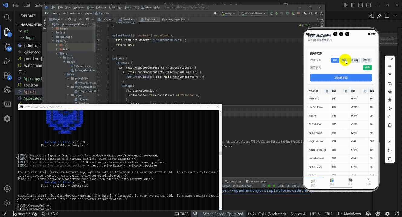
接下来通过打包命令npn run harmony将reactNative的代码打包成为bundle,这样可以进行在开源鸿蒙OpenHarmony中进行使用。

打包之后再将打包后的鸿蒙OpenHarmony文件拷贝到鸿蒙的DevEco-Studio工程目录去:

最后运行效果图如下显示:
本文探讨了React Native横向滚动表格组件的设计与实现,重点解决了移动端多列数据展示的技术挑战。该组件采用分层滚动设计(表头与数据行独立水平滚动)和固定列宽计算机制,支持排序等交互功能。通过TypeScript强类型定义数据结构和交互逻辑,确保跨端开发的一致性。组件实现了"垂直滚动行+水平滚动列"的复合滚动效果,并针对性能优化采用虚拟列表等技术。文章还分析了向鸿蒙ArkUI迁移的关键点,包括组件映射、滚动同步和状态管理转换,为多平台多列数据展示组件开发提供了实用方案。
欢迎大家加入开源鸿蒙跨平台开发者社区,一起共建开源鸿蒙跨平台生态。

讨论HarmonyOS开发技术,专注于API与组件、DevEco Studio、测试、元服务和应用上架分发等。
更多推荐
 13
13 0
0- 0


 已为社区贡献12条内容

所有评论(0)