基于React Native鸿蒙跨平台开发功能完整、用户友好的商品评价与晒单界面,通过星级评分、评价内容输入、图片上传、匿名评价等核心功能
本文深入探讨了一个基于React Native实现的商品评价系统,从架构设计到技术实现,并特别关注了鸿蒙系统的跨端适配策略。系统采用TypeScript定义简洁的商品数据模型,通过React Hooks进行模块化状态管理,实现了包含星级评分、富文本评价、图片上传和匿名选项等完整功能。在跨端兼容性方面,系统利用React Native核心组件库和Base64图标处理技术,确保在鸿蒙平台的良好运行。文
在电商应用中,商品评价系统是用户反馈购买体验、帮助其他用户做出购买决策的重要功能。本文将深入分析一个基于 React Native 实现的商品评价与晒单系统,探讨其架构设计、技术实现以及鸿蒙跨端适配策略。
核心数据
该系统构建了简洁的商品数据模型,为评价功能提供了基础数据支持:
// 商品类型
type Product = {
  id: string;
  name: string;
  price: number;
  image: string;
};
这种数据模型设计的优势:
- 类型安全:使用 TypeScript 类型确保数据结构一致性
- 简洁性:只包含评价所需的核心商品信息
- 扩展性:支持添加更多属性,如商品规格、订单信息等
状态管理
系统采用了 React Hooks 中的 useState 进行轻量级状态管理:
const [product] = useState<Product>({
  // 商品数据...
});

const [rating, setRating] = useState<number>(5);
const [reviewText, setReviewText] = useState<string>('');
const [photos, setPhotos] = useState<string[]>([]);
const [anonymous, setAnonymous] = useState<boolean>(false);
这种状态管理方式具有以下优势:
- 模块化:将商品数据、评分、评价内容、图片和选项分离管理,提高代码可读性
- 响应式:状态变更自动触发组件重渲染,确保 UI 与数据同步
- 跨端兼容:React Hooks 在鸿蒙系统的 React Native 实现中通常都有良好支持
- 灵活性:支持实时更新评价内容和状态,提高用户体验
系统实现了完整的商品评价功能,包括:
星级评分
系统实现了交互式的星级评分功能:
- 显示5个星星,默认选中5星
- 支持点击选择不同的评分等级
- 根据选择的评分实时更新显示
- 提供评分文本反馈,如"5星好评"
const renderStars = () => {
  return Array.from({ length: 5 }, (_, i) => (
    <TouchableOpacity key={i} onPress={() => setRating(i + 1)}>
      <Text style={[styles.star, i < rating ? styles.filledStar : styles.emptyStar]}>
        {i < rating ? '★' : '☆'}
      </Text>
    </TouchableOpacity>
  ));
};
评价内容
系统实现了多行文本输入功能,支持用户输入详细的评价内容:
- 使用 TextInput 组件,设置为多行模式
- 提供占位符文本,引导用户输入
- 实时更新评价内容状态
图片上传
系统实现了图片上传功能,支持用户晒单:
- 显示已上传的图片,支持删除
- 支持添加新图片,最多5张
- 提供清晰的图片上传区域和添加按钮
const handleAddPhoto = () => {
  // 模拟添加照片
  setPhotos([...photos, `https://via.placeholder.com/80x80?text=${photos.length + 1}`]);
};

const handleRemovePhoto = (index: number) => {
  setPhotos(photos.filter((_, i) => i !== index));
};
匿名评价
系统支持匿名评价选项:
- 提供复选框,允许用户选择是否匿名
- 根据选择状态显示不同的复选框样式
- 匿名评价可以保护用户隐私,鼓励用户更真实地反馈
评价提交
系统实现了评价提交功能:
- 进行表单验证,确保评分和评价内容已填写
- 显示确认对话框,避免误操作
- 提交成功后显示提示信息,完成流程闭环
const handleSubmitReview = () => {
  if (rating === 0) {
    Alert.alert('提示', '请先评分');
    return;
  }

  if (!reviewText.trim()) {
    Alert.alert('提示', '请写下您的评价');
    return;
  }

  Alert.alert(
    '提交评价',
    `您确定要提交 ${rating} 星评价吗?`,
    [
      {
        text: '取消',
        style: 'cancel'
      },
      {
        text: '确定',
        onPress: () => {
          Alert.alert('成功', '评价已提交,感谢您的反馈!');
        }
      }
    ]
  );
};
该实现采用了 React Native 核心组件库,确保了在鸿蒙系统上的基本兼容性:
SafeAreaView:适配刘海屏等异形屏ScrollView:处理内容滚动,确保长页面可浏览TouchableOpacity:提供触摸反馈,增强用户体验TextInput:提供文本输入功能,支持评价内容输入Image:显示商品图片和上传的晒单图片Alert:系统级弹窗提示,提供操作反馈
Base64 图标
系统使用 Base64 编码的图标库,这种处理方式在跨端开发中尤为重要:
- 避免了不同平台对资源文件格式的兼容性问题
- 减少了网络请求,提高了加载速度
- 简化了构建流程,无需处理多平台资源文件
- 确保图标在不同设备上的显示一致性
系统通过 Dimensions API 获取屏幕尺寸,确保了在不同屏幕尺寸的设备上都能获得一致的布局体验,无论是 React Native 环境还是鸿蒙系统:
const { width, height } = Dimensions.get('window');
系统采用了模块化的样式定义,确保了样式的一致性和可维护性:
const styles = StyleSheet.create({
  container: {
    flex: 1,
    backgroundColor: '#f5f5f5',
  },
  // 其他样式...
});
这种方式为后续的主题定制和深色模式适配预留了扩展空间。
在鸿蒙系统上使用 React Native 时,应注意以下 API 兼容性问题:
- Image API:鸿蒙系统的 Image 实现可能与 React Native 有所差异,建议测试确认图片加载行为
- TextInput API:鸿蒙系统的 TextInput 实现可能与 React Native 有所差异,建议测试确认多行输入行为
- Alert API:鸿蒙系统的 Alert 实现可能与 React Native 有所差异,建议测试确认弹窗行为
本商品评价系统实现了一个功能完整、用户友好的商品评价与晒单界面,通过合理的架构设计和代码组织,为用户提供了良好的评价体验。在跨端开发场景下,该实现充分考虑了 React Native 和鸿蒙系统的兼容性需求,为后续的功能扩展和性能优化预留了空间。
通过星级评分、评价内容输入、图片上传、匿名评价等核心功能,结合 Base64 图标处理、卡片式布局等技术手段,该系统不仅功能完善,而且具有良好的可维护性和可扩展性。这些实践经验对于构建其他跨端应用组件也具有参考价值。
商品评价是电商生态的核心环节,既是用户消费决策的重要参考,也是商家优化产品的关键依据。这份 React Native 商品评价页面代码,从星级评分交互、富文本评价、图片晒单、隐私控制四个维度构建了完整的评价体验体系。本文将深度拆解其技术设计思路,并提供鸿蒙(HarmonyOS)ArkTS 端的完整适配方案,为跨端电商评价模块开发提供可落地的技术参考。
1. 状态管理:
评价模块的核心是多维度用户输入,代码通过 TypeScript 类型约束和 React 状态管理,实现了评价数据的结构化存储和精细化控制:
(1)商品数据类型
// 商品类型:聚焦评价场景的核心字段
type Product = {
  id: string;
  name: string;
  price: number;
  image: string;
};
该类型仅保留评价场景必需的商品信息,避免冗余字段干扰,同时保证商品展示的完整性。
(2)核心状态
// 评价核心状态
const [rating, setRating] = useState<number>(5); // 星级评分,默认5星
const [reviewText, setReviewText] = useState<string>(''); // 评价文本内容
const [photos, setPhotos] = useState<string[]>([]); // 晒单图片数组
const [anonymous, setAnonymous] = useState<boolean>(false); // 匿名评价开关
状态设计亮点:
- 默认值合理:星级评分默认设为5星(正向引导,符合多数用户评价习惯);
- 状态粒度精准:每个输入维度独立管理,便于单独控制和联动校验;
- 数组管理图片:使用数组存储晒单图片,支持多图增删操作;
- 布尔值控制隐私:匿名开关使用布尔值,简单高效且语义明确。
2. 核心交互逻辑:
星级评分是评价模块的核心交互元素,代码通过动态渲染 + 视觉反馈实现了符合用户直觉的评分体验:
const renderStars = () => {
  return Array.from({ length: 5 }, (_, i) => (
    <TouchableOpacity key={i} onPress={() => setRating(i + 1)}>
      <Text style={[styles.star, i < rating ? styles.filledStar : styles.emptyStar]}>
        {i < rating ? '★' : '☆'}
      </Text>
    </TouchableOpacity>
  ));
};
交互设计亮点:
- 点击即选中:点击任意星级,自动选中该星级及左侧所有星级(如点击第3颗星,选中前3颗),符合用户对星级评分的操作认知;
- 视觉分层明显:选中星级使用金色(
#fbbf24)实心星星,未选中使用灰色(#cbd5e1)空心星星,对比强烈; - 实时反馈:评分后立即更新下方的"X星好评"文本,强化用户操作感知;
- 尺寸适配:32px 字号的星星,保证移动端点击区域足够大,降低误触概率。
3. 表单校验:
评价提交涉及用户核心反馈,代码实现了前置校验 + 二次确认 + 结果反馈的完整流程,既保证数据完整性,又降低误操作概率:
const handleSubmitReview = () => {
  // 1. 前置校验:确保核心字段完整
  if (rating === 0) {
    Alert.alert('提示', '请先评分');
    return;
  }

  if (!reviewText.trim()) {
    Alert.alert('提示', '请写下您的评价');
    return;
  }

  // 2. 二次确认:避免误提交
  Alert.alert(
    '提交评价',
    `您确定要提交 ${rating} 星评价吗?`,
    [
      { text: '取消', style: 'cancel' },
      {
        text: '确定',
        onPress: () => {
          // 3. 结果反馈:明确告知提交状态
          Alert.alert('成功', '评价已提交,感谢您的反馈!');
        }
      }
    ]
  );
};
流程设计亮点:
- 必填项校验:星级评分和评价文本为必填项,提交前强制校验;
- 空文本过滤:使用
trim()过滤纯空格的评价内容,避免无效提交; - 个性化确认文案:根据用户选择的星级生成确认文案,提升操作透明度;
- 操作闭环:从校验→确认→反馈形成完整操作闭环,增强用户确定性。
4. 图片晒单交互:
图片晒单是提升评价可信度的关键,代码实现了多图上传、预览、删除的完整交互,符合移动端图片操作习惯:
// 添加图片(模拟)
const handleAddPhoto = () => {
  setPhotos([...photos, `https://via.placeholder.com/80x80?text=${photos.length + 1}`]);
};

// 删除图片
const handleRemovePhoto = (index: number) => {
  setPhotos(photos.filter((_, i) => i !== index));
};
交互亮点:
- 数量限制:最多上传5张图片,兼顾用户表达需求和服务器存储压力;
- 视觉引导:添加按钮使用虚线边框 + 加号图标,符合移动端"添加"操作的视觉认知;
- 删除便捷:每张图片右上角添加红色圆形删除按钮,操作直观且不遮挡图片内容;
- 布局合理:流式布局(
flexWrap: 'wrap')自动换行,适配不同数量的图片展示。
5. 隐私控制:
匿名评价是保护用户隐私的重要功能,代码通过自定义复选框实现了直观的开关控制:
<TouchableOpacity
  style={styles.optionRow}
  onPress={() => setAnonymous(!anonymous)}
>
  <Text style={styles.optionText}>匿名评价</Text>
  <View style={[
    styles.checkbox,
    anonymous && styles.checkedCheckbox
  ]}>
    {anonymous && <Text style={styles.checkmark}>✓</Text>}
  </View>
</TouchableOpacity>
设计亮点:
- 自定义复选框:圆形复选框 + 勾选标记,视觉风格统一且辨识度高;
- 状态对比明显:选中状态使用蓝色背景 + 白色对勾,未选中使用灰色边框,状态清晰;
- 整行可点击:包含文本和复选框的整行区域均可点击,提升操作便捷性;
- 切换逻辑简单:通过取反操作实现开关切换,逻辑清晰且易于维护。
代码通过 StyleSheet.create 构建了一套完整的视觉规范,核心设计原则包括:
(1)卡片式
所有功能模块(商品信息、评分、评价内容等)采用统一的卡片样式:
- 白色背景 + 12px 圆角
- 轻微阴影提升层次感
- 16px 内边距保证内容呼吸空间
- 12px 上下间距,视觉节奏舒适
(2)色彩语义
| 元素类型 | 颜色值 | 语义 |
|---|---|---|
| 主色调 | #3b82f6 |
提交按钮、选中状态、强调色 |
| 警示色 | #ef4444 |
价格、删除按钮 |
| 评分色 | #fbbf24 |
选中的星级评分 |
| 背景色 | #f5f7fa |
页面整体背景 |
| 表单背景 | #f8fafc |
输入框背景 |
| 文本主色 | #1e293b |
标题、重要文本 |
| 文本次要色 | #64748b |
说明文本、辅助信息 |
| 文字类型 | 字号 | 字重 | 用途 |
|---|---|---|---|
| 页面标题 | 20px | bold | 头部标题 |
| 模块标题 | 16px | 500 | 各卡片标题 |
| 商品名称/价格 | 16px | 500/bold | 商品核心信息 |
| 正文 | 14px | normal | 评价输入、说明文本 |
| 辅助文本 | 12px | normal | 导航栏文字 |
将 React Native 评价页面迁移至鸿蒙平台,核心是基于 ArkTS + ArkUI 实现状态管理、交互逻辑、视觉规范的对等还原,同时适配鸿蒙的组件特性和布局范式。
1. 核心适配
鸿蒙端适配遵循逻辑复用、语法适配、体验统一的原则,业务逻辑和视觉规范 100% 复用,仅需适配平台特有 API 和组件语法:
@Entry
@Component
struct ReviewApp {
  // 商品数据:完全复用 RN 端类型定义
  @State product: Product = {/* 商品数据 */};

  // 状态管理:对等实现 useState → @State
  @State rating: number = 5;
  @State reviewText: string = '';
  @State photos: string[] = [];
  @State anonymous: boolean = false;

  // 业务逻辑:完全复用 RN 端实现
  handleAddPhoto() {/* 添加图片 */}
  handleRemovePhoto(index: number) {/* 删除图片 */}
  handleSubmitReview() {/* 提交评价 */}

  // 页面构建:镜像 RN 端布局结构
  build() {
    Column() {
      // 头部区域
      // 滚动内容区
      // 底部提交按钮
      // 底部导航
    }
  }
}
| React Native 特性 | 鸿蒙 ArkUI 对应实现 | 适配关键说明 |
|---|---|---|
useState |
@State 装饰器 |
状态初始化与更新逻辑完全复用 |
TouchableOpacity |
Button + onClick |
可点击组件的交互逻辑复用 |
Alert.alert |
AlertDialog.show |
弹窗 API 语法差异,交互逻辑对等 |
StyleSheet |
链式样式 | 样式属性 100% 复用 |
Image |
Image 组件 |
图片加载语法差异,属性一致 |
TextInput |
TextInput 组件 |
输入框属性(value、onChange 等)复用 |
Array.from + map |
ForEach 组件 |
星级/图片列表渲染语法差异,逻辑一致 |
ScrollView |
Scroll 组件 |
滚动容器语法差异,功能一致 |
| 绝对定位 | position: Position.Absolute |
定位语法差异,效果一致 |
| 流式布局 | flexWrap: FlexWrap.Wrap |
布局属性对等实现 |
3. 鸿蒙代码
// 鸿蒙 ArkTS 完整实现
type Product = {
id: string;
name: string;
price: number;
image: string;
};
@Entry
@Component
struct ReviewApp {
@State product: Product = {
id: 'p1',
name: 'iPhone 15 Pro Max',
price: 9999,
image: 'https://via.placeholder.com/100x100'
};
@State rating: number = 5;
@State reviewText: string = '';
@State photos: string[] = [];
@State anonymous: boolean = false;
handleAddPhoto() {
this.photos = [...this.photos, `https://via.placeholder.com/80x80?text=${this.photos.length + 1}`];
}
handleRemovePhoto(index: number) {
this.photos = this.photos.filter((_, i) => i !== index);
}
handleSubmitReview() {
if (this.rating === 0) {
AlertDialog.show({
title: '提示',
message: '请先评分',
confirm: { value: '确定' }
});
return;
}
if (!this.reviewText.trim()) {
AlertDialog.show({
title: '提示',
message: '请写下您的评价',
confirm: { value: '确定' }
});
return;
}
AlertDialog.show({
title: '提交评价',
message: `您确定要提交 ${this.rating} 星评价吗?`,
confirm: {
value: '确定',
action: () => {
AlertDialog.show({
title: '成功',
message: '评价已提交,感谢您的反馈!',
confirm: { value: '确定' }
});
}
},
cancel: { value: '取消' }
});
}
build() {
Column()
.flex(1)
.backgroundColor('#f5f7fa')
.safeArea(true) {
// 头部
Column()
.padding(16)
.backgroundColor('#ffffff')
.borderBottom({ width: 1, color: '#e2e8f0' }) {
Text('商品评价')
.fontSize(20)
.fontWeight(FontWeight.Bold)
.fontColor('#1e293b')
.marginBottom(4);
Text('写下您的使用感受')
.fontSize(14)
.fontColor('#64748b');
}
// 滚动内容区
Scroll()
.flex(1)
.marginTop(12) {
Column() {
// 商品信息
Column()
.backgroundColor('#ffffff')
.marginLeft(16)
.marginRight(16)
.marginBottom(12)
.borderRadius(12)
.padding(16)
.shadow({ color: '#000', offsetX: 0, offsetY: 1, opacity: 0.1, radius: 2 }) {
Row()
.alignItems(ItemAlign.Center) {
Image(this.product.image)
.width(60)
.height(60)
.borderRadius(8)
.marginRight(12);
Column()
.flexGrow(1) {
Text(this.product.name)
.fontSize(16)
.fontWeight(FontWeight.Medium)
.fontColor('#1e293b')
.marginBottom(4);
Text(`¥${this.product.price}`)
.fontSize(16)
.fontColor('#ef4444')
.fontWeight(FontWeight.Bold);
}
}
}
// 评分
Column()
.backgroundColor('#ffffff')
.marginLeft(16)
.marginRight(16)
.marginBottom(12)
.borderRadius(12)
.padding(16)
.shadow({ color: '#000', offsetX: 0, offsetY: 1, opacity: 0.1, radius: 2 }) {
Text('评分')
.fontSize(16)
.fontWeight(FontWeight.Medium)
.fontColor('#1e293b')
.marginBottom(12);
Row()
.justifyContent(FlexAlign.SpaceAround)
.marginBottom(8) {
ForEach(Array.from({ length: 5 }), (_, i: number) => {
Button()
.backgroundColor('transparent')
.onClick(() => {
this.rating = i + 1;
}) {
Text(i < this.rating ? '★' : '☆')
.fontSize(32)
.fontColor(i < this.rating ? '#fbbf24' : '#cbd5e1')
.marginHorizontal(4);
}
})
}
Text(`${this.rating} 星好评`)
.fontSize(16)
.fontColor('#64748b')
.textAlign(TextAlign.Center)
.marginTop(8);
}
// 评价内容
Column()
.backgroundColor('#ffffff')
.marginLeft(16)
.marginRight(16)
.marginBottom(12)
.borderRadius(12)
.padding(16)
.shadow({ color: '#000', offsetX: 0, offsetY: 1, opacity: 0.1, radius: 2 }) {
Text('评价内容')
.fontSize(16)
.fontWeight(FontWeight.Medium)
.fontColor('#1e293b')
.marginBottom(12);
TextInput({
value: this.reviewText,
placeholder: '请分享您的使用体验,包括商品的优点和不足...'
})
.border({ width: 1, color: '#e2e8f0' })
.borderRadius(6)
.padding(12)
.fontSize(14)
.backgroundColor('#f8fafc')
.minHeight(100)
.multiline(true)
.onChange((value) => {
this.reviewText = value;
});
}
// 上传图片
Column()
.backgroundColor('#ffffff')
.marginLeft(16)
.marginRight(16)
.marginBottom(12)
.borderRadius(12)
.padding(16)
.shadow({ color: '#000', offsetX: 0, offsetY: 1, opacity: 0.1, radius: 2 }) {
Text('晒单图片(可选)')
.fontSize(16)
.fontWeight(FontWeight.Medium)
.fontColor('#1e293b')
.marginBottom(12);
Row()
.flexWrap(FlexWrap.Wrap) {
ForEach(this.photos, (photo: string, index: number) => {
Stack()
.marginRight(8)
.marginBottom(8)
.width(80)
.height(80)
.borderRadius(6) {
Image(photo)
.width('100%')
.height('100%')
.borderRadius(6);
Button()
.width(20)
.height(20)
.borderRadius(10)
.backgroundColor('#ef4444')
.position(Position.Absolute)
.top(-5)
.right(-5)
.onClick(() => {
this.handleRemovePhoto(index);
}) {
Text('×')
.fontSize(12)
.fontColor('#ffffff')
.fontWeight(FontWeight.Bold);
}
}
})
if (this.photos.length < 5) {
Button()
.width(80)
.height(80)
.borderRadius(6)
.border({ width: 1, color: '#cbd5e1', style: BorderStyle.Dashed })
.backgroundColor('#ffffff')
.onClick(() => {
this.handleAddPhoto();
}) {
Text('+')
.fontSize(24)
.fontColor('#94a3b8');
}
}
}
}
// 选项
Column()
.backgroundColor('#ffffff')
.marginLeft(16)
.marginRight(16)
.marginBottom(12)
.borderRadius(12)
.padding(16)
.shadow({ color: '#000', offsetX: 0, offsetY: 1, opacity: 0.1, radius: 2 }) {
Text('附加选项')
.fontSize(16)
.fontWeight(FontWeight.Medium)
.fontColor('#1e293b')
.marginBottom(12);
Button()
.width('100%')
.flexDirection(FlexDirection.Row)
.justifyContent(FlexAlign.SpaceBetween)
.alignItems(ItemAlign.Center)
.paddingVertical(8)
.backgroundColor('transparent')
.onClick(() => {
this.anonymous = !this.anonymous;
}) {
Text('匿名评价')
.fontSize(16)
.fontColor('#1e293b');
Stack()
.width(20)
.height(20)
.borderRadius(10)
.border({
width: 1,
color: this.anonymous ? '#3b82f6' : '#cbd5e1'
})
.backgroundColor(this.anonymous ? '#3b82f6' : 'transparent')
.alignItems(ItemAlign.Center)
.justifyContent(FlexAlign.Center) {
if (this.anonymous) {
Text('✓')
.fontSize(12)
.fontColor('#ffffff')
.fontWeight(FontWeight.Bold);
}
}
}
}
// 评价建议
Column()
.backgroundColor('#ffffff')
.marginLeft(16)
.marginRight(16)
.marginBottom(12)
.borderRadius(12)
.padding(16)
.shadow({ color: '#000', offsetX: 0, offsetY: 1, opacity: 0.1, radius: 2 }) {
Text('评价小贴士')
.fontSize(16)
.fontWeight(FontWeight.Medium)
.fontColor('#1e293b')
.marginBottom(8);
Text('• 从多个角度评价商品')
.fontSize(14)
.fontColor('#64748b')
.lineHeight(20)
.marginBottom(4);
Text('• 描述使用场景和感受')
.fontSize(14)
.fontColor('#64748b')
.lineHeight(20)
.marginBottom(4);
Text('• 提供真实可靠的图片')
.fontSize(14)
.fontColor('#64748b')
.lineHeight(20)
.marginBottom(4);
Text('• 客观公正地评价')
.fontSize(14)
.fontColor('#64748b')
.lineHeight(20);
}
// 注意事项
Column()
.backgroundColor('#ffffff')
.marginLeft(16)
.marginRight(16)
.marginBottom(80)
.borderRadius(12)
.padding(16)
.shadow({ color: '#000', offsetX: 0, offsetY: 1, opacity: 0.1, radius: 2 }) {
Text('注意事项')
.fontSize(16)
.fontWeight(FontWeight.Medium)
.fontColor('#1e293b')
.marginBottom(8);
Text('• 评价内容需真实有效')
.fontSize(14)
.fontColor('#64748b')
.lineHeight(20)
.marginBottom(4);
Text('• 请勿发布不当言论')
.fontSize(14)
.fontColor('#64748b')
.lineHeight(20)
.marginBottom(4);
Text('• 评价提交后不可修改')
.fontSize(14)
.fontColor('#64748b')
.lineHeight(20)
.marginBottom(4);
Text('• 优质评价可获得积分奖励')
.fontSize(14)
.fontColor('#64748b')
.lineHeight(20);
}
}
}
// 底部提交按钮
Column()
.position(Position.Fixed)
.bottom(60)
.left(16)
.right(16)
.padding(8)
.backgroundColor('#ffffff') {
Button()
.width('100%')
.backgroundColor('#3b82f6')
.paddingVertical(14)
.borderRadius(8)
.onClick(() => {
this.handleSubmitReview();
}) {
Text('提交评价')
.fontSize(16)
.fontWeight(FontWeight.Medium)
.fontColor('#ffffff');
}
}
// 底部导航
Row()
.justifyContent(FlexAlign.SpaceAround)
.backgroundColor('#ffffff')
.borderTop({ width: 1, color: '#e2e8f0' })
.paddingVertical(12)
.position(Position.Fixed)
.bottom(0)
.width('100%') {
Column()
.alignItems(ItemAlign.Center)
.flexGrow(1) {
Text('🏠')
.fontSize(20)
.fontColor('#94a3b8')
.marginBottom(4);
Text('首页')
.fontSize(12)
.fontColor('#94a3b8');
}
Column()
.alignItems(ItemAlign.Center)
.flexGrow(1) {
Text('🔍')
.fontSize(20)
.fontColor('#94a3b8')
.marginBottom(4);
Text('分类')
.fontSize(12)
.fontColor('#94a3b8');
}
Column()
.alignItems(ItemAlign.Center)
.flexGrow(1) {
Text('🛒')
.fontSize(20)
.fontColor('#94a3b8')
.marginBottom(4);
Text('购物车')
.fontSize(12)
.fontColor('#94a3b8');
}
Column()
.alignItems(ItemAlign.Center)
.flexGrow(1)
.paddingTop(4)
.borderTop({ width: 2, color: '#3b82f6' }) {
Text('📦')
.fontSize(20)
.fontColor('#3b82f6')
.marginBottom(4);
Text('订单')
.fontSize(12)
.fontColor('#3b82f6')
.fontWeight(FontWeight.Medium);
}
}
}
}
- 商品评价的核心是多维度用户反馈的结构化采集:通过星级评分(量化)+ 文本评价(质化)+ 图片晒单(可视化)+ 隐私控制(个性化),构建完整的评价数据体系;
- 星级评分的交互设计决定核心体验:点击即选中的交互逻辑、强烈的视觉对比、实时的文本反馈,是提升评分体验的关键;
- 表单校验保障评价数据的有效性:前置校验必填字段、过滤无效内容、二次确认提交,既保证数据质量,又降低误操作概率;
- 跨端适配的关键是逻辑复用+体验统一:业务逻辑和视觉规范可跨端复用,仅需适配平台特有 API 和组件语法,保证跨端体验一致性;
- 图片晒单提升评价可信度:可视化的图片增删交互、合理的数量限制,既满足用户表达需求,又控制服务器存储成本;
- 隐私控制提升用户评价意愿:匿名评价功能降低用户评价的心理门槛,提升评价率和评价真实性。
这份商品评价页面的跨端适配实践,验证了 React Native 与鸿蒙 ArkTS 在电商核心评价场景下的高度兼容性,为跨端电商应用的评价模块开发提供了可落地的技术参考,同时也为其他表单类跨端场景提供了设计思路和实现范式。
真实演示案例代码:
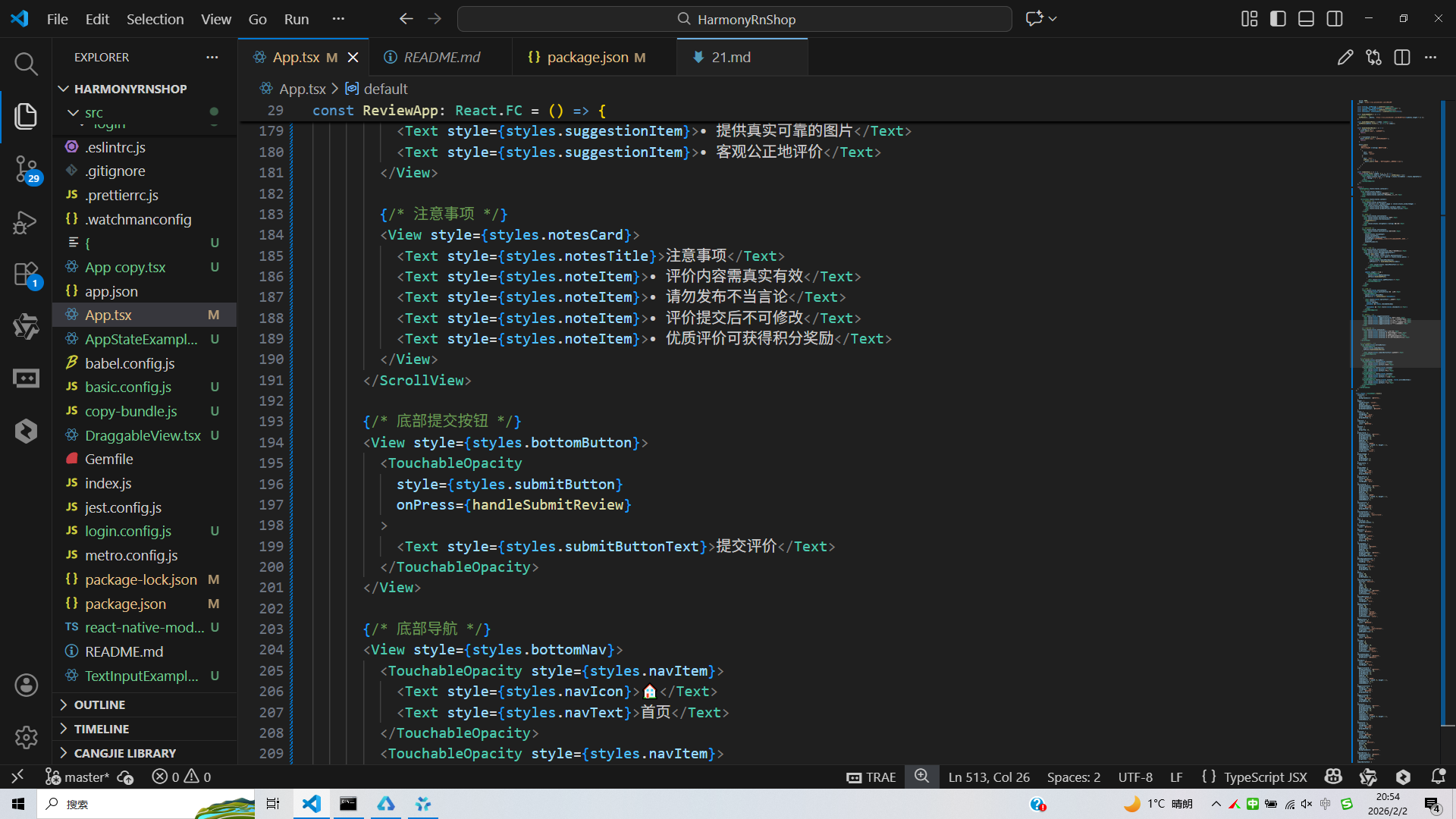
// App.tsx
import React, { useState } from 'react';
import { SafeAreaView, View, Text, StyleSheet, TouchableOpacity, ScrollView, Dimensions, Alert, TextInput, Image } from 'react-native';

// Base64 图标库
const ICONS_BASE64 = {
  star: 'data:image/png;base64,iVBORw0KGgoAAAANSUhEUgAAAAEAAAABCAYAAAAfFcSJAAAADUlEQVR42mNkYPhfDwAChwGA60e6kgAAAABJRU5ErkJggg==',
  photo: 'data:image/png;base64,iVBORw0KGgoAAAANSUhEUgAAAAEAAAABCAYAAAAfFcSJAAAADUlEQVR42mNkYPhfDwAChwGA60e6kgAAAABJRU5ErkJggg==',
  like: 'data:image/png;base64,iVBORw0KGgoAAAANSUhEUgAAAAEAAAABCAYAAAAfFcSJAAAADUlEQVR42mNkYPhfDwAChwGA60e6kgAAAABJRU5ErkJggg==',
  comment: 'data:image/png;base64,iVBORw0KGgoAAAANSUhEUgAAAAEAAAABCAYAAAAfFcSJAAAADUlEQVR42mNkYPhfDwAChwGA60e6kgAAAABJRU5ErkJggg==',
  check: 'data:image/png;base64,iVBORw0KGgoAAAANSUhEUgAAAAEAAAABCAYAAAAfFcSJAAAADUlEQVR42mNkYPhfDwAChwGA60e6kgAAAABJRU5ErkJggg==',
  clock: 'data:image/png;base64,iVBORw0KGgoAAAANSUhEUgAAAAEAAAABCAYAAAAfFcSJAAAADUlEQVR42mNkYPhfDwAChwGA60e6kgAAAABJRU5ErkJggg==',
  home: 'data:image/png;base64,iVBORw0KGgoAAAANSUhEUgAAAAEAAAABCAYAAAAfFcSJAAAADUlEQVR42mNkYPhfDwAChwGA60e6kgAAAABJRU5ErkJggg==',
  user: 'data:image/png;base64,iVBORw0KGgoAAAANSUhEUgAAAAEAAAABCAYAAAAfFcSJAAAADUlEQVR42mNkYPhfDwAChwGA60e6kgAAAABJRU5ErkJggg==',
};

const { width, height } = Dimensions.get('window');

// 商品类型
type Product = {
  id: string;
  name: string;
  price: number;
  image: string;
};

// 商品评价与晒单应用组件
const ReviewApp: React.FC = () => {
  const [product] = useState<Product>({
    id: 'p1',
    name: 'iPhone 15 Pro Max',
    price: 9999,
    image: 'https://via.placeholder.com/100x100'
  });

  const [rating, setRating] = useState<number>(5);
  const [reviewText, setReviewText] = useState<string>('');
  const [photos, setPhotos] = useState<string[]>([]);
  const [anonymous, setAnonymous] = useState<boolean>(false);

  const handleAddPhoto = () => {
    // 模拟添加照片
    setPhotos([...photos, `https://via.placeholder.com/80x80?text=${photos.length + 1}`]);
  };

  const handleRemovePhoto = (index: number) => {
    setPhotos(photos.filter((_, i) => i !== index));
  };

  const handleSubmitReview = () => {
    if (rating === 0) {
      Alert.alert('提示', '请先评分');
      return;
    }

    if (!reviewText.trim()) {
      Alert.alert('提示', '请写下您的评价');
      return;
    }

    Alert.alert(
      '提交评价',
      `您确定要提交 ${rating} 星评价吗?`,
      [
        {
          text: '取消',
          style: 'cancel'
        },
        {
          text: '确定',
          onPress: () => {
            Alert.alert('成功', '评价已提交,感谢您的反馈!');
          }
        }
      ]
    );
  };

  const renderStars = () => {
    return Array.from({ length: 5 }, (_, i) => (
      <TouchableOpacity key={i} onPress={() => setRating(i + 1)}>
        <Text style={[styles.star, i < rating ? styles.filledStar : styles.emptyStar]}>
          {i < rating ? '★' : '☆'}
        </Text>
      </TouchableOpacity>
    ));
  };

  return (
    <SafeAreaView style={styles.container}>
      {/* 头部 */}
      <View style={styles.header}>
        <Text style={styles.title}>商品评价</Text>
        <Text style={styles.subtitle}>写下您的使用感受</Text>
      </View>

      <ScrollView style={styles.content}>
        {/* 商品信息 */}
        <View style={styles.productCard}>
          <Image source={{ uri: product.image }} style={styles.productImage} />
          <View style={styles.productInfo}>
            <Text style={styles.productName}>{product.name}</Text>
            <Text style={styles.productPrice}>¥{product.price}</Text>
          </View>
        </View>

        {/* 评分 */}
        <View style={styles.sectionCard}>
          <Text style={styles.sectionTitle}>评分</Text>
          <View style={styles.starsContainer}>
            {renderStars()}
          </View>
          <Text style={styles.ratingText}>{rating} 星好评</Text>
        </View>

        {/* 评价内容 */}
        <View style={styles.sectionCard}>
          <Text style={styles.sectionTitle}>评价内容</Text>
          <TextInput
            style={styles.reviewInput}
            value={reviewText}
            onChangeText={setReviewText}
            placeholder="请分享您的使用体验,包括商品的优点和不足..."
            multiline
            numberOfLines={5}
          />
        </View>

        {/* 上传图片 */}
        <View style={styles.sectionCard}>
          <Text style={styles.sectionTitle}>晒单图片(可选)</Text>
          <View style={styles.photoUploadContainer}>
            {photos.map((photo, index) => (
              <View key={index} style={styles.photoContainer}>
                <Image source={{ uri: photo }} style={styles.photo} />
                <TouchableOpacity
                  style={styles.removePhotoButton}
                  onPress={() => handleRemovePhoto(index)}
                >
                  <Text style={styles.removePhotoText}>×</Text>
                </TouchableOpacity>
              </View>
            ))}

            {photos.length < 5 && (
              <TouchableOpacity
                style={styles.addPhotoButton}
                onPress={handleAddPhoto}
              >
                <Text style={styles.addPhotoText}>+</Text>
              </TouchableOpacity>
            )}
          </View>
        </View>

        {/* 选项 */}
        <View style={styles.sectionCard}>
          <Text style={styles.sectionTitle}>附加选项</Text>
          <TouchableOpacity
            style={styles.optionRow}
            onPress={() => setAnonymous(!anonymous)}
          >
            <Text style={styles.optionText}>匿名评价</Text>
            <View style={[
              styles.checkbox,
              anonymous && styles.checkedCheckbox
            ]}>
              {anonymous && <Text style={styles.checkmark}>✓</Text>}
            </View>
          </TouchableOpacity>
        </View>

        {/* 评价建议 */}
        <View style={styles.suggestionsCard}>
          <Text style={styles.suggestionsTitle}>评价小贴士</Text>
          <Text style={styles.suggestionItem}>• 从多个角度评价商品</Text>
          <Text style={styles.suggestionItem}>• 描述使用场景和感受</Text>
          <Text style={styles.suggestionItem}>• 提供真实可靠的图片</Text>
          <Text style={styles.suggestionItem}>• 客观公正地评价</Text>
        </View>

        {/* 注意事项 */}
        <View style={styles.notesCard}>
          <Text style={styles.notesTitle}>注意事项</Text>
          <Text style={styles.noteItem}>• 评价内容需真实有效</Text>
          <Text style={styles.noteItem}>• 请勿发布不当言论</Text>
          <Text style={styles.noteItem}>• 评价提交后不可修改</Text>
          <Text style={styles.noteItem}>• 优质评价可获得积分奖励</Text>
        </View>
      </ScrollView>

      {/* 底部提交按钮 */}
      <View style={styles.bottomButton}>
        <TouchableOpacity
          style={styles.submitButton}
          onPress={handleSubmitReview}
        >
          <Text style={styles.submitButtonText}>提交评价</Text>
        </TouchableOpacity>
      </View>

      {/* 底部导航 */}
      <View style={styles.bottomNav}>
        <TouchableOpacity style={styles.navItem}>
          <Text style={styles.navIcon}>🏠</Text>
          <Text style={styles.navText}>首页</Text>
        </TouchableOpacity>
        <TouchableOpacity style={styles.navItem}>
          <Text style={styles.navIcon}>🔍</Text>
          <Text style={styles.navText}>分类</Text>
        </TouchableOpacity>
        <TouchableOpacity style={styles.navItem}>
          <Text style={styles.navIcon}>🛒</Text>
          <Text style={styles.navText}>购物车</Text>
        </TouchableOpacity>
        <TouchableOpacity style={[styles.navItem, styles.activeNavItem]}>
          <Text style={styles.navIcon}>📦</Text>
          <Text style={styles.navText}>订单</Text>
        </TouchableOpacity>
      </View>
    </SafeAreaView>
  );
};

const styles = StyleSheet.create({
  container: {
    flex: 1,
    backgroundColor: '#f5f7fa',
  },
  header: {
    flexDirection: 'column',
    padding: 16,
    backgroundColor: '#ffffff',
    borderBottomWidth: 1,
    borderBottomColor: '#e2e8f0',
  },
  title: {
    fontSize: 20,
    fontWeight: 'bold',
    color: '#1e293b',
    marginBottom: 4,
  },
  subtitle: {
    fontSize: 14,
    color: '#64748b',
  },
  content: {
    flex: 1,
    marginTop: 12,
  },
  productCard: {
    backgroundColor: '#ffffff',
    marginHorizontal: 16,
    marginBottom: 12,
    borderRadius: 12,
    padding: 16,
    elevation: 1,
    shadowColor: '#000',
    shadowOffset: { width: 0, height: 1 },
    shadowOpacity: 0.1,
    shadowRadius: 2,
    flexDirection: 'row',
    alignItems: 'center',
  },
  productImage: {
    width: 60,
    height: 60,
    borderRadius: 8,
    marginRight: 12,
  },
  productInfo: {
    flex: 1,
  },
  productName: {
    fontSize: 16,
    fontWeight: '500',
    color: '#1e293b',
    marginBottom: 4,
  },
  productPrice: {
    fontSize: 16,
    color: '#ef4444',
    fontWeight: 'bold',
  },
  sectionCard: {
    backgroundColor: '#ffffff',
    marginHorizontal: 16,
    marginBottom: 12,
    borderRadius: 12,
    padding: 16,
    elevation: 1,
    shadowColor: '#000',
    shadowOffset: { width: 0, height: 1 },
    shadowOpacity: 0.1,
    shadowRadius: 2,
  },
  sectionTitle: {
    fontSize: 16,
    fontWeight: '500',
    color: '#1e293b',
    marginBottom: 12,
  },
  starsContainer: {
    flexDirection: 'row',
    justifyContent: 'space-around',
    marginBottom: 8,
  },
  star: {
    fontSize: 32,
    marginHorizontal: 4,
  },
  filledStar: {
    color: '#fbbf24',
  },
  emptyStar: {
    color: '#cbd5e1',
  },
  ratingText: {
    textAlign: 'center',
    fontSize: 16,
    color: '#64748b',
    marginTop: 8,
  },
  reviewInput: {
    borderWidth: 1,
    borderColor: '#e2e8f0',
    borderRadius: 6,
    padding: 12,
    fontSize: 14,
    backgroundColor: '#f8fafc',
    minHeight: 100,
    textAlignVertical: 'top',
  },
  photoUploadContainer: {
    flexDirection: 'row',
    flexWrap: 'wrap',
  },
  photoContainer: {
    position: 'relative',
    marginRight: 8,
    marginBottom: 8,
  },
  photo: {
    width: 80,
    height: 80,
    borderRadius: 6,
  },
  removePhotoButton: {
    position: 'absolute',
    top: -5,
    right: -5,
    width: 20,
    height: 20,
    borderRadius: 10,
    backgroundColor: '#ef4444',
    alignItems: 'center',
    justifyContent: 'center',
  },
  removePhotoText: {
    color: '#ffffff',
    fontSize: 12,
    fontWeight: 'bold',
  },
  addPhotoButton: {
    width: 80,
    height: 80,
    borderRadius: 6,
    borderWidth: 1,
    borderStyle: 'dashed',
    borderColor: '#cbd5e1',
    alignItems: 'center',
    justifyContent: 'center',
  },
  addPhotoText: {
    fontSize: 24,
    color: '#94a3b8',
  },
  optionRow: {
    flexDirection: 'row',
    justifyContent: 'space-between',
    alignItems: 'center',
    paddingVertical: 8,
  },
  optionText: {
    fontSize: 16,
    color: '#1e293b',
  },
  checkbox: {
    width: 20,
    height: 20,
    borderRadius: 10,
    borderWidth: 1,
    borderColor: '#cbd5e1',
    alignItems: 'center',
    justifyContent: 'center',
  },
  checkedCheckbox: {
    backgroundColor: '#3b82f6',
    borderColor: '#3b82f6',
  },
  checkmark: {
    color: '#ffffff',
    fontSize: 12,
    fontWeight: 'bold',
  },
  suggestionsCard: {
    backgroundColor: '#ffffff',
    marginHorizontal: 16,
    marginBottom: 12,
    borderRadius: 12,
    padding: 16,
    elevation: 1,
    shadowColor: '#000',
    shadowOffset: { width: 0, height: 1 },
    shadowOpacity: 0.1,
    shadowRadius: 2,
  },
  suggestionsTitle: {
    fontSize: 16,
    fontWeight: '500',
    color: '#1e293b',
    marginBottom: 8,
  },
  suggestionItem: {
    fontSize: 14,
    color: '#64748b',
    lineHeight: 20,
    marginBottom: 4,
  },
  notesCard: {
    backgroundColor: '#ffffff',
    marginHorizontal: 16,
    marginBottom: 80,
    borderRadius: 12,
    padding: 16,
    elevation: 1,
    shadowColor: '#000',
    shadowOffset: { width: 0, height: 1 },
    shadowOpacity: 0.1,
    shadowRadius: 2,
  },
  notesTitle: {
    fontSize: 16,
    fontWeight: '500',
    color: '#1e293b',
    marginBottom: 8,
  },
  noteItem: {
    fontSize: 14,
    color: '#64748b',
    lineHeight: 20,
    marginBottom: 4,
  },
  bottomButton: {
    position: 'absolute',
    bottom: 60,
    left: 16,
    right: 16,
    padding: 8,
    backgroundColor: '#ffffff',
  },
  submitButton: {
    backgroundColor: '#3b82f6',
    paddingVertical: 14,
    borderRadius: 8,
    alignItems: 'center',
  },
  submitButtonText: {
    color: '#ffffff',
    fontSize: 16,
    fontWeight: '500',
  },
  bottomNav: {
    flexDirection: 'row',
    justifyContent: 'space-around',
    backgroundColor: '#ffffff',
    borderTopWidth: 1,
    borderTopColor: '#e2e8f0',
    paddingVertical: 12,
    position: 'absolute',
    bottom: 0,
    left: 0,
    right: 0,
  },
  navItem: {
    alignItems: 'center',
    flex: 1,
  },
  activeNavItem: {
    paddingTop: 4,
    borderTopWidth: 2,
    borderTopColor: '#3b82f6',
  },
  navIcon: {
    fontSize: 20,
    color: '#94a3b8',
    marginBottom: 4,
  },
  activeNavIcon: {
    color: '#3b82f6',
  },
  navText: {
    fontSize: 12,
    color: '#94a3b8',
  },
  activeNavText: {
    color: '#3b82f6',
    fontWeight: '500',
  },
});

export default ReviewApp;
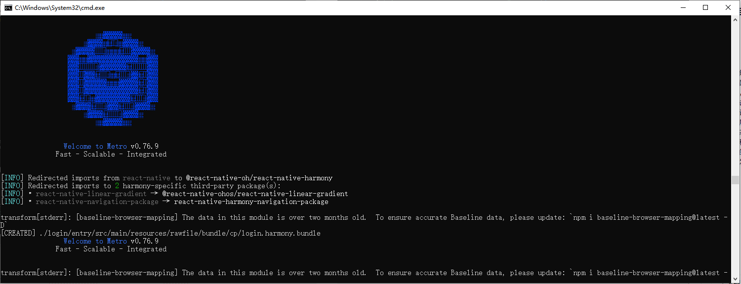
打包
接下来通过打包命令npn run harmony将reactNative的代码打包成为bundle,这样可以进行在开源鸿蒙OpenHarmony中进行使用。
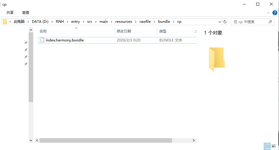
打包之后再将打包后的鸿蒙OpenHarmony文件拷贝到鸿蒙的DevEco-Studio工程目录去:
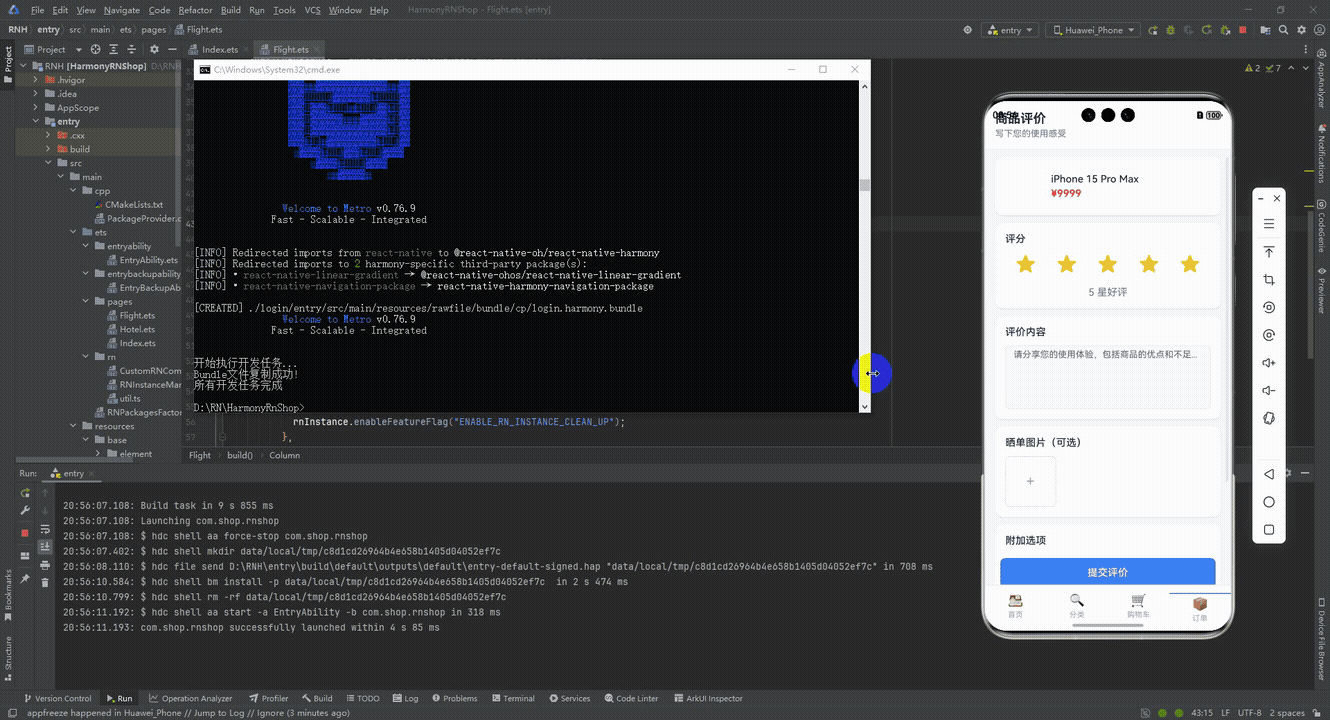
最后运行效果图如下显示:
本文深入探讨了一个基于React Native实现的商品评价系统,从架构设计到技术实现,并特别关注了鸿蒙系统的跨端适配策略。系统采用TypeScript定义简洁的商品数据模型,通过React Hooks进行模块化状态管理,实现了包含星级评分、富文本评价、图片上传和匿名选项等完整功能。在跨端兼容性方面,系统利用React Native核心组件库和Base64图标处理技术,确保在鸿蒙平台的良好运行。文章还详细拆解了状态管理方案、交互逻辑设计以及鸿蒙适配要点,为电商评价模块的开发提供了可落地的技术参考。
欢迎大家加入开源鸿蒙跨平台开发者社区,一起共建开源鸿蒙跨平台生态。

讨论HarmonyOS开发技术,专注于API与组件、DevEco Studio、测试、元服务和应用上架分发等。
更多推荐


 7
7 0
0- 0


 已为社区贡献7条内容

所有评论(0)