万字干货|HarmonyOS 6.0从画圆到画爱心,我把Shape玩明白了
本文是程序员Feri分享的HarmonyOS 6.0几何图形绘制指南,涵盖14年开发经验总结。文章系统讲解了两种图形实现方式:绘制组件(Shape、Circle等)用于独立展示图形,形状裁剪(clipShape)用于修改组件可见区域。详细解析了8种核心绘制组件的使用技巧,包括圆形、椭圆、矩形、多边形和自由路径Path,并提供了多个实战案例(进度条、头像裁剪、波浪动画等)。同时深入探讨了渲染原理和性
小邢哥 | 14年编程老炮,拆解技术脉络,记录程序员的进化史
开篇唠嗑:为什么我要写这篇文章
大家好,我是小邢哥。
掐指一算,从2013年参加工作到现在,我已经在这个行业摸爬滚打了14年。从最早的Java Swing画圆画方,到Android的Canvas,再到Flutter的CustomPainter,再到现在的HarmonyOS ArkTS——画图形这件事,我这辈子估计画了不下十万个。
前两天有个粉丝私信我:" 小邢哥,HarmonyOS 6.0的图形绘制我看官方文档看了三遍,还是云里雾里的,能不能给讲讲?"
我一看官方文档,嚯,写得确实很全面,但对新手来说,确实有点"学院派"。于是我决定用我这14年的经验,给大家来一篇接地气、能落地、有深度的技术科普。
今天这篇文章,我承诺:看完你就能在HarmonyOS 6.0下画出任何你想要的几何图形。
废话不多说,系好安全带,咱们发车!
第一章:先搞清楚——为什么要学绘制几何图形?
1.1 图形绘制:UI开发的"内功"
很多新手可能会问:"小邢哥,现在UI组件那么丰富,我直接用Button、Image不就行了吗?为什么要学画图形?"
好问题!
我来给你举几个真实的开发场景:
场景一:个性化的数据可视化
你接到一个需求:展示用户的健康数据,需要一个半圆形的进度条,进度条外围还要有刻度线。请问,系统组件里有这玩意儿吗?
没有!你只能自己画。
场景二:创意型的按钮设计
设计师给你甩了一个六边形的按钮,说这是最新的设计趋势。你找遍了组件库,发现所有按钮都是圆角矩形。
怎么办?自己画!
场景三:炫酷的引导动画
产品经理说新用户引导页要有一个聚光灯效果,只高亮某个区域,其他地方暗下来。这种不规则的遮罩效果,组件库里也没有。
还是得自己画!
所以你看,绑定几何图形绘制是UI开发的"内功"。组件库是"招式",用得好可以应付大多数场景;但遇到复杂需求,没有内功的人就只能干瞪眼了。
1.2 HarmonyOS 6.0的两条技术路线
在HarmonyOS 6.0的ArkTS框架下,官方给我们提供了两条技术路线来实现几何图形:
| 技术路线 | 核心工具 | 适用场景 | 特点 |
|---|---|---|---|
| 绘制组件 | Shape、Circle、Rect、Line等 | 需要独立展示几何图形 | 直接生成图形组件 |
| 形状裁剪 | clipShape属性 | 把现有组件裁剪成特定形状 | 改变组件的可见区域 |
打个比方:
-
绘制组件就像是用画笔在白纸上画画,你画什么就是什么;
-
形状裁剪就像是用剪刀把照片裁成特定形状,照片还是那张照片,只是你只能看到剪刀圈定的部分。
这两种方式各有千秋,接下来我会逐一深入讲解。
第二章:绘制组件Shape——你的专属画笔
2.1 Shape家族全景图
在HarmonyOS 6.0中,Shape相关的绘制组件一共有8个核心成员:
Shape家族
├── Shape(容器组件,用于组合多个图形)
├── Circle(圆形)
├── Ellipse(椭圆)
├── Rect(矩形)
├── Line(直线)
├── Polyline(折线)
├── Polygon(多边形)
└── Path(自由路径,最灵活)
我给大家画一张能力分布图:
灵活度:Path > Polygon > Polyline > 其他基础图形
易用度:Circle/Rect > Ellipse > Line > Polyline > Polygon > Path
性能:基础图形 > 复杂图形 > Path
记住这个规律:越灵活的组件,学习成本越高,性能开销也越大。
2.2 Circle——从最简单的圆形开始
2.2.1 基础用法
圆形是最简单的几何图形了,没有之一。在HarmonyOS中画一个圆,代码简洁到令人发指:
@Entry
@Component
struct Study1 {
  build() {
    Column({ space: 20 }) {
      // 最简单的圆形
      Circle({ width: 100, height: 100 })
        .fill(Color.Blue)

      Text('这是一个蓝色的圆')
        .fontSize(16)
    }
    .width('100%')
    .height('100%')
    .justifyContent(FlexAlign.Center)
  }
}
运行结果:屏幕中央出现一个直径100vp的蓝色圆形。
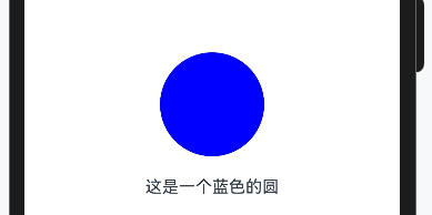
代码拆解:
-
Circle({ width: 100, height: 100 }):创建一个圆形,宽高都是100vp -
.fill(Color.Blue):填充颜色为蓝色
是不是简单得有点不像话?
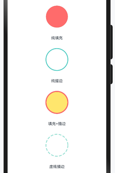
2.2.2 进阶:描边与填充
实际开发中,我们经常需要给圆形加上边框,或者只要边框不要填充:
@Entry
@Component
struct Study2 {
  build() {
    Column({ space: 30 }) {
      // 纯填充圆形
      Circle({ width: 80, height: 80 })
        .fill('#FF6B6B')
      Text('纯填充').fontSize(14)

      // 纯描边圆形(空心圆)
      Circle({ width: 80, height: 80 })
        .fill(Color.Transparent) // 填充透明
        .stroke('#4ECDC4')       // 描边颜色
        .strokeWidth(3)           // 描边宽度
      Text('纯描边').fontSize(14)

      // 填充+描边
      Circle({ width: 80, height: 80 })
        .fill('#FFE66D')
        .stroke('#FF6B6B')
        .strokeWidth(4)
      Text('填充+描边').fontSize(14)

      // 虚线描边
      Circle({ width: 80, height: 80 })
        .fill(Color.Transparent)
        .stroke('#95E1D3')
        .strokeWidth(3)
        .strokeDashArray([10, 5]) // 虚线:10vp实线,5vp间隔
      Text('虚线描边').fontSize(14)
    }
    .width('100%')
    .padding(20)
  }
}
重点属性解析:
| 属性 | 作用 | 取值示例 |
|---|---|---|
fill |
填充颜色 | Color.Blue、'#FF6B6B'、Color.Transparent |
stroke |
描边颜色 | Color.Red、'#4ECDC4' |
strokeWidth |
描边宽度 | 数值,单位vp |
strokeDashArray |
虚线样式 | [实线长度, 间隔长度] |
2.2.3 小邢哥的踩坑笔记
坑点一:宽高不一致时会变成椭圆吗?
新手常问:如果我写Circle({ width: 100, height: 50 })会怎样?
答案:Circle永远是正圆!当宽高不一致时,它会取较小值作为直径。所以width: 100, height: 50的结果是一个直径50vp的圆,而不是椭圆。
想画椭圆?请用Ellipse组件!
坑点二:fill和stroke的默认值
如果你既不写fill也不写stroke,圆形默认会有一个黑色的填充。所以想画空心圆,一定要显式写fill(Color.Transparent)。
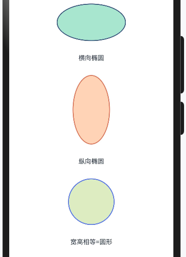
2.3 Ellipse——当圆被"压扁"
椭圆就是"不那么圆的圆"。在数学上,椭圆有两个轴:长轴和短轴。在HarmonyOS中,椭圆的宽度对应横轴,高度对应纵轴。
@Entry
@Component
struct EllipseDemo {
  build() {
    Column({ space: 30 }) {
      // 横向椭圆(扁椭圆)
      Ellipse({ width: 150, height: 80 })
        .fill('#A8E6CF')
        .stroke('#3D5A80')
        .strokeWidth(2)
      Text('横向椭圆').fontSize(14)

      // 纵向椭圆(瘦椭圆)
      Ellipse({ width: 80, height: 150 })
        .fill('#FFD3B6')
        .stroke('#E07A5F')
        .strokeWidth(2)
      Text('纵向椭圆').fontSize(14)

      // 当宽高相等时,就是圆
      Ellipse({ width: 100, height: 100 })
        .fill('#DCEDC1')
        .stroke('#5C7AEA')
        .strokeWidth(2)
      Text('宽高相等=圆形').fontSize(14)
    }
    .width('100%')
    .padding(20)
  }
}
使用场景举例:
-
设计师给的头像框是椭圆形的
-
需要做一个跑道形状的背景
-
数据可视化中的椭圆饼图
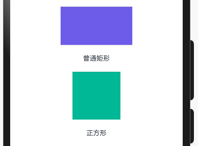
2.4 Rect——矩形,UI界的"劳模"
矩形可能是所有几何图形中使用频率最高的。按钮是矩形、卡片是矩形、输入框是矩形……可以说,现代UI就是建立在矩形基础上的。
2.4.1 基础矩形
@Entry
@Component
struct RectDemo {
  build() {
    Column({ space: 20 }) {
      // 普通矩形
      Rect({ width: 150, height: 80 })
        .fill('#6C5CE7')
      Text('普通矩形').fontSize(14)

      // 正方形
      Rect({ width: 100, height: 100 })
        .fill('#00B894')
      Text('正方形').fontSize(14)
    }
    .width('100%')
    .padding(20)
  }
}
2.4.2 圆角矩形——UI设计的最爱
现代UI设计非常喜欢圆角,因为圆角给人柔和、友好的感觉。HarmonyOS的Rect组件提供了多种圆角设置方式:
@Entry
@Component
struct RoundRectDemo {
  build() {
    Column({ space: 25 }) {
      // 统一圆角
      Rect({ width: 150, height: 80 })
        .fill('#74B9FF')
        .radius(15) // 四个角统一15vp圆角
      Text('统一圆角').fontSize(14)

      // 分别设置四个角
      Rect({ width: 150, height: 80 })
        .fill('#FD79A8')
        .radiusWidth(20)  // 水平方向圆角半径
        .radiusHeight(10) // 垂直方向圆角半径
      Text('椭圆形圆角').fontSize(14)

      // 胶囊形状(圆角=短边的一半)
      Rect({ width: 150, height: 60 })
        .fill('#55EFC4')
        .radius(30) // 30 = 60/2,形成胶囊
      Text('胶囊形状').fontSize(14)

      // 超大圆角变成圆形
      Rect({ width: 100, height: 100 })
        .fill('#FFEAA7')
        .radius(50) // 50 = 100/2
      Text('圆形(矩形变的)').fontSize(14)
    }
    .width('100%')
    .padding(20)
  }
}
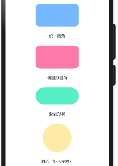
小邢哥的设计心得:
圆角大小的选择有讲究:
-
圆角 = 4~8vp:微圆角,适合专业、严肃的场景
-
圆角 = 12~16vp:中等圆角,通用性强,大多数App都这么干
-
圆角 = 高度/2:胶囊形,适合按钮、标签
-
圆角 = 尺寸/2:变成圆形
2.4.3 进阶:描边艺术
描边可以让矩形更有层次感:
@Entry
@Component
struct RectStrokeDemo {
  build() {
    Column({ space: 25 }) {
      // 实线描边
      Rect({ width: 140, height: 70 })
        .fill(Color.White)
        .stroke('#2D3436')
        .strokeWidth(2)
        .radius(10)
      Text('实线描边').fontSize(14)

      // 虚线描边
      Rect({ width: 140, height: 70 })
        .fill(Color.White)
        .stroke('#0984E3')
        .strokeWidth(2)
        .strokeDashArray([8, 4]) // 8vp实线,4vp间隔
        .radius(10)
      Text('虚线描边').fontSize(14)

      // 圆点虚线
      Rect({ width: 140, height: 70 })
        .fill(Color.White)
        .stroke('#E17055')
        .strokeWidth(3)
        .strokeDashArray([1, 6]) // 1vp实线,6vp间隔 → 圆点效果
        .strokeLineCap(LineCapStyle.Round)
        .radius(10)
      Text('圆点描边').fontSize(14)
    }
    .width('100%')
    .padding(20)
  }
}
strokeLineCap属性解析:
这个属性控制线条端点的样式,有三个选项:
| 值 | 效果 | 使用场景 |
|---|---|---|
LineCapStyle.Butt |
平头,线条在端点处截断 | 默认值,普通线条 |
LineCapStyle.Round |
圆头,端点有半圆 | 虚线变圆点 |
LineCapStyle.Square |
方头,端点多出一个方块 | 特殊设计需求 |
2.5 Line——最基础的线段
Line组件用于绘制直线段。虽然简单,但在很多场景都有用武之地:分割线、进度条底线、连接线等。
@Entry
@Component
struct LineDemo {
  build() {
    Column({ space: 30 }) {
      // 水平线
      Line()
        .width(200)
        .height(2)
        .startPoint([0, 1])
        .endPoint([200, 1])
        .stroke('#636E72')
        .strokeWidth(2)
      Text('水平线').fontSize(14)

      // 垂直线
      Line()
        .width(2)
        .height(100)
        .startPoint([1, 0])
        .endPoint([1, 100])
        .stroke('#00CEC9')
        .strokeWidth(2)
      Text('垂直线').fontSize(14)

      // 斜线
      Line()
        .width(150)
        .height(80)
        .startPoint([0, 0])
        .endPoint([150, 80])
        .stroke('#FF7675')
        .strokeWidth(3)
      Text('斜线').fontSize(14)

      // 虚线
      Line()
        .width(200)
        .height(2)
        .startPoint([0, 1])
        .endPoint([200, 1])
        .stroke('#74B9FF')
        .strokeWidth(2)
        .strokeDashArray([10, 5])
      Text('虚线').fontSize(14)
    }
    .width('100%')
    .padding(30)
  }
}
关键点理解:
Line的坐标系以组件左上角为原点(0,0):
-
startPoint([x1, y1]):起点坐标 -
endPoint([x2, y2]):终点坐标
坐标值是相对于组件宽高的,所以通常需要配合设置width和height。
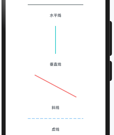
小邢哥提醒:
画水平或垂直线时,记得给线条留出strokeWidth的空间。比如画一条2vp粗的水平线,height至少要设为2,y坐标设为1(线条中心在y=1的位置)。
2.6 Polyline——折线,连接多个点
当你需要画一条"拐弯"的线时,Polyline就派上用场了。它可以依次连接多个点形成折线。
@Entry
@Component
struct PolylineDemo {
  build() {
    Column({ space: 30 }) {
      // 简单折线
      Polyline()
        .width(200)
        .height(100)
        .points([[0, 100], [50, 20], [100, 80], [150, 10], [200, 60]])
        .stroke('#E84393')
        .strokeWidth(3)
        .fill(Color.Transparent)
      Text('股票走势图效果').fontSize(14)

      // 阶梯线
      Polyline()
        .width(200)
        .height(100)
        .points([[0, 80], [40, 80], [40, 50], [80, 50], [80, 30], [120, 30], [120, 60], [160, 60], [160, 20], [200, 20]])
        .stroke('#00B894')
        .strokeWidth(2)
        .fill(Color.Transparent)
      Text('阶梯线').fontSize(14)

      // 填充的折线区域
      Polyline()
        .width(200)
        .height(100)
        .points([[0, 100], [0, 70], [50, 30], [100, 60], [150, 20], [200, 50], [200, 100]])
        .stroke('#0984E3')
        .strokeWidth(2)
        .fill('#74B9FF')
        .fillOpacity(0.3)
      Text('面积图效果').fontSize(14)
    }
    .width('100%')
    .padding(30)
  }
}
Polyline的核心属性:
-
points:点的数组,格式为[[x1,y1], [x2,y2], [x3,y3], ...] -
stroke:线条颜色 -
fill:填充颜色(如果不想填充,设为Transparent) -
fillOpacity:填充透明度,0-1之间
使用场景:
-
股票/基金走势图
-
温度变化曲线
-
运动轨迹
-
数据统计折线图
2.7 Polygon——多边形,封闭图形
Polygon和Polyline很像,区别在于:Polygon会自动把最后一个点和第一个点连接起来,形成封闭图形。
@Entry
@Component
struct PolygonDemo {
  build() {
    Column({ space: 30 }) {
      // 三角形
      Polygon()
        .width(100)
        .height(90)
        .points([[50, 0], [100, 90], [0, 90]])
        .fill('#FF6B6B')
        .stroke('#C0392B')
        .strokeWidth(2)
      Text('三角形').fontSize(14)

      // 正五边形(近似)
      Polygon()
        .width(100)
        .height(100)
        .points([
          [50, 0],      // 顶点
          [97, 35],     // 右上
          [79, 90],     // 右下
          [21, 90],     // 左下
          [3, 35]       // 左上
        ])
        .fill('#4ECDC4')
        .stroke('#1ABC9C')
        .strokeWidth(2)
      Text('五边形').fontSize(14)

      // 六边形
      Polygon()
        .width(100)
        .height(87)
        .points([
          [50, 0],      // 上顶点
          [100, 22],    // 右上
          [100, 65],    // 右下
          [50, 87],     // 下顶点
          [0, 65],      // 左下
          [0, 22]       // 左上
        ])
        .fill('#A29BFE')
        .stroke('#6C5CE7')
        .strokeWidth(2)
      Text('六边形').fontSize(14)

      // 五角星
      Polygon()
        .width(100)
        .height(95)
        .points([
          [50, 0],       // 顶角
          [61, 35],
          [98, 35],      // 右上角
          [68, 57],
          [79, 95],      // 右下角
          [50, 72],
          [21, 95],      // 左下角
          [32, 57],
          [2, 35],       // 左上角
          [39, 35]
        ])
        .fill('#FFEAA7')
        .stroke('#F39C12')
        .strokeWidth(2)
      Text('五角星').fontSize(14)
    }
    .width('100%')
    .padding(30)
  }
}
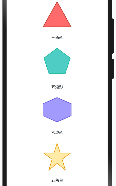
正多边形的顶点坐标计算:
对于正N边形,如果圆心在(cx, cy),半径为r,则第i个顶点的坐标为:
xi = cx + r * sin(2π * i / N)
yi = cy - r * cos(2π * i / N)
注意:这里的坐标系y轴向下,所以用减号。
小邢哥的数学小课堂:
别被公式吓到!其实就是把圆等分成N份,每份对应一个顶点。
上面的五边形和六边形坐标,我就是这样算出来的。
当然,如果你数学不好,也可以用一些在线工具生成坐标,比如搜索"polygon coordinate generator"。
2.8 Path——终极武器,自由绘制
如果说前面的组件都是"格式化写作",那Path就是"自由创作"。它可以绘制任意形状的图形,是最灵活也是最复杂的绘制方式。
2.8.1 Path的核心概念:路径命令
Path通过一系列"命令"来描述图形的轮廓。这些命令用单个字母表示:
| 命令 | 含义 | 参数 | 示例 |
|---|---|---|---|
| M | Move to(移动到) | x, y | M 50 50 |
| L | Line to(画直线到) | x, y | L 100 100 |
| H | Horizontal line(水平线) | x | H 150 |
| V | Vertical line(垂直线) | y | V 80 |
| A | Arc(圆弧) | rx ry rotation large-arc sweep x y | A 25 25 0 0 1 100 50 |
| Q | Quadratic curve(二次贝塞尔曲线) | cx cy x y | Q 75 0 100 50 |
| C | Cubic curve(三次贝塞尔曲线) | c1x c1y c2x c2y x y | C 25 0 75 100 100 50 |
| Z | Close path(闭合路径) | 无 | Z |
大写字母表示绝对坐标,小写字母表示相对坐标(相对于当前位置的偏移)。
2.8.2 从简单开始:用Path画三角形
@Entry
@Component
struct PathTriangleDemo {
  build() {
    Column({ space: 20 }) {
      Path()
        .width(100)
        .height(100)
        .commands('M 50 10 L 90 90 L 10 90 Z')
        .fill('#FF6B6B')
        .stroke('#C0392B')
        .strokeWidth(2)

      Text('Path绘制的三角形').fontSize(14)

      // 命令解析
      Text('M 50 10 → 移动到顶点(50,10)')
        .fontSize(12).fontColor(Color.Gray)
      Text('L 90 90 → 画线到右下角(90,90)')
        .fontSize(12).fontColor(Color.Gray)
      Text('L 10 90 → 画线到左下角(10,90)')
        .fontSize(12).fontColor(Color.Gray)
      Text('Z → 闭合路径,回到起点')
        .fontSize(12).fontColor(Color.Gray)
    }
    .width('100%')
    .padding(30)
  }
}
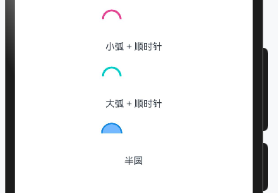
2.8.3 画圆弧:A命令详解
圆弧命令是Path中最复杂的命令,但也是最常用的之一。让我详细解释一下:
A rx ry rotation large-arc-flag sweep-flag x y
-
rx, ry:椭圆的x轴和y轴半径
-
rotation:椭圆相对于x轴的旋转角度
-
large-arc-flag:0=小弧,1=大弧
-
sweep-flag:0=逆时针,1=顺时针
-
x, y:终点坐标
@Entry
@Component
struct Study9 {
  build() {
    Column({space: 20}) {
      // 小弧 + 顺时针
      Path()
        .width(100)
        .height(30)
        .commands('M 10 50 A 40 40 0 0 1 90 50')
        .fill(Color.Transparent)
        .stroke('#E84393')
        .strokeWidth(3)
      Text('小弧 + 顺时针').fontSize(14)
      // 大弧 + 顺时针
      Path()
        .width(100)
        .height(30)
        .commands('M 10 50 A 40 40 0 1 1 90 50')
        .fill(Color.Transparent)
        .stroke('#00CEC9')
        .strokeWidth(3)
      Text('大弧 + 顺时针').fontSize(14)
      // 半圆
      Path()
        .width(100)
        .height(30)
        .commands('M 5 50 A 45 45 0 0 1 95 50')
        .fill('#74B9FF')
        .stroke('#0984E3')
        .strokeWidth(2)
      Text('半圆').fontSize(14)
    }
    .width('100%')
    .padding(30)
  }
}
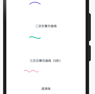
2.8.4 贝塞尔曲线:画出丝滑的曲线
贝塞尔曲线是绘制平滑曲线的利器。有两种:
二次贝塞尔曲线(Q命令):一个控制点
Q cx cy x y
三次贝塞尔曲线(C命令):两个控制点
C c1x c1y c2x c2y x y
@Entry
@Component
struct PathBezierDemo {
  build() {
    Column({ space: 30 }) {
      // 二次贝塞尔曲线
      Path()
        .width(150)
        .height(80)
        .commands('M 0 60 Q 75 0 150 60')
        .fill(Color.Transparent)
        .stroke('#6C5CE7')
        .strokeWidth(3)
      Text('二次贝塞尔曲线').fontSize(14)

      // 三次贝塞尔曲线
      Path()
        .width(150)
        .height(80)
        .commands('M 0 40 C 30 0 120 80 150 40')
        .fill(Color.Transparent)
        .stroke('#00B894')
        .strokeWidth(3)
      Text('三次贝塞尔曲线(S形)').fontSize(14)

      // 波浪线
      Path()
        .width(200)
        .height(50)
        .commands('M 0 25 Q 25 0 50 25 Q 75 50 100 25 Q 125 0 150 25 Q 175 50 200 25')
        .fill(Color.Transparent)
        .stroke('#FD79A8')
        .strokeWidth(2)
      Text('波浪线').fontSize(14)
    }
    .width('100%')
    .padding(30)
  }
}
2.8.5 实战:用Path画一个爱心
@Entry
@Component
struct HeartDemo {
  build() {
    Column({ space: 20 }) {
      Path()
        .width(100)
        .height(90)
        .commands(
          'M 50 20 ' +
          'C 50 10 40 0 25 0 ' +
          'C 10 0 0 15 0 30 ' +
          'C 0 50 15 70 50 90 ' +
          'C 85 70 100 50 100 30 ' +
          'C 100 15 90 0 75 0 ' +
          'C 60 0 50 10 50 20 ' +
          'Z'
        )
        .fill('#FF6B6B')
        .stroke('#C0392B')
        .strokeWidth(2)

      Text('Path画的爱心').fontSize(16)
    }
    .width('100%')
    .height('100%')
    .justifyContent(FlexAlign.Center)
  }
}
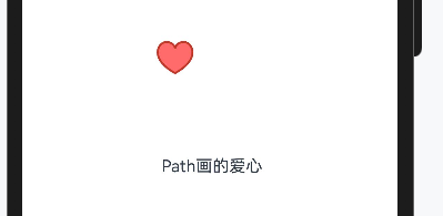
小邢哥解析这颗爱心:
爱心本质上是两个相切的圆弧加上一个尖角。
我用三次贝塞尔曲线来拟合这个形状:
-
从顶部凹陷处开始(M 50 20)
-
画左半边的弧线(两个C命令)
-
画右半边的弧线(两个C命令)1
-
回到起点(Z)
2.8.6 Path命令的简写规则
Path命令支持一些简写规则,让你的代码更简洁:
-
连续相同命令可省略命令字母
L 10 20 L 30 40 L 50 60
// 可以写成
L 10 20 30 40 50 60
-
M后面连续的坐标会被视为L
M 0 0 10 20 30 40
// 等价于
M 0 0 L 10 20 L 30 40
-
数字之间的逗号可以省略(用空格分隔)
M 50,20 L 100,80
// 等价于
M 50 20 L 100 80
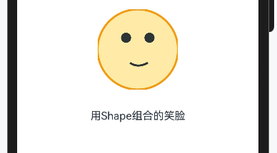
2.9 Shape容器——组合多个图形
Shape组件本身是一个容器,可以把多个基础图形组合在一起:
@Entry
@Component
struct ShapeContainerDemo {
  build() {
    Column({ space: 30 }) {
      // 笑脸
      Shape() {
        // 脸
        Circle({ width: 120, height: 120 })
          .fill('#FFEAA7')
          .stroke('#F39C12')
          .strokeWidth(3)

        // 左眼
        Circle({ width: 15, height: 15 })
          .fill('#2D3436')
          .offset({ x: 35, y: 35 })

        // 右眼
        Circle({ width: 15, height: 15 })
          .fill('#2D3436')
          .offset({ x: 70, y: 35 })

        // 嘴巴(用Path画弧线)
        Path()
          .commands('M 25 75 Q 60 100 105 75')
          .stroke('#2D3436')
          .strokeWidth(3)
          .fill(Color.Transparent)
          .offset({ x: 40, y: 55 })
      }
      .width(120)
      .height(120)

      Text('用Shape组合的笑脸').fontSize(16)
    }
    .width('100%')
    .height('100%')
    .justifyContent(FlexAlign.Center)
  }
}
Shape容器的关键属性:
| 属性 | 作用 | 示例 |
|---|---|---|
viewPort |
定义形状的视口 | viewPort({ x: 0, y: 0, width: 100, height: 100 }) |
fill |
统一设置所有子图形的填充色 | fill(Color.Blue) |
stroke |
统一设置所有子图形的描边色 | stroke(Color.Red) |
小技巧: 使用offset({ x: number, y: number })可以调整子图形在容器内的位置。
第三章:形状裁剪clipShape——给组件"整容"
3.1 clipShape是什么?
前面讲的Shape家族是"画图形",而clipShape是"裁图形"。
打个比方:
-
Shape = 用画笔在白纸上画一个圆
-
clipShape = 用圆形模具把一张照片裁成圆形
clipShape是一个通用属性,几乎所有组件都可以使用它。它的作用是:把组件的可见区域裁剪成指定的形状。
3.2 基础用法
@Entry
@Component
struct ClipShapeBasicDemo {
  build() {
    Column({ space: 30 }) {
      // 原始图片
      Image($r('app.media.sample'))
        .width(150)
        .height(150)
        .objectFit(ImageFit.Cover)
      Text('原始图片').fontSize(14)

      // 圆形裁剪
      Image($r('app.media.sample'))
        .width(150)
        .height(150)
        .objectFit(ImageFit.Cover)
        .clipShape(new Circle({ width: 150, height: 150 }))
      Text('圆形裁剪').fontSize(14)

      // 椭圆裁剪
      Image($r('app.media.sample'))
        .width(150)
        .height(100)
        .objectFit(ImageFit.Cover)
        .clipShape(new Ellipse({ width: 150, height: 100 }))
      Text('椭圆裁剪').fontSize(14)
    }
    .width('100%')
    .padding(20)
  }
}
语法要点:
clipShape的参数需要传入形状对象实例,而不是组件。注意写法的区别:
// ❌ 错误写法(组件写法)
.clipShape(Circle({ width: 100, height: 100 }))

// ✅ 正确写法(对象实例)
.clipShape(new Circle({ width: 100, height: 100 }))
3.3 支持的裁剪形状
clipShape支持以下形状:
| 形状 | 创建方式 | 示例 |
|---|---|---|
| 圆形 | new Circle() | new Circle({ width: 100, height: 100 }) |
| 椭圆 | new Ellipse() | new Ellipse({ width: 150, height: 100 }) |
| 矩形 | new Rect() | new Rect({ width: 100, height: 80 }) |
| 圆角矩形 | new Rect() + radius | new Rect({ width: 100, height: 80 }).radius(10) |
| 自由路径 | new Path() | new Path().commands('...') |
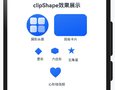
3.4 实战案例:各种裁剪效果
@Entry
@Component
struct ClipShapeGalleryDemo {
  build() {
    Column({ space: 20 }) {
      Text('clipShape效果展示').fontSize(20).fontWeight(FontWeight.Bold)

      Row({ space: 20 }) {
        // 圆形头像
        Column({ space: 5 }) {
          Image($r('app.media.startIcon'))
            .width(80)
            .height(80)
            .objectFit(ImageFit.Cover)
            .clipShape(new Circle({ width: 80, height: 80 }))
          Text('圆形头像').fontSize(12)
        }

        // 圆角矩形卡片
        Column({ space: 5 }) {
          Image($r('app.media.background'))
            .width(120)
            .height(80)
            .objectFit(ImageFit.Cover)
            .clipShape(new Rect({ width: 120, height: 80 }).radius(15))
          Text('圆角卡片').fontSize(12)
        }
      }

      Row({ space: 20 }) {
        // 菱形
        Column({ space: 5 }) {
          Image($r('app.media.background'))
            .width(40)
            .height(30)
            .objectFit(ImageFit.Cover)
            .clipShape(new Path().commands(
              'M 40 0 L 80 40 L 40 80 L 0 40 Z'
            ))
          Text('菱形').fontSize(12)
        }

        // 六边形
        Column({ space: 5 }) {
          Image($r('app.media.background'))
            .width(40)
            .height(30)
            .objectFit(ImageFit.Cover)
            .clipShape(new Path().commands(
              'M 40 0 L 80 17 L 80 53 L 40 70 L 0 53 L 0 17 Z'
            ))
          Text('六边形').fontSize(12)
        }

        // 五角星
        Column({ space: 5 }) {
          Image($r('app.media.background'))
            .width(40)
            .height(36)
            .objectFit(ImageFit.Cover)
            .clipShape(new Path().commands(
              'M 40 0 L 49 28 L 80 28 L 55 45 L 64 76 L 40 57 L 16 76 L 25 45 L 0 28 L 31 28 Z'
            ))
          Text('五角星').fontSize(12)
        }
      }

      // 心形裁剪
      Column({ space: 5 }) {
        Image($r('app.media.background'))
          .width(50)
          .height(50)
          .objectFit(ImageFit.Cover)
          .clipShape(new Path().commands(
            'M 60 20 ' +
              'C 60 10 48 0 30 0 ' +
              'C 12 0 0 15 0 33 ' +
              'C 0 55 18 80 60 110 ' +
              'C 102 80 120 55 120 33 ' +
              'C 120 15 108 0 90 0 ' +
              'C 72 0 60 10 60 20 Z'
          ))
        Text('心形情侣照').fontSize(12)
      }
    }
    .width('100%')
    .padding(20)
  }
}
3.5 clipShape vs clip属性
你可能注意到,HarmonyOS还有一个clip属性。它们有什么区别呢?
| 属性 | 作用 | 用法 |
|---|---|---|
clip(true) |
简单开启裁剪,使用组件自身边界 | .clip(true) |
clipShape |
使用自定义形状裁剪 | .clipShape(new Circle(...)) |
// clip(true):按组件边界裁剪
Row() {
  Text('超长文本会被裁剪掉不会溢出到外面去')
}
.width(100)
.clip(true)

// clipShape:按自定义形状裁剪
Image($r('app.media.photo'))
  .width(100)
  .height(100)
  .clipShape(new Circle({ width: 100, height: 100 }))
3.6 clipShape的性能考虑
clipShape本质上是在渲染管线中增加了一个遮罩层,会有一定的性能开销。
小邢哥的优化建议:
-
简单形状优先:Circle/Ellipse/Rect的性能比Path好
-
避免大量使用:如果列表中每个item都用clipShape,考虑用预处理图片代替
-
静态优先:如果形状不会变化,系统可以缓存裁剪结果
-
合理尺寸:裁剪区域越大,开销越大
第四章:综合实战——打造实用UI组件
理论讲完了,现在进入实战环节。我会带你用Shape和clipShape打造几个实用的UI组件。
4.1 实战一:圆形进度条
@Entry
@Component
struct CircularProgressDemo {
  @State progress: number = 0.75 // 75%进度

  build() {
    Column({ space: 20 }) {
      Stack() {
        // 背景圆环
        Circle({ width: 120, height: 120 })
          .fill(Color.Transparent)
          .stroke('#E0E0E0')
          .strokeWidth(10)

        // 进度圆弧
        Path()
          .width(120)
          .height(120)
          .commands(this.getProgressPath())
          .fill(Color.Transparent)
          .stroke('#4CAF50')
          .strokeWidth(10)
          .strokeLineCap(LineCapStyle.Round)

        // 中间的百分比文字
        Text(`${Math.round(this.progress * 100)}%`)
          .fontSize(24)
          .fontWeight(FontWeight.Bold)
          .fontColor('#333333')
      }
      .width(120)
      .height(120)

      // 控制进度的滑块
      Slider({
        value: this.progress * 100,
        min: 0,
        max: 100,
        step: 1
      })
        .width(200)
        .onChange((value: number) => {
          this.progress = value / 100
        })

      Text('拖动滑块调整进度').fontSize(14).fontColor(Color.Gray)
    }
    .width('100%')
    .height('100%')
    .justifyContent(FlexAlign.Center)
  }

  // 计算进度弧线的Path命令
  getProgressPath(): string {
    const centerX = 60
    const centerY = 60
    const radius = 55 // 略小于容器一半,留出strokeWidth空间

    // 起点:12点钟方向
    const startX = centerX
    const startY = centerY - radius

    // 终点角度计算
    const angle = this.progress * 360 - 90 // -90是因为从12点钟开始
    const angleRad = angle * Math.PI / 180
    const endX = centerX + radius * Math.cos(angleRad)
    const endY = centerY + radius * Math.sin(angleRad)

    // 大弧标志:进度>50%时使用大弧
    const largeArcFlag = this.progress > 0.5 ? 1 : 0

    if (this.progress === 0) {
      return '' // 0%时不画任何东西
    }

    if (this.progress >= 1) {
      // 100%时画完整圆,需要分两个弧
      return `M ${startX} ${startY} A ${radius} ${radius} 0 1 1 ${startX} ${startY + 0.01}`
    }

    return `M ${startX} ${startY} A ${radius} ${radius} 0 ${largeArcFlag} 1 ${endX} ${endY}`
  }
}

代码解析:
-
底层是一个灰色圆环:用Circle配合stroke实现
-
上层是一个彩色弧线:用Path的A命令绘制
-
中间是百分比文字:用Stack布局叠加
-
弧线的终点用三角函数计算:根据进度百分比换算成角度
这个组件可以直接用在健康App的数据展示、下载进度显示等场景。
4.2 实战二:六边形头像
@Entry
@Component
struct HexagonAvatarDemo {
  build() {
    Column({ space: 30 }) {
      Text('六边形头像').fontSize(20).fontWeight(FontWeight.Bold)

      // 普通六边形头像
      Image($r('app.media.avatar'))
        .width(100)
        .height(87)
        .objectFit(ImageFit.Cover)
        .clipShape(new Path().commands(
          'M 50 0 L 100 22 L 100 65 L 50 87 L 0 65 L 0 22 Z'
        ))

      // 带边框的六边形头像
      Stack() {
        // 边框(稍大的六边形)
        Path()
          .width(110)
          .height(96)
          .commands('M 55 0 L 110 24 L 110 72 L 55 96 L 0 72 L 0 24 Z')
          .fill('#4ECDC4')

        // 头像
        Image($r('app.media.avatar'))
          .width(100)
          .height(87)
          .objectFit(ImageFit.Cover)
          .clipShape(new Path().commands(
            'M 50 0 L 100 22 L 100 65 L 50 87 L 0 65 L 0 22 Z'
          ))
      }
      .width(110)
      .height(96)

      // 蜂窝布局的头像组
      Row({ space: -20 }) {
        ForEach([1, 2, 3, 4], (item: number, index: number) => {
          Image($r('app.media.avatar'))
            .width(60)
            .height(52)
            .objectFit(ImageFit.Cover)
            .clipShape(new Path().commands(
              'M 30 0 L 60 13 L 60 39 L 30 52 L 0 39 L 0 13 Z'
            ))
            .offset({ y: index % 2 === 1 ? 26 : 0 })
        })
      }
      Text('蜂窝布局').fontSize(14).fontColor(Color.Gray)
    }
    .width('100%')
    .padding(30)
  }
}
4.3 实战三:波浪背景动画
@Entry
@Component
struct WaveBackgroundDemo {
  @State waveOffset: number = 0

  build() {
    Stack({ alignContent: Alignment.Bottom }) {
      // 背景色
      Column()
        .width('100%')
        .height('100%')
        .backgroundColor('#87CEEB')

      // 波浪
      Path()
        .width('200%')
        .height(150)
        .commands(this.getWavePath())
        .fill('#4169E1')
        .offset({ x: this.waveOffset })

      // 第二层波浪(更浅的颜色,增加层次感)
      Path()
        .width('200%')
        .height(120)
        .commands(this.getWavePath2())
        .fill('#6495ED')
        .fillOpacity(0.7)
        .offset({ x: -this.waveOffset })

      // 内容
      Column({ space: 20 }) {
        Text('波浪动画')
          .fontSize(28)
          .fontWeight(FontWeight.Bold)
          .fontColor(Color.White)
        Text('Shape绘制 + offset动画')
          .fontSize(16)
          .fontColor(Color.White)
      }
      .width('100%')
      .height('60%')
      .justifyContent(FlexAlign.Center)
    }
    .width('100%')
    .height('100%')
    .onAppear(() => {
      this.startWaveAnimation()
    })
  }

  getWavePath(): string {
    // 绘制两个完整周期的波浪,这样动画可以无缝循环
    return 'M 0 50 ' +
      'Q 90 0 180 50 ' +
      'Q 270 100 360 50 ' +
      'Q 450 0 540 50 ' +
      'Q 630 100 720 50 ' +
      'L 720 150 L 0 150 Z'
  }

  getWavePath2(): string {
    // 第二层波浪,相位不同
    return 'M 0 60 ' +
      'Q 80 20 160 60 ' +
      'Q 240 100 320 60 ' +
      'Q 400 20 480 60 ' +
      'Q 560 100 640 60 ' +
      'Q 720 20 800 60 ' +
      'L 800 150 L 0 150 Z'
  }

  startWaveAnimation() {
    // 使用定时器实现波浪动画
    setInterval(() => {
      this.waveOffset -= 2
      if (this.waveOffset <= -360) {
        this.waveOffset = 0
      }
    }, 30)
  }
}
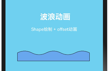
动画原理:
-
绘制两个波浪周期的Path
-
宽度设为200%,确保始终覆盖屏幕
-
通过offset不断左移
-
当移动一个周期后,重置offset,实现无缝循环
4.4 实战四:自定义形状的按钮
@Entry
@Component
struct CustomShapeButtonDemo {
  @State isPressed: boolean = false

  build() {
    Column({ space: 40 }) {
      Text('自定义形状按钮').fontSize(20).fontWeight(FontWeight.Bold)

      // 菱形按钮
      Stack() {
        Path()
          .width(120)
          .height(60)
          .commands('M 60 0 L 120 30 L 60 60 L 0 30 Z')
          .fill(this.isPressed ? '#2980B9' : '#3498DB')
          .stroke('#2471A3')
          .strokeWidth(2)

        Text('菱形按钮')
          .fontSize(14)
          .fontColor(Color.White)
      }
      .width(120)
      .height(60)
      .onTouch((event: TouchEvent) => {
        if (event.type === TouchType.Down) {
          this.isPressed = true
        } else if (event.type === TouchType.Up || event.type === TouchType.Cancel) {
          this.isPressed = false
        }
      })
      .onClick(() => {
        console.log('菱形按钮被点击')
      })

      // 箭头按钮
      Stack() {
        Path()
          .width(140)
          .height(50)
          .commands(
            'M 0 10 L 100 10 L 100 0 L 140 25 L 100 50 L 100 40 L 0 40 Z'
          )
          .fill('#27AE60')
          .stroke('#1E8449')
          .strokeWidth(2)

        Text('下一步')
          .fontSize(14)
          .fontColor(Color.White)
          .offset({ x: -15 })
      }
      .width(140)
      .height(50)

      // 云朵形按钮
      Stack() {
        Path()
          .width(150)
          .height(80)
          .commands(
            'M 30 60 ' +
            'A 30 30 0 1 1 60 30 ' +
            'A 25 25 0 1 1 110 35 ' +
            'A 20 20 0 1 1 130 60 ' +
            'L 30 60 Z'
          )
          .fill('#9B59B6')
          .stroke('#7D3C98')
          .strokeWidth(2)

        Text('云端上传')
          .fontSize(14)
          .fontColor(Color.White)
      }
      .width(150)
      .height(80)
    }
    .width('100%')
    .height('100%')
    .justifyContent(FlexAlign.Center)
  }
}
4.5 实战五:数据可视化——雷达图
@Entry
@Component
struct RadarChartDemo {
  // 数据:5个维度,每个维度0-100分
  private data: number[] = [80, 65, 90, 55, 75]
  private labels: string[] = ['攻击', '防御', '速度', '智力', '耐力']
  private maxValue: number = 100
  private centerX: number = 120
  private centerY: number = 120
  private radius: number = 100

  build() {
    Column({ space: 20 }) {
      Text('能力雷达图').fontSize(20).fontWeight(FontWeight.Bold)

      Shape() {
        // 绘制背景网格(5层)
        ForEach([0.2, 0.4, 0.6, 0.8, 1], (scale: number) => {
          Polygon()
            .points(this.getPentagonPoints(scale))
            .fill(Color.Transparent)
            .stroke('#E0E0E0')
            .strokeWidth(1)
        })

        // 绘制5条轴线
        ForEach([0, 1, 2, 3, 4], (index: number) => {
          Line()
            .startPoint([this.centerX, this.centerY])
            .endPoint(this.getAxisEndPoint(index))
            .stroke('#BDBDBD')
            .strokeWidth(1)
        })

        // 绘制数据多边形
        Polygon()
          .points(this.getDataPoints())
          .fill('#3498DB')
          .fillOpacity(0.3)
          .stroke('#2980B9')
          .strokeWidth(2)

        // 绘制数据点
        ForEach([0, 1, 2, 3, 4], (index: number) => {
          Circle({ width: 8, height: 8 })
            .fill('#E74C3C')
            .offset(this.getDataPointOffset(index))
        })
      }
      .width(240)
      .height(240)

      // 图例
      Row({ space: 15 }) {
        ForEach(this.labels, (label: string, index: number) => {
          Text(`${label}: ${this.data[index]}`)
            .fontSize(12)
            .fontColor('#666666')
        })
      }
      .width('100%')
      .justifyContent(FlexAlign.Center)
    }
    .width('100%')
    .padding(20)
  }

  // 获取正五边形顶点坐标
  getPentagonPoints(scale: number): number[][] {
    const points: number[][] = []
    for (let i = 0; i < 5; i++) {
      const angle = (i * 72 - 90) * Math.PI / 180
      const x = this.centerX + this.radius * scale * Math.cos(angle)
      const y = this.centerY + this.radius * scale * Math.sin(angle)
      points.push([x, y])
    }
    return points
  }

  // 获取轴线终点
  getAxisEndPoint(index: number): number[] {
    const angle = (index * 72 - 90) * Math.PI / 180
    return [
      this.centerX + this.radius * Math.cos(angle),
      this.centerY + this.radius * Math.sin(angle)
    ]
  }

  // 获取数据多边形顶点
  getDataPoints(): number[][] {
    const points: number[][] = []
    for (let i = 0; i < 5; i++) {
      const angle = (i * 72 - 90) * Math.PI / 180
      const value = this.data[i] / this.maxValue
      const x = this.centerX + this.radius * value * Math.cos(angle)
      const y = this.centerY + this.radius * value * Math.sin(angle)
      points.push([x, y])
    }
    return points
  }

  // 获取数据点的偏移量(用于Circle的offset)
  getDataPointOffset(index: number): Position {
    const angle = (index * 72 - 90) * Math.PI / 180
    const value = this.data[index] / this.maxValue
    return {
      x: this.centerX + this.radius * value * Math.cos(angle) - 4,
      y: this.centerY + this.radius * value * Math.sin(angle) - 4
    }
  }
}
第五章:进阶知识——深入理解渲染原理
5.1 Shape组件的渲染流程
了解渲染流程,有助于我们写出性能更好的代码。
用户代码定义Shape
      ↓
ArkUI框架解析Shape组件树
      ↓
计算图形顶点、路径等几何数据
      ↓
生成绘制指令(Draw Commands)
      ↓
Skia图形引擎执行绘制
      ↓
GPU光栅化输出像素
      ↓
显示到屏幕
关键点:
-
Shape组件最终由Skia图形引擎渲染
-
简单图形(Circle、Rect)有GPU加速优化
-
Path组件因为形状自由,需要更多CPU计算
5.2 抗锯齿与渲染质量
你有没有注意过,有些圆形边缘很光滑,有些则有明显的锯齿?
这就涉及到抗锯齿(Anti-aliasing)。好消息是,HarmonyOS的Shape组件默认开启了抗锯齿,你不需要手动设置。
但在某些极端情况下(比如非常细的线条、超小的图形),可能仍会看到锯齿。这时可以:
-
适当增加strokeWidth
-
使用更大的尺寸,然后缩放显示
5.3 坐标系统详解
HarmonyOS的坐标系:
-
原点(0,0)在左上角
-
X轴向右为正
-
Y轴向下为正
这与传统数学坐标系不同(数学坐标系Y轴向上),在用三角函数计算坐标时要注意转换。
(0,0) ─────────────→ X
  │
  │
  │
  │
  ↓
  Y
5.4 viewPort与坐标缩放
Shape容器的viewPort属性可以定义一个"虚拟坐标系",让你用更方便的数值来绘图:
Shape() {
  Path()
    .commands('M 0 0 L 100 0 L 100 100 L 0 100 Z')
    .fill(Color.Blue)
}
.width(200)  // 实际显示200vp
.height(200) // 实际显示200vp
.viewPort({ x: 0, y: 0, width: 100, height: 100 }) // 虚拟坐标系100x100
上面的代码中,虽然Path的坐标只用到0-100,但会被自动缩放到200vp的显示区域。
使用场景:
-
引用SVG的path数据时,保持原始坐标
-
需要精确控制缩放比例时
第六章:性能优化指南
6.1 图形复杂度与性能关系
性能消耗(从低到高):
Circle/Rect < Ellipse < Line < Polyline < Polygon < Path(简单)< Path(复杂)
小邢哥的经验法则:
-
能用简单图形就不用Path
-
Path的commands越长,性能越差
-
避免在列表中使用复杂Path
6.2 动态更新的优化
如果图形需要频繁更新(比如动画),注意以下几点:
1. 使用@State而不是重新创建组件
// ✅ 好的做法
@State progress: number = 0
Circle({ width: 100, height: 100 })
  .strokeDashOffset(this.progress) // 只更新属性

// ❌ 避免的做法
// 每次更新都重新计算整个Path
2. 减少Path commands的动态拼接
// ❌ 每帧都拼接字符串,性能差
getPath(): string {
  return `M ${this.x} ${this.y} L ${this.endX} ${this.endY}`
}

// ✅ 使用变换代替重新计算
Path()
  .commands('M 0 0 L 100 100')
  .translate({ x: this.offsetX, y: this.offsetY }) // 使用translate
6.3 离屏渲染注意事项
clipShape会触发离屏渲染,这在某些情况下会影响性能。
什么是离屏渲染? 正常渲染是直接把图像画到屏幕缓冲区。离屏渲染是先画到一个临时缓冲区,应用遮罩后,再转移到屏幕缓冲区。多了一步转移操作。
优化建议:
-
如果只是需要圆角,优先用
borderRadius而不是clipShape -
列表中的item尽量避免使用clipShape
-
对于静态图片,考虑预处理成目标形状
6.4 内存优化
每个Shape组件都会占用一定内存。如果你有大量图形:
// ❌ 创建100个Circle组件
ForEach(Array(100).fill(0), (_, index) => {
  Circle({ width: 10, height: 10 })
    .fill(Color.Blue)
    .offset({ x: index * 15, y: 0 })
})

// ✅ 使用一个Path绘制100个圆
Path()
  .commands(this.generate100CirclesPath())
  .fill(Color.Blue)
第七章:常见问题FAQ
Q1:Shape组件可以响应点击事件吗?
A: 可以,但默认情况下点击区域是矩形边界框,而不是图形本身的形状。
// 这个三角形的点击区域是一个100x100的正方形
Polygon()
  .points([[50, 0], [100, 100], [0, 100]])
  .width(100)
  .height(100)
  .onClick(() => {
    console.log('点击了三角形区域...或者是三角形外的空白区域')
  })
如果需要精确到形状的点击区域,需要自己在onClick中判断坐标:
.onTouch((event: TouchEvent) => {
  const x = event.touches[0].x
  const y = event.touches[0].y
  if (this.isPointInTriangle(x, y)) {
    // 真正点击在三角形内
  }
})
Q2:如何实现渐变填充?
A: HarmonyOS支持线性渐变和径向渐变:
Circle({ width: 100, height: 100 })
  .fill({
    type: GradientType.Linear,
    direction: GradientDirection.Bottom,
    colors: [['#FF6B6B', 0], ['#4ECDC4', 1]]
  })
Q3:Shape可以加阴影吗?
A: 可以使用通用的shadow属性:
Circle({ width: 80, height: 80 })
  .fill('#3498DB')
  .shadow({
    radius: 10,
    color: '#00000033',
    offsetX: 5,
    offsetY: 5
  })
Q4:Path的commands字符串太长怎么办?
A: 有几种方法:
-
模板字符串换行
.commands(`
  M 50 0
  L 100 100
  L 0 100
  Z
`)
-
字符串拼接
.commands(
  'M 50 0 ' +
  'L 100 100 ' +
  'L 0 100 ' +
  'Z'
)
-
封装成函数
getStarPath(cx: number, cy: number, r: number): string {
  // 计算五角星各点坐标
  const points: number[][] = []
  for (let i = 0; i < 10; i++) {
    const angle = (i * 36 - 90) * Math.PI / 180
    const radius = i % 2 === 0 ? r : r * 0.38
    points.push([
      cx + radius * Math.cos(angle),
      cy + radius * Math.sin(angle)
    ])
  }
  return 'M ' + points.map(p => p.join(' ')).join(' L ') + ' Z'
}
Q5:clipShape裁剪后,能看到组件原来的边界吗?
A: 不能。clipShape真的会把超出区域"剪掉",完全不可见。
如果你想要"镂空"效果(中间透明,周围有内容),需要用到更高级的技术,比如:
-
BlendMode混合模式
-
Canvas API
第八章:总结与展望
8.1 本文知识点回顾
我们从最基础的Circle,一路讲到复杂的Path,再到clipShape的裁剪技术,覆盖了HarmonyOS 6.0几何图形绘制的方方面面:
基础组件篇:
-
Circle:圆形,最简单
-
Ellipse:椭圆
-
Rect:矩形,支持圆角
-
Line:直线
-
Polyline:折线
-
Polygon:多边形
-
Path:自由路径,终极武器
Path命令篇:
-
M:移动
-
L/H/V:直线
-
A:圆弧
-
Q/C:贝塞尔曲线
-
Z:闭合
clipShape篇:
-
用于裁剪组件可见区域
-
支持Circle、Ellipse、Rect、Path
-
注意性能影响
8.2 学习路径建议
如果你是新手,我建议按这个顺序学习:
第一天:掌握Circle、Rect、基础样式(fill、stroke)
    ↓
第二天:学习Line、Polyline、Polygon
    ↓
第三天:攻克Path,重点是A和Q/C命令
    ↓
第四天:学习clipShape,做综合实战
    ↓
进阶:研究性能优化、动画结合
8.3 写在最后
14年的编程生涯教会我一个道理:技术的本质是相通的。
今天你学的是HarmonyOS的Shape,但这套知识可以迁移到任何UI框架:
-
Web的SVG/Canvas用的是几乎相同的Path语法
-
Flutter的CustomPainter原理类似
-
甚至Android的Canvas、iOS的CoreGraphics,底层逻辑都是一样的
所以,不要只是背API,要理解原理。理解了"为什么这样设计",你才能触类旁通。
好了,这篇文章就到这里。如果你觉得有收获,欢迎点赞、收藏、转发。有问题可以评论区留言,我会逐一回复。
我是小邢哥,14年编程老炮,我们下篇文章见!
附录:本文代码仓库
本文所有完整代码已上传到Gitee,欢迎Star:
https://gitcode.com/u014332200/HarmonyShape

讨论HarmonyOS开发技术,专注于API与组件、DevEco Studio、测试、元服务和应用上架分发等。
更多推荐


 15
15 0
0- 0


 已为社区贡献32条内容

所有评论(0)