【HarmonyOS 6】:Slider 滑块与快捷选择设计
在移动应用开发中,用户输入是一个关键的交互环节。对于数值输入,传统的键盘输入方式虽然精确,但操作繁琐。而 Slider(滑块)组件配合快捷按钮的设计,可以让用户快速、直观地选择数值,大大提升用户体验。本文将通过一个实际案例——健康管理应用的自定义饮水量对话框,带你深入理解 Slider 组件的使用方法和对话框交互设计技巧。本文适合已经了解 ArkTS 基础语法的初学者阅读。Slider 组件的基础
前言
在移动应用开发中,用户输入是一个关键的交互环节。对于数值输入,传统的键盘输入方式虽然精确,但操作繁琐。而 Slider(滑块)组件配合快捷按钮的设计,可以让用户快速、直观地选择数值,大大提升用户体验。
本文将通过一个实际案例——健康管理应用的自定义饮水量对话框,带你深入理解 Slider 组件的使用方法和对话框交互设计技巧。
本文适合已经了解 ArkTS 基础语法的初学者阅读。通过学习本文,你将掌握:
- Slider 组件的基础用法和属性配置
- 自定义对话框的实现方式
- Slider 与按钮组合的交互设计
- 快捷选择按钮的设计模式
- 对话框的响应式布局
- 数值输入的用户体验优化
- 状态管理与数据更新
- 常见问题与解决方案
什么是 Slider 组件
Slider 是 ArkTS 提供的滑块组件,用于在一个范围内选择数值。用户可以通过拖动滑块来调整数值,也可以点击滑动条的任意位置快速跳转。
核心特点:
- 直观可视:数值选择过程可视化,用户能看到当前位置
- 快速操作:拖动比输入更快,适合快速调整
- 范围限制:自动限制在最小值和最大值之间
- 步进控制:支持设置步进值,避免无效数值
常见应用场景:
- 音量调节:调整音量大小(0-100)
- 亮度调节:调整屏幕亮度(0-100)
- 数量选择:选择商品数量、饮水量等
- 时间选择:选择时长、倒计时等
- 筛选条件:价格区间、距离范围等
案例背景
我们要实现一个自定义饮水量对话框,包含以下功能:
- Slider 滑块:拖动选择饮水量(50-1000ml)
- 快捷按钮:-50 和 +50 按钮快速调整
- 实时显示:大字号显示当前选择的数值
- 步进控制:每次调整 50ml,避免奇怪的数值
- 确认操作:取消和添加按钮
最终效果如下图所示: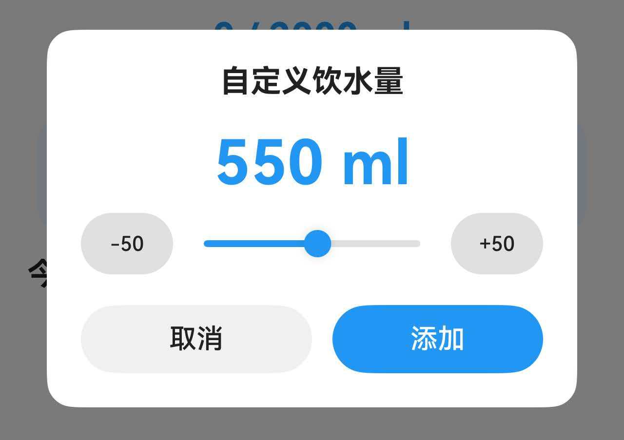
一、完整代码实现
让我们先看自定义饮水量对话框的完整实现代码。
@Component
export struct WaterTabContent {
  @State showCustomDialog: boolean = false;  // 控制对话框显示
  @State customAmount: number = 250;         // 当前选择的饮水量

  build() {
    Stack() {
      // 主页面内容
      Column() {
        // ... 其他内容

        // 自定义按钮,点击打开对话框
        this.CustomWaterBtn()
      }

      // 自定义饮水量弹窗
      if (this.showCustomDialog) {
        Column() {
          Column() {
            // 标题
            Text('自定义饮水量')
              .fontSize(20)
              .fontWeight(FontWeight.Bold)
              .fontColor($r('app.color.text_primary'))

            // 当前数值显示
            Text(`${this.customAmount} ml`)
              .fontSize(40)
              .fontWeight(FontWeight.Bold)
              .fontColor($r('app.color.water_blue'))
              .margin({ top: 20 })

            // Slider 和快捷按钮
            Row() {
              // -50 按钮
              Button('-50')
                .width(60)
                .height(40)
                .fontSize(13)
                .backgroundColor($r('app.color.divider_color'))
                .fontColor($r('app.color.text_primary'))
                .onClick(() => {
                  if (this.customAmount > 50) {
                    this.customAmount -= 50;
                  }
                })

              // Slider 滑块
              Slider({
                value: this.customAmount,
                min: 50,
                max: 1000,
                step: 50
              })
                .layoutWeight(1)
                .blockColor($r('app.color.water_blue'))
                .trackColor($r('app.color.divider_color'))
                .selectedColor($r('app.color.water_blue'))
                .margin({ left: 8, right: 8 })
                .onChange((value: number) => {
                  this.customAmount = value;
                })

              // +50 按钮
              Button('+50')
                .width(60)
                .height(40)
                .fontSize(13)
                .backgroundColor($r('app.color.divider_color'))
                .fontColor($r('app.color.text_primary'))
                .onClick(() => {
                  if (this.customAmount < 1000) {
                    this.customAmount += 50;
                  }
                })
            }
            .width('100%')
            .margin({ top: 8 })

            // 确认按钮
            Row() {
              Button('取消')
                .layoutWeight(1)
                .height(44)
                .backgroundColor($r('app.color.input_background'))
                .fontColor($r('app.color.text_primary'))
                .onClick(() => {
                  this.showCustomDialog = false;
                })

              Button('添加')
                .layoutWeight(1)
                .height(44)
                .backgroundColor($r('app.color.water_blue'))
                .fontColor(Color.White)
                .margin({ left: 12 })
                .onClick(() => {
                  this.addWater(this.customAmount);
                  this.showCustomDialog = false;
                })
            }
            .width('100%')
            .margin({ top: 20 })
          }
          .width('85%')
          .padding(24)
          .backgroundColor($r('app.color.card_background'))
          .borderRadius(16)
        }
        .width('100%')
        .height('100%')
        .backgroundColor($r('app.color.overlay_background'))
        .justifyContent(FlexAlign.Center)
      }
    }
  }

  // 打开对话框的按钮
  @Builder
  CustomWaterBtn() {
    Column() {
      Text('+')
        .fontSize(24)
        .fontColor($r('app.color.water_blue'))
      Text('自定义')
        .fontSize(12)
        .fontColor($r('app.color.text_secondary'))
        .margin({ top: 4 })
    }
    .width(64)
    .height(64)
    .justifyContent(FlexAlign.Center)
    .backgroundColor($r('app.color.water_surface'))
    .borderRadius(12)
    .onClick(() => {
      this.showCustomDialog = true;
    })
  }

  // 添加饮水记录
  addWater(amount: number): void {
    // 保存数据到持久化存储
    const today = getTodayDateString();
    this.prefService.addWaterRecord(today, amount).then(() => {
      this.loadWaterData();  // 刷新数据
    });
  }
}
二、Slider 组件基础知识
2.1 Slider 的基本用法
最简单的 Slider:
Slider({
  value: 50,      // 当前值
  min: 0,         // 最小值
  max: 100,       // 最大值
  step: 1         // 步进值
})
核心参数说明:
| 参数 | 类型 | 说明 | 示例 |
|---|---|---|---|
| value | number | 当前值 | value: 50 |
| min | number | 最小值 | min: 0 |
| max | number | 最大值 | max: 100 |
| step | number | 步进值 | step: 1 |
2.2 Slider 的样式属性
颜色配置:
Slider({ value: 50, min: 0, max: 100 })
  .blockColor('#2196F3')        // 滑块颜色(圆形按钮)
  .trackColor('#E0E0E0')        // 轨道颜色(未选中部分)
  .selectedColor('#2196F3')     // 已选中部分的颜色
尺寸配置:
Slider({ value: 50, min: 0, max: 100 })
  .width('100%')                // 宽度
  .height(20)                   // 高度(影响轨道粗细)
  .blockSize({ width: 24, height: 24 })  // 滑块大小
完整样式示例:
Slider({
  value: this.volume,
  min: 0,
  max: 100,
  step: 1
})
  .width('100%')
  .blockColor('#4CAF50')
  .trackColor('#E0E0E0')
  .selectedColor('#4CAF50')
  .onChange((value: number) => {
    this.volume = value;
  })
2.3 onChange 事件处理
Slider 的 onChange 事件在滑块值改变时触发。
基础用法:
@State sliderValue: number = 50;

Slider({ value: this.sliderValue, min: 0, max: 100 })
  .onChange((value: number) => {
    this.sliderValue = value;  // 更新状态
    console.log('Slider value:', value);
  })
实时更新显示:
@State brightness: number = 50;

Column() {
  Text(`亮度: ${this.brightness}%`)
    .fontSize(18)

  Slider({ value: this.brightness, min: 0, max: 100 })
    .onChange((value: number) => {
      this.brightness = value;  // 实时更新显示
    })
}
注意事项:
✅ 正确做法:
@State value: number = 50;  // 使用 @State 装饰器

Slider({ value: this.value, min: 0, max: 100 })
  .onChange((value: number) => {
    this.value = value;  // UI 会自动更新
  })
❌ 错误做法:
value: number = 50;  // 没有使用 @State

Slider({ value: this.value, min: 0, max: 100 })
  .onChange((value: number) => {
    this.value = value;  // UI 不会更新
  })
2.4 步进值(step)的作用
步进值决定了 Slider 每次移动的最小单位。
示例1:步进值为 1(默认)
Slider({ value: 50, min: 0, max: 100, step: 1 })
// 可以选择:0, 1, 2, 3, ..., 98, 99, 100
示例2:步进值为 10
Slider({ value: 50, min: 0, max: 100, step: 10 })
// 只能选择:0, 10, 20, 30, ..., 80, 90, 100
示例3:步进值为 50(饮水量)
Slider({ value: 250, min: 50, max: 1000, step: 50 })
// 只能选择:50, 100, 150, 200, ..., 950, 1000
步进值的选择原则:
- 精确控制:step = 1,适合需要精确控制的场景(音量、亮度)
- 快速选择:step = 10 或更大,适合快速选择的场景(价格、数量)
- 避免无效值:通过步进值避免用户选择无意义的数值
饮水量案例分析:
// 为什么选择 step: 50?
Slider({ value: 250, min: 50, max: 1000, step: 50 })

// 原因:
// 1. 饮水量通常以 50ml 为单位(一小口)
// 2. 避免出现 237ml 这样的奇怪数值
// 3. 快速选择,不需要精确到 1ml
// 4. 符合用户认知习惯
三、自定义对话框的实现
3.1 对话框的基本结构
在 ArkTS 中,自定义对话框通常使用条件渲染 + Stack 布局实现。
基本结构:
@Component
struct MyDialog {
  @State showDialog: boolean = false;

  build() {
    Stack() {
      // 主页面内容
      Column() {
        Button('打开对话框')
          .onClick(() => {
            this.showDialog = true;
          })
      }

      // 对话框(条件渲染)
      if (this.showDialog) {
        Column() {
          // 对话框内容
          Column() {
            Text('这是一个对话框')

            Button('关闭')
              .onClick(() => {
                this.showDialog = false;
              })
          }
          .backgroundColor(Color.White)
          .padding(20)
          .borderRadius(12)
        }
        .width('100%')
        .height('100%')
        .backgroundColor('rgba(0, 0, 0, 0.5)')  // 半透明遮罩
        .justifyContent(FlexAlign.Center)
      }
    }
  }
}
关键点:
- Stack 布局:让对话框覆盖在主页面之上
- 条件渲染:
if (this.showDialog)控制对话框显示/隐藏 - 半透明遮罩:
backgroundColor('rgba(0, 0, 0, 0.5)')创建遮罩层 - 居中对齐:
justifyContent(FlexAlign.Center)让对话框居中
3.2 对话框的层次结构
对话框通常包含三层:
Stack
├── 主页面内容(底层)
└── 对话框层(顶层)
    ├── 遮罩层(半透明背景)
    └── 对话框内容(白色卡片)
        ├── 标题
        ├── 内容区
        └── 按钮区
代码实现:
if (this.showDialog) {
  // 第1层:遮罩层
  Column() {
    // 第2层:对话框内容
    Column() {
      // 标题
      Text('对话框标题')
        .fontSize(20)
        .fontWeight(FontWeight.Bold)

      // 内容区
      Column() {
        // 对话框的主要内容
      }
      .margin({ top: 16, bottom: 16 })

      // 按钮区
      Row() {
        Button('取消')
          .layoutWeight(1)
        Button('确定')
          .layoutWeight(1)
          .margin({ left: 12 })
      }
      .width('100%')
    }
    .width('85%')                                    // 对话框宽度
    .padding(24)                                     // 内边距
    .backgroundColor(Color.White)                    // 白色背景
    .borderRadius(16)                                // 圆角
  }
  .width('100%')                                     // 遮罩层占满屏幕
  .height('100%')
  .backgroundColor('rgba(0, 0, 0, 0.5)')            // 半透明黑色
  .justifyContent(FlexAlign.Center)                 // 垂直居中
}
3.3 对话框的显示与隐藏
显示对话框:
@State showDialog: boolean = false;

Button('打开对话框')
  .onClick(() => {
    this.showDialog = true;  // 设置为 true,对话框显示
  })
隐藏对话框:
// 方式1:点击取消按钮
Button('取消')
  .onClick(() => {
    this.showDialog = false;  // 设置为 false,对话框隐藏
  })

// 方式2:点击确定按钮后隐藏
Button('确定')
  .onClick(() => {
    this.handleConfirm();      // 处理确认逻辑
    this.showDialog = false;   // 隐藏对话框
  })

// 方式3:点击遮罩层隐藏(可选)
Column() {
  // 对话框内容
}
.onClick(() => {
  // 阻止事件冒泡,点击对话框内容不关闭
})
.width('85%')
.backgroundColor(Color.White)
.borderRadius(16)
3.4 对话框的宽度设计
对话框的宽度需要根据屏幕大小适配。
固定宽度(不推荐):
Column() {
  // 对话框内容
}
.width(300)  // 固定 300px,在大屏上显得太小
百分比宽度(推荐):
Column() {
  // 对话框内容
}
.width('85%')  // 占屏幕宽度的 85%,自动适配
响应式宽度(最佳):
private getDialogWidth(): string {
  return getValueByBreakpoint(
    this.currentBreakpoint,
    new BreakpointValue<string>('85%', '70%', '60%')
  );
}

Column() {
  // 对话框内容
}
.width(this.getDialogWidth())
// 小屏:85%,中屏:70%,大屏:60%
宽度选择原则:
- 小屏(手机):85-90%,留出少量边距
- 中屏(平板竖屏):70-80%,避免过宽
- 大屏(平板横屏):60-70%,保持合理比例
四、Slider 与按钮组合设计
4.1 为什么需要快捷按钮
虽然 Slider 可以拖动选择数值,但在某些场景下,用户可能需要更精确的控制。
Slider 的局限性:
- 精确定位困难:在手机小屏幕上,很难精确拖到某个值
- 步进不明显:用户不知道每次移动多少
- 单手操作不便:拖动需要双手或大拇指伸展
快捷按钮的优势:
- 精确调整:每次固定增减,结果可预期
- 单手操作:点击比拖动更方便
- 步进可见:按钮上显示 +50/-50,用户清楚每次变化
最佳实践:Slider + 快捷按钮
Row() {
  Button('-50')      // 减少按钮
  Slider()           // 滑块(快速调整)
  Button('+50')      // 增加按钮
}
这种组合设计兼顾了快速调整(Slider)和精确控制(按钮)的需求。
4.2 快捷按钮的实现
基础实现:
@State amount: number = 250;

Row() {
  // 减少按钮
  Button('-50')
    .onClick(() => {
      if (this.amount > 50) {
        this.amount -= 50;
      }
    })

  // Slider
  Slider({ value: this.amount, min: 50, max: 1000, step: 50 })
    .layoutWeight(1)
    .onChange((value: number) => {
      this.amount = value;
    })

  // 增加按钮
  Button('+50')
    .onClick(() => {
      if (this.amount < 1000) {
        this.amount += 50;
      }
    })
}
边界检查:
// 减少按钮:确保不小于最小值
Button('-50')
  .onClick(() => {
    if (this.amount > 50) {        // 检查下限
      this.amount -= 50;
    }
  })

// 增加按钮:确保不大于最大值
Button('+50')
  .onClick(() => {
    if (this.amount < 1000) {      // 检查上限
      this.amount += 50;
    }
  })
为什么需要边界检查?
❌ 没有边界检查的问题:
Button('-50')
  .onClick(() => {
    this.amount -= 50;  // 可能变成负数!
  })

// 用户点击多次后:250 → 200 → 150 → 100 → 50 → 0 → -50 ❌
✅ 有边界检查的正确行为:
Button('-50')
  .onClick(() => {
    if (this.amount > 50) {
      this.amount -= 50;
    }
  })

// 用户点击多次后:250 → 200 → 150 → 100 → 50 → 50(不再减少)✅
4.3 按钮样式设计
尺寸设计:
Button('-50')
  .width(60)         // 宽度:足够容纳文字
  .height(40)        // 高度:与 Slider 高度协调
  .fontSize(13)      // 字体大小:清晰可读
颜色设计:
Button('-50')
  .backgroundColor($r('app.color.divider_color'))    // 浅灰色背景
  .fontColor($r('app.color.text_primary'))           // 深色文字
为什么不用主题色?
- 主题色(蓝色、绿色)通常用于主要操作(确定、添加)
- 快捷按钮是辅助操作,用中性色(灰色)更合适
- 避免视觉干扰,让用户关注 Slider 和数值显示
完整样式示例:
Row() {
  Button('-50')
    .width(60)
    .height(40)
    .fontSize(13)
    .backgroundColor($r('app.color.divider_color'))
    .fontColor($r('app.color.text_primary'))
    .onClick(() => {
      if (this.amount > 50) {
        this.amount -= 50;
      }
    })

  Slider({ value: this.amount, min: 50, max: 1000, step: 50 })
    .layoutWeight(1)
    .blockColor($r('app.color.water_blue'))
    .trackColor($r('app.color.divider_color'))
    .selectedColor($r('app.color.water_blue'))
    .margin({ left: 8, right: 8 })
    .onChange((value: number) => {
      this.amount = value;
    })

  Button('+50')
    .width(60)
    .height(40)
    .fontSize(13)
    .backgroundColor($r('app.color.divider_color'))
    .fontColor($r('app.color.text_primary'))
    .onClick(() => {
      if (this.amount < 1000) {
        this.amount += 50;
      }
    })
}
.width('100%')
4.4 布局设计
使用 layoutWeight 实现弹性布局:
Row() {
  Button('-50')
    .width(60)        // 固定宽度

  Slider()
    .layoutWeight(1)  // 占据剩余空间
    .margin({ left: 8, right: 8 })

  Button('+50')
    .width(60)        // 固定宽度
}
.width('100%')
布局原理:
总宽度:100%
├── Button(-50):60px(固定)
├── 间距:8px
├── Slider:剩余空间(弹性)
├── 间距:8px
└── Button(+50):60px(固定)
为什么这样设计?
- 按钮固定宽度:确保文字完整显示,不会被压缩
- Slider 弹性宽度:适应不同屏幕尺寸
- 间距固定:保持视觉节奏一致
响应式优化:
private getDialogSmallBtnWidth(): number {
  return getValueByBreakpoint(
    this.currentBreakpoint,
    new BreakpointValue<number>(54, 60, 66)
  );
}

private getDialogSmallBtnHeight(): number {
  return getValueByBreakpoint(
    this.currentBreakpoint,
    new BreakpointValue<number>(36, 40, 44)
  );
}

Button('-50')
  .width(this.getDialogSmallBtnWidth())
  .height(this.getDialogSmallBtnHeight())
结语
Slider 组件虽然简单,但在实际应用中却非常实用。通过合理的设计和优化,可以为用户提供流畅、直观的数值输入体验。

讨论HarmonyOS开发技术,专注于API与组件、DevEco Studio、测试、元服务和应用上架分发等。
更多推荐

 50
50 0
0- 0


 已为社区贡献9条内容

所有评论(0)