【HarmonyOS 6】输入框实战:表单设计与数据验证
在移动应用开发中,表单输入是用户与应用交互的重要方式。无论是注册登录、添加数据、还是编辑信息,都离不开输入框组件。一个设计良好的输入框不仅要美观易用,还要具备完善的验证机制,确保用户输入的数据符合要求。本文将通过一个实际案例——健康管理应用的运动类型添加功能,带你深入理解TextInput 组件的使用方法和表单设计技巧。已经了解基础语法的初学者TextInput 组件的基础用法和属性配置输入验证与
前言
在移动应用开发中,表单输入是用户与应用交互的重要方式。无论是注册登录、添加数据、还是编辑信息,都离不开输入框组件。一个设计良好的输入框不仅要美观易用,还要具备完善的验证机制,确保用户输入的数据符合要求。
本文将通过一个实际案例——健康管理应用的运动类型添加功能,带你深入理解 TextInput 组件的使用方法和表单设计技巧。
本文适合: 已经了解基础语法的初学者
你将学到:
- TextInput 组件的基础用法和属性配置
- 输入验证与字数限制的实现
- 输入框样式设计与用户体验优化
案例背景
我们要实现一个"添加运动类型"的对话框,用户可以自定义运动类型,包含以下功能:
- 名称输入:用户输入运动类型名称(如"爬山"、"游泳"等)
- 字数限制:名称最多 6 个字符
- 图标选择:从预设图标库中选择一个图标
- 卡路里设置:设置每分钟消耗的卡路里
- 输入验证:提交前检查名称是否为空
最终效果如下图所示: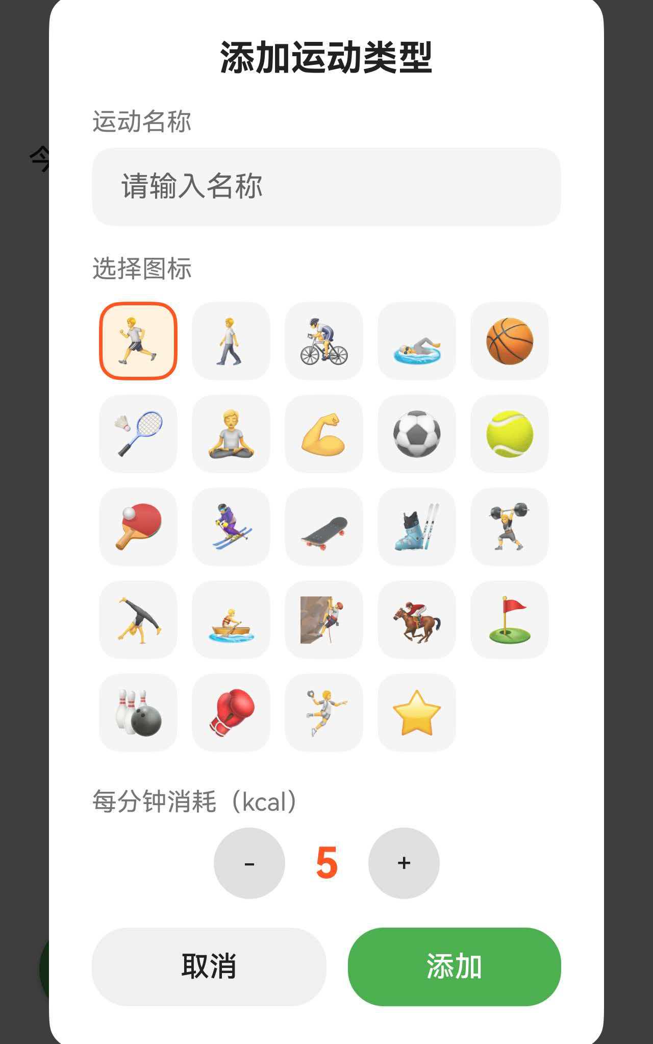
一、完整代码实现
让我们先看添加运动类型对话框的完整实现代码。
@Component
export struct ExerciseTabContent {
  // 添加类型对话框相关状态
  @State showAddTypeDialog: boolean = false;
  @State newTypeName: string = '';
  @State newTypeIconIndex: number = 0;
  @State newTypeCalories: number = 5;
  @State currentBreakpoint: BreakpointType = getBreakpointManager().getCurrentBreakpoint();

  private prefService: PreferencesService | null = null;

  aboutToAppear(): void {
    const ctx = getContext(this) as common.UIAbilityContext;
    this.prefService = PreferencesService.getInstance(ctx);
  }

  // 添加自定义运动类型
  addCustomExerciseType(): void {
    if (!this.prefService) return;

    // 验证:名称不能为空
    if (this.newTypeName.trim().length === 0) return;

    const newType: CustomExerciseType = {
      id: `custom_${Date.now()}`,
      name: this.newTypeName.trim(),
      icon: EXERCISE_ICONS[this.newTypeIconIndex],
      caloriesPerMinute: this.newTypeCalories,
      isDefault: false
    };

    const pref: PreferencesService = this.prefService;
    pref.addExerciseType(newType).then((): void => {
      this.loadExerciseTypes();
      this.showAddTypeDialog = false;
      // 重置表单
      this.newTypeName = '';
      this.newTypeIconIndex = 0;
      this.newTypeCalories = 5;
    });
  }

  build() {
    Stack() {
      // 主页面内容...

      // 添加运动类型对话框
      if (this.showAddTypeDialog) {
        Column() {
          Column() {
            // 标题
            Text('添加运动类型')
              .fontSize(this.getDialogTitleSize())
              .fontWeight(FontWeight.Bold)
              .fontColor($r('app.color.text_primary'))

            // 名称输入
            Column() {
              Text('运动名称')
                .fontSize(this.getDialogLabelSize())
                .fontColor($r('app.color.text_secondary'))
                .width('100%')
                .margin({ top: this.getSectionGap() } as Padding)

              TextInput({ placeholder: '请输入名称', text: this.newTypeName })
                .width('100%')
                .height(this.getDialogButtonHeight())
                .backgroundColor($r('app.color.secondary_background'))
                .borderRadius(this.getCardRadius())
                .margin({ top: this.getItemGap() } as Padding)
                .maxLength(6)
                .onChange((value: string) => {
                  this.newTypeName = value;
                })
            }

            // 图标选择
            Column() {
              Text('选择图标')
                .fontSize(this.getDialogLabelSize())
                .fontColor($r('app.color.text_secondary'))
                .width('100%')
                .margin({ top: this.getSectionGap() } as Padding)

              Flex({ wrap: FlexWrap.Wrap, justifyContent: FlexAlign.Start }) {
                ForEach(EXERCISE_ICONS, (icon: string, index: number) => {
                  Column() {
                    Text(icon)
                      .fontSize(this.getTypeItemIconSize())
                  }
                  .width(this.getTypeIconButtonSize())
                  .height(this.getTypeIconButtonSize())
                  .justifyContent(FlexAlign.Center)
                  .backgroundColor(this.newTypeIconIndex === index ?
                    $r('app.color.exercise_surface') :
                    $r('app.color.secondary_background'))
                  .borderRadius(this.getCardRadius())
                  .border({
                    width: this.newTypeIconIndex === index ? 2 : 0,
                    color: $r('app.color.exercise_orange')
                  })
                  .margin(4 as Padding)
                  .onClick(() => {
                    this.newTypeIconIndex = index;
                  })
                })
              }
              .width('100%')
              .margin({ top: this.getItemGap() } as Padding)
            }

            // 卡路里设置
            Column() {
              Text('每分钟消耗(kcal)')
                .fontSize(this.getDialogLabelSize())
                .fontColor($r('app.color.text_secondary'))
                .width('100%')
                .margin({ top: this.getSectionGap() } as Padding)

              Row() {
                Button('-')
                  .width(this.getDialogSmallButtonSize())
                  .height(this.getDialogSmallButtonSize())
                  .fontSize(this.getDialogLabelSize())
                  .backgroundColor($r('app.color.divider_color'))
                  .fontColor($r('app.color.text_primary'))
                  .onClick(() => {
                    if (this.newTypeCalories > 1) this.newTypeCalories -= 1;
                  })

                Text(this.newTypeCalories.toString())
                  .fontSize(getValueByBreakpoint(this.currentBreakpoint,
                    new BreakpointValue<number>(24, 28, 32)))
                  .fontWeight(FontWeight.Bold)
                  .fontColor($r('app.color.exercise_orange'))
                  .margin({ left: this.getSectionGap(), right: this.getSectionGap() } as Padding)

                Button('+')
                  .width(this.getDialogSmallButtonSize())
                  .height(this.getDialogSmallButtonSize())
                  .fontSize(this.getDialogLabelSize())
                  .backgroundColor($r('app.color.divider_color'))
                  .fontColor($r('app.color.text_primary'))
                  .onClick(() => {
                    if (this.newTypeCalories < 20) this.newTypeCalories += 1;
                  })
              }
              .margin({ top: this.getItemGap() } as Padding)
            }

            // 底部按钮
            Row() {
              Button('取消')
                .layoutWeight(1)
                .height(this.getDialogButtonHeight())
                .backgroundColor($r('app.color.input_background'))
                .fontColor($r('app.color.text_primary'))
                .onClick(() => {
                  this.showAddTypeDialog = false;
                })

              Button('添加')
                .layoutWeight(1)
                .height(this.getDialogButtonHeight())
                .backgroundColor($r('app.color.primary_color'))
                .fontColor(Color.White)
                .margin({ left: 12 } as Padding)
                .onClick(() => {
                  this.addCustomExerciseType();
                })
            }
            .width('100%')
            .margin({ top: this.getSectionGap() } as Padding)
          }
          .width(this.getDialogWidth())
          .padding(this.getDialogPadding() as Padding)
          .backgroundColor($r('app.color.card_background'))
          .borderRadius(this.getDialogRadius())
        }
        .width('100%')
        .height('100%')
        .backgroundColor($r('app.color.overlay_background'))
        .justifyContent(FlexAlign.Center)
      }
    }
  }
}

// 运动图标库
export const EXERCISE_ICONS: string[] = [
  '🏃', '🚶', '🚴', '🏊', '🏀', '🏸', '🧘', '💪',
  '⚽', '🎾', '🏓', '⛷️', '🛹', '🎿', '🏋️', '🤸',
  '🚣', '🧗', '🏇', '⛳', '🎳', '🥊', '🤾', '⭐'
];
二、TextInput 组件基础
2.1 TextInput 的基本用法
最简单的 TextInput:
TextInput({ placeholder: '请输入内容' })
这会创建一个带占位符的输入框。
核心参数说明:
| 参数 | 类型 | 说明 | 示例 |
|---|---|---|---|
| placeholder | string | 占位符文本 | placeholder: '请输入名称' |
| text | string | 输入框的初始值 | text: this.userName |
基础示例:
@State inputValue: string = '';

TextInput({ placeholder: '请输入内容', text: this.inputValue })
  .onChange((value: string) => {
    this.inputValue = value;
  })
2.2 TextInput 的常用属性
样式属性:
TextInput({ placeholder: '请输入名称' })
  .width('100%')                                    // 宽度
  .height(44)                                       // 高度
  .backgroundColor('#F5F5F5')                       // 背景色
  .borderRadius(8)                                  // 圆角
  .fontSize(16)                                     // 字体大小
  .fontColor('#333333')                             // 文字颜色
  .placeholderColor('#999999')                      // 占位符颜色
  .placeholderFont({ size: 14, weight: 400 })      // 占位符字体
功能属性:
TextInput({ placeholder: '请输入名称' })
  .maxLength(10)                                    // 最大字符数
  .type(InputType.Normal)                           // 输入类型
  .enterKeyType(EnterKeyType.Done)                  // 回车键类型
  .caretColor('#007AFF')                            // 光标颜色
输入类型(InputType):
| 类型 | 说明 | 适用场景 |
|---|---|---|
| Normal | 普通文本 | 姓名、标题等 |
| Number | 数字 | 年龄、数量等 |
| PhoneNumber | 电话号码 | 手机号输入 |
| 邮箱 | 邮箱地址输入 | |
| Password | 密码 | 密码输入(显示为 ●) |
2.3 TextInput 的事件处理
onChange 事件:
当输入内容变化时触发,这是最常用的事件。
@State userName: string = '';

TextInput({ placeholder: '请输入姓名', text: this.userName })
  .onChange((value: string) => {
    this.userName = value;
    console.log(`当前输入:${value}`);
  })
其他常用事件:
TextInput({ placeholder: '请输入内容' })
  .onSubmit((enterKey: EnterKeyType) => {
    // 按下回车键时触发
    console.log('提交输入');
  })
  .onEditChange((isEditing: boolean) => {
    // 输入状态改变时触发
    console.log(`编辑状态:${isEditing}`);
  })
  .onCopy((value: string) => {
    // 复制文本时触发
    console.log(`复制内容:${value}`);
  })
  .onCut((value: string) => {
    // 剪切文本时触发
    console.log(`剪切内容:${value}`);
  })
  .onPaste((value: string) => {
    // 粘贴文本时触发
    console.log(`粘贴内容:${value}`);
  })
2.4 完整的输入流程
@Component
struct TextInputDemo {
  @State inputValue: string = '';
  @State isEditing: boolean = false;

  build() {
    Column() {
      // 显示当前输入
      Text(`当前输入:${this.inputValue}`)
        .fontSize(16)
        .margin({ bottom: 12 })

      // 输入框
      TextInput({ placeholder: '请输入内容', text: this.inputValue })
        .width('100%')
        .height(44)
        .backgroundColor('#F5F5F5')
        .borderRadius(8)
        .onChange((value: string) => {
          this.inputValue = value;
        })
        .onEditChange((isEditing: boolean) => {
          this.isEditing = isEditing;
        })

      // 状态显示
      Text(this.isEditing ? '正在输入...' : '未输入')
        .fontSize(12)
        .fontColor('#999999')
        .margin({ top: 8 })
    }
    .padding(16)
  }
}
流程:
用户点击输入框
    ↓
onEditChange(true) - 进入编辑状态
    ↓
用户输入文字
    ↓
onChange(value) - 实时获取输入内容
    ↓
更新 @State 变量
    ↓
UI 自动刷新显示新内容
    ↓
用户点击完成/失焦
    ↓
onEditChange(false) - 退出编辑状态
三、字数限制与输入验证
3.1 字数限制的实现
使用 maxLength 属性:
这是最简单的字数限制方式,直接限制用户输入的字符数。
@State typeName: string = '';

TextInput({ placeholder: '请输入名称', text: this.typeName })
  .maxLength(6)  // 最多输入 6 个字符
  .onChange((value: string) => {
    this.typeName = value;
  })
效果演示:
用户输入:爬
显示:爬

用户输入:爬山
显示:爬山

用户输入:爬山运动
显示:爬山运动

用户输入:爬山运动健身游泳
显示:爬山运动健身  ← 只显示前 6 个字符,后面的无法输入
为什么需要字数限制?
- 界面美观:过长的名称会导致 UI 显示不完整
- 数据库限制:数据库字段通常有长度限制
- 用户体验:简短的名称更易记忆和识别
- 性能考虑:限制输入长度可以减少数据处理负担
3.2 实时字数统计
虽然 maxLength 可以限制输入,但用户不知道还能输入多少字符。我们可以添加字数统计提示。
@State typeName: string = '';
private maxLength: number = 6;

Column() {
  Row() {
    Text('运动名称')
      .fontSize(14)
      .fontColor('#666666')

    Blank()

    Text(`${this.typeName.length}/${this.maxLength}`)
      .fontSize(12)
      .fontColor(this.typeName.length >= this.maxLength ? '#FF0000' : '#999999')
  }
  .width('100%')

  TextInput({ placeholder: '请输入名称', text: this.typeName })
    .width('100%')
    .height(44)
    .maxLength(this.maxLength)
    .onChange((value: string) => {
      this.typeName = value;
    })
}
3.3 输入验证
在提交表单前,需要验证输入是否符合要求。
基础验证:检查是否为空
@State typeName: string = '';
@State errorMessage: string = '';

// 验证函数
private validateInput(): boolean {
  // 去除首尾空格后检查
  if (this.typeName.trim().length === 0) {
    this.errorMessage = '请输入运动名称';
    return false;
  }

  this.errorMessage = '';
  return true;
}

// 提交按钮
Button('添加')
  .onClick(() => {
    if (this.validateInput()) {
      // 验证通过,执行添加操作
      this.addCustomExerciseType();
    }
  })
显示错误提示:
Column() {
  Text('运动名称')
    .fontSize(14)
    .fontColor('#666666')

  TextInput({ placeholder: '请输入名称', text: this.typeName })
    .width('100%')
    .height(44)
    .maxLength(6)
    .onChange((value: string) => {
      this.typeName = value;
      // 输入时清除错误提示
      if (this.errorMessage.length > 0) {
        this.errorMessage = '';
      }
    })

  // 错误提示
  if (this.errorMessage.length > 0) {
    Row() {
      Text('⚠️')
        .fontSize(12)
      Text(this.errorMessage)
        .fontSize(12)
        .fontColor('#FF0000')
        .margin({ left: 4 })
    }
    .margin({ top: 4 })
  }
}
验证流程:
用户点击"添加"按钮
    ↓
调用 validateInput()
    ↓
检查 typeName.trim().length
    ↓
如果为 0:
  - 设置 errorMessage = '请输入运动名称'
  - 显示错误提示
  - 返回 false
    ↓
如果不为 0:
  - 清除 errorMessage
  - 返回 true
  - 执行添加操作
3.4 高级验证:多条件检查
private validateInput(): boolean {
  const trimmedName: string = this.typeName.trim();

  // 检查是否为空
  if (trimmedName.length === 0) {
    this.errorMessage = '请输入运动名称';
    return false;
  }

  // 检查最小长度
  if (trimmedName.length < 2) {
    this.errorMessage = '名称至少需要2个字符';
    return false;
  }

  // 检查是否包含特殊字符
  const specialChars: RegExp = /[!@#$%^&*(),.?":{}|<>]/;
  if (specialChars.test(trimmedName)) {
    this.errorMessage = '名称不能包含特殊字符';
    return false;
  }

  // 检查是否重复(假设有 existingTypes 数组)
  const isDuplicate: boolean = this.existingTypes.some(
    (type) => type.name === trimmedName
  );
  if (isDuplicate) {
    this.errorMessage = '该运动类型已存在';
    return false;
  }

  this.errorMessage = '';
  return true;
}
四、输入框样式设计
4.1 基础样式配置
一个美观的输入框需要精心设计样式。
标准样式:
TextInput({ placeholder: '请输入名称' })
  .width('100%')
  .height(44)
  .backgroundColor('#F5F5F5')
  .borderRadius(8)
  .fontSize(16)
  .fontColor('#333333')
  .placeholderColor('#999999')
  .padding({ left: 12, right: 12 })
六、实战技巧与注意事项
6.1 使用 trim() 处理空格
用户可能输入空格,提交前必须去除首尾空格。
// ❌ 错误:直接使用原始输入
if (this.newTypeName.length === 0) {
  return false;
}

// ✅ 正确:使用 trim() 去除空格
if (this.newTypeName.trim().length === 0) {
  return false;
}
为什么需要 trim()?
用户输入:"   "(三个空格)
this.newTypeName.length = 3  ← 不为 0,验证通过 ❌
this.newTypeName.trim().length = 0  ← 为 0,验证失败 ✅
6.2 输入时清除错误提示
当用户开始输入时,应该立即清除错误提示,提升用户体验。
TextInput({ placeholder: '请输入名称', text: this.newTypeName })
  .onChange((value: string) => {
    this.newTypeName = value;
    // 输入时清除错误
    if (this.errorMessage.length > 0) {
      this.errorMessage = '';
    }
  })
6.3 提交后重置表单
添加成功后,应该重置表单,方便用户继续添加。
addCustomExerciseType(): void {
  if (!this.prefService) return;
  if (this.newTypeName.trim().length === 0) return;

  const newType: CustomExerciseType = {
    id: `custom_${Date.now()}`,
    name: this.newTypeName.trim(),
    icon: EXERCISE_ICONS[this.newTypeIconIndex],
    caloriesPerMinute: this.newTypeCalories,
    isDefault: false
  };

  this.prefService.addExerciseType(newType).then((): void => {
    this.showAddTypeDialog = false;

    // 重置表单
    this.newTypeName = '';
    this.newTypeIconIndex = 0;
    this.newTypeCalories = 5;
    this.errorMessage = '';
  });
}
6.4 合理的默认值
为表单项设置合理的默认值,减少用户操作。
@State newTypeName: string = '';           // 名称默认为空,需要用户输入
@State newTypeIconIndex: number = 0;       // 默认选中第一个图标
@State newTypeCalories: number = 5;        // 默认 5 kcal/分钟(中等强度)
总结
通过本文的学习,我们掌握了 TextInput 组件的核心用法和表单设计技巧:
TextInput 核心知识:
- 使用 placeholder 和 text 参数创建输入框
- 通过 onChange 事件实时获取用户输入
- 使用 maxLength 限制输入字符数
- 配置样式属性美化输入框外观
输入验证技巧:
- 使用 trim() 去除首尾空格
- 检查输入是否为空、是否符合长度要求
- 显示清晰的错误提示信息
- 输入时自动清除错误状态
TextInput 是移动应用中最常用的组件之一,掌握其使用方法和设计技巧,可以大大提升应用的用户体验。
希望本文能帮助你在实际项目中灵活运用 TextInput 组件,打造出优雅、易用的表单界面。

讨论HarmonyOS开发技术,专注于API与组件、DevEco Studio、测试、元服务和应用上架分发等。
更多推荐
 57
57 0
0- 0


 已为社区贡献9条内容

所有评论(0)