HarmonyOS 游戏界面进阶:状态栏与导航栏定制全解析
摘要 本文详细介绍了如何在HarmonyOS中实现游戏界面的沉浸式UI定制。通过@ohos.window模块隐藏原生状态栏和导航栏,利用ArkTS组件构建自定义顶部区域。关键步骤包括:获取安全区域高度、设计半透明状态栏组件、实现游戏主题融合(色彩/动态元素),以及创建功能型导航栏(返回/暂停/设置等核心操作)。最终效果既保证了系统UI与游戏视觉风格的统一,又优化了屏幕空间利用率,显著提升玩家沉浸体
·

个人主页:ujainu
文章目录
游戏界面的沉浸感是提升玩家体验的核心要素。而原生的状态栏与导航栏往往割裂游戏视觉体系,破坏沉浸式体验。HarmonyOS 提供了强大的窗口控制与 UI 定制能力,让开发者能够深度定制系统级 UI 组件,打造符合游戏风格的顶部交互区域。本文将从实战角度,全面解析如何在 HarmonyOS 中实现沉浸式状态栏定制、功能型导航栏构建,以及交互细节的极致优化,最终完成一个可直接运行的游戏界面示例。
一、前言:为什么游戏需要深度定制系统 UI?
1.1 游戏对沉浸感的极致要求
不同于普通应用,游戏需构建完整的虚拟世界。任何来自系统的视觉干扰(如状态栏的时间、信号图标,导航栏的返回键)都会打断玩家注意力,降低体验完整性。
1.2 原生状态栏/导航栏的干扰问题
- 视觉割裂:原生栏样式与游戏画面不融合;
- 操作冲突:导航栏误触导致意外退出;
- 空间浪费:顶部区域无法被游戏内容利用,尤其在小屏设备上影响显著。
1.3 HarmonyOS 提供的能力概览
从 API 9 起,HarmonyOS 通过 @ohos.window 模块开放窗口控制能力,支持隐藏系统栏、获取安全区域;同时 ArkTS 的组件化特性大幅提升自定义 UI 开发效率。
1.4 本文目标
帮助开发者掌握状态栏与导航栏的全流程定制,打造视觉统一、交互流畅的专业级游戏顶部区域。
二、第一部分:沉浸式状态栏定制 —— 隐藏原生栏 + 自定义顶部区域
2.1 隐藏系统原生状态栏与导航栏
使用 @ohos.window 控制窗口属性,实现全屏沉浸。
import window from '@ohos.window';
import common from '@ohos.app.ability.common';

@Entry
@Component
struct GamePage {
  async aboutToAppear() {
    const context = getContext(this) as common.UIAbilityContext;
    const win = await window.getLastWindow(context);
    // 传入数组参数,分别控制状态栏和导航栏
    await win.setWindowSystemBarEnable(["status", "navigation"]);
  }

  build() {
    Column() { Text('游戏画面').width('100%').height('100%') }
  }
}
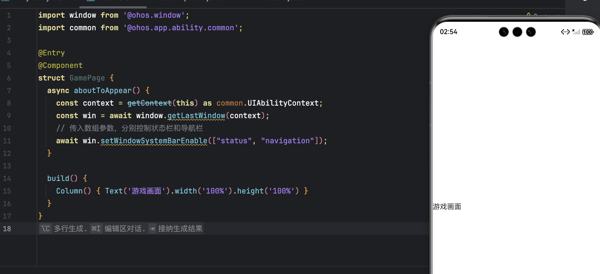
✅
setWindowSystemBarEnable(false)同时隐藏状态栏与导航栏,适用于 API 9+。
2.2 获取状态栏高度(安全区域)
import display from '@ohos.display';

function getStatusBarHeight(): number {
  const d = display.getDefaultDisplaySync();
  return d.getSafeAreaInsetsSync().top / d.pixelDensity || 24;
}
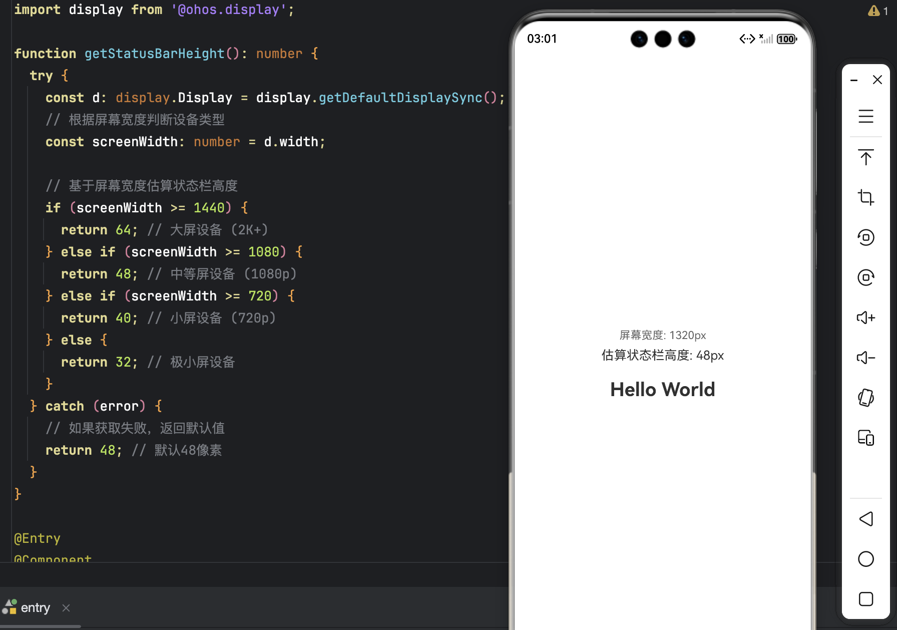
- 返回值单位为 vp;
- 兜底值
24确保兼容性。
2.3 构建自定义状态栏组件
@Component
struct CustomStatusBar {
  build() {
    Row() {
      Blank()
        .layoutWeight(1)
      Text(new Date().toTimeString().slice(0, 5))
      // 暂时移除图标,专注于时间显示
    }
    .width('100%')
    .height(getStatusBarHeight())
    .backgroundColor('#1A1A1A80')
    .padding({ left: 16, right: 16 })
  }
}
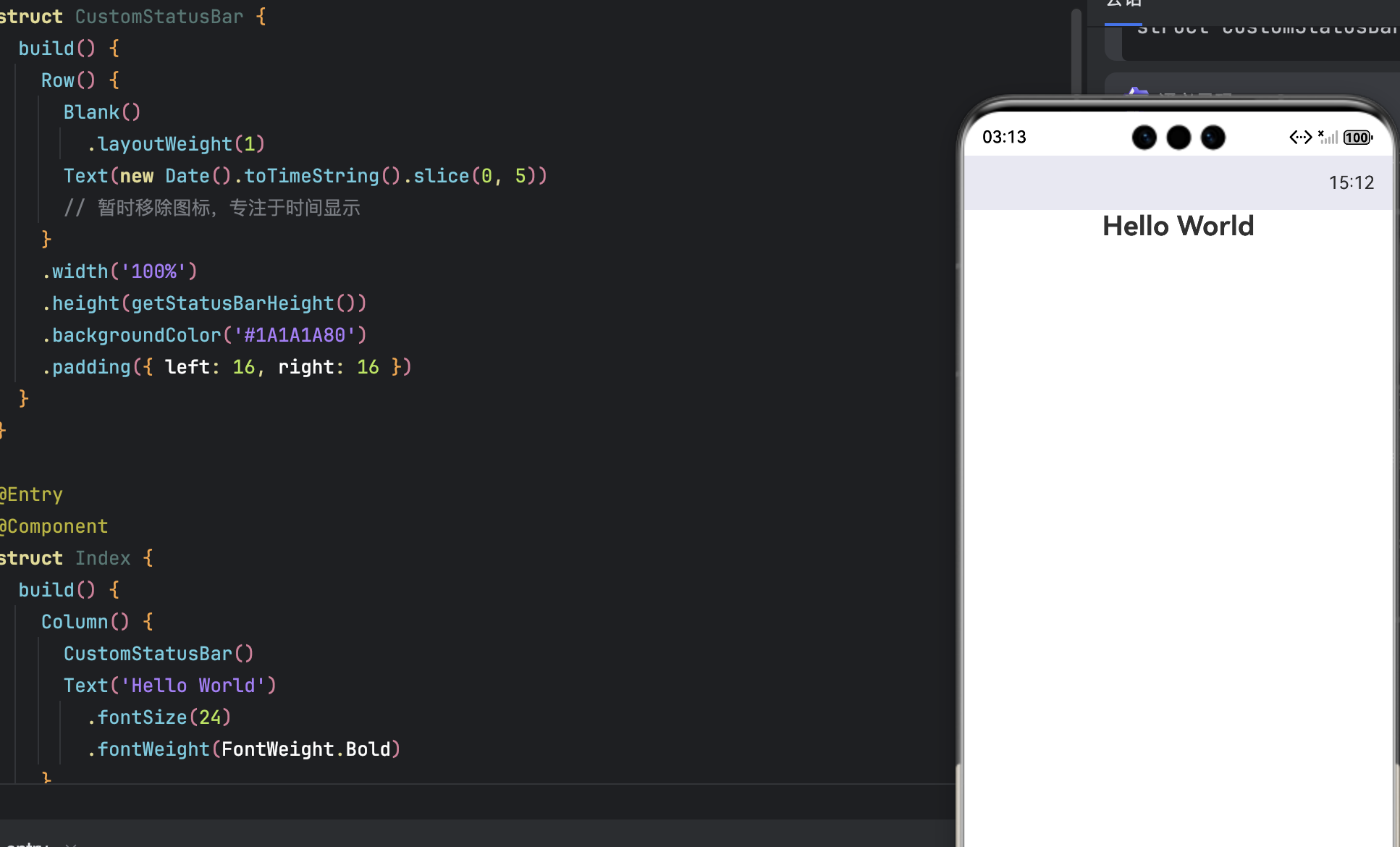
- 半透明背景
#1A1A1A80融入游戏画面;- 内容右对齐,符合原生状态栏习惯。
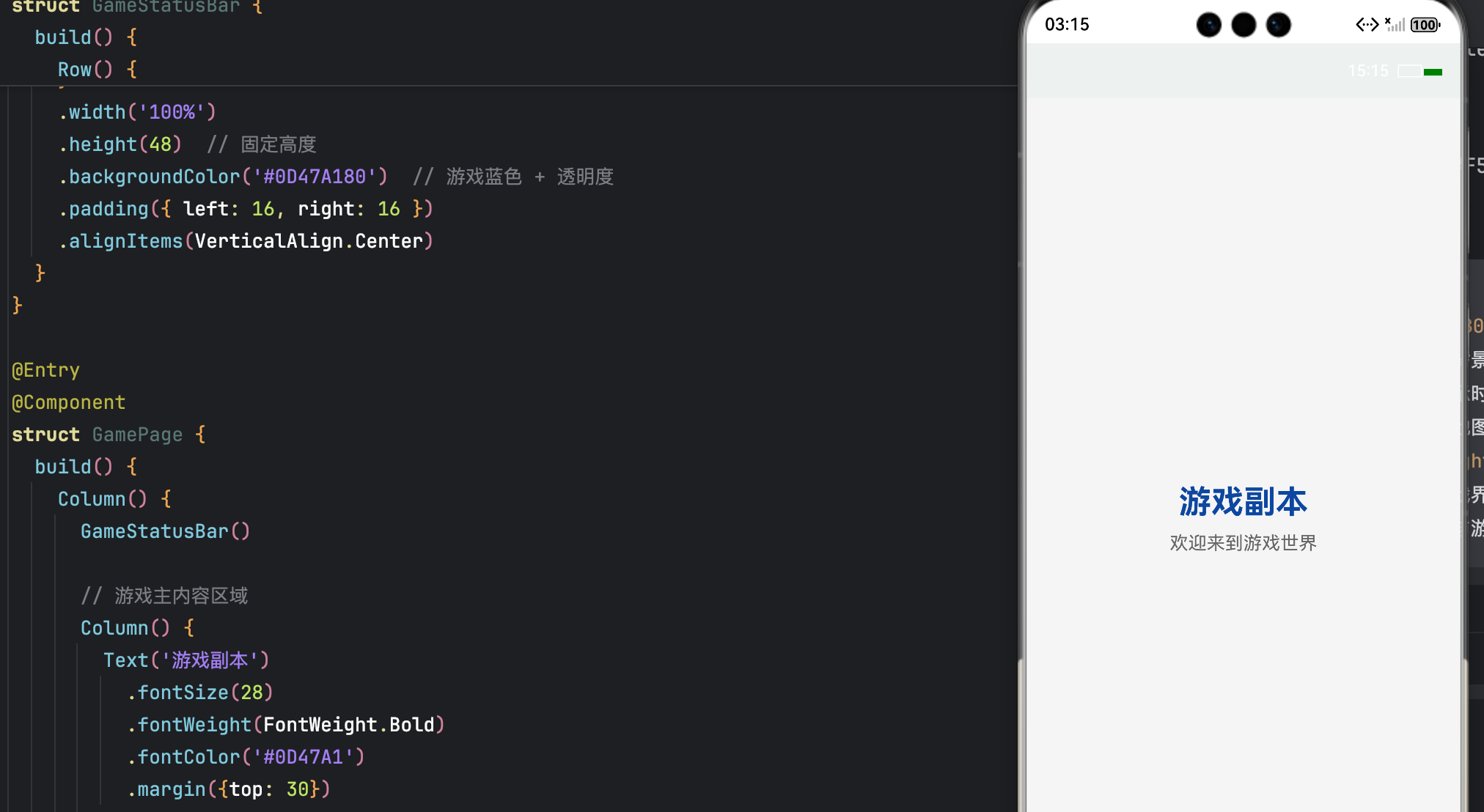
2.4 状态栏与游戏主题融合技巧
- 背景色:使用游戏主色调 + 透明度(如
#0D47A180); - 文字颜色:深背景配浅色文字(白/浅灰),浅背景配深色文字;
- 动态更新:可定时刷新时间或电量(需申请权限)。
@Component
struct GameStatusBar {
  @State currentTime: string = new Date().toTimeString().slice(0, 5);

  aboutToAppear() {
    // 定时更新时间
    setInterval(() => {
      this.currentTime = new Date().toTimeString().slice(0, 5);
    }, 60000); // 每分钟更新一次
  }

  build() {
    Row() {
      // 左侧:游戏Logo或空白
      Blank()
        .layoutWeight(1)

      // 中间:时间显示
      Text(this.currentTime)
        .fontColor('#FFFFFF')  // 白色文字配深色背景
        .fontSize(14)
        .fontWeight(FontWeight.Medium)

      // 右侧:电池指示器(简化版)
      Row() {
        // 电池外壳
        Rect()
          .width(20)
          .height(10)
          .stroke(Color.White)
          .strokeWidth(1)
          .fill(Color.Transparent)

        // 电池电量(模拟)
        Rect()
          .width(16)
          .height(6)
          .fill(Color.Green)
          .margin({left: 2, top: 2})
      }
      .margin({left: 8})
    }
    .width('100%')
    .height(48)  // 固定高度
    .backgroundColor('#0D47A180')  // 游戏蓝色 + 透明度
    .padding({ left: 16, right: 16 })
    .alignItems(VerticalAlign.Center)
  }
}

@Entry
@Component
struct GamePage {
  build() {
    Column() {
      GameStatusBar()

      // 游戏主内容区域
      Column() {
        Text('游戏副本')
          .fontSize(28)
          .fontWeight(FontWeight.Bold)
          .fontColor('#0D47A1')
          .margin({top: 30})

        Text('欢迎来到游戏世界')
          .fontSize(16)
          .fontColor('#666666')
          .margin({top: 10})
      }
      .layoutWeight(1)
      .justifyContent(FlexAlign.Center)
    }
    .width('100%')
    .height('100%')
    .backgroundColor('#F5F5F5')  // 页面背景色
  }
}
三、第二部分:功能型导航栏构建 —— 游戏专属操作中枢
3.1 导航栏功能定位
- 左侧:返回、暂停等核心操作;
- 中间:当前关卡/场景名称;
- 右侧:设置、背包等辅助入口。
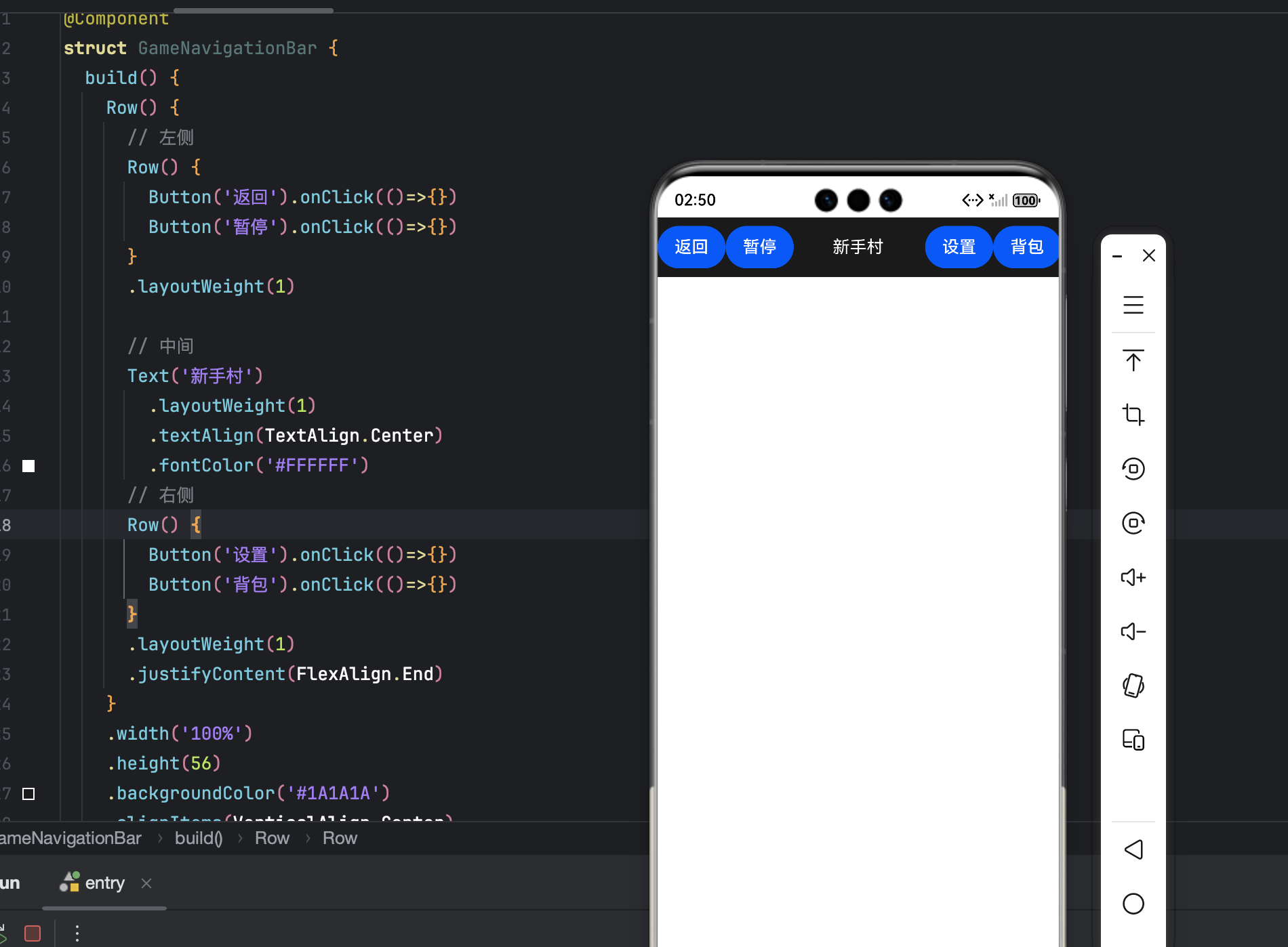
@Component
struct GameNavigationBar {
  build() {
    Row() {
      // 左侧按钮组
      Row() {
        Button('返回').onClick(()=>{})
        Button('暂停').onClick(()=>{})
      }
      .layoutWeight(1)

      // 中间标题
      Text('新手村')
        .layoutWeight(1)
        .textAlign(TextAlign.Center)
        .fontColor('#FFFFFF')

      // 右侧按钮组
      Row() {
        Button('设置').onClick(()=>{})
        Button('背包').onClick(()=>{})
      }
      .layoutWeight(1)
      .justifyContent(FlexAlign.End)
    }
    .width('100%')
    .height(56)
    .backgroundColor('#1A1A1A')
    .alignItems(VerticalAlign.Center)
  }
}
3.2 三段式布局实现
@Component
struct GameNavigationBar {
  build() {
    Row() {
      Button('返回').onClick(() => {})
      Spacer()
      Text('第5关:暗影森林')
      Spacer()
      Button('设置').onClick(() => {})
    }
    .width('100%')
    .height(56)
    .backgroundColor('#1A1A1A')
    .alignItems(VerticalAlign.Center)
  }
}
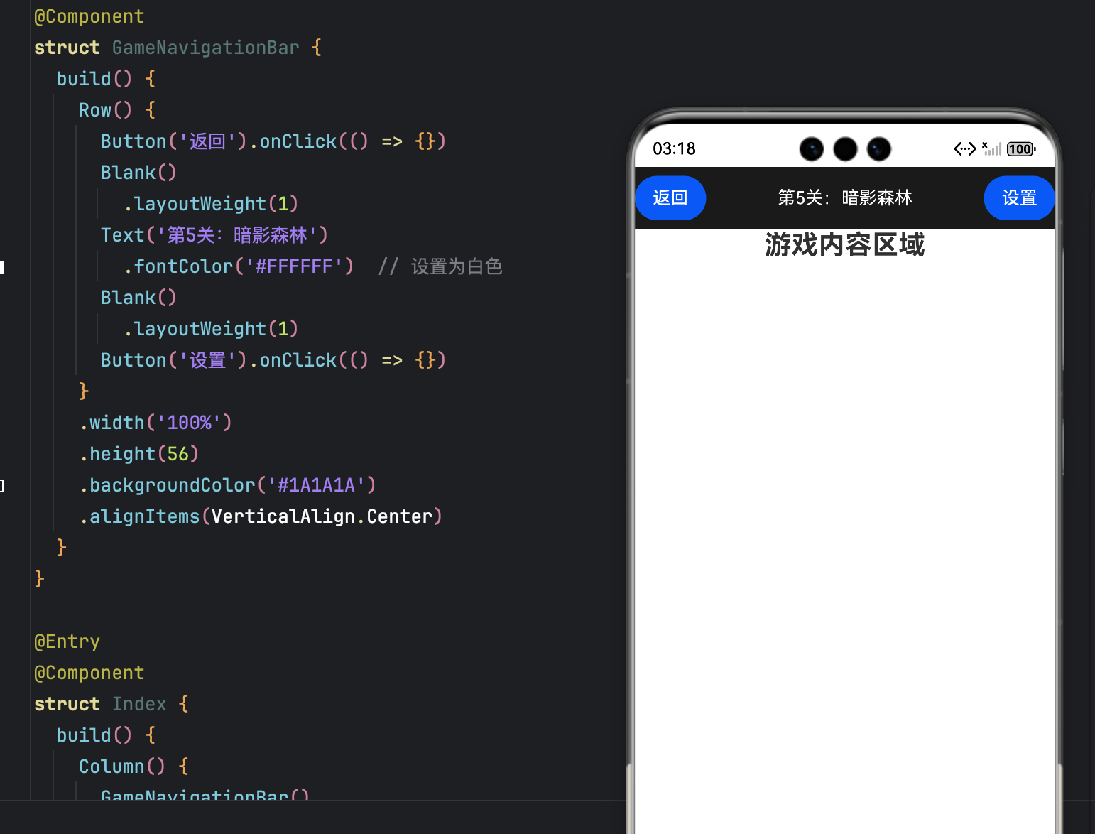
- 高度
56vp符合触控规范;Spacer()实现左右对齐、中间居中。
3.3 图标 + 文字组合(可选)
Button() {
  Column() {
    Image($r('app.media.icon_settings')).width(20)
    Text('设置').fontSize(10)
  }
}.onClick(() => {})
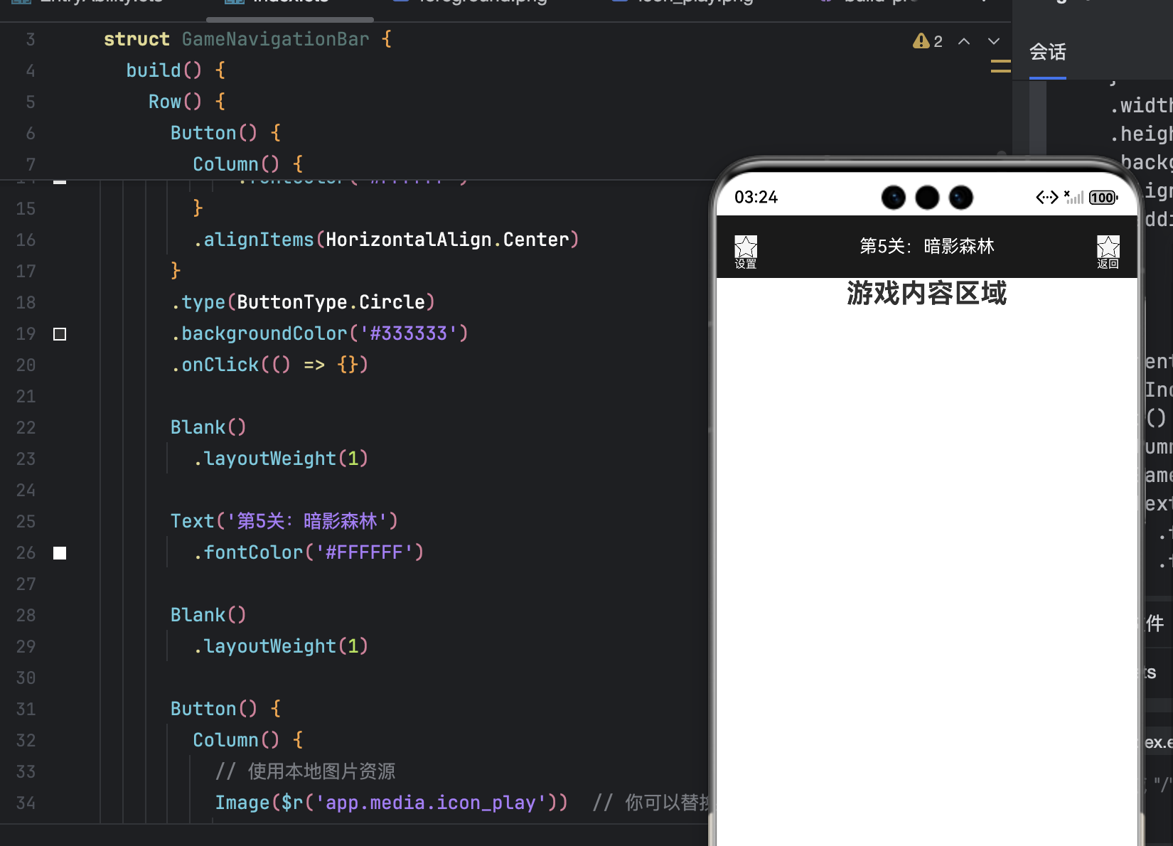
适用于低频功能,提升可识别性。
3.4 实现滚动渐隐效果
@State navOpacity: number = 1;
private scrollTimer: any = null;

build() {
  Column() {
    CustomStatusBar()
    GameNavigationBar().opacity(this.navOpacity)

    Scroll() {
      // 游戏内容列表
    }
    .onScroll((offset) => {
      const delta = offset.deltaY;
      if (Math.abs(delta) < 5) return;

      this.navOpacity = delta > 0 ? 0 : 1;
      clearTimeout(this.scrollTimer);
      this.scrollTimer = setTimeout(() => {
        this.navOpacity = 1;
      }, 1000);
    })
  }
}
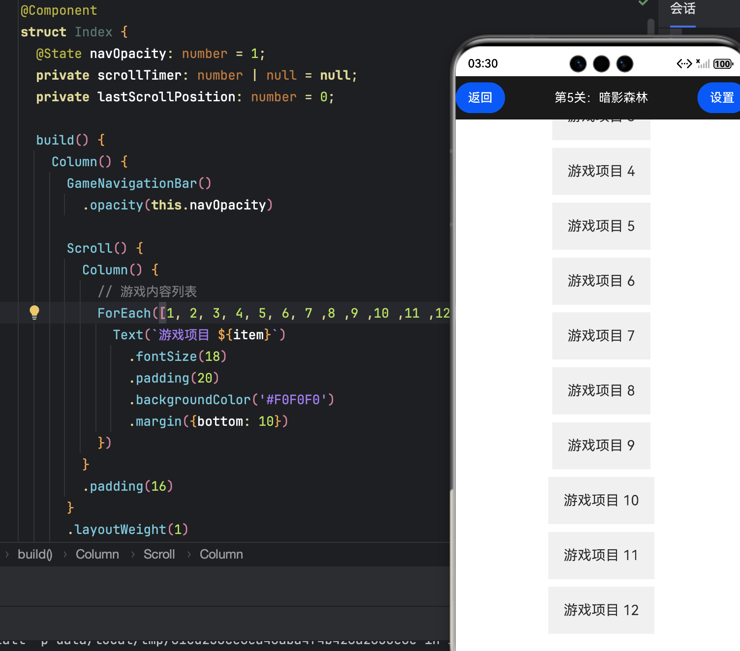
- 向下滚动 → 隐藏;向上滚动 → 显示;
- 停止 1 秒后自动恢复,避免频繁切换。
四、第三部分:交互细节优化 —— 点击反馈与状态统一
4.1 按钮点击反馈
@Component
struct GameButton {
  @State isPress: boolean = false;

  build() {
    Button('操作')
      .scale({ x: this.isPress ? 0.9 : 1, y: this.isPress ? 0.9 : 1 })
      .onTouch((e) => {
        this.isPress = e.type === TouchType.Down;
        if (e.type === TouchType.Up) {
          setTimeout(() => this.isPress = false, 150);
        }
      })
  }
}
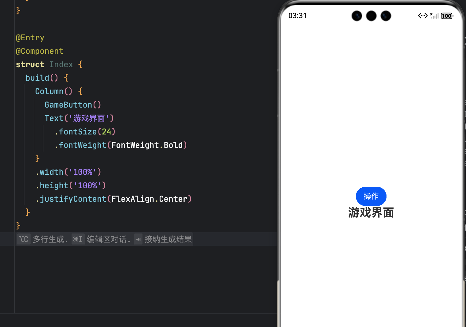
按下按钮会缩小,有按下的效果
- 按压缩放 + 背景色变化(可叠加);
- 150ms 回弹,符合人机交互标准。
4.2 选中态高亮(多选项场景)
@State activeTab: string = '关卡';

Row() {
  ['关卡', '背包', '设置'].map(item =>
    Button(item)
      .backgroundColor(this.activeTab === item ? '#0D47A1' : 'transparent')
      .onClick(() => this.activeTab = item)
  )
}
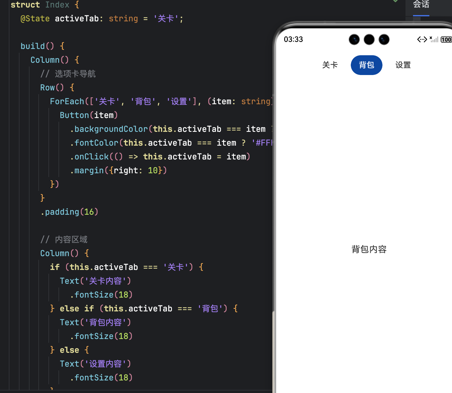
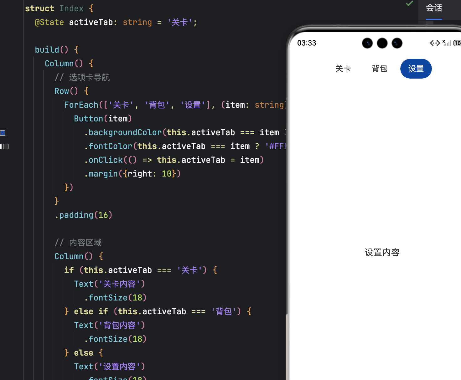
- 选中项高亮,未选中项透明;
- 视觉层次清晰,操作意图明确。
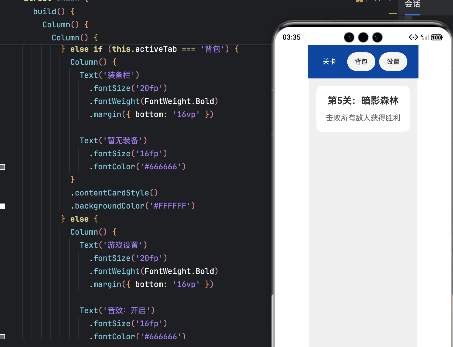
4.3 与全局 UI 风格统一
- 使用
@Styles封装通用样式(圆角、内边距、字体); - 导航栏与状态栏背景色保持一致;
- 避免过多阴影/描边,游戏界面以简洁为主。
// 定义通用样式
@Styles
function gameButtonStyle() {
.width('80vp')
.height('36vp')
.borderRadius('18vp')
.padding({ left: '12vp', right: '12vp' })
}
@Styles
function tabBarStyle() {
.height('40vp')
.borderRadius('20vp')
.padding({ left: '16vp', right: '16vp' })
}
@Styles
function contentCardStyle() {
.borderRadius('12vp')
.padding('20vp')
.margin({ bottom: '16vp' })
}
@Entry
@Component
struct Index {
@State activeTab: string = '关卡';
build() {
Column() {
// 统一的导航栏背景
Row() {
ForEach(['关卡', '背包', '设置'], (item: string) => {
Button(item)
.tabBarStyle()
.fontSize('14fp')
.backgroundColor(this.activeTab === item ? '#0D47A1' : '#F5F5F5')
.fontColor(this.activeTab === item ? '#FFFFFF' : '#333333')
.onClick(() => this.activeTab = item)
.margin({ right: '8vp' })
})
}
.padding('16vp')
.backgroundColor('#0D47A1') // 与状态栏背景色保持一致
// 内容区域
Column() {
if (this.activeTab === '关卡') {
Column() {
Text('第5关:暗影森林')
.fontSize('20fp')
.fontWeight(FontWeight.Bold)
.margin({ bottom: '16vp' })
Text('击败所有敌人获得胜利')
.fontSize('16fp')
.fontColor('#666666')
}
.contentCardStyle()
.backgroundColor('#FFFFFF')
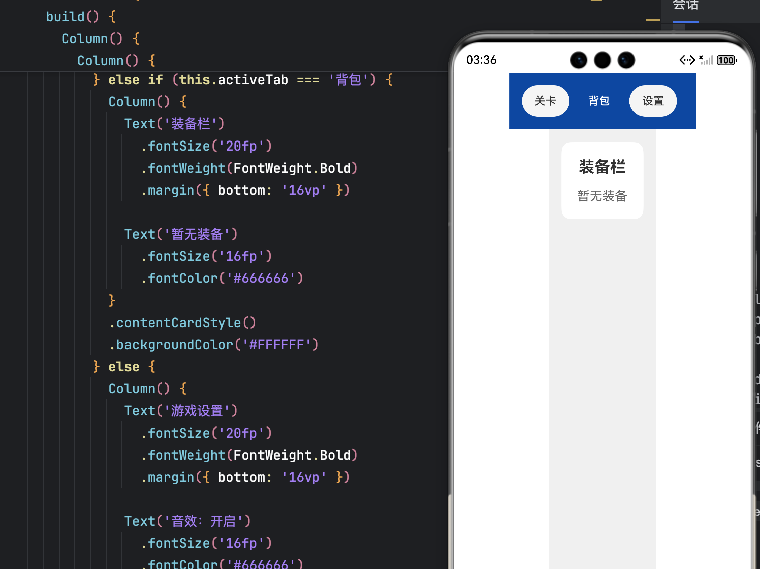
} else if (this.activeTab === '背包') {
Column() {
Text('装备栏')
.fontSize('20fp')
.fontWeight(FontWeight.Bold)
.margin({ bottom: '16vp' })
Text('暂无装备')
.fontSize('16fp')
.fontColor('#666666')
}
.contentCardStyle()
.backgroundColor('#FFFFFF')
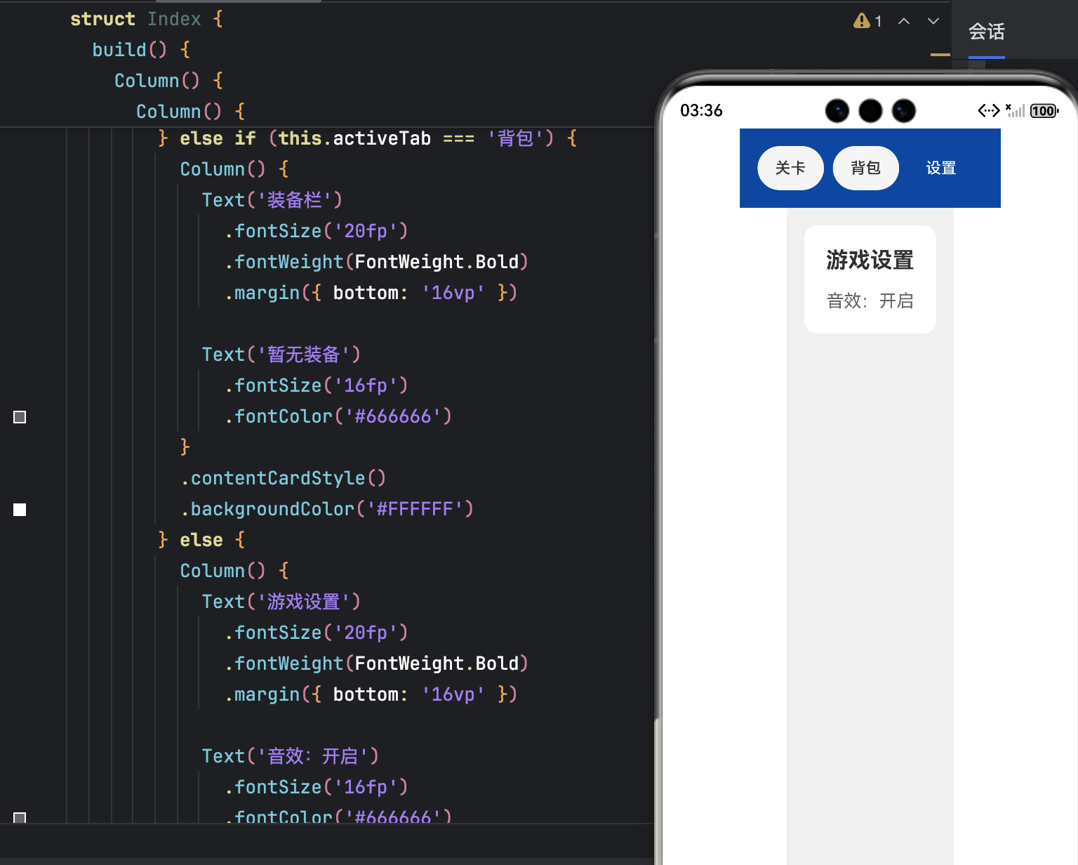
} else {
Column() {
Text('游戏设置')
.fontSize('20fp')
.fontWeight(FontWeight.Bold)
.margin({ bottom: '16vp' })
Text('音效:开启')
.fontSize('16fp')
.fontColor('#666666')
}
.contentCardStyle()
.backgroundColor('#FFFFFF')
}
}
.layoutWeight(1)
.padding('16vp')
.backgroundColor('#F0F0F0') // 整体背景色
}
.width('100%')
.height('100%')
}
}
五、完整实战:可运行的沉浸式游戏界面示例
5.1 项目结构
entry/
├── src/main/ets/pages/Index.ets
└── resources/base/media/
    ├── icon_battery.png
    └── icon_settings.png
5.2 完整代码(Index.ets)
import window from '@ohos.window';
import common from '@ohos.app.ability.common';
import display from '@ohos.display';
import promptAction from '@ohos.promptAction';
function getStatusBarHeight(): number {
const d = display.getDefaultDisplaySync();
return d.getSafeAreaInsetsSync().top / d.pixelDensity || 24;
}
@Component
struct CustomStatusBar {
build() {
Row() {
Spacer()
Text(new Date().toTimeString().slice(0, 5))
Text('🔋85%').fontColor(Color.White).fontSize(12)
}
.width('100%')
.height(getStatusBarHeight())
.backgroundColor('#0D47A180')
.padding({ right: 16 })
}
}
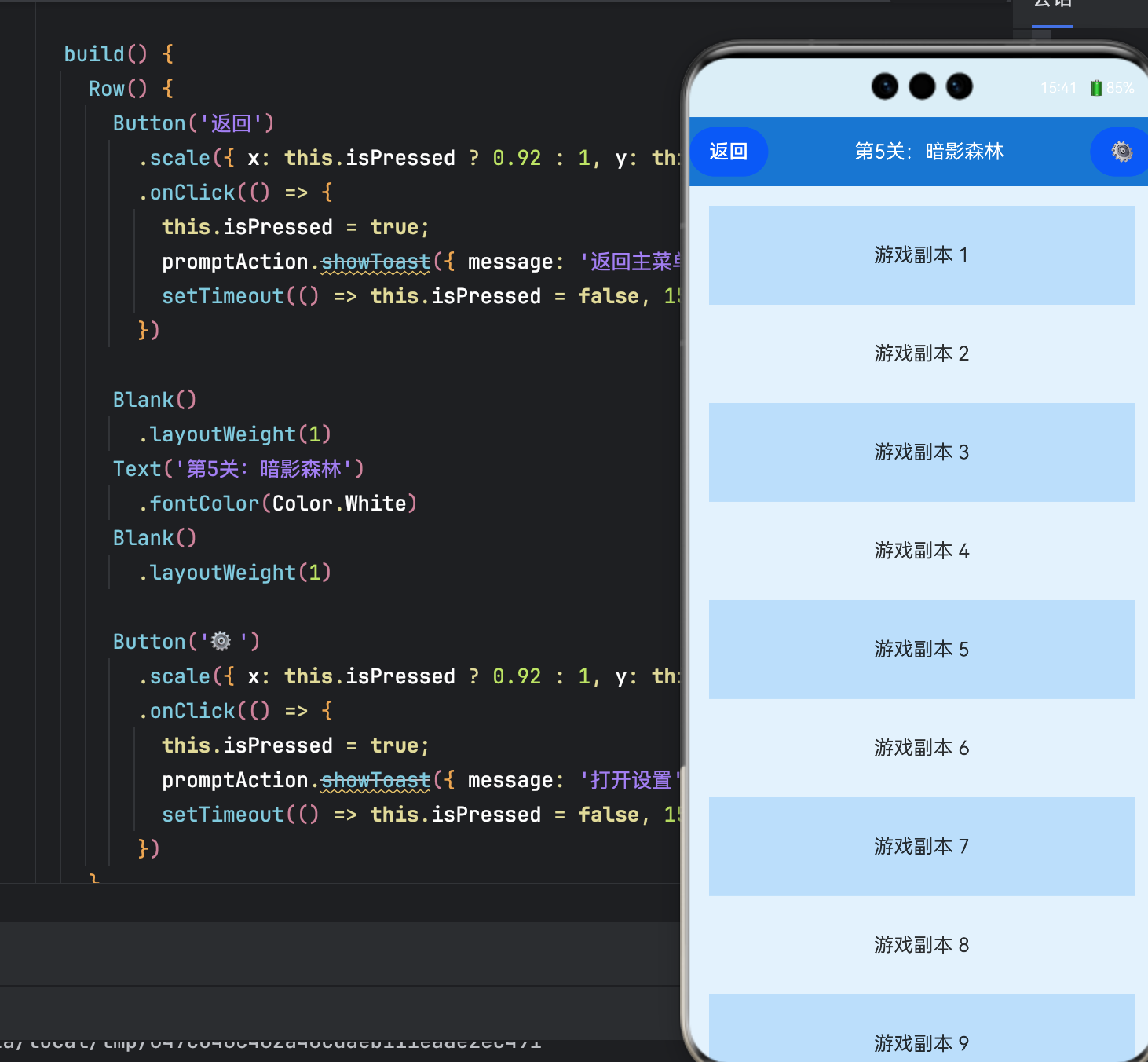
@Component
struct GameNavigationBar {
@Prop opacityVal: number = 1;
@State isPressed: boolean = false;
build() {
Row() {
Button('返回')
.scale({ x: this.isPressed ? 0.92 : 1, y: this.isPressed ? 0.92 : 1 })
.onClick(() => {
this.isPressed = true;
promptAction.showToast({ message: '返回主菜单' });
setTimeout(() => this.isPressed = false, 150);
})
Spacer()
Text('第5关:暗影森林').fontColor(Color.White)
Spacer()
Button('⚙️')
.scale({ x: this.isPressed ? 0.92 : 1, y: this.isPressed ? 0.92 : 1 })
.onClick(() => {
this.isPressed = true;
promptAction.showToast({ message: '打开设置' });
setTimeout(() => this.isPressed = false, 150);
})
}
.width('100%')
.height(56)
.backgroundColor('#1976D2')
.alignItems(VerticalAlign.Center)
.opacity(this.opacityVal)
}
}
@Entry
@Component
struct GamePage {
@State navOpacity: number = 1;
private scrollTimer: any = null;
async aboutToAppear() {
const ctx = getContext(this) as common.UIAbilityContext;
const win = await window.getLastWindow(ctx);
await win.setWindowSystemBarEnable(false);
}
build() {
Column() {
CustomStatusBar()
GameNavigationBar({ opacityVal: this.navOpacity })
Scroll() {
Column() {
ForEach(Array.from({ length: 20 }, (_, i) => i), item => {
Text(`游戏副本 ${item + 1}`)
.width('100%')
.height(80)
.backgroundColor(item % 2 ? '#E3F2FD' : '#BBDEFB')
.textAlign(TextAlign.Center)
})
}
}
.onScroll((offset) => {
const delta = offset.deltaY;
if (Math.abs(delta) < 10) return;
this.navOpacity = delta > 0 ? 0 : 1;
clearTimeout(this.scrollTimer);
this.scrollTimer = setTimeout(() => {
this.navOpacity = 1;
}, 1000);
})
.scrollBar(BarState.Off)
}
.width('100%')
.height('100%')
.backgroundColor('#E3F2FD')
}
}
5.3 运行要求
- DevEco Studio:4.0+
- HarmonyOS SDK:API 9 或更高
- 设备:真机或模拟器(支持全屏模式)
六、总结与进阶建议
6.1 核心价值
- 沉浸感提升:隐藏系统栏,UI 与游戏风格无缝融合;
- 操作效率优化:三段式导航聚焦核心功能,滚动渐隐扩大视野;
- 交互体验升级:点击反馈、选中态让操作更有确认感。
6.2 性能注意事项
- 滚动监听中加入防抖,避免频繁
setState; - 页面销毁时清除
setTimeout定时器; - 图标优先使用 SVG,减少资源体积。
6.3 扩展方向
- 折叠屏适配:通过
display.getFoldStatus()避开铰链区; - 动态状态栏:嵌入血条、技能冷却等游戏状态;
- 手势交互:侧滑返回替代按钮,释放屏幕空间;
- 主题切换:根据系统暗色/亮色模式自动适配配色。
结语
真正的沉浸式体验,不是抹去系统,而是让系统成为游戏的一部分。HarmonyOS 提供的灵活窗口控制与 UI 定制能力,让开发者能够从玩家视角出发,打磨每一个像素、每一次点击。从状态栏的透明度微调,到导航栏的滚动渐隐,细节的累积,终将成就专业的游戏品质。

讨论HarmonyOS开发技术,专注于API与组件、DevEco Studio、测试、元服务和应用上架分发等。
更多推荐
 26
26 0
0- 0


 已为社区贡献23条内容

所有评论(0)