【HarmonyOS 6】悬浮按钮实战:FAB 的设计与定位
悬浮操作按钮(Floating Action Button,简称 FAB),它悬浮在页面内容之上,用于展示应用中最主要的操作。FAB 通常是一个圆形按钮,带有阴影效果,固定在屏幕的某个位置,方便用户快速触达核心功能。在移动应用中,FAB 常用于"添加"、“编辑”、"分享"等主要操作。本文将通过一个实际案例——健康管理应用的运动记录添加功能,带你深入理解如何在HarmonyOS 6应用中实现一个优雅
前言
悬浮操作按钮(Floating Action Button,简称 FAB),它悬浮在页面内容之上,用于展示应用中最主要的操作。FAB 通常是一个圆形按钮,带有阴影效果,固定在屏幕的某个位置,方便用户快速触达核心功能。
在移动应用中,FAB 常用于"添加"、“编辑”、"分享"等主要操作。本文将通过一个实际案例——健康管理应用的运动记录添加功能,带你深入理解如何在HarmonyOS 6应用中实现一个优雅的悬浮按钮。
本文适合: 已经了解 ArkTS 基础语法的初学者
你将学到:
- 悬浮按钮的设计原则与视觉规范
- position 绝对定位的使用方法
- 阴影效果的配置技巧
- 响应式尺寸与位置适配
- 悬浮按钮与对话框的联动
什么是 FAB
FAB(Floating Action Button)是一个悬浮在界面上的圆形按钮,具有以下特点:
核心特征:
- 圆形外观:通常是正圆形,直径 56dp 左右
- 悬浮效果:通过阴影营造悬浮感
- 固定位置:通常在右下角,不随页面滚动
- 主题色:使用应用的主题色,视觉突出
- 单一操作:代表页面的主要操作
常见应用场景:
- 添加操作:添加联系人、创建笔记、新建任务
- 编辑操作:编辑资料、修改设置
- 分享操作:分享内容、发送消息
案例背景
我们要实现一个运动记录页面的悬浮添加按钮,包含以下功能:
- 圆形按钮:直径 56-64dp,根据屏幕尺寸自适应
- 固定位置:位于屏幕右下角,距离边缘合适距离
- 阴影效果:营造悬浮感,提升视觉层次
- 点击交互:点击后弹出添加运动记录的对话框
最终效果如下图所示: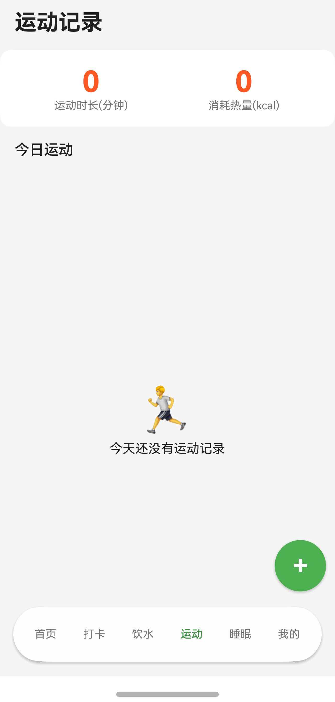
点击后弹出对话框: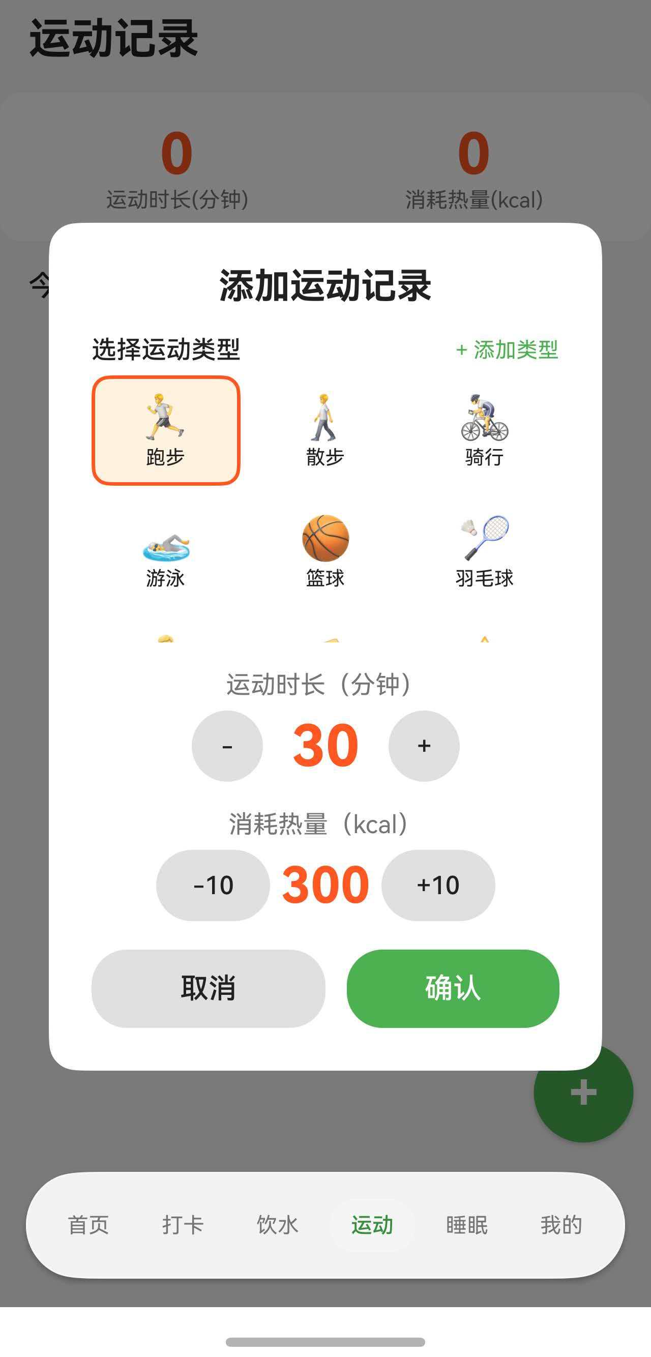
一、完整代码实现
让我们先看悬浮按钮的完整实现代码。
@Component
export struct ExerciseTabContent {
  @State exerciseRecords: ExerciseRecordData[] = [];
  @State exerciseTypes: ExerciseTypeData[] = [];
  @State showAddDialog: boolean = false;
  @State currentBreakpoint: BreakpointType = getBreakpointManager().getCurrentBreakpoint();

  private prefService: PreferencesService | null = null;
  private breakpointManager: BreakpointManager | null = null;
  private breakpointListener: ((breakpoint: BreakpointType) => void) | null = null;

  aboutToAppear(): void {
    const ctx = getContext(this) as common.UIAbilityContext;
    this.prefService = PreferencesService.getInstance(ctx);
    this.loadExerciseTypes();
    this.loadExerciseData();

    this.breakpointManager = getBreakpointManager();
    this.currentBreakpoint = this.breakpointManager.getCurrentBreakpoint();
    this.breakpointListener = (breakpoint: BreakpointType) => {
      this.currentBreakpoint = breakpoint;
    };
    this.breakpointManager.onChange(this.breakpointListener);
  }

  aboutToDisappear(): void {
    if (this.breakpointManager && this.breakpointListener) {
      this.breakpointManager.removeCallback(this.breakpointListener);
    }
  }

  // 响应式尺寸配置
  private getFabSize(): number {
    return getValueByBreakpoint(
      this.currentBreakpoint,
      new BreakpointValue<number>(56, 60, 64)
    );
  }

  private getFabRadius(): number {
    return getValueByBreakpoint(
      this.currentBreakpoint,
      new BreakpointValue<number>(28, 30, 32)
    );
  }

  private getFabPosX(): string {
    return getValueByBreakpoint(
      this.currentBreakpoint,
      new BreakpointValue<string>('82%', '86%', '90%')
    );
  }

  private getFabPosY(): string {
    return getValueByBreakpoint(
      this.currentBreakpoint,
      new BreakpointValue<string>('80%', '82%', '84%')
    );
  }

  build() {
    Stack() {
      // 主页面内容
      Column() {
        // 标题
        Text('运动记录')
          .fontSize(24)
          .fontWeight(FontWeight.Bold)
          .fontColor($r('app.color.text_primary'))
          .padding(16)

        // 今日统计
        Row() {
          Column() {
            Text(this.getTotalDuration().toString())
              .fontSize(32)
              .fontWeight(FontWeight.Bold)
              .fontColor($r('app.color.exercise_orange'))
            Text('运动时长(分钟)')
              .fontSize(12)
              .fontColor($r('app.color.text_secondary'))
          }
          .layoutWeight(1)

          Column() {
            Text(this.getTotalCalories().toString())
              .fontSize(32)
              .fontWeight(FontWeight.Bold)
              .fontColor($r('app.color.exercise_orange'))
            Text('消耗热量(kcal)')
              .fontSize(12)
              .fontColor($r('app.color.text_secondary'))
          }
          .layoutWeight(1)
        }
        .width('100%')
        .padding(20)
        .backgroundColor($r('app.color.card_background'))
        .borderRadius(12)
        .margin({ left: 16, right: 16 })

        // 今日记录列表
        Text('今日运动')
          .fontSize(16)
          .fontWeight(FontWeight.Medium)
          .fontColor($r('app.color.text_primary'))
          .width('100%')
          .padding({ left: 16, top: 16, bottom: 8 })

        List() {
          ForEach(this.exerciseRecords, (record: ExerciseRecordData) => {
            ListItem() {
              Row() {
                Text(record.icon)
                  .fontSize(24)
                Column() {
                  Text(record.typeName)
                    .fontSize(16)
                    .fontColor($r('app.color.text_primary'))
                  Text(`${record.duration}分钟 · ${record.calories}kcal`)
                    .fontSize(12)
                    .fontColor($r('app.color.text_secondary'))
                    .margin({ top: 2 })
                }
                .alignItems(HorizontalAlign.Start)
                .margin({ left: 12 })
                Blank()
                Text(record.time)
                  .fontSize(12)
                  .fontColor($r('app.color.text_secondary'))
              }
              .width('100%')
              .padding(12)
              .backgroundColor($r('app.color.card_background'))
              .borderRadius(8)
            }
            .margin({ left: 16, right: 16, bottom: 8 })
          })
        }
        .layoutWeight(1)
      }
      .width('100%')
      .height('100%')
      .backgroundColor($r('app.color.background_color'))

      // 右下角悬浮按钮
      Column() {
        Text('+')
          .fontSize(getValueByBreakpoint(
            this.currentBreakpoint,
            new BreakpointValue<number>(28, 30, 32)
          ))
          .fontColor(Color.White)
          .fontWeight(FontWeight.Bold)
      }
      .width(this.getFabSize())
      .height(this.getFabSize())
      .backgroundColor($r('app.color.primary_color'))
      .borderRadius(this.getFabRadius())
      .justifyContent(FlexAlign.Center)
      .shadow({ radius: 8, color: $r('app.color.shadow_color'), offsetY: 4 })
      .position({ x: this.getFabPosX(), y: this.getFabPosY() })
      .onClick(() => {
        if (this.exerciseTypes.length > 0) {
          this.showAddDialog = true;
        }
      })

      // 添加运动记录对话框
      if (this.showAddDialog) {
        this.AddExerciseDialog()
      }
    }
  }

  @Builder
  AddExerciseDialog() {
    Column() {
      Column() {
        Text('添加运动记录')
          .fontSize(20)
          .fontWeight(FontWeight.Bold)
          .fontColor($r('app.color.text_primary'))

        // 对话框内容...

        Row() {
          Button('取消')
            .layoutWeight(1)
            .height(44)
            .backgroundColor($r('app.color.divider_color'))
            .fontColor($r('app.color.text_primary'))
            .onClick(() => {
              this.showAddDialog = false;
            })

          Button('确认')
            .layoutWeight(1)
            .height(44)
            .backgroundColor($r('app.color.primary_color'))
            .fontColor(Color.White)
            .margin({ left: 12 })
            .onClick(() => {
              this.addExercise();
            })
        }
        .width('100%')
        .margin({ top: 20 })
      }
      .width('85%')
      .padding(24)
      .backgroundColor($r('app.color.card_background'))
      .borderRadius(16)
    }
    .width('100%')
    .height('100%')
    .backgroundColor('rgba(0, 0, 0, 0.5)')
    .justifyContent(FlexAlign.Center)
  }
}
二、Stack 层叠布局基础
2.1 为什么使用 Stack
要实现悬浮按钮,我们需要让按钮"浮"在页面内容之上。这就需要使用 Stack 层叠布局。
Stack 的特点:
- 子组件按照添加顺序层叠显示
- 后添加的组件在上层
- 可以通过 position 精确定位子组件
2.2 Stack 的基本用法
最简单的 Stack:
Stack() {
  // 底层内容
  Column() {
    Text('这是底层内容')
  }
  .width('100%')
  .height('100%')
  .backgroundColor('#F5F5F5')

  // 顶层内容(悬浮按钮)
  Column() {
    Text('+')
  }
  .width(56)
  .height(56)
  .backgroundColor('#007AFF')
  .borderRadius(28)
}
2.3 Stack 的对齐方式
Stack 可以通过 alignContent 参数设置子组件的对齐方式。
// 右下角对齐
Stack({ alignContent: Alignment.BottomEnd }) {
  Column() {
    Text('主内容')
  }
  .width('100%')
  .height('100%')

  Column() {
    Text('+')
  }
  .width(56)
  .height(56)
}
常用对齐方式:
| 对齐方式 | 说明 | 适用场景 |
|---|---|---|
| Alignment.TopStart | 左上角 | 返回按钮 |
| Alignment.TopEnd | 右上角 | 更多按钮 |
| Alignment.BottomStart | 左下角 | - |
| Alignment.BottomEnd | 右下角 | FAB 按钮 |
| Alignment.Center | 居中 | 对话框 |
注意: 使用 alignContent 对齐时,子组件会紧贴边缘。如果需要留出间距,应该使用 position 定位。
三、position 绝对定位
3.1 position 的基本用法
position 属性可以让组件脱离正常的布局流,精确定位到指定位置。
基础语法:
Column() {
  Text('+')
}
.width(56)
.height(56)
.position({ x: 300, y: 600 })  // 绝对定位到 (300, 600)
坐标系统:
(0, 0) ────────────────────► X 轴
  │
  │
  │
  │
  │
  ▼
Y 轴

position({ x: 300, y: 600 })
         ↑        ↑
      距左边    距顶部
3.2 使用百分比定位
使用固定像素值定位在不同屏幕上效果不一致,更好的方式是使用百分比。
Column() {
  Text('+')
}
.width(56)
.height(56)
.position({ x: '85%', y: '85%' })  // 相对于父容器的百分比
3.3 响应式位置调整
在不同屏幕尺寸上,FAB 的位置应该有所调整。
private getFabPosX(): string {
  return getValueByBreakpoint(
    this.currentBreakpoint,
    new BreakpointValue<string>('82%', '86%', '90%')
  );
}

private getFabPosY(): string {
  return getValueByBreakpoint(
    this.currentBreakpoint,
    new BreakpointValue<string>('80%', '82%', '84%')
  );
}

Column() {
  Text('+')
}
.position({ x: this.getFabPosX(), y: this.getFabPosY() })
3.4 position 与 margin 的区别
position:
- 脱离正常布局流
- 不影响其他组件
- 可以覆盖在其他组件上
margin:
- 在正常布局流中
- 会影响其他组件的位置
- 不能覆盖其他组件
// ❌ 使用 margin(不推荐)
Column() {
  Text('+')
}
.margin({ right: 16, bottom: 16 })
// 问题:无法固定在屏幕右下角,会随内容滚动

// ✅ 使用 position(推荐)
Column() {
  Text('+')
}
.position({ x: '85%', y: '85%' })
// 优点:固定在屏幕位置,不随内容滚动
四、阴影效果设计
4.1 shadow 属性的使用
阴影是 FAB 的重要视觉特征,营造"悬浮"的感觉。
基础语法:
Column() {
  Text('+')
}
.shadow({
  radius: 8,                              // 模糊半径
  color: '#00000033',                     // 阴影颜色(带透明度)
  offsetX: 0,                             // X 轴偏移
  offsetY: 4                              // Y 轴偏移
})
阴影参数说明:
| 参数 | 类型 | 说明 | 推荐值 |
|---|---|---|---|
| radius | number | 模糊半径,值越大越模糊 | 8-12 |
| color | Color/string | 阴影颜色,建议带透明度 | rgba(0,0,0,0.2) |
| offsetX | number | 水平偏移,正值向右 | 0 |
| offsetY | number | 垂直偏移,正值向下 | 2-6 |
4.3 阴影颜色的选择
阴影颜色应该根据背景色调整。
浅色背景:
// 使用深色阴影
.shadow({ radius: 8, color: '#00000033', offsetY: 4 })
深色背景:
// 使用浅色阴影
.shadow({ radius: 8, color: '#FFFFFF33', offsetY: 4 })
彩色背景:
// 使用与按钮颜色相近的阴影
.backgroundColor('#007AFF')
.shadow({ radius: 8, color: '#007AFF33', offsetY: 4 })
五、FAB 样式设计
5.1 圆形按钮的实现
FAB 必须是正圆形,这需要宽高相等,且圆角半径为宽度的一半。
private getFabSize(): number {
  return 56;  // 宽高都是 56
}

Column() {
  Text('+')
}
.width(this.getFabSize())
.height(this.getFabSize())
.borderRadius(this.getFabSize() / 2)  // 圆角 = 宽度的一半
5.2 响应式尺寸设计
FAB 的尺寸应该根据屏幕大小调整。
private getFabSize(): number {
  return getValueByBreakpoint(
    this.currentBreakpoint,
    new BreakpointValue<number>(56, 60, 64)
  );
}

private getFabRadius(): number {
  return getValueByBreakpoint(
    this.currentBreakpoint,
    new BreakpointValue<number>(28, 30, 32)
  );
}
5.3 图标大小适配
FAB 内部的图标大小也应该响应式调整。
Column() {
  Text('+')
    .fontSize(getValueByBreakpoint(
      this.currentBreakpoint,
      new BreakpointValue<number>(28, 30, 32)
    ))
    .fontColor(Color.White)
    .fontWeight(FontWeight.Bold)
}
.width(this.getFabSize())
.height(this.getFabSize())
5.4 颜色设计
FAB 应该使用应用的主题色,确保视觉突出。
Column() {
  Text('+')
    .fontColor(Color.White)  // 白色图标
}
.backgroundColor($r('app.color.primary_color'))  // 主题色背景
六、FAB 与对话框联动
6.1 点击事件处理
FAB 最常见的用途是打开对话框或跳转页面。
@State showAddDialog: boolean = false;

Column() {
  Text('+')
}
.onClick(() => {
  this.showAddDialog = true;  // 显示对话框
})
6.2 对话框的显示与隐藏
对话框也使用 Stack 层叠在 FAB 之上。
Stack() {
  // 底层:主页面内容
  Column() {
    // 页面内容
  }

  // 中层:FAB 按钮
  Column() {
    Text('+')
  }
  .position({ x: '85%', y: '85%' })
  .onClick(() => {
    this.showAddDialog = true;
  })

  // 顶层:对话框(条件显示)
  if (this.showAddDialog) {
    Column() {
      Column() {
        Text('添加运动记录')
        // 对话框内容...

        Row() {
          Button('取消')
            .onClick(() => {
              this.showAddDialog = false;  // 隐藏对话框
            })
          Button('确认')
            .onClick(() => {
              this.addExercise();
              this.showAddDialog = false;
            })
        }
      }
      .width('85%')
      .padding(24)
      .backgroundColor(Color.White)
      .borderRadius(16)
    }
    .width('100%')
    .height('100%')
    .backgroundColor('rgba(0, 0, 0, 0.5)')  // 半透明遮罩
    .justifyContent(FlexAlign.Center)
  }
}
总结
通过本文的学习,我们掌握了悬浮按钮(FAB)的设计与实现:
核心知识点:
- 使用 Stack 层叠布局实现悬浮效果
- 使用 position 绝对定位精确控制位置
- 使用百分比定位实现响应式布局
- 使用 shadow 属性营造悬浮感
FAB 是移动应用中最常用的设计之一,掌握其设计和实现技巧,可以让你的应用更加专业和易用。
希望本文能帮助你在实际项目中灵活运用悬浮按钮,打造出优雅的用户界面。

讨论HarmonyOS开发技术,专注于API与组件、DevEco Studio、测试、元服务和应用上架分发等。
更多推荐


 54
54 0
0- 0


 已为社区贡献17条内容

所有评论(0)